Swipe Documentation
Header Group
Header
This theme offers 2 types of header layouts. You can also modify the search promo and add a Mega Menu.


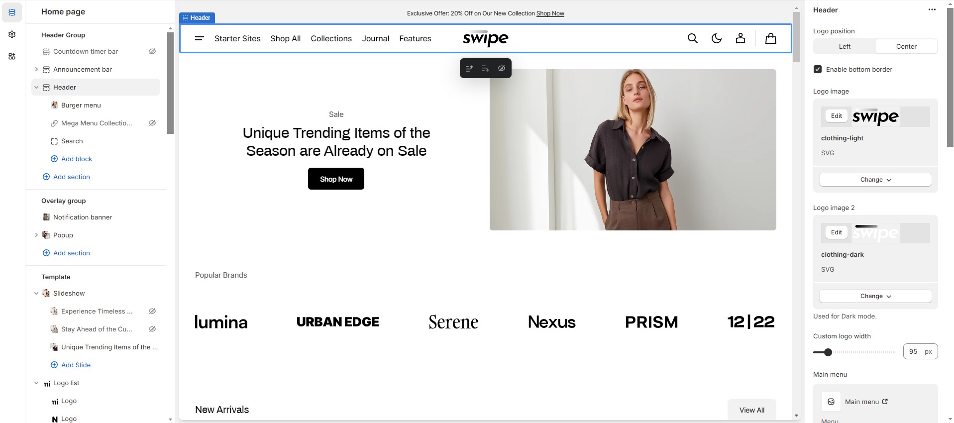
Mega Menu
To add a Mega Menu, make sure that the main menu link has sublinks, and then follow these steps:
- Add the Mega Menu to the Header.
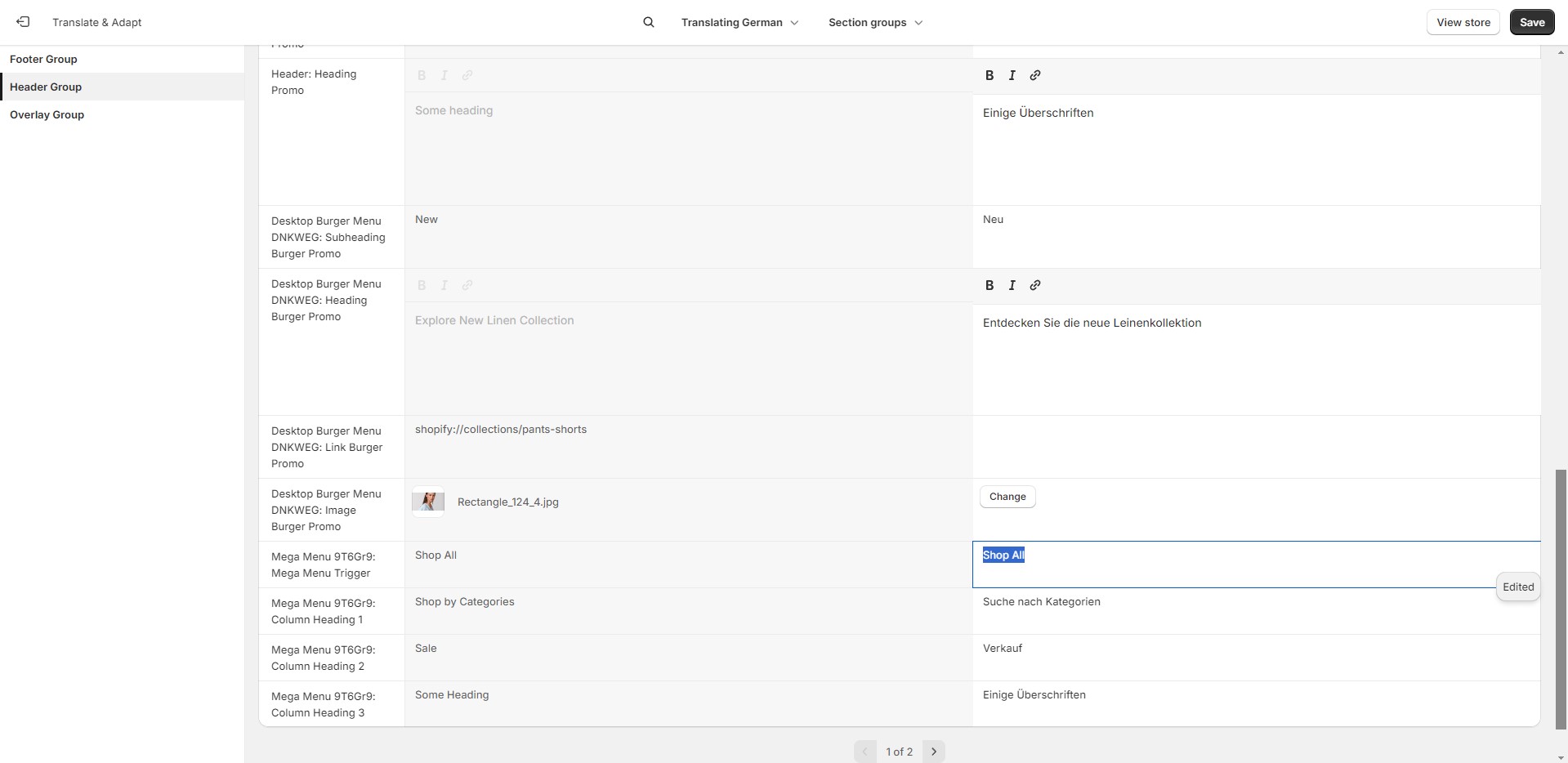
- Type the exact name of the link in the Trigger field.
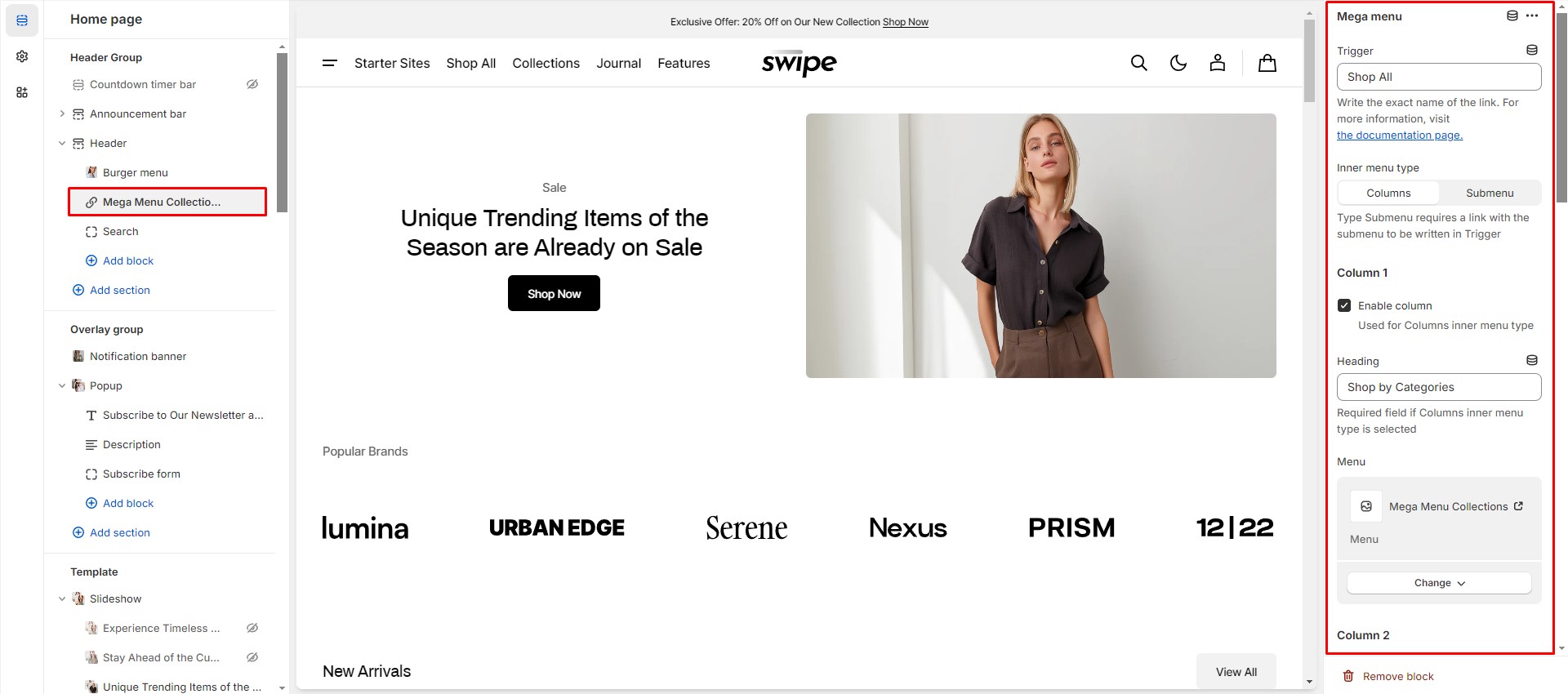
To avoid issues in stores with multiple languages, keep the {trigger} untranslated.
Search
In this theme, you can use a predictive search. It is enabled by default, but you can disable it in the Theme settings > Search.
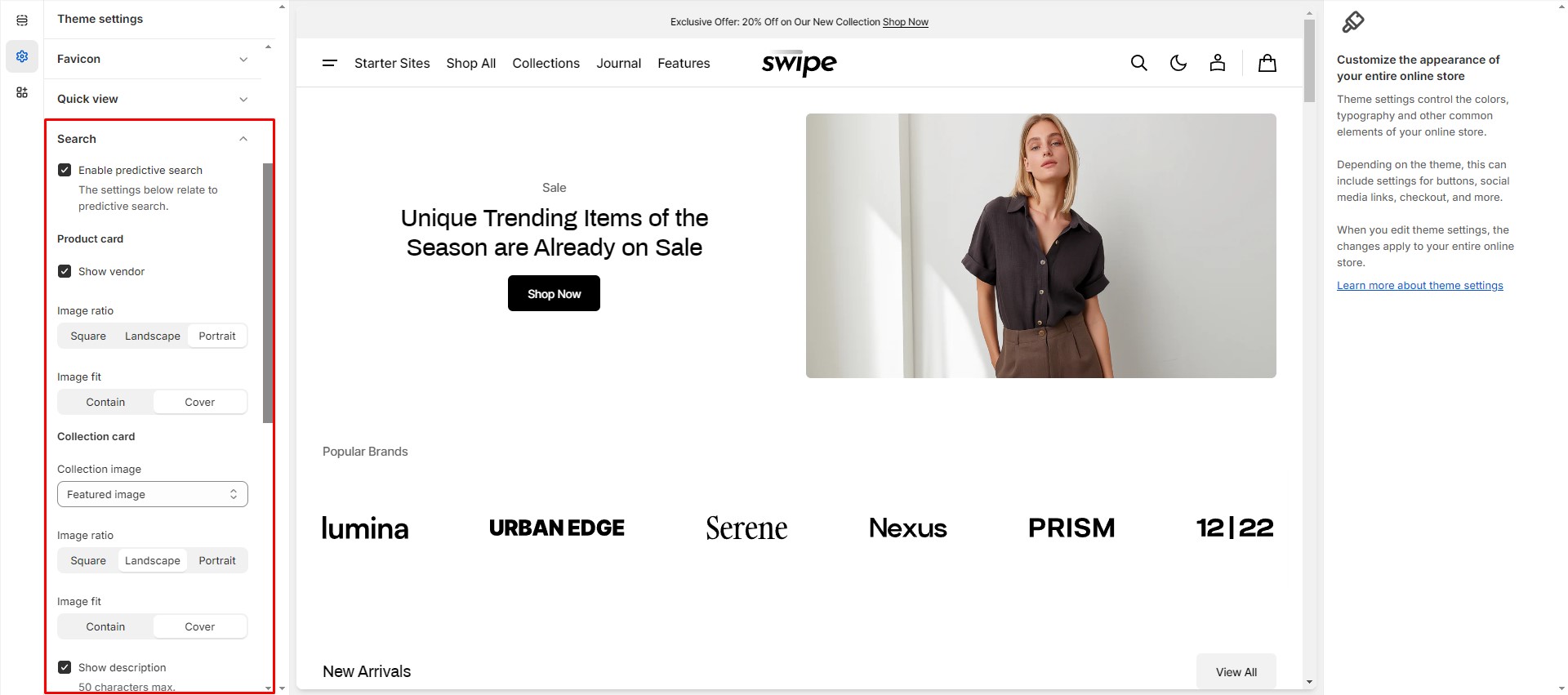
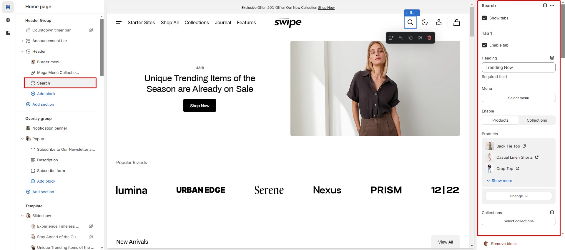
You can also enable the Search promo block in the Header settings, which opens before the user starts to type. There are 2 types of information that can be added to this block: collections and products.
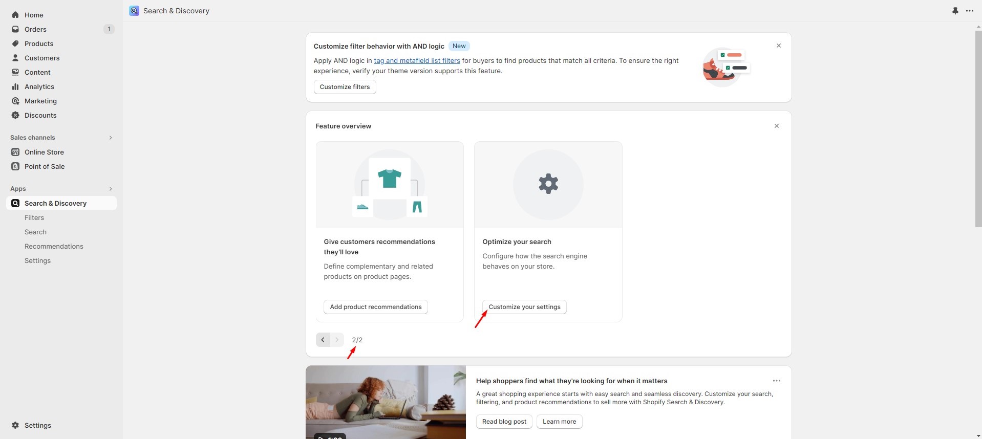
To manage search results, navigate to the Search settings within the Search & Discovery App.
Overlay Group
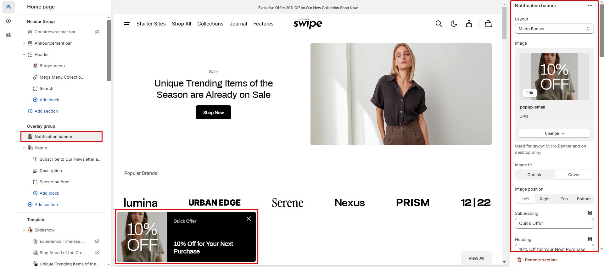
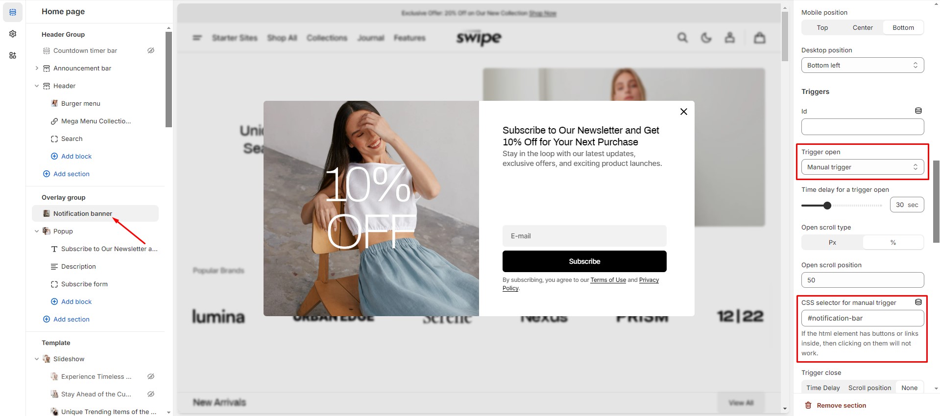
Notification Banner
In the Notification Banner settings, you can change layout, add image, texts, edit banner position, change open and exit animations and options.
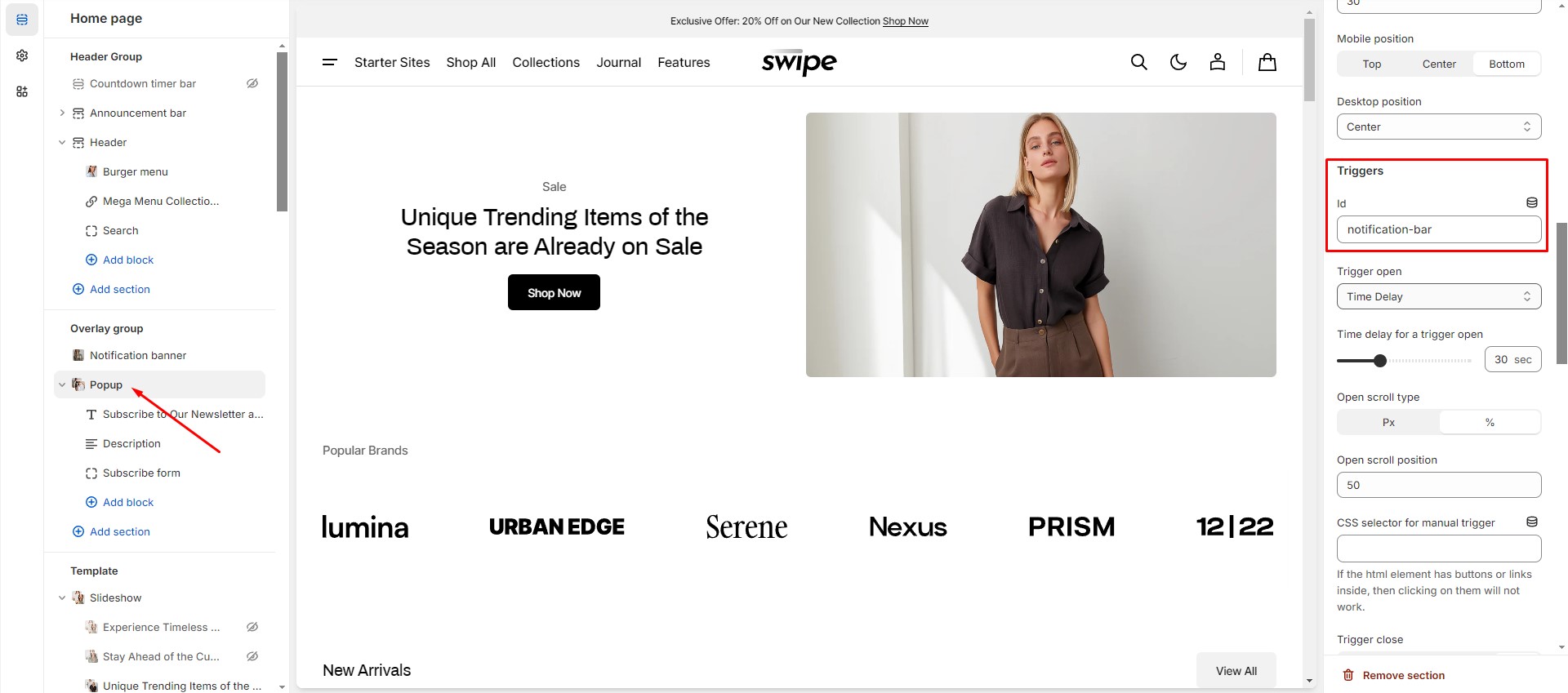
You can also use this banner as a button-trigger for opening another notification bar or a popup by following these steps:
-
Pass the ID of the popup/notification bar you would like to open to the Id field in the Triggers section
(e.g. "popup").
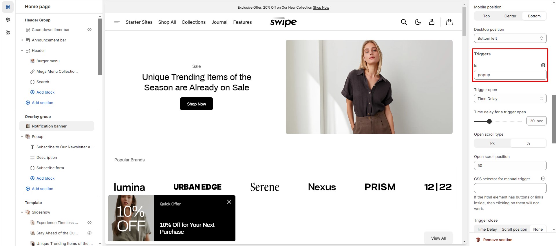
- Navigate to the popup/notification bar settings, add the same ID with "#" at the beginning to the "CSS
selector for
manual trigger" field, and choose an option in the "Trigger open" select.
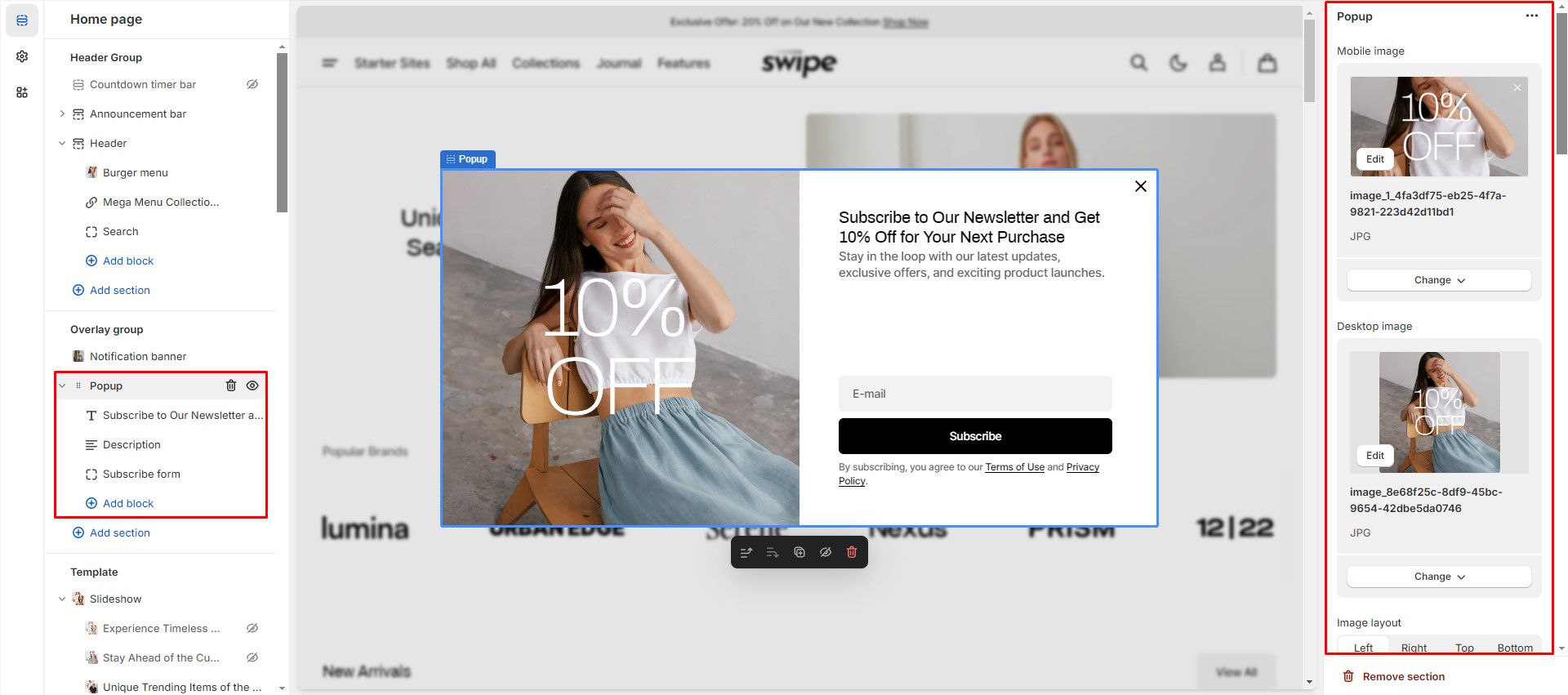
Popup
In the Popup settings, you can change layout, add image, subscribe form, edit position, change open and exit animations and options.
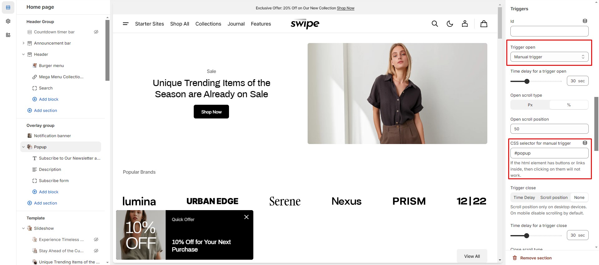
You can also use this popup as a button-trigger for opening another popup or notification bar by following these steps:
- Pass the ID of the popup/notification bar you chose to open to the Id field in the Triggers section
(e.g.
"notification-bar").
- Navigate to the popup/notification bar settings and add the same ID with "#" in the beginning to the
"CSS selector for
manual trigger" field.
Sections
Featured Collection
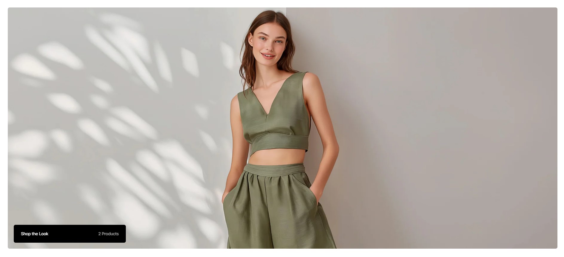
The Featured Collection section showcases a selected collection of products in your store. It provides various layout, style, and content options to match your store's branding and design preferences.
Layout Options
- Simple Layout displays the collection with a clean, straightforward design.
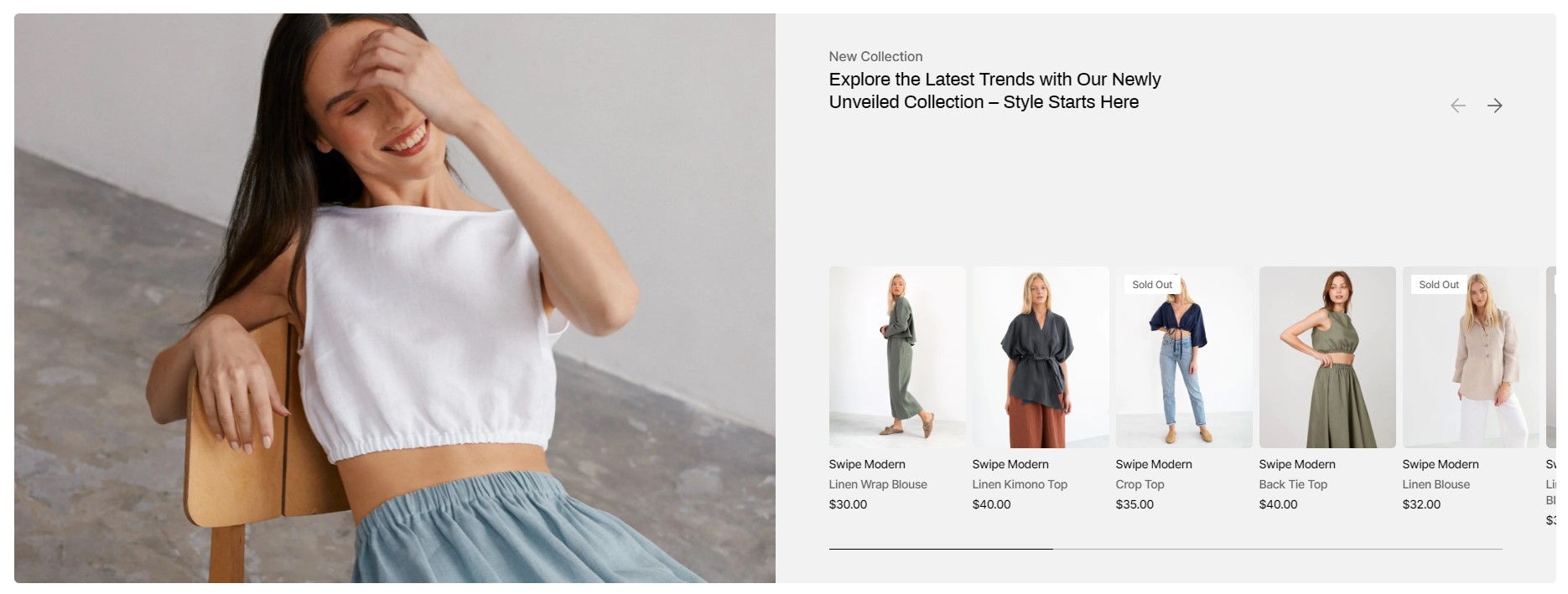
Simple layout - Overlay Layout adds an overlay effect on the collection image, creating a modern and dynamic presentation.
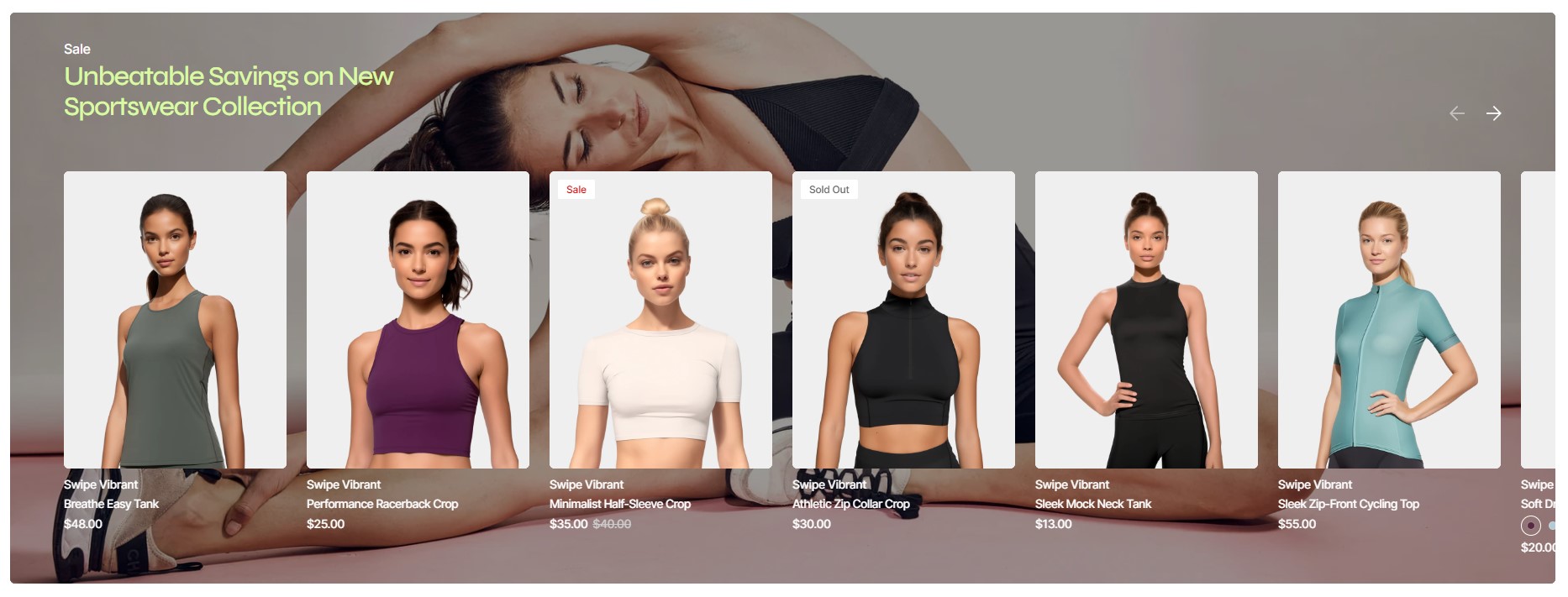
Overlay layout
Configuration Options
-
Featured Collection:
- Collection: Select the specific collection you want to feature.
-
Layout:
- Simple: Standard grid display of products.
- Overlay: Products are displayed with an overlay effect on images.
-
Color Scheme:
- Choose the color scheme to match your store's overall design.
-
Subheading:
- Add a subheading above the collection.
-
Heading:
- Add a main heading for the collection.
-
Heading Size:
- Select the size of the heading (e.g., small, medium, large).
-
Heading Color:
- Basic: Default heading color.
- Accent: Highlight the heading with an accent color.
-
Product Card Options:
-
Image Ratio:
- Square: Square format for product images.
- Landscape: Wider than tall format.
- Portrait: Taller than wide format.
-
Image Fit:
- Contain: Entire image fits within the product card.
- Cover: Image covers the entire product card, potentially cropping the image.
-
Image Ratio:
-
Additional Product Card Options:
- Show Second Image on Hover: Toggle to display a second image when hovering over the product.
- Show Vendor: Toggle to display the vendor's name.
- Show Description: Toggle to display a short product description.
-
Image Options:
- Mobile Image Ratio: Set the image ratio for mobile devices.
- Desktop Image Ratio: Set the image ratio for desktop devices.
-
Alternative Cover Images:
- Mobile: Upload alternative cover images for mobile view or use the default collection image.
- Desktop: Upload alternative cover images for desktop view or use the default collection image.
-
Overlay Opacity:
- Adjust the opacity of the overlay effect (only applicable for the "Overlay" layout).
-
Section Padding:
- Top Padding: Adjust the padding at the top of the section.
- Bottom Padding: Adjust the padding at the bottom of the section.
-
Section Margin:
- Top Margin: Adjust the margin at the top of the section.
- Bottom Margin: Adjust the margin at the bottom of the section.
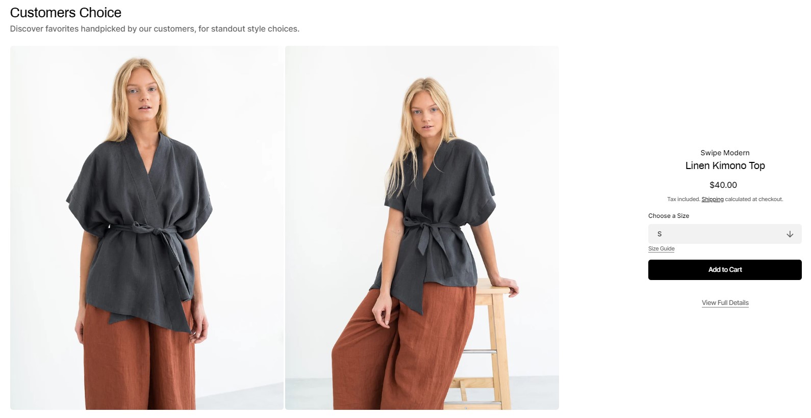
Featured Product
The "Featured Product" section is designed to showcase a specific product prominently on your Shopify store's page. It provides a range of customization options to tailor the presentation to fit your store's aesthetic and functional needs.
Configuration Options
-
Subheading:
- Add a subheading above the product.
-
Heading:
- Add a main heading for the product.
-
Heading Size:
- Medium: Medium size for the heading.
- Large: Large size for the heading.
-
Description:
- Add a description for the featured product.
-
Product:
- Select the product to feature.
-
Color Scheme:
- Choose the color scheme to match your store's overall design.
-
Mobile Gallery Type:
- Stacked Gallery: Display images in a stacked format.
- Slideshow: Display images as a slideshow.
-
Mobile Product Gallery Alignment:
- Before Product Info: Display the gallery before the product information.
- After Product Info: Display the gallery after the product information.
-
Desktop Gallery Type:
- Stacked Gallery: Display images in a stacked format.
- Slider with Previews: Display images in a slider format with previews.
-
Desktop Product Gallery Alignment:
- Left: Align the gallery to the left of the product information.
- Right: Align the gallery to the right of the product information.
-
Aspect Ratio:
- Set the aspect ratio for the product images.
-
Image Fit:
- Contain: Entire image fits within the gallery.
- Cover: Image covers the entire gallery, potentially cropping the image. Used for slideshow.
-
Section Padding:
- Top Padding: Adjust the padding at the top of the section.
- Bottom Padding: Adjust the padding at the bottom of the section.
Available Blocks
-
Text:
- Add customizable text to the product section.
-
Heading:
- Add a heading to the product section.
-
Price:
- Display the price of the product.
-
Variant Picker:
- Allow customers to select product variants (e.g., size, color).
-
Size Guide:
- Provide a size guide for the product.
-
Buy Buttons:
- Add buttons for purchasing the product.
-
Custom Badges:
- Add custom badges to highlight specific features or promotions.
-
Description:
- Add a detailed description of the product.
-
Tags:
- Add tags to the product for better organization and searchability.
-
SKU:
- Display the stock keeping unit (SKU) for the product.
-
Inventory:
- Show the inventory status of the product.
-
Pickup Availability:
- Show the availability of in-store pickup options.
-
Popup:
- Add a popup for additional information or promotions.
-
Size Guide Popup:
- Provide a popup with a size guide for the product.
-
Dropdown Information:
- Add dropdown sections for additional product information.
-
Custom Liquid:
- Add custom Liquid code for advanced customization.
Media with Text
The Media with Text section lets you create a visually appealing layout by combining images or videos with text. It's highly customizable, offering options to adjust the color scheme, add headings and descriptions, and configure the layout for both mobile and desktop views. You can enhance the design by aligning text, uploading different media for each device, and adding buttons with various styles and links.

Configuration Options
-
Color Scheme:
- Choose the color scheme to match your store's overall design.
-
Subheading:
- Add a subheading above the media.
-
Heading:
- Add a main heading for the media section.
-
Heading Size:
- Medium: Medium size for the heading.
- Large: Large size for the heading.
- Extra Large: Extra large size for the heading.
-
Description:
- Add a description for the media section.
-
Text Alignment:
- Left: Align text to the left.
- Center: Center-align the text.
-
Mobile Image:
- Upload an image for mobile devices.
-
Desktop Image:
- Upload an image for desktop devices.
-
Mobile Media Ratio:
- Set the media ratio for mobile devices.
-
Desktop Media Ratio:
- Set the media ratio for desktop devices.
-
Shopify-Hosted Video:
- Show Video: Enable or disable the video (checkbox).
- Mobile Video: Upload a video for mobile devices.
- Desktop Video: Upload a video for desktop devices.
-
Button Options:
- Show Button: Enable or disable the button (checkbox).
- Button Label: Set the label for the button.
-
Button Style:
- Primary: Primary button style.
- Secondary: Secondary button style.
- Tertiary: Tertiary button style.
-
Button Link:
- Set the link for the button.
-
Section Padding:
- Top Padding: Adjust the padding at the top of the section.
- Bottom Padding: Adjust the padding at the bottom of the section.
-
Section Margin:
- Top Margin: Adjust the margin at the top of the section.
- Bottom Margin: Adjust the margin at the bottom of the section.
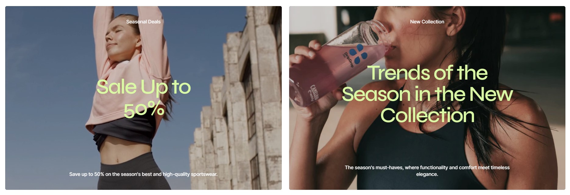
Slideshow
The "Slideshow" section is a dynamic and versatile feature that allows you to showcase multiple images or videos in a rotating carousel. This section is highly customizable, enabling you to choose different layouts, set aspect ratios for mobile and desktop, and configure various animation and playback settings. Whether you want a simple, overlay, or grid layout, the slideshow section helps you create an engaging visual experience for your visitors.
Configuration Options
-
Layout:
- Simple: A standard rotating slideshow.
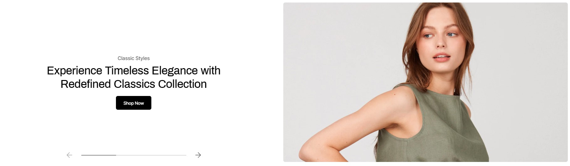
Simple layout - Overlay: A slideshow with an overlay effect on images.
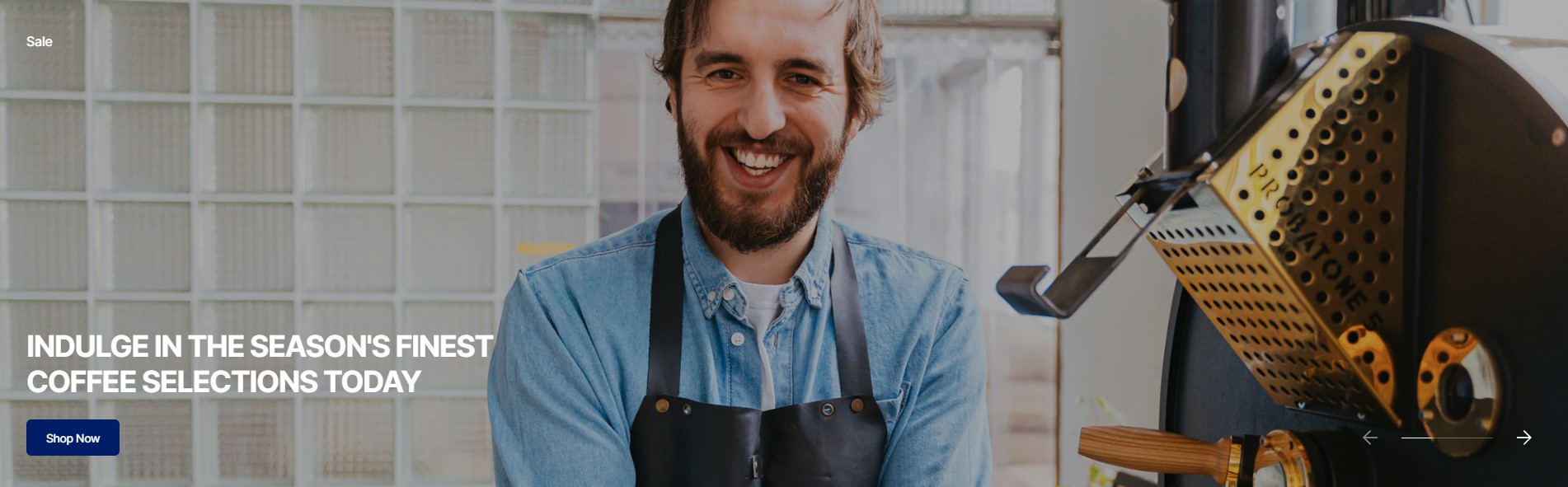
Overlay layout - Grid: A grid layout for displaying multiple slides simultaneously.
Grid layout
- Simple: A standard rotating slideshow.
-
Full Width:
- Enable this option to make the slideshow span the full width of the page.
-
Header Overlay:
- Only applicable for the first section on the page when "Overlay" or "Grid" layout and "Full Width" settings are enabled.
- Adds an overlay effect to the header.
-
Color Scheme:
- Choose the color scheme to match your store's overall design.
-
Mobile Aspect Ratio:
- Set the aspect ratio for mobile devices.
-
Desktop Aspect Ratio:
- Set the aspect ratio for desktop devices.
-
Slide Text Alignment:
- Align the text on slides (left, center, or right).
-
Enable Autoplay:
- Toggle to enable automatic slide rotation.
-
Slide Duration:
- Set the duration each slide is displayed (in seconds).
-
Enable Content Animation:
- Toggle to enable animations for slide content.
-
Enable Parallax Effect:
- Used for "Simple" and "Overlay" layouts. Toggle to enable a parallax scrolling effect.
-
Enable Loop:
- Toggle to enable continuous looping of the slideshow.
-
Enable Pagination:
- Toggle to enable pagination controls for navigating between slides.
-
Enable Navigation:
- Toggle to enable navigation controls for navigating between slides.
-
Section Padding:
- Top Padding: Adjust the padding at the top of the section.
- Bottom Padding: Adjust the padding at the bottom of the section.
-
Section Margin:
- Top Margin: Adjust the margin at the top of the section.
- Bottom Margin: Adjust the margin at the bottom of the section.
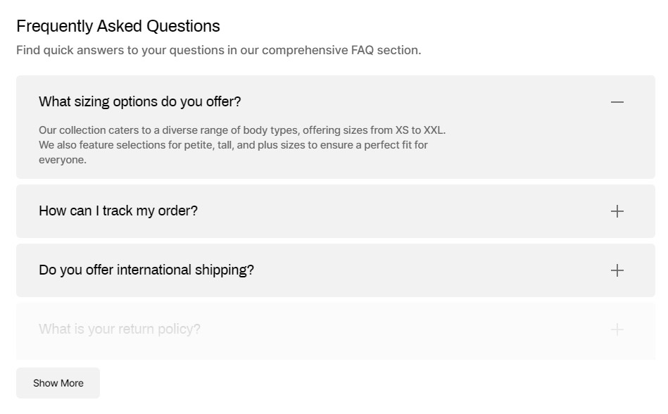
Collapsible Content
The "Collapsible Content" section allows you to create expandable sections of content that provide additional information without cluttering your page. Customize the layout, colors, and styles to match your store's branding and improve user experience.
Configuration Options
-
Layout:
- Border: Content blocks are separated by borders.
Border layout - Background: Content blocks have a background.
Background layout - Border: Content blocks are separated by borders.
-
Border:
- Enable Border Top: Adds a border at the top of the section.
- Border Full Width: Expand the border to cover the entire width of the section.
-
Background:
- Set the background color or image for the section.
-
Color Scheme:
- Define the color scheme for text and icons within the collapsible content.
-
Subheading:
- Optional subheading for the collapsible section.
-
Heading:
- Main heading for the collapsible section.
-
Heading Size:
- Choose the size of the heading:
- Medium
- Large
-
Description:
- Additional text content to describe the collapsible section.
-
Text Alignment:
- Align text within the collapsible content:
- Left
- Center
-
Rows Color Scheme:
- Choose a color scheme for rows within the collapsible content:
- Scheme 2
-
Button Options:
-
Show Buttons "Show More" and "Show Less":
- If enabled, displays 3 blocks by default.
-
"Show More" Button Style:
- Primary
- Secondary
- Tertiary
-
"Show Less" Button Style:
- Primary
- Secondary
- Tertiary
-
Show Buttons "Show More" and "Show Less":
-
Section Padding:
- Top Padding: Adjust the padding at the top of the section.
- Bottom Padding: Adjust the padding at the bottom of the section.
-
Section Margin:
- Top Margin: Adjust the margin at the top of the section.
- Bottom Margin: Adjust the margin at the bottom of the section.
Newsletter
Encourage visitors to stay informed with the "Newsletter" section. Customize the content alignment and choose from various button styles to seamlessly integrate with your store's design.

Newsletter Section Configuration
-
Content Alignment:
- Image Left: Aligns the content with the image on the left.
- Image Right: Aligns the content with the image on the right.
-
Subheading:
- Optional subheading for the newsletter section.
-
Heading:
- Main heading for the newsletter section.
-
Heading Size:
- Choose the size of the heading:
- Large
- Extra Large
-
Description:
- Additional text content to describe the newsletter section.
-
Additional Text:
- Additional text that complements the main description.
-
Button Style:
- Select the style for the newsletter subscription button:
- Primary
- Secondary
- Tertiary
-
Image:
- Upload an image to accompany the newsletter section.
-
Section Margin:
- Top Margin: Adjust the margin at the top of the section.
- Bottom Margin: Adjust the margin at the bottom of the section.
Contact Form
Drive customer engagement with a customizable contact form. Customize colors, buttons, and layout details for seamless integration with your brand, providing clear instructions and optimized design to streamline user interaction and enhance customer satisfaction.
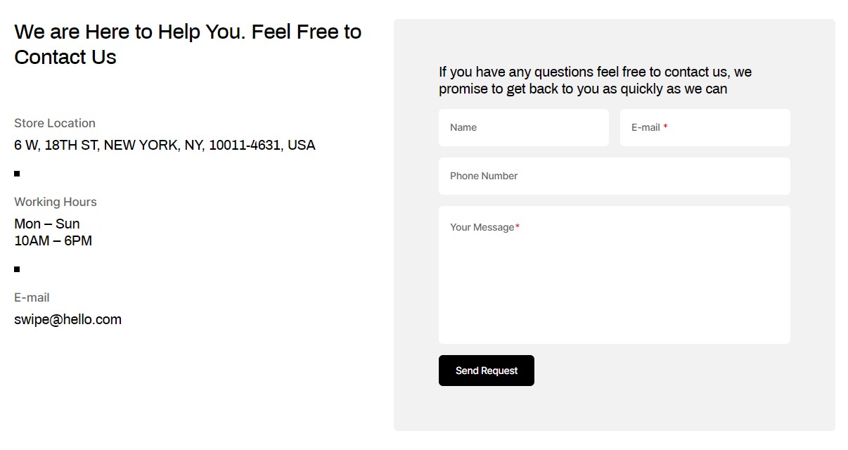
Contact Form Section Configuration
-
Form Position:
- Left: Positions the contact form on the left side.
- Bottom: Places the contact form at the bottom of the section.
- Right: Aligns the contact form on the right side.
-
Color Scheme:
- Define the color scheme for text and icons within the contact form section.
-
Subheading:
- Optional subheading for the contact form section.
-
Heading:
- Main heading for the contact form section.
-
Heading Size:
- Choose the size of the heading:
- Medium
- Large
- Extra Large
-
Description:
- Additional text content to describe the contact form section.
-
Form Color Scheme:
- Define the color scheme for the contact form fields and submit button.
-
Form Heading:
- Heading for the contact form itself (inside the section).
-
Heading Size (Form):
- Choose the size of the form heading:
- Medium
- Small
- Extra Small
-
Form Description:
- Additional text to guide users filling out the contact form.
-
Additional Text:
- Additional text that complements the main description of the contact form section.
-
Button Style:
- Select the style for the submit button in the contact form:
- Primary
- Secondary
- Tertiary
-
Section Padding:
- Top Padding: Adjust the top padding of the contact form section.
- Bottom Padding: Adjust the bottom padding of the contact form section.
-
Section Margin:
- Top Margin: Set the top margin for the contact form section.
- Bottom Margin: Set the bottom margin for the contact form section.
Information Block Configuration
-
Subheading:
- Optional subheading for the information block section.
-
Description:
- Main description for the information block section.
-
Description Text Transform:
- Transform the text in the description (e.g., capitalize, uppercase, lowercase).
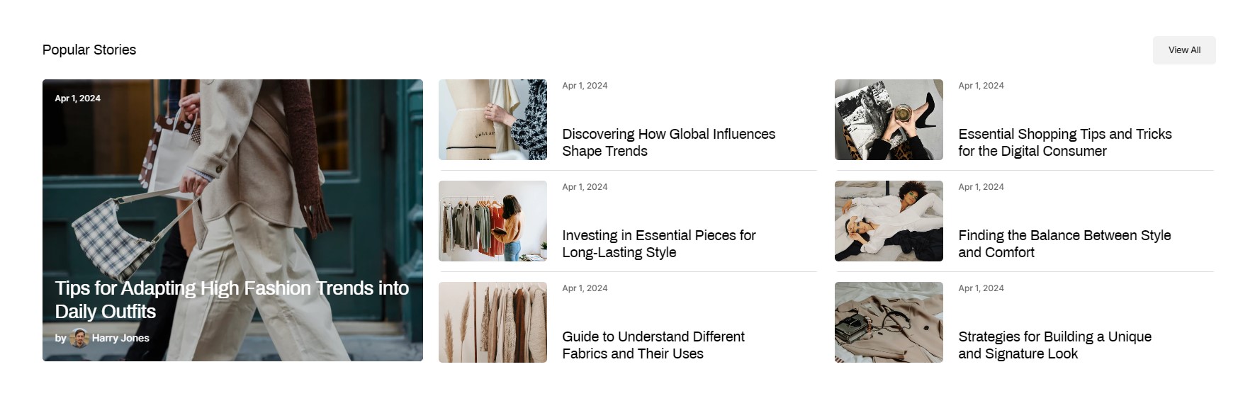
Featured Blog
Enhance your blog with the "Featured Blog" section. Choose grid or column layouts to beautifully display your latest posts on any device. Customize headings, descriptions, and visuals like author and featured images to match your store's style effortlessly with customizable colors and buttons.
Featured Blog Section Configuration
-
Blog:
- Link to the blog or journal section.
-
Post Layout:
- Grid: Display blog posts in a grid layout.
Grid Layout - Columns: Arrange blog posts in columns.
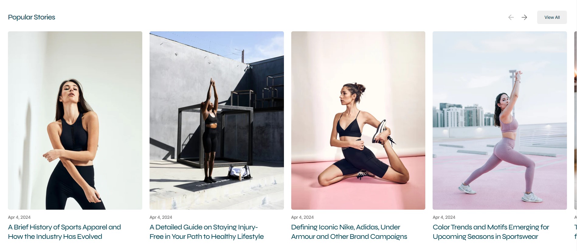
Columns Layout
- Grid: Display blog posts in a grid layout.
-
Enable Border Top:
- Enable a border at the top of the section.
-
Enable Carousel:
- Enable carousel for post layout "Columns" to showcase multiple posts.
-
Number of Columns:
- Set the number of columns for post layout "Columns".
-
Blog Posts Mobile:
- Set the number of blog posts displayed on mobile devices.
-
Blog Posts Desktop and Tablet:
- Set the number of blog posts displayed on desktop and tablet devices.
-
Subheading:
- Optional subheading for the featured blog section.
-
Heading:
- Main heading for the featured blog section.
-
Heading Size:
- Choose the size of the heading:
- Medium
- Large
-
Description:
- Description text to provide context for the featured blog section.
-
Featured Image Ratio:
- Select the preferred ratio for featured images (landscape, portrait, square).
-
Author's Image:
- Upload or select an image for the author of the blog posts.
-
First Blog Post: Specify the color scheme and other settings for the first blog post displayed in the
grid
layout.
- Color Scheme:
- Choose the color scheme to match your store's overall design.
-
Show Featured Image:
- Toggle to show or hide featured images in blog posts.
-
Show Tags:
- Toggle to show or hide tags associated with blog posts.
-
Show Date:
- Toggle to show or hide publication dates of blog posts.
-
Show Author:
- Toggle to show or hide the author's name on blog posts.
-
Show Excerpt:
- Toggle to show or hide excerpts of blog posts.
- Color Scheme:
-
Blog Post:
-
Show Featured Image:
- Toggle to show or hide featured images in blog posts.
-
Show Tags:
- Toggle to show or hide tags associated with blog posts.
-
Show Date:
- Toggle to show or hide publication dates of blog posts.
-
Show Author:
- Toggle to show or hide the author's name on blog posts.
-
Show Excerpt:
- Toggle to show or hide excerpts of blog posts.
-
Show Featured Image:
-
Button Options:
- Toggle to show or hide a button linking to more blog posts.
- Button Label: Specify the label for the button.
-
Button Style:
- Select the style for the button (Primary, Secondary, Tertiary).
-
Section Padding:
- Top Padding: Adjust the top padding of the featured blog section.
- Bottom Padding: Adjust the bottom padding of the featured blog section.
-
Section Margin:
- Top Margin: Set the top margin for the featured blog section.
- Bottom Margin: Set the bottom margin for the featured blog section.
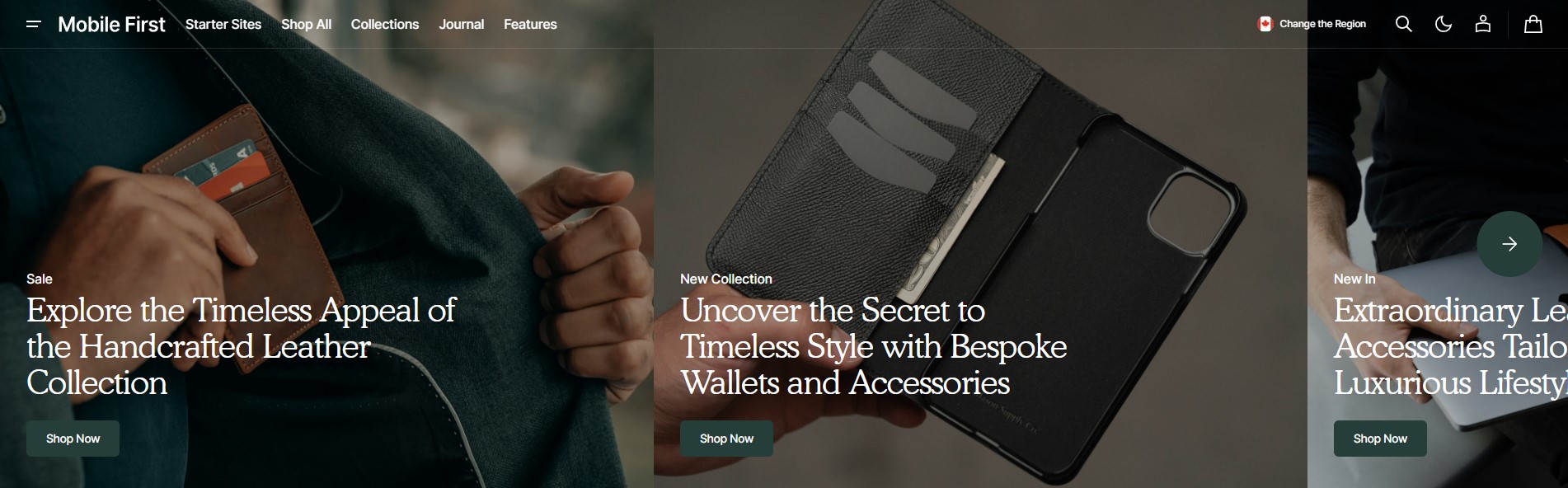
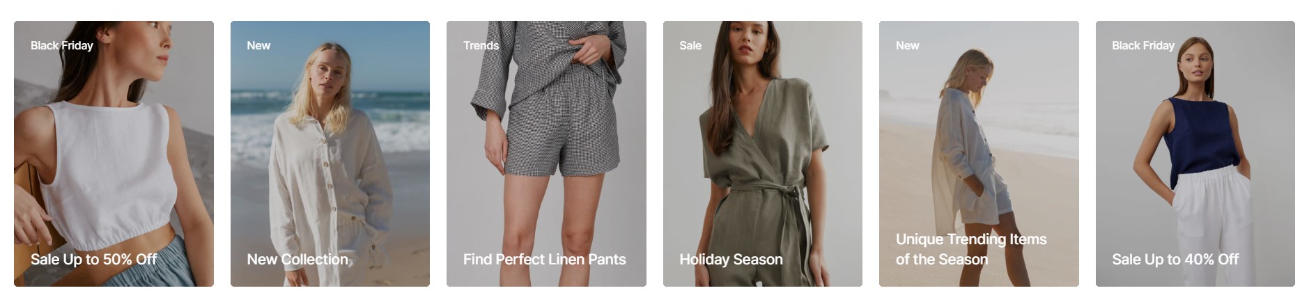
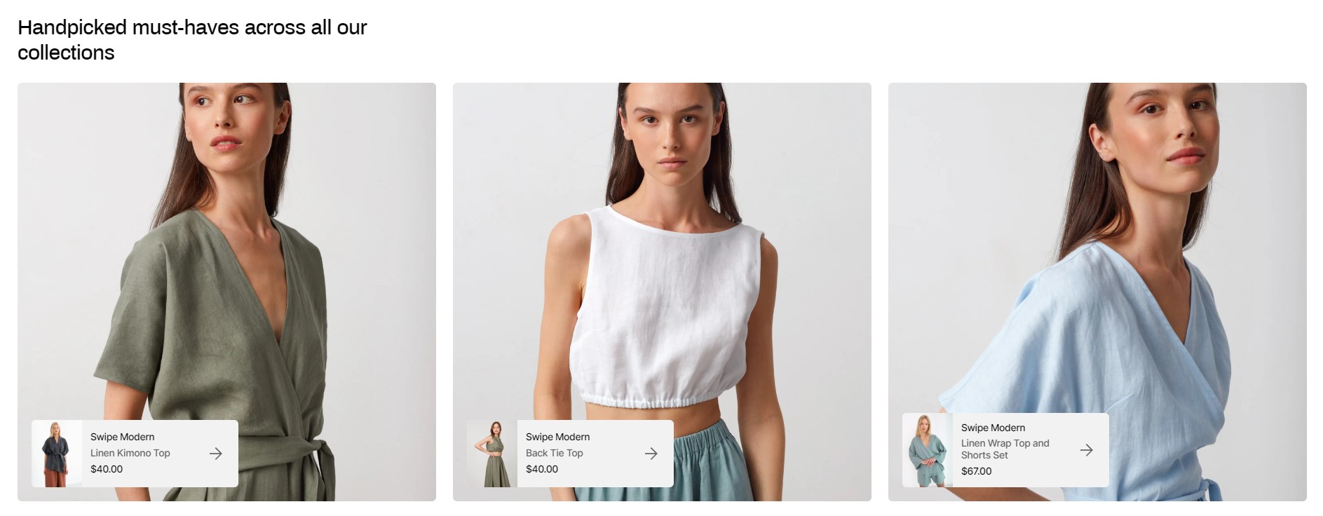
Banner Grid
Customize each card with unique imagery and text, tailored for mobile and desktop devices. Seamlessly integrate Shopify-hosted videos to enrich content and add interactive buttons.
Banner Grid Section Configuration
-
Mobile Devices:
- Cards per Row for Mobile and Tablet:
-
Swipe on Mobile and Tablet Devices:
- Enable swipe functionality for mobile and tablet devices.
-
Desktop Devices:
- Cards per Row
-
Color Scheme:
- Define the color scheme for the banner grid section.
-
Subheading:
- Optional subheading for the banner grid section.
-
Heading:
- Main heading for the banner grid section.
-
Heading Size:
- Choose the size of the heading:
- Medium
- Large
-
Description:
- Description text to provide context for the banner grid section.
-
Mobile Media Ratio:
- Select the preferred ratio for media (images, videos) on mobile devices.
-
Desktop Media Ratio:
- Select the preferred ratio for media (images, videos) on desktop devices.
-
Gap:
- Choose the gap between cards:
- None
- Small
- Normal
-
Card Text Alignment:
- Align text within each card:
-
Card Heading Size:
- Choose the size of the heading for each card:
-
Card Heading Color:
- Select the color scheme for card headings:
- Basic
- Accent
-
Card Description Size:
- Choose the size of the description text within each card:
-
Section Padding:
- Top Padding: Adjust the top padding of the banner grid section.
- Bottom Padding: Adjust the bottom padding of the banner grid section.
-
Section Margin:
- Top Margin: Set the top margin for the banner grid section.
- Bottom Margin: Set the bottom margin for the banner grid section.
Card Block Configuration
-
Color Scheme:
- Define the color scheme for the card block.
-
Mobile Image:
- Upload or select an image for mobile devices.
-
Desktop Image:
- Upload or select an image for desktop devices.
-
Enable Image Parallax Effect:
- Enable parallax scrolling effect for the images.
-
Overlay Opacity:
- Adjust the opacity level of the overlay.
-
Subheading:
- Optional subheading for the card block.
-
Subheading Opacity:
- Adjust the opacity level of the subheading text.
-
Heading:
- Main heading for the card block.
-
Description:
- Description text to provide context for the card block.
-
Show Video:
- Select to show the video.
-
Mobile Video:
- Upload or select a video for mobile devices.
-
Desktop Video:
- Upload or select a video for desktop devices.
-
Button Options:
- Show or hide a button within the card block.
- Button Label: Specify the label for the button.
- Button Style: Select the style for the button (Primary, Secondary, Tertiary).
- Button Link: Enter the URL link for the button.
-
Overlay Link:
- Enable overlay link to make the entire card block clickable.
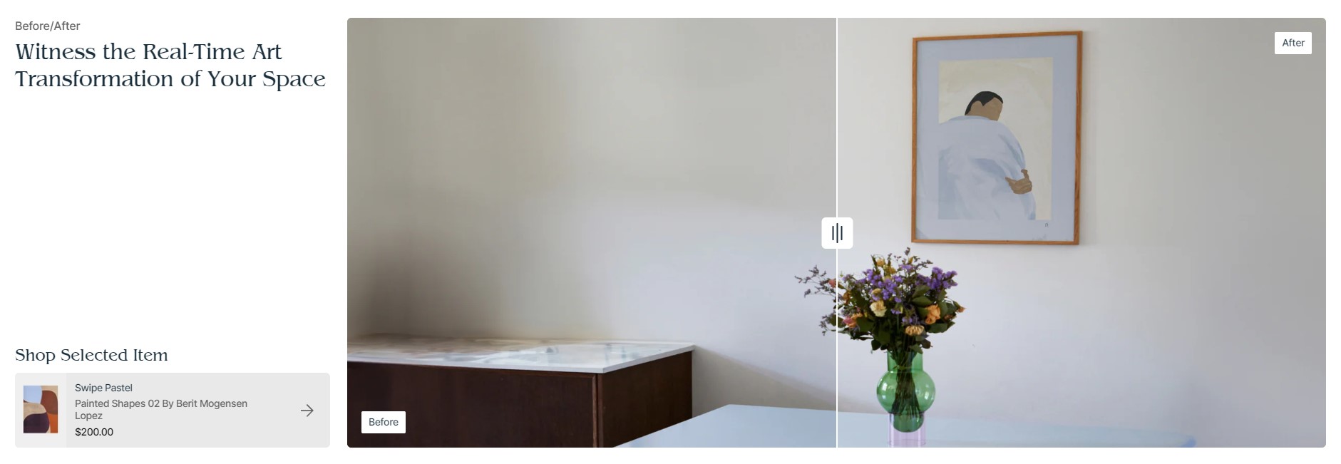
Before/After
Showcase compelling visual comparisons with the "Before/After" section. Customize text alignment, heading sizes, and color schemes while adding product details in customizable blocks for seamless exploration of featured items.
Before/After Section Configuration
-
Subheading:
- Optional subheading for the Before/After section.
-
Heading:
- Main heading for the Before/After section.
-
Heading Size:
- Choose the size of the heading:
- Medium
- Large
-
Description:
- Description text to provide context for the Before/After section.
-
Text Alignment:
- Align text within the section:
- Left
- Center
-
Image Before:
- Upload or select an image for the 'Before' comparison.
-
Image After:
- Upload or select an image for the 'After' comparison (must match aspect ratio of 'Before' image).
-
Left and Right Texts' Color Scheme:
- Select the color scheme for the 'Before' and 'After' labels.
-
Left Text:
- Label for the 'Before' side of the comparison.
-
Right Text:
- Label for the 'After' side of the comparison.
-
Product Card:
- Product Block Heading:
- Product: Select the product to display in the Before/After section.
- Color Scheme:
- Image Ratio:
- Image Fit:
- Show Vendor:
-
Section Margin:
- Top Margin: Set the top margin for the Before/After section.
- Bottom Margin: Set the bottom margin for the Before/After section.
-
Section Padding:
- Top Padding: Adjust the top padding of the Before/After section.
- Bottom Padding: Adjust the bottom padding of the Before/After section.
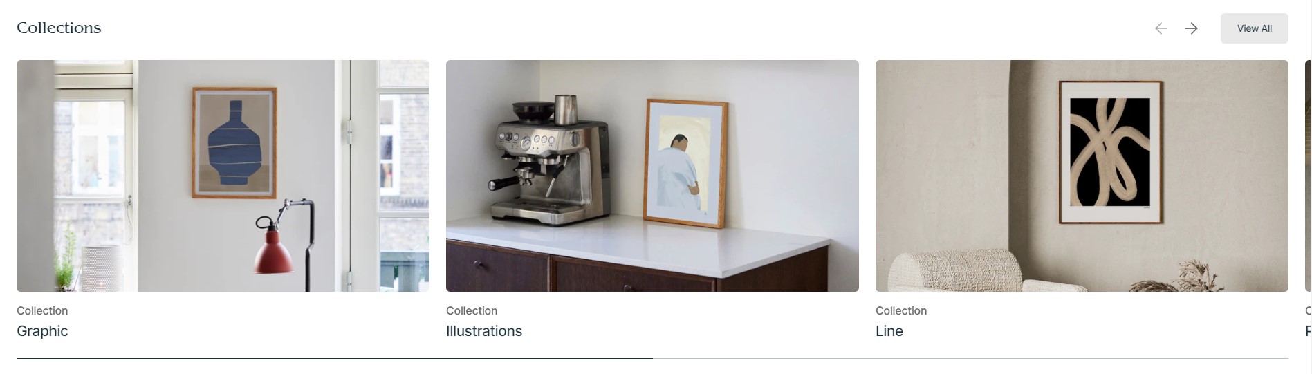
Collections Grid
Showcase your curated collections beautifully with the "Collections Grid" section, featuring flexible layout options and carousel functionality for dynamic display. Choose image ratios and fitting options to present each collection perfectly and configure mobile-specific settings for optimal viewing across devices.
Collections Grid Section Configuration
-
Subheading:
- Optional subheading for the Collections Grid section.
-
Heading:
- Main heading for the Collections Grid section.
-
Heading Size: Choose the size of the heading.
- Medium
- Large
-
Description:
- Description text to provide context for the Collections Grid section.
-
Enable Carousel:
- Enable carousel functionality to display collections in a rotating format.
-
Image Ratio:
- Select the preferred ratio for collection images.
-
Image Fit: Choose how collection images should fit within their containers.
- Contain
- Cover
-
Subheading Card:
- Optionally display a subheading for each collection card.
-
Show Description:
- Toggle to show or hide descriptions for each collection.
-
Collections per Row:
- Set the number of collections displayed per row.
-
Mobile Layout:
- Specify the number of columns for mobile layout:
-
Button Options:
- Show or hide a button within the Collections Grid section.
- Button Label: Specify the label for the button.
- Button Style: Select the style for the button (Primary, Secondary, Tertiary).
- Button Link: Enter the URL link for the button.
-
Section Padding:
- Top Padding: Adjust the top padding of the Collections Grid section.
- Bottom Padding: Adjust the bottom padding of the Collections Grid section.
Collection Block
- Collection: Select the collection to display in the Collections Grid section.
- Image: Default to collection image.
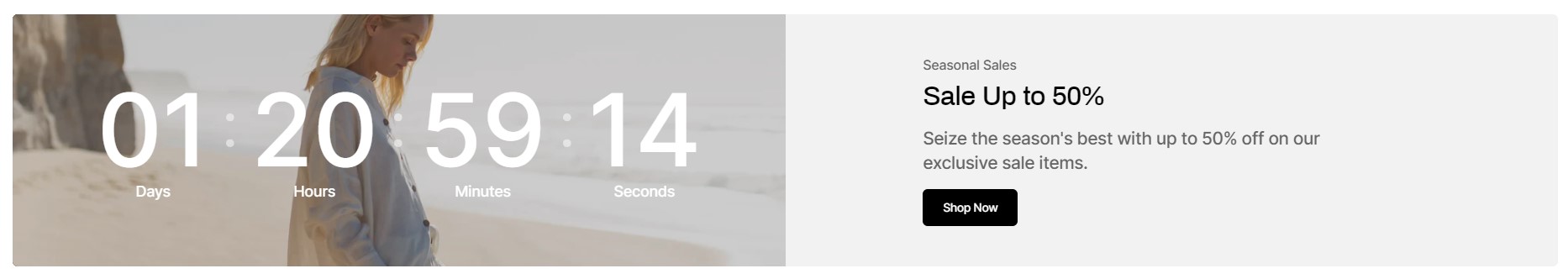
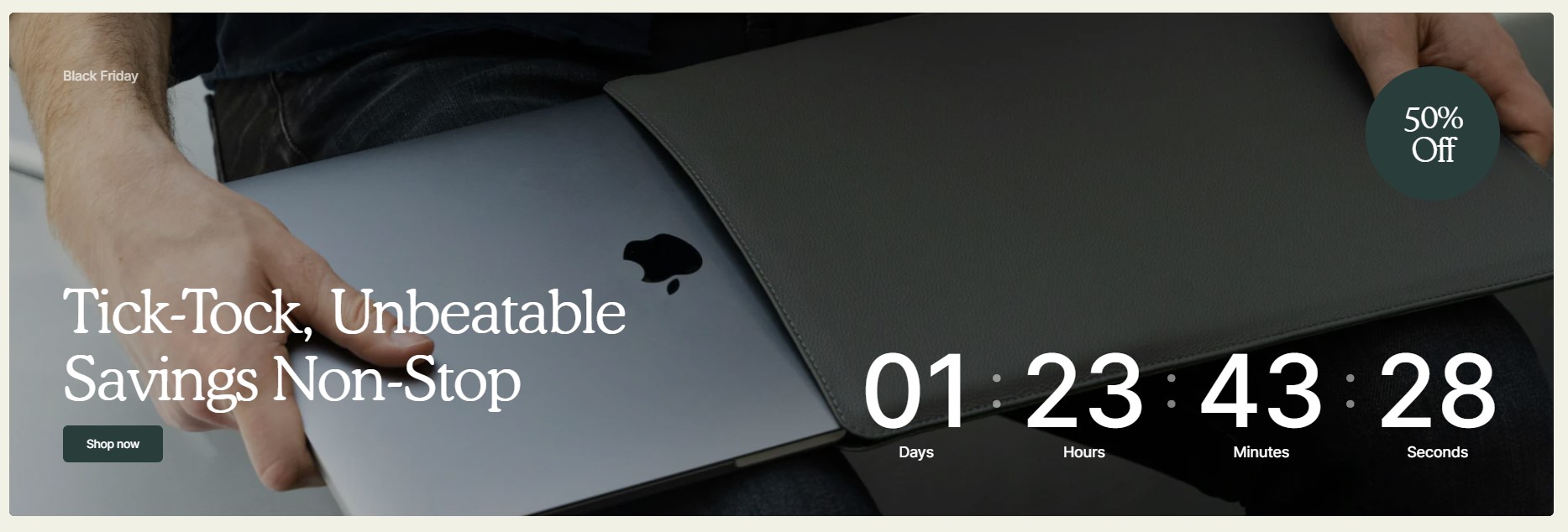
Countdown
Create urgency and drive engagement with the "Countdown" section.
Countdown Section Configuration
-
Layout: Choose between Simple and Overlay layouts for the countdown section.
-
Simple layout
- Overlay layout
-
Simple layout
-
Color Scheme:
- Define the color scheme for the countdown section.
-
Timer Color Scheme:
- Select the color scheme used for the timer in the Simple layout.
-
End Date:
- Specify the date when the countdown timer should end.
-
End Time:
- Specify the time when the countdown timer should end.
-
Date Font Size:
- Set the font size for the date displayed in the countdown timer.
-
Timer Position: Choose the position of the timer on desktop devices.
- Left
- Right
-
Timer Alignment on Mobile: Choose the alignment of the timer on mobile devices.
- Top
- Center
- Bottom
-
After the Timer Ends: Choose what happens after the countdown timer ends.
- Hide Section
- Show Text
-
Text After Countdown:
- Enter text to display after the countdown timer ends.
-
Content Options:
- Mobile Image
- Mobile Image Ratio
- Desktop Image
- Desktop Image Ratio
- Overlay Opacity
- Enable Image Parallax
-
Subheading:
- Optional subheading for the countdown section.
-
Heading:
- Main heading for the countdown section.
-
Heading Size: Choose the size of the heading.
- Medium
- Large (Recommended)
-
Heading Color: Select the color scheme for the heading.
- Basic
- Accent
-
Description:
- Description text to provide context for the countdown section.
-
Show Badge:
- Toggle to show or hide a badge in the countdown section.
- Badge Text: Enter text for the badge.
-
Button Options:
- Show or hide a button within the countdown section.
- Button Label: Specify the label for the button.
- Button Style: Select the style for the button (Primary, Secondary, Tertiary).
- Button Link: Enter the URL link for the button.
-
Section Margin:
- Top Margin: Set the top margin for the countdown section.
- Bottom Margin: Set the bottom margin for the countdown section.
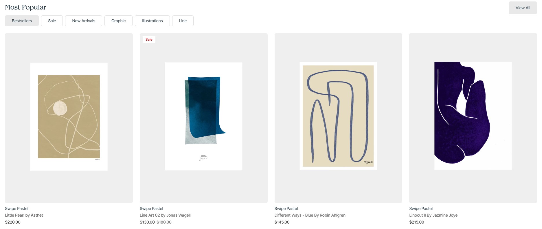
Featured Collections
Highlight your top collections with our Featured Collections section. Tailor collection cards with specific image ratios and content elements such as headings, descriptions, and buttons. Optimize media presentation with customizable images and optional videos for both mobile and desktop views.
Featured Collections Section Configuration
-
Full Width:
- Enable this option to make the section span the full width of the page.
-
Color Scheme:
- Select the color scheme for the Featured Collections section.
-
Collection Card Options:
- Card Image Ratio:
- Square
- Landscape
- Portrait
-
Content Options:
- Subheading
- Heading
- Heading Size
- Heading Color
- Description
- Text Alignment
- Text Width
- Show Button
- Button Label
- Button Style
- Button Link
- Collections Heading
-
Image Options:
- Mobile Image
- Desktop Image
-
Video Options:
- Show Video
- Mobile Video
- Desktop Video
- Mobile Media Ratio
- Desktop Media Ratio
-
Overlay Opacity:
- Adjust the opacity of overlays applied to collection images or videos.
-
Section Margin:
- Top Margin: Set the top margin for the Featured Collections section.
- Bottom Margin: Set the bottom margin for the Featured Collections section.
Collection Card Block Configuration:
- Select Collection
- Color Scheme
- Collection Image
- Overlay Opacity
Featured Products
Highlight top products with Featured Products section. Enhance visibility with clear description and specify number of products per row. Enable carousels for both mobile/tablet and desktop views for dynamic browsing experience. Section is designed to attract attention to featured products, helping drive sales and engagement.
Featured Products Section Configuration
-
Color Scheme:
- Select the color scheme for the Featured Products section.
-
Subheading:
- Optional subheading for the Featured Products section.
-
Heading:
- Main heading for the Featured Products section.
-
Heading Size:
- Choose the size of the heading:
- Medium
- Large
-
Description:
- Description text to provide context for the Featured Products section.
-
Products per Row:
- Set the number of products displayed per row.
-
Enable Carousel on Mobile and Tablet Devices:
- Toggle to enable carousel functionality for mobile and tablet devices.
-
Enable Carousel on Desktop Devices:
- Toggle to enable carousel functionality for desktop devices.
-
Background Image:
- Product Image First
- Mobile Background Media Ratio
- Desktop Background Media Ratio
-
Product Card:
- Color Scheme
- Image Ratio
- Image Fit
- Show Vendor
-
Section Padding:
- Top Padding: Adjust the top padding of the Featured Products section.
- Bottom Padding: Adjust the bottom padding of the Featured Products section.
-
Section Margin:
- Top Margin: Set the top margin for the Featured Products section.
- Bottom Margin: Set the bottom margin for the Featured Products section.
Featured Products Slideshow
The Featured Products Slideshow section highlights key products in an interactive slideshow format, offering customizable headings, descriptions, and color schemes for an engaging and visually appealing display.
Featured Products Slideshow Section Configuration
-
Subheading:
- Enter a subheading for the Featured Products Slideshow section.
-
Heading:
- Specify the main heading for the Featured Products Slideshow section.
-
Heading Size:
- Medium
- Large
-
Heading Color:
- Basic
- Accent
-
Description:
- Enter a description for the Featured Products Slideshow section.
-
Products:
- Choose products to feature in the slideshow.
-
Slideshow Color Scheme for Desktop:
- Choose a color scheme for the slideshow on desktop devices.
-
Information Block Color Scheme for Mobile and Tablet:
- Choose a color scheme for the information block on mobile and tablet devices.
-
Enable Padding for Information Block for Mobile and Tablet:
- Enable padding for the information block on mobile and tablet devices.
-
Product Color Scheme:
- Choose a color scheme for the products in the slideshow.
-
Slideshow Controls' Color:
- Basic
- Accent
-
Aspect Ratio:
- Specify the aspect ratio for the slideshow images.
-
Image Fit:
- Contain
- Cover
-
Section Padding:
- Top Padding
- Bottom Padding
Google Map
Integrate Google Maps seamlessly into your Shopify store with the Google Map section. This section is ideal for showcasing your business location or providing interactive directions to customers, enhancing their shopping experience.
Google Map Section Configuration
-
Google Maps API Key:
- Enter your Google Maps API key to enable the map integration.
-
Latitude:
- Specify the latitude coordinate for the map's center.
-
Longitude:
- Specify the longitude coordinate for the map's center.
-
Full Width:
- Enable this option to make the map section span the full width of the page.
-
Mobile Aspect Ratio:
- Select the aspect ratio for the map on mobile devices:
- 1:1
- 32:9
- 3:4
-
Desktop Aspect Ratio:
- Select the aspect ratio for the map on desktop devices:
- 1:1
- 32:9
- 3:4
-
Section Margin:
- Top Margin: Set the top margin for the Google Map section.
- Bottom Margin: Set the bottom margin for the Google Map section.
Logo List
Showcase your partners or affiliations with the Logo List section. This section is perfect for building credibility and showcasing key partnerships effectively.
Logo List Section Configuration
-
Color Scheme:
- Select the color scheme for the Logo List section.
-
Subheading:
- Optional subheading for the Logo List section.
-
Heading:
- Main heading for the Logo List section.
-
Heading Size:
- Medium
- Large
-
Description:
- Description text to provide context for the Logo List section.
-
Enable Border Top:
- Toggle to enable a top border for the Logo List section.
-
Enable Navigation (Used on Desktop):
- Toggle to enable navigation controls for desktop users.
-
Animation Options:
- Enable Desktop Animation
- Repeat Desktop Animation
-
Section Padding:
- Top Padding: Adjust the top padding of the Logo List section.
- Bottom Padding: Adjust the bottom padding of the Logo List section.
-
Section Margin:
- Top Margin: Set the top margin for the Logo List section.
- Bottom Margin: Set the bottom margin for the Logo List section.
Media Banner
The Media Banner section allows you to add multimedia elements like images and videos for both mobile and desktop. You can enable a parallax effect, adjust overlay opacity, and format text with alignment and transformations. Additionally, you can add a marquee effect to highlight important text, with control over position and speed.


Media Banner Section Configuration
-
Full Width:
- Enable this option to make the media banner section span the full width of the page.
-
Color Scheme:
- Select the color scheme for the media banner section.
-
Image Options:
- Mobile Image
- Desktop Image
- Enable Image Parallax Effect
-
Video Options:
- Show Video
- Mobile Video
- Select Video
- Desktop Video
-
Mobile Media Ratio:
- Select the aspect ratio for media content on mobile devices.
-
Desktop Media Ratio:
- Select the aspect ratio for media content on desktop devices.
-
Overlay Opacity:
- Adjust the opacity of any overlay applied to the media content.
-
Content Options:
- Text Alignment
- Text Transform
- Text Width
- Enable Marquee
- Marquee Text
- Marquee Position
- Marquee Speed
-
Section Margin:
- Top Margin: Set the top margin for the media banner section.
- Bottom Margin: Set the bottom margin for the media banner section.
Media Banner with Products
The Media Banner with Products section allows you to create an engaging visual display that highlights your products alongside media content.
Media Banner with Products Section Configuration
- Color Scheme
-
Subheading:
- Enter a subheading for the media banner section.
-
Heading:
- Specify the main heading for the media banner section.
-
Heading Size:
- Choose the size of the heading:
- Medium
- Large
-
Description:
- Enter a description for the media banner section.
-
Inner Heading:
- Specify an inner heading for the media banner section.
-
Products:
- Select the products to display in the media banner section.
-
Mobile Image:
- Upload an image for mobile devices.
-
Mobile Media Ratio:
- Set the aspect ratio for mobile media content.
-
Desktop Image:
- Upload an image for desktop devices.
-
Desktop Media Ratio:
- Set the aspect ratio for desktop media content.
-
Shopify-Hosted Video:
- Show Mobile Video.
- Select a video for mobile devices.
- Show Desktop Video.
- Select a video for desktop devices.
-
Product Card:
- Color Scheme
- Image Ratio:
- Square
- Landscape
- Portrait
- Image Fit:
- Contain
- Cover
- Show Vendor
-
Button Options:
- Button Label
- Button Style:
- Primary
- Secondary
- Tertiary
-
Section Padding:
- Top Padding: Set the top padding for the media banner section.
- Bottom Padding: Set the bottom padding for the media banner section.
-
Section Margin:
- Top Margin: Set the top margin for the media banner section.
- Bottom Margin: Set the bottom margin for the media banner section.
Popular Products
The Popular Products section showcases top-selling items to attract customer attention.
Popular Products Section Configuration
-
Color Scheme:
- Edit or change the color scheme by going to your theme's color settings.
-
Subheading:
- Enter a subheading for the Popular Products section.
-
Heading:
- Specify the main heading for the Popular Products section.
-
Heading Size:
- Choose the size of the heading:
- Medium
- Large
- Choose the size of the heading:
-
Description:
- Enter a description for the Popular Products section.
-
Products:
- List of popular products displayed in this section.
-
Products per Row:
- Number of products to display per row.
-
Enable Carousel:
- Enable carousel mode for displaying products.
-
Mobile Layout:
- Number of columns to display on mobile devices.
-
Collection Card:
- Show Collection Card
- Collection
- Color Scheme
- Subheading
- Heading Color
- Show Description
- Image
- Overlay Opacity
-
Product Card:
- Image Ratio
- Image Fit
- Show Second Image on Hover
- Show Vendor
- Show Description
-
Button Options:
- Show Button
- Button Label
- Button Style
- Button Link
-
Section Padding:
- Top Padding: Set the top padding for the Popular Products section.
- Bottom Padding: Set the bottom padding for the Popular Products section.
-
Section Margin:
- Top Margin: Set the top margin for the Popular Products section.
- Bottom Margin: Set the bottom margin for the Popular Products section.
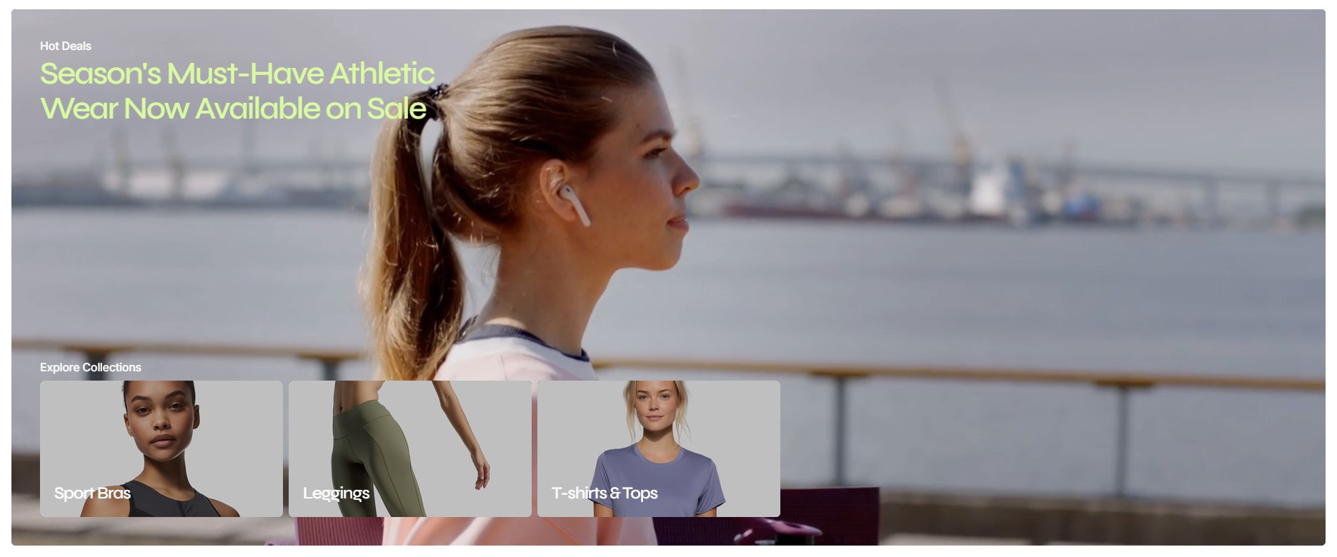
Product Markers
The Product Markers section allows you to highlight products in a slideshow or banner layout, with customizable color schemes, media options, and detailed product cards to enhance user engagement and visual appeal.
Product Markers Section Configuration
-
Layout:
- Banner

- Slideshow
- Banner
-
Show Markers:
- Enable markers for the "Slideshow" layout.
-
Color Scheme:
- Choose a color scheme for the section.
-
Subheading:
- Enter a subheading for the Product Markers section.
-
Heading:
- Specify the main heading for the Product Markers section.
-
Heading Size:
- Choose the size of the heading:
- Medium
- Large
- Choose the size of the heading:
-
Description:
- Enter a description for the Product Markers section.
-
Mobile and Tablet Image:
- Upload an image for mobile and tablet devices.
-
Desktop Image:
- Upload an image for desktop devices.
-
Mobile and Tablet Media Ratio:
- Set the aspect ratio for mobile and tablet media content.
-
Desktop Media Ratio:
- Set the aspect ratio for desktop media content.
-
Minimum Height:
- Sets the minimum image height for the "Banner" layout:
- None
- Small
- Medium
- Large
- Sets the minimum image height for the "Banner" layout:
-
Shopify-Hosted Video:
- Show Video
- Mobile Video
- Desktop Video
-
Product Card:
- Color Scheme
-
For Layout "Banner":
- Image Ratio
- Square
- Landscape
- Portrait
- Image Fit
- Contain
- Cover
- Show Second Image on Hover
- Image Ratio
-
For Layout "Slideshow":
- Show Vendor
- Show Description
-
Section Padding:
- Top Padding: Set the top padding for the Product Markers section.
- Bottom Padding: Set the bottom padding for the Product Markers section.
-
Section Margin:
- Top Margin: Set the top margin for the Product Markers section.
- Bottom Margin: Set the bottom margin for the Product Markers section.
Products Grid
The Products Grid section allows you to display a customizable grid of products, with options for sorting, column layout, and detailed product cards to enhance browsing and shopping experiences.
Products Grid Section Configuration
-
Products Amount:
- Specify the number of products to display in the grid.
-
Number of Columns:
- Set the number of columns for the product grid.
-
Sort Products By:
- Alphabetically, A-Z
- Alphabetically, Z-A
- Date, new to old
- Date, old to new
- Product price, high to low
- Product price, low to high
-
Product Card:
- Image Ratio:
- Square
- Landscape
- Portrait
- Image Fit:
- Contain
- Cover
- Show Second Image on Hover
- Show Vendor
- Show Description
- Image Ratio:
-
Content Options:
- Subheading
- Heading
- Heading Size:
- Medium
- Large
- Description
-
Button Options:
- Show Button
- Button Label
- Button Style:
- Primary
- Secondary
- Tertiary
- Button Link
-
Mobile Layout:
- Number of Columns on Mobile
-
Section Padding:
- Top Padding
- Bottom Padding
Products with Tabs
The Products with Tabs section allows you to showcase products in a tabbed layout, offering customizable options for product display, sorting, and detailed product cards for an enhanced browsing experience.
Products with Tabs Section Configuration
-
Color Scheme:
- Choose a color scheme for the section.
-
Subheading:
- Enter a subheading for the Products with Tabs section.
-
Heading:
- Specify the main heading for the Products with Tabs section.
-
Heading Size:
- Choose the size of the heading:
- Medium
- Large
- Choose the size of the heading:
-
Description:
- Enter a description for the Products with Tabs section.
-
Products Per Row:
- Specify the number of products to display per row.
-
Enable Carousel:
- Enable carousel for the product display.
-
Mobile Layout:
- Number of Columns on Mobile:
- Specify the number of columns for the mobile layout.
-
Product Card:
- Image Ratio:
- Square
- Landscape
- Portrait
- Image Fit:
- Contain
- Cover
- Show Second Image on Hover
- Show Vendor
- Show Description
- Image Ratio:
-
Button Options:
- Show Button
- Button Label
- Button Style:
- Primary
- Secondary
- Tertiary
- Button Link
-
Section Padding:
- Top Padding
- Bottom Padding
-
Section Margin:
- Top Margin
- Bottom Margin
Products Tab Configuration:
- Tab Label: Specify the label for each tab.
- Collection: Select a collection to display products from.
- Limit Products from Selected Collection
- Products: Select individual products if a collection is not chosen.
Video Banner
The Video Banner section enables you to create an engaging visual display with video content, customizable headings, descriptions, and button options, perfect for capturing visitor attention and conveying key messages.
Video Banner Section Configuration
-
Mobile and Tablet Layout:
- Overlay
- Column
-
Full Width:
- Enable this option to make the video banner span the full width of the page.
-
Color Scheme:
- Choose a color scheme for the section.
-
Subheading:
- Enter a subheading for the Video Banner section.
-
Heading:
- Specify the main heading for the Video Banner section.
-
Heading Size:
- Large
- Medium
- Small
-
Description:
- Enter a description for the Video Banner section.
-
Text Align:
- Left
- Center
-
Button Options:
- Show Button
- Button Label
- Button Style:
- Primary
- Secondary
- Tertiary
- Button Link
-
Video Options:
- Mobile Video: Specify the video to be displayed on mobile devices.
- Desktop Video: Specify the video to be displayed on desktop devices.
- Mobile Aspect Ratio: Specify the aspect ratio for mobile devices.
- Desktop Aspect Ratio: Specify the aspect ratio for desktop devices.
- Video Fit:
- Contain
- Cover
-
Overlay Opacity:
- Adjust the opacity of the overlay on the video.
-
Section Margin:
- Top Margin
- Bottom Margin
Settings
Colors
- Overlay
- Column
- Enable this option to make the video banner span the full width of the page.
- Choose a color scheme for the section.
- Enter a subheading for the Video Banner section.
- Specify the main heading for the Video Banner section.
- Large
- Medium
- Small
- Enter a description for the Video Banner section.
- Left
- Center
- Show Button
- Button Label
- Button Style:
- Primary
- Secondary
- Tertiary
- Button Link
- Mobile Video: Specify the video to be displayed on mobile devices.
- Desktop Video: Specify the video to be displayed on desktop devices.
- Mobile Aspect Ratio: Specify the aspect ratio for mobile devices.
- Desktop Aspect Ratio: Specify the aspect ratio for desktop devices.
- Video Fit:
- Contain
- Cover
- Adjust the opacity of the overlay on the video.
- Top Margin
- Bottom Margin
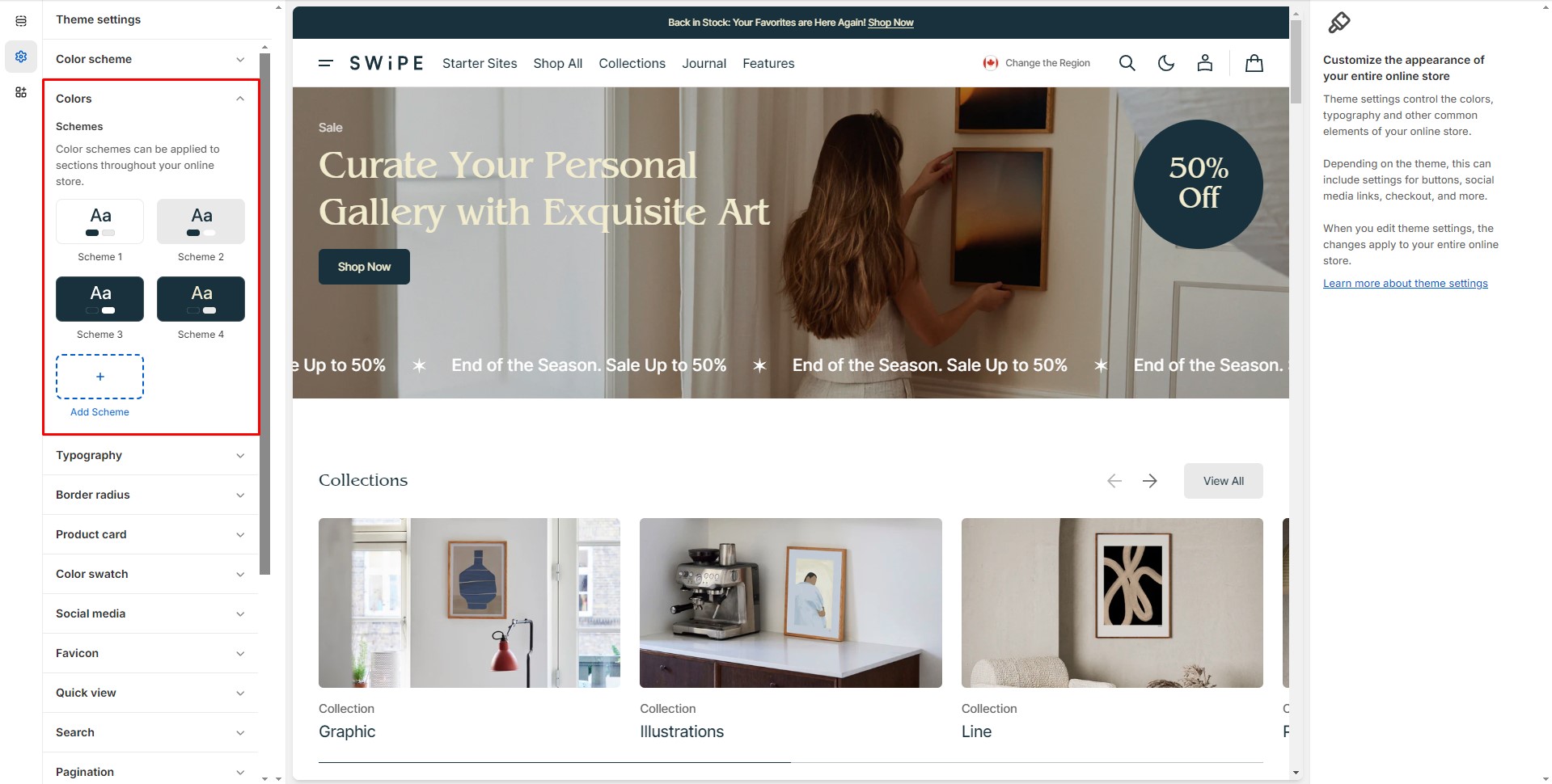
To edit the four base color schemes and add new ones, go to Theme settings > Colors. From there, you can select a color scheme in the sections and blocks where this option is available.
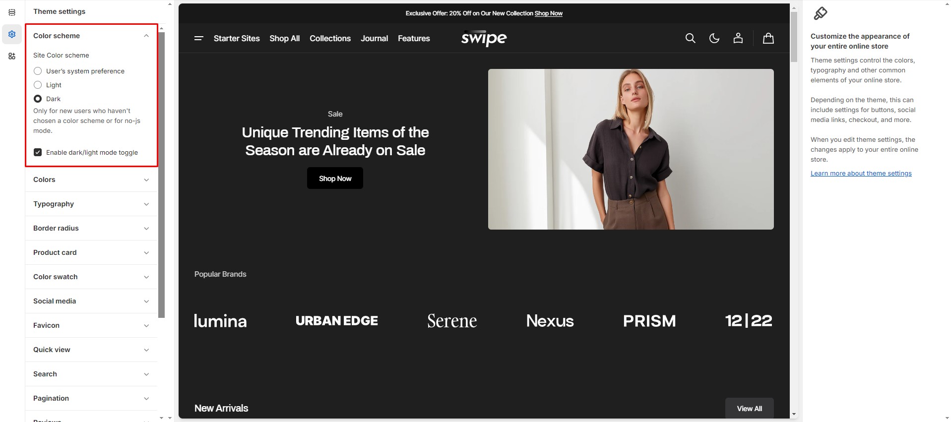
Dark Mode
To edit the Dark Mode settings, navigate to Theme settings > Color scheme.
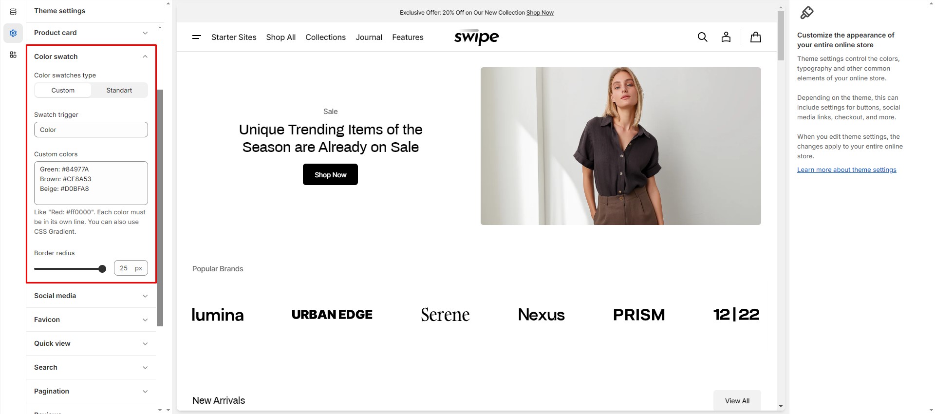
Color Swatches
To enable and edit Color Swatches, navigate to Theme settings > Color swatches.
Swatch trigger should be the same as the option in Product variants.
You can also add custom colors by adding their name and color in HEX format.
Metafields
To add and edit metafields, follow these steps:
-
Navigate to
Settings > Custom data in the Admin panel.
- Select an item to which you would like to add a metafield.
- Click the button "Add definition" and fill the fields.
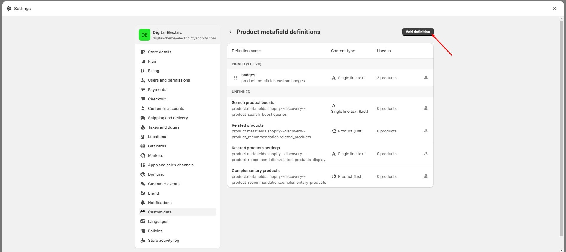
- Navigate to the item to which you've added a metafield (e.g. Product or Collection) and add information below.
For more information about metafields, follow the link.
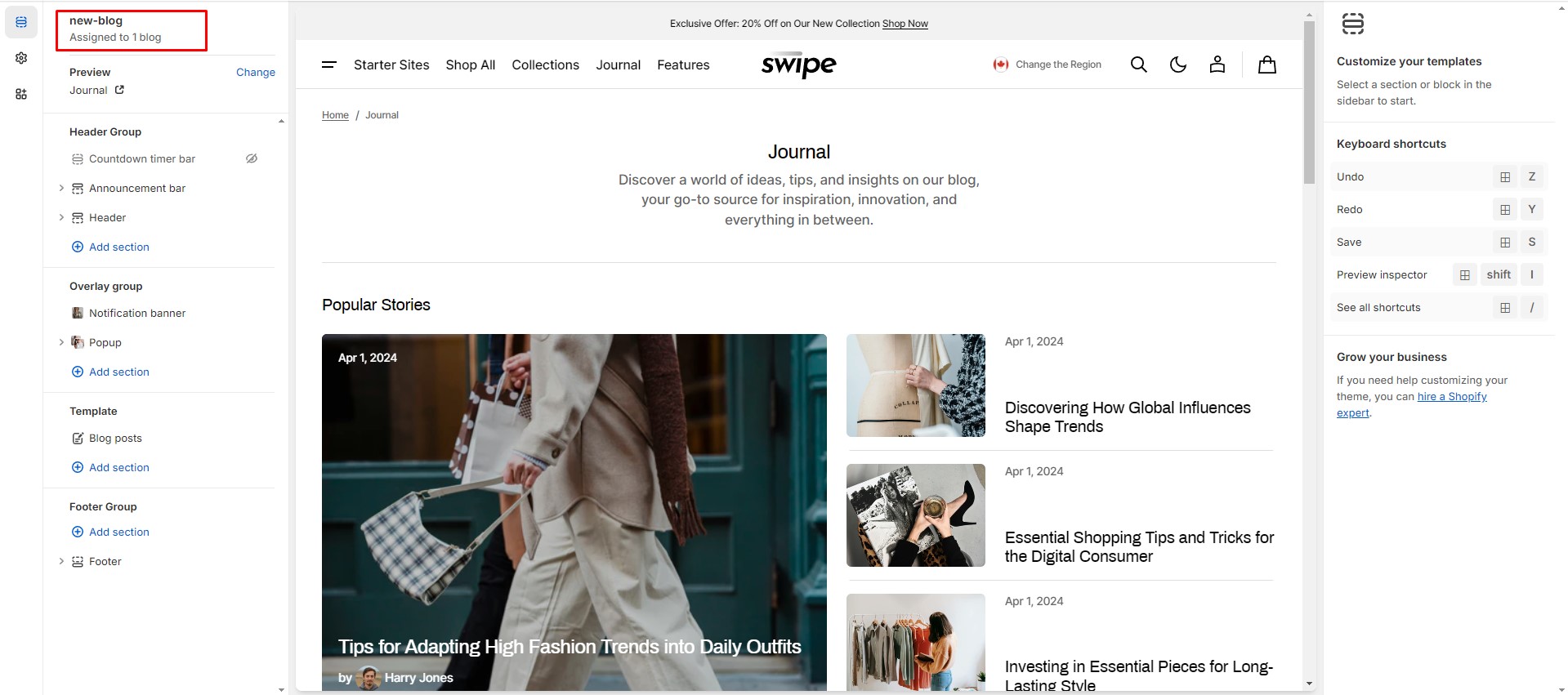
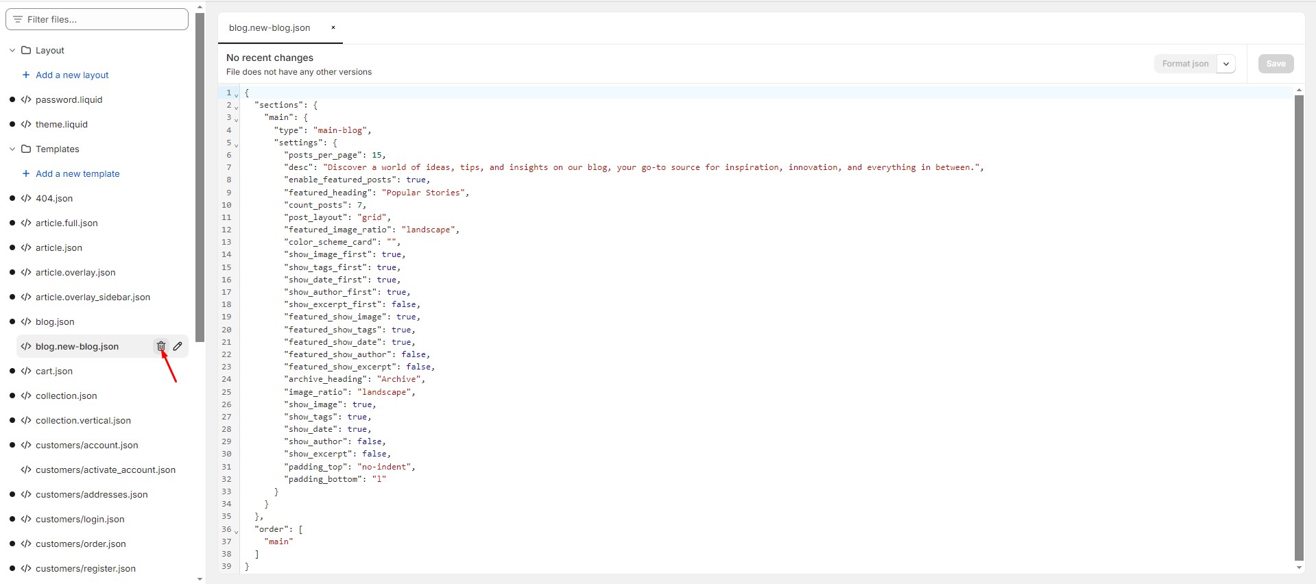
Custom Templates
You can easily create and customize your templates. Here's an example below:
-
Choose the type of template you'd like to create and give it a name.
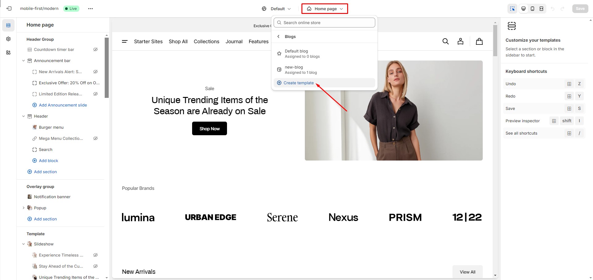
- In the Admin Panel, select the page you want to assign your custom template to. Choose a theme template and save the changes.
- Now, go back to the customizer, open the new template, and add the desired sections.
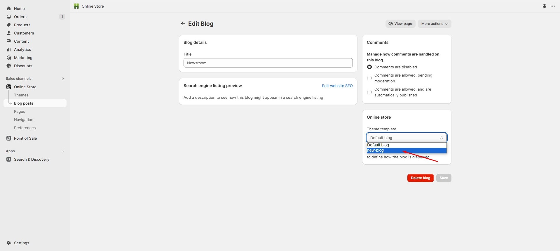
If you want to delete a custom template, follow the 'Edit code' link in the Admin Panel, select the template, and click the delete button. Please note that this action can impact your theme, so be cautious.

Page
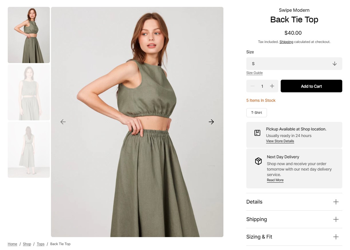
Product Page
There’re 2 types of product gallery:
- Stacked gallery
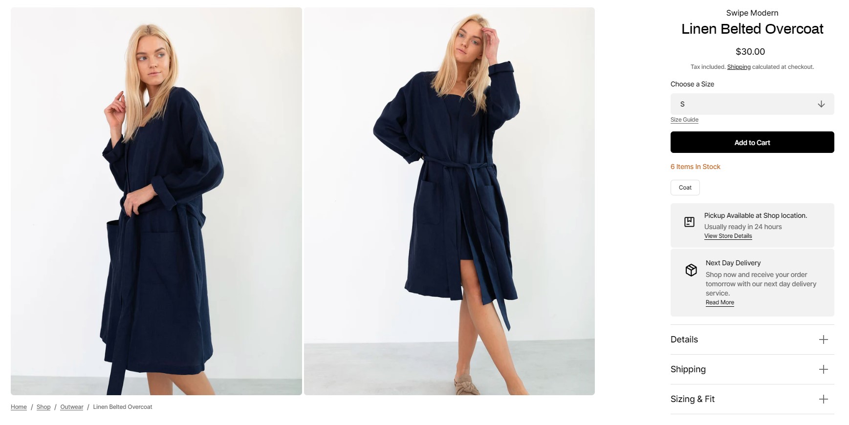
- Slider with previews
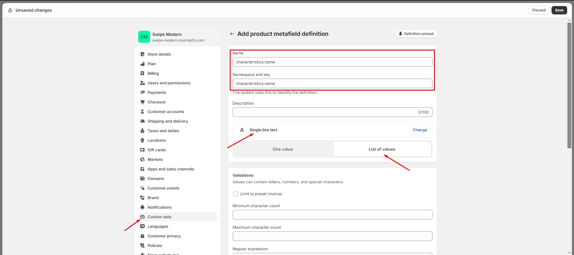
If you would like to add more dynamic information to the product, you can use metafields. To add metafields, navigate to Settings > Custom data > Products in the Admin panel.
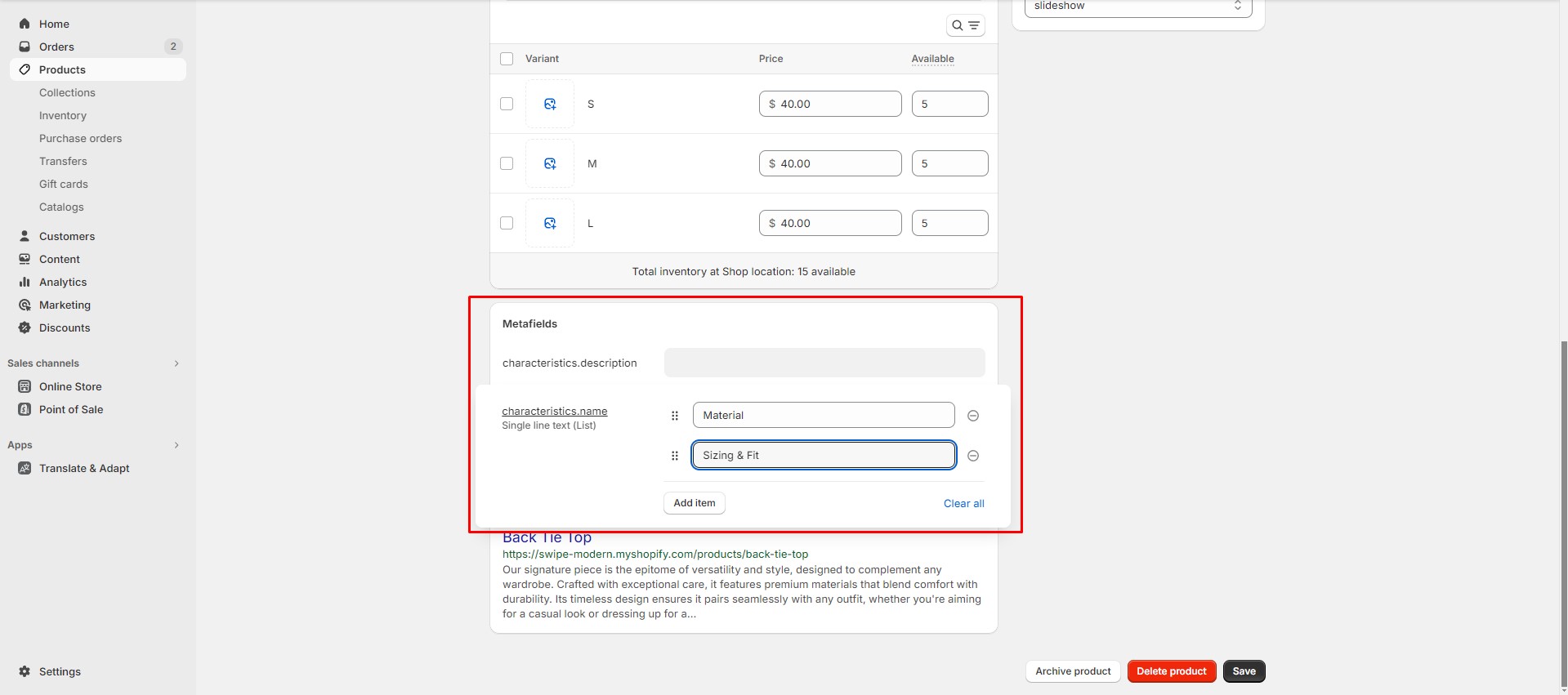
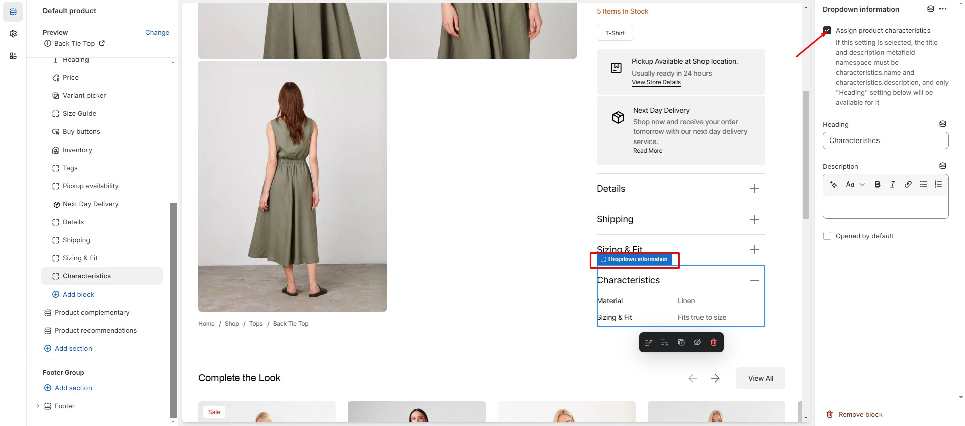
You can add dynamic characteristics to the product by following these steps:
- Add two metafield definitions with the key names "characteristics.name" and "characteristics.description".
- Choose the "Single-line text with list of values" type for the both metafields.

- Navigate to the product and add characteristics.
- Add Dropdown information block to the product page and enable checkbox “Assign product
characteristics”.
For more information about metafields, follow the link.
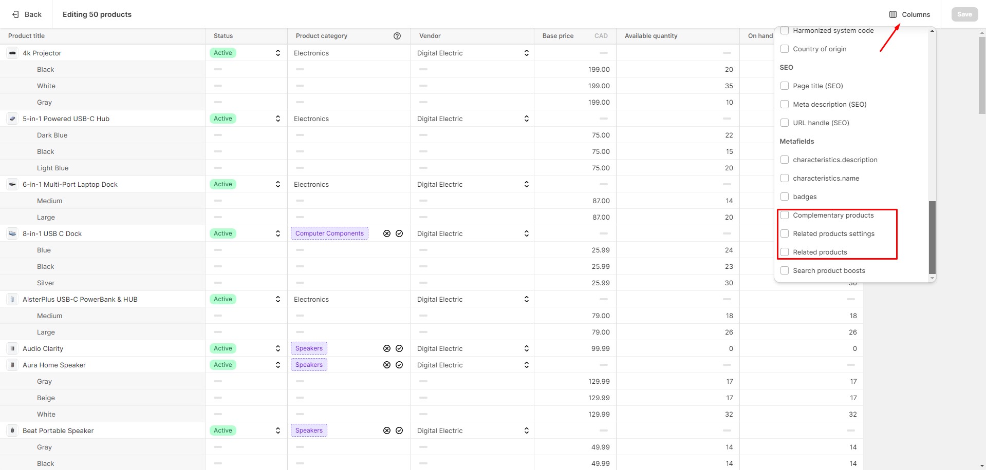
Product Recommendations and Complementary Products
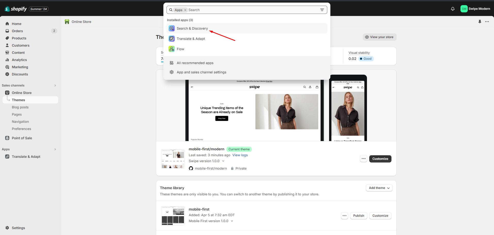
To add and edit product recommendations, follow these steps:
- Install the Search & Discovery app by Shopify from the Apps page in the Admin Panel.
-
Once installed, open the app and follow the “Add product recommendations” link in the Feature overview
section to add
recommendations to your products.

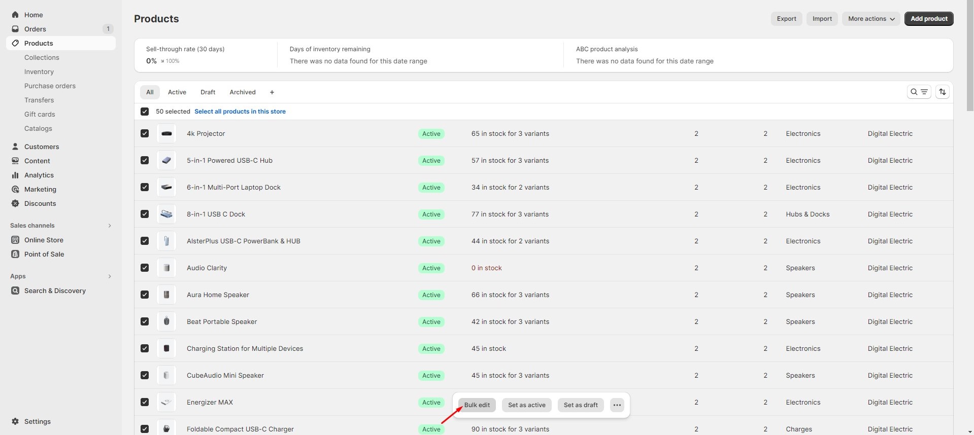
You can easily edit or add recommendations for multiple products using the Bulk Editor in the Products tab in the Admin Panel.
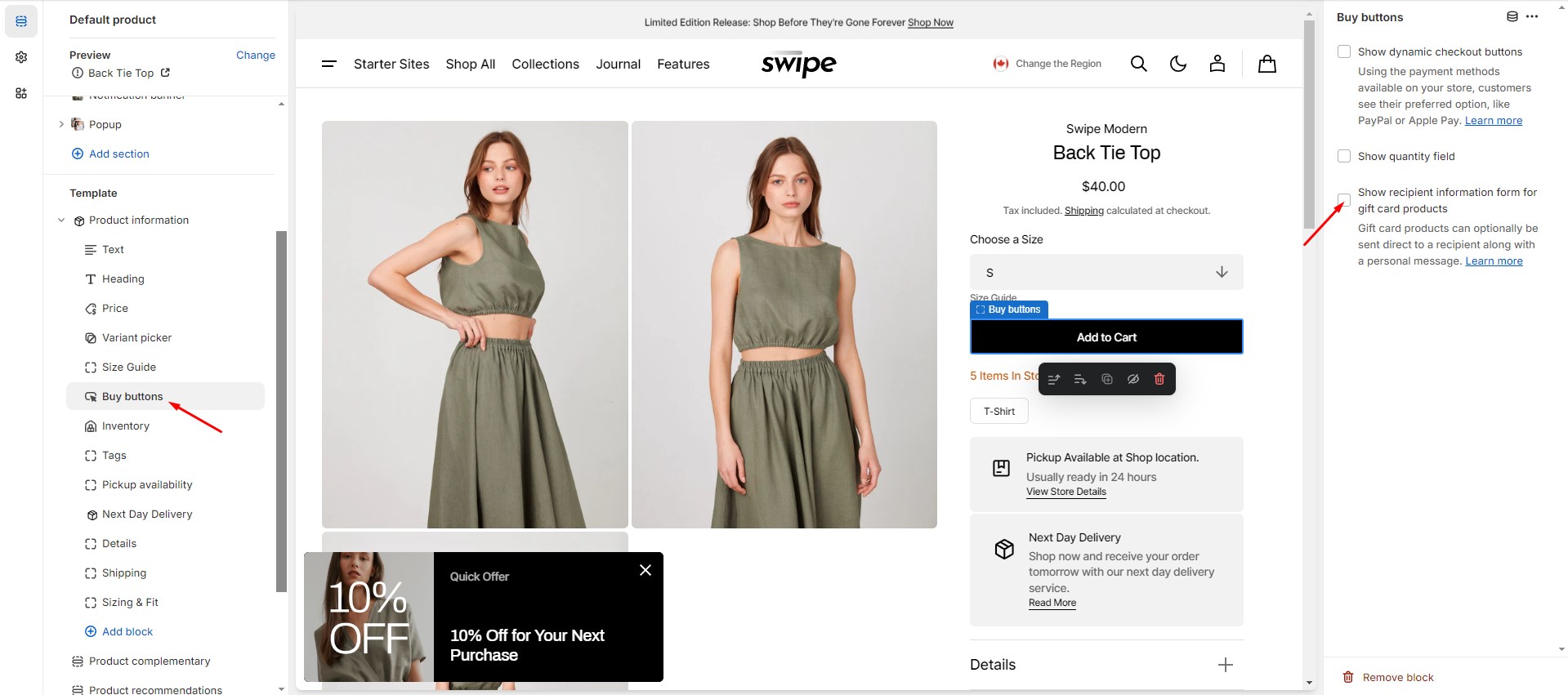
Gift Card Recipient
To add recipient and message fields to gift card products, navigate to the customizer > Product page > But buttons block. Check the "Show recipient information form for gift card products" option that enables the display of recipient information form for gift card products.
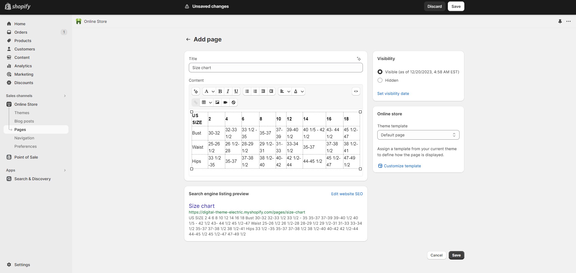
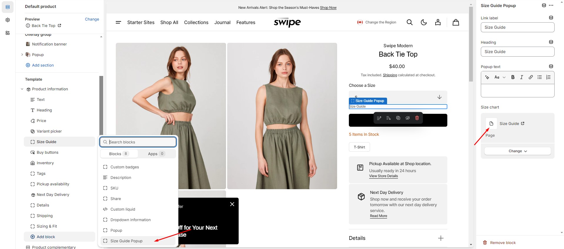
Size Chart
To add a Size Chart, follow these steps:
- Create new page with a table.
- Add a "Size chart popup" block to the product page.
- Select "Size chart" page. Works only in Popup toggle type.
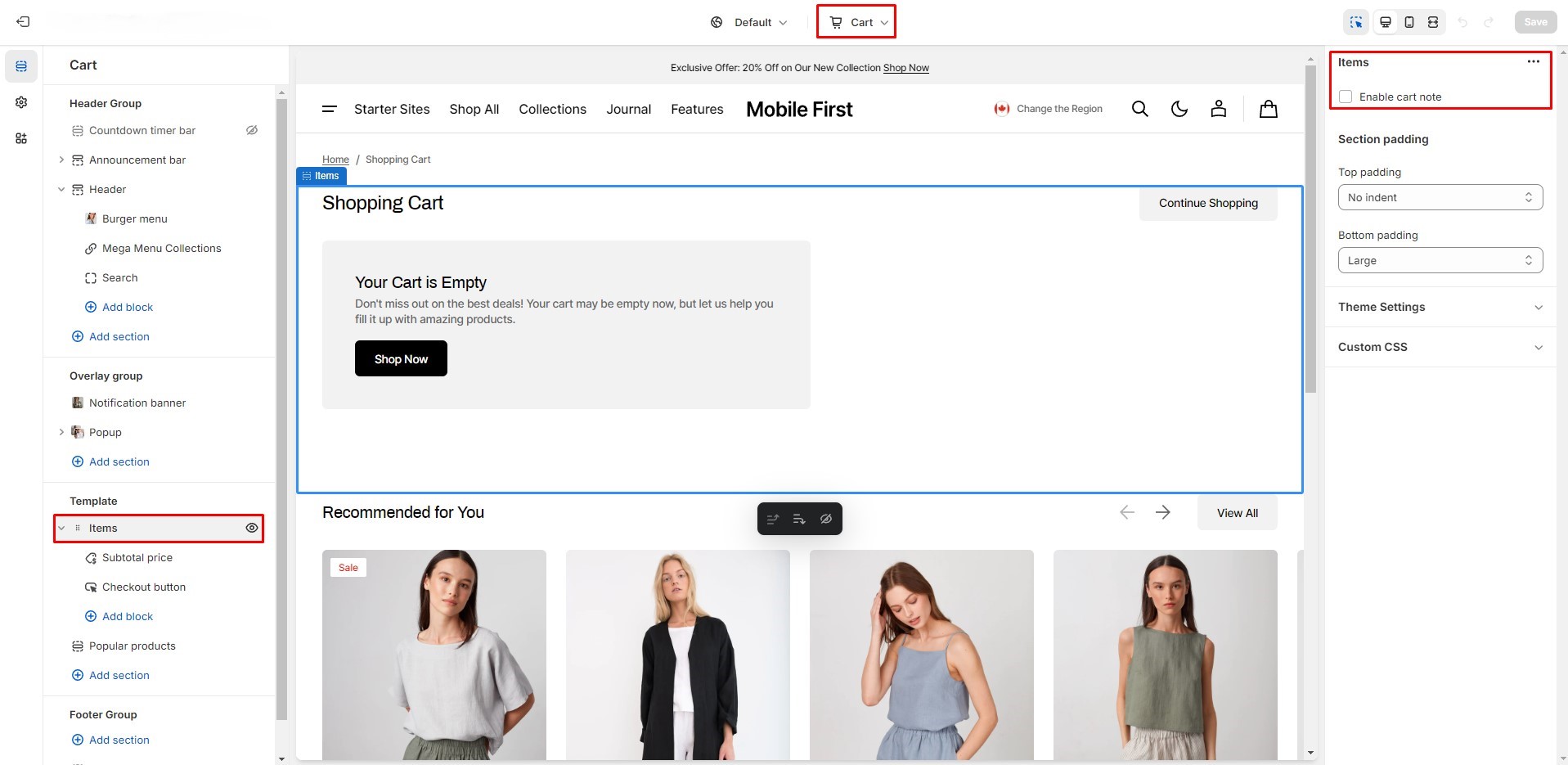
Cart Note
To enable cart note, navigate to the customizer > Cart > Items, and check the “Enable cart note” option.
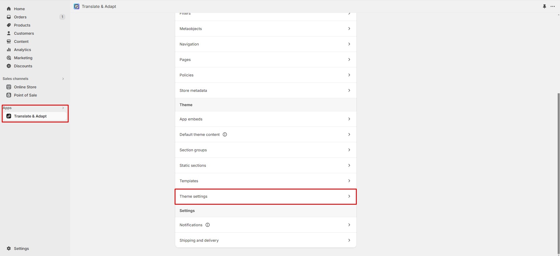
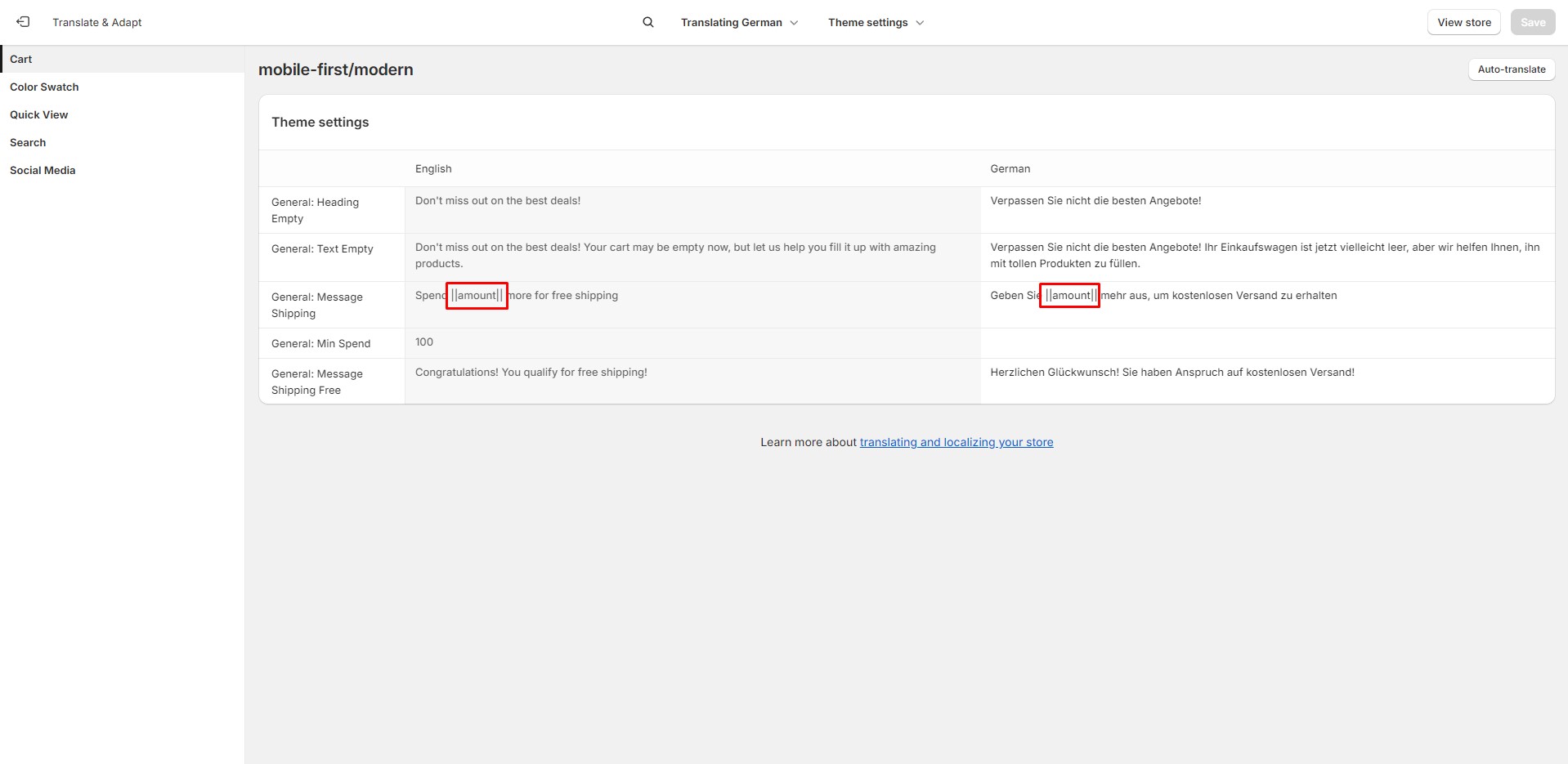
Free Shipping
There can be issues when a store has multiple languages. To avoid them, keep the text {amount} untranslated.
Collection Page
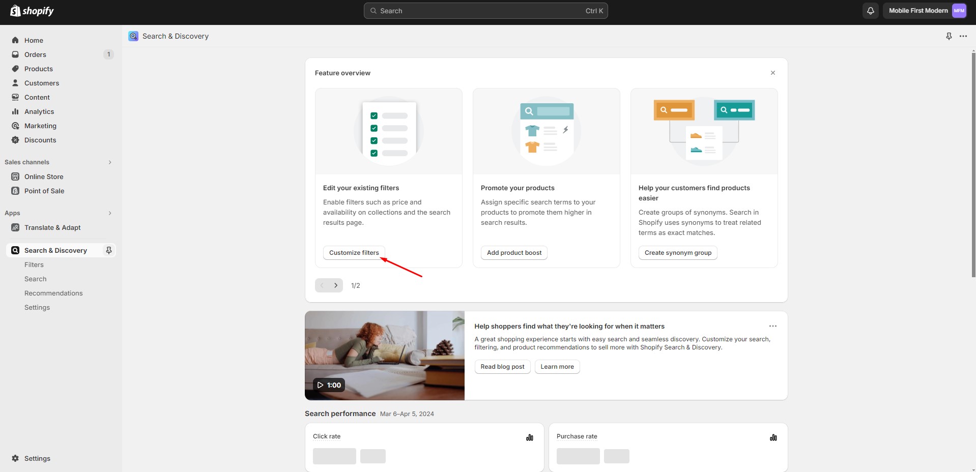
To enable advanced filtering, follow these steps:
- Install the Search & Discovery app by Shopify from the Apps page in the Admin Panel.
- Once installed, open the app and follow the 'View filters' link in the Feature overview section to
manage
the filters.
Note: Product type and tag filters are only shown to customers shopping in the store's default language. Vendor filter values are always based on the store's default language.
Importing Our Demos
You can also copy the structure of any of our 5 demos in a few steps.
- Copy the demo structure from the links (Cmd-A or Ctrl-A to select all).
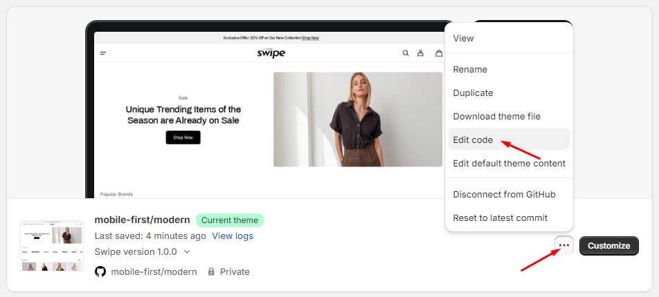
- Follow to the section Online Store > Themes in your store. Click the three dots button of your theme.
-
Open the code editor by clicking the Edit code button.
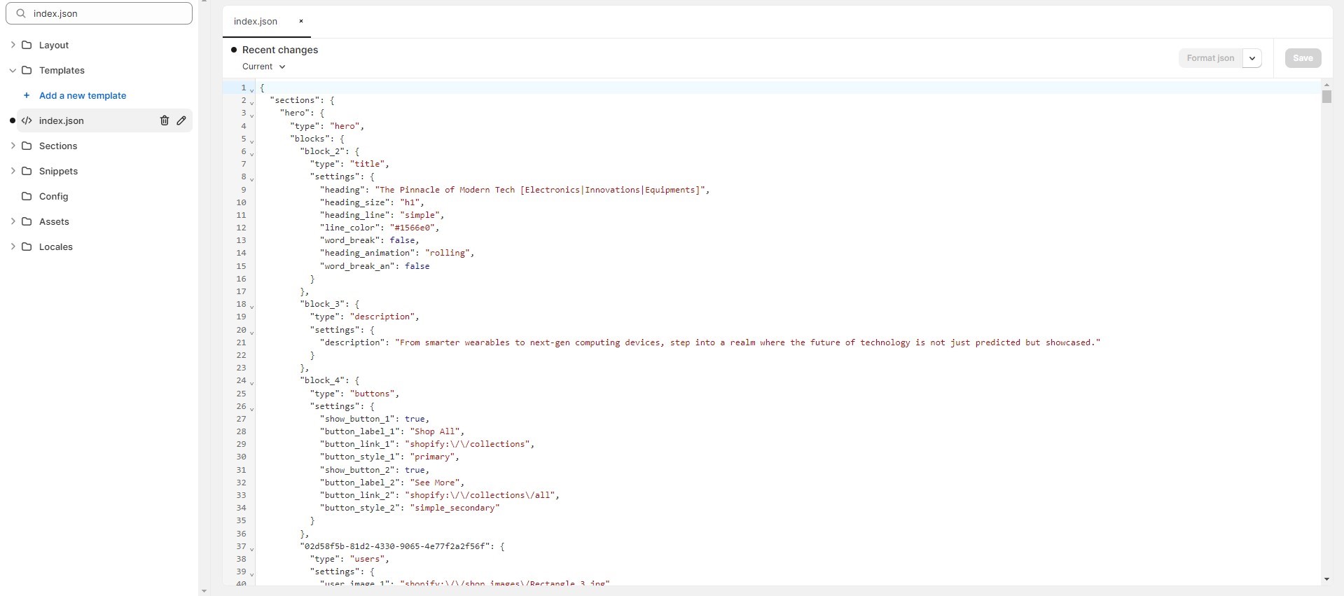
-
In the code editor, search for the file "index.json", select all content, and paste replacing the
demo
structure. Click
"Save" to save your changes. If there's an error, click "Format json" and try to save the file
again.
Demos Structure
Support
You can ask any questions about the theme and our support agent will help you within 24 hours on business days.
Visit Help Center View Terms & Conditions
