This theme offers multiple header styles. You can select from different layouts and color schemes to customize the design.
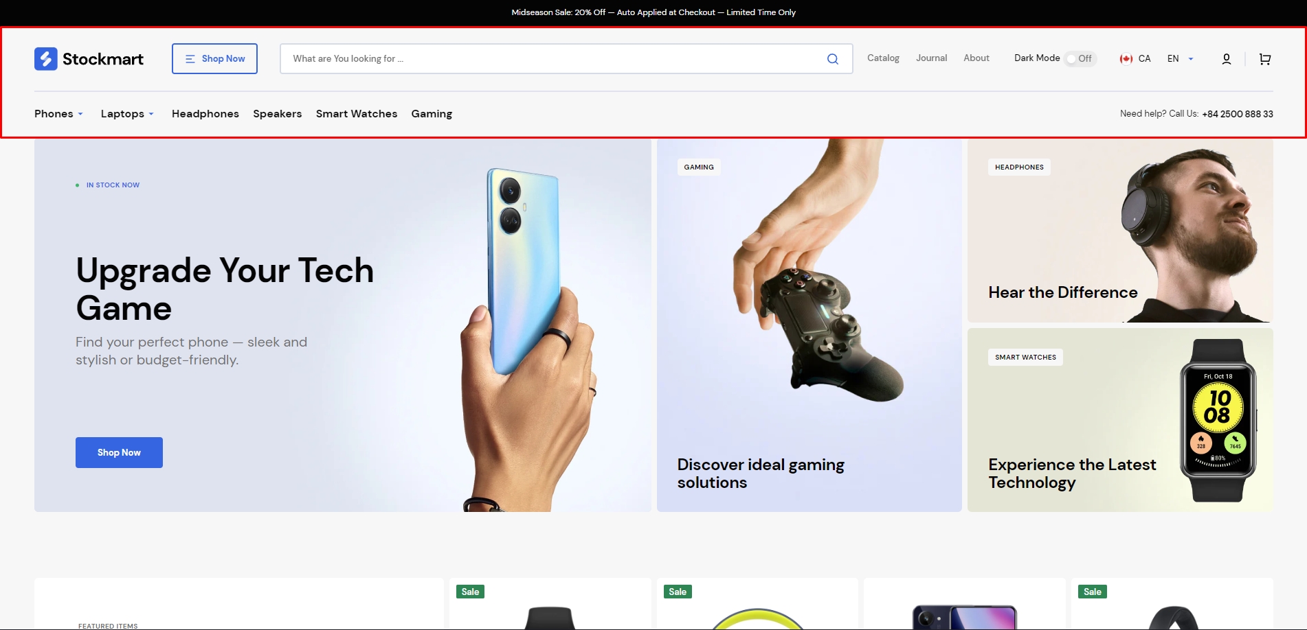
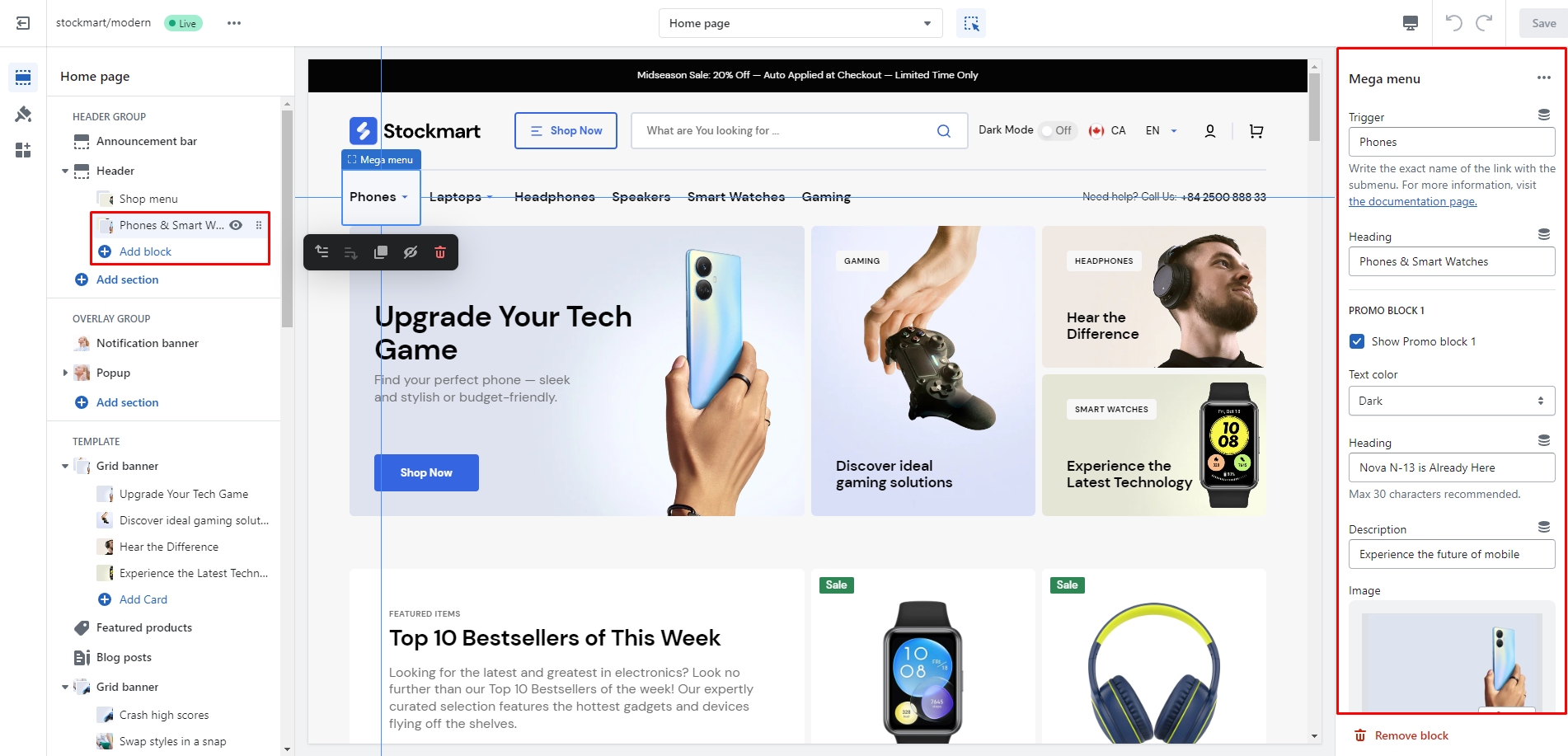
Mega Menu
To add a Mega Menu, ensure the main menu link contains sublinks, then follow these steps:
Add the Mega Menu to the header.
Enter the exact name of the main menu link in the Trigger field.
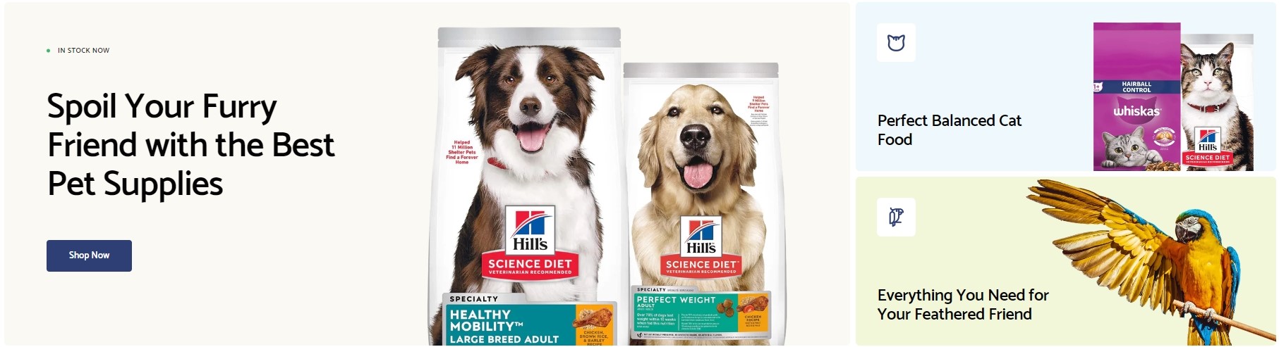
You can also add images, text, and links to the two promo blocks, and customize their color scheme to match your design.
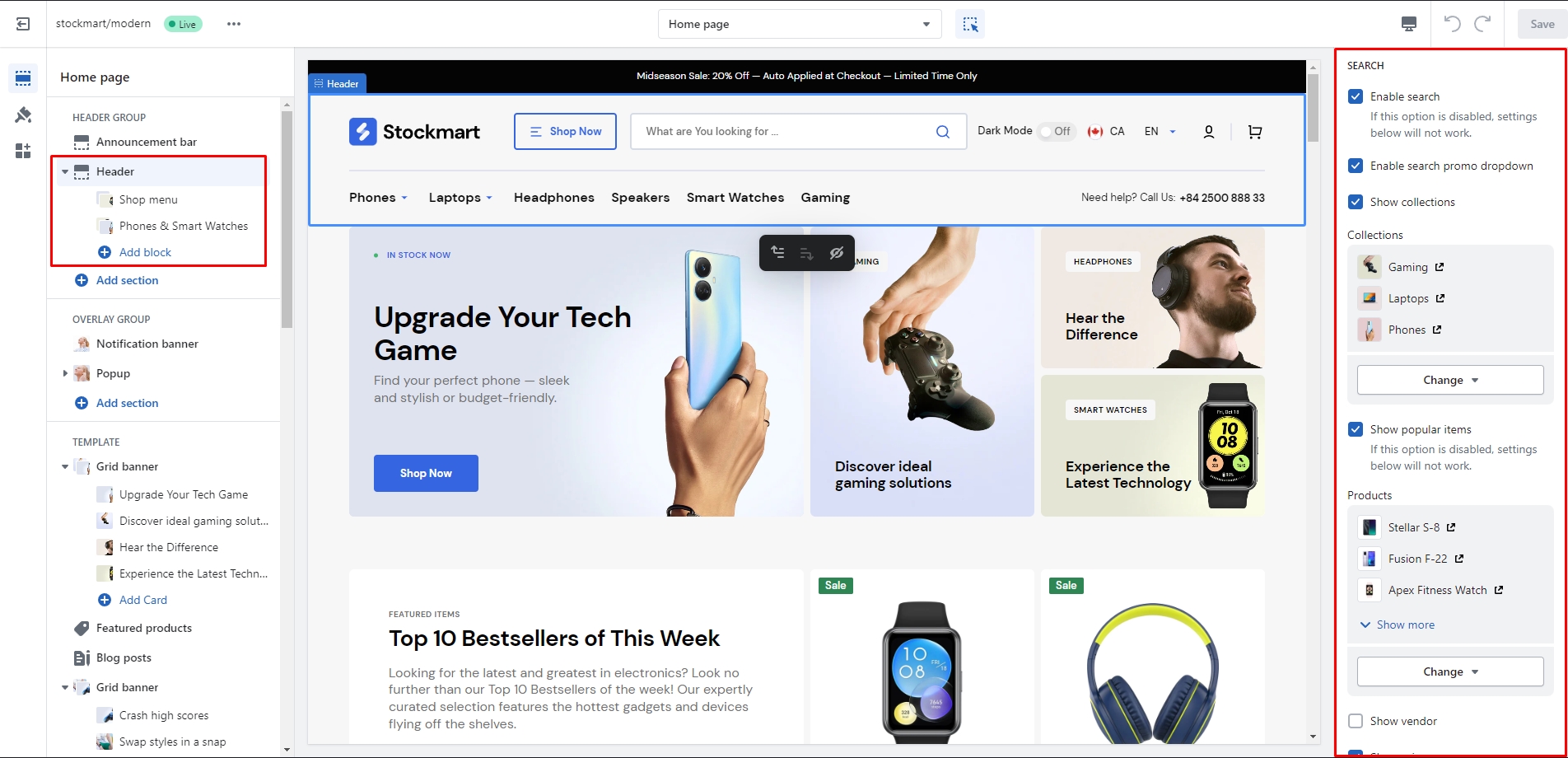
Search
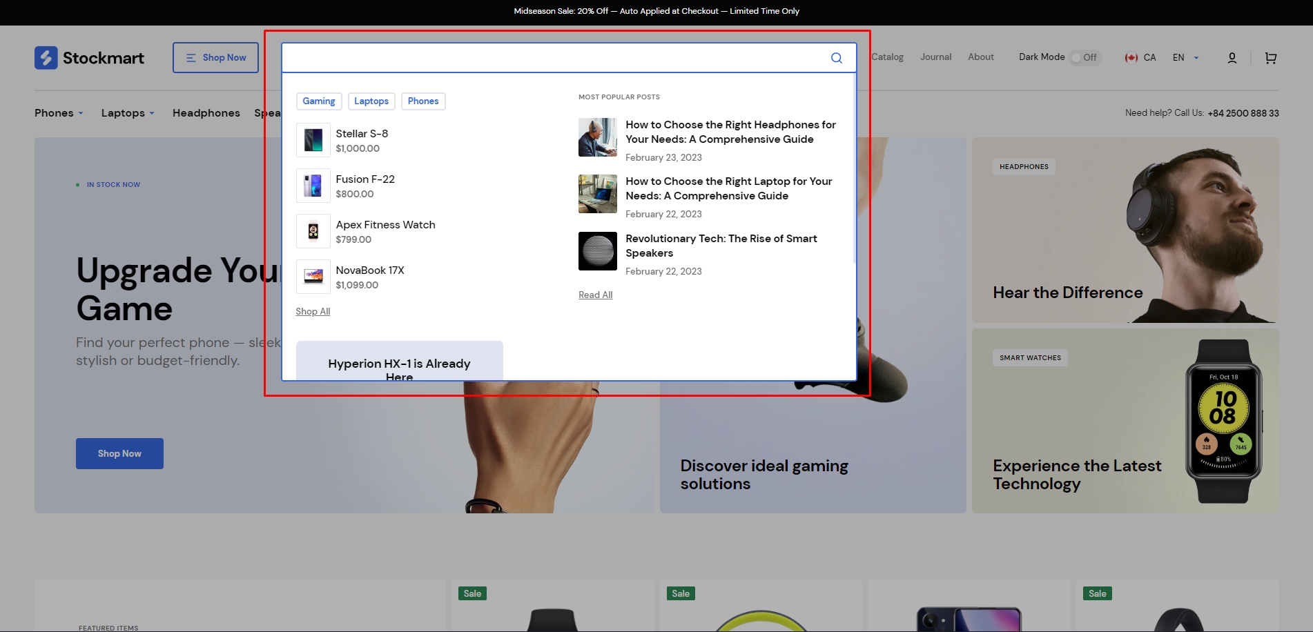
This theme includes a predictive search feature, enabled by default. You can easily disable it by going to Theme Settings > Search.
You can enable the Search Promo Dropdown in the header settings, which appears before the user starts typing. This dropdown can display up to 4 types of content: collections, products, blog posts, and one promo block.
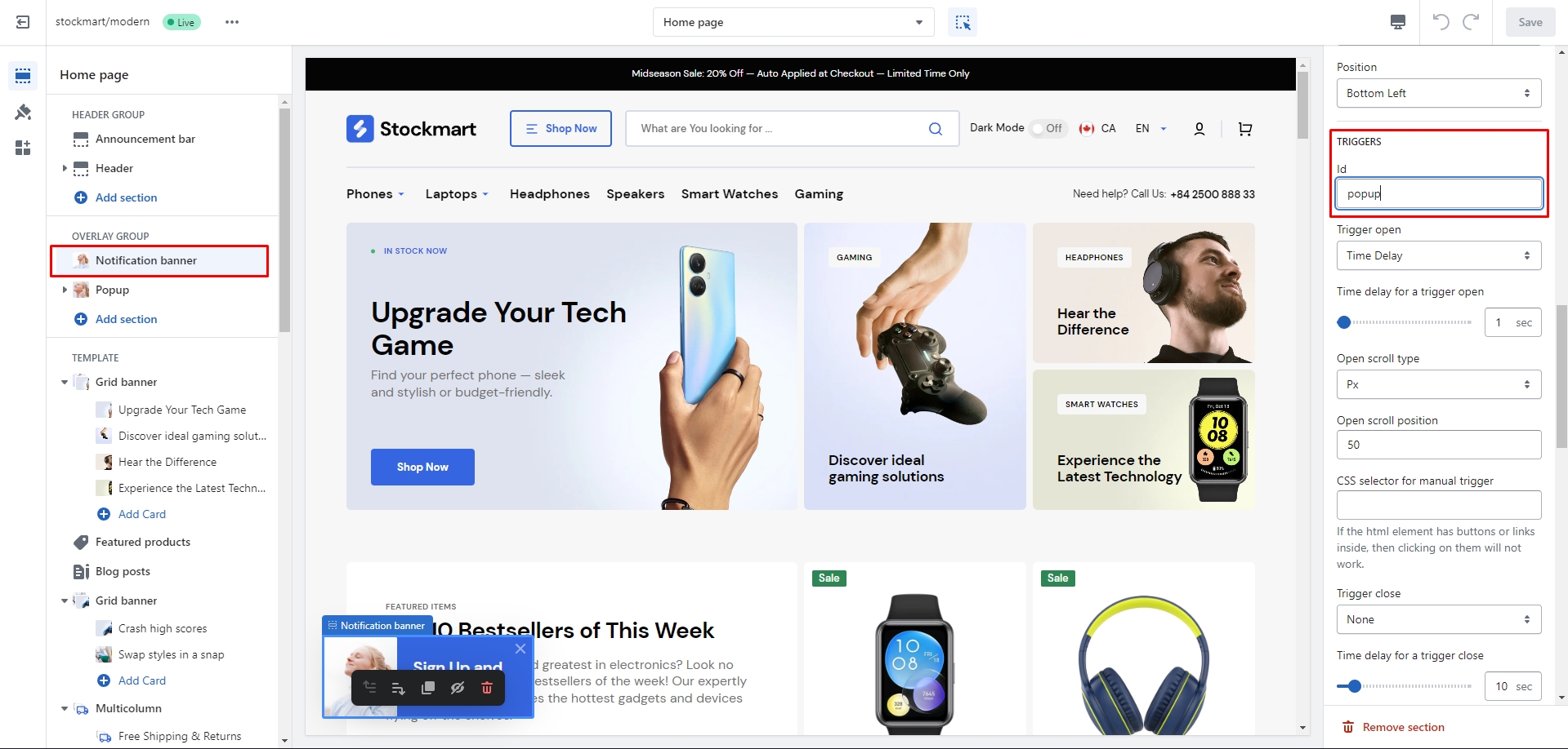
Overlay Group
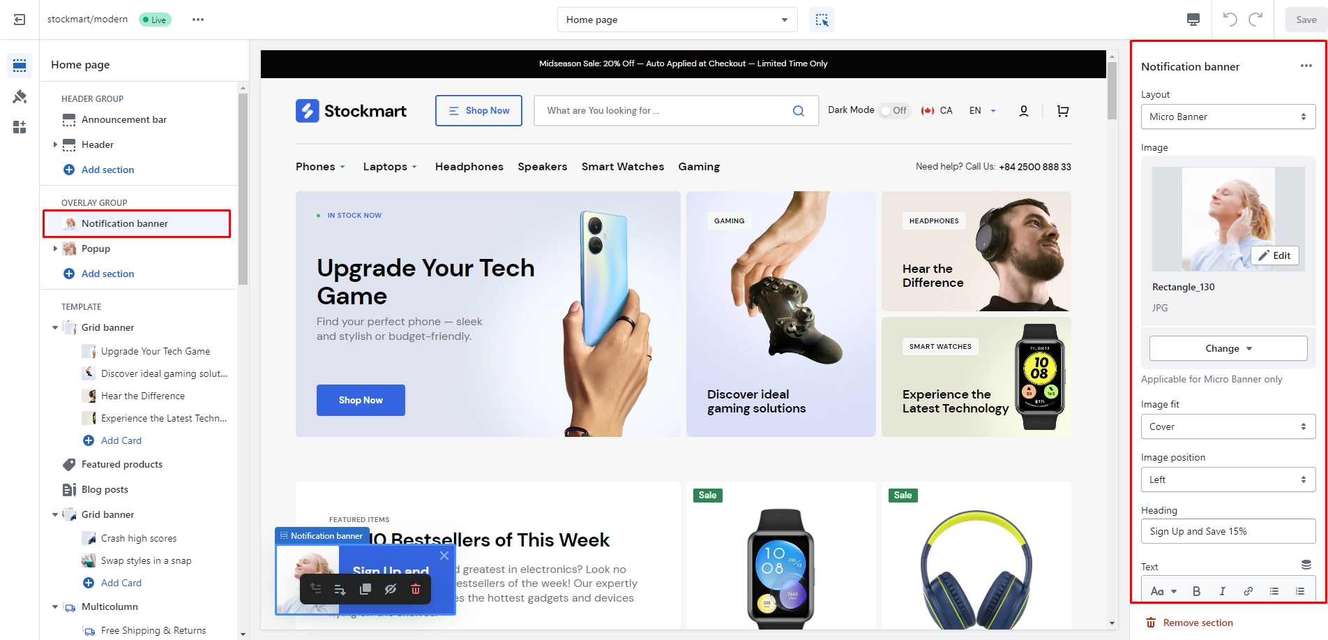
Notification Banner
In the Notification Banner settings, you can customize the layout, add images and text, adjust the banner position, and modify the opening and exit animations, as well as other options.
You can also use this banner as a button trigger to open another notification bar or popup by following these steps:
Add the ID of the popup/notification bar you want to open to the ID field in the Triggers section (e.g., "popup").
Navigate to the popup/notification bar settings and add the ID (with "#" at the beginning) to the CSS Selector for Manual Trigger field.
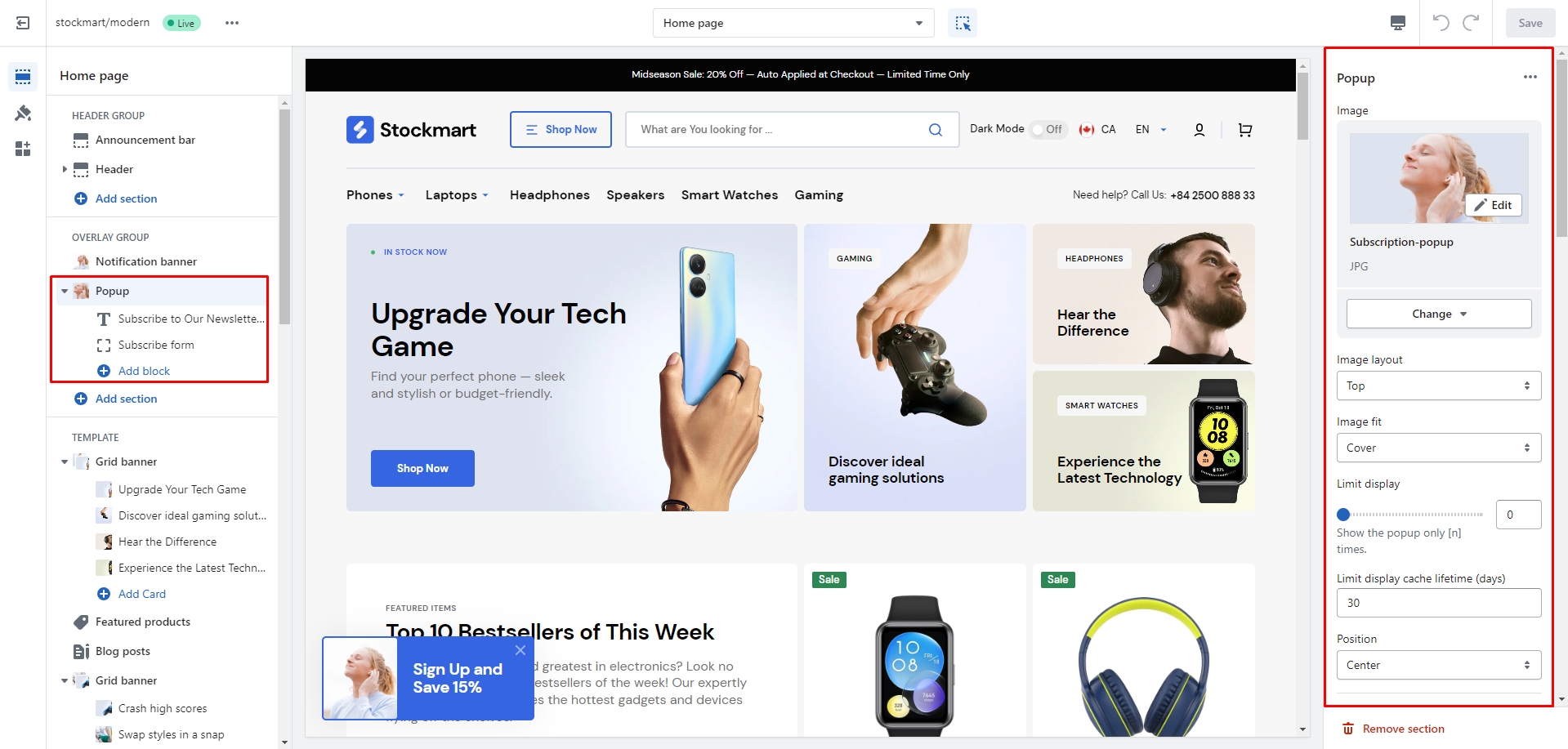
Popup
In the Popup settings, you can customize the layout, add images or subscription forms, adjust the position, and configure the open and close animations, along with other options.
You can also use this popup as a button trigger to open another popup or notification bar by following these steps:
Add the ID of the popup/notification bar you want to open to the ID field in the Triggers section (e.g., "popup").
Go to the popup/notification bar settings and add the ID, starting with "#" (e.g., "#popup"), to the CSS Selector for Manual Trigger field.
Sections
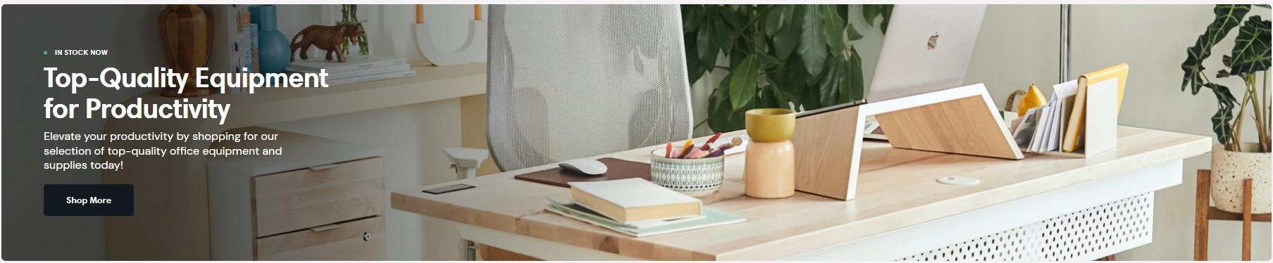
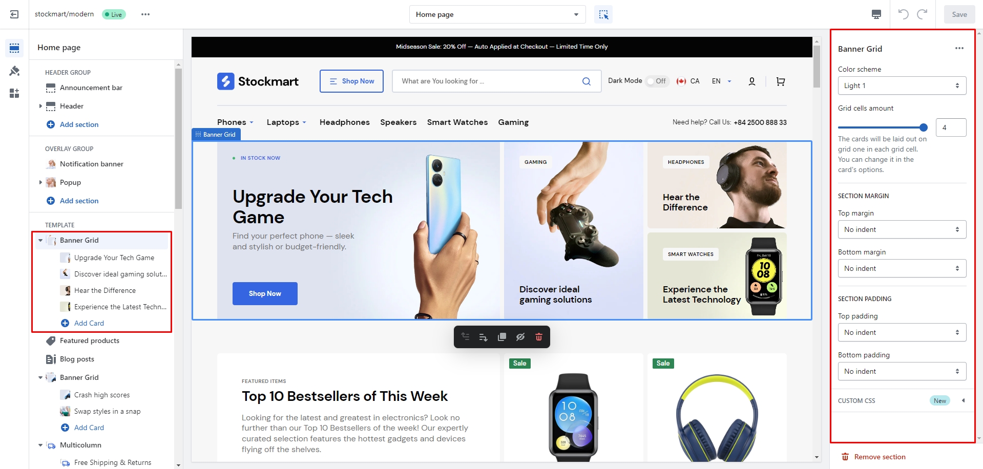
Banner Grid
In this section, you have full flexibility to customize the layout and blocks. You can adjust their position and height, modify the background, and change text size, padding, and overlay effects. You can choose between overlay or gradient effects, and add a background image or an icon to each block.
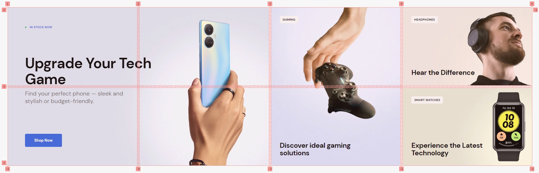
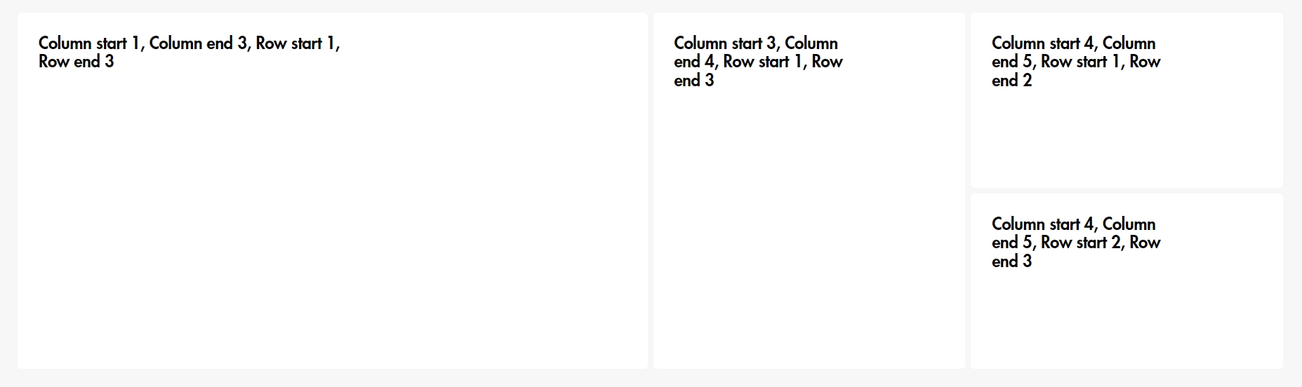
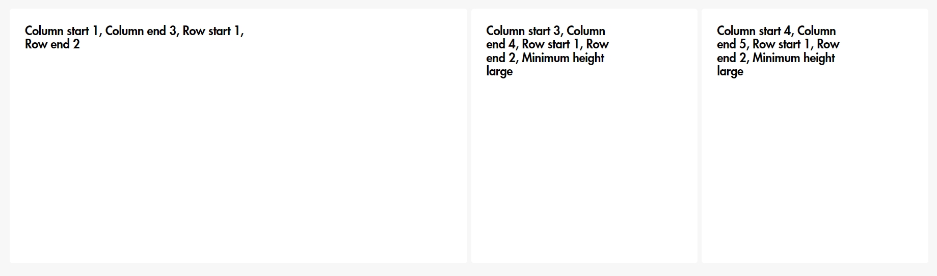
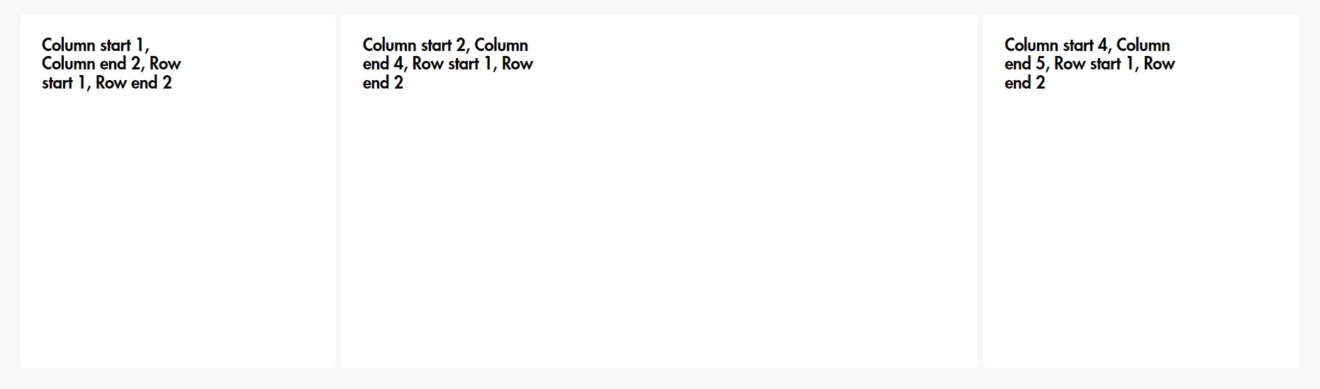
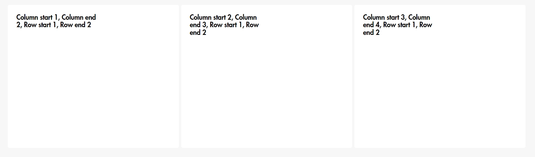
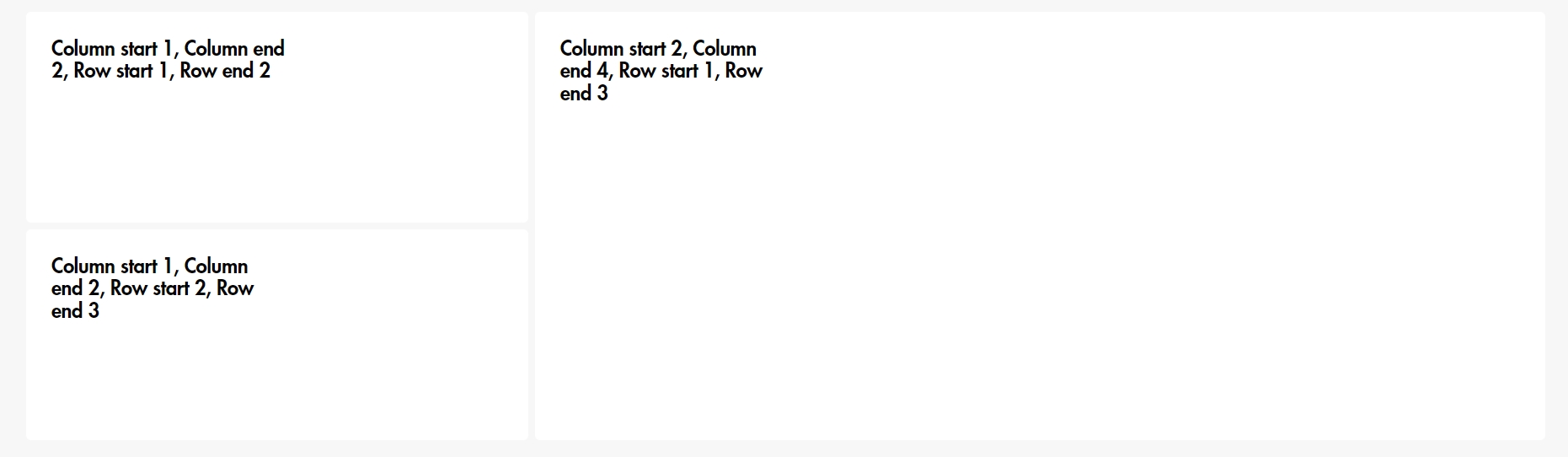
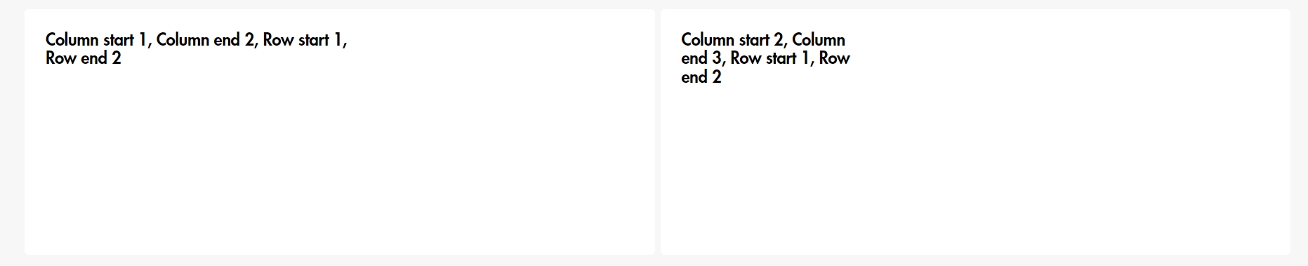
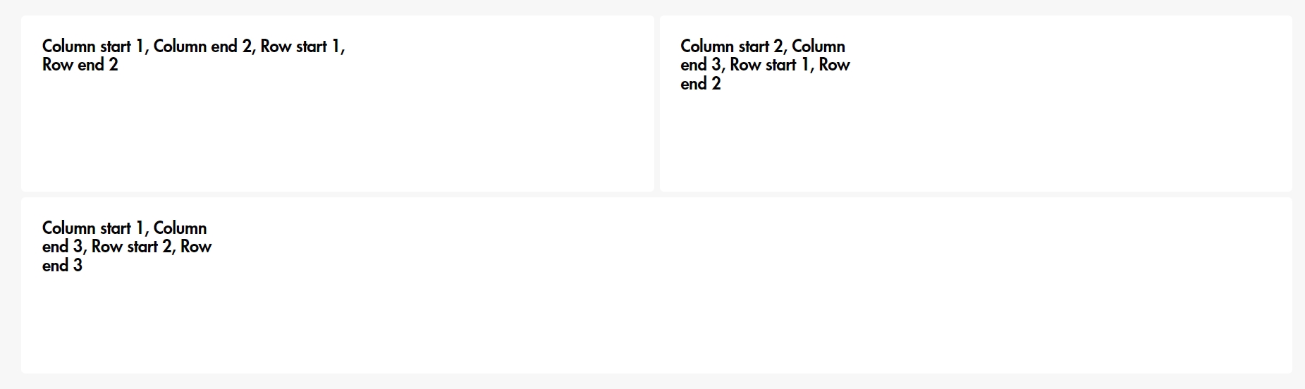
The "Grid Cells Amount" defines the number of columns in the section's grid layout. For example, if you want a block to span 4 columns, set the "Grid Cells Amount" to 4. To position the block, set the "Column Start" to 1 and "Column End" to 5. Keep in mind that both column and row numbering begins at 1, not 0.
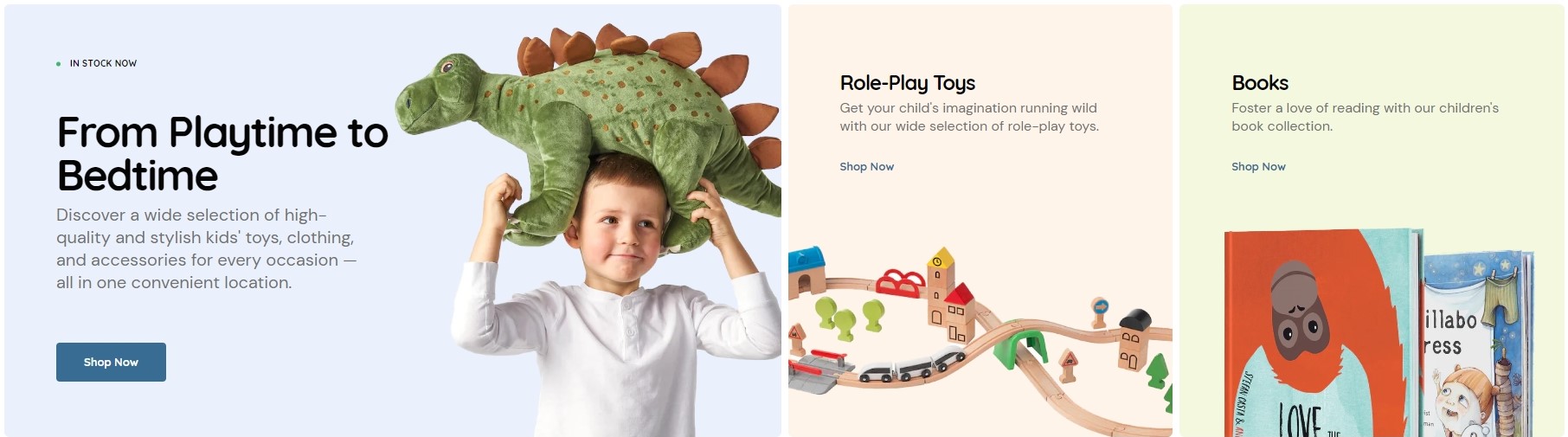
Examples of the grid and blocks
"Grid cells amount": 4
"Grid cells amount": 4
"Grid cells amount": 4
"Grid cells amount": 4
"Grid cells amount": 3
"Grid cells amount": 3
"Grid cells amount": 3
"Grid cells amount": 2
"Grid cells amount": 2
"Grid cells amount": 2
"Grid cells amount": 1
Blog Posts
To add custom icons to your Blog Posts, follow these steps:
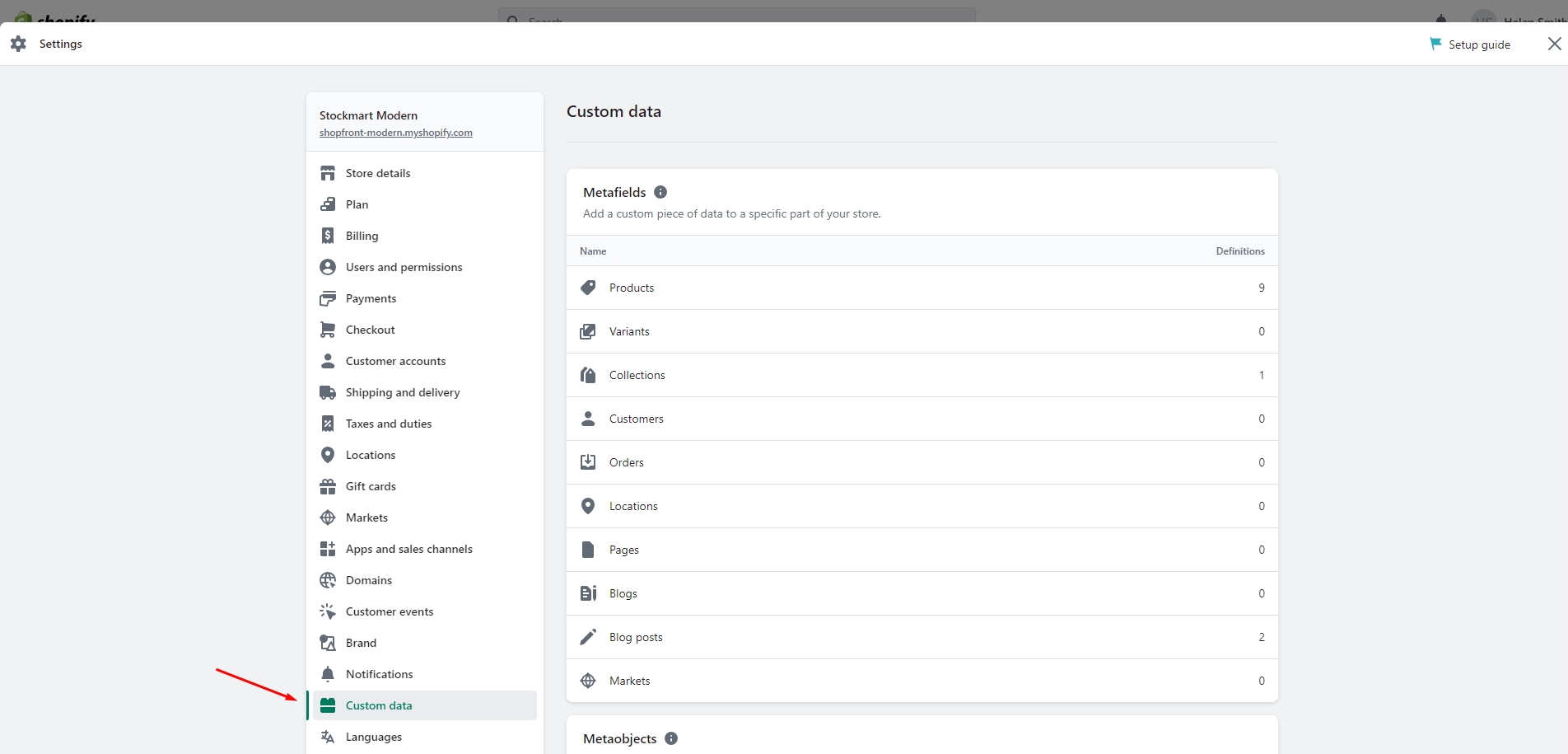
Go to the Admin Panel and open Settings.
Navigate to Custom Data and select Blog Posts.
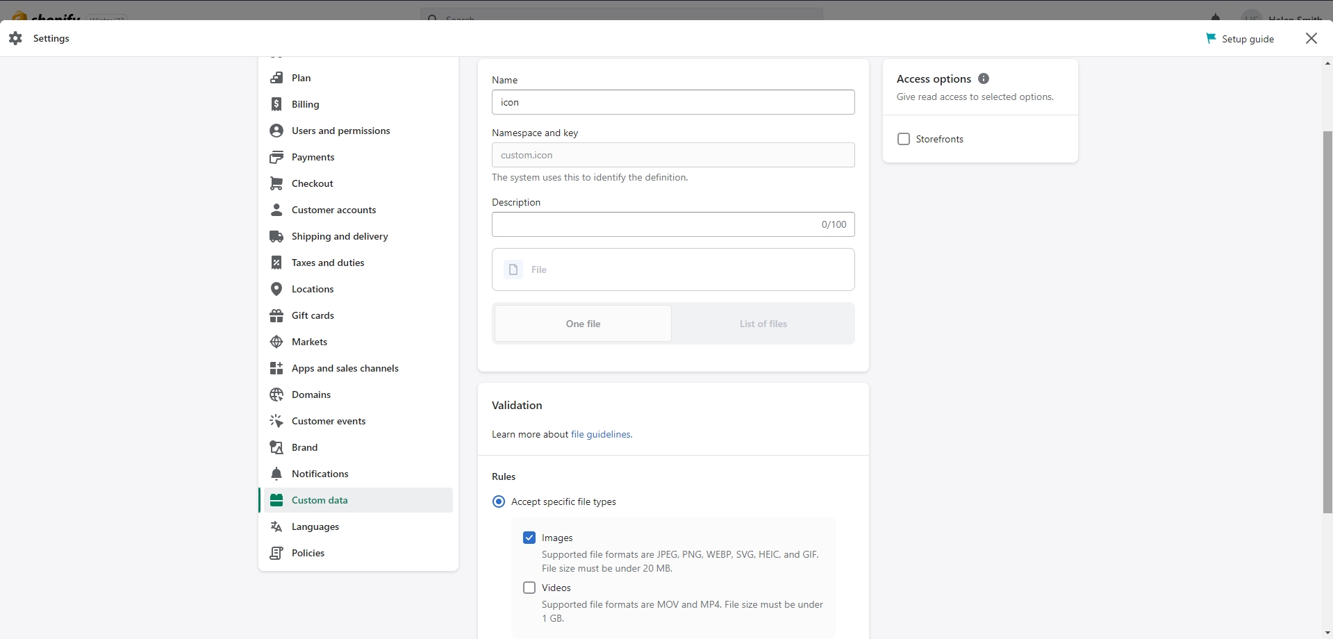
Create a new definition and name it "Icon".
Choose the "File" type and make sure to check the "Images" box.
Save the changes.
The custom icon metafield will now be visible in the blog post settings. You can upload your images directly there and then adjust the layout of the post in the Blog Posts section settings.
If you want to add more dynamic information to your product, you can use metafields. To add metafields, go to Settings > Custom Data > Products in the Admin Panel.
Here are some examples of using metafields:
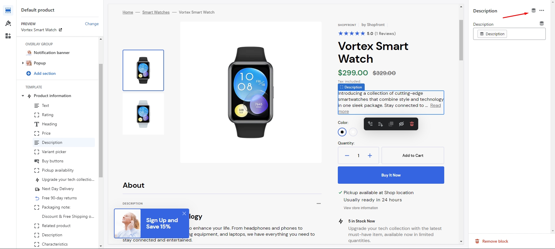
There are 2 types of the product description on the page — long and short.
The long one you can add as
usual, and for
the short one you can use a metafield definition named "description" with the "Single-line text" type. You
can add and
edit this metafield in the product page.
To add dynamic characteristics to your product, follow these simple steps:
Add two metafields with these exact names: 'characteristics.name' for the name, and 'characteristics.description' for the description.
Choose the "Single-line text with list of values" type for the both metafields.
Navigate to the product and add characteristics.
Add a block "About" with a heading "Characteristics" to the product page.
Product Recommendations and Complementary Products
To add and edit product recommendations, follow these steps:
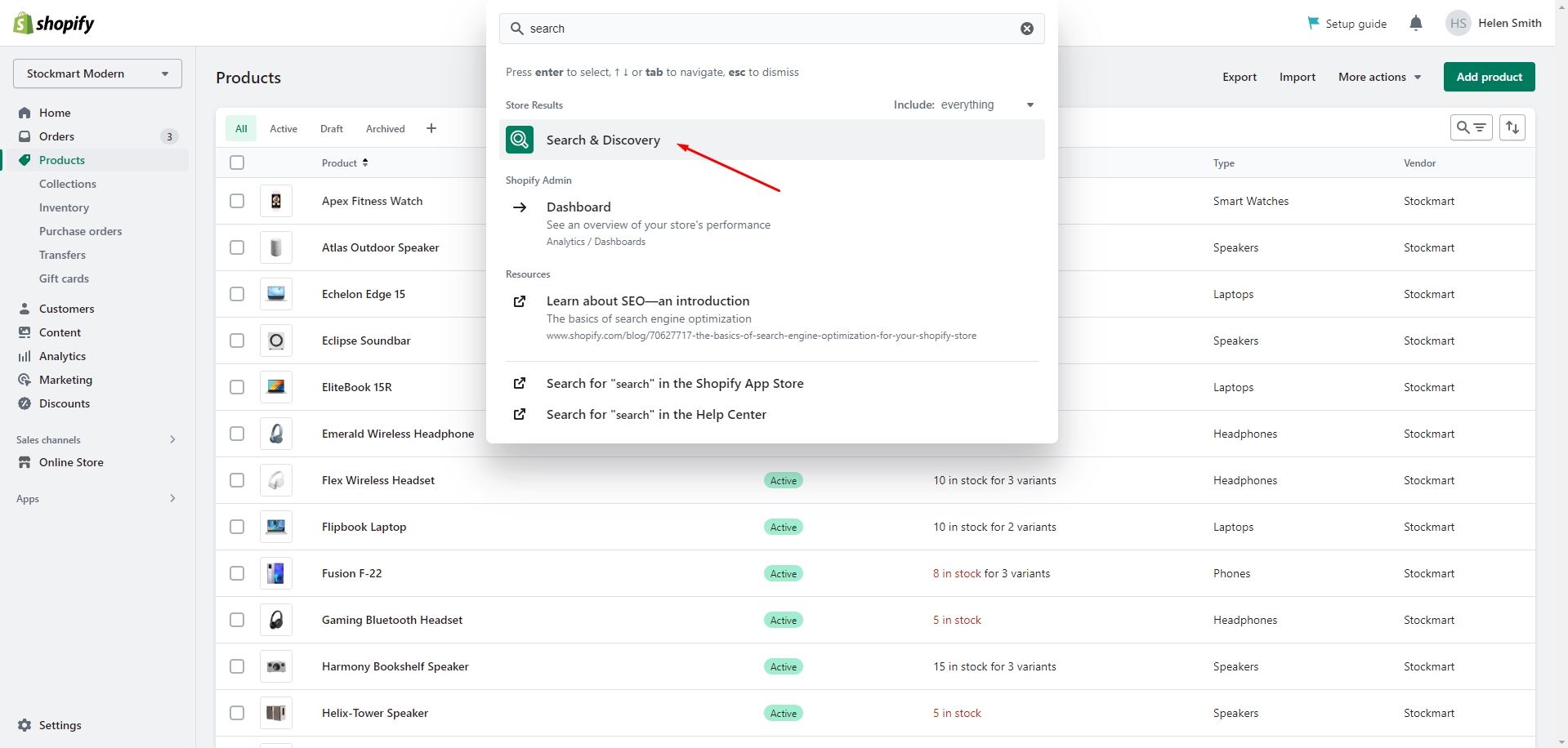
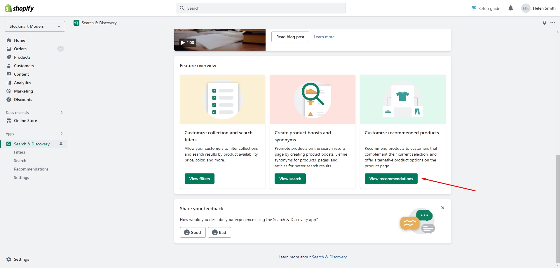
Go to the Apps page in the Shopify Admin panel and install the 'Search & Discovery' app by Shopify.
After installing the app, open it and click the 'View recommendations' link in the Feature overview section to start adding recommendations to your products.
You can quickly edit or add recommendations for multiple products by using the Bulk editor in the Products tab of the Admin Panel.
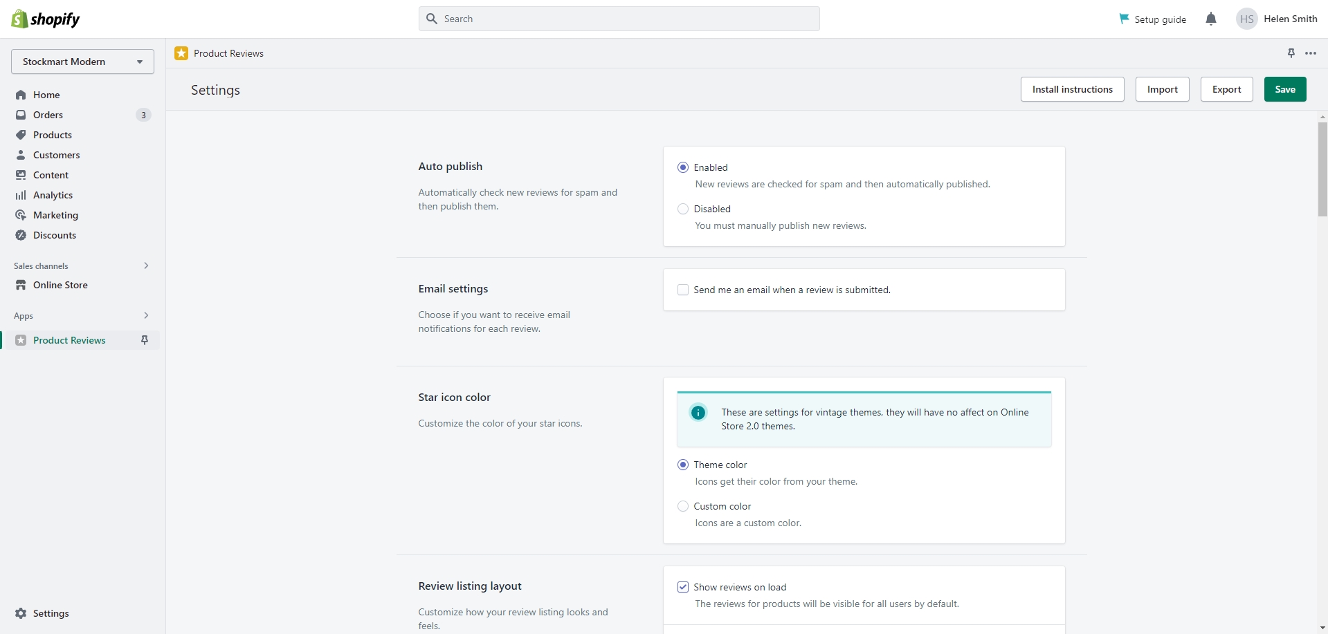
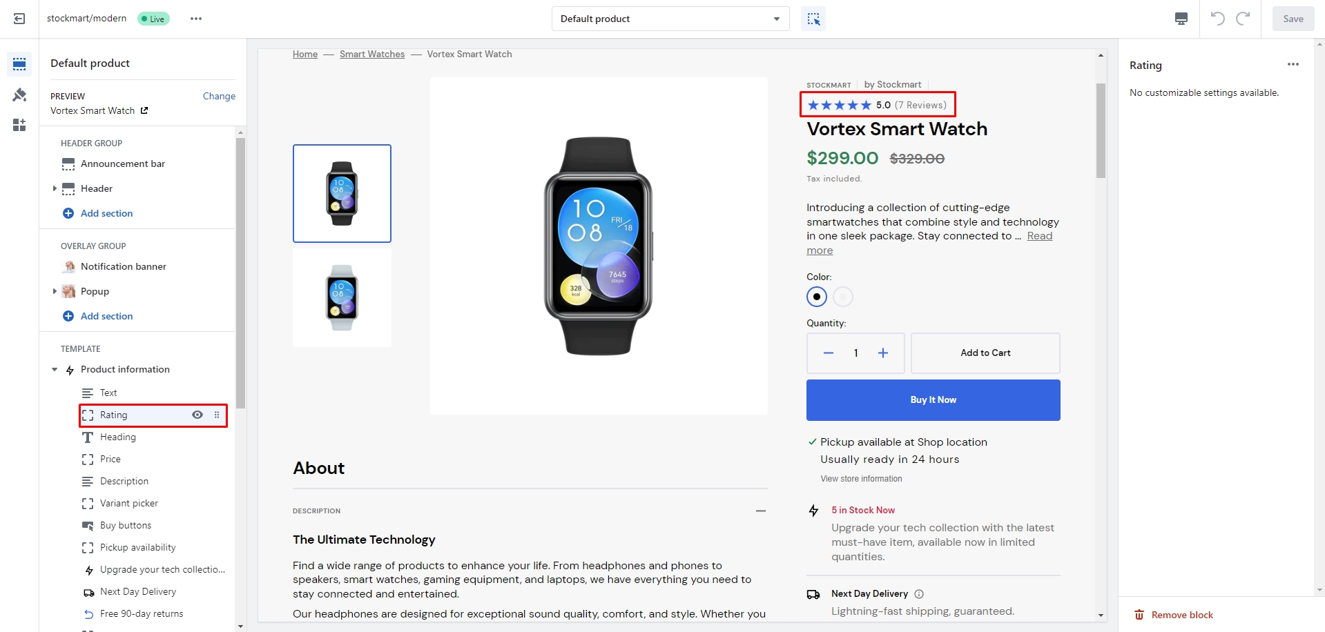
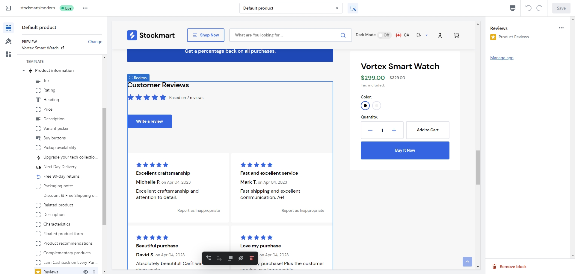
Product Reviews
To enable and manage customer reviews on your shop, follow these steps:
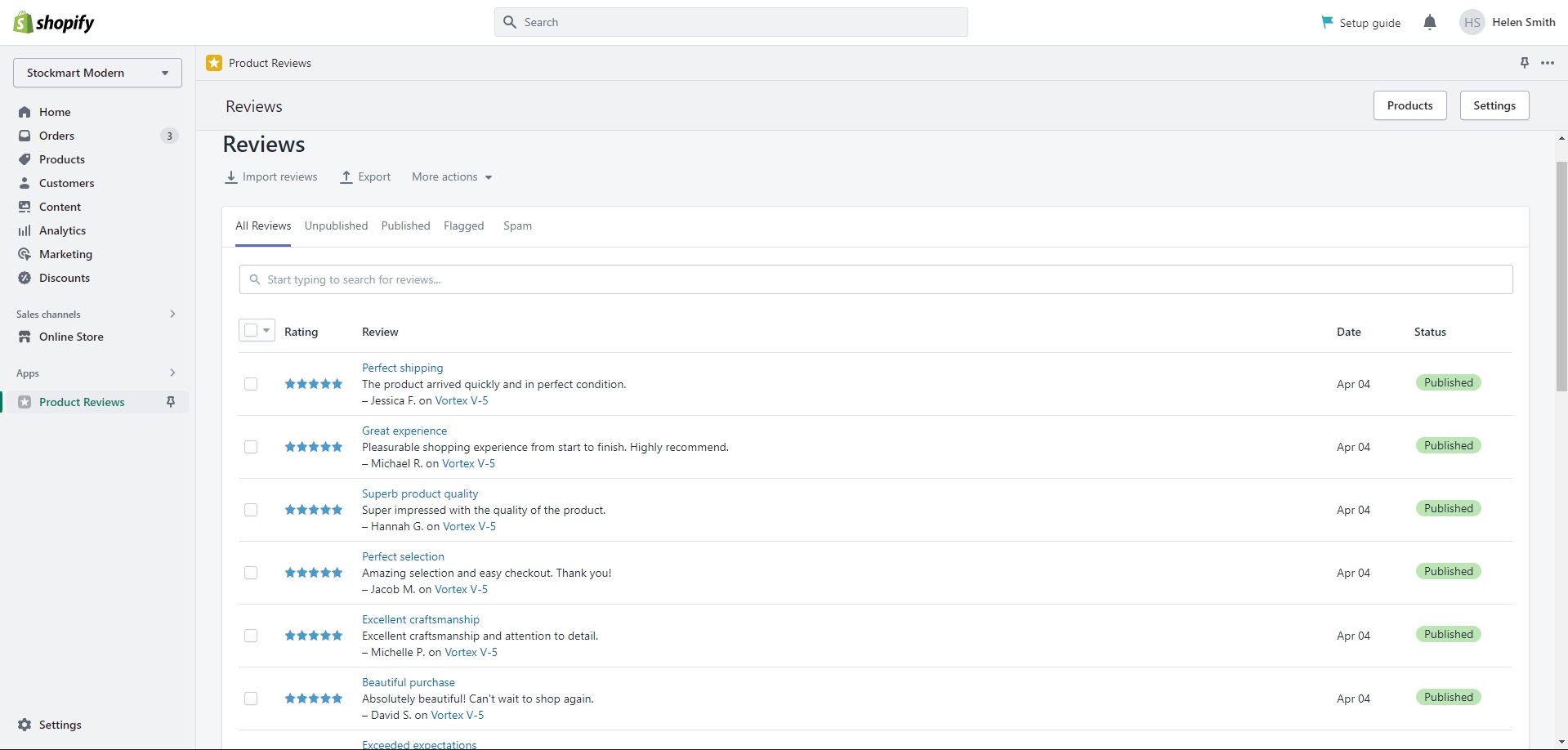
Go to the Apps page in the Admin panel and install the 'Product Reviews' app by Shopify.
After installing the app, add the 'Rating' and 'Reviews' blocks to your Product page to enable customer feedback and reviews.
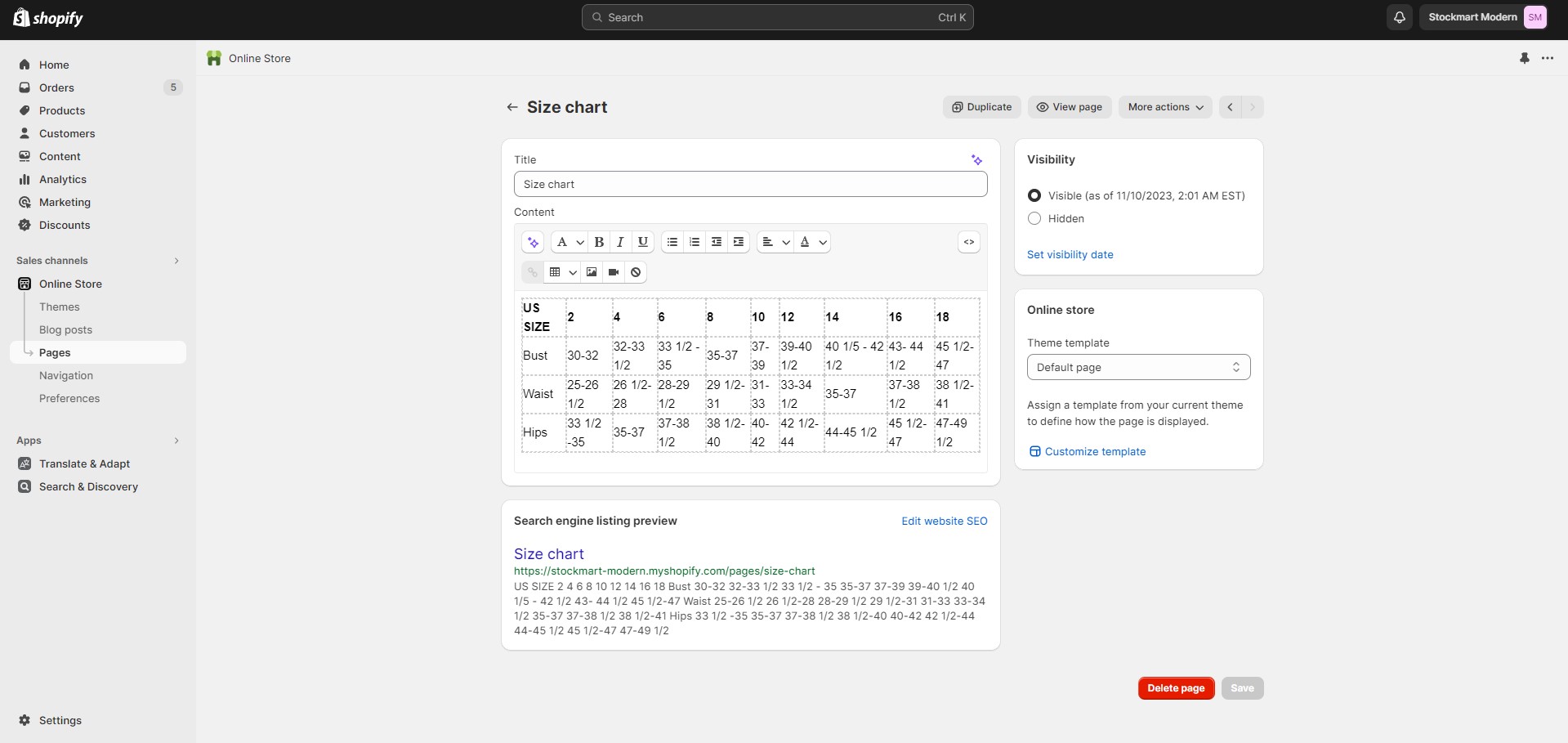
Size Chart
To add a size chart, follow these steps:
Create new page with a table.
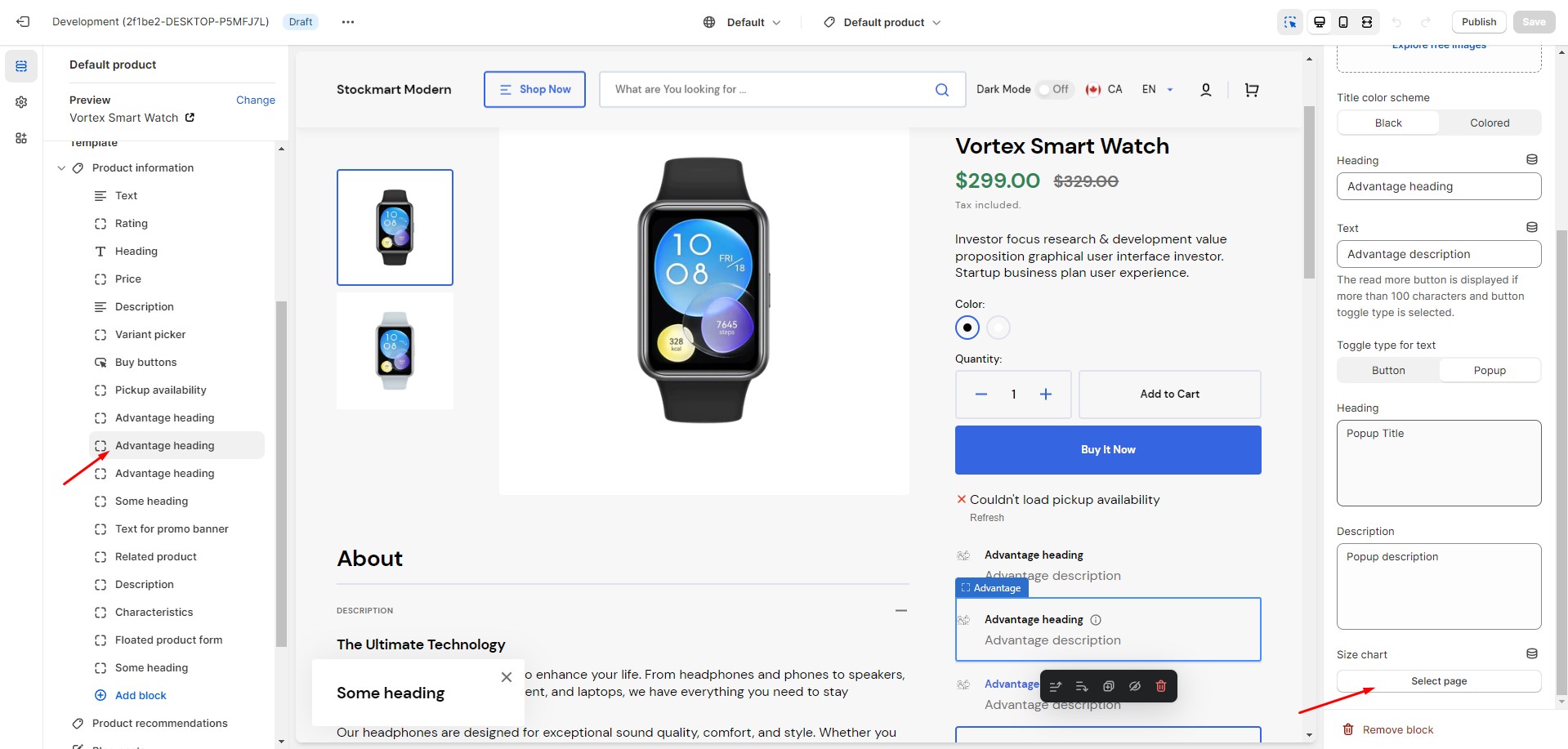
Add an 'Advantage' block to the product page to showcase the key benefits of the product.
Select the 'Size chart' page. This option only works with the Popup toggle type.
Collection Page
You can add custom images to your collections by following these steps:
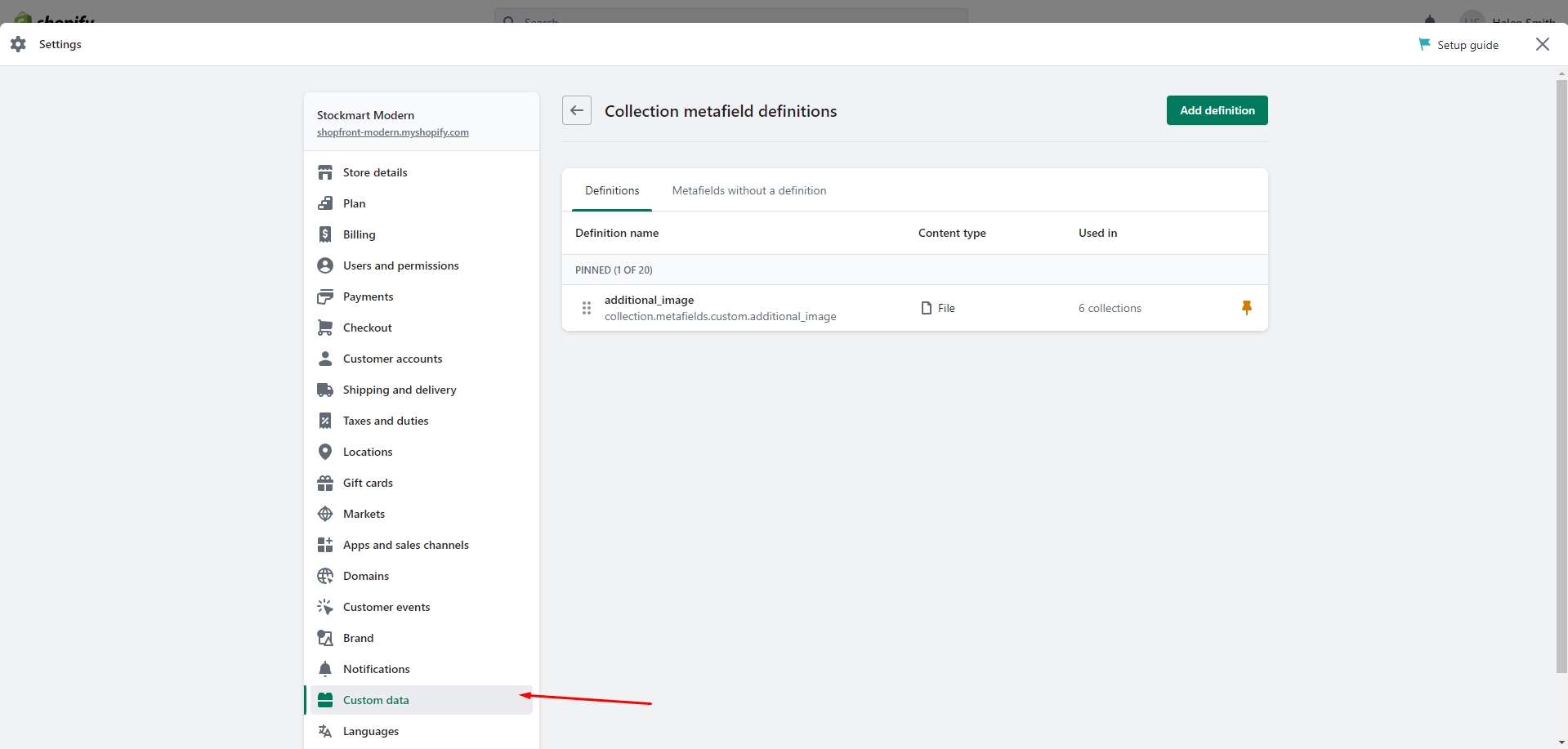
Open the Settings in the Admin Panel.
Go to Custom Data and select Collections.
Add a new definition with the name 'additional_image' to store custom images for your collections.
Select the 'File' type and check the 'Images' checkbox to allow image uploads for your collections.
Save the changes.
The custom icon metafield will now be available in the Collection settings, allowing you to upload your images. After adding the images, you can change the Image type in the Collection banner section settings.
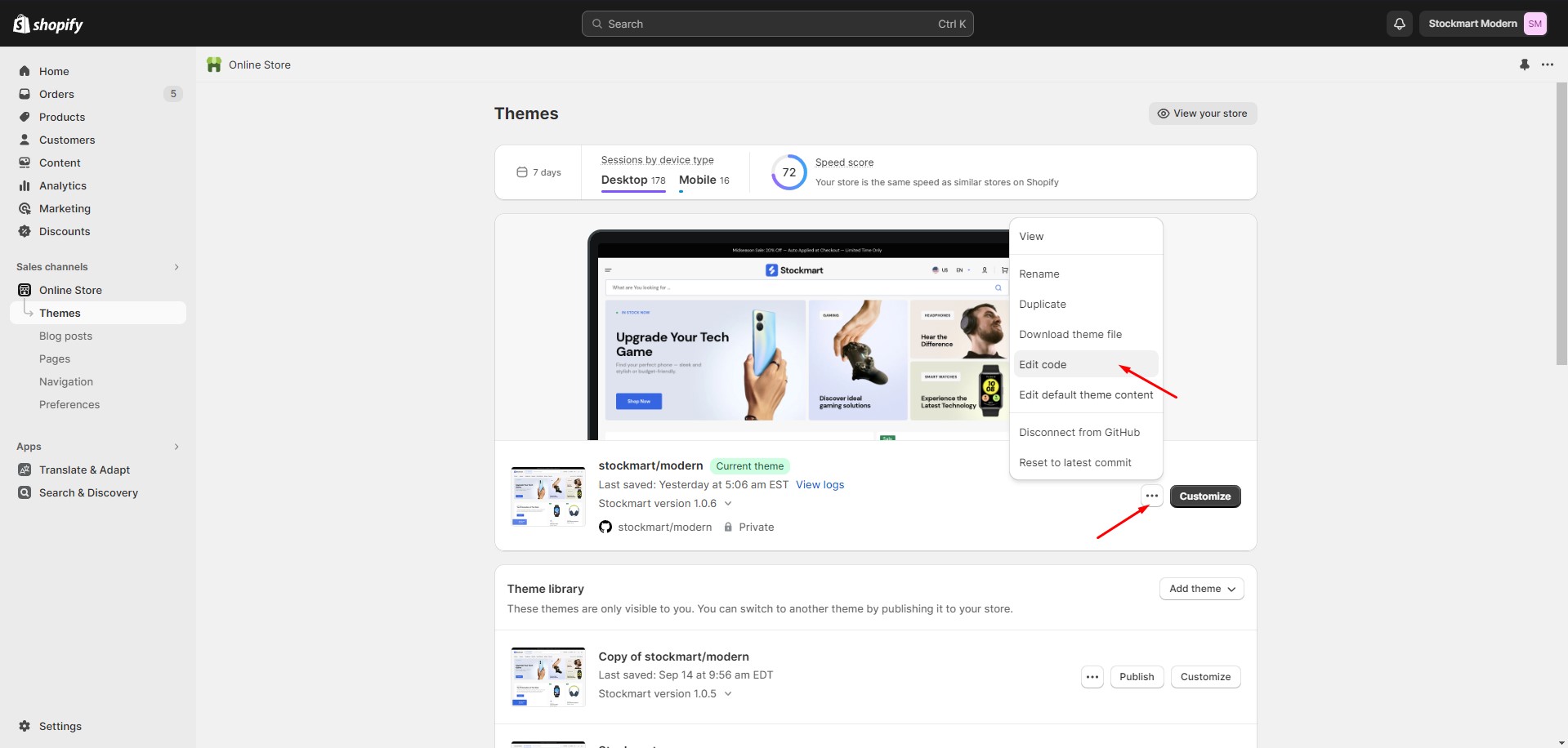
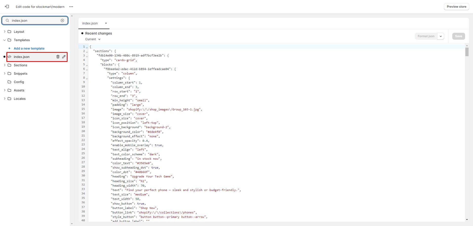
Go to the Online Store > Themes section in your store. Then, click the three dots button next to your theme.
Open the code editor by clicking the Edit code button.
In the code editor, search for the 'index.json' file. Select all the content and paste the demo structure to replace it. Click 'Save' to save your changes. If an error occurs, click 'Format json' and try saving the file again.


