Select Documentation
General Settings
Settings that are used in almost all sections.
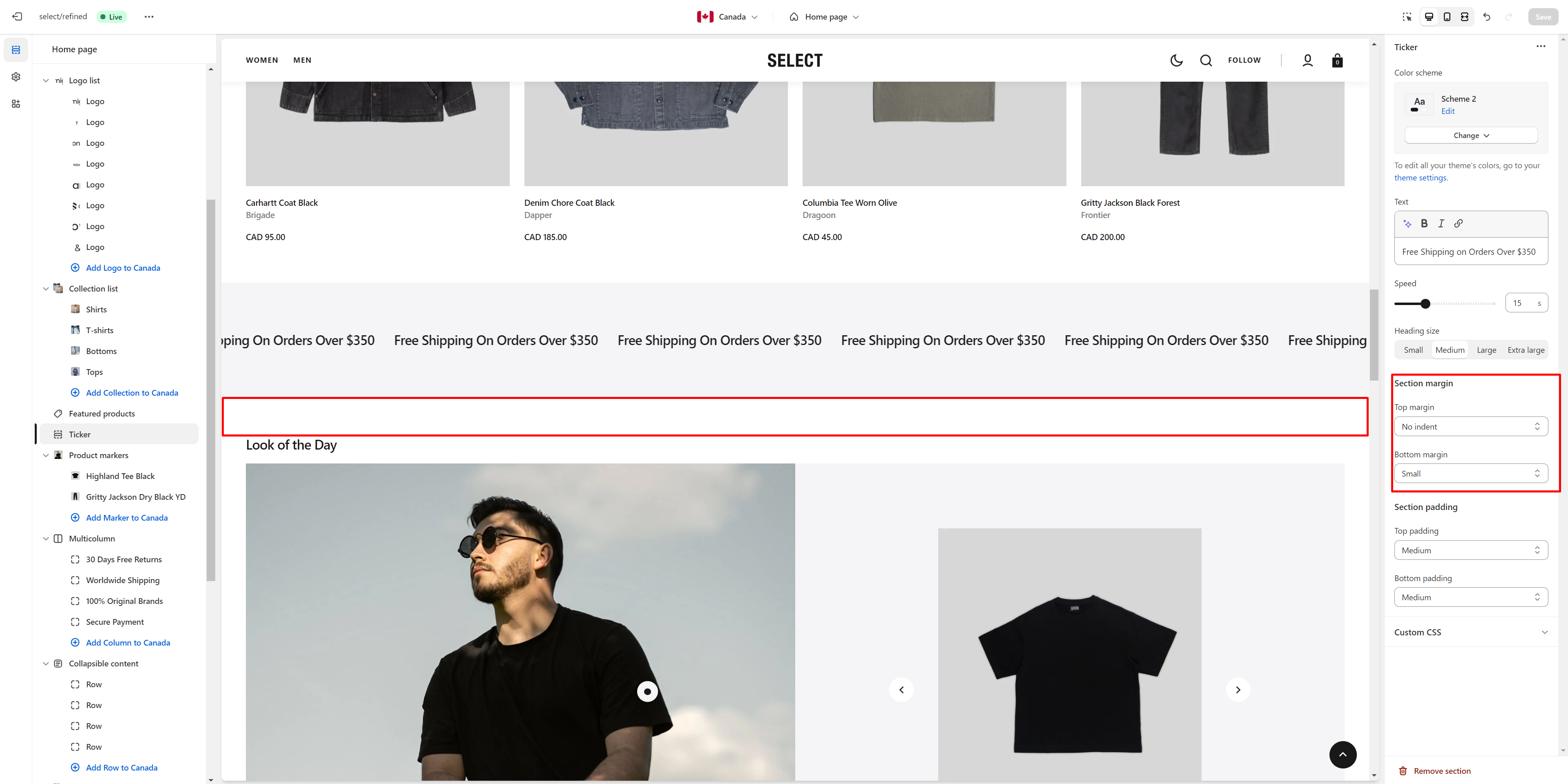
Section Margin
This option lets you adjust the top and bottom margins of the section.
- Top margin slider allows you to change the top margin in the section.
- Bottom margin slider allows you to change the bottom margin in the section.
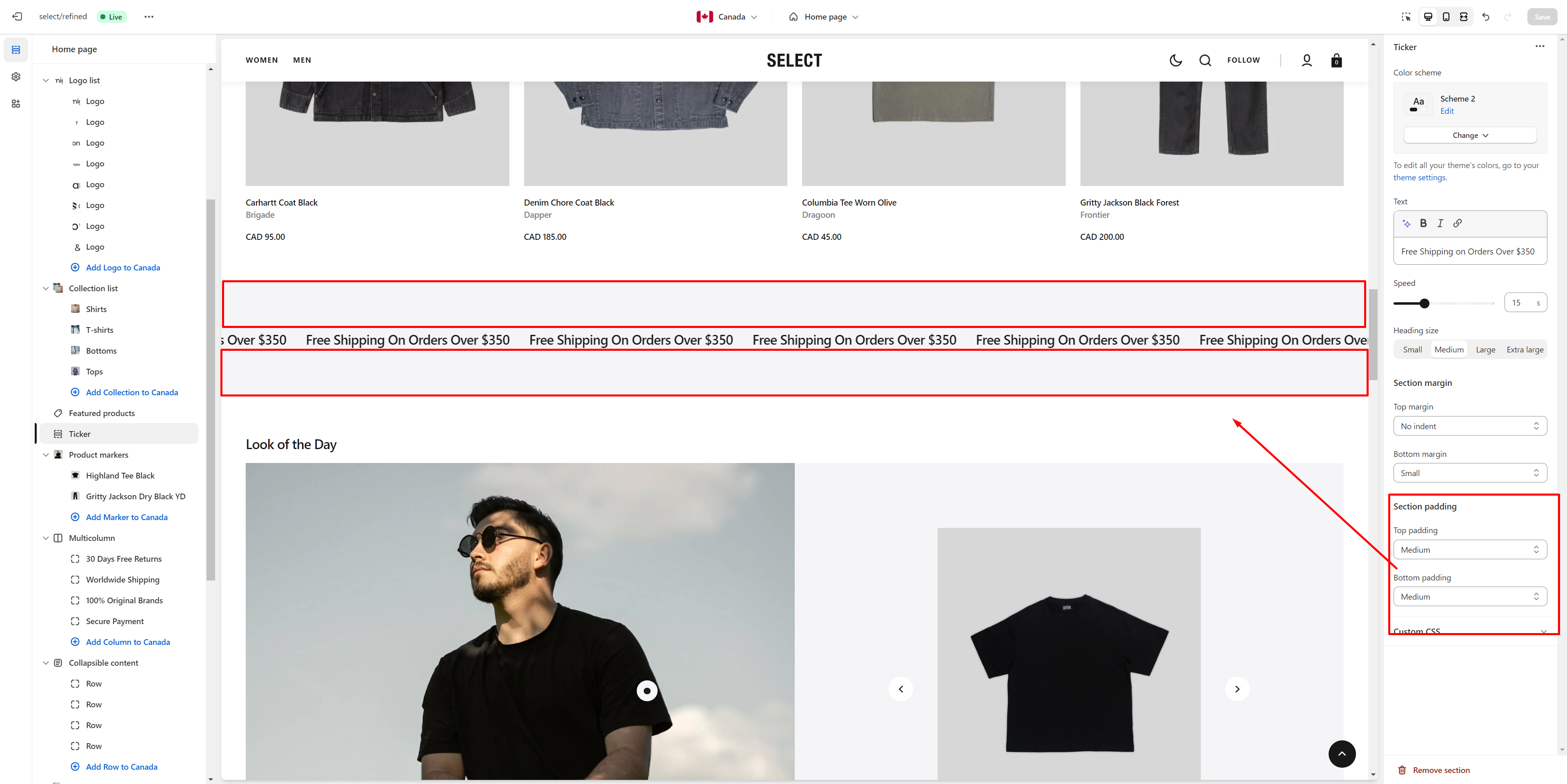
Section Padding
This option lets you adjust the top and bottom paddings of the section.
- Top padding slider allows you to change the top padding in the section.
- Bottom padding slider allows you to change the bottom padding in the section.
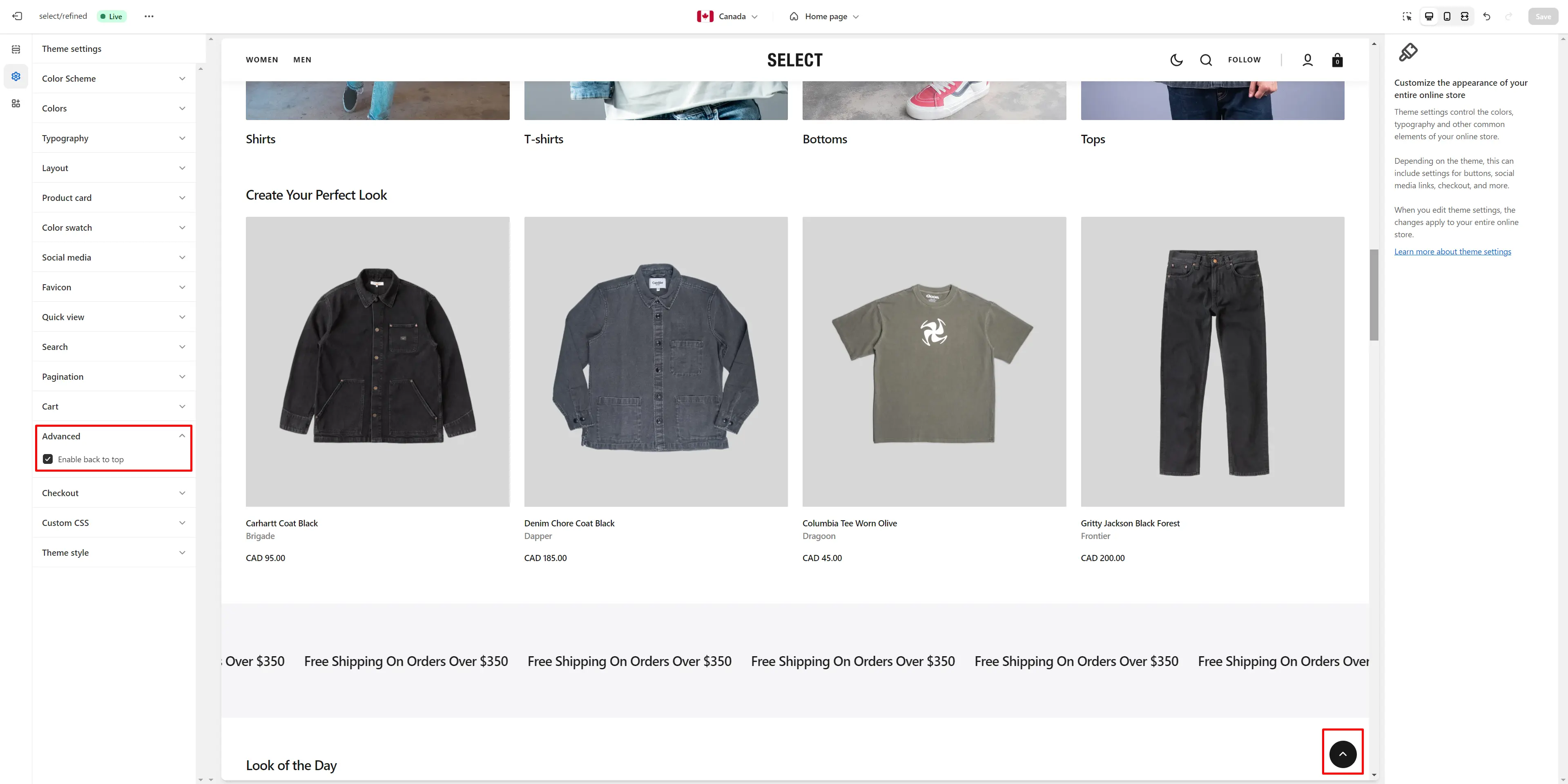
Back to Top
To enable Back to Top button, navigate to Theme settings > Advanced.
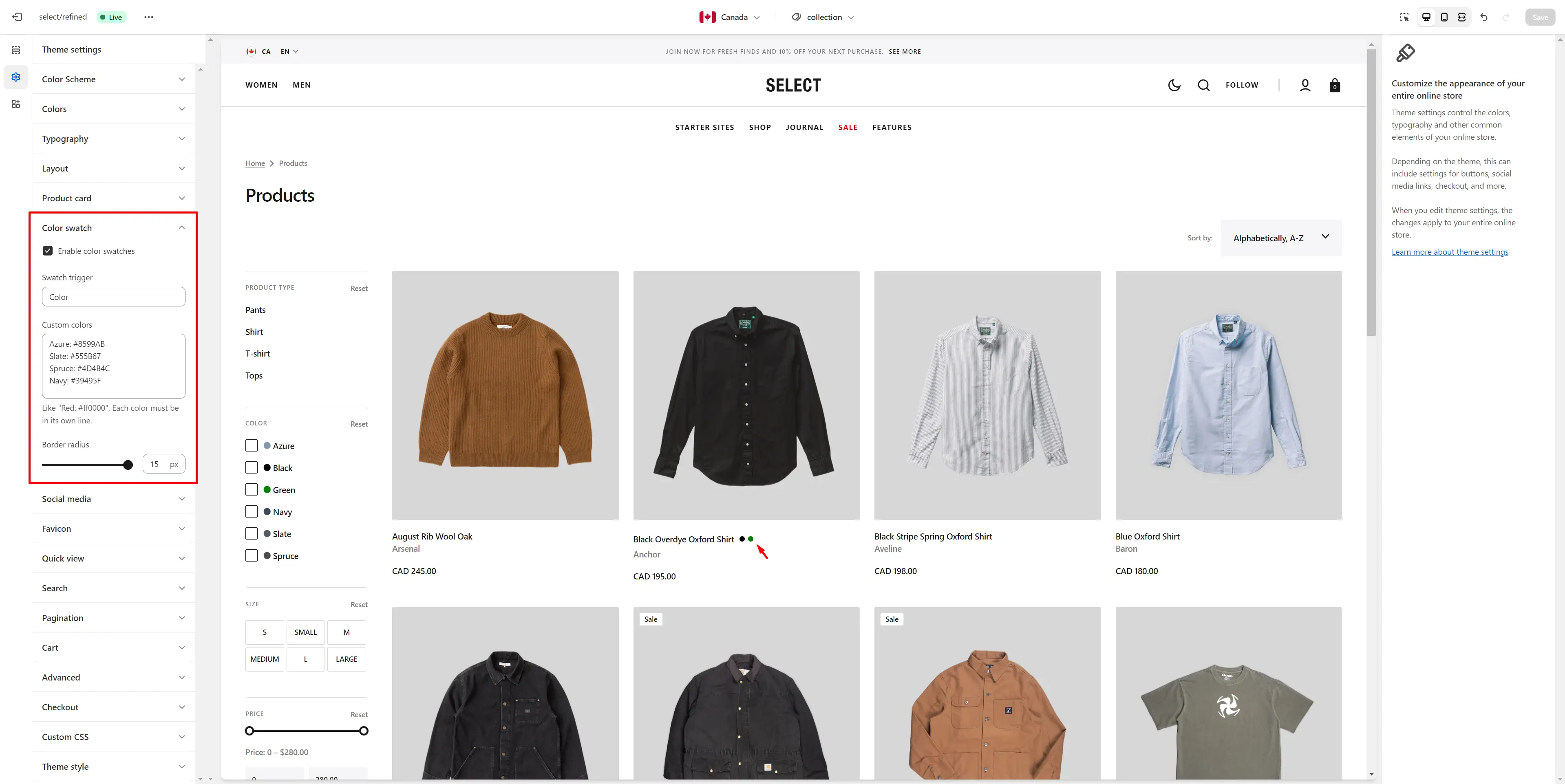
Color Swatches
To enable and edit color swatches, go to Theme settings > Color Swatches. The swatch trigger must match the option in Product variants. You can also add custom colors by specifying their name and HEX color code.
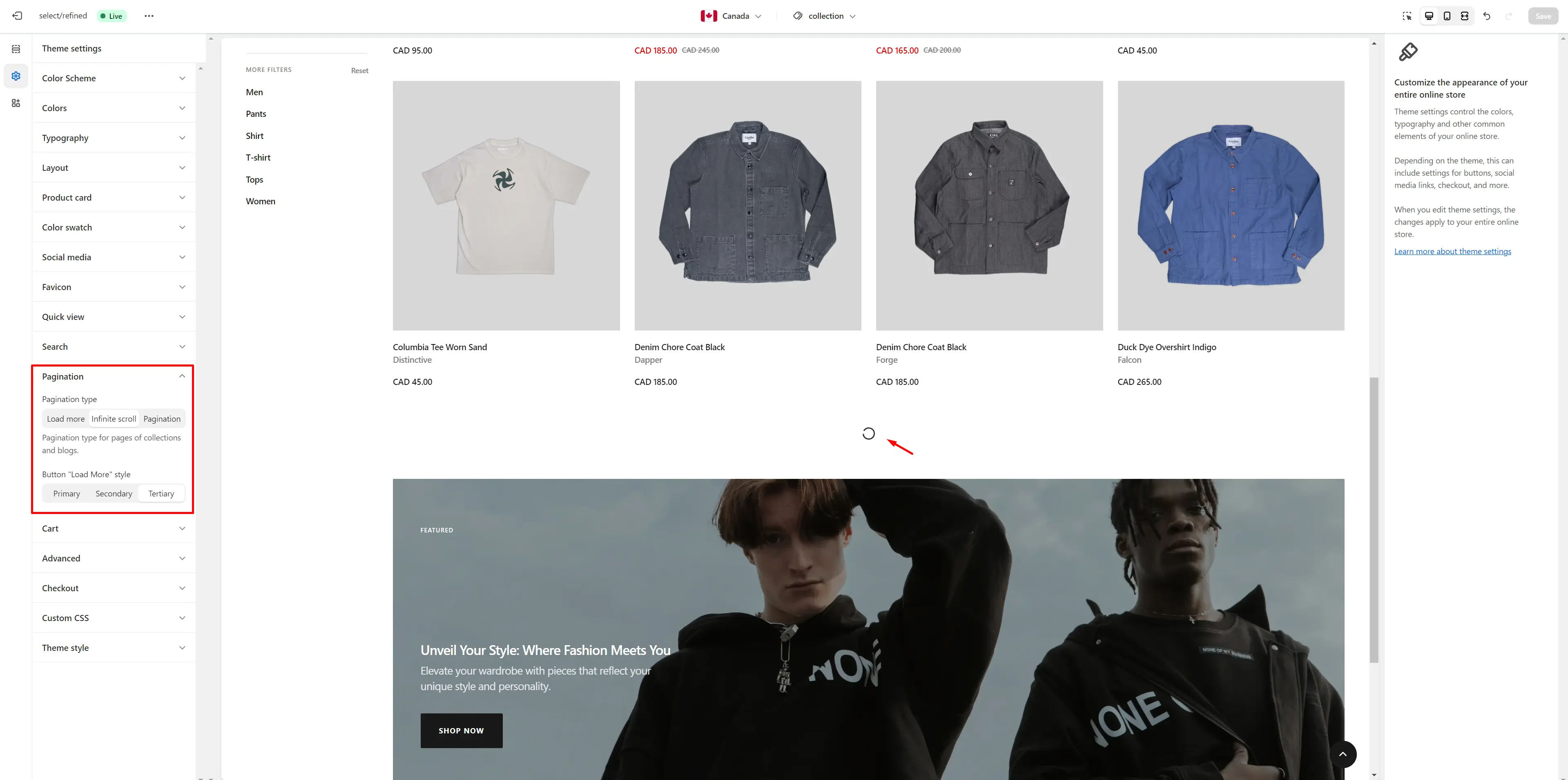
Infinite Scroll
To enable and customize Infinite Scroll, go to Theme settings > Pagination > Pagination type.
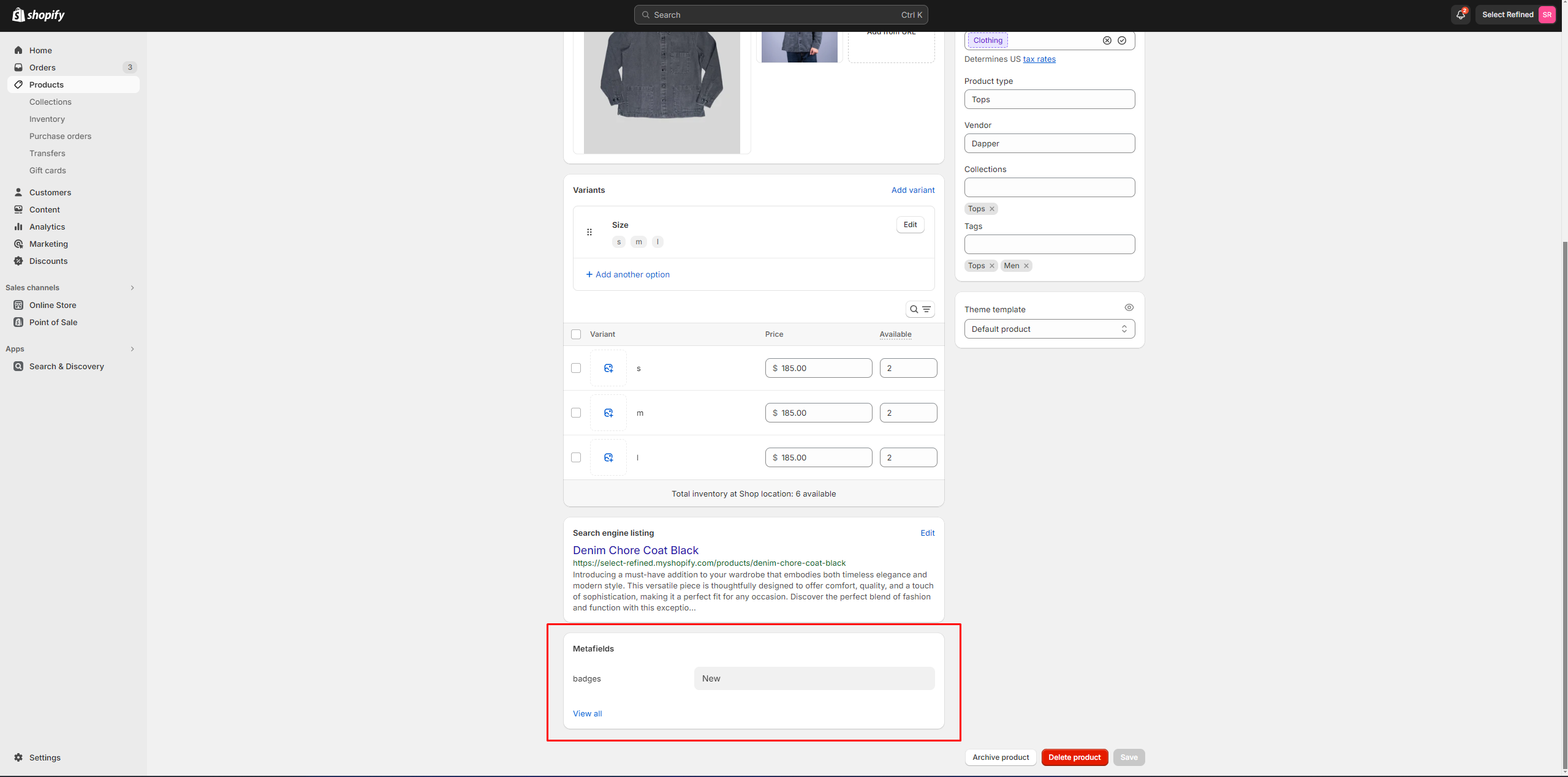
Custom Product Badges
To enable and edit Custom badges, navigate to Theme settings > Product card.
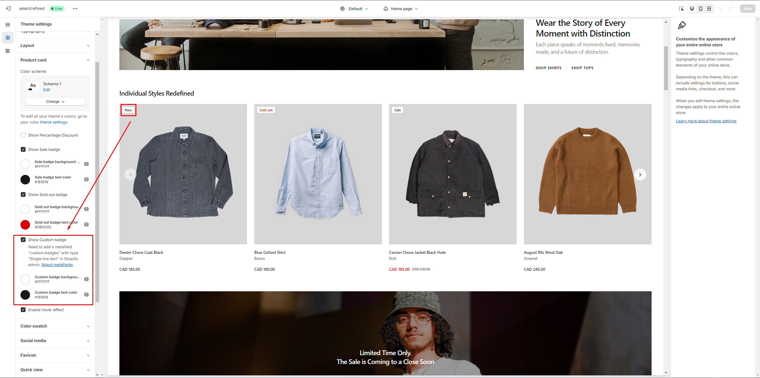
The next step is to add metafields to the products.
To add and edit metafields, follow these steps:
-
Go to Settings > Custom data in the Admin Panel.
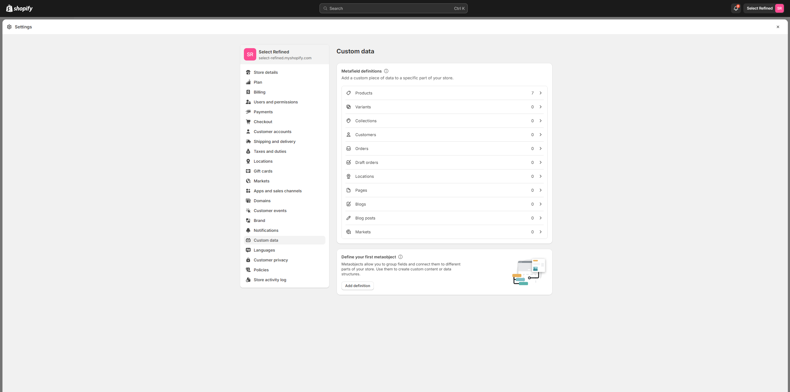
- Select Products.
- Click the button "Add definition" and fill the fields.
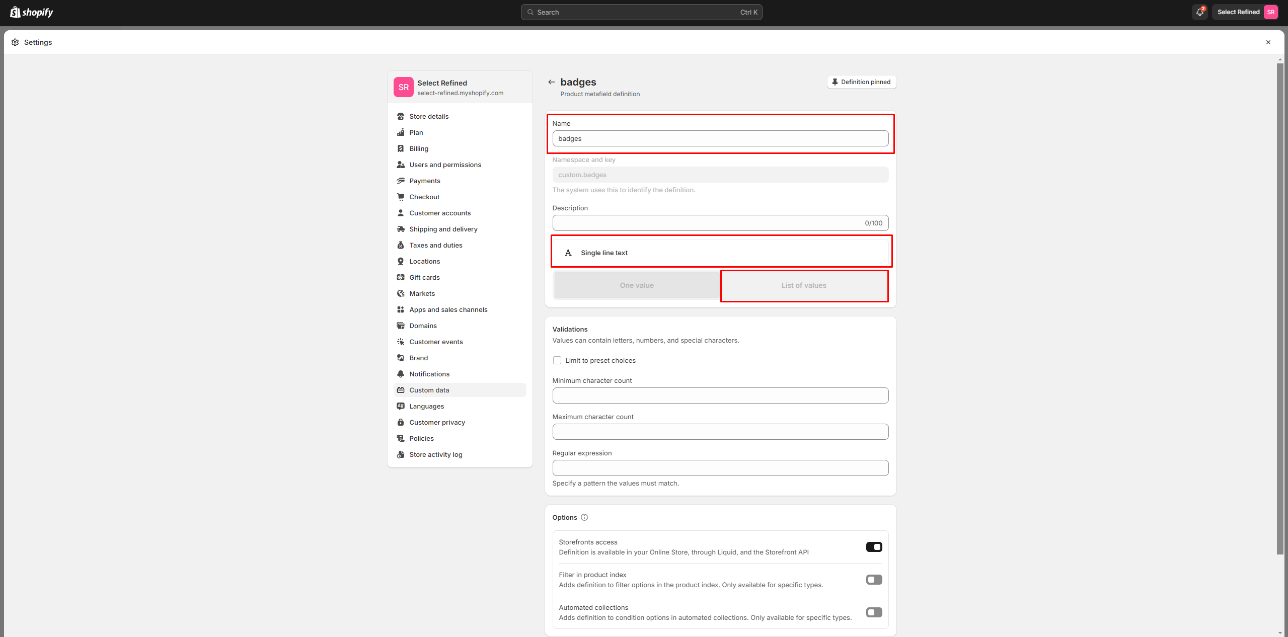
- Navigate to the product and add
information
below.
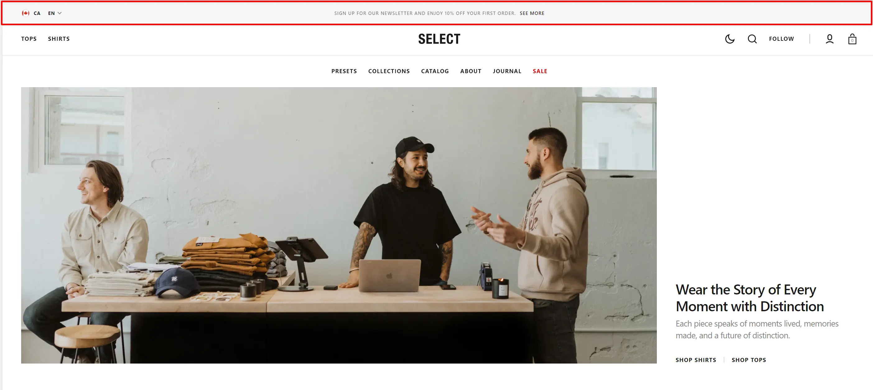
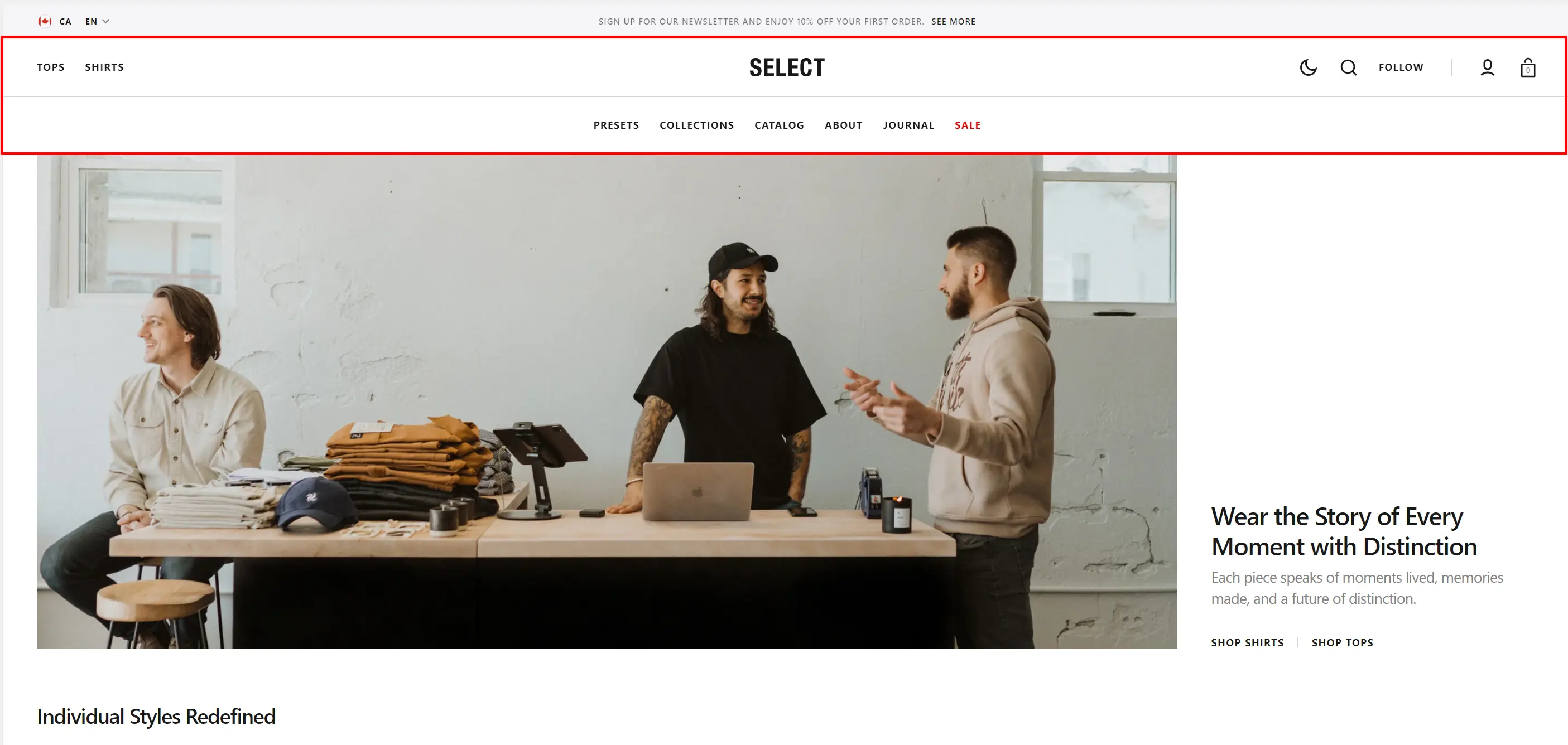
Header Group
Sections that are used on all pages by default.
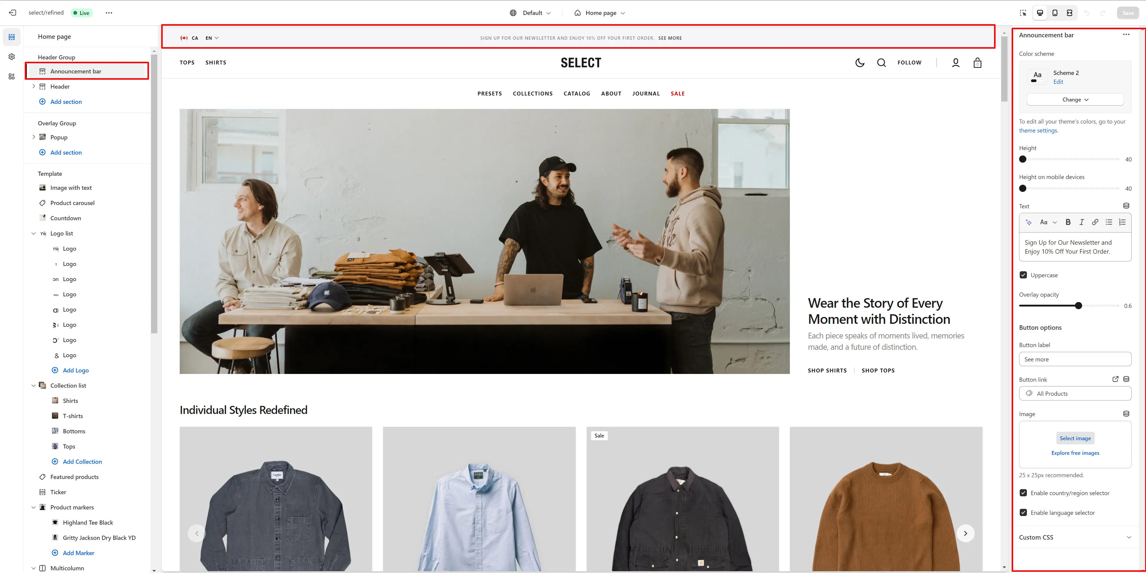
Announcement Bar
The announcement bar appears at the top of every page and displays custom messages with optional links. It's ideal for promoting sales or important updates.
- Color scheme selector allows you to change the color scheme. You can change the background color in the Theme settings.
- Height slider allows you to change the announcement height only on desktop devices.
- Height on mobile devices slider allows you to change the announcement height only on mobile devices.
- Uppercasefield allows you to make the all texts uppercase.
- Overlay options allows you to change the opacity of the text.
- Button options allows you to set a button and customize it.
- Text field allows you to add and edit text.
- Use the 'Image (Optional)' field to add or change the image.
- Enable country/region selector field enables the display of country/region.
- Enable language selector field enables the display of language.
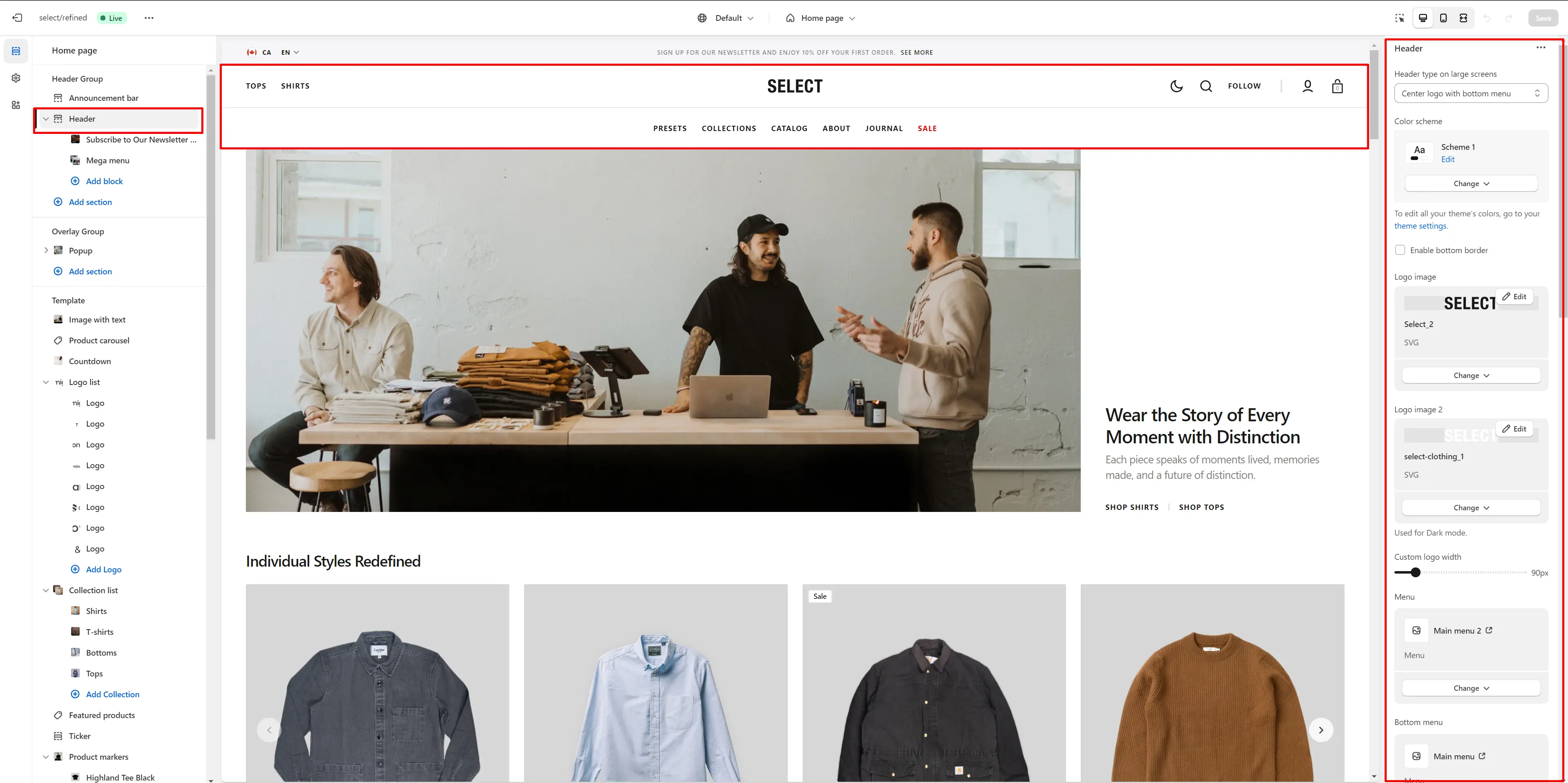
Header
There are several types of the header in this theme. You can choose a variant.
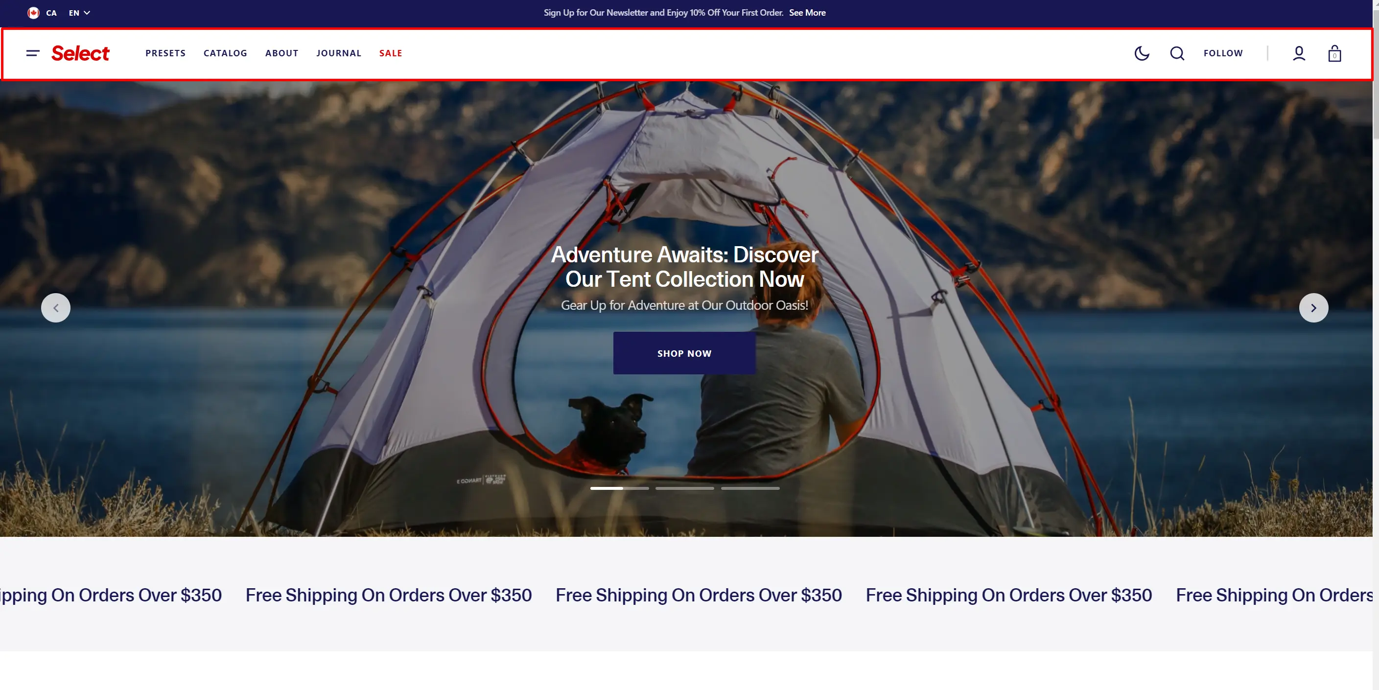
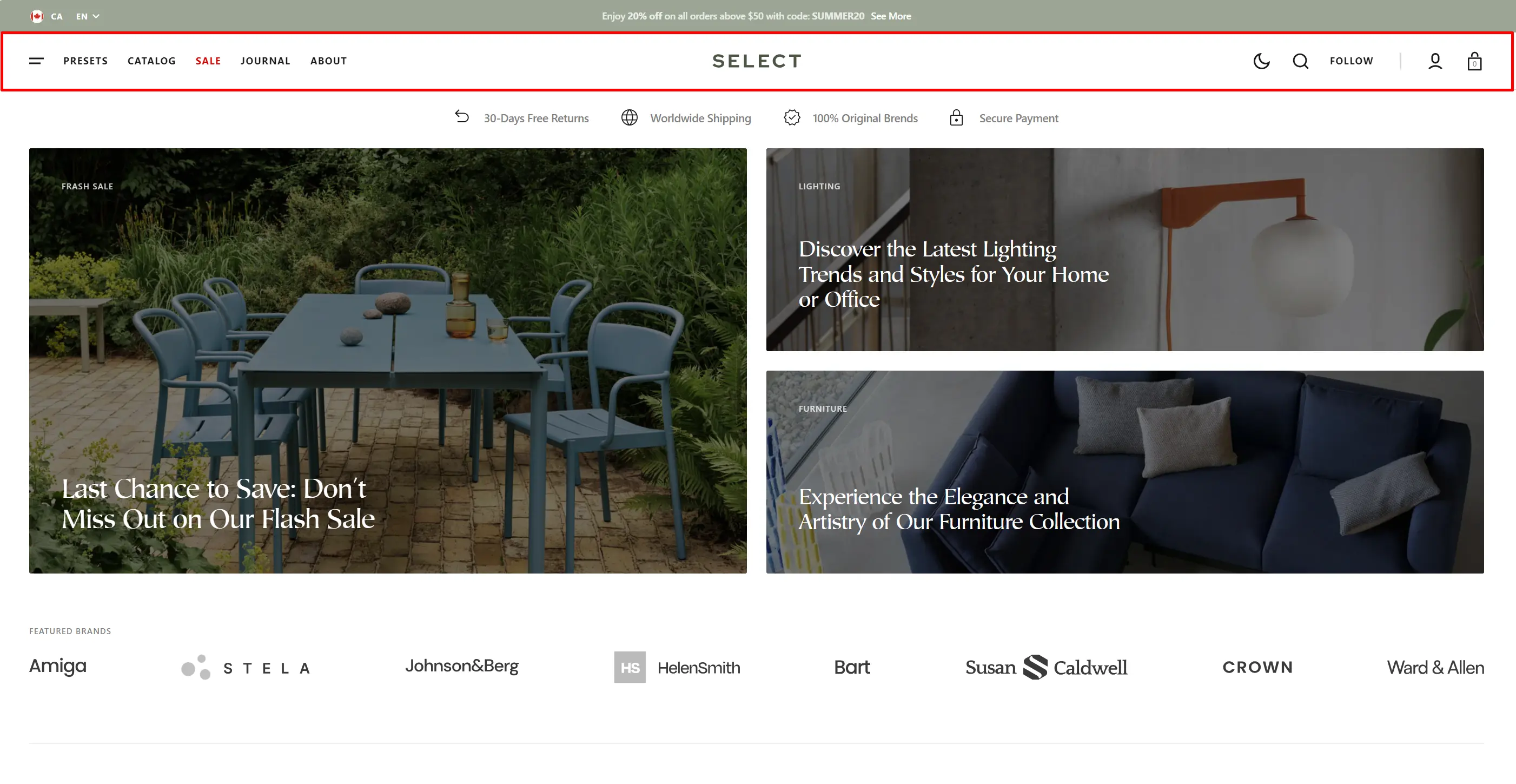
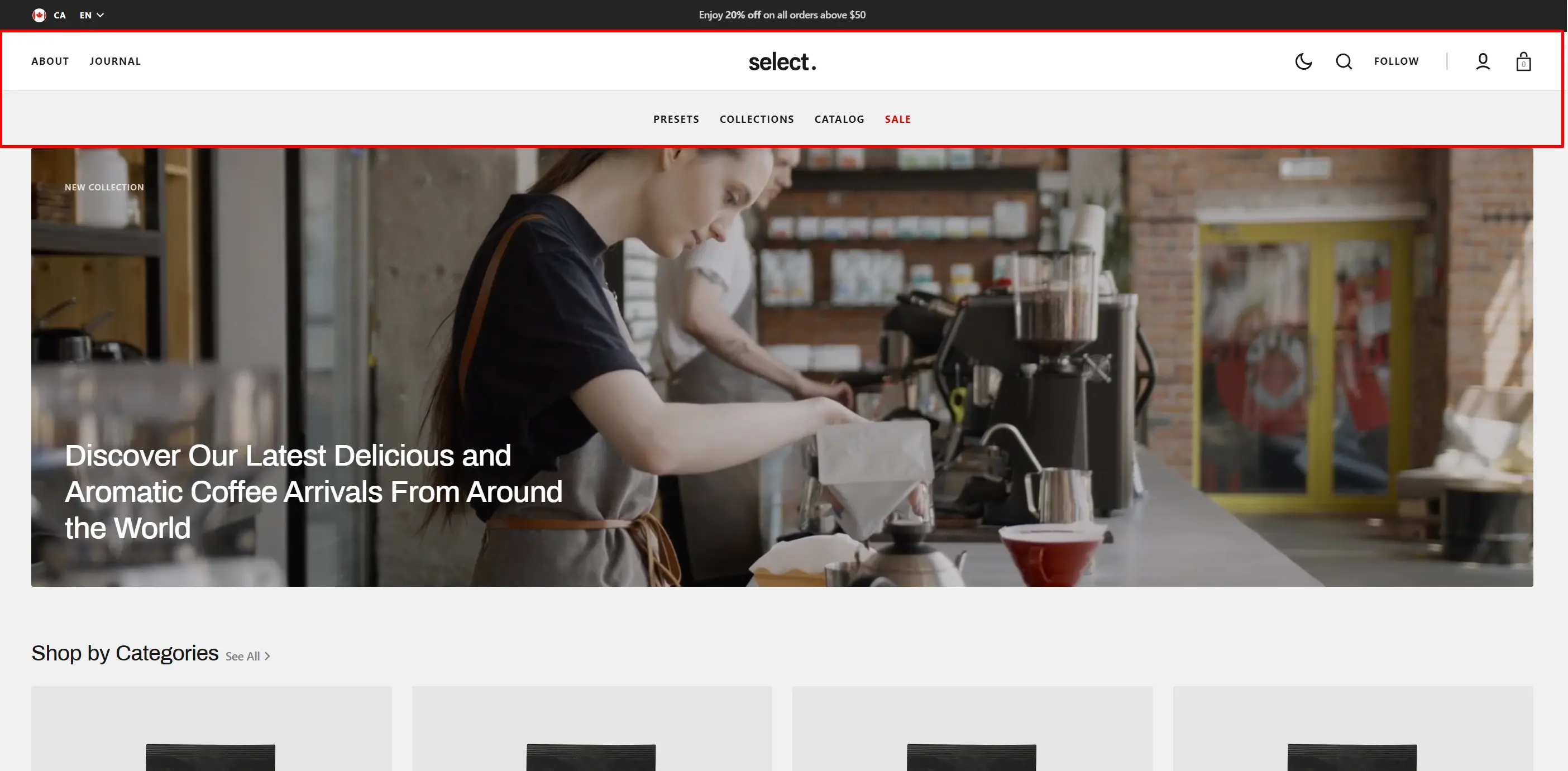
- Use the Header variant on large screen field to select a variant of the header.
- Color scheme selector lets you change the color scheme and adjust the background color in the Theme settings.
- Enable bottom border field allows you to connect the lines under the header.
- Use the Logo image file selector to select or upload your logo file.
- Use the Logo image 2 file selector to select or upload a logo for Dark Mode.
- (Optional) If a logo is added, you can adjust its size using the Custom logo width slider.
- Choose a Menu to be displayed in the header.
- Select a Bottom Menu to display in the header. This option is available only for the 'Center logo with a bottom menu' header type.
- Enable country/region selector field enables the display of country/region.
- Enable country/region selector on mobile devices displays the country/region selector on mobile devices.
- Enable language selector field enables the display of language.
- Enable language selector on mobile devices selector field enables the display of language on mobile devices.
- Use the sticky header to select a header variant that remains visible as the user scrolls the page.
- Search options allows you to add Search modal and customize it.
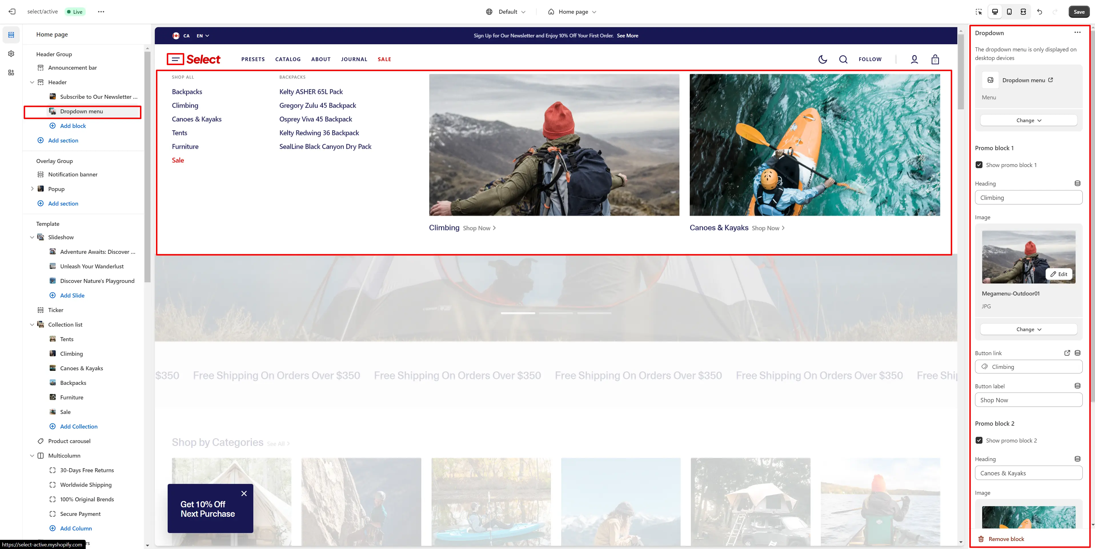
Fullscreen Menu
- Choose a Menu to display in the dropdown.
- The promo block lets you add an image and text.
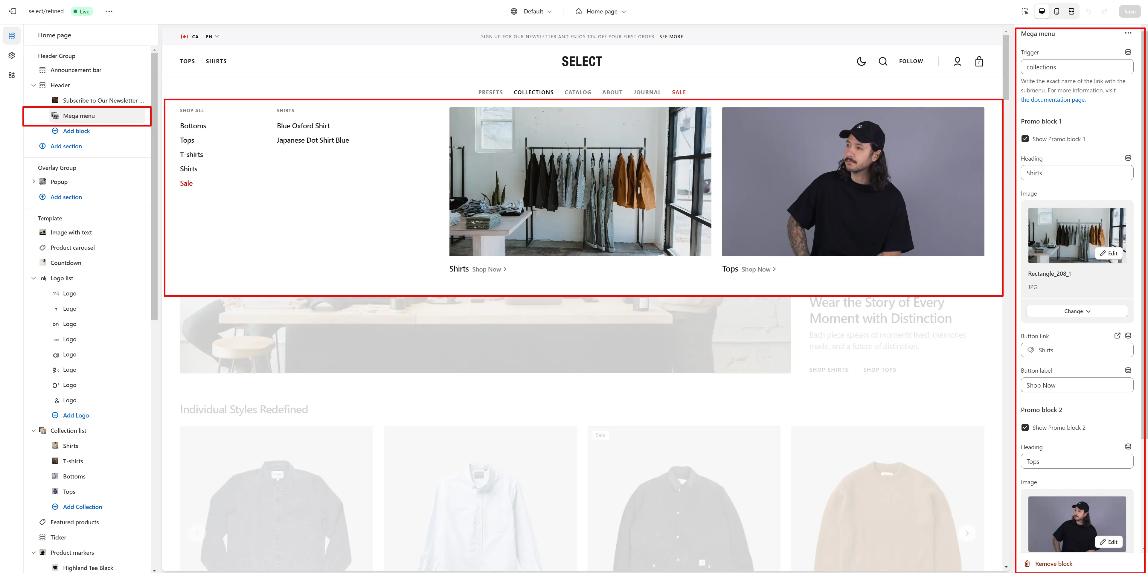
Mega Menu
To add a Mega Menu, ensure the main menu link has sublinks, then follow these steps:
- Add the Mega Menu to the Header.
- Type the exact name of the link in the Trigger field.
- The promo block lets you add an image and text.
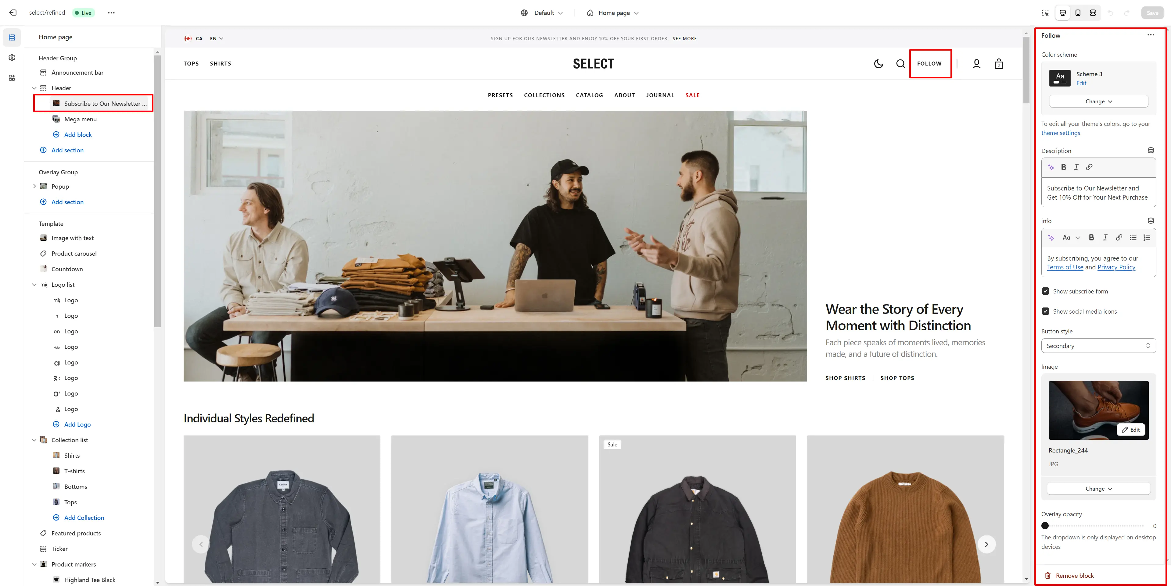
Follow Modal
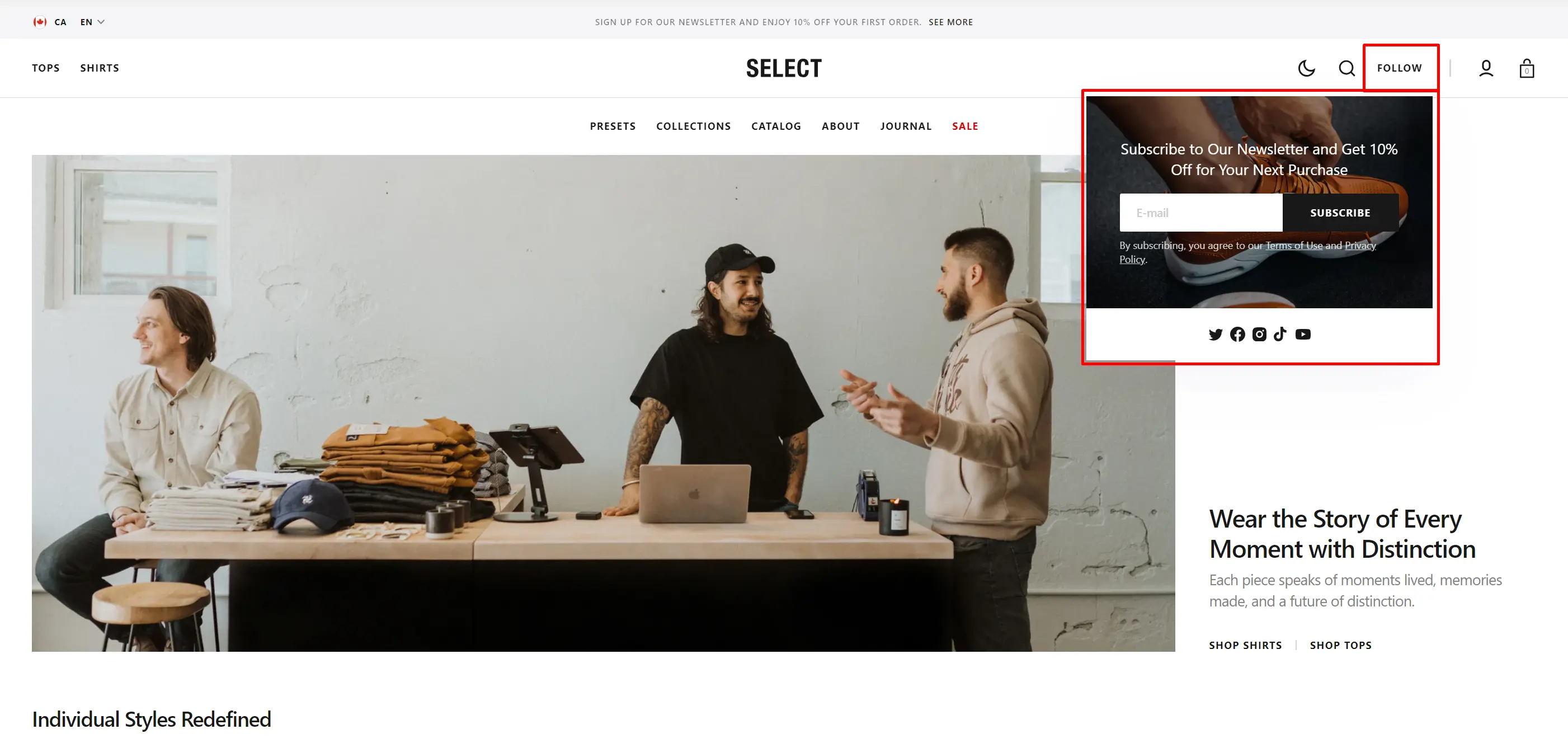
- Color scheme selector lets you change the color scheme and adjust the background color in Theme settings.
- Description lets you set a description for the modal.
- Info allows you to add more detailed information.
- Subscribe form allows you to add and customize the subscribe form.
- Social media icons enable the display of social media icons.
- Image lets you set an image for the modal.
- Overlay opacity slider allows you to change the opacity of the overlay.
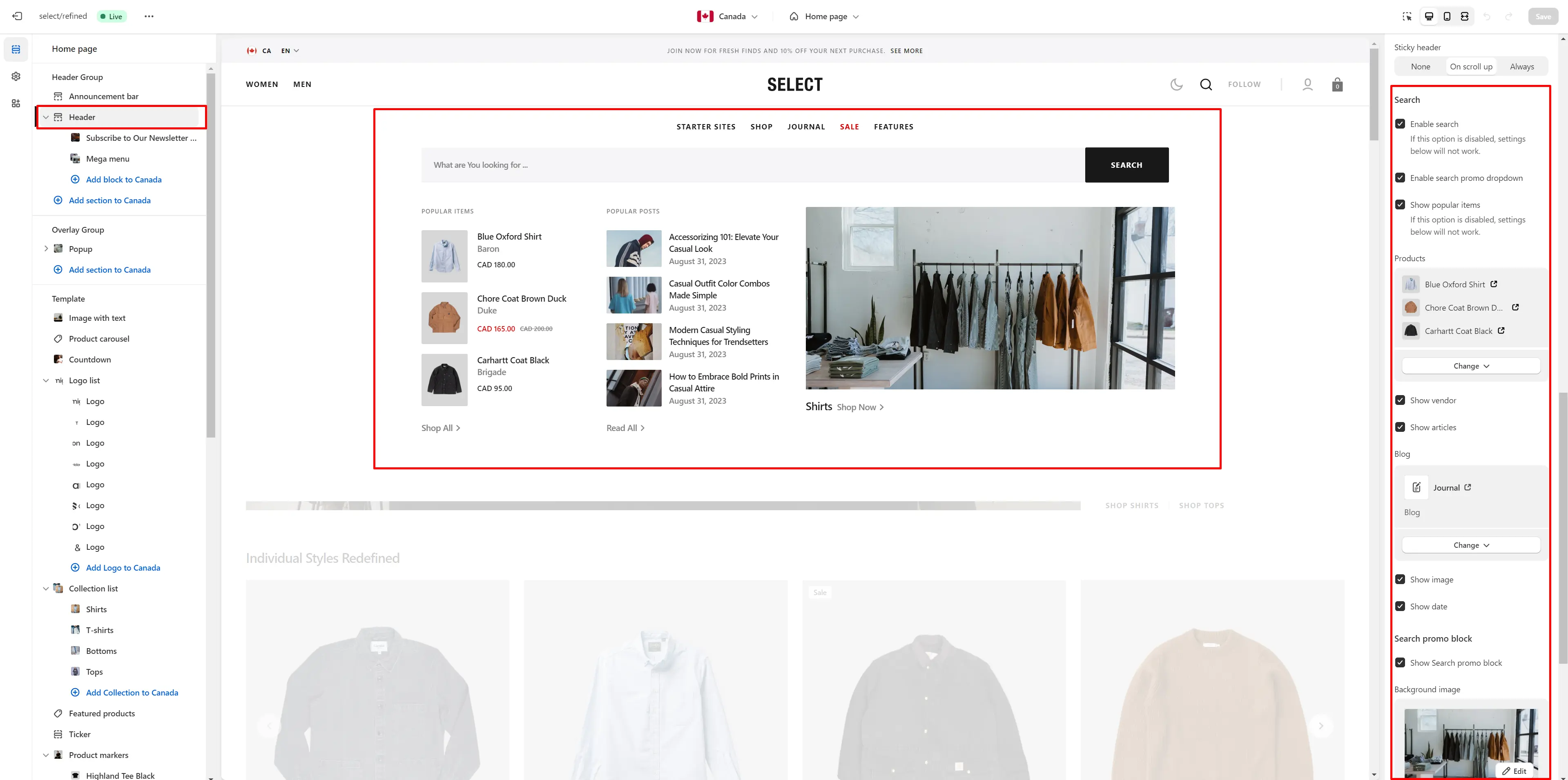
Search
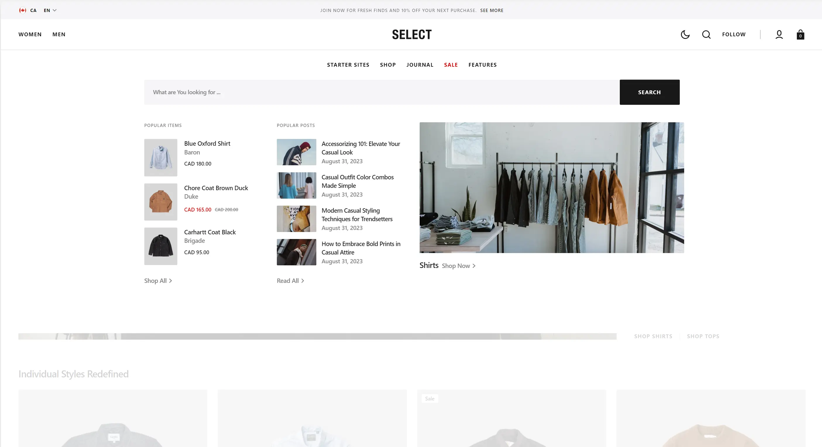
This theme offers predictive search, enabled by default. You can disable it in Theme settings > Search.
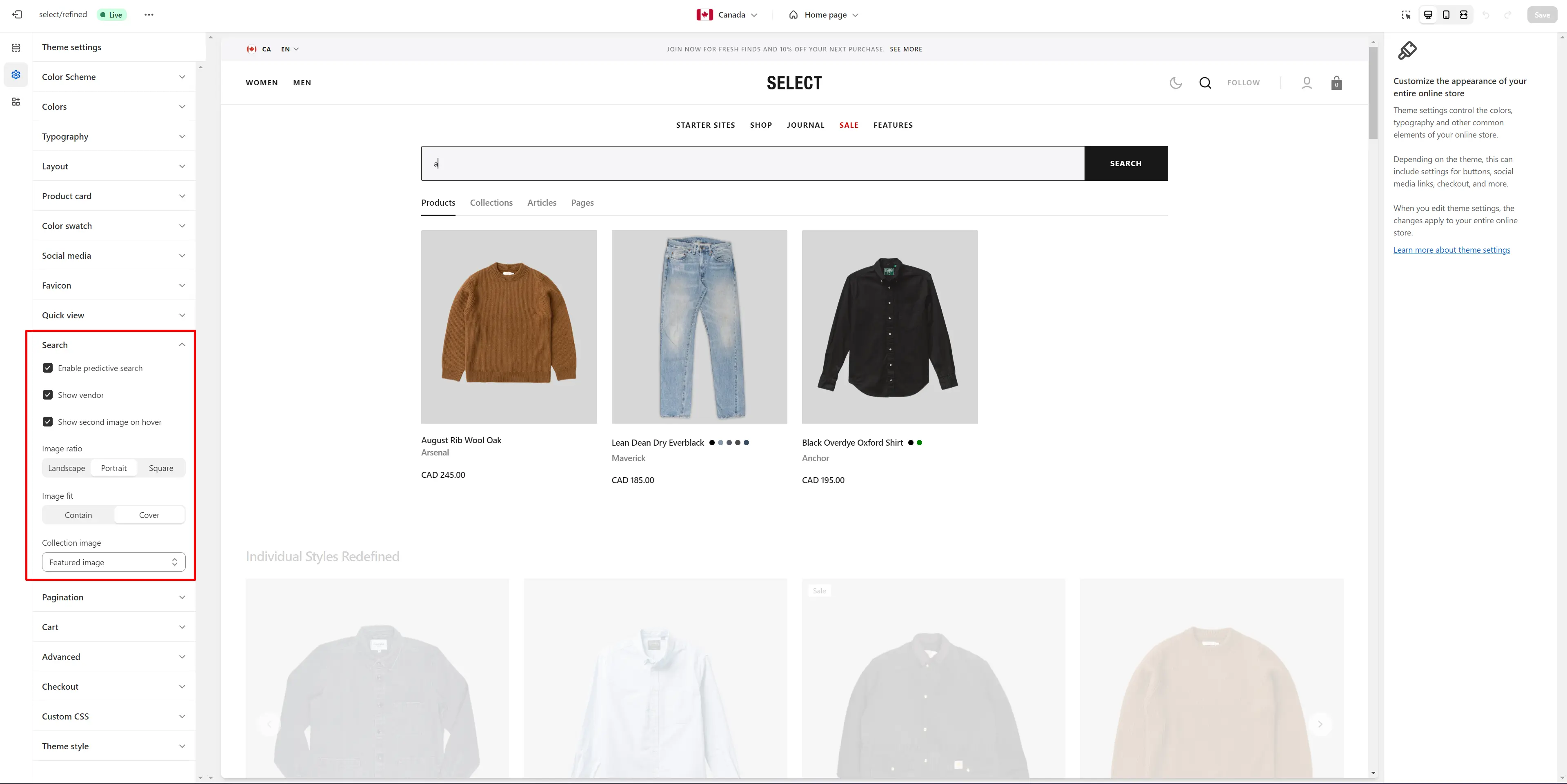
You can also enable the Search promo block in the Header settings. This block can display three types of information: products, collections, and blog posts.
Overlay Group
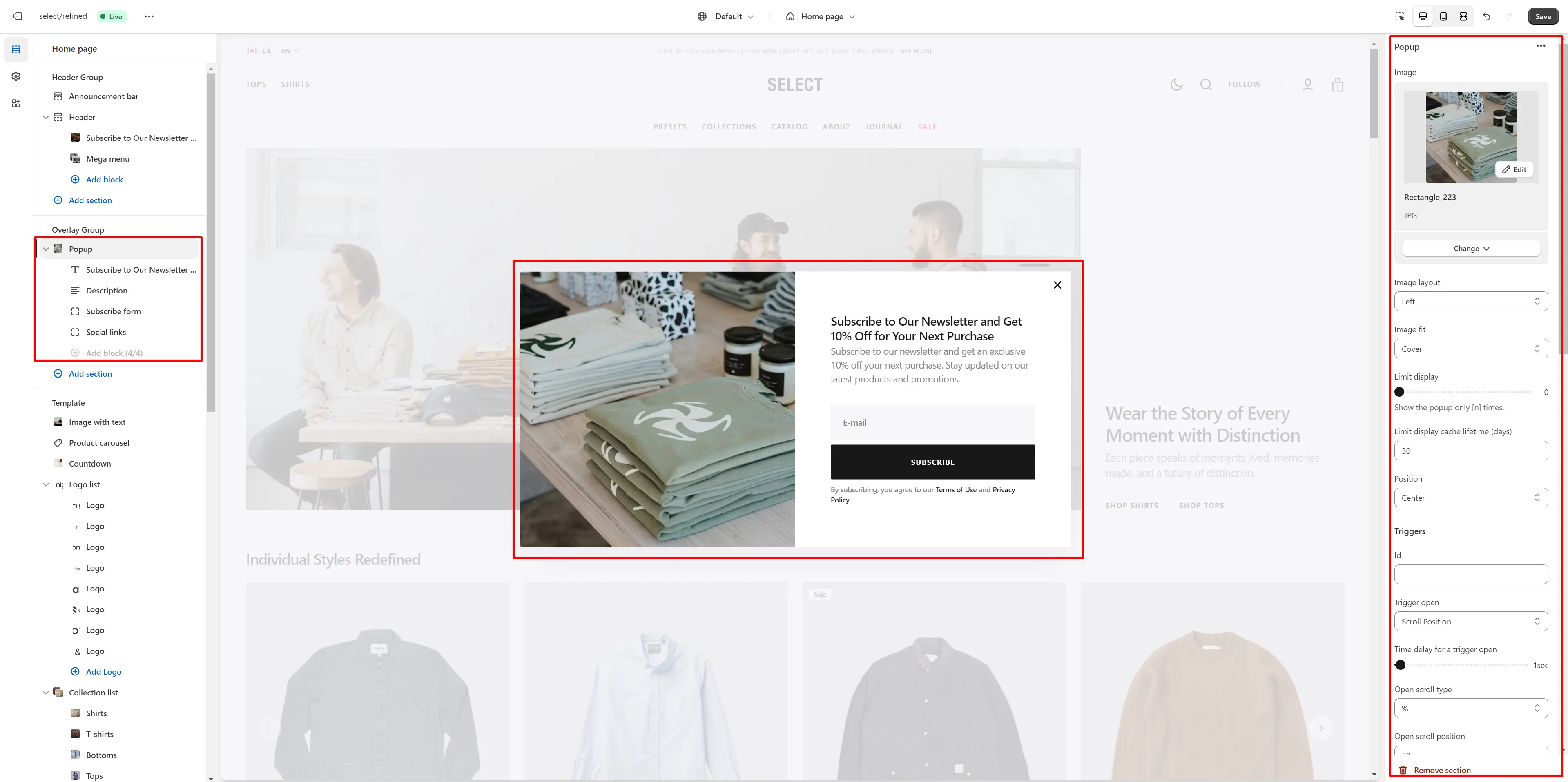
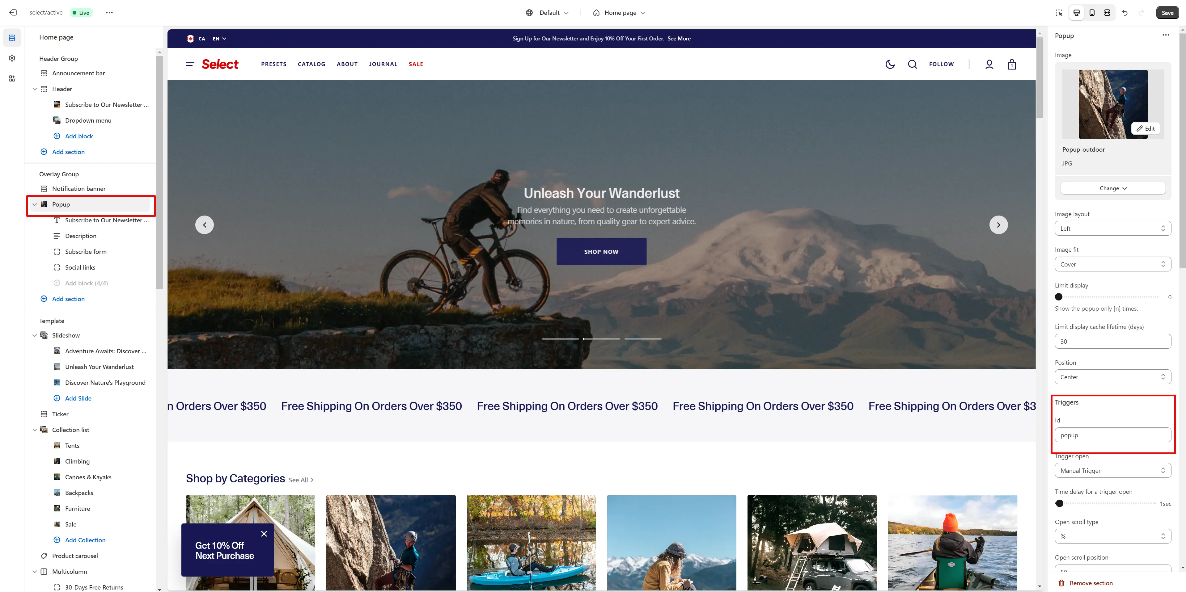
Popup
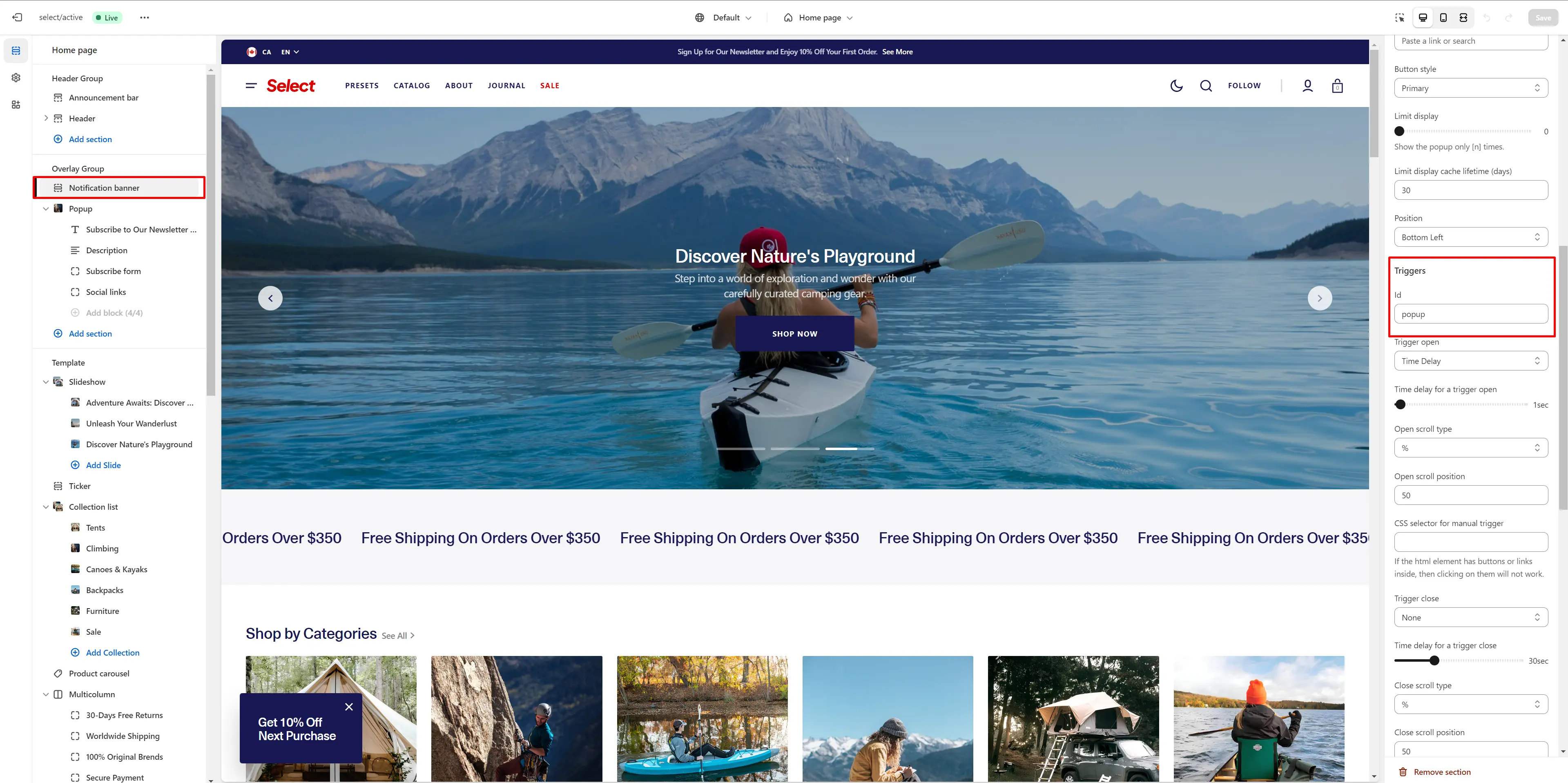
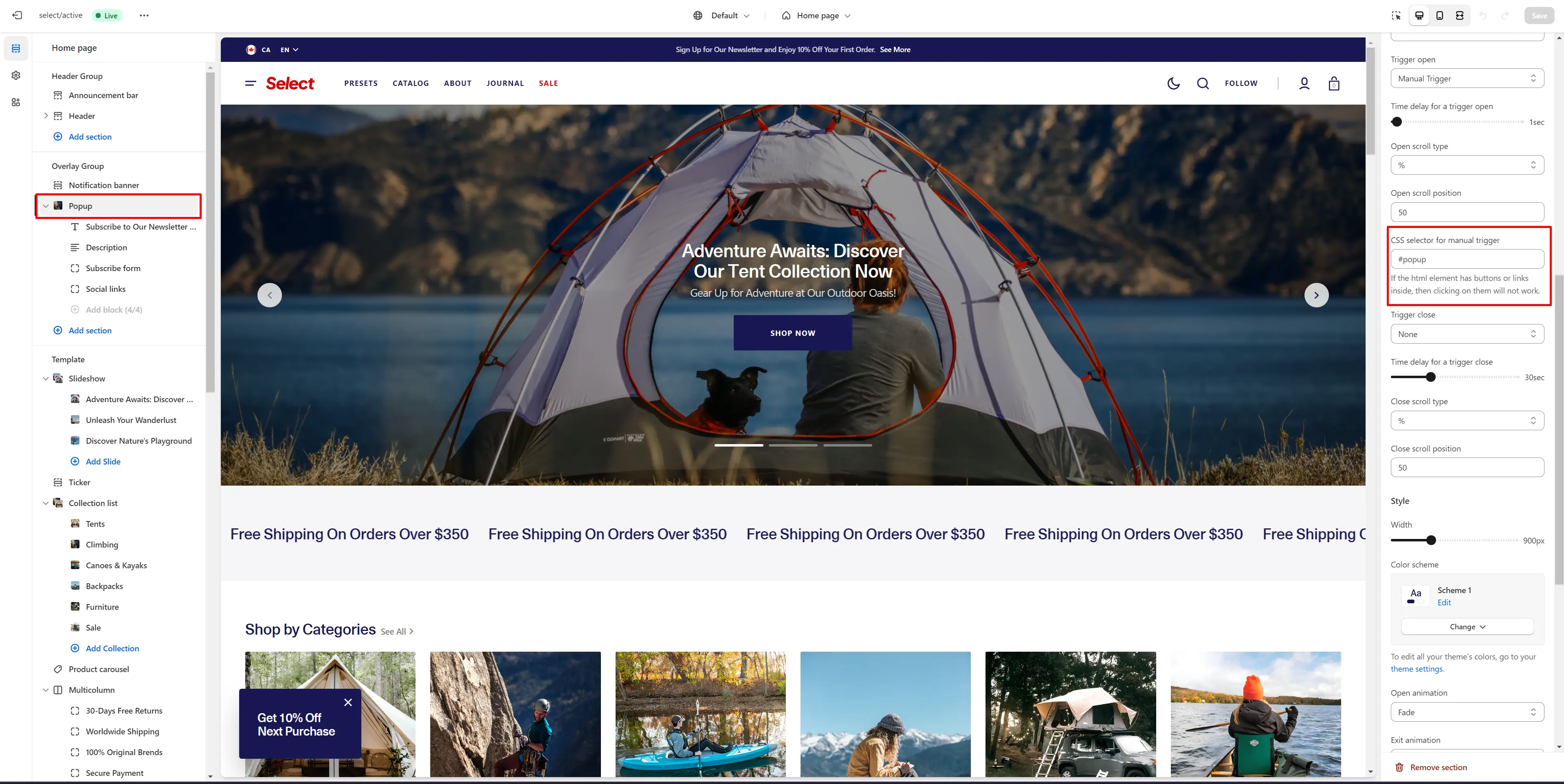
In the Popup settings, you can adjust the layout, add an image, customize the subscribe form, edit the position, and modify open/exit animations and options.
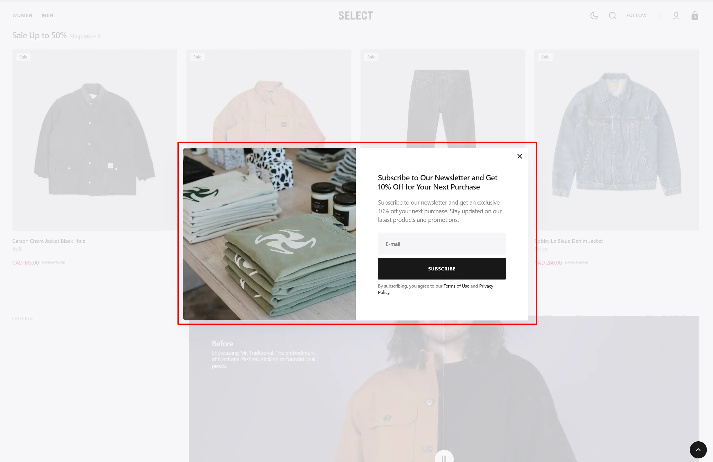
You can also use this popup as a button-trigger to open another popup or notification bar by following these steps:
- Add the ID of the popup/notification bar you want to open to the ID field in the Triggers section (e.g. "popup").
- Navigate to the popup/notification bar settings and add the ID (with "#" at the beginning) in the "CSS selector for manual trigger" field.
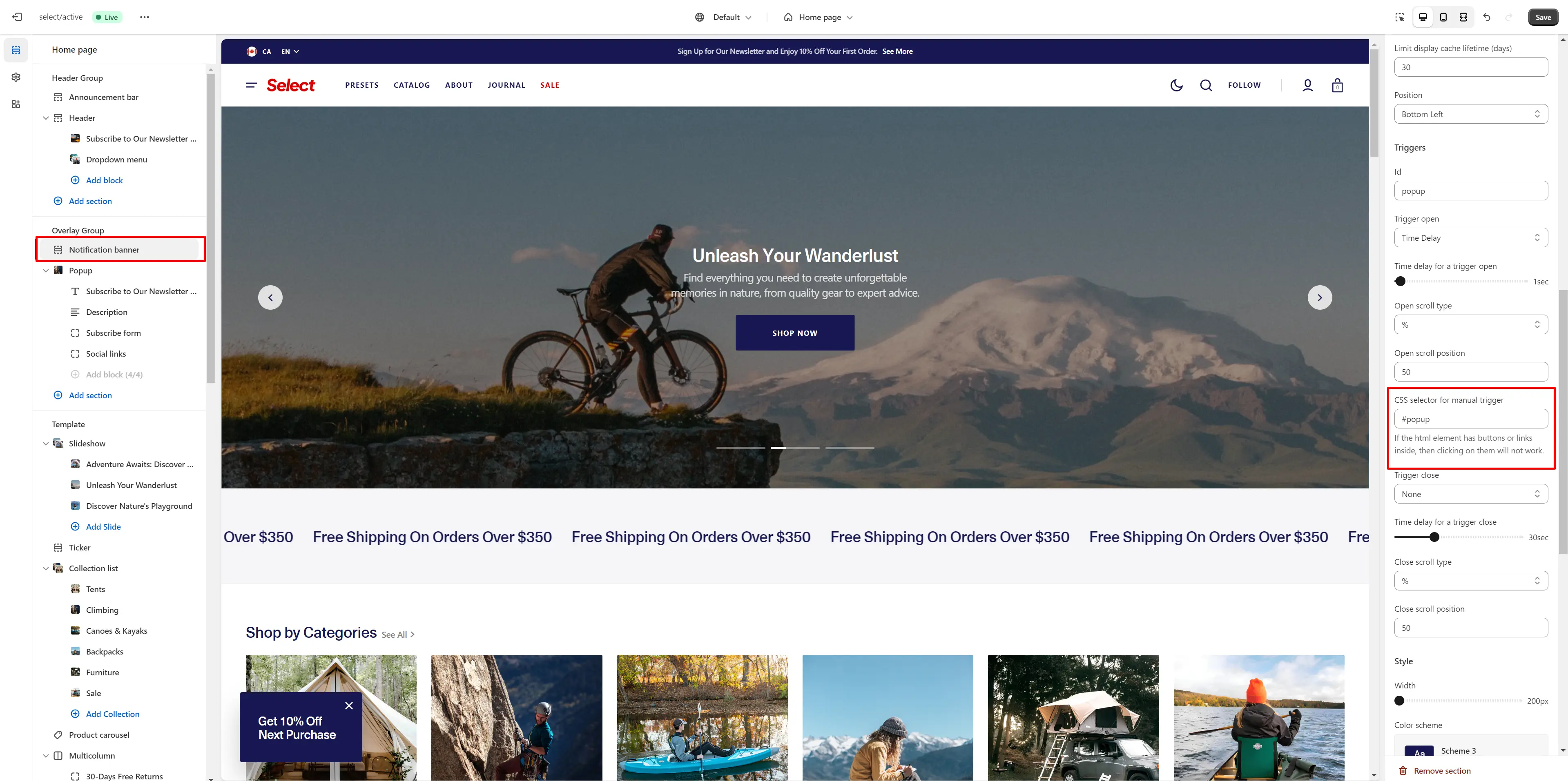
Notification Banner
In the Notification Banner settings, you can change layout, add image, texts, edit banner position, change open and exit animations and options.
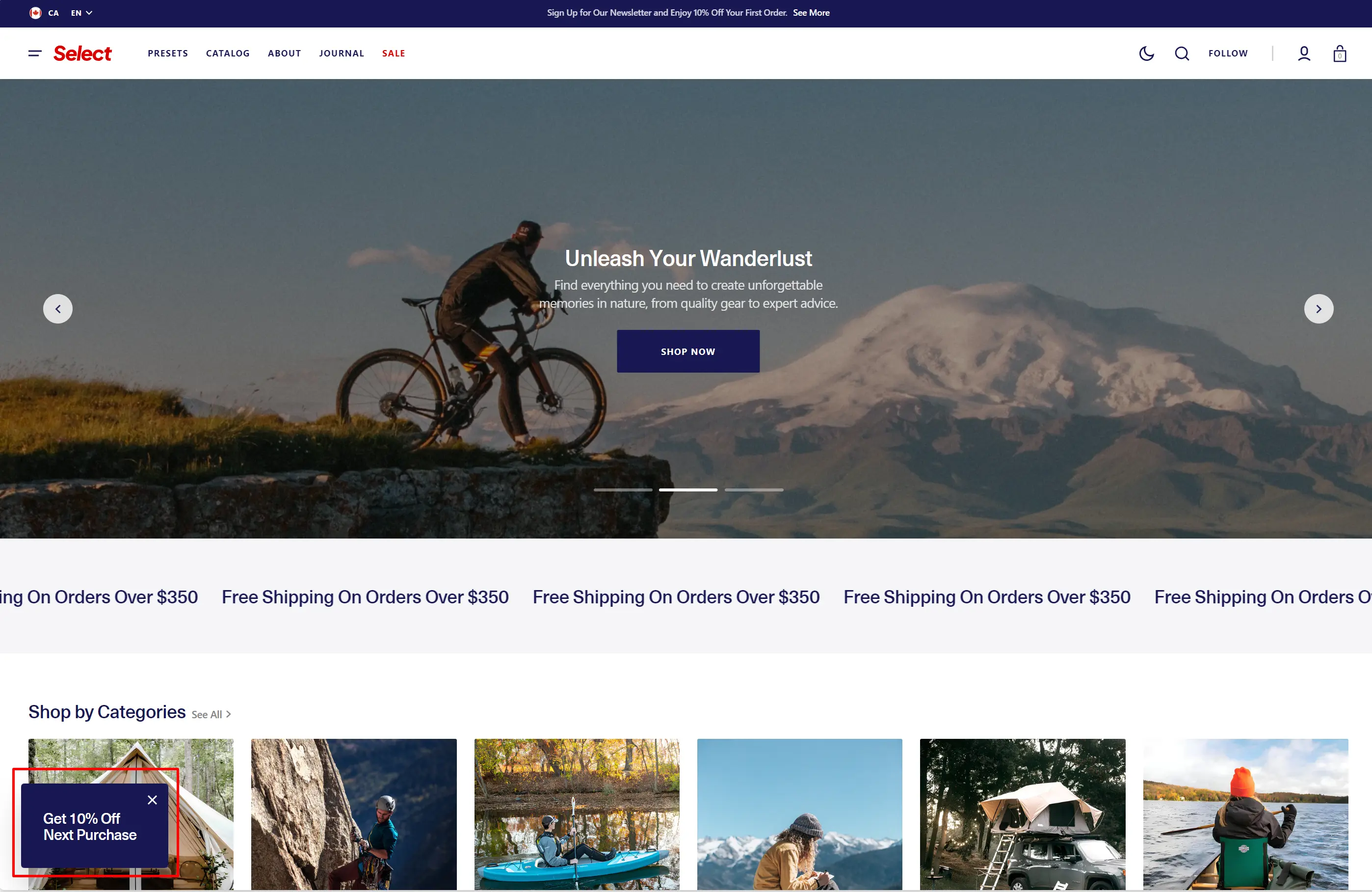
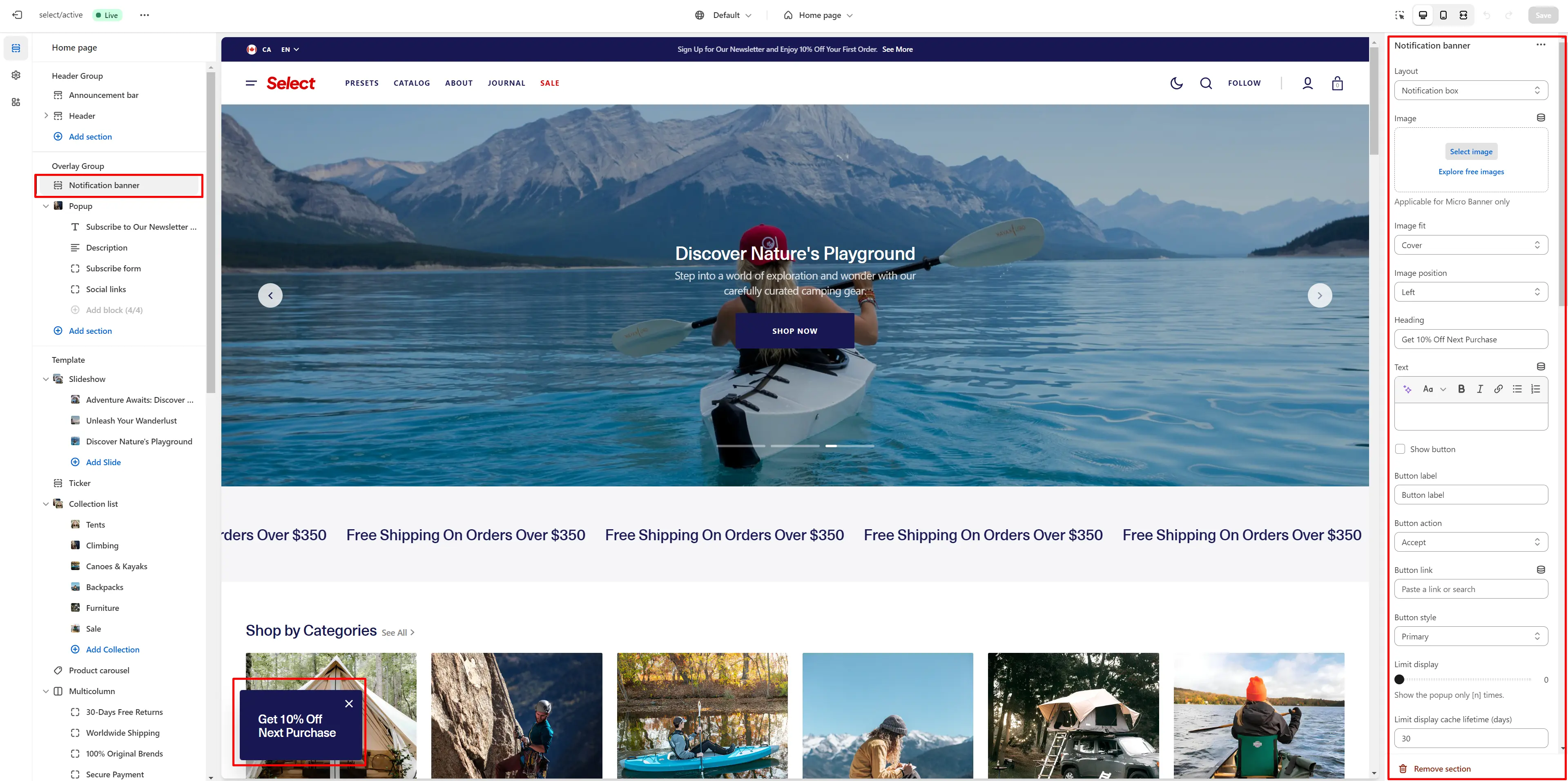
You can also use this banner as a button-trigger for opening another notification bar or a popup by following these steps:
- Add the ID of the popup/notification bar you want to open in the ID field under the Triggers section (e.g., "popup").
- Navigate to the popup/notification bar settings and add the ID (with "#" at the beginning) in the "CSS selector for manual trigger" field.
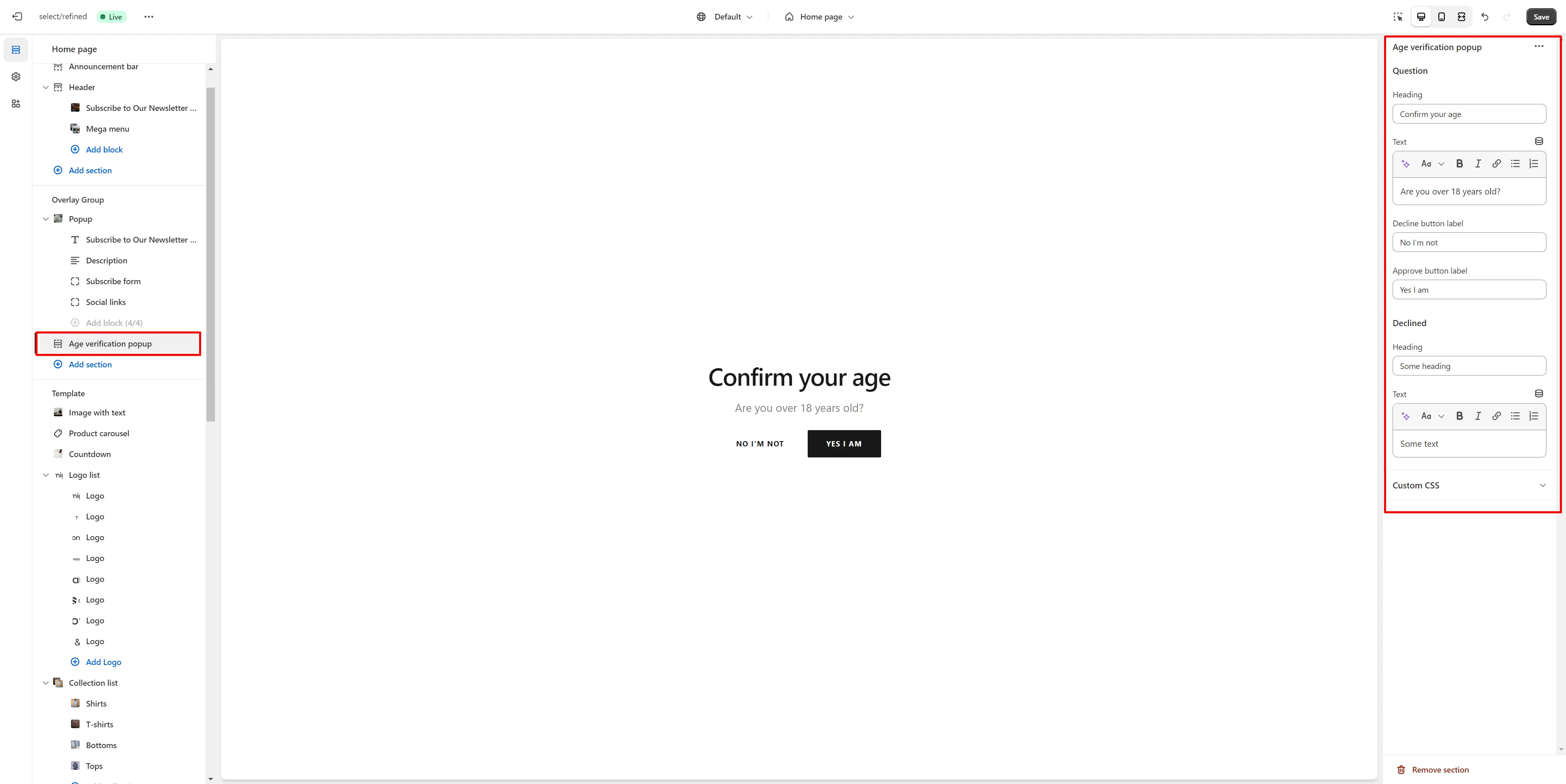
Age Verification Popup
An Age verification popup prompts users to confirm their age before accessing restricted content. In the Age verification popup settings, you can customize the text and buttons.
Footer Group
Sections are used on all pages by default.
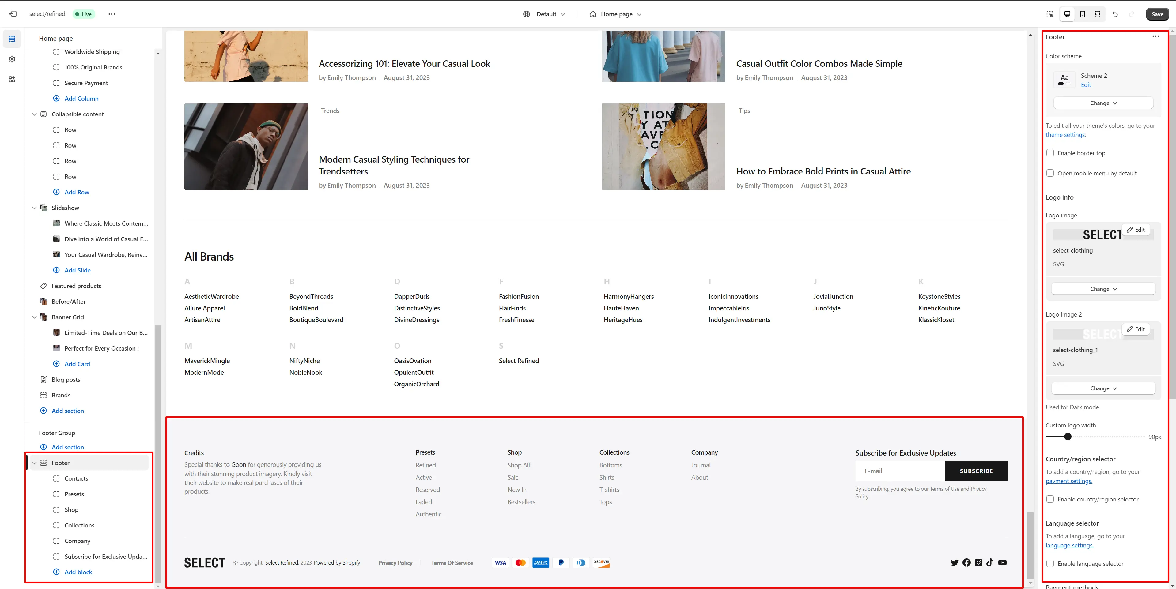
Footer
The Footer appears at the bottom of every page. You can customize it to align with your brand and product offerings.
- Use Color scheme selector to change the color scheme.
- Enable border top field enables a line above the section.
- Use the Logo image file selector allows you to select or upload your logo file.
- Use the Logo image 2 file selector to select or upload your logo, which can be seen in Dark mode.
- (Optional) If you add a logo, use the Custom logo width slider to adjust its size.
- Country/region selector field enables the display of the region selector in the footer.
- Language selector field enables the display of the language selector in the footer.
- Payment methods field enables the display of payment methods in the bottom line of the footer.
- Follow on Shop allows customers to follow your store on the Shop app from your storefront, but Shop Pay must be enabled.
- Social media icons enable the display of social media icons in the bottom line of the footer.
- Policy links allow you to display policy links in the footer.
- Block Menu lets you select menus to be displayed on the top line of the footer.
- Block Subscribe form allows you to add and customize subscribe form.
- Block Contacts allows you to add additional description, which will be displayed on the top line of the footer.
All Sections
The theme includes several customizable sections that you can add to your page in any order.
Slideshow
The section lets you add slides with images and headings.
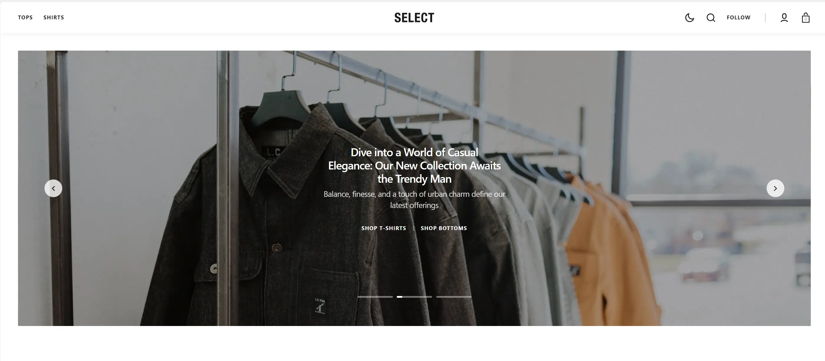
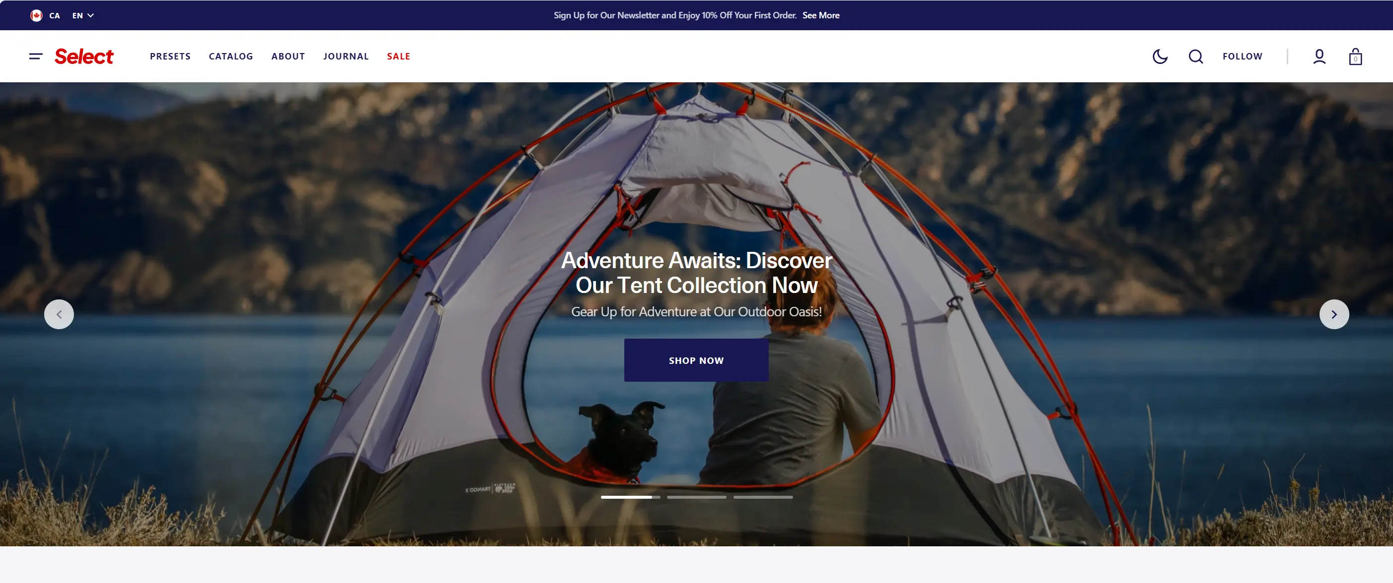
- Aspect ratio sets the aspect ratio of the image.
- Heading size selector field allows you to change the size of the block header.
- Heading max width field allows you to change the maximum width of the heading.
- Description max width field allows you to change the maximum width of the description.
- Button style selector to change the button style.
- Enable autoplay checkbox allows you to enable autoplay for the slider.
- Disable sliding on hover checkbox stops the slider autoplay when hovering.
- Enable buttons checkbox field enables the display arrows.
- Enable pagination checkbox field enables the display bullets.
- Duration allows you to change speed of transition between items.
- Block Slide options Color scheme selector to change the color scheme for the block.
- Block Slide options Background image allows you to set a image for the block.
- Block Slide options Video allows you to set a video for the block.
- Block Slide options Overlay opacity slider allows you to change the opacity of the overlay.
- Block Slide options Heading allows you toset a heading for the block.
- Block Slide options Description allows you toset a description for the block.
- Block Slide options Button options allows you to set a button and customize it.
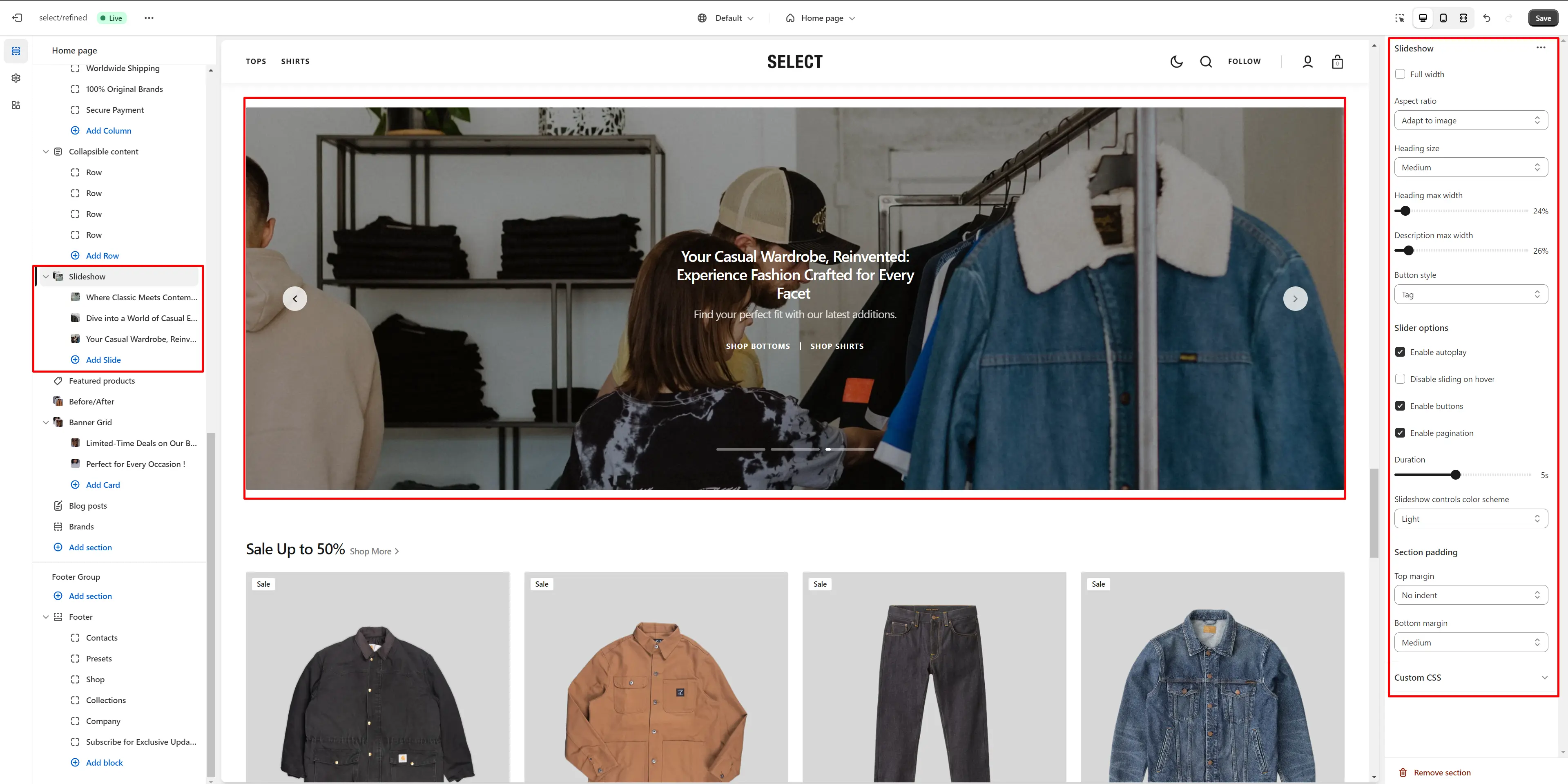
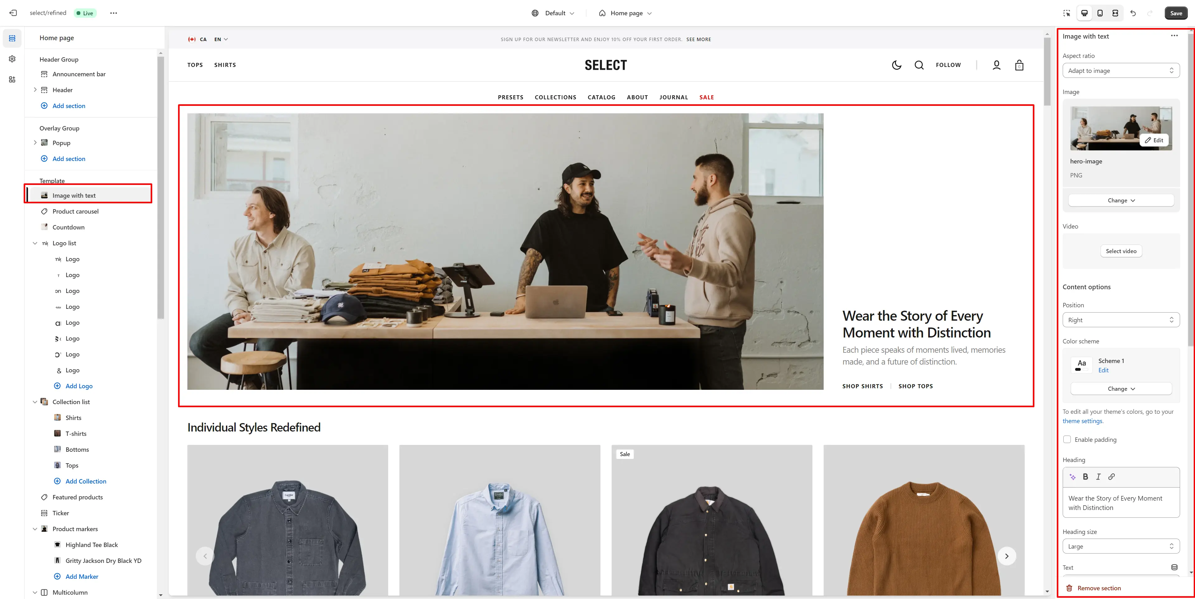
Image with text
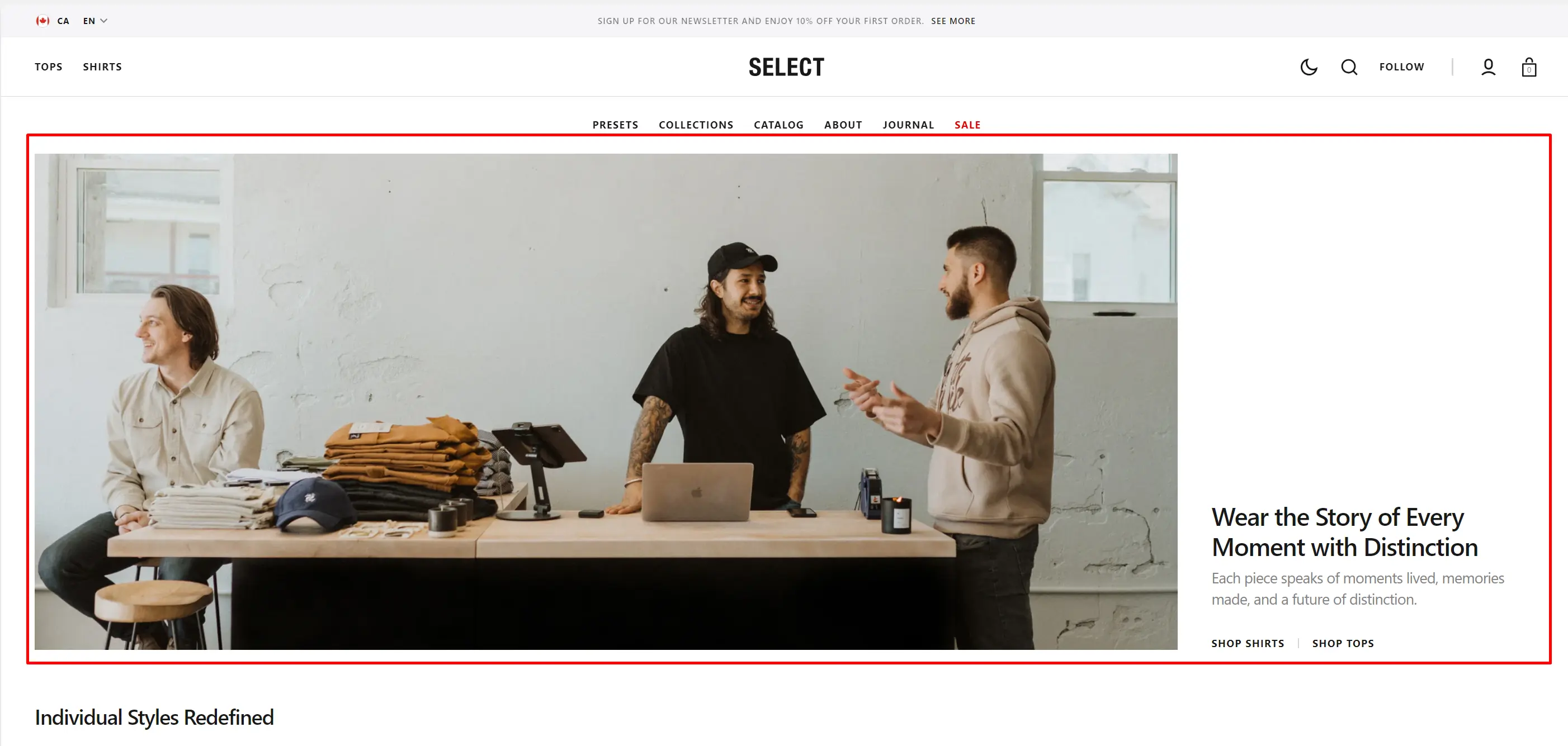
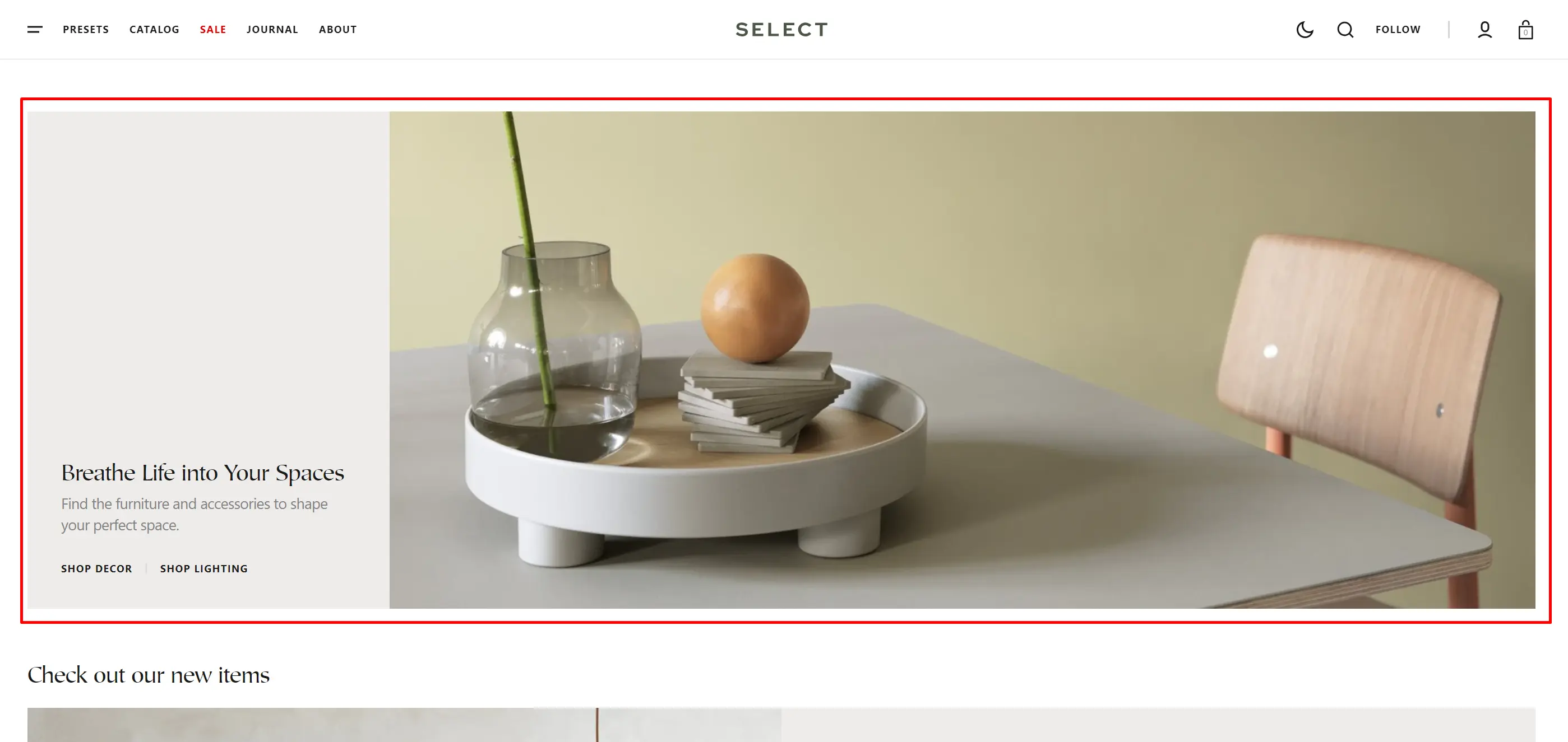
- Aspect ratio sets the aspect ratio of the image.
- Aspect ratio for mobile sets the aspect ratio of the image on mobile devices.
- Image allows you to set a image for the section.
- Video allows you to set a video for the section.
- Position allows you to change content position.
- Use Color scheme selector to change the color scheme.
- Enable padding allows you to add more padding for the content block.
- Heading allows you to set a heading for the section.
- Heading size selector field allows you to change the size of the block header.
- Text allows you to set a text for the section.
- Text position allows you to change text position.
- Button options allows you to set a button and customize it.
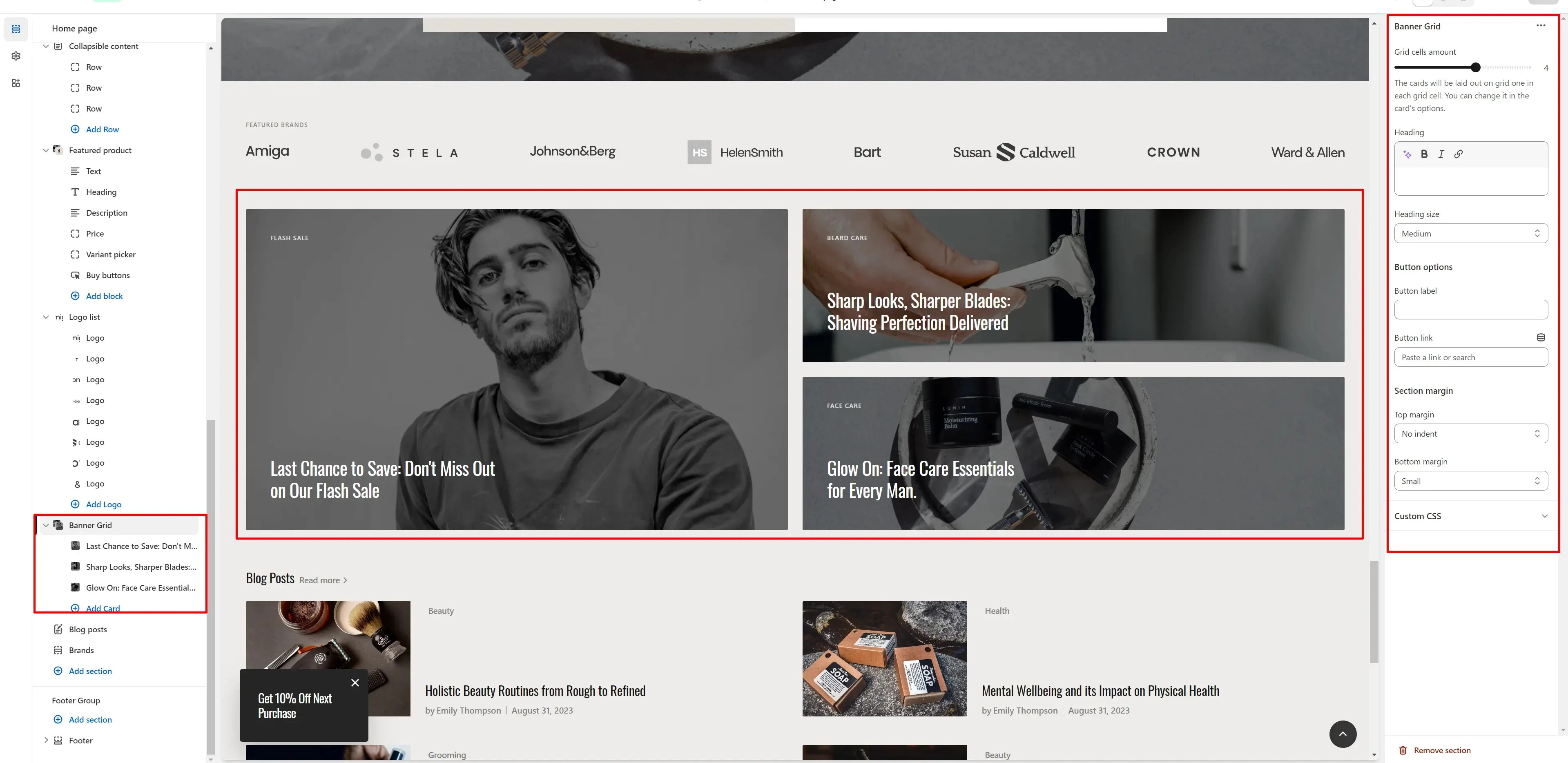
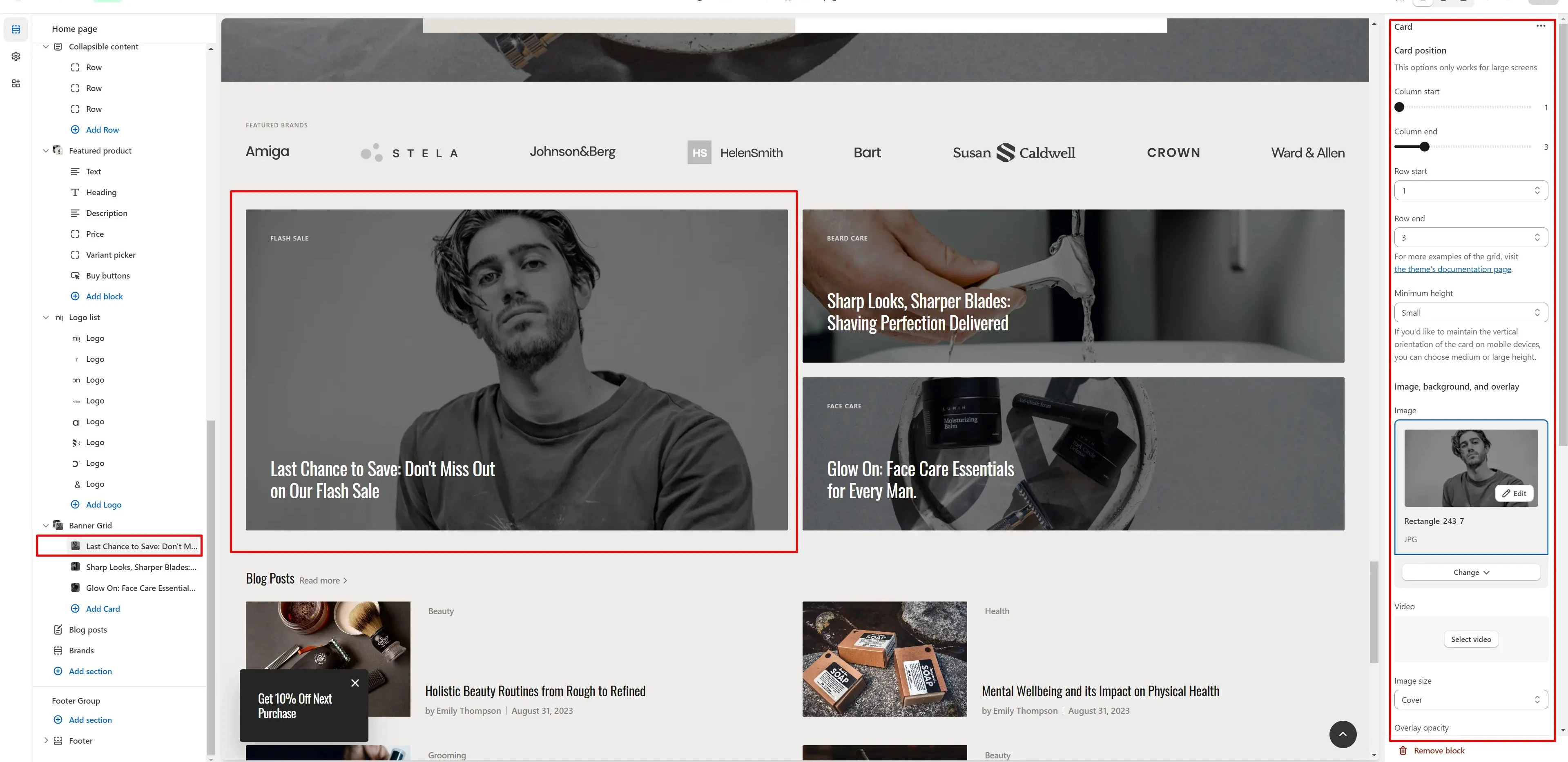
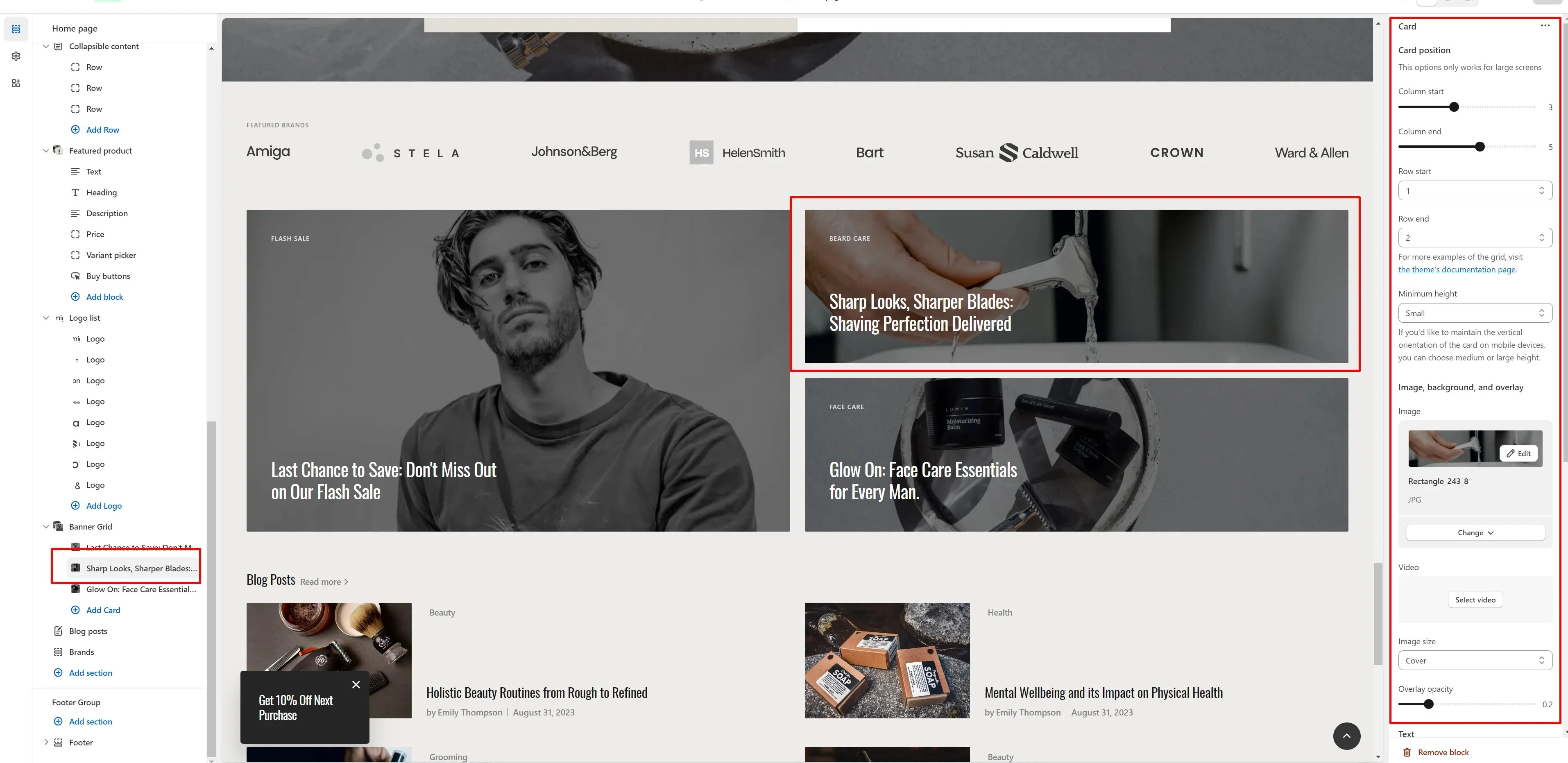
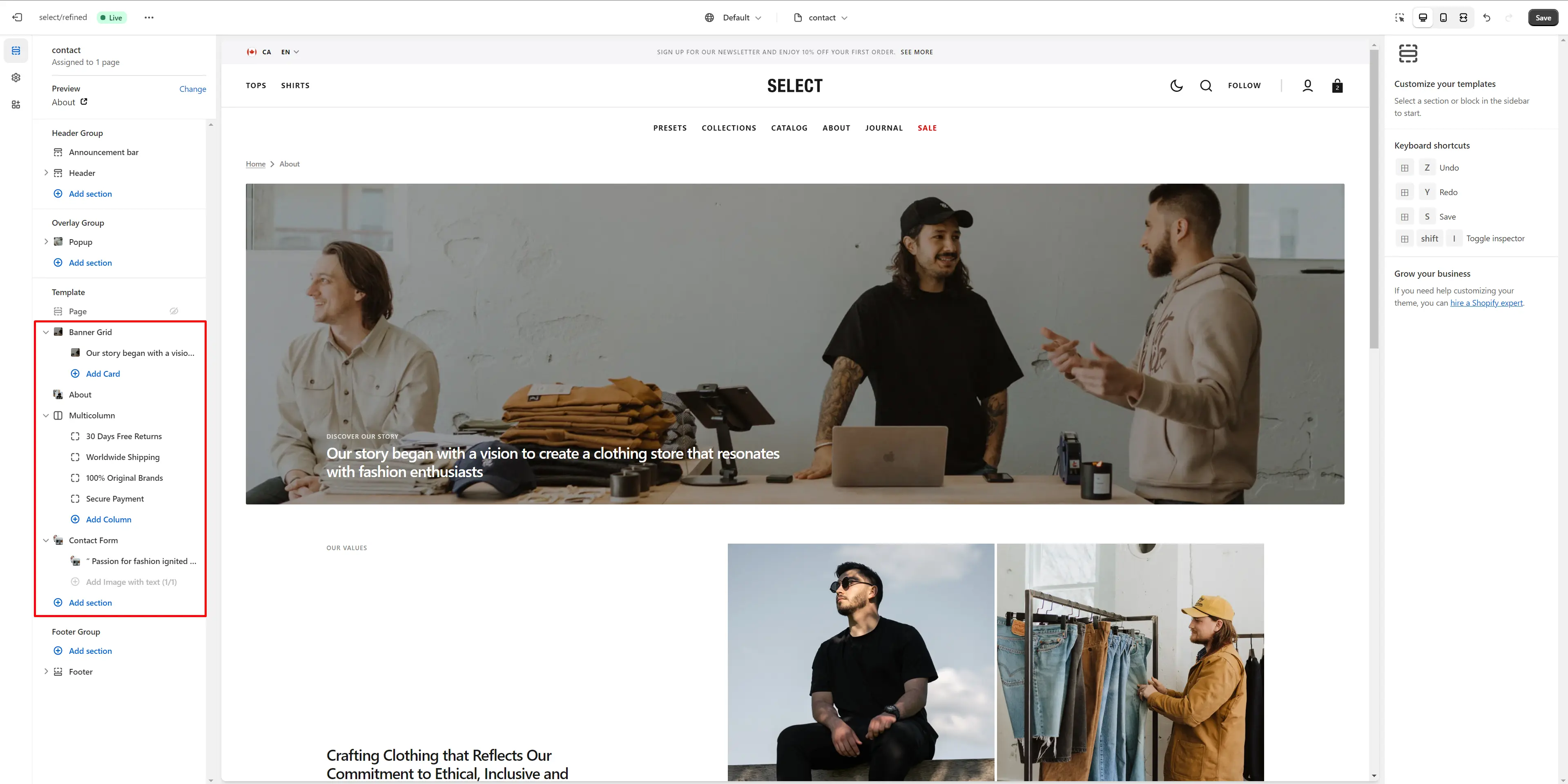
Banner Grid
In this section you can flexibly customize the section and blocks, their position, height, text size, overlay, add a background image or video over the block.
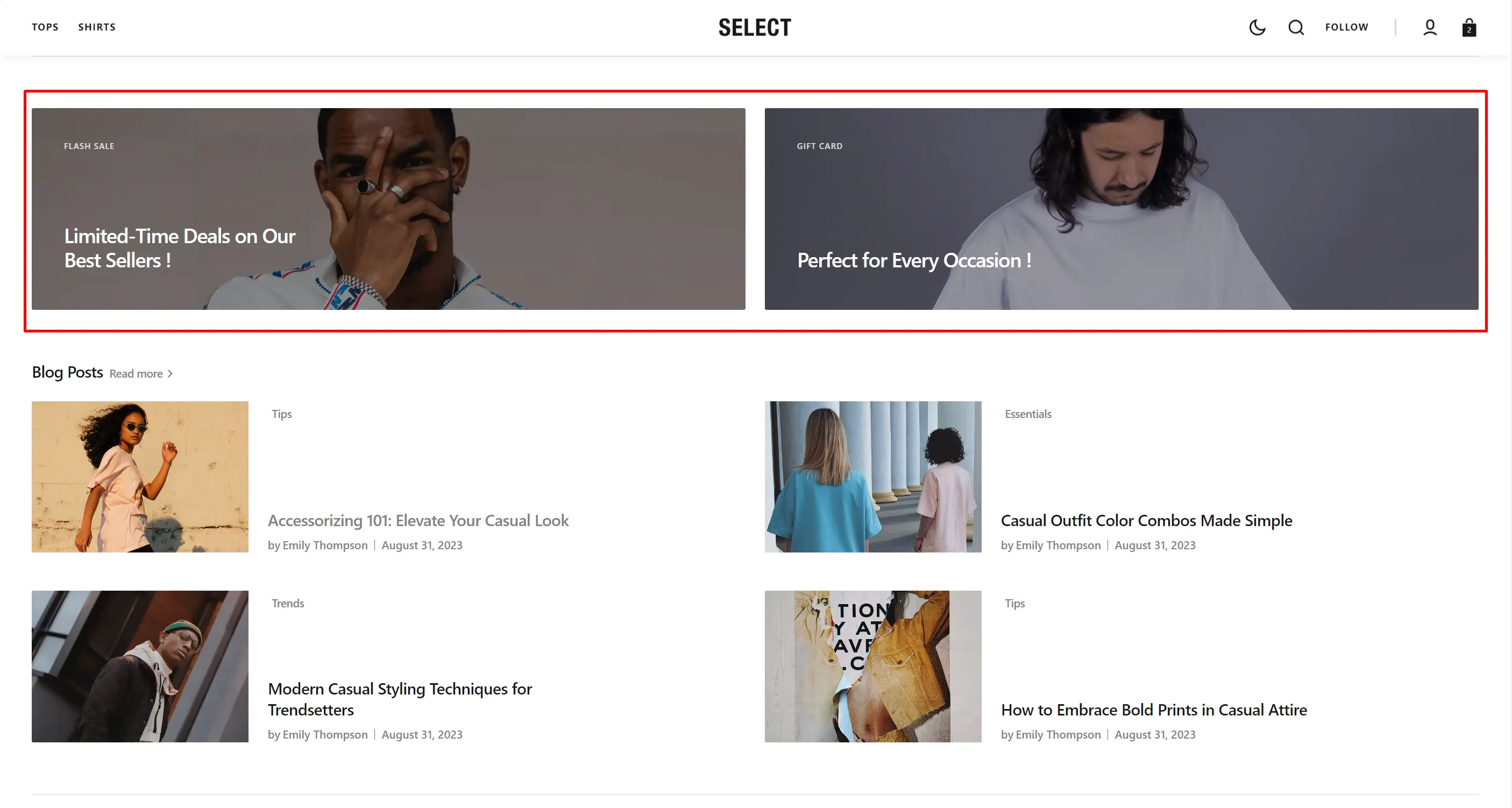
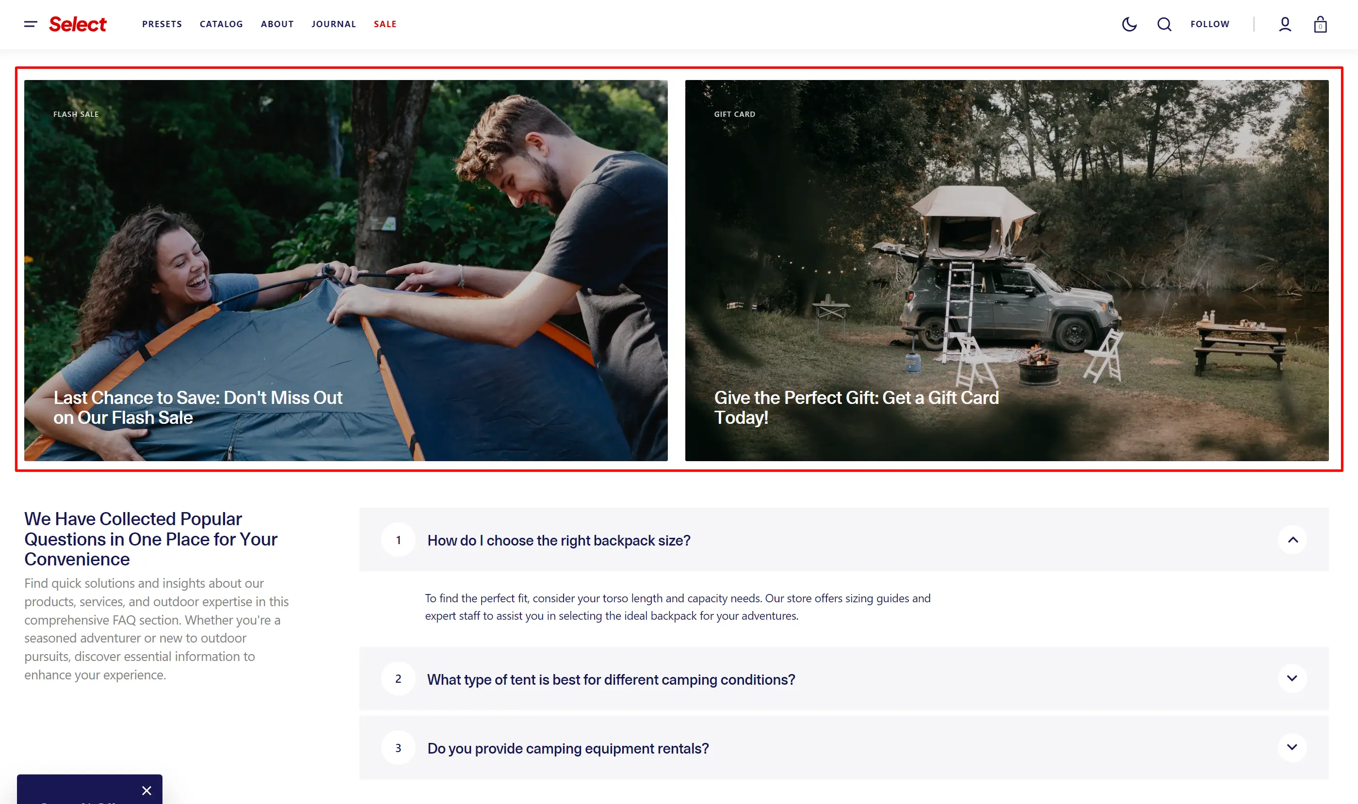
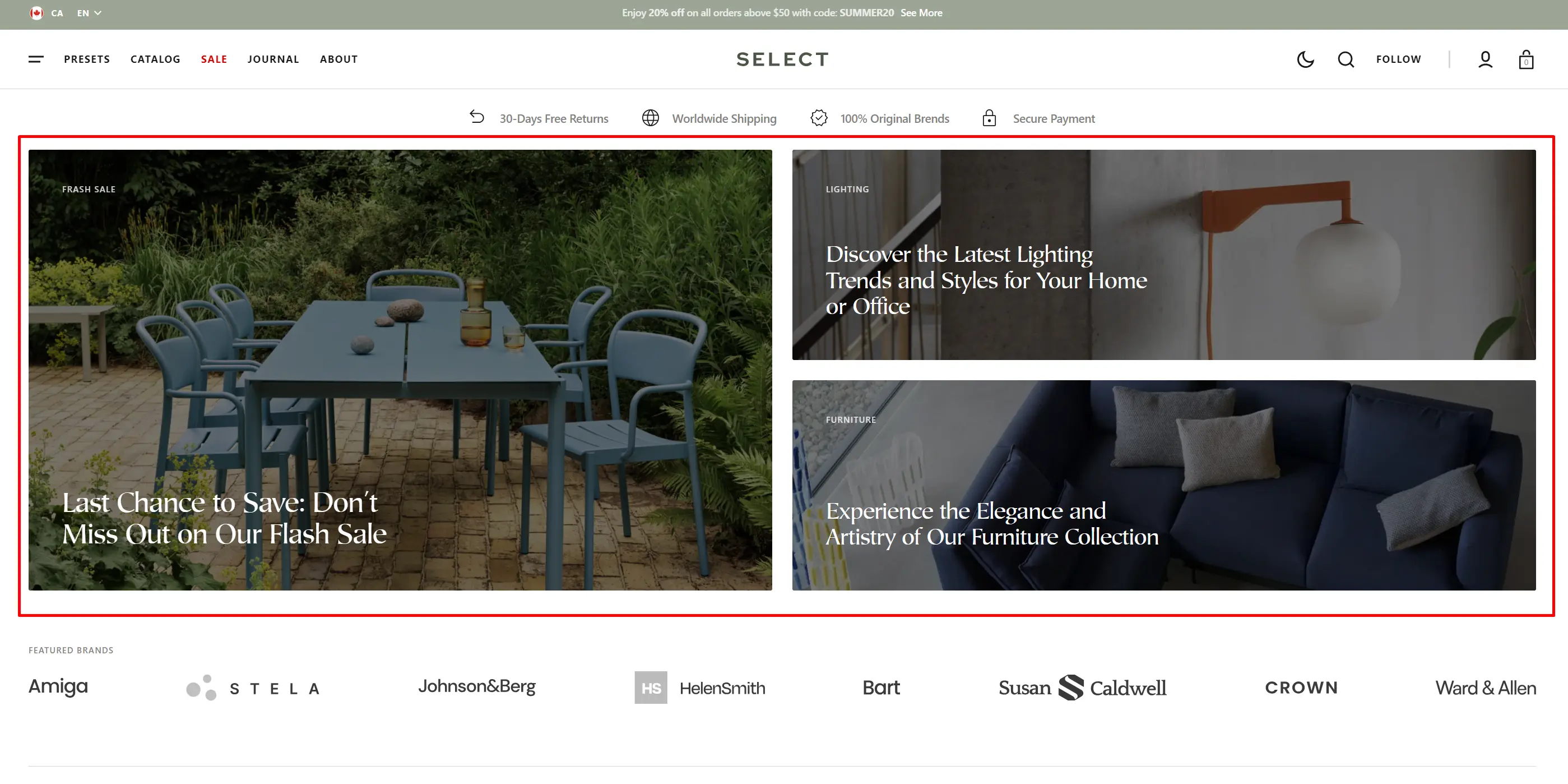
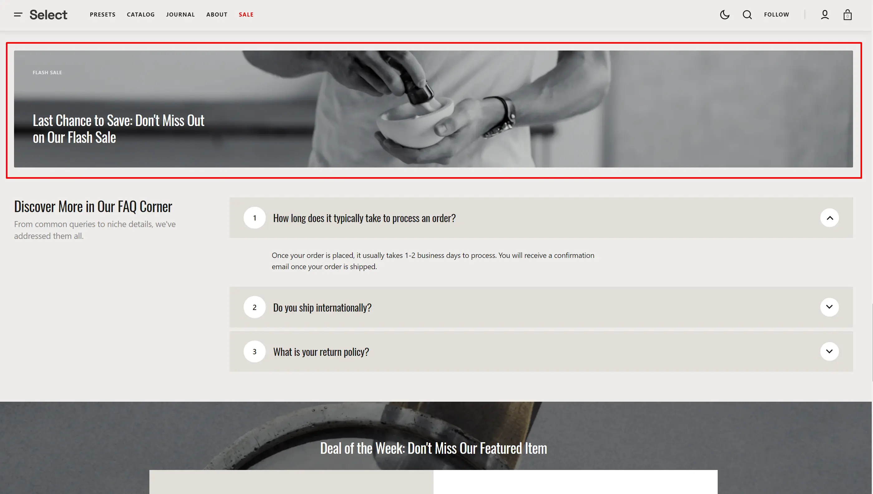
"Grid cells amount" defines the layout of the grid in the section. To create a block that spans 3 columns, set the "Grid cells amount" to 3. For the block's "Column start", choose 1, and for "Column end", choose 4, since both columns and rows start from 1, not 0.
Product Carousel
The section allows you to select products and customize their display.
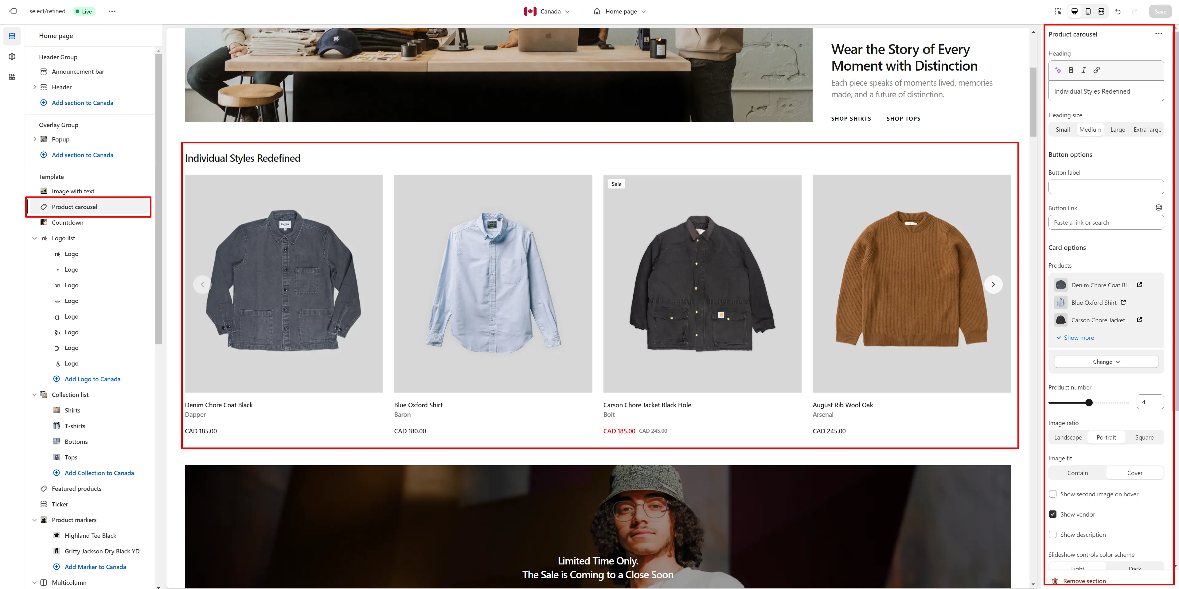
- Heading allows you to set a heading for the section.
- Heading size selector field allows you to change the size of the section header.
- Button label field sets the button's label.
- Button link field allows you to add a link to any source.
- Card options allow you to customize product cards in the section.
Countdown
You can add and customize a countdown timer.
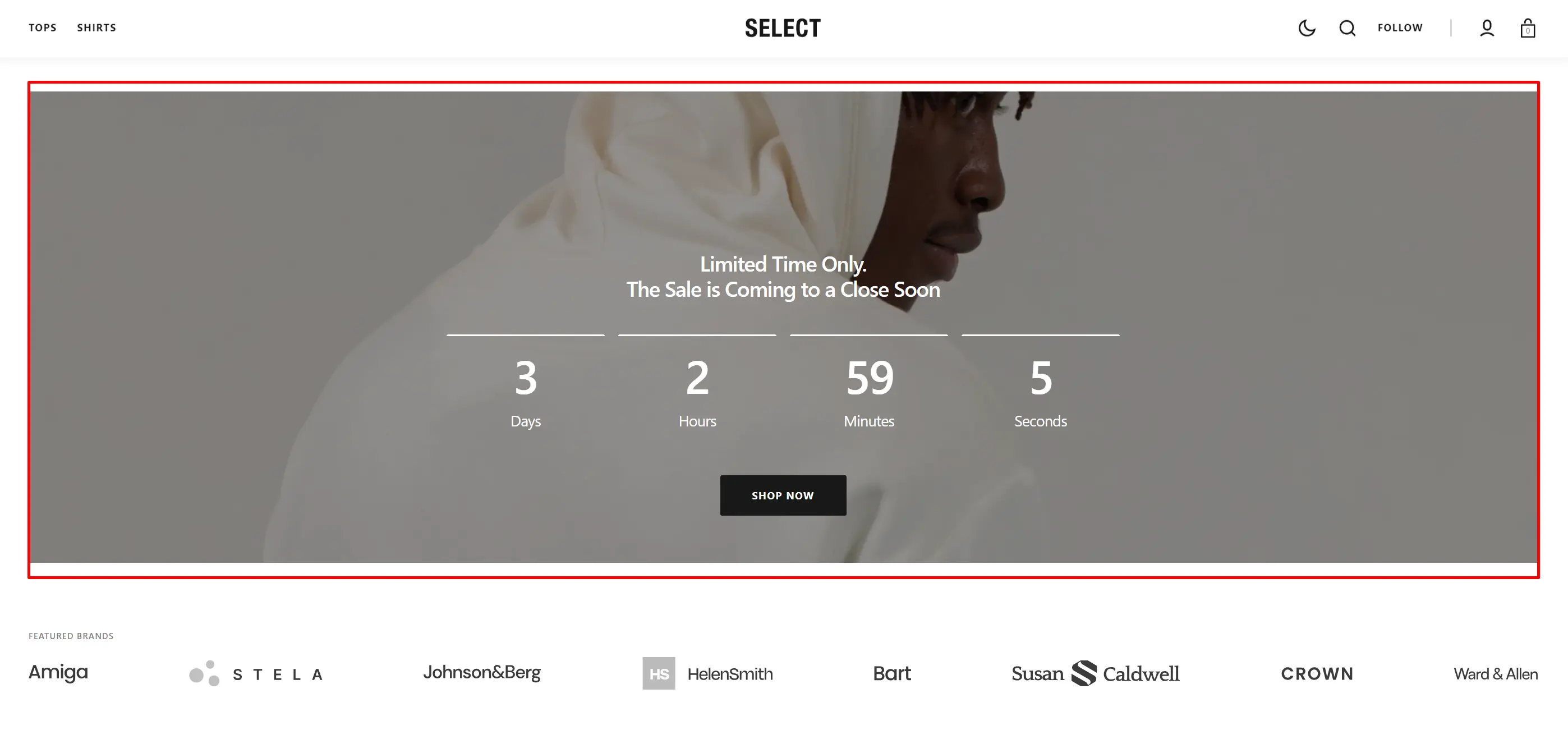
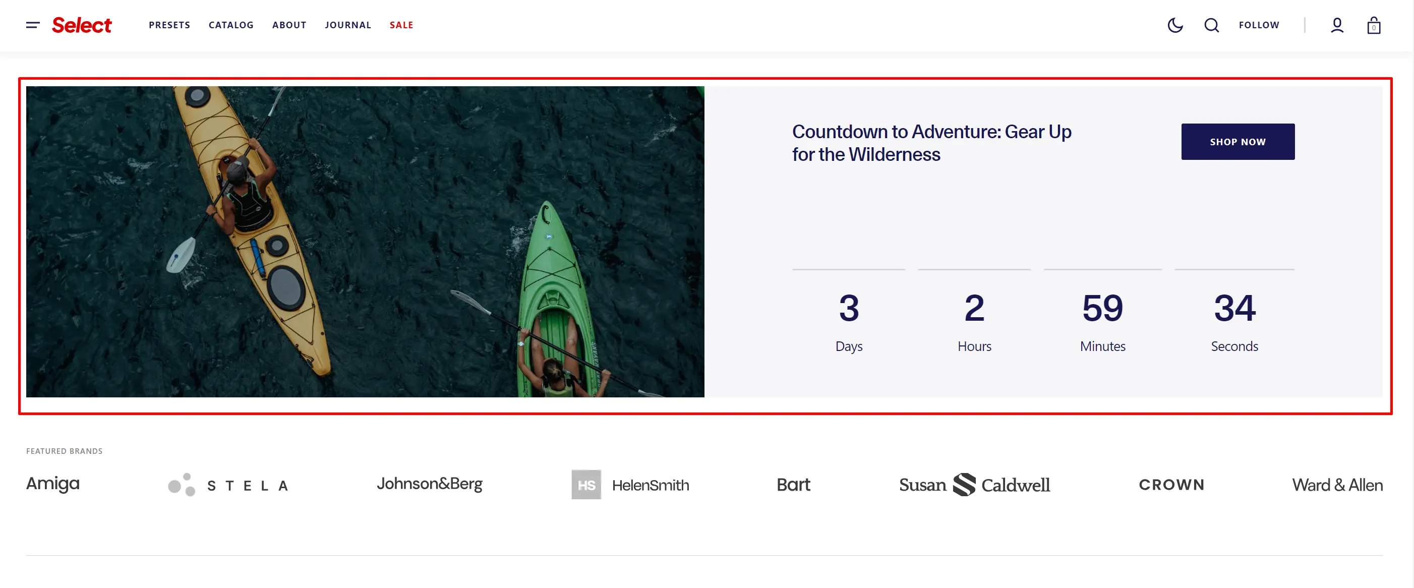
- Section type lets you select the layout type.
- Use Color scheme selector to change the color scheme.
- Image allows you to set a image for the section.
- Video allows you to set a video for the section.
- Overlay opacity slider allows you to change the opacity of the overlay.
- Content position allows you to change content position.
- Heading allows you to set a heading for the section.
- Text allows you to set a text for the section.
- Form text field adds a text to the top of the form.
- End date allows you to set the countdown end date.
- End time allows you to set the countdown end time.
- After the timer ends lets you select the action that should occur when the countdown is completed.
- Text allows you to set a text when countdown is completed.
- Button options allows you to set a button and customize it.
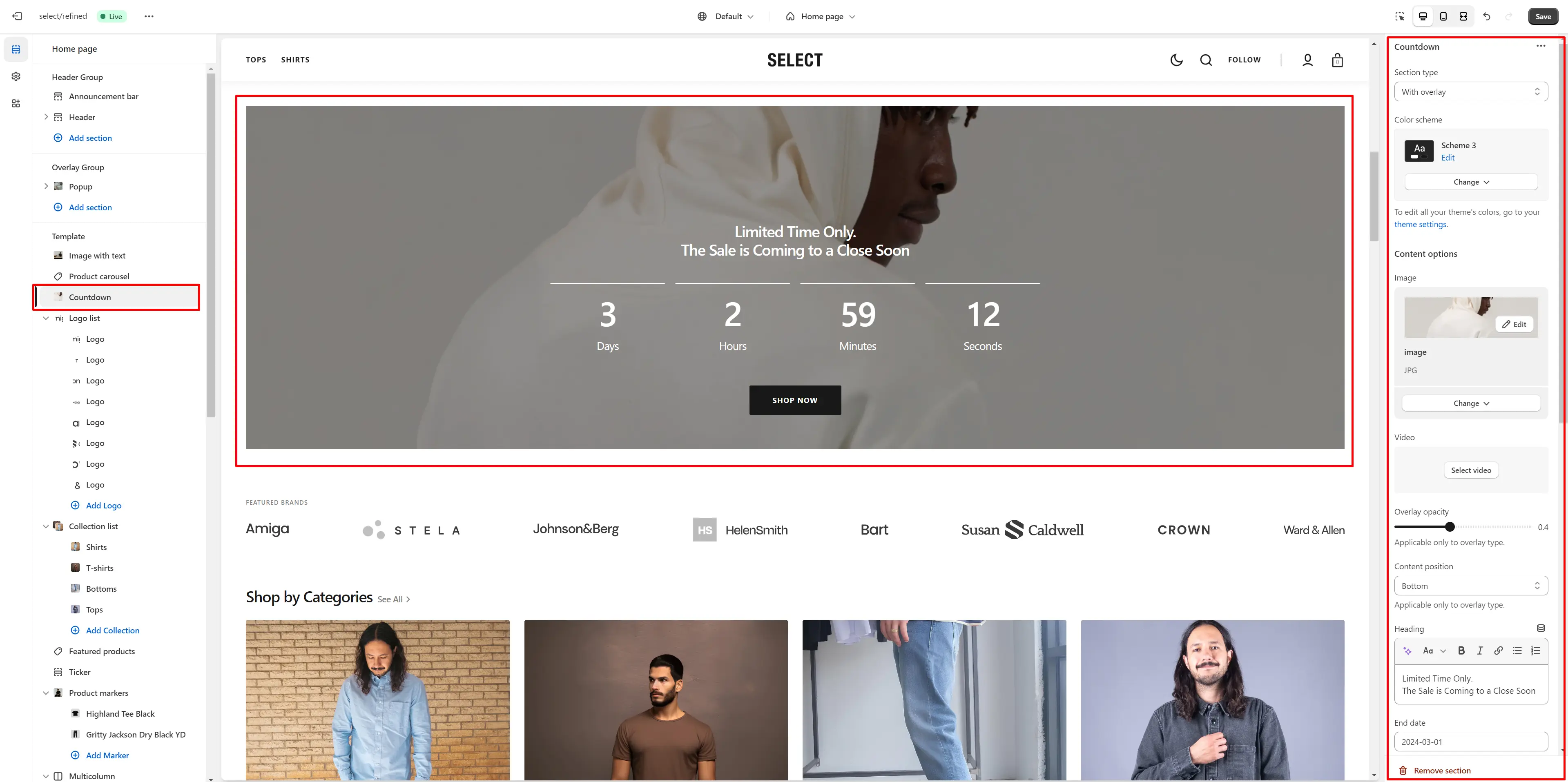
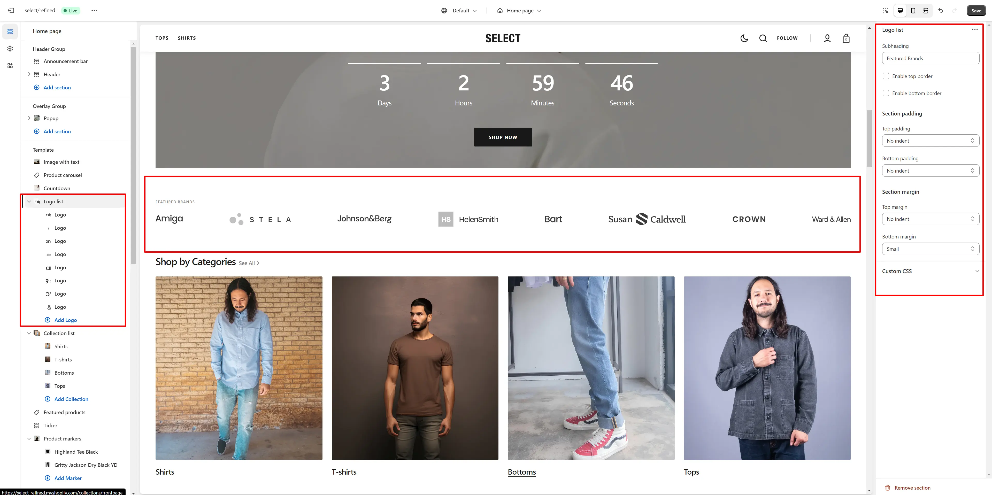
Logo lis
Section allows you to add brand logos with their links.
- Subheading allows you to set a subheading for the section.
- Enable top border field allows you to connect the lines above the section.
- Enable bottom border field allows you to connect the lines under the section.
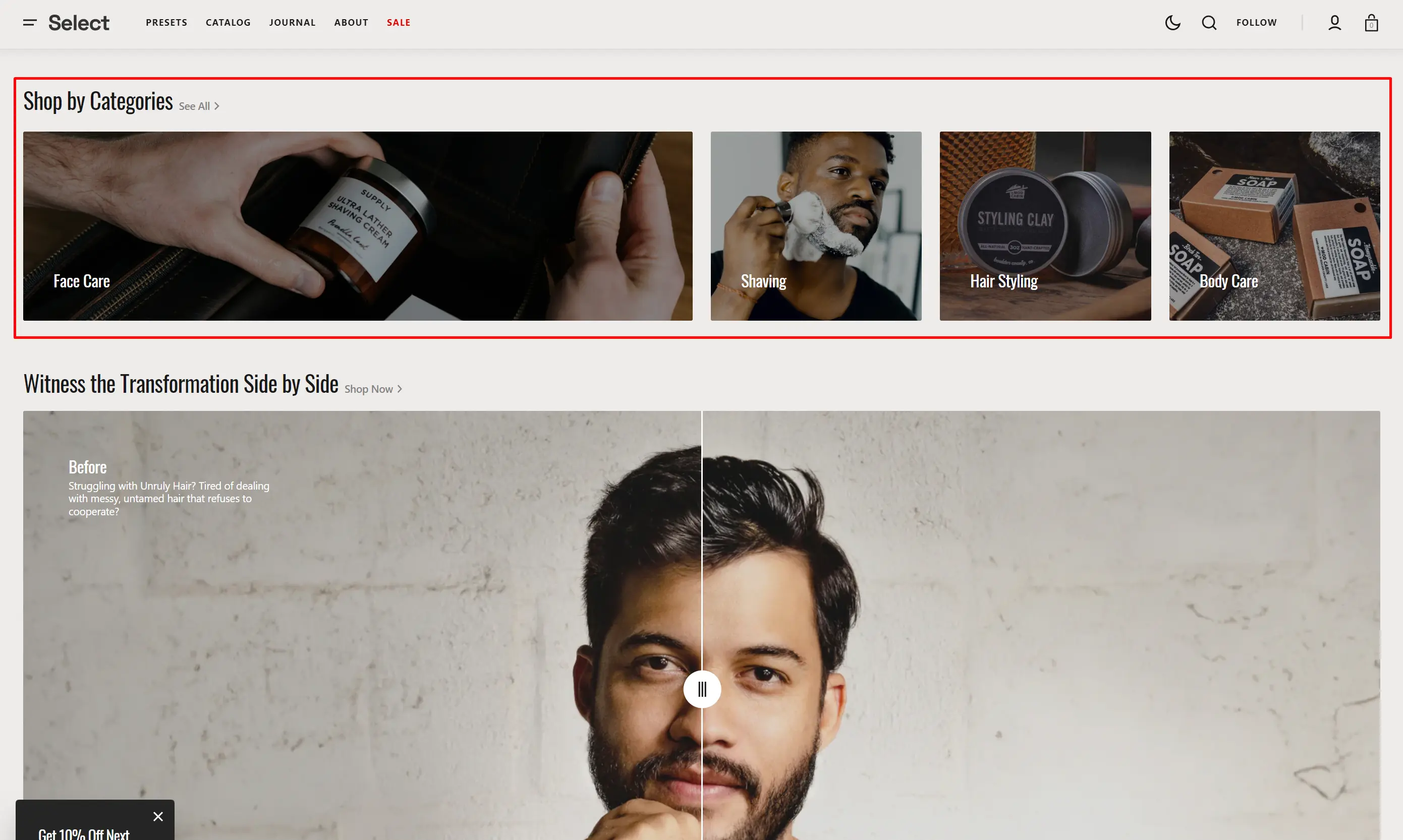
Collection List
Displays a list of all collections.
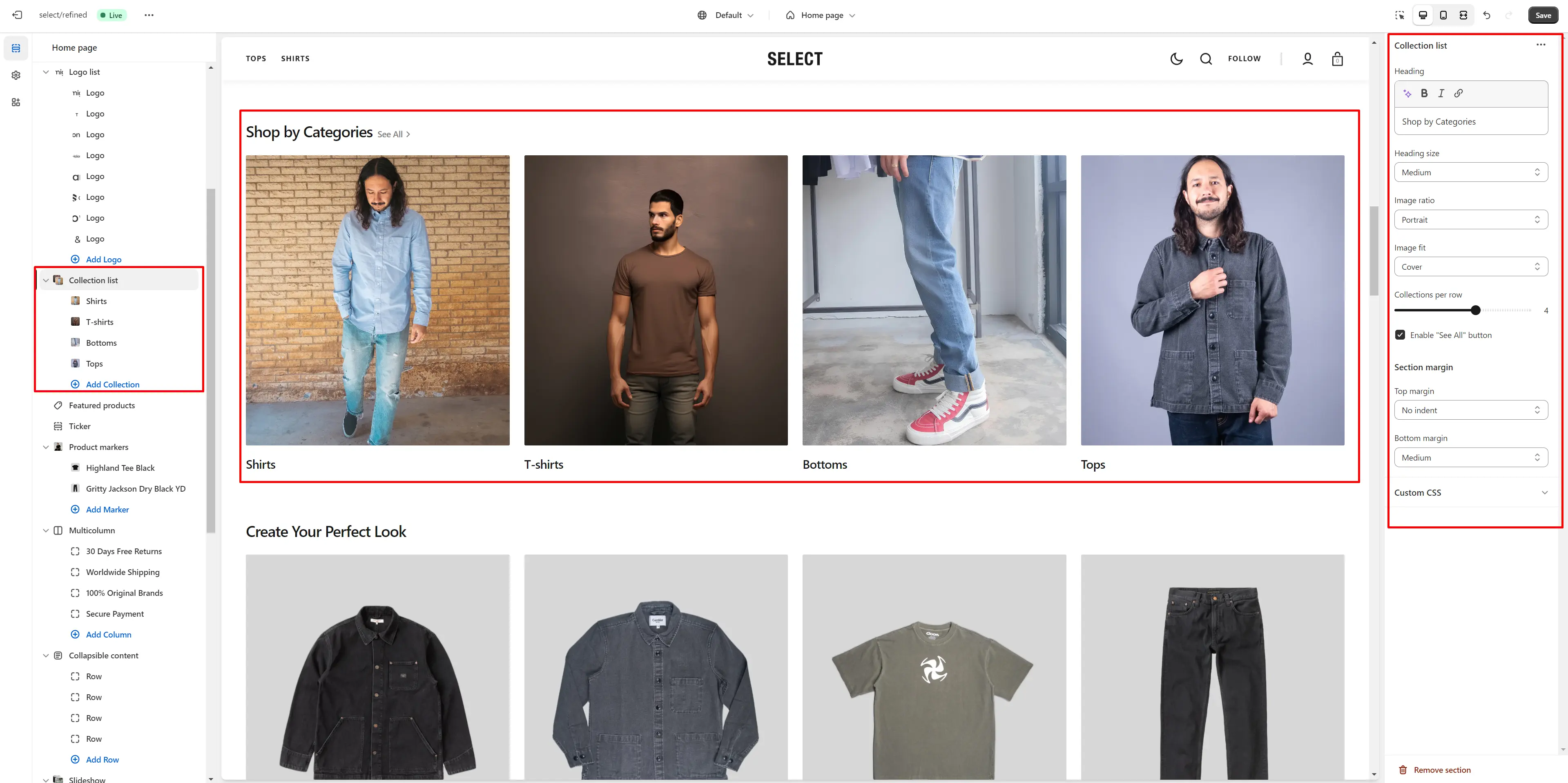
- Heading allows you to set a heading for the section.
- Heading size selector field allows you to change the size of the section header.
- Image ratio selector allows you to change the height of the collection of cards in this section.
- Columns per row slider allows you to change the number of collections per line only on desktop devices.
Ticker
The section allows you to add scrolling ticker
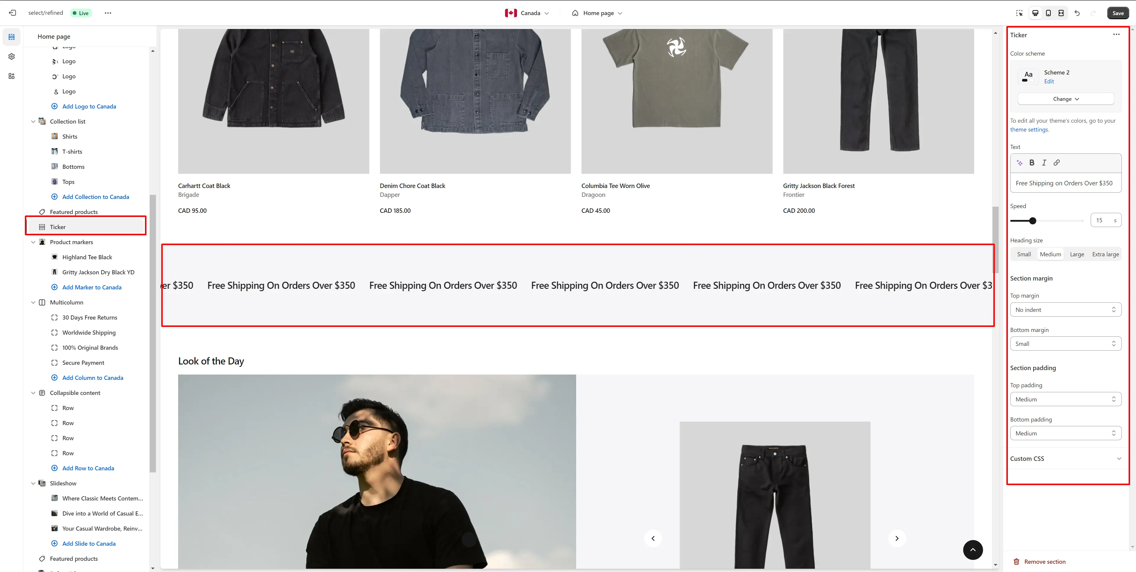
- Use Color scheme selector to change the color scheme.
- Text allows you to set a text for the ticker.
- Speed allows you to change speed for the ticker.
- Text size selector field allows you to change the size of the section text.
Featured Products
The section allows you to select products and customize their display.
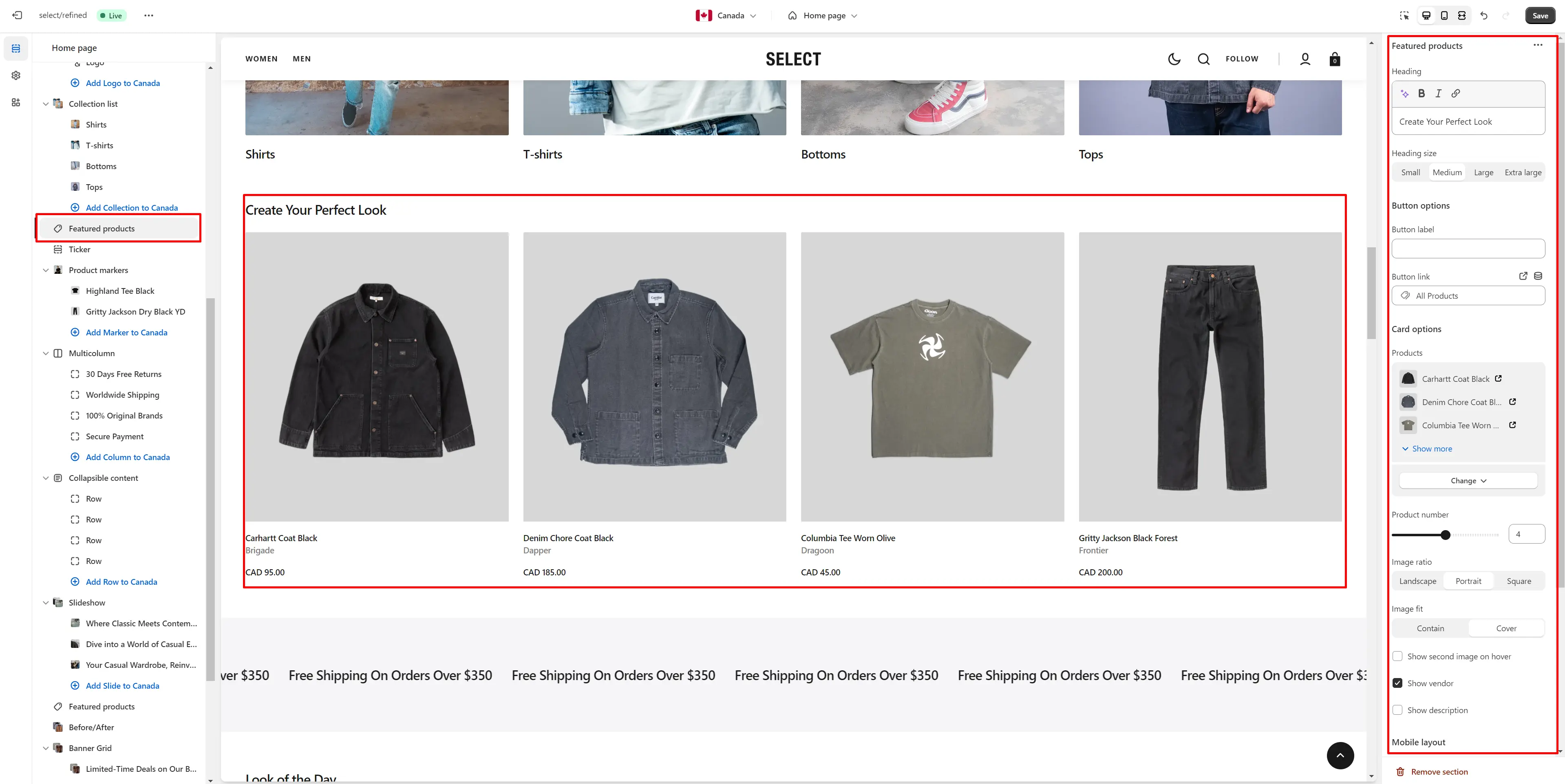
- Heading allows you to set a heading for the section.
- Heading size selector field allows you to change the size of the section header.
- Button label sets the text displayed on the button.
- Button link field allows you to add a link to any source.
- Card options allow you to customize product cards in the section.
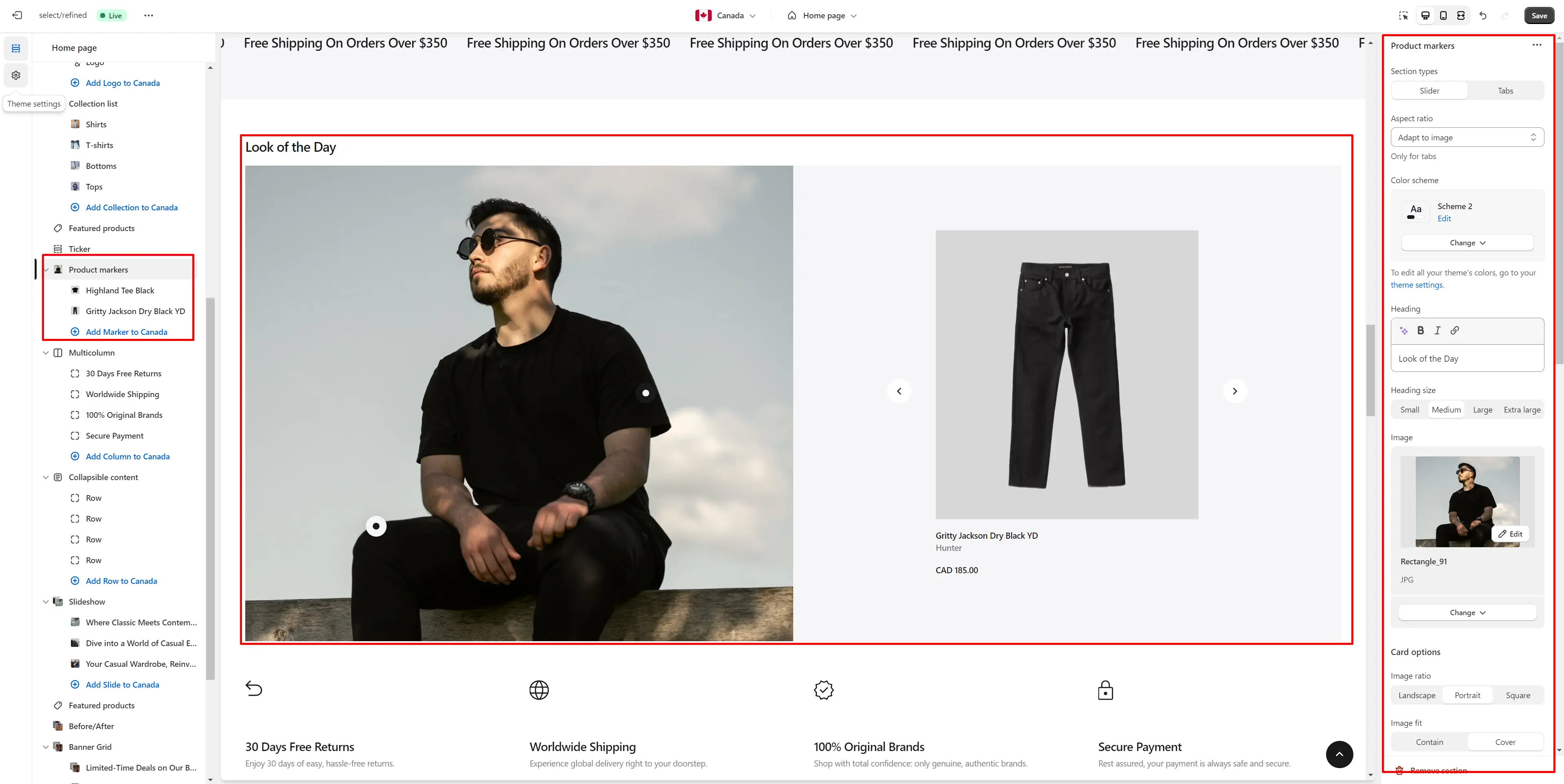
Product Markers
The section lets you mark products in the image and choose their display position.
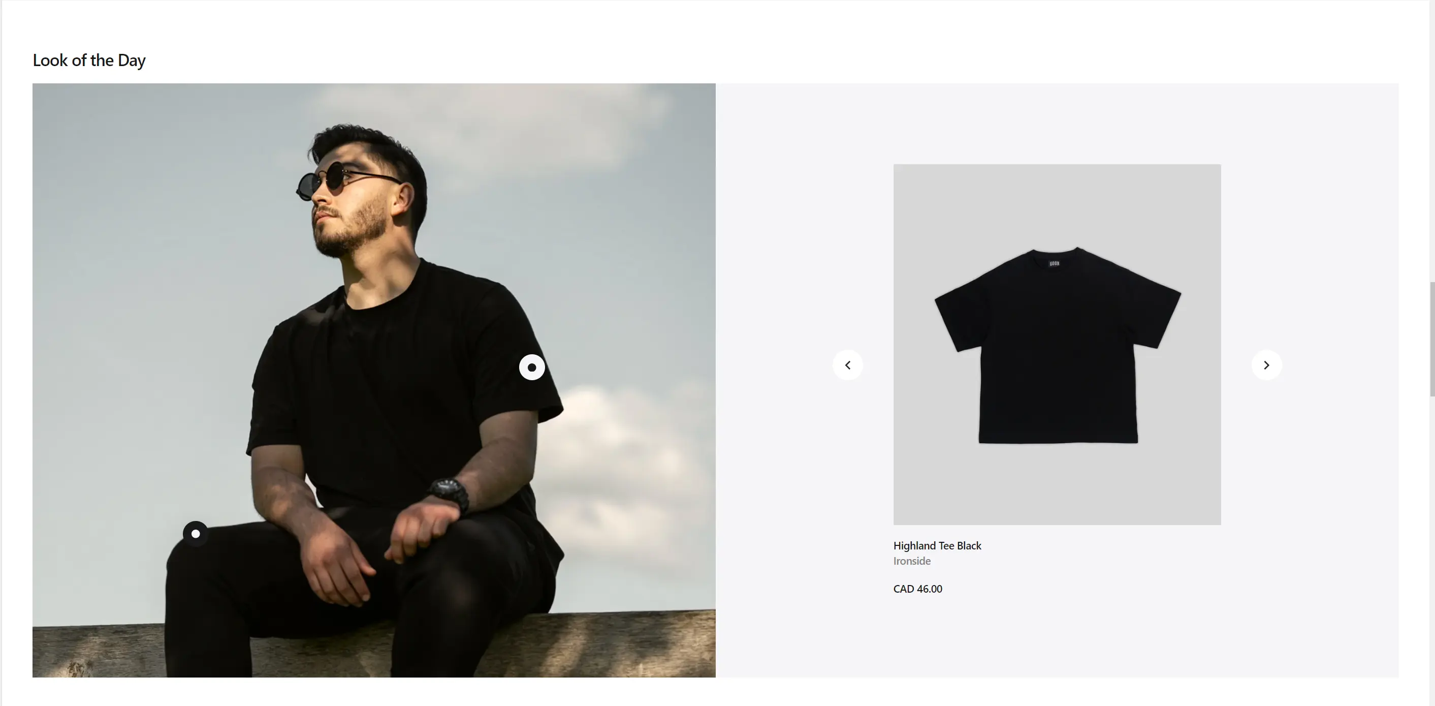
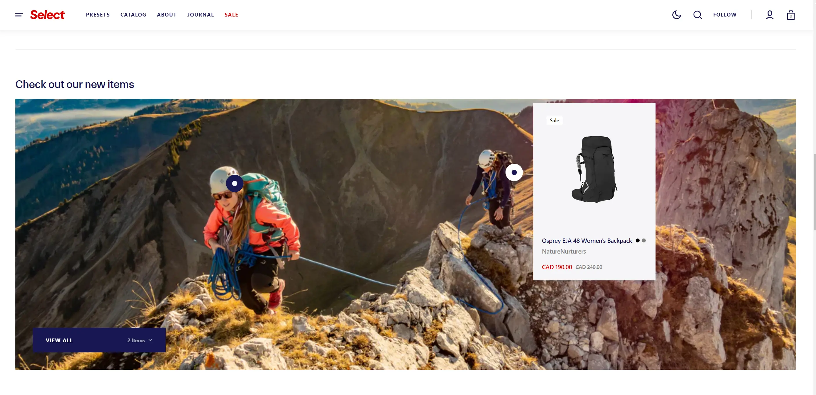
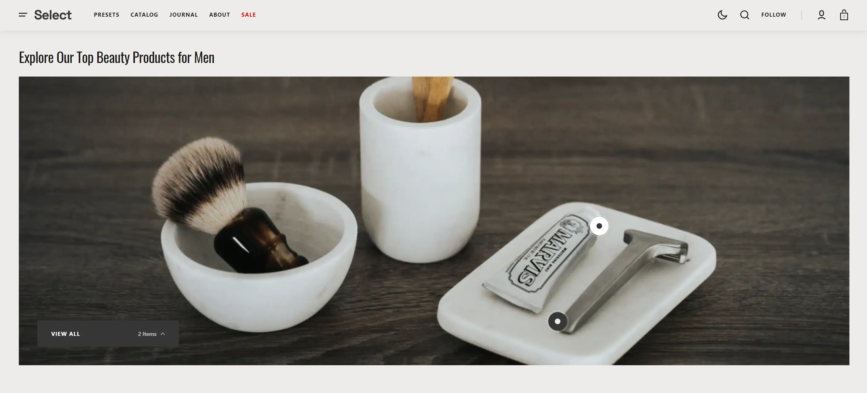
- Section type lets you select the layout type.
- Aspect ratio sets the aspect ratio of the image.
- Use Color scheme selector to change the color scheme.
- Heading allows you to set a heading for the section.
- Heading size selector field allows you to change the size of the section header.
- Image allows you to set a image for the section.
- Card options allow you to customize product cards in the section.
- Button options allows you to set a button and customize it.
- Block Markers options Product select product that will be displayed.
- Block Markers options Position allow you to choose display position for the marker.
- Block Markers options Opening direction allow you to choose product marker window direction.
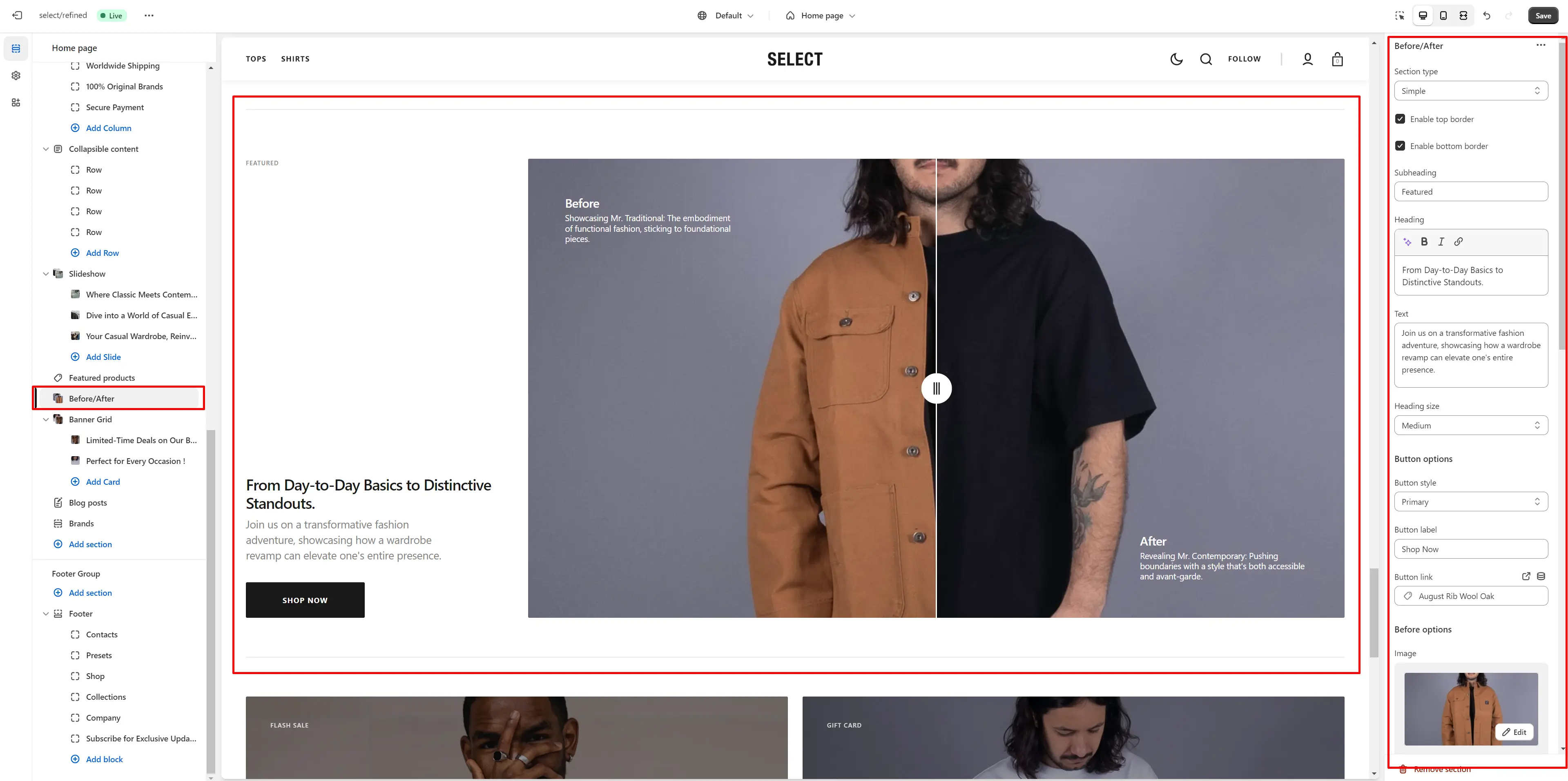
Before/After
The section allows you to compare products results.
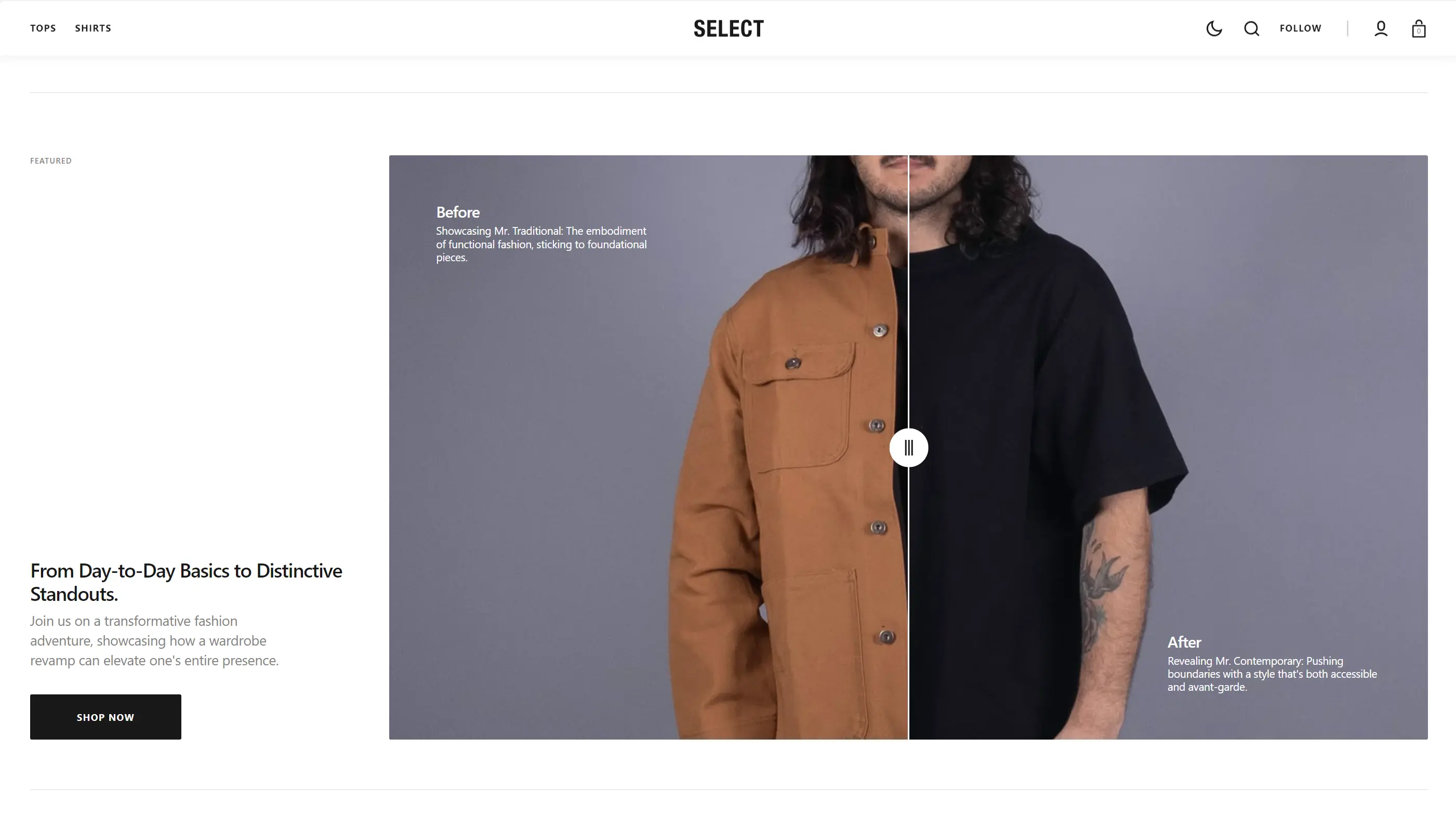
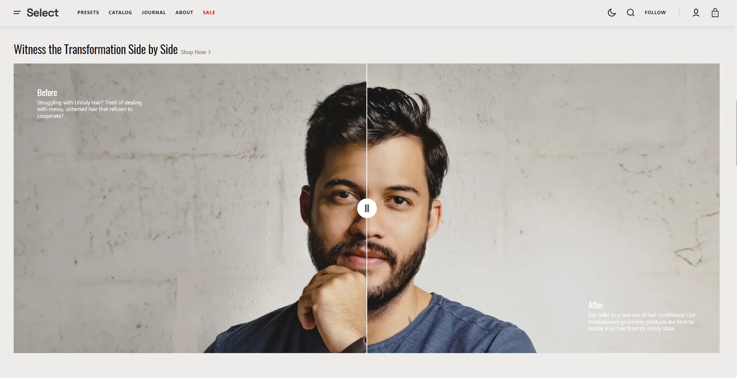
- Section type lets you select the layout type.
- Enable top border field allows you to connect the lines above the section.
- Enable top border field allows you to connect the lines under the section.
- Subheading allows you to set a subheading for the section.
- Heading allows you to set a heading for the section.
- Text allows you to set a text for the section.
- Heading size selector field allows you to change the size of the section header.
- Button options allows you to set a button and customize it.
- Before options allows you to add images and texts for compare.
Collapsible Content
You can add and customize a Collapsible Content section, such as using it for FAQs.
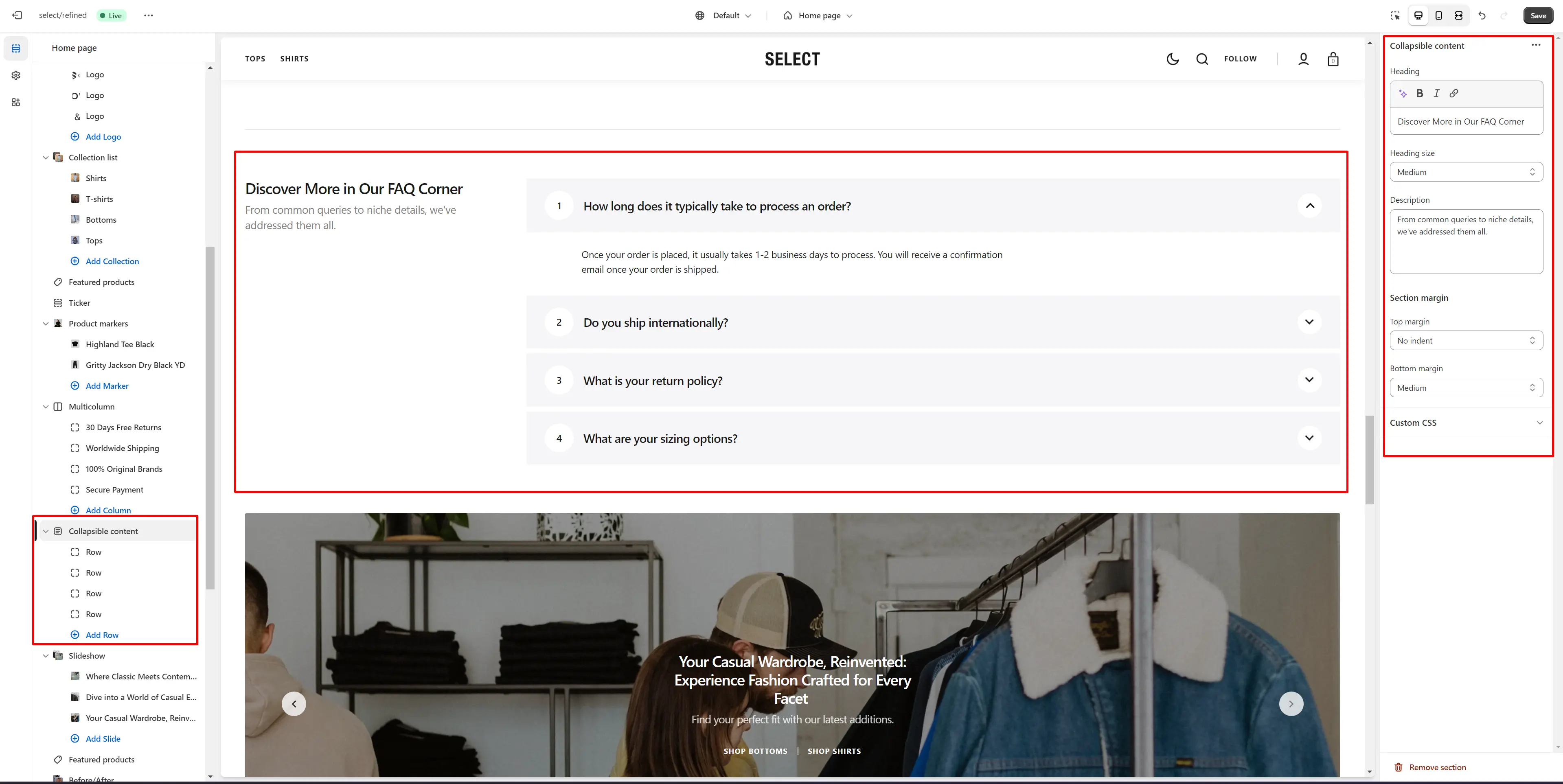
- Content position allows you to change content position.
- Heading allows you to set a heading for the section.
- Heading size selector field allows you to change the size of the section header.
- Description allows you to set a description for the section.
Multicolumn
The section lets you add a scrolling ticker.
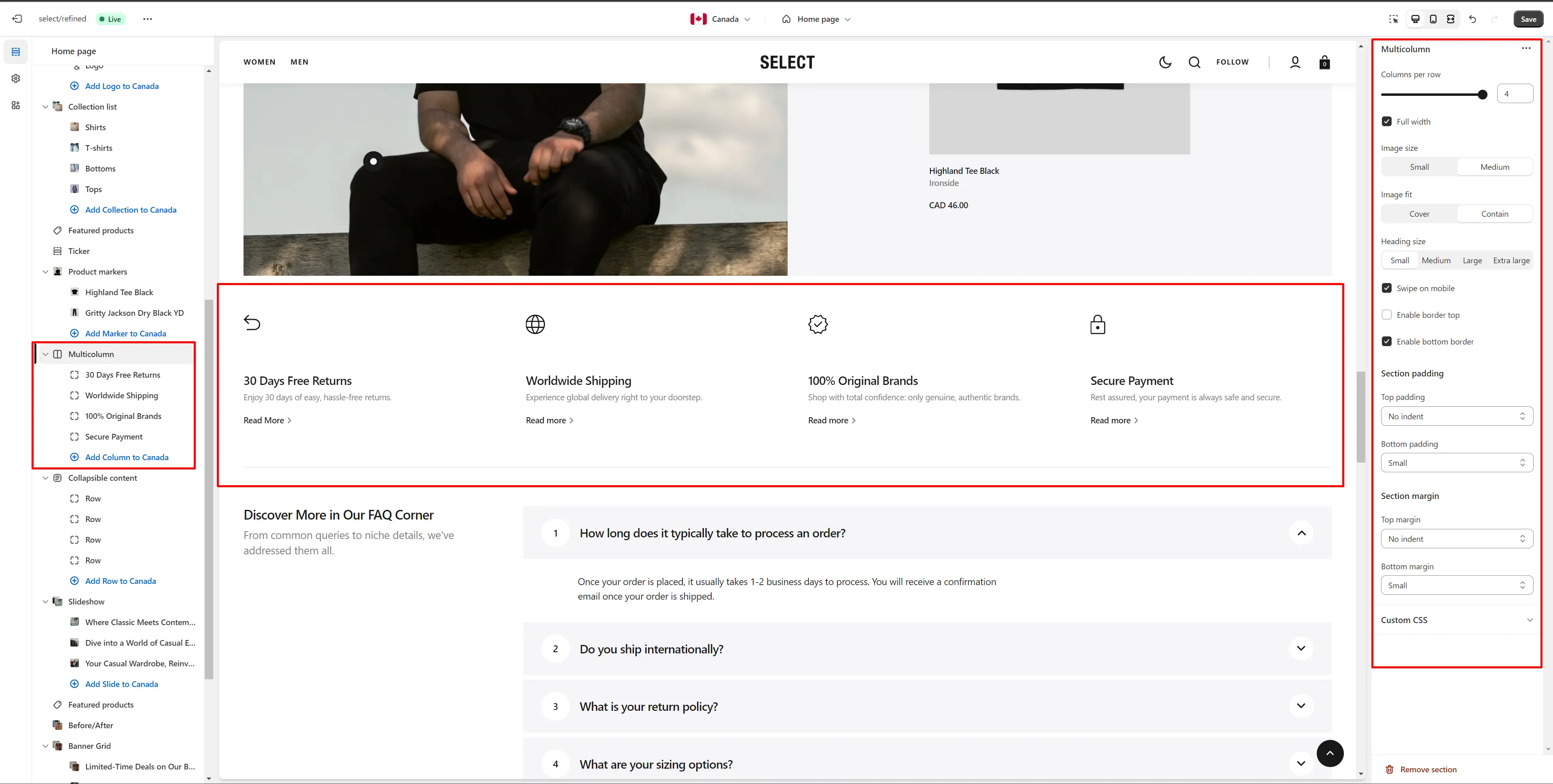
- Columns per row slider allows you to change the number of blocks per line only on desktop devices.
- Image size allows you to change the size of the icon.
- Heading size selector field allows you to change the size of the section header.
- Swipe on mobile checkbox field allows you to enable the slider on mobile devices.
- Enable top border field allows you to connect the lines above the section.
- Enable bottom border field allows you to connect the lines under the section.
- Block Column options Image file selector allows you to select or upload your image file.
- Block Column options Dark Mode image file selector to select or upload your image, which can be seen in Dark Mode.
- Block Column options Icon file selector allows you to select icon from a list.
- Block Column options Heading allows you to set a heading for the block.
- Block Column options Description allows you to set a description for the block.
- Block Column options Button label field sets the button's label.
- Block Column options Button link field allows you to add a link to any source.
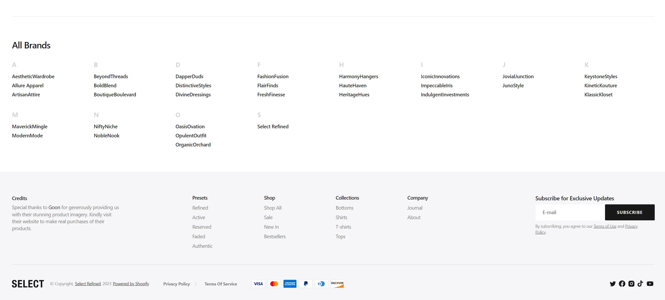
Brands
Section allows you to add all the brands of your store.
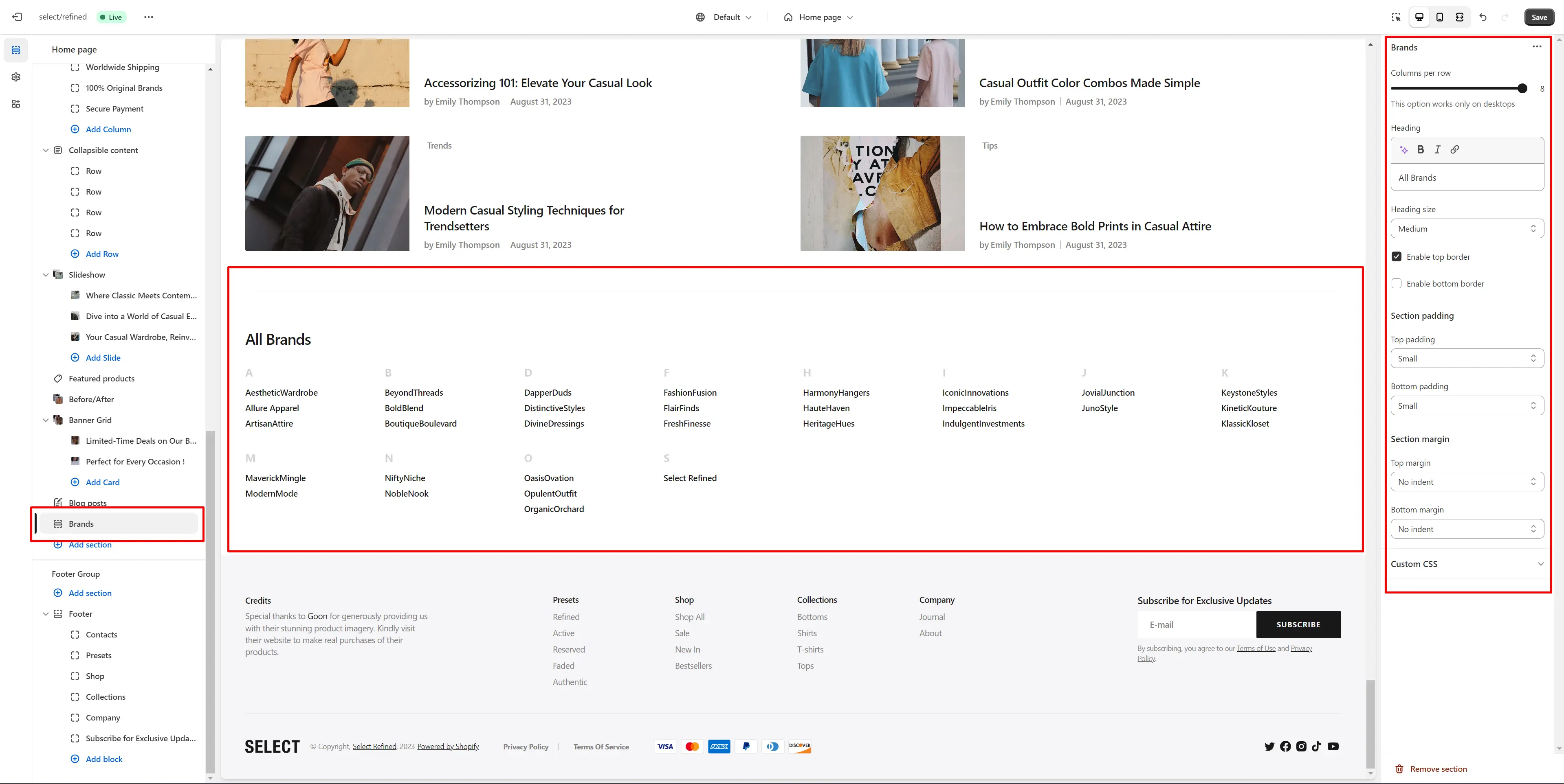
- Columns per row slider allows you to change the number of brands per line only on desktop devices.
- Heading allows you to set a heading for the section.
- Heading size selector field allows you to change the size of the section header.
- Enable top border field allows you to connect the lines above the section.
- Enable bottom border field allows you to connect the lines under the section.
Information Bar
Section allows you to add logos and tests.
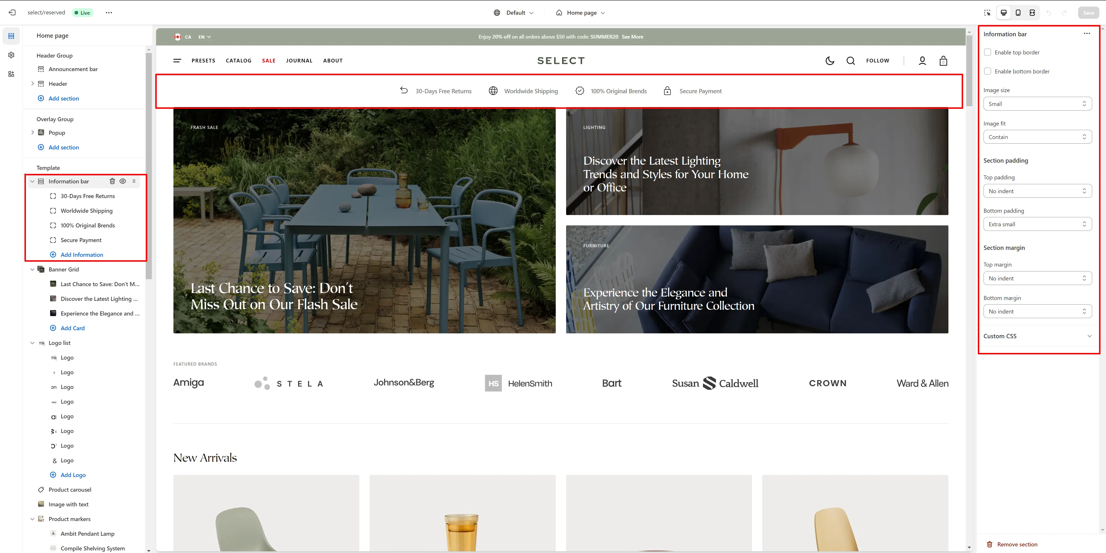
- Enable top border field allows you to connect the lines above the section.
- Enable bottom border field allows you to connect the lines under the section.
- Image size allows you to change the size of the icon.
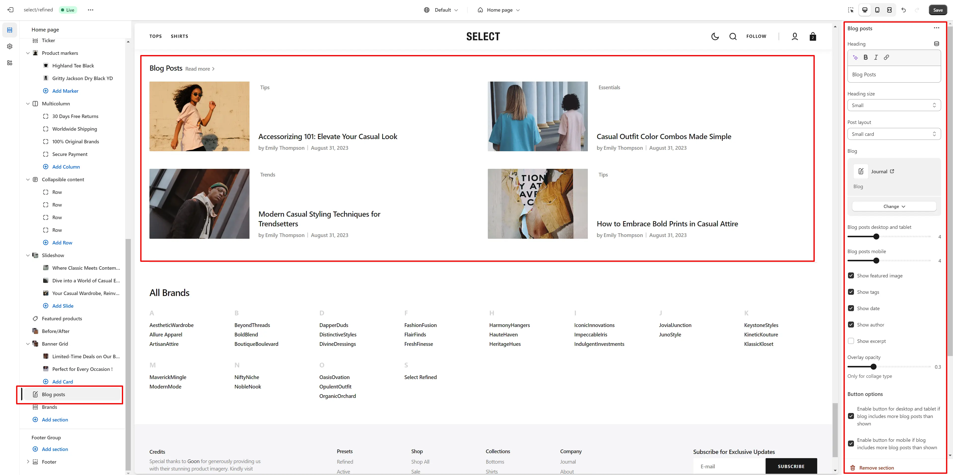
Blog Posts
The section allows you to select a blog and customize it.
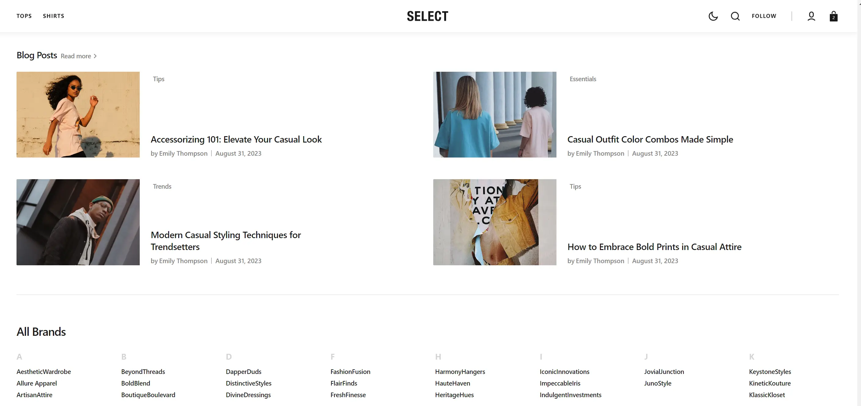
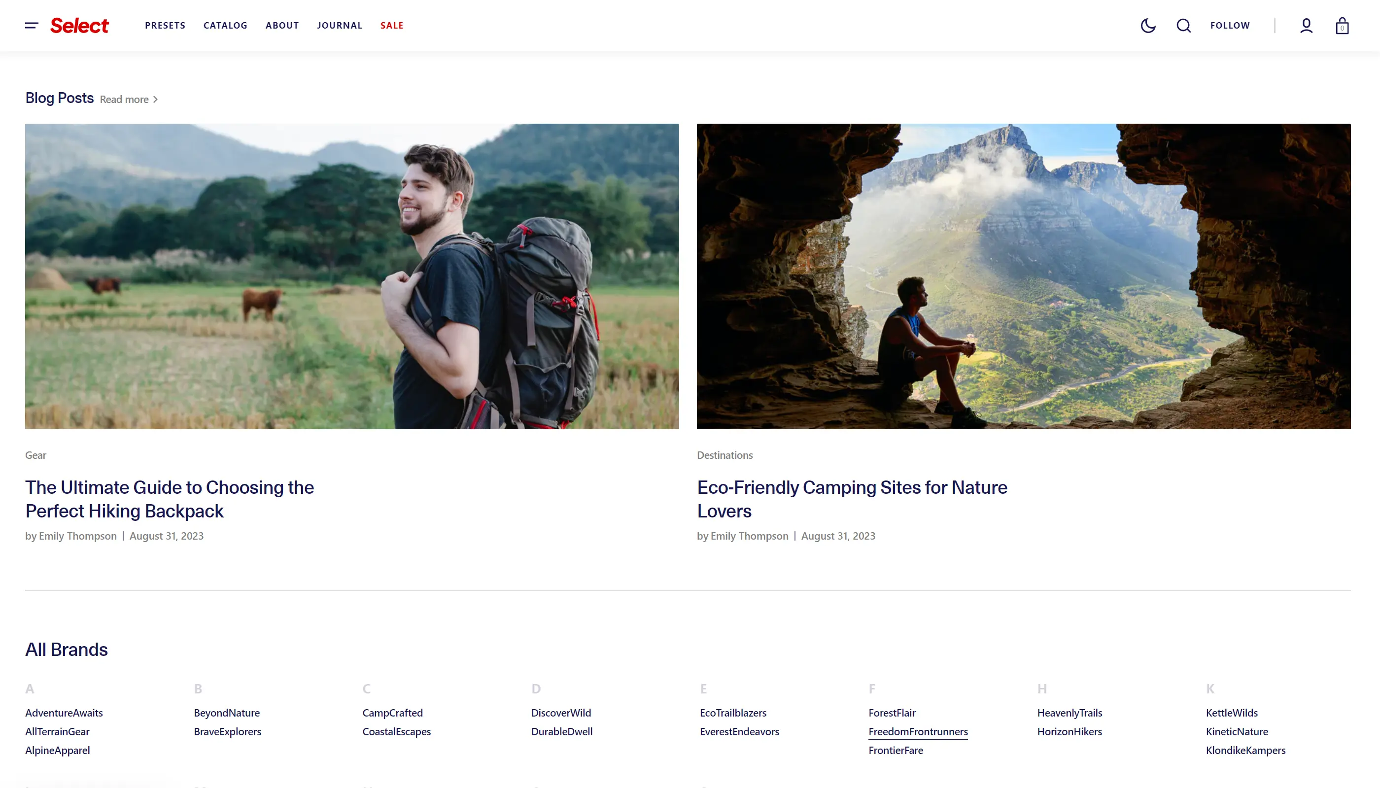
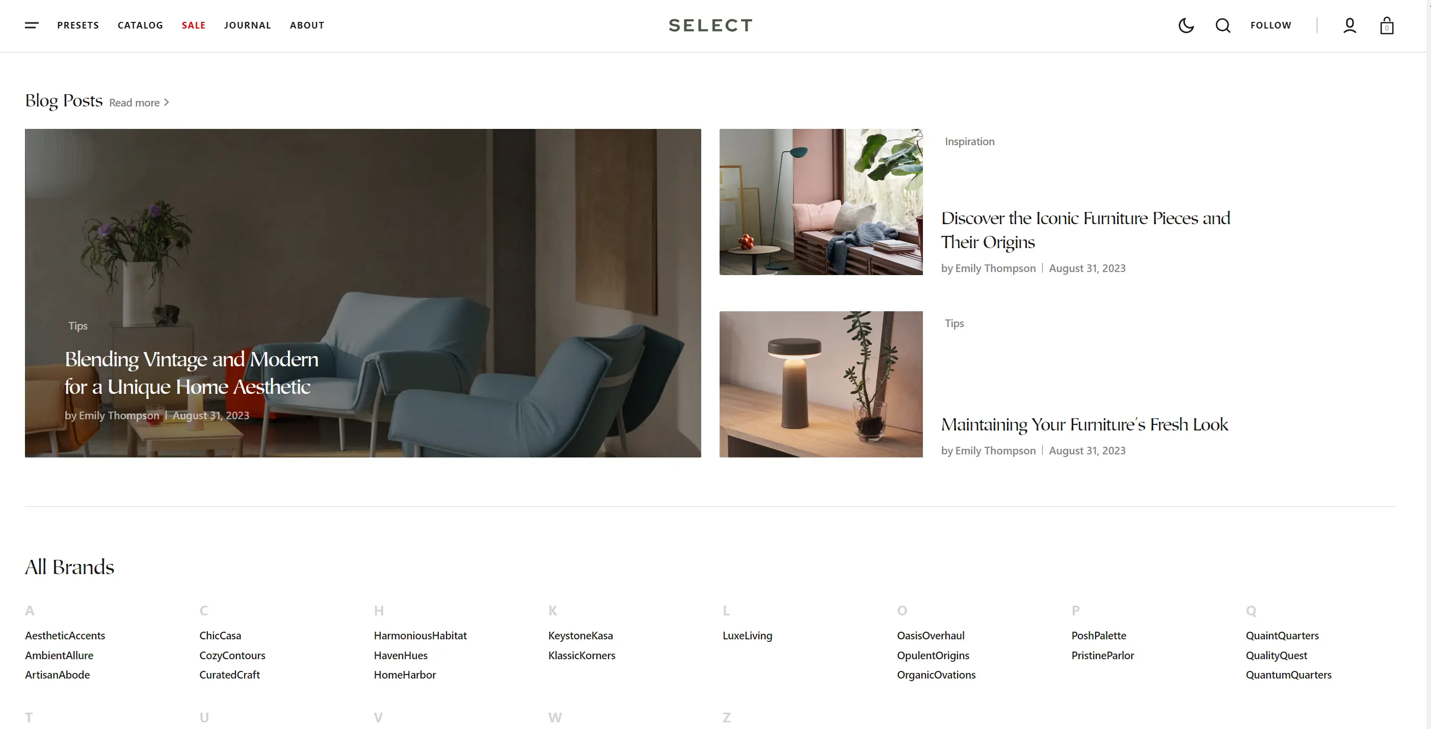
- Heading allows you to set a heading for the section.
- Heading size selector field allows you to change the size of the section header.
- Post layout field allows you to select layout type.
- Blog field allows you to choose a blog.
- Blog posts slider allows you to select the number of columns in one line.
- Show featured image field enables the display of an image for the blog post.
- Show tags field enables the display of tags for the blog post.
- Show date field enables the display of the date for the blog post.
- Show author field enables the display of the author for the blog post.
- Show excerpt field enables the display of the excerpt for the blog post
- Overlay opacity slider allows you to change the opacity of the overlay.
- Button options allows you to display of a button linking to all blog posts.
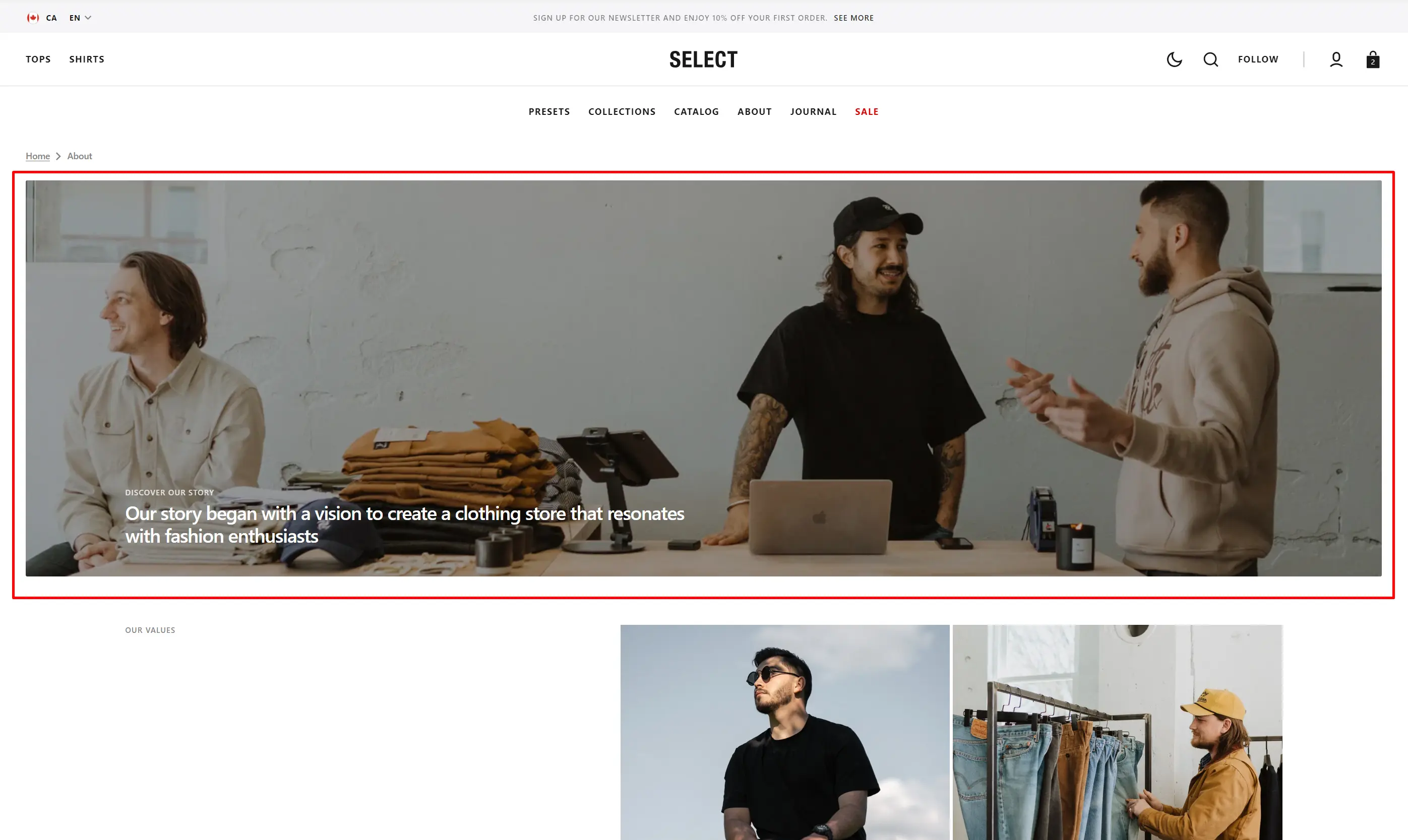
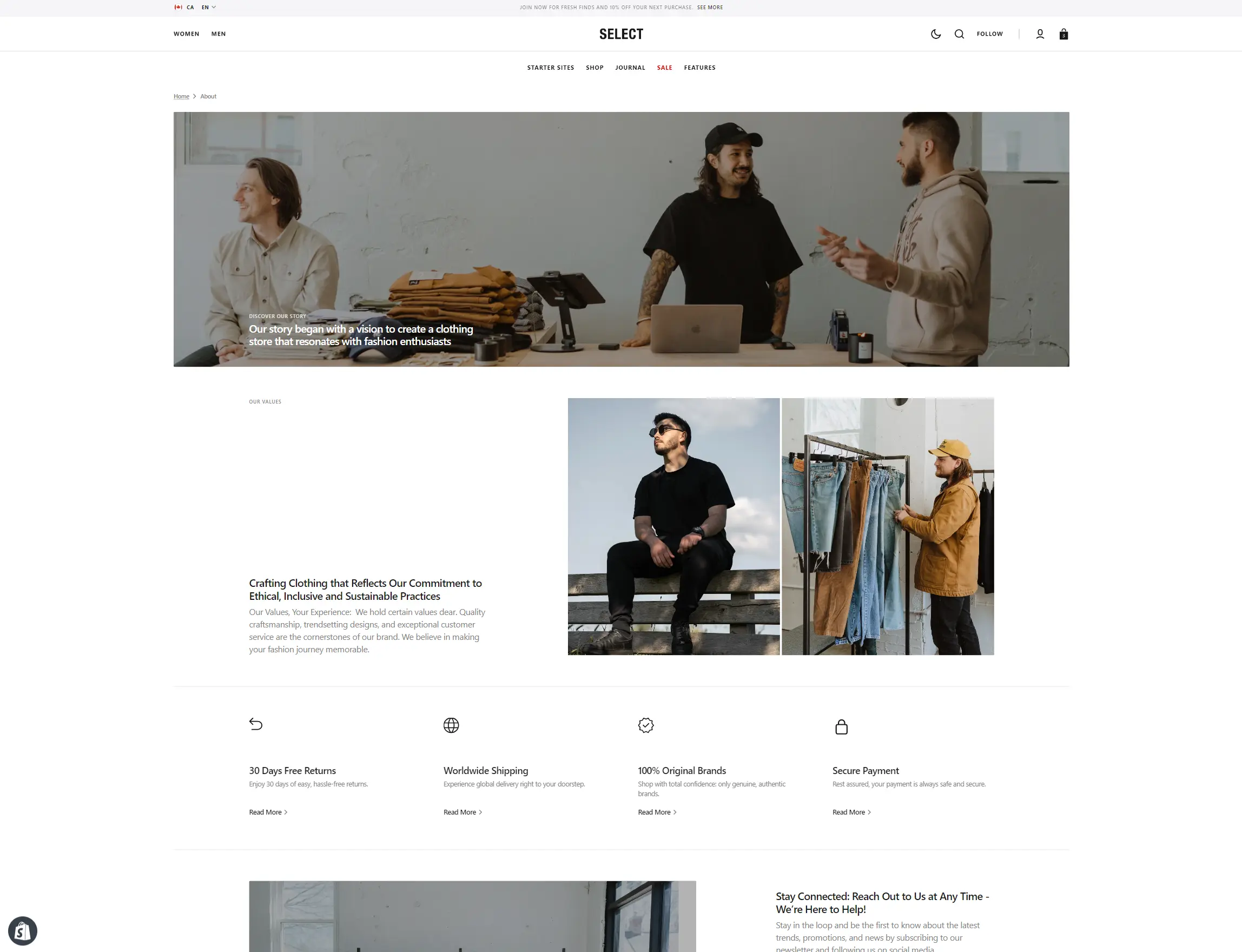
About
In this section, you can provide information about your business or brand.
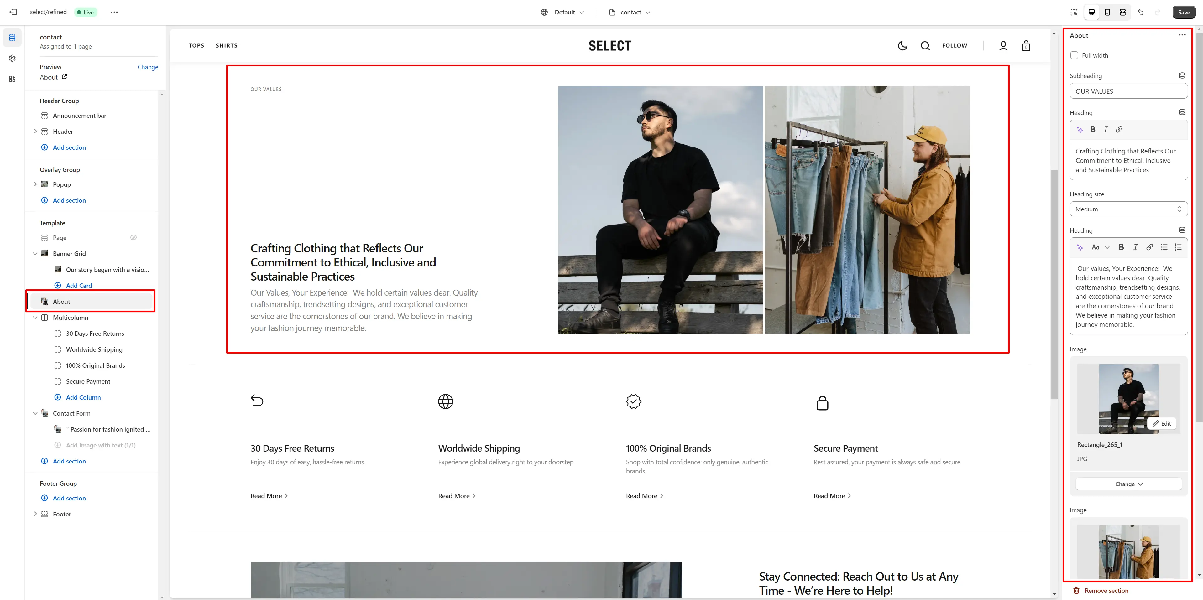
- Subheading allows you to set a subheading for the section.
- Heading allows you to set a heading for the section.
- Heading size selector field allows you to change the size of the section header.
- Description allows you to set a description for the section.
- Image allows you to set a image for the section.
- Image 2 allows you to set a second image for the section.
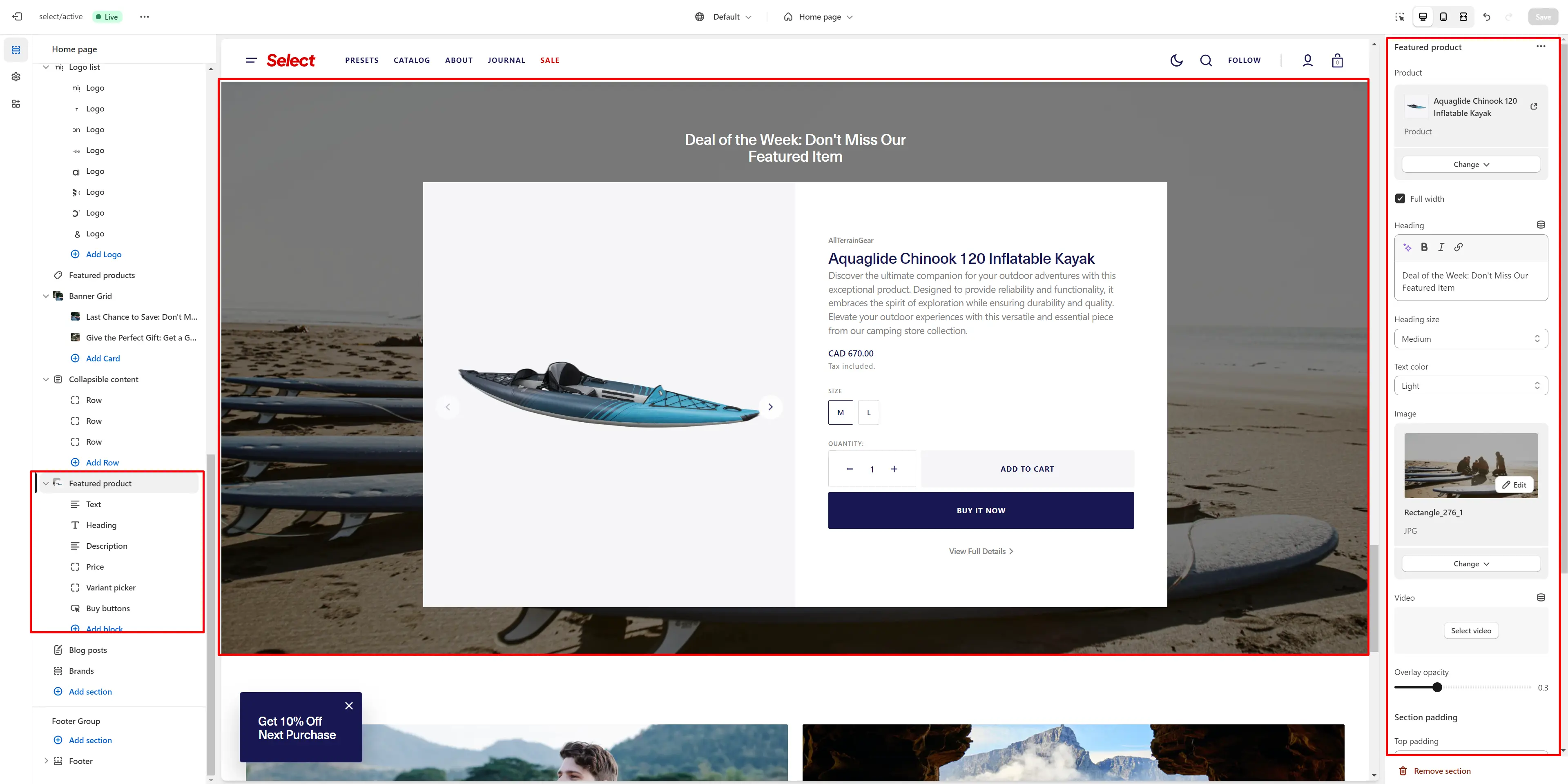
Featured Product
This section allows you to display a single product and highlight its key information.
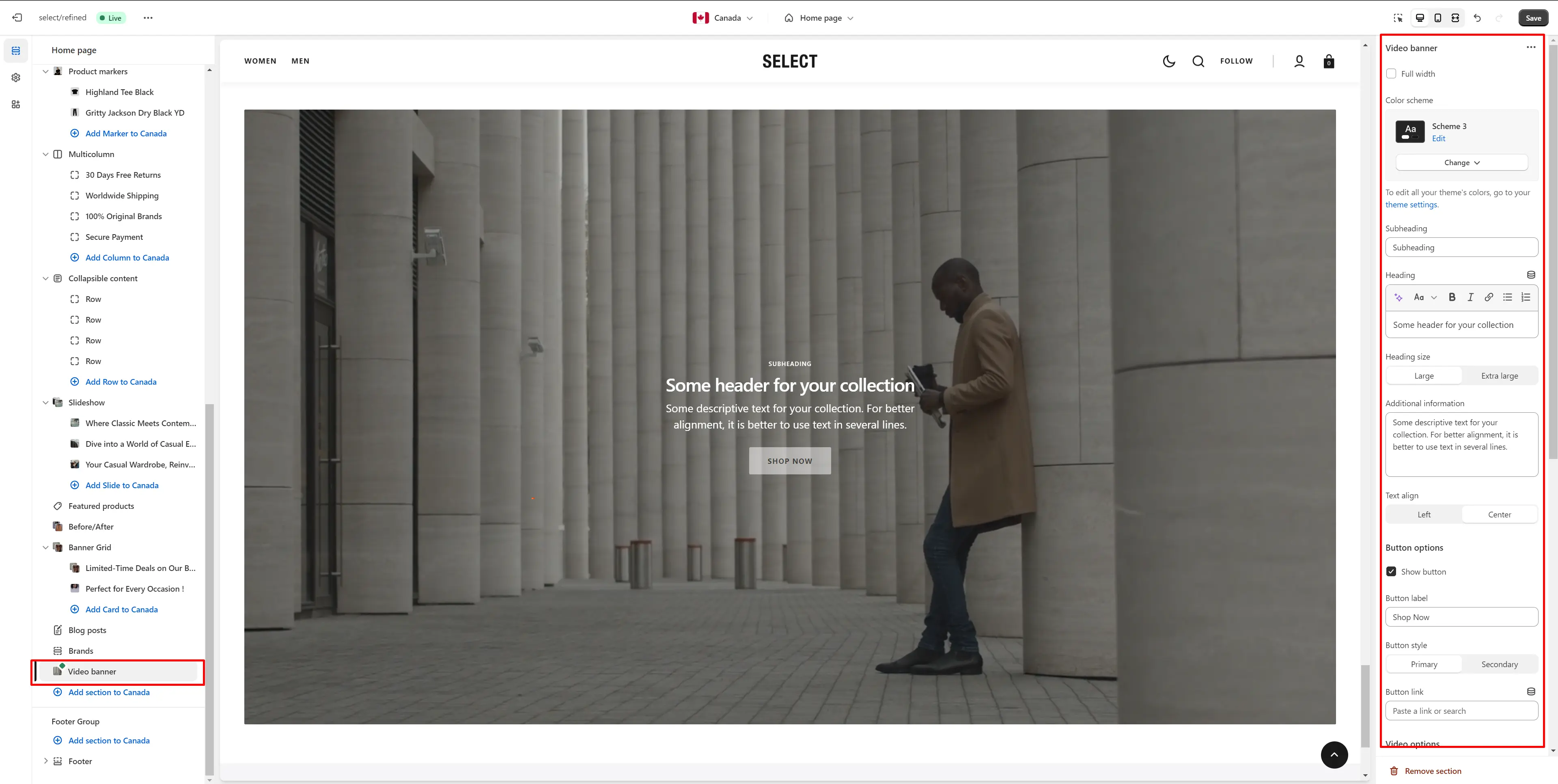
Video Banner
In this section, you can add and customize an autoplay video.
Page
Information on topic pages includes relevant details.
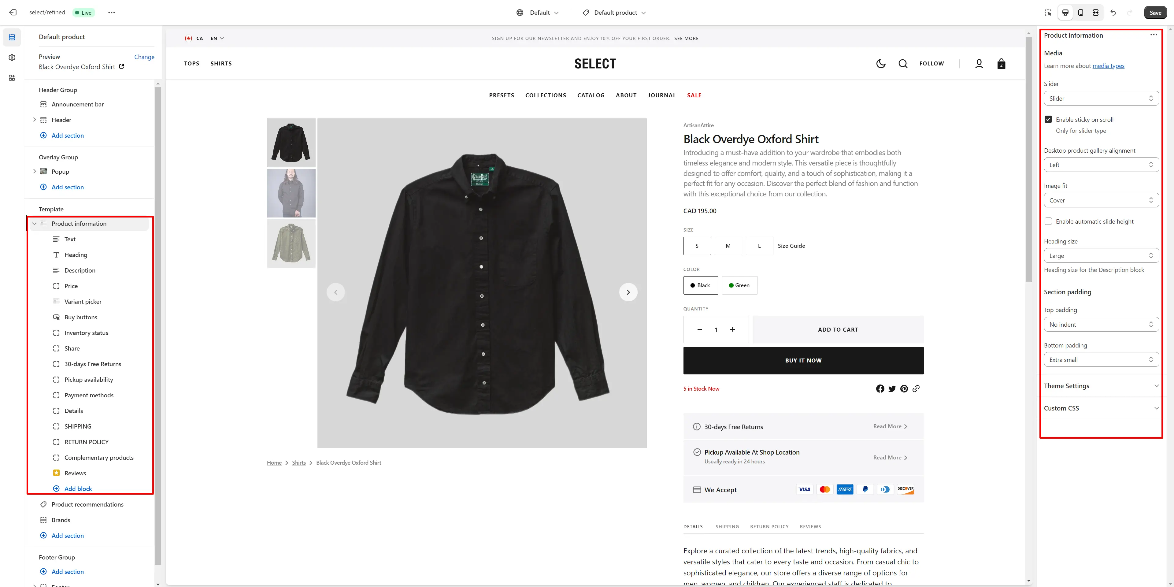
Product Page
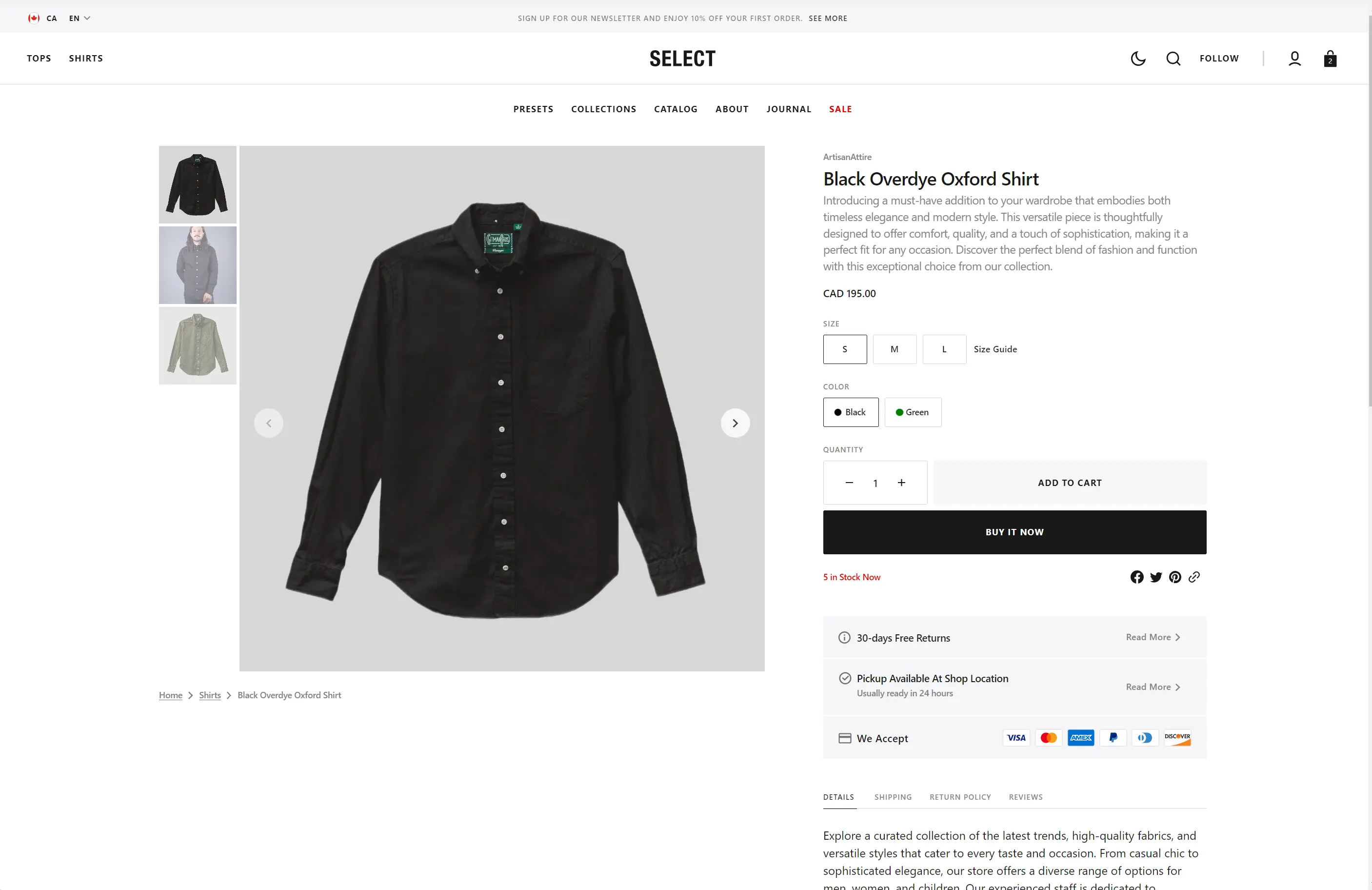
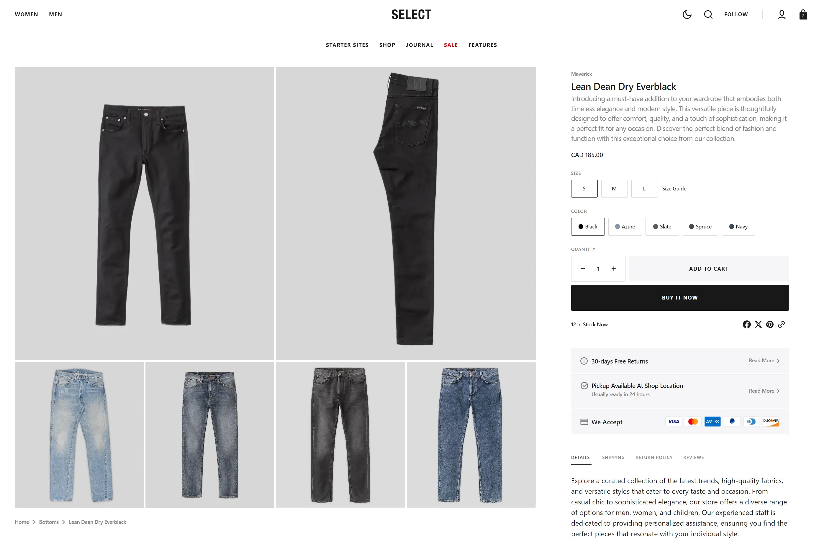
Product Information
- Desktop layout selector allows you to choose gallery type on desktop devices.
- Desktop product gallery alignment selector allows you to choose alignment type on desktop devices.
- Mobile product gallery alignment selector allows you to choose alignment type on mobile devices.
- Enable sticky on scroll makes the gallery stick to the page when scrolling up.
- Heading size selector field allows you to change the size of the section header.
- Block Pop-up allows you to enable and customize pop-up modals.
- Block Buy buttons option shows dynamic checkout buttons based on the payment methods available in your store, allowing customers to see their preferred option, such as PayPal or Apple Pay.
- Block Share allows enable links from the list.
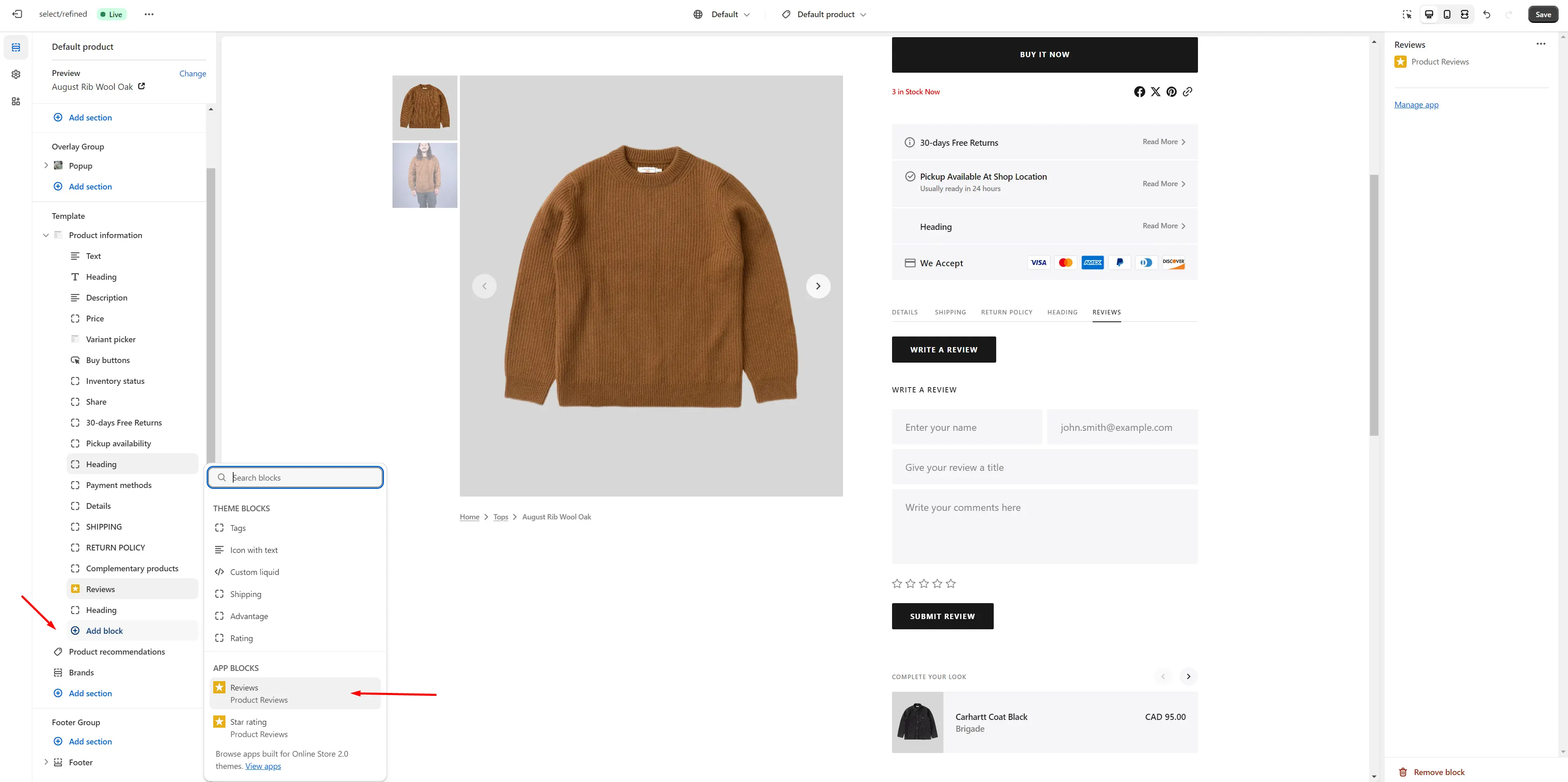
Product Reviews
To enable and manage customer reviews on your shop, follow these steps:
-
Install the Product Reviews app by Shopify from the Apps page in the Admin Panel.
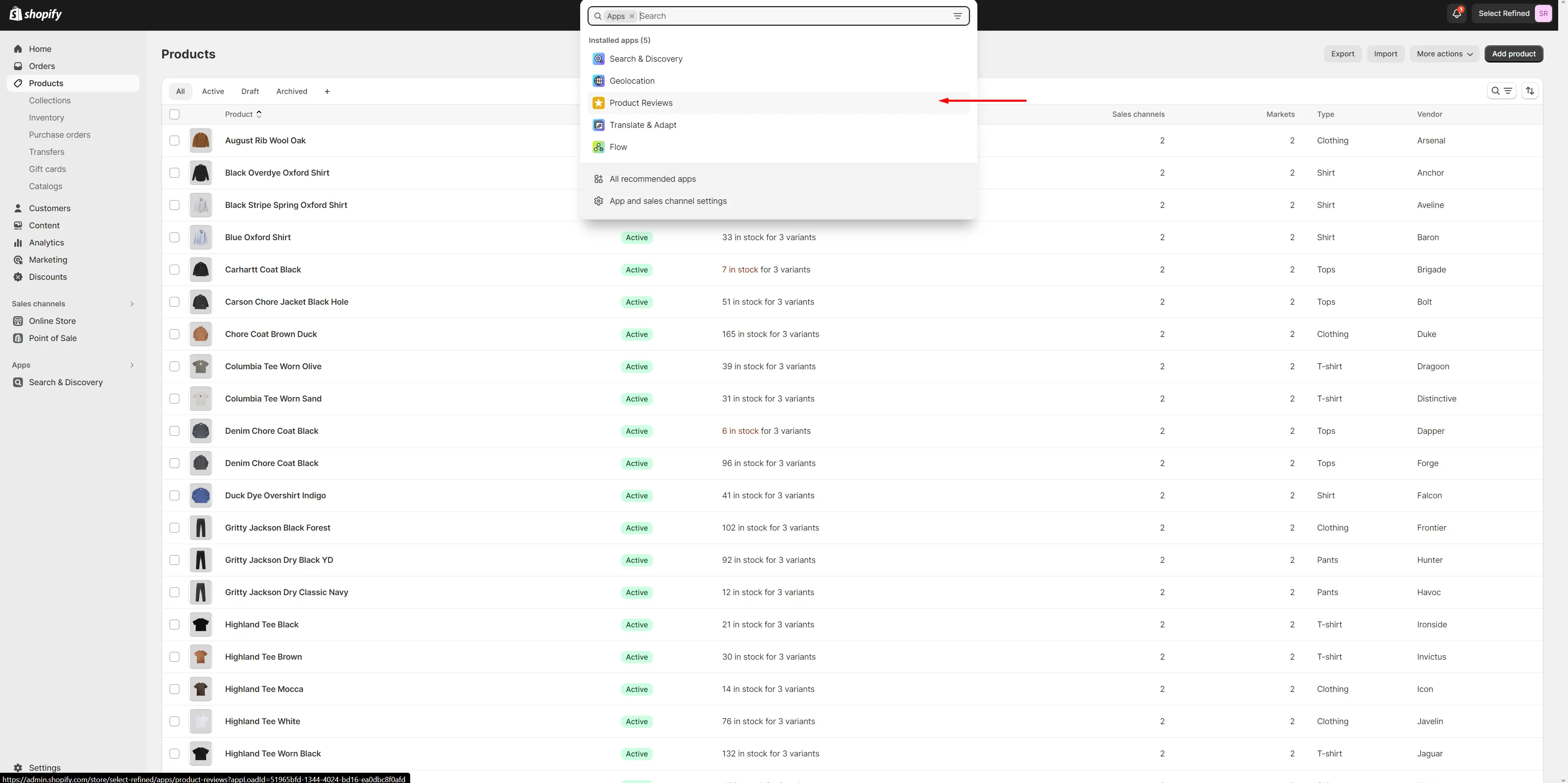
-
After installing the app, add the Rating and Reviews blocks to your Product page.
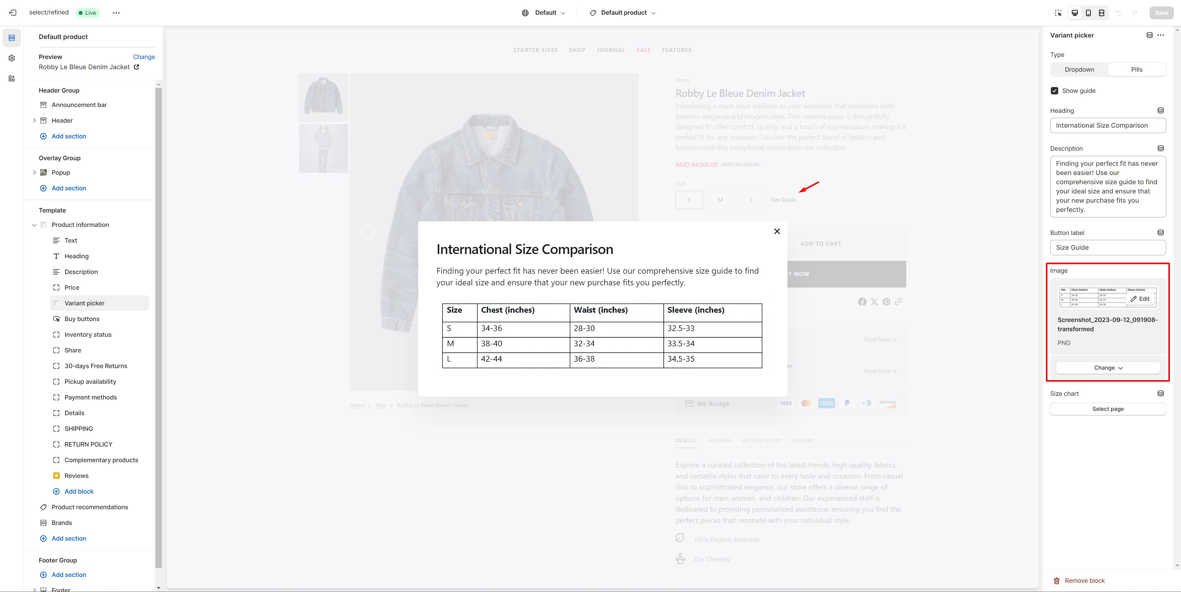
Size Chart
To add a Size Chart, follow these steps:
- Enable Show guide works only if the product has a Size variant.
-
Create new page with a table.
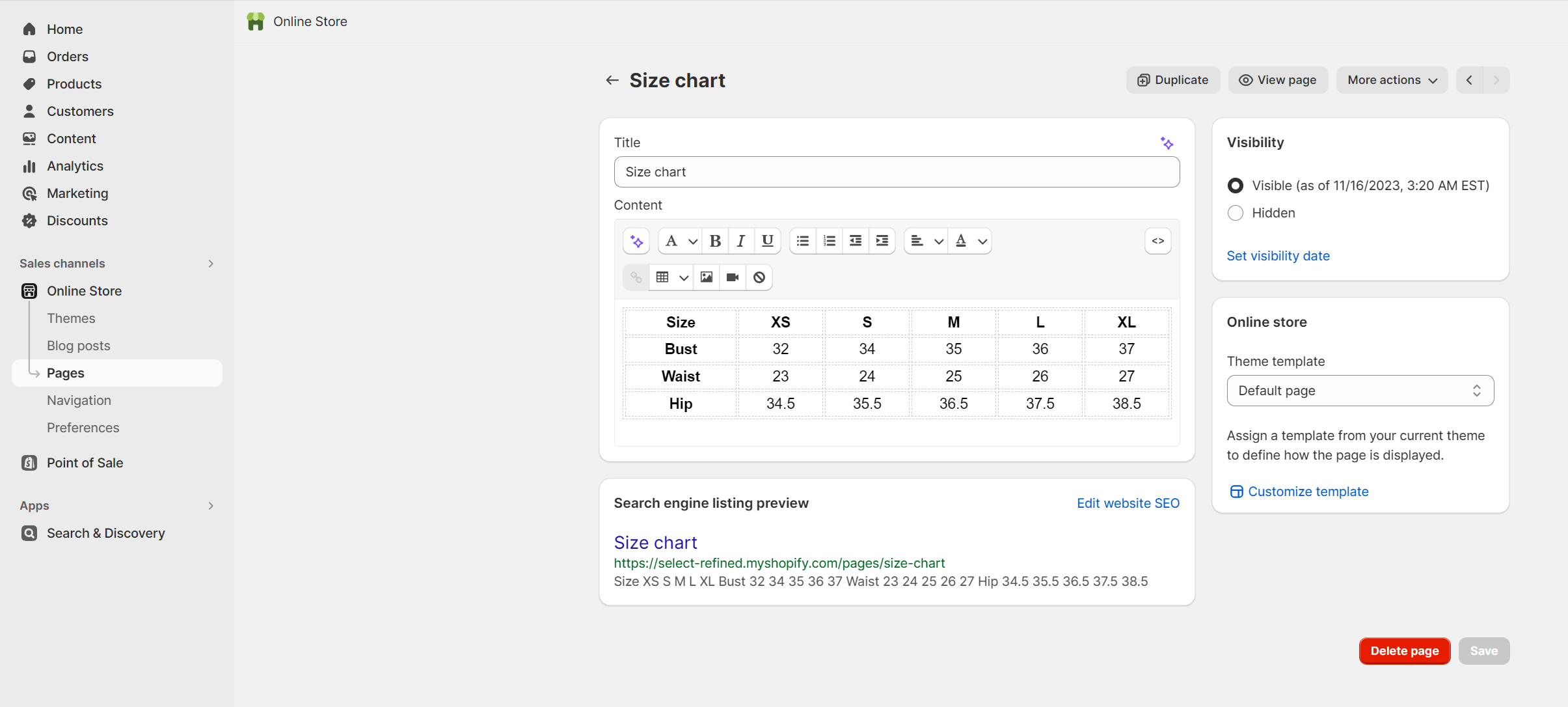
-
Select the "Size chart" page.
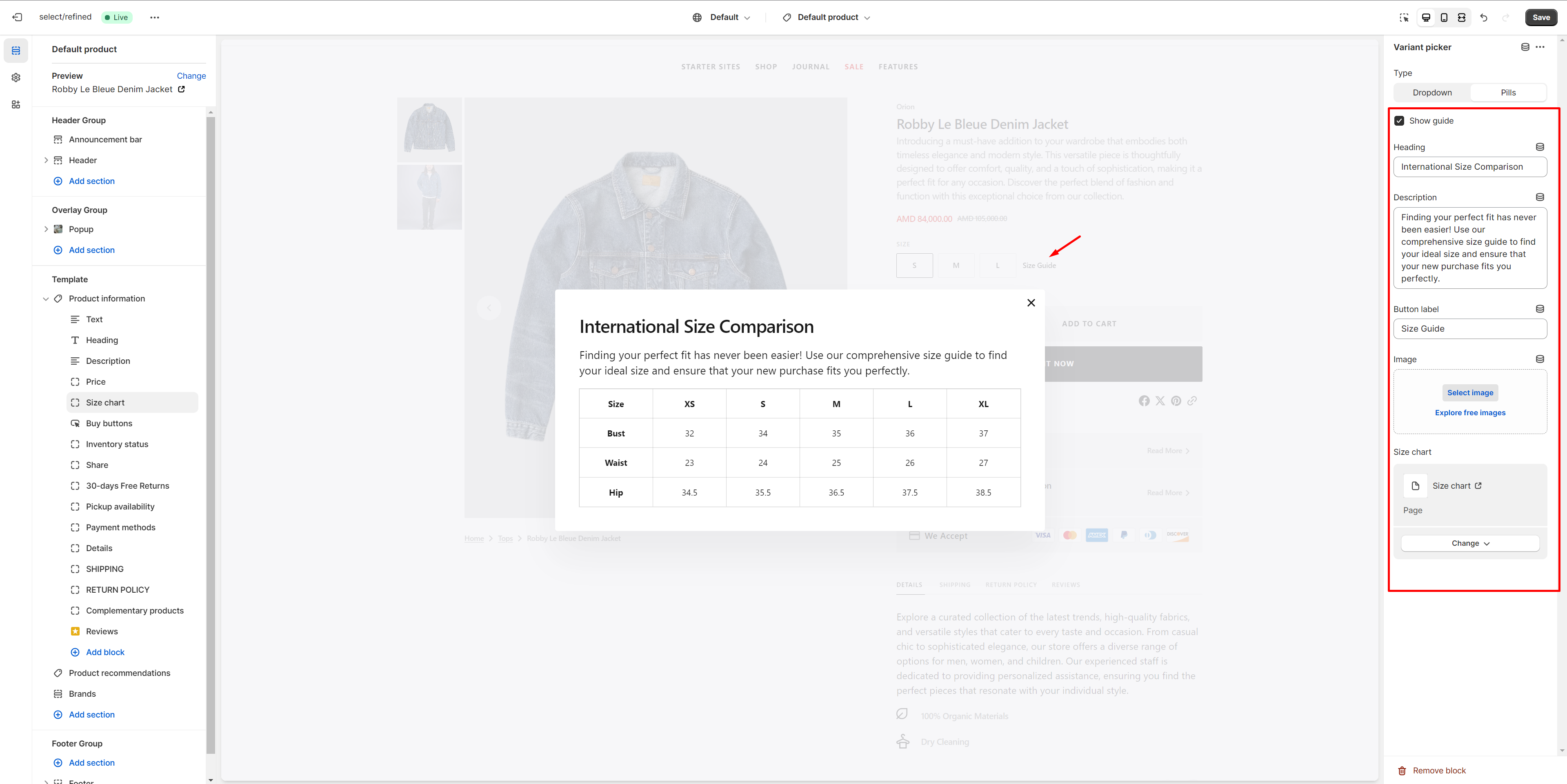
-
If you don't want to use the existing size chart, create a new page with a table or add an image.
Product Recommendations
Dynamic recommendations use order and product information to change and improve over time.
To add and edit product recommendations, follow these steps:
-
Install the Search & Discovery app by Shopify from the Apps page in the Admin Panel.
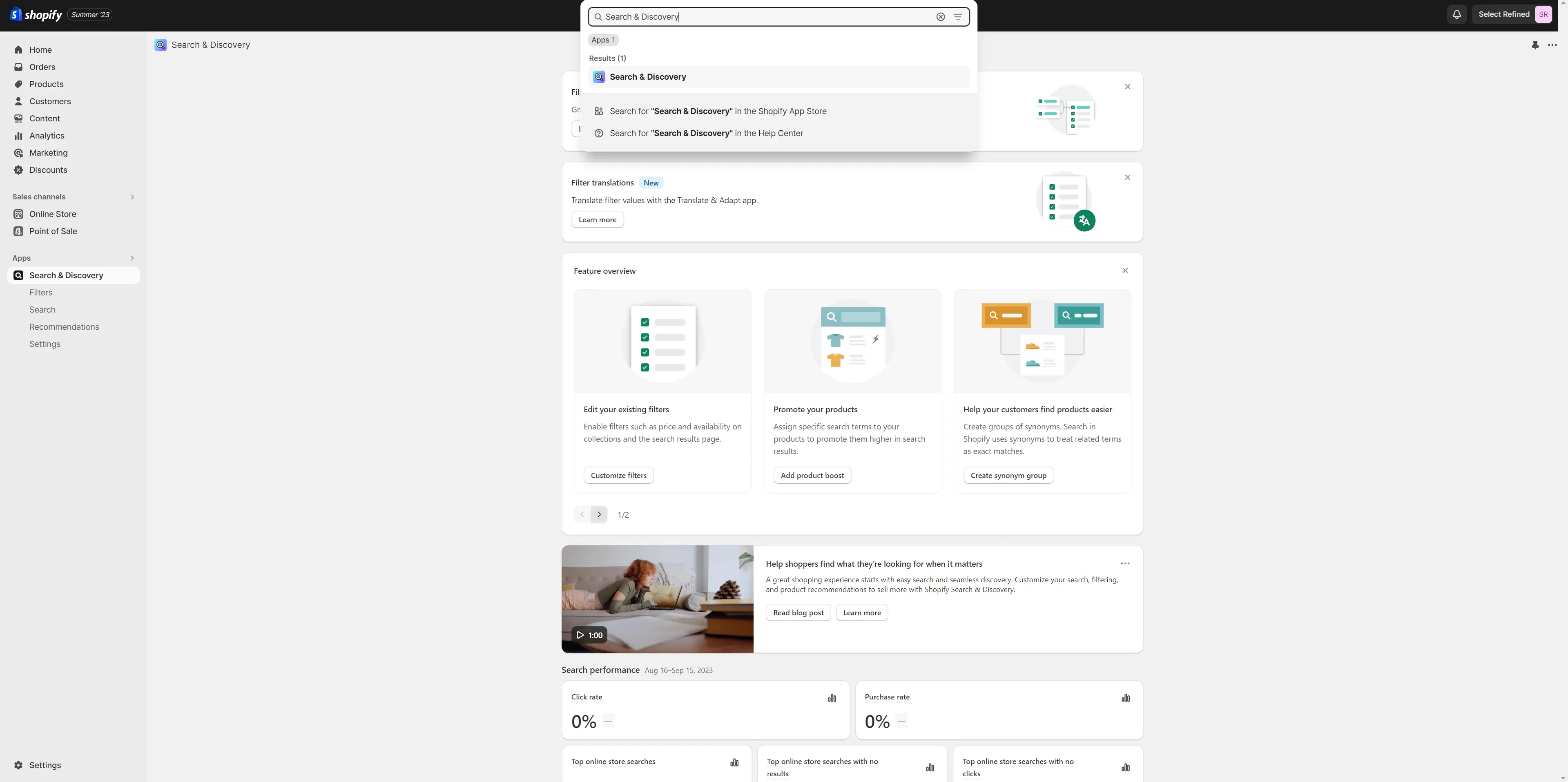
-
Once installed, open the app and follow the 'View recommendations'
link in the Feature overview section to add recommendations to your
products.
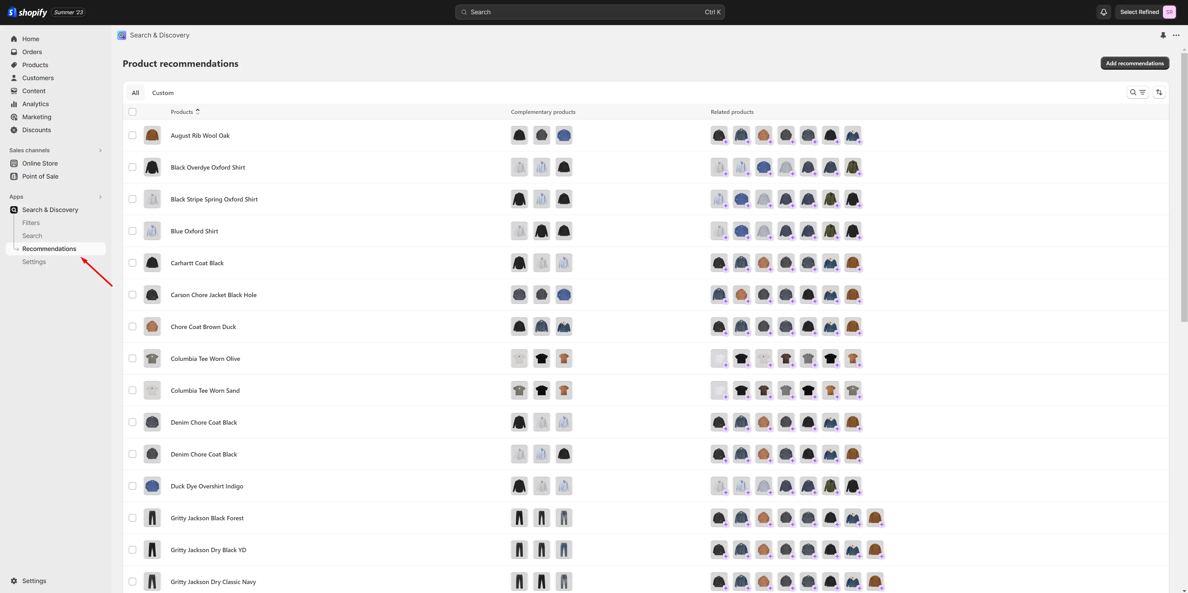
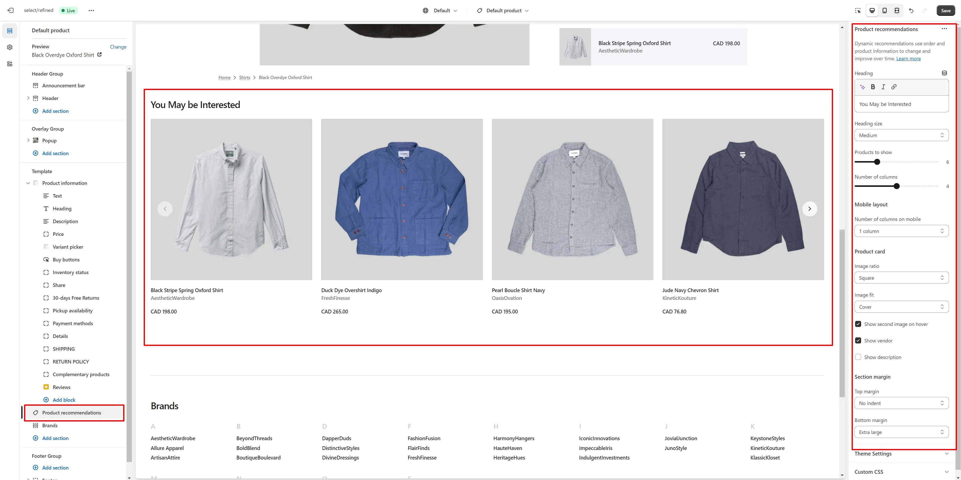
- Heading allows you to set a heading for the section.
- Heading size selector field allows you to change the size of the section header.
- Product card options allow you to customize product cards in the section
Collections Page
Collection Banner
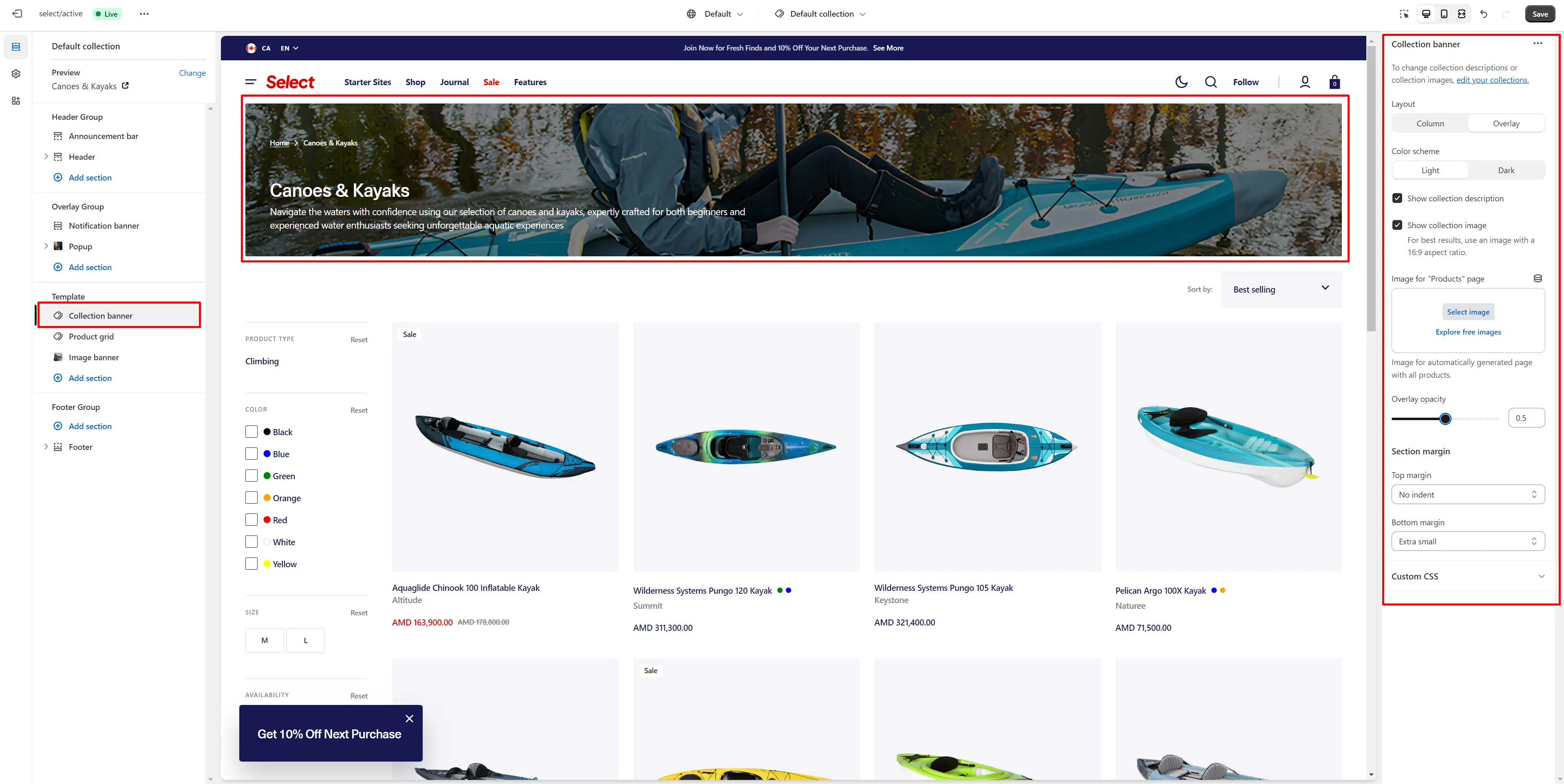
- Show collection description field turn on description display
- Show collection image field turn on image display
- Image for "Products" page Image for automatically generated page with all products
- Overlay opacity slider allows you to change the opacity of the overlay.
Product Grid
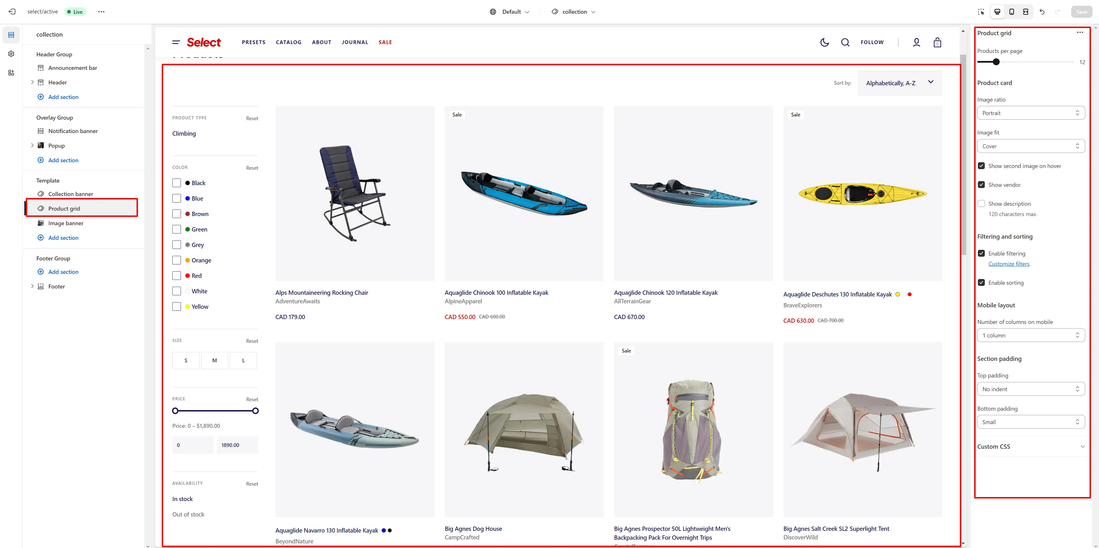
- Layout field allows you to select layout type
- Use Color scheme selector to change the color scheme.
- Products per page field sets the number of displayed cards
- Product card options allow you to customize product cards in the section
- Enable filtering field turn filtering
- Enable sorting field turn sorting
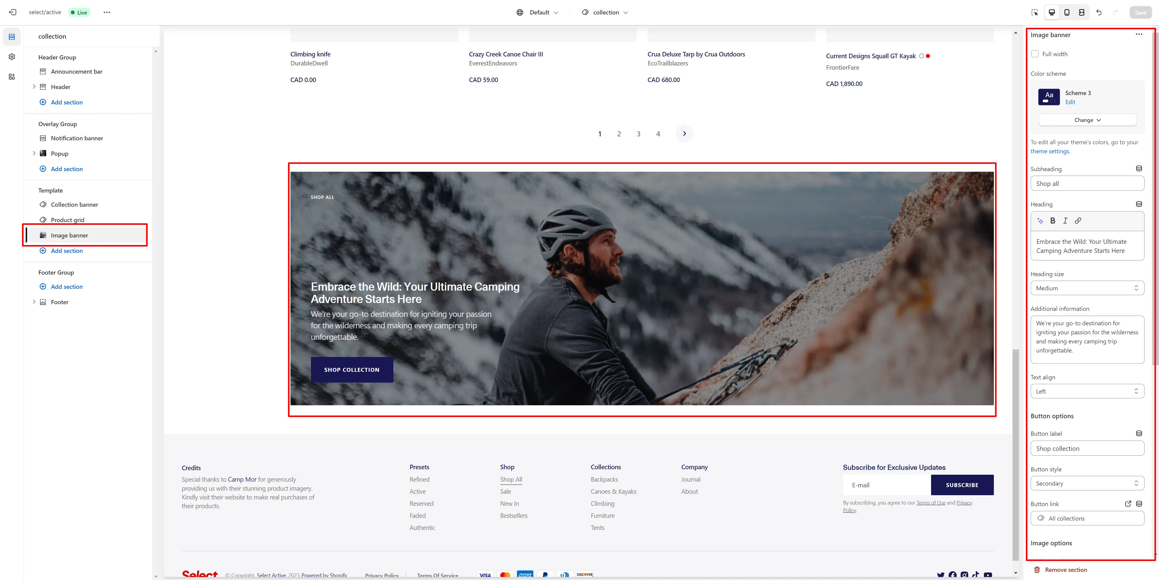
Image Banner
Collections List
Displays a list of all collections
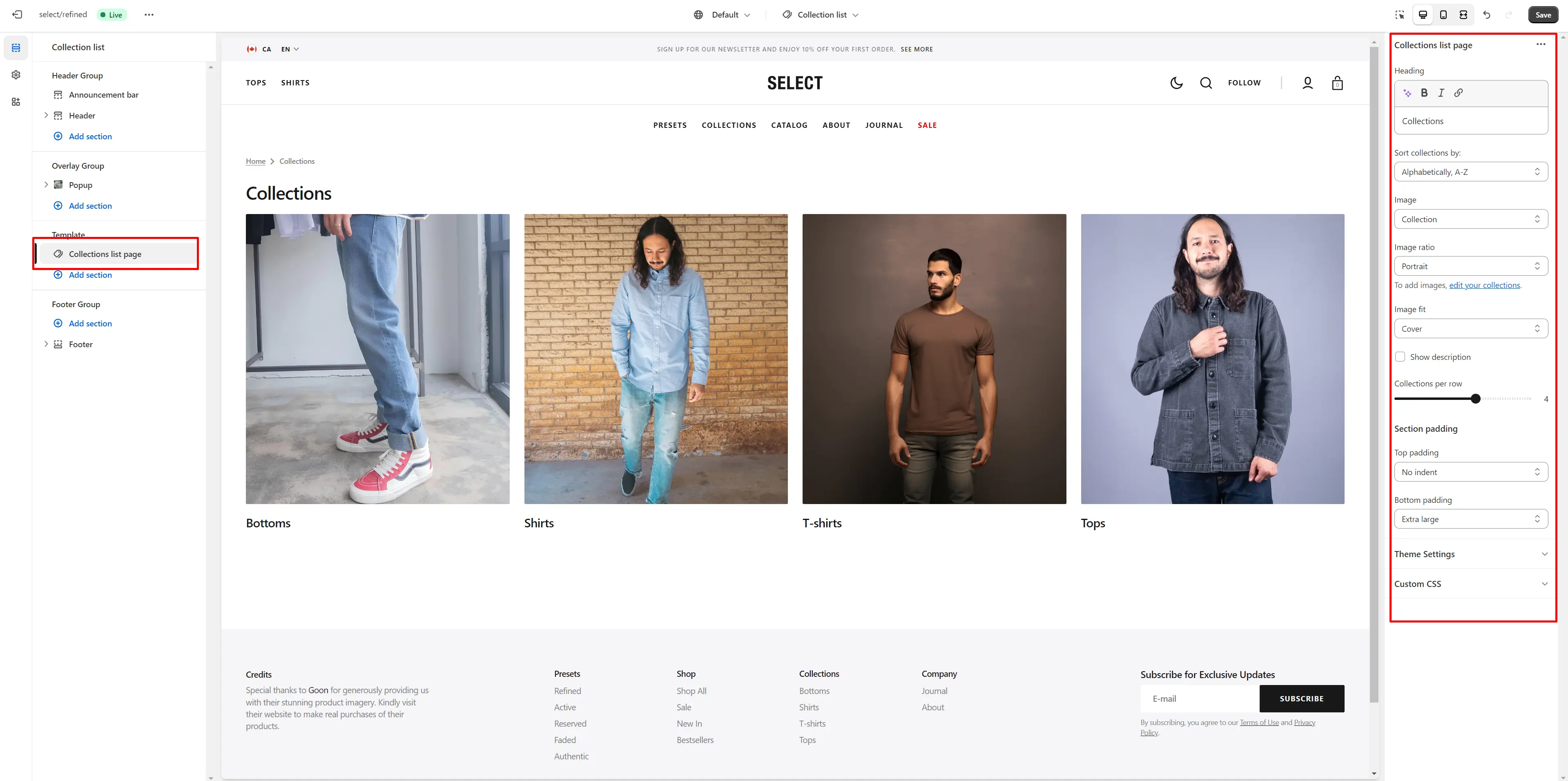
- Heading field sets a header section.
- Sort collections by filters the collections based on the specified parameters.
- Image field allows you to choose cover for collections items.
- Image ratio field allows you to choose the orientation of pictures for cards.
- Image fit field allows you to choose the fit of pictures for cards.
- Show description enables the display of the collection description.
- Collections per row slider allows you to change the number of collections per line only on desktop devices.
Cart
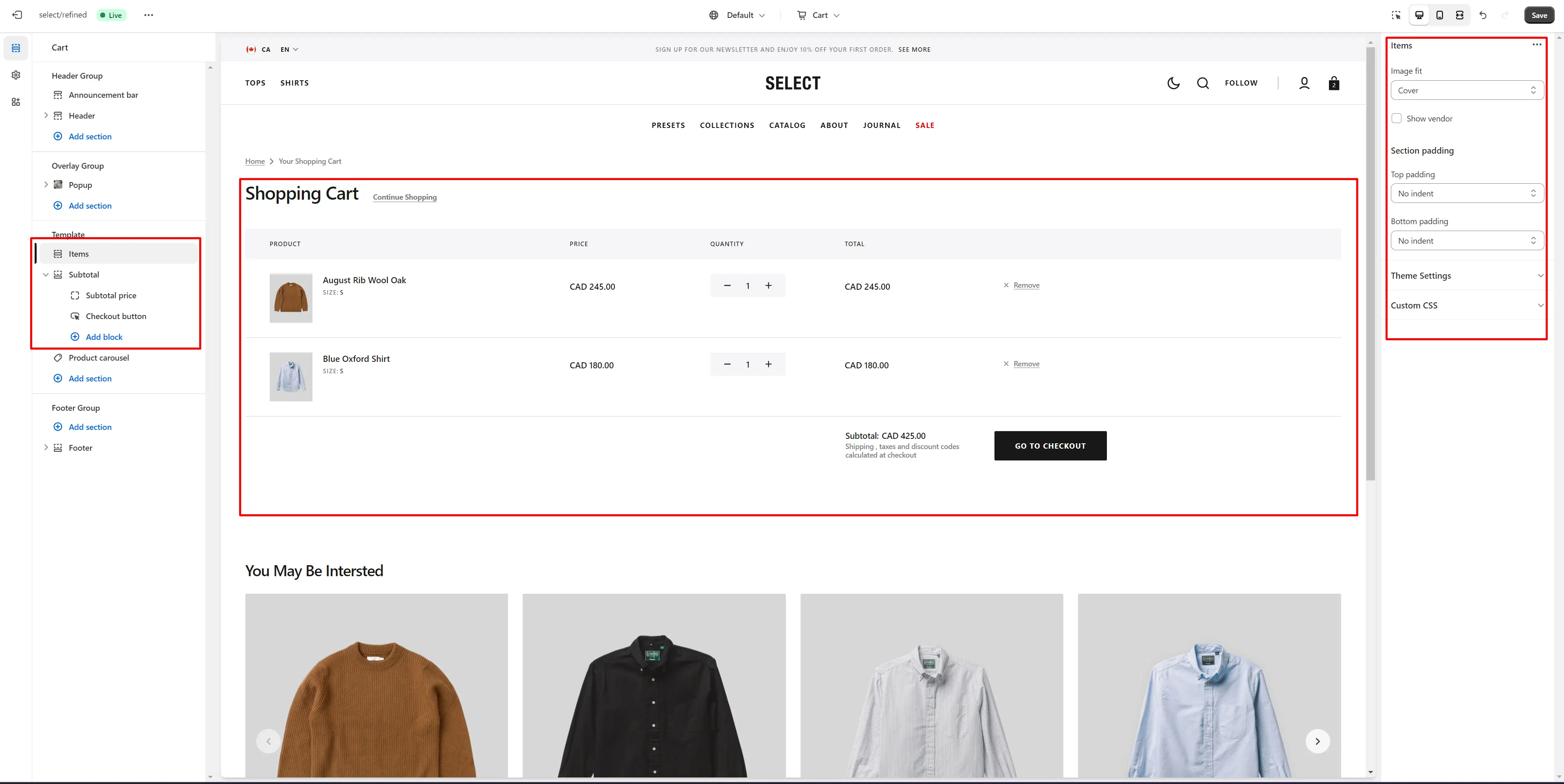
- Image fit field allows you to choose the fit of pictures for cards.
- Show vendorenables the display of the vendor.
- Subtotal option Enable cart note field sets note.
Free Shipping
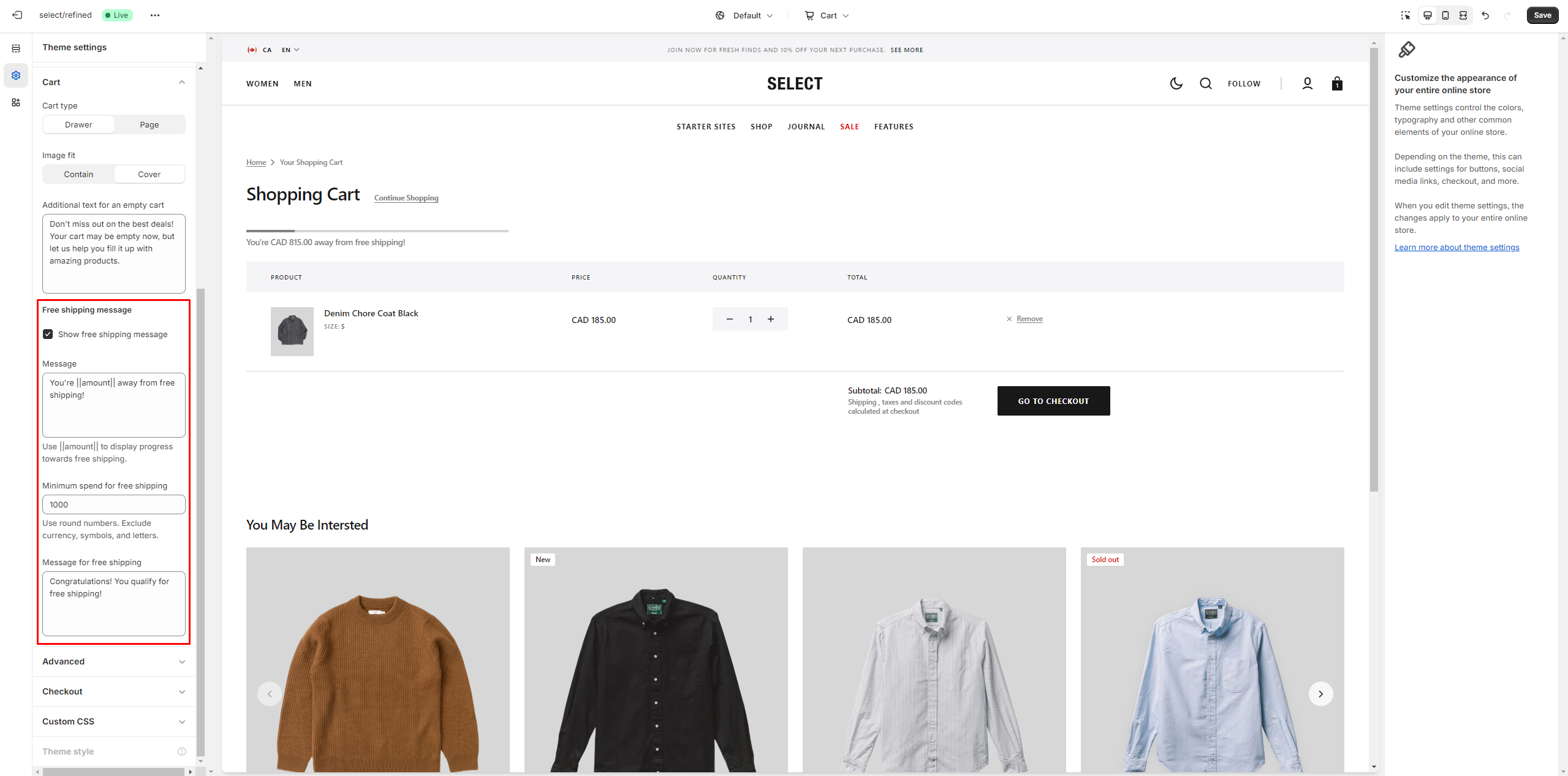
To avoid issues in stores with multiple languages, keep the text '{amount}' untranslated.
Blog
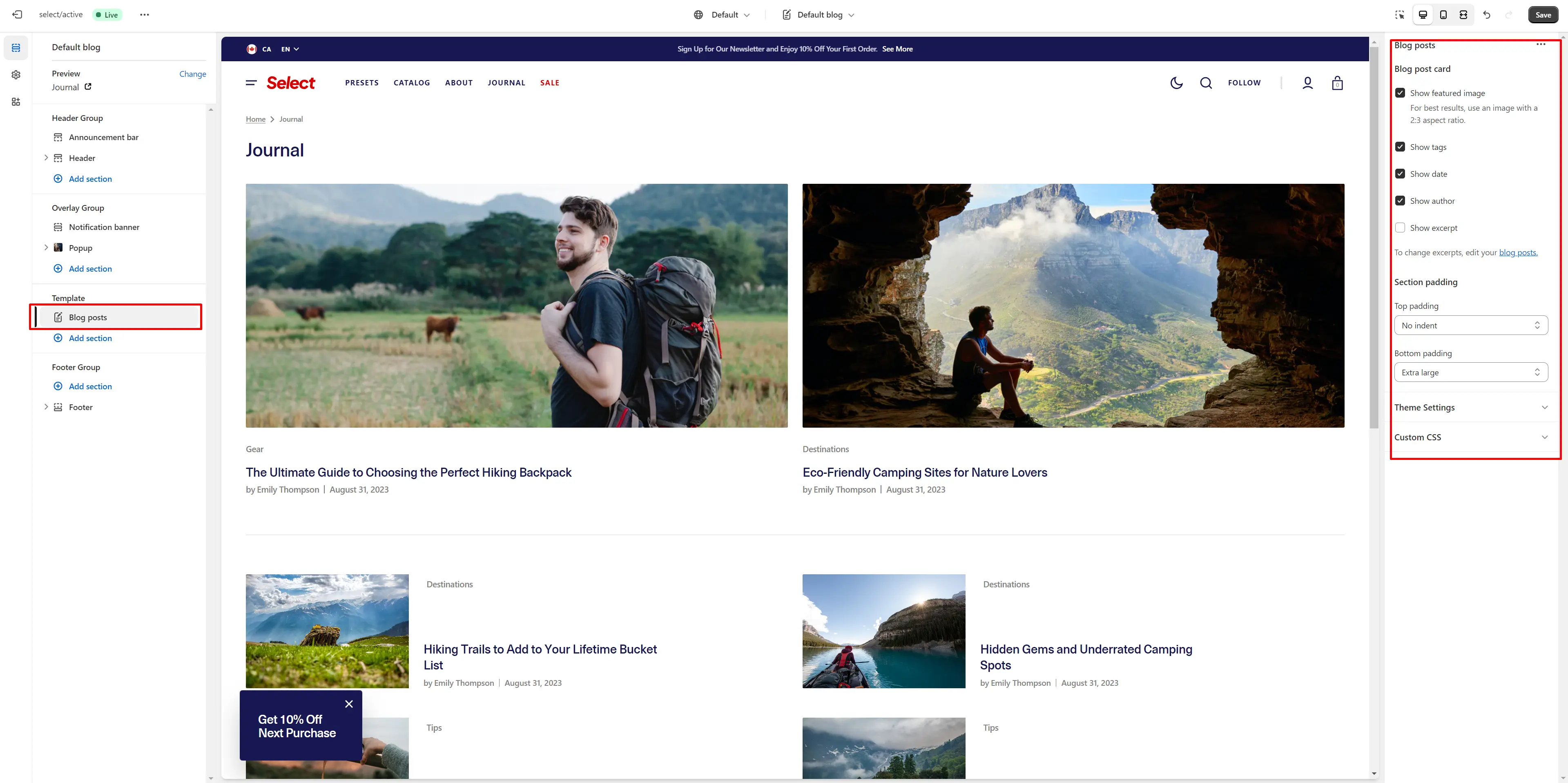
- Show featured image field enables the display of an image for the blog post.
- Show tags field enables the display of tags for the blog post.
- Show date field enables the display of the date for the blog post.
- Show author field enables the display of the author for the blog post.
- Show excerpt field enables the display of the excerpt for the blog post.
Blog Post
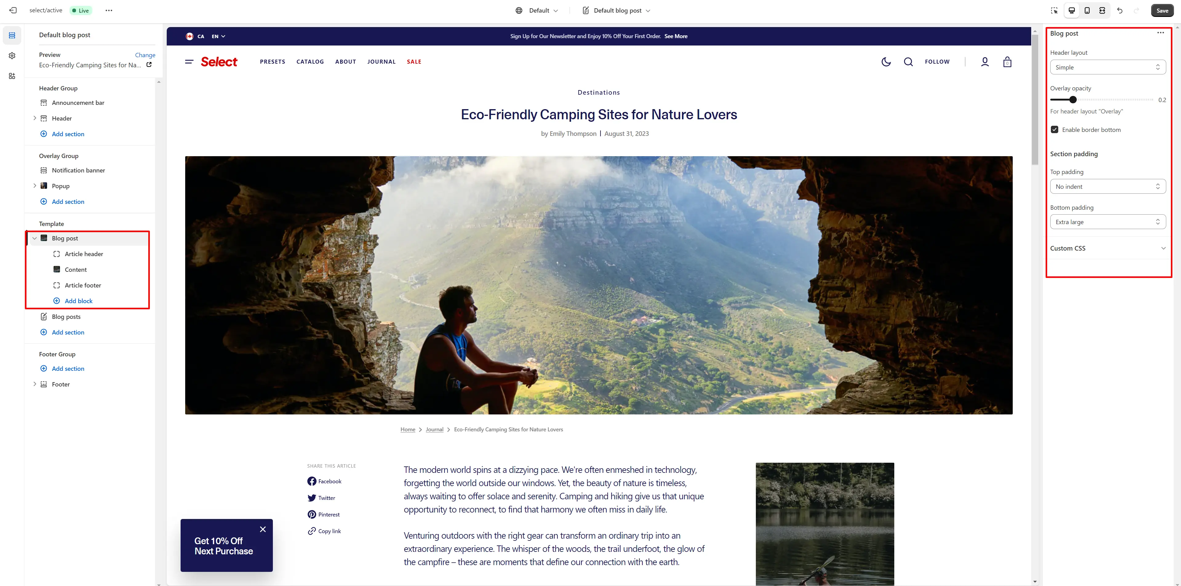
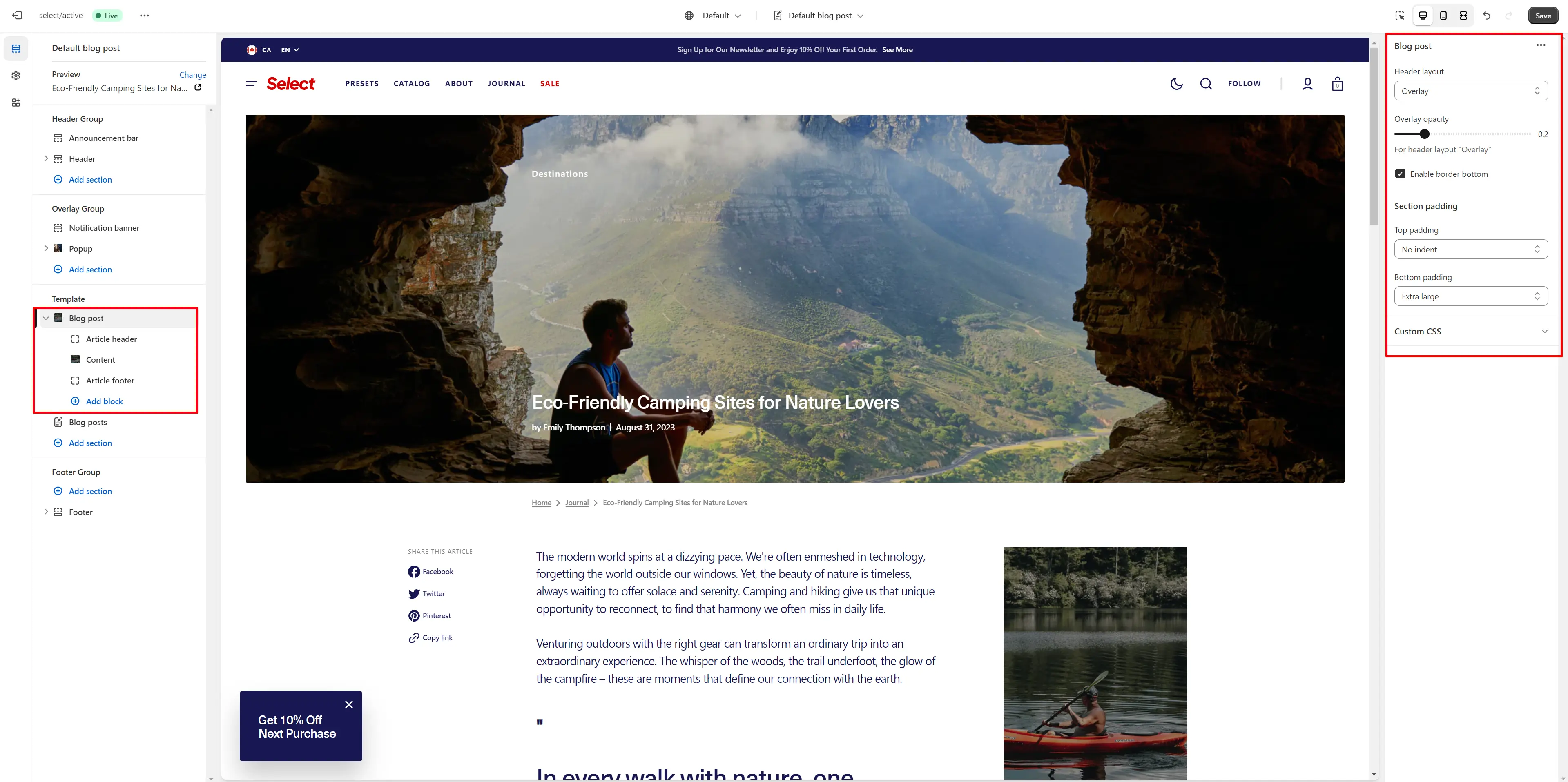
- Header layout allows you to select the location of the image.
- Overlay opacity slider allows you to change the opacity of the overlay.
- Enable border bottom field allows you to connect the lines under the section.
- Block Article header option Show tags field enables the display of tags for the blog post.
- Block Article header option Show excerpt field enables the display of the excerpt for the blog post.
- Block Article header option Show date field enables the display of the date for the blog post.
- Block Article header option Show author field enables the display of the author for the blog post.
- Block Article header option Image author field allows you to set an image.
- Block Article header option Featured image height field allows you to select an image ratio.
- Block Content option Show Share block allows enable links from the list.
- Block Content option Promo block allows you to add image and text
- Block Article footer option Show date field enable date for blog post.
- Block Article footer option Show author field enable author for blog post.
- Block Article footer option Image author field allows you to set an image.
- Block Article footer option Share allows enable links from the list.
About
Importing our demos
You can also copy the structure of any of our 5 demos in a few steps.
- Download the settings file to copy the demo settings from there.
-
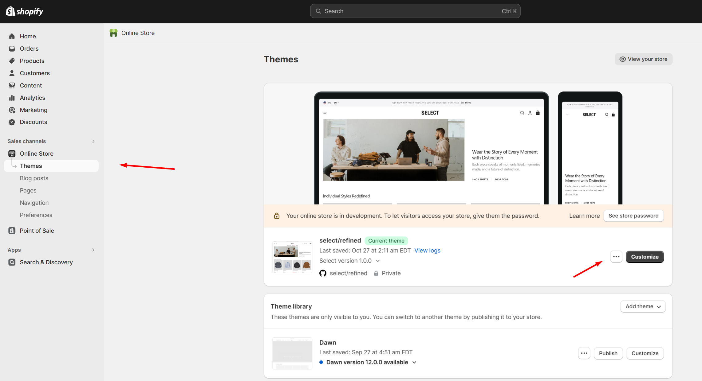
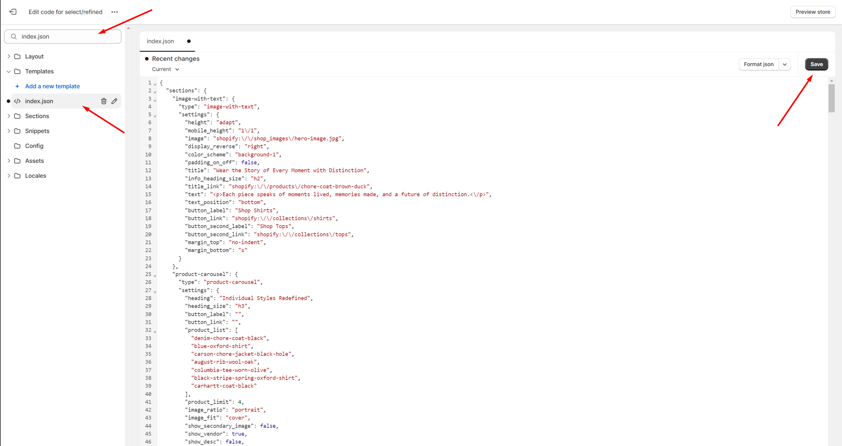
Go to section "Online Store >> Themes" your store. Click on the three dots button of your theme.
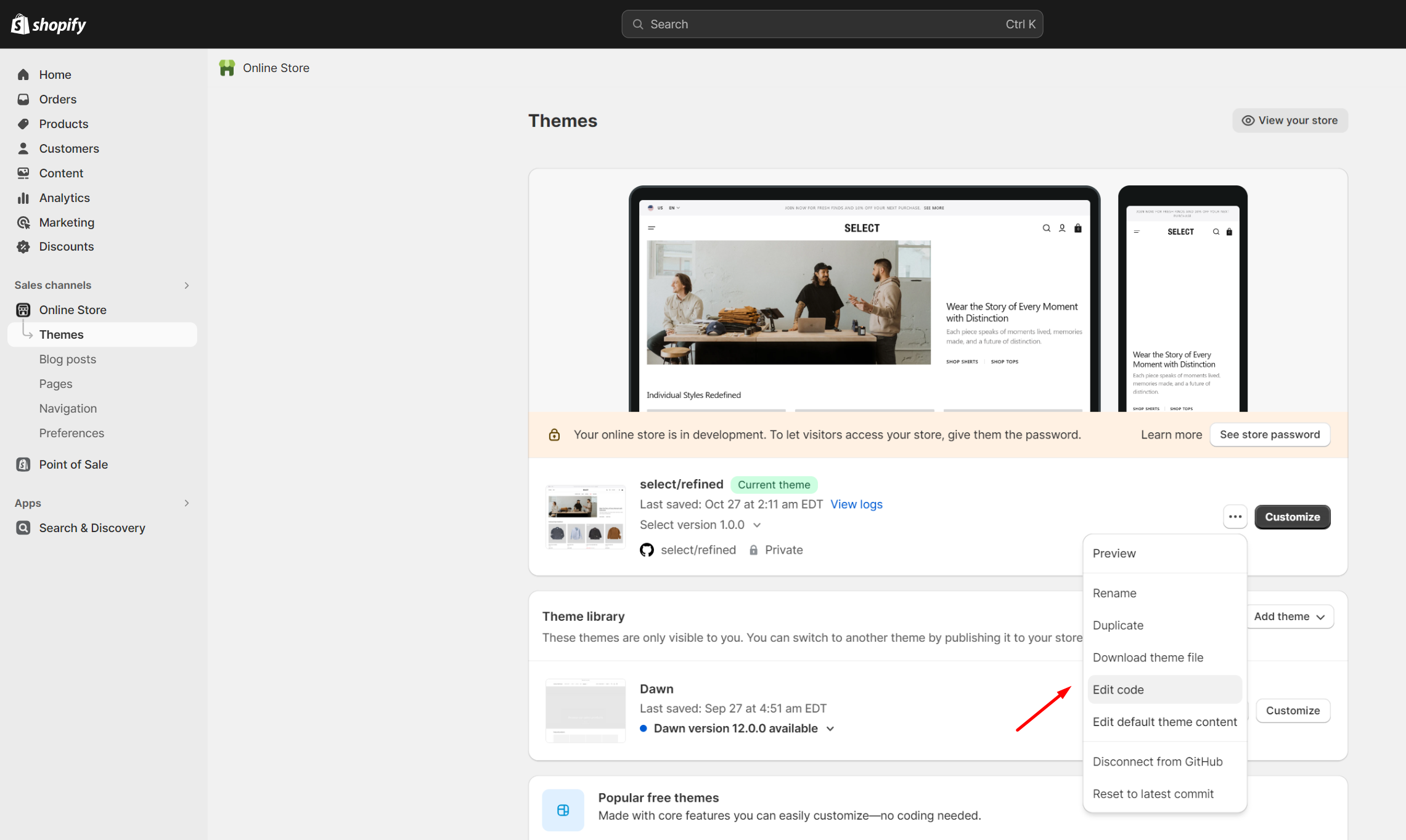
-
Go to the code editor by clicking the edit code button.
-
In the code editor, search for the file "index.json" and change the code to the demo code you want to transfer. Click "save" to save your changes.
Demos Structure
Click on the demo name to download the file with the appropriate structure.
Support
You can ask any questions about the theme and our support agent will help you within 24 hours on business days.
Visit Help Center View Terms & Conditions