Outsiders Documentation
General Settings
These settings are used across almost all sections.
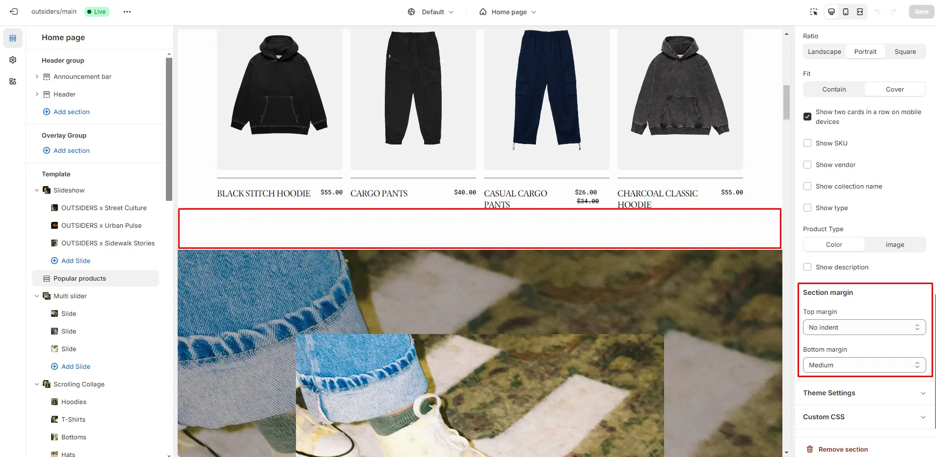
Section Margin
Allows you to adjust the top and bottom margins in the section:
- Top margin slider allows you to change the top margin in the section.
- Bottom margin slider allows you to change the bottom margin in the section.
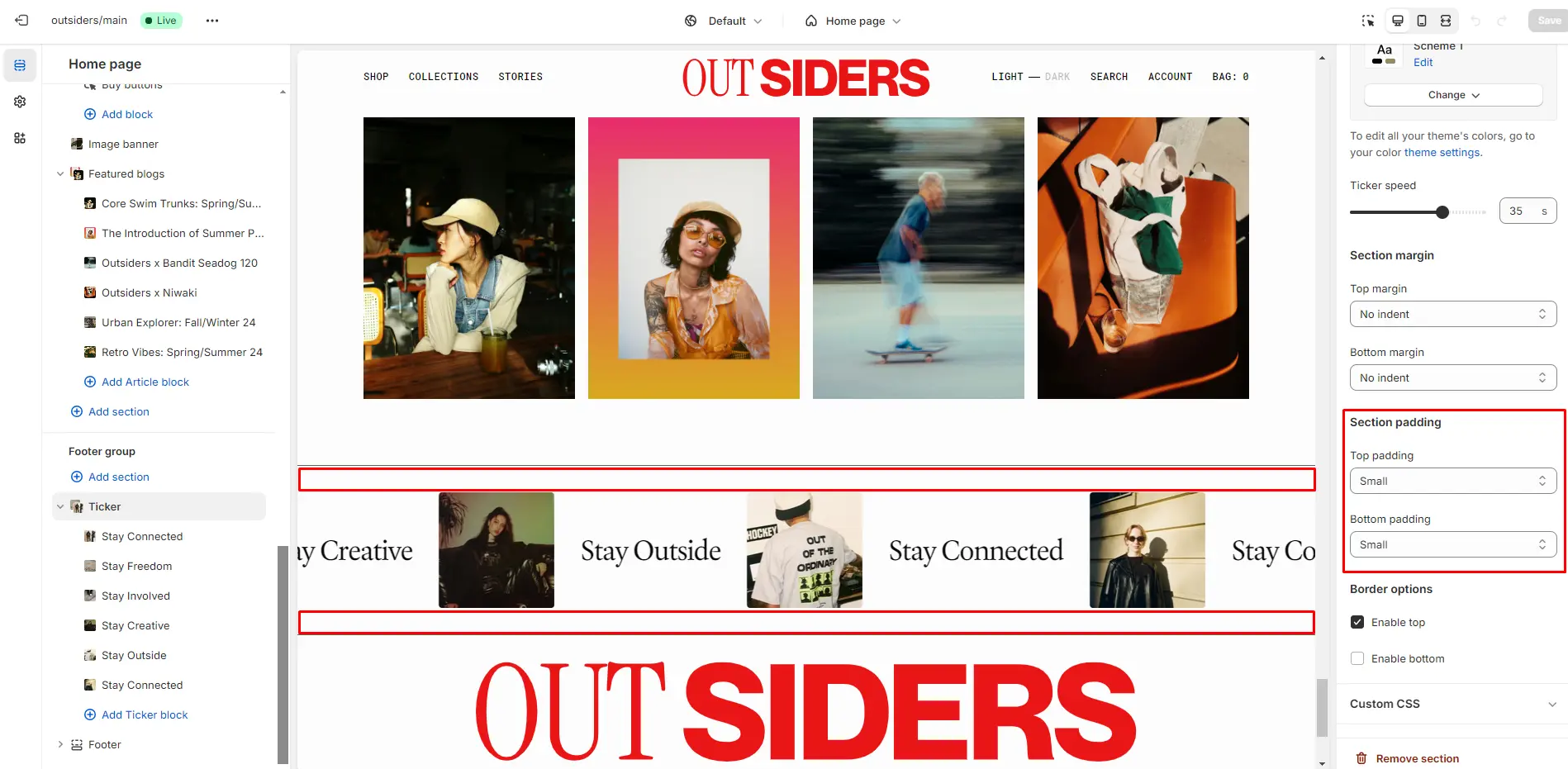
Section Padding
Allows you to change the top and bottom padding in the section:
- Top padding slider allows you to change the top padding in the section.
- Bottom padding slider allows you to change the bottom padding in the section.
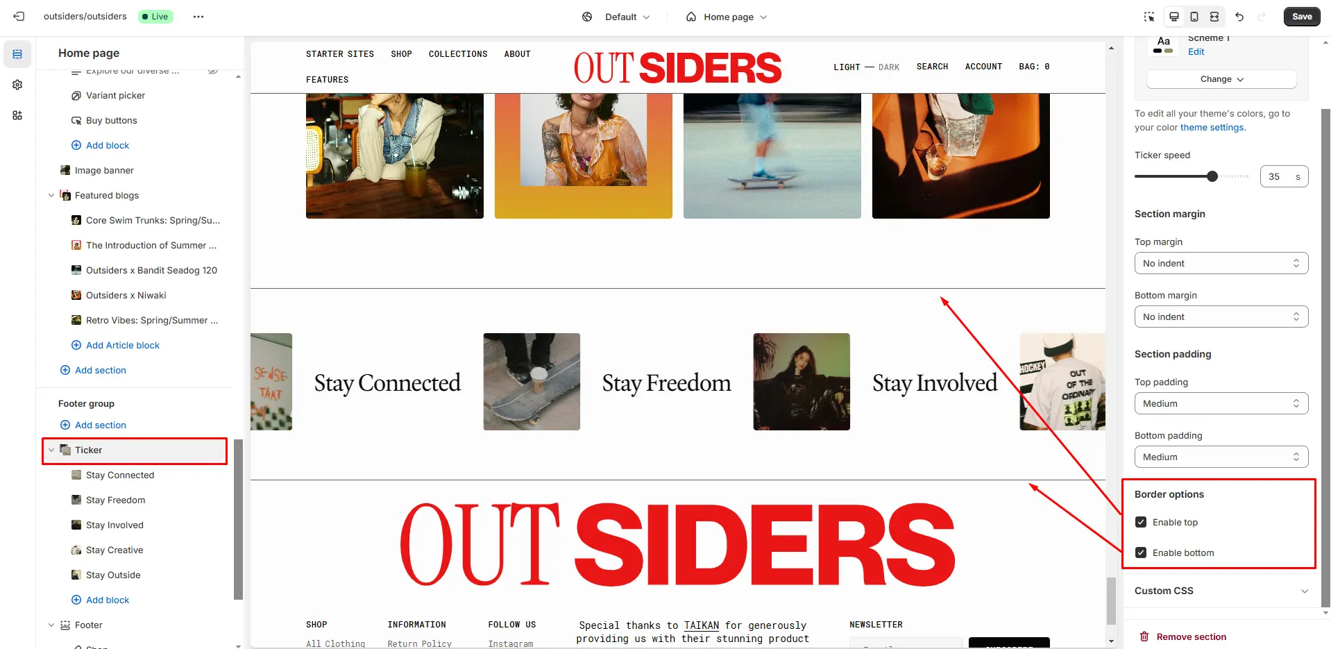
Section Borders
To enable top and bottom borders in the section, follow these steps:
- Enable top field enables a line above the section.
- Enable bottom field enables a line below the section.
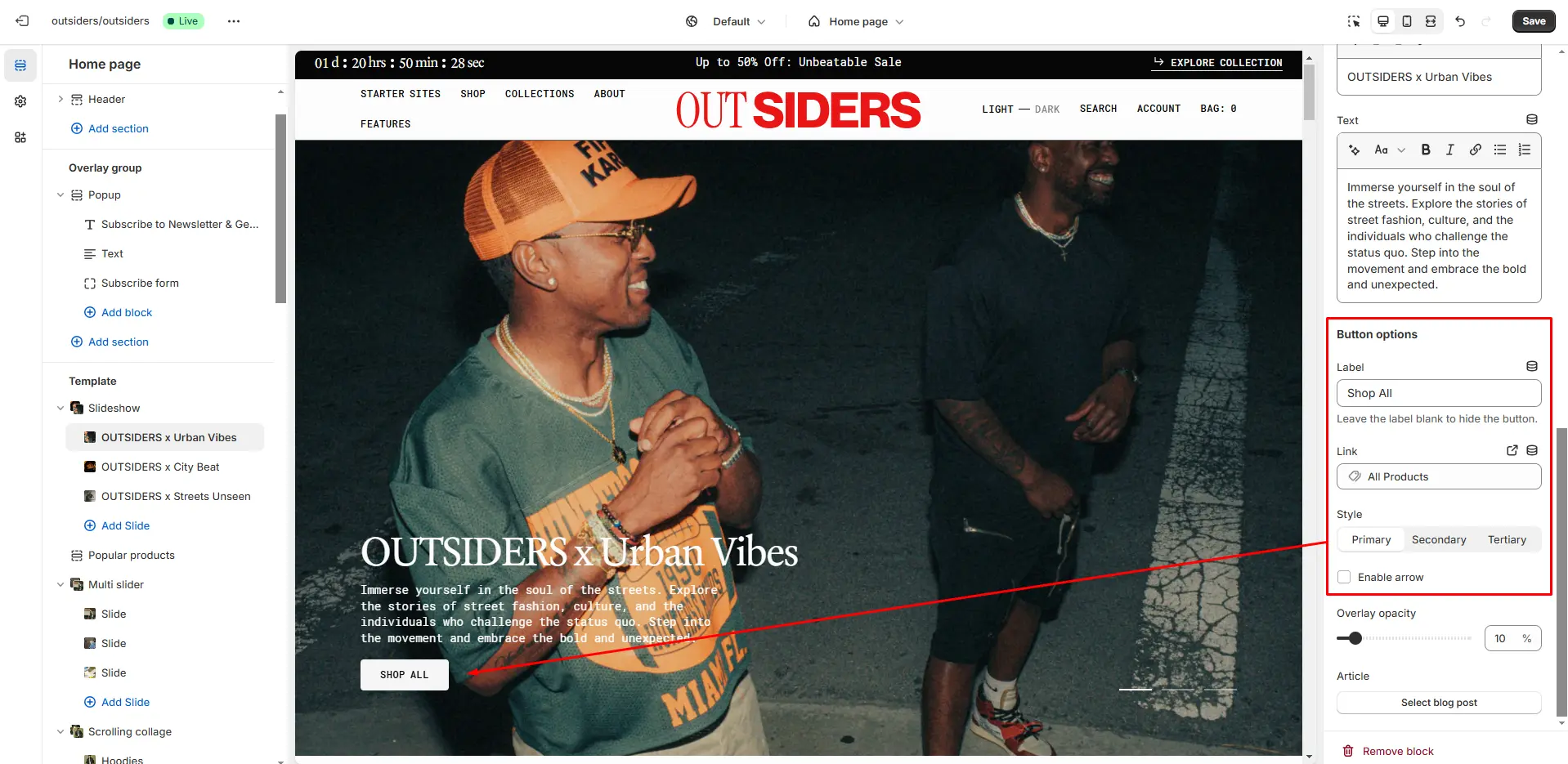
Buttons
Customize the button options to suit your design and functionality needs.
- Button label field sets the button's label.
- Button link field allows you to add a link to any source.
- Button style selector to change the button style.
- Enable arrow field enables an arrow in the button.
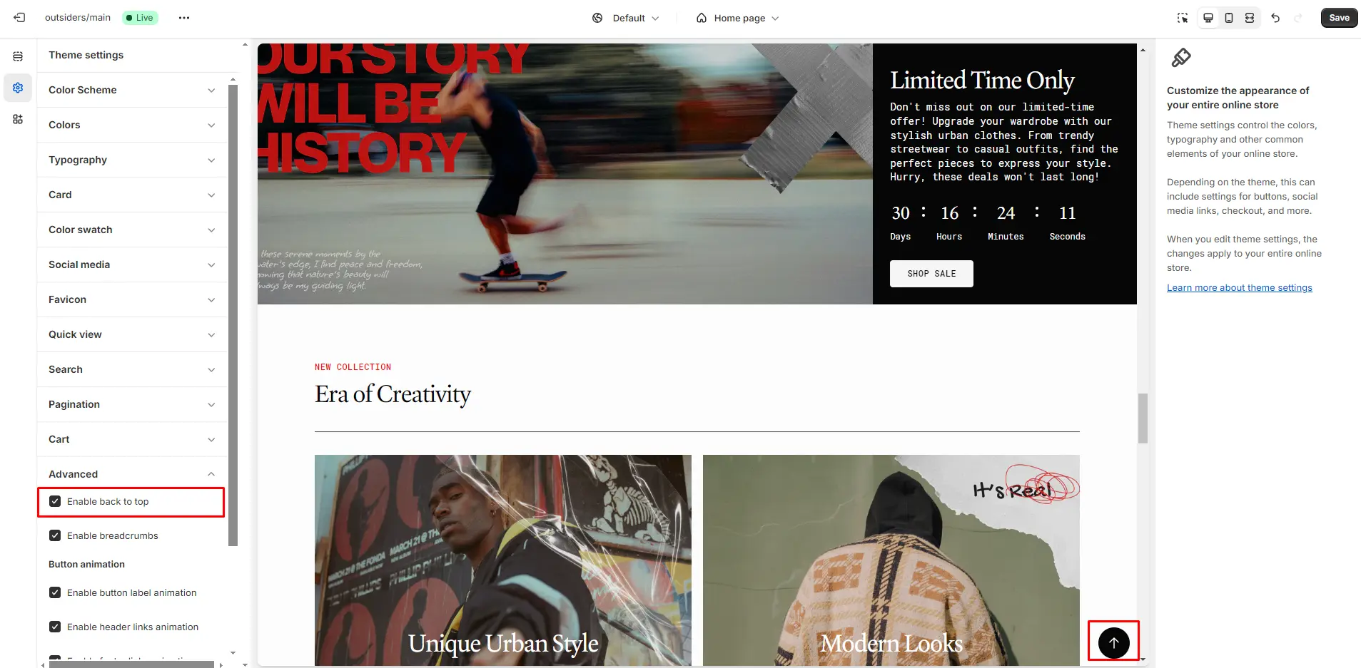
Back to Top
To enable Back to Top button, navigate to Theme settings > Advanced.
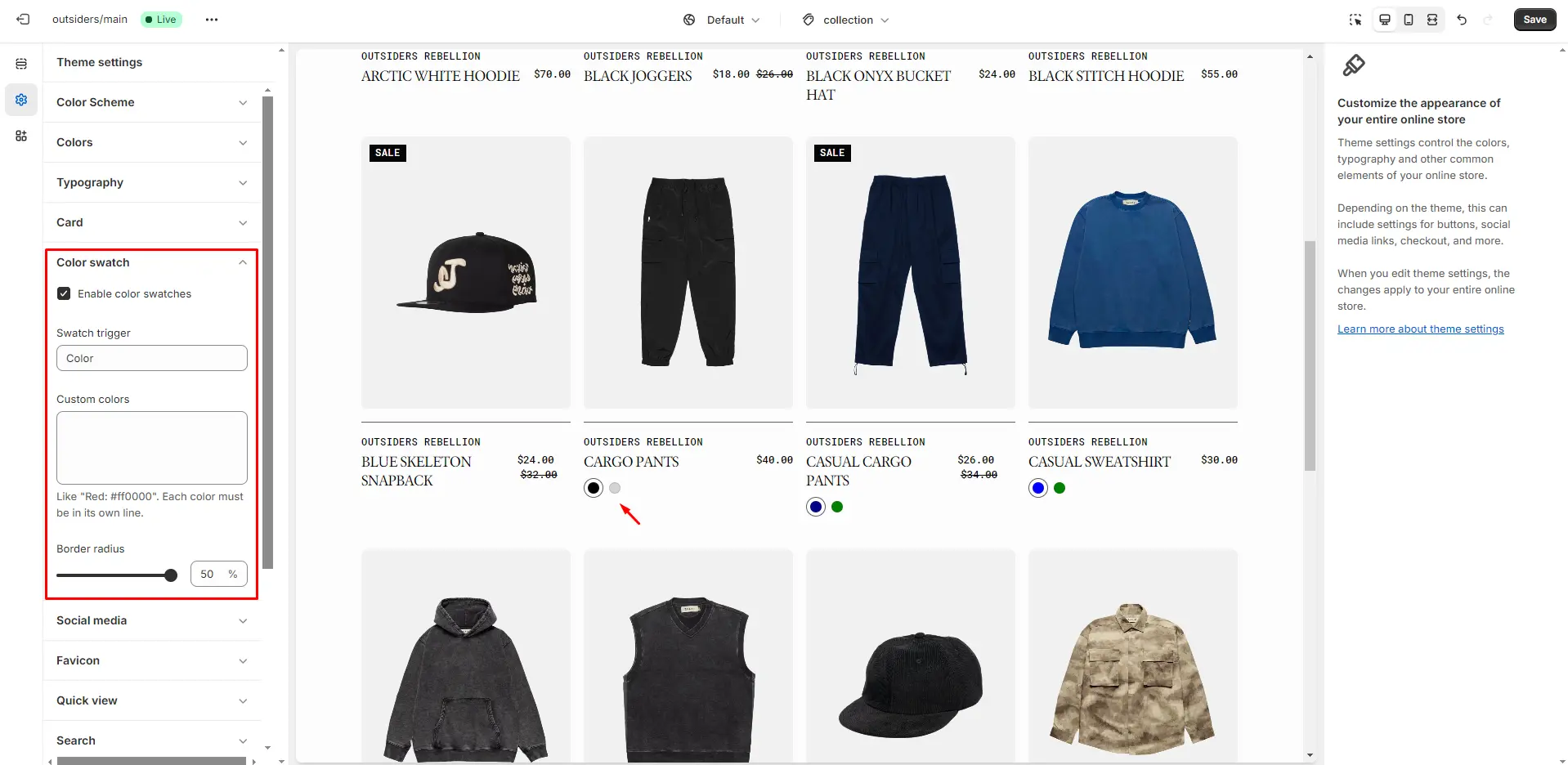
Color Swatches
To enable and edit Color Swatches, go to Theme settings > Color Swatches. The swatch trigger should match the option in Product variants. You can also add custom colors by specifying their name and HEX color code.
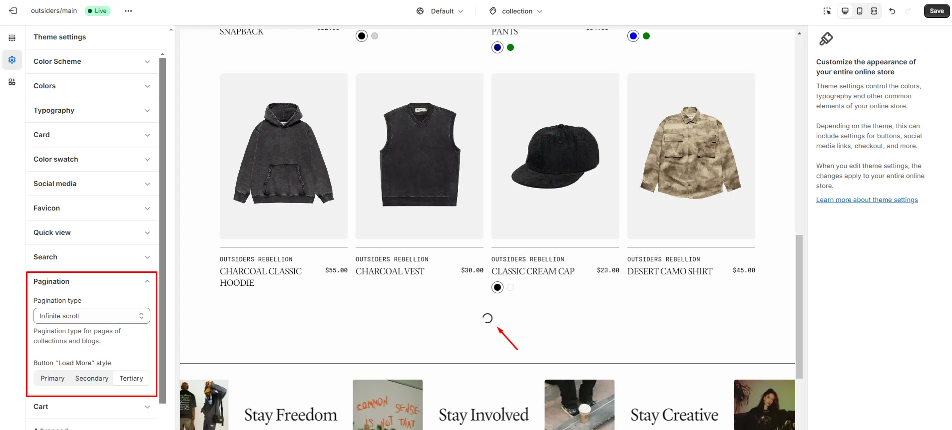
Infinite Scroll
To enable and edit Infinite Scroll, navigate to Theme settings > Pagination > Pagination type.
Custom Product Badges
To enable and edit Custom Badges, navigate to Theme settings > Product card.
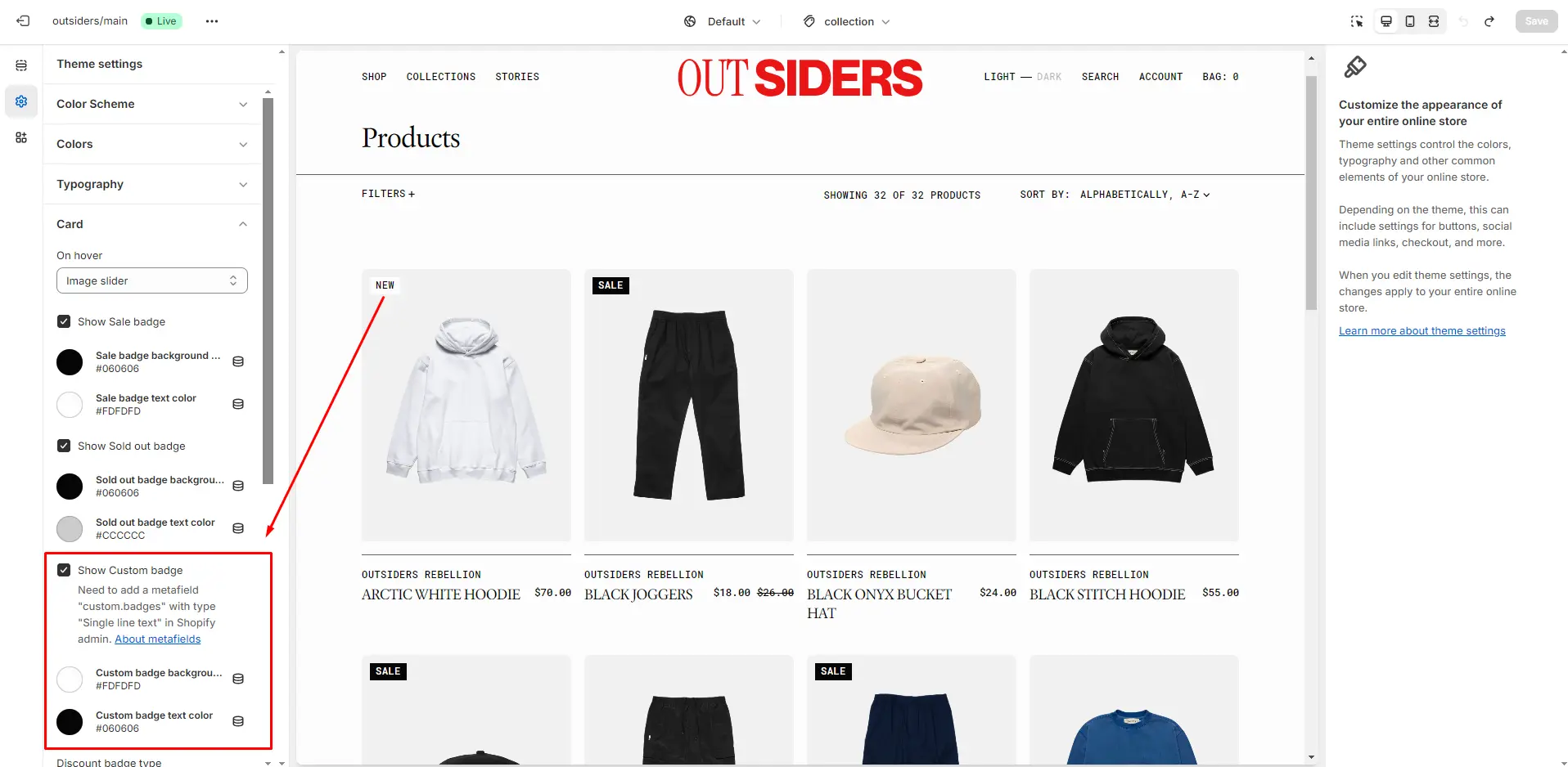
The next step is to add metafields to the products.
To add and edit metafields, follow these steps:
-
Navigate to Settings > Custom data in the Admin Panel.
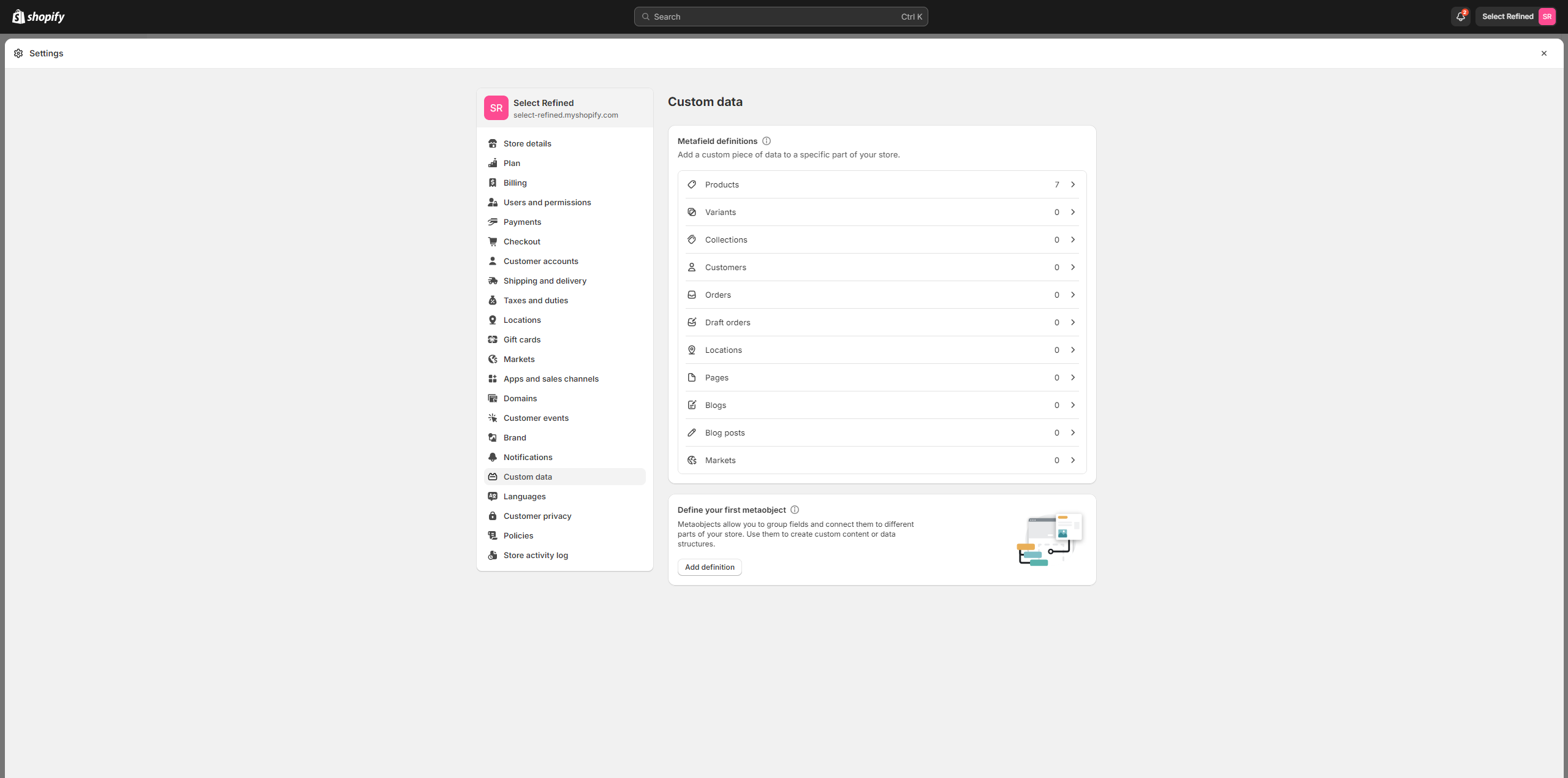
- Select Products.
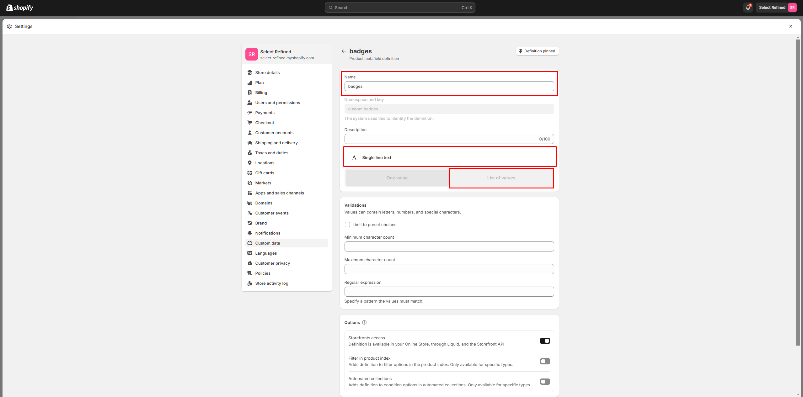
- Click the button "Add definition" and fill the fields.
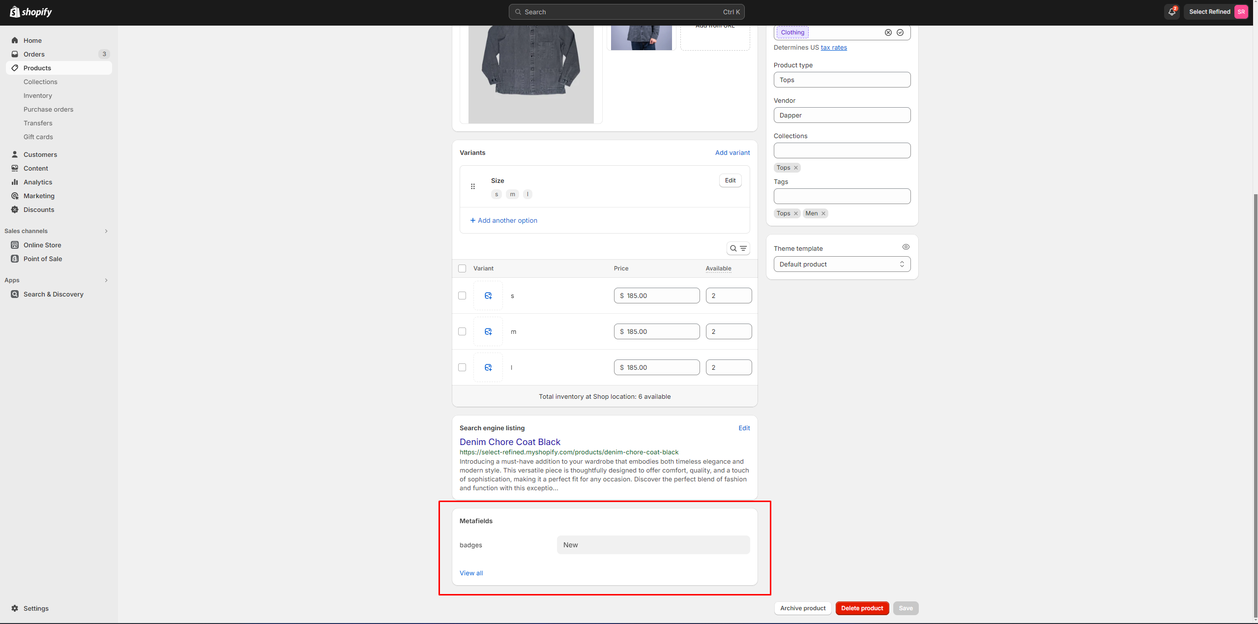
- Navigate to the product and add
information
below.
Header Group
Sections that are applied across all pages by default.
Announcement Bar
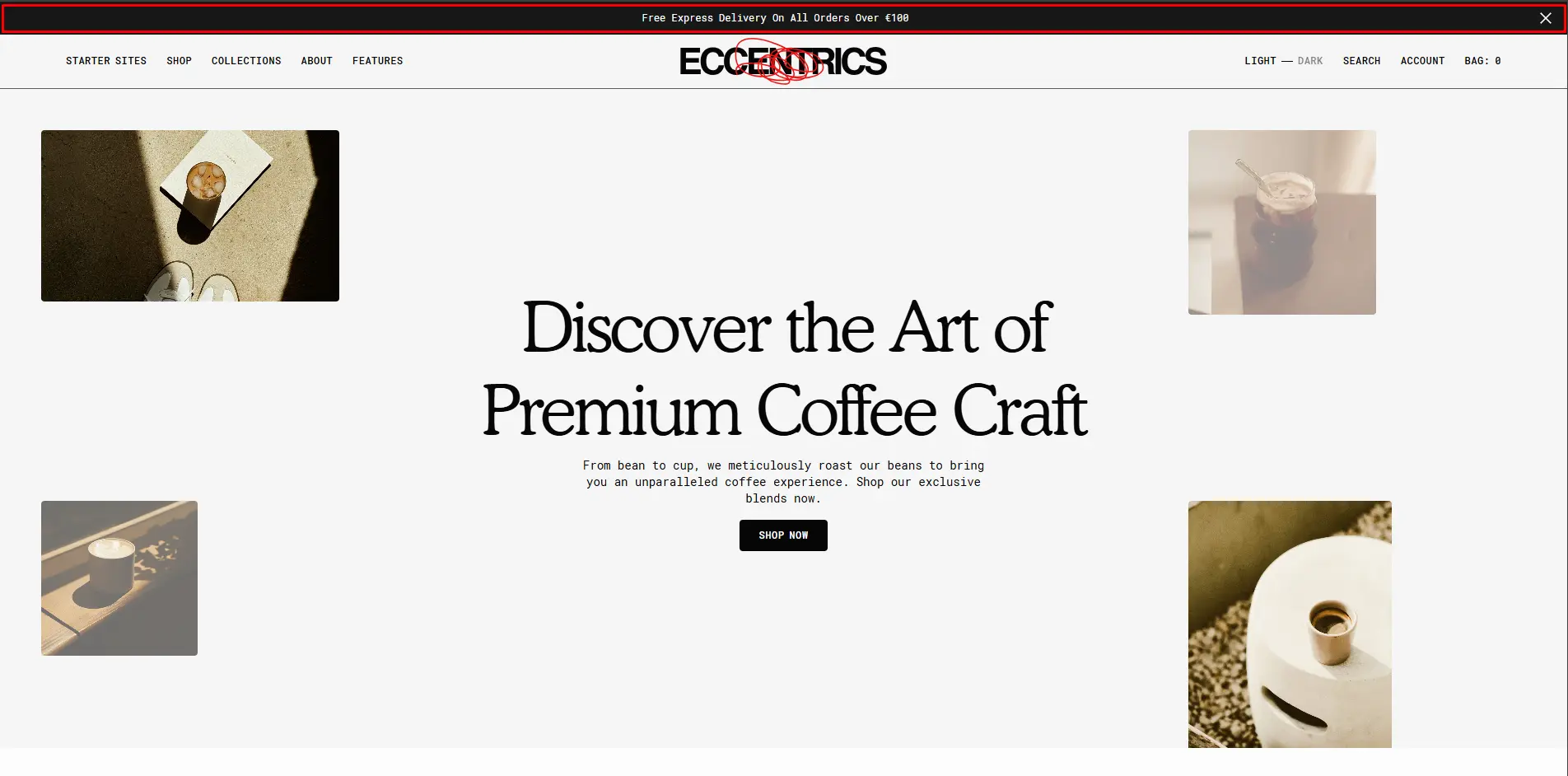
The Announcement Bar appears at the top of every page and includes custom messages with optional links. It's good to use for promoting sales or need-to-know updates.
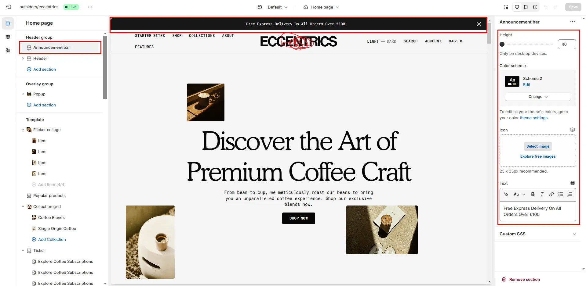
- Height slider allows you to change the announcement height only on desktop devices.
- Color scheme selector allows you to change the color scheme. You can change the background color in the Theme settings.
- Use the Icon (Optional) field to add or change the image.
- Text field allows you to add and edit text.
Countdown timer Bar
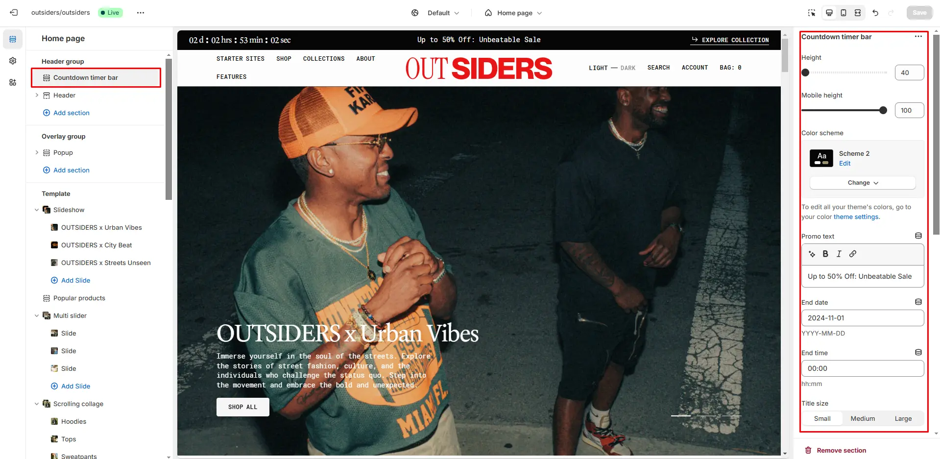
- Height slider allows you to change the announcement height only on desktop devices.
- Height on mobile devices slider allows you to change the announcement height only on mobile devices.
- Color scheme selector allows you to change the color scheme. You can change the background color in the Theme settings.
- End date allows you to set the countdown end date.
- End time allows you to set the countdown end time.
- Title size selector field allows you to change the size of the title.
- After the timer ends allows you to select what should be when countdown is completed.
- Text allows you to set a text when countdown is completed.
- Button options allows you to set a button and customize it.
Header
There are several types of the header in this theme. You can choose a variant.
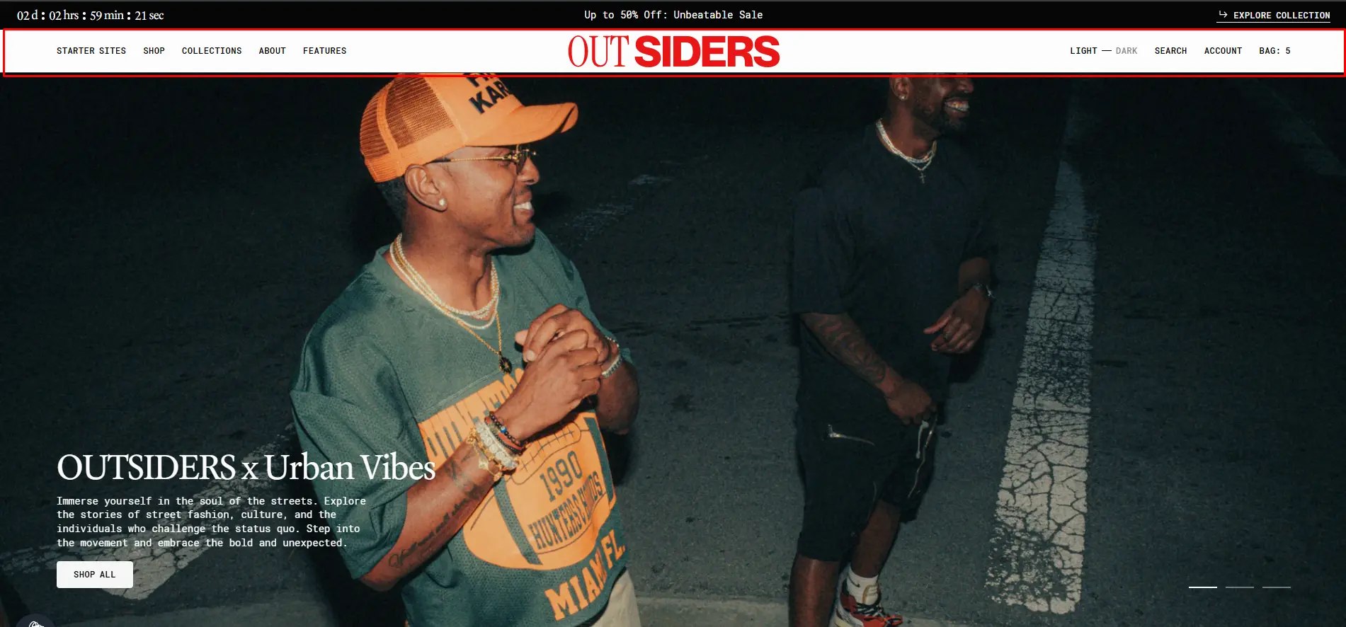
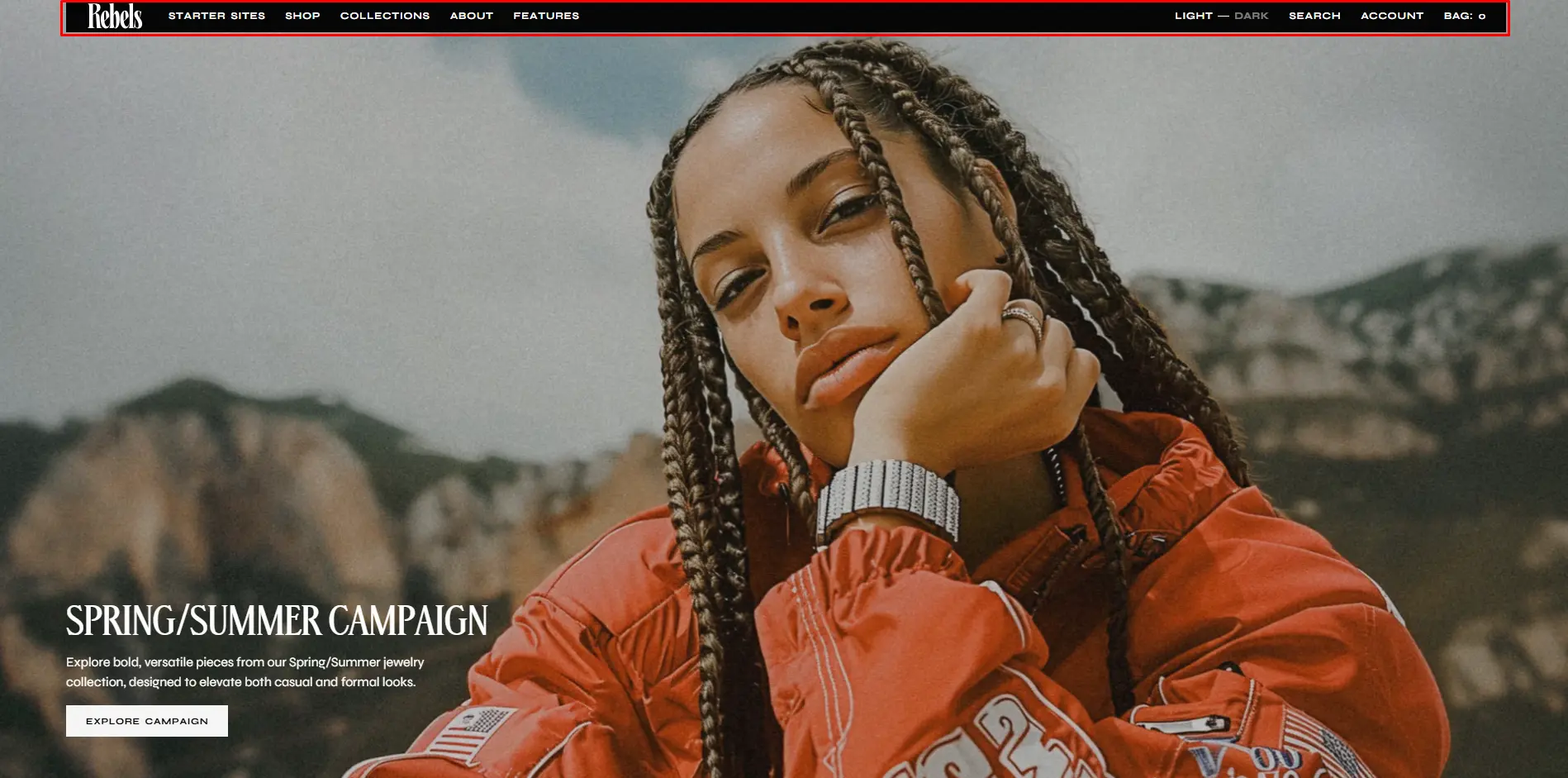
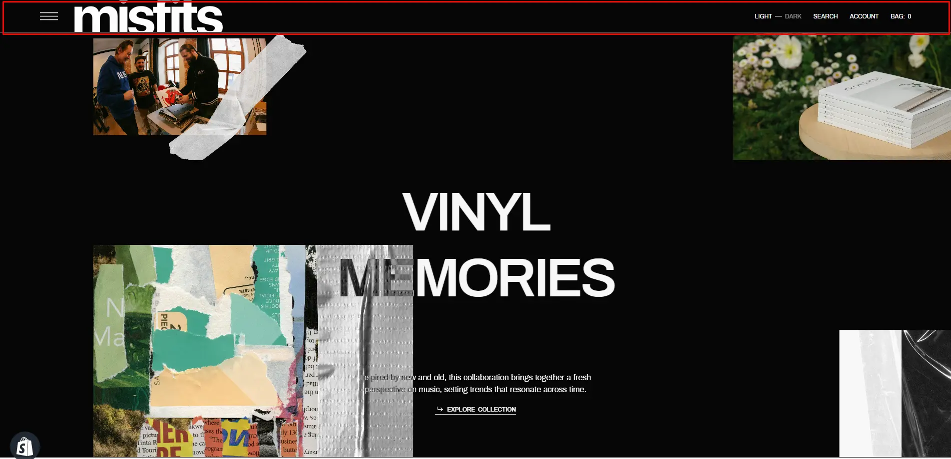
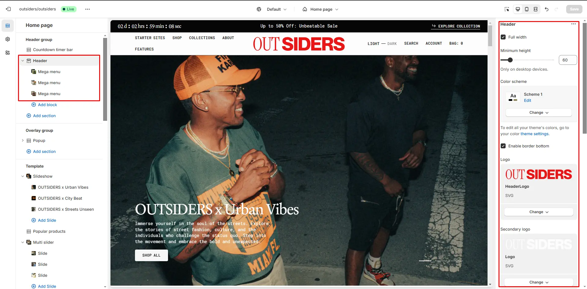
- Full width enables the header to span the full width of the page.
- Minimum height sets the smallest allowable height for the header, ensuring it looks consistent across devices.
- Color scheme selector allows you to change the color scheme. You can change the background color in the Theme settings.
- Enable bottom border field allows you to connect the lines under the header.
- Use the Logo file selector allows you to select or upload your logo file.
- Use the Secondary logo file selector to select or upload your logo, which can be seen in Dark mode.
- If you add a logo, you can adjust its size using the Custom logo width slider. (Optional)
- On scroll inverse color enables the header color to invert when scrolling down the page.
- Header overlay enables an overlay effect for the header when the first section is a hero.
- Choose a Menu to be displayed in the header.
- Enable country/region selector field enables the display of country/region.
- Enable language selector field enables the display of language.
- Use the sticky header field to select a variant of the header when user scrolls in page.
- Search options allows you to add Search modal and customize it.
Mega Menu
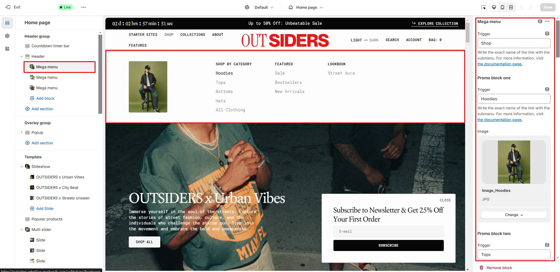
To add a Mega Menu, make sure that the main menu link has sublinks, and then follow these steps:
- Add the Mega Menu to the Header.
- Type the exact name of the link in the Trigger field.
- Promo block allows you to add image.
- Promo block Trigger allows you to specify the submenu link name, and when you add an image, it will be displayed on hover over that link.
Burger Menu
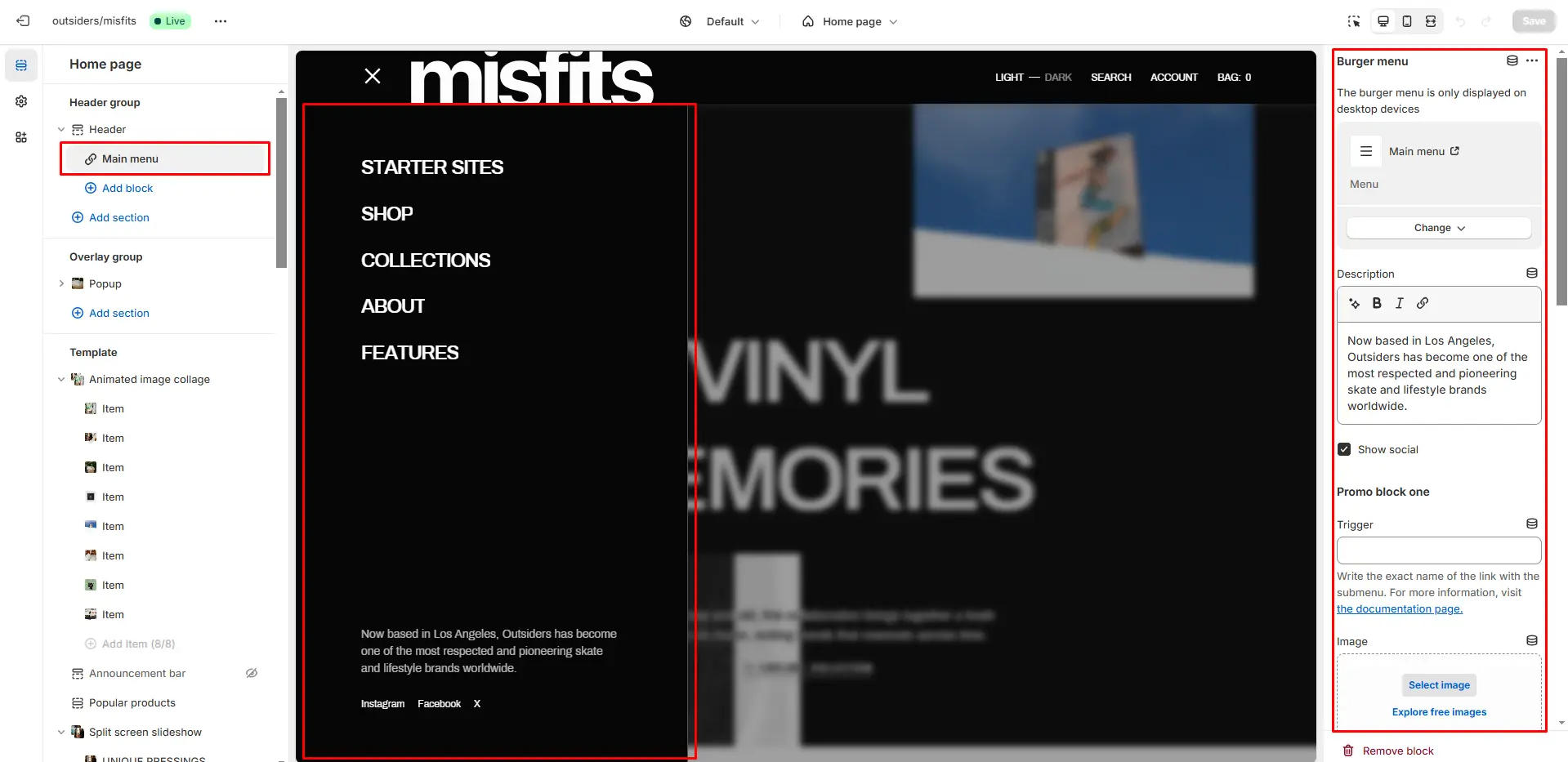
- Choose a Menu to display it in the dropdown.
- Show social enables the display of social icons.
- Promo block allows you to add image.
- Promo block Trigger allows you to specify the submenu link name, and when you add an image, it will be displayed on hover over that link.
Search
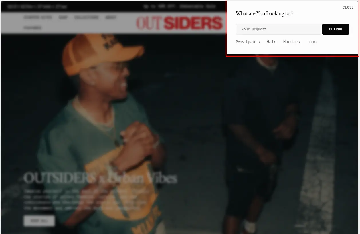
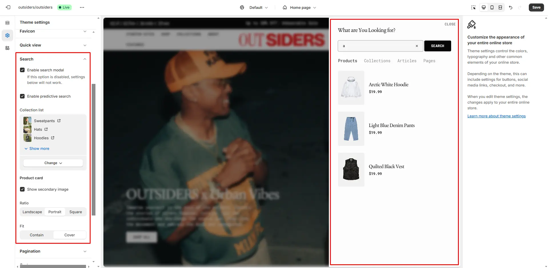
In this theme, you can use a predictive search. It is enabled by default, but you can disable it in the Theme settings > Search.
Overlay Group
Popup
In the Popup settings, you can change layout, add image, subscribe form, edit position, change open and exit animations and options.
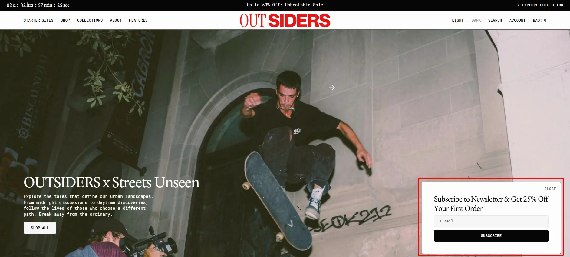
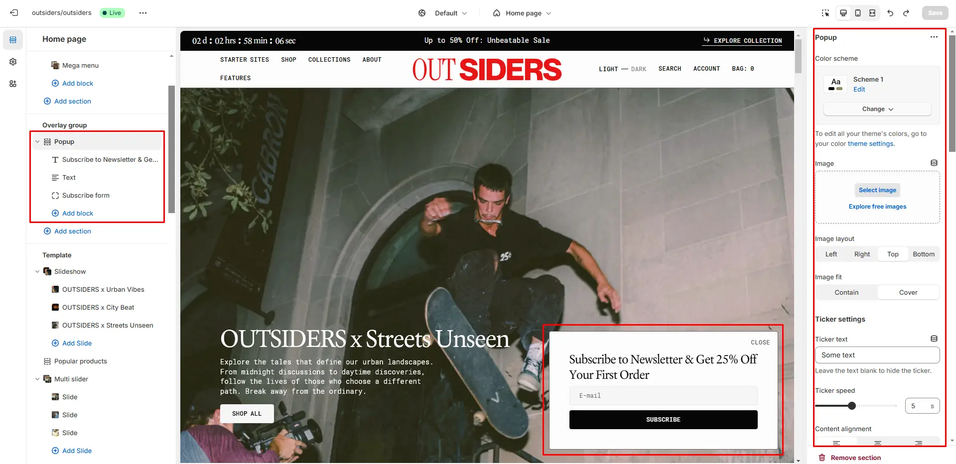
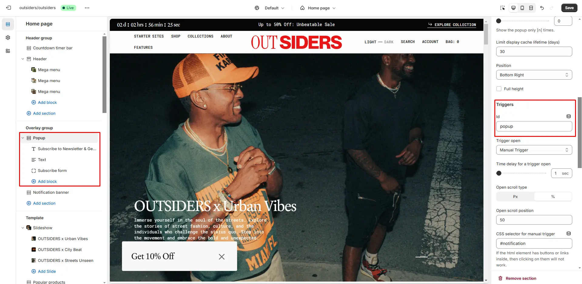
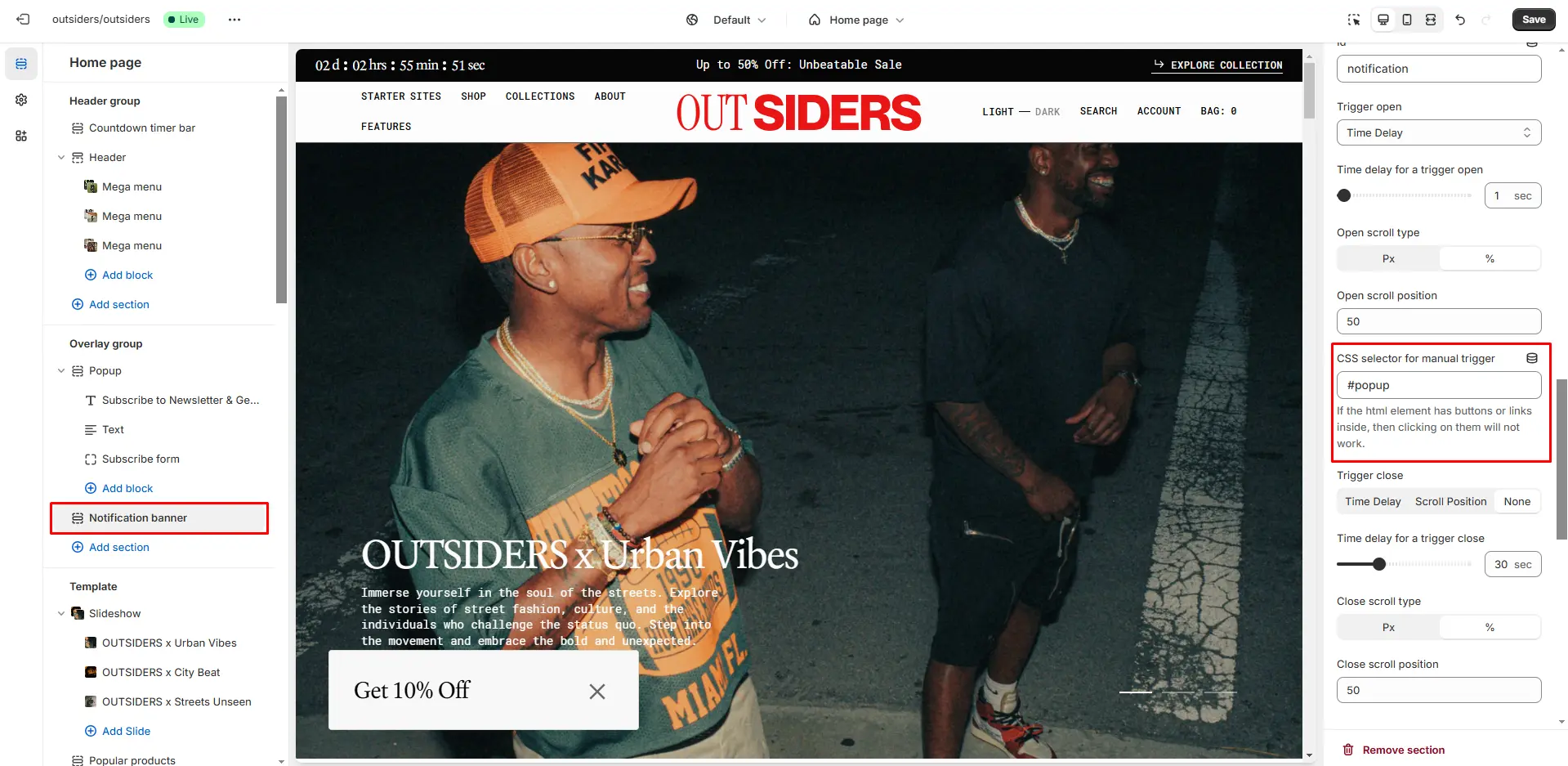
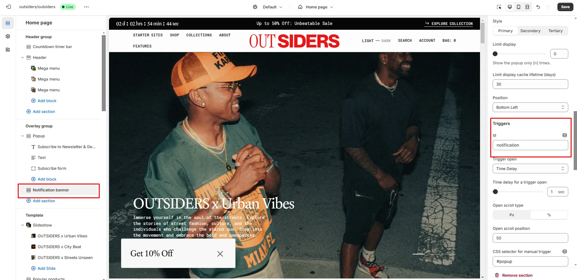
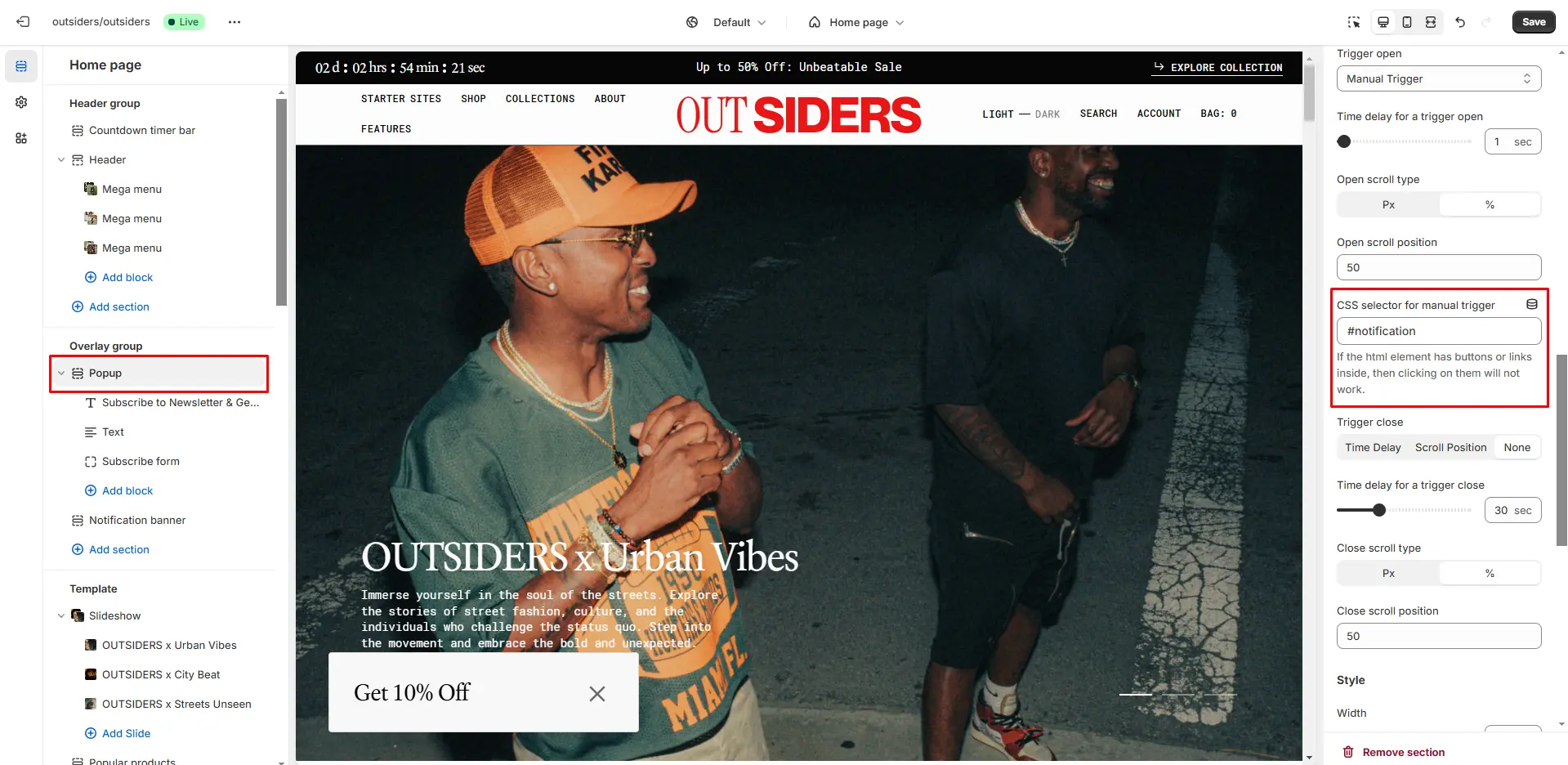
You can also use this popup as a button-trigger for opening another popup or notification bar by following these steps:
- Add the ID of the popup/notification bar you want to open to the ID field in the Triggers section (e.g., "popup").
- Go to the popup/notification bar settings and add the ID, with a "#" at the beginning, in the CSS selector for manual trigger field.
Notification Banner
In the Notification Banner settings, you can change layout, add image, texts, edit banner position, change open and exit animations and options.
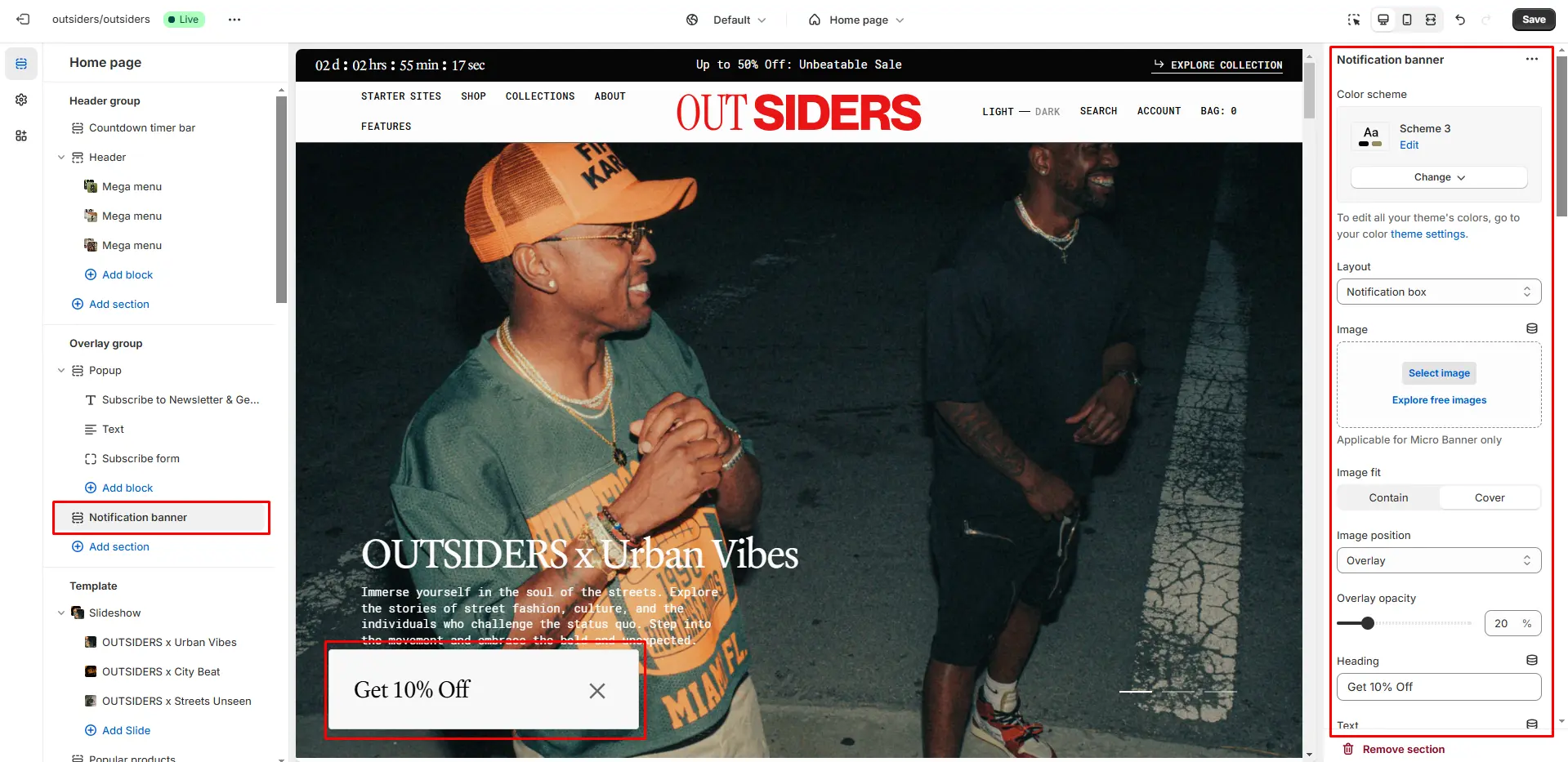
You can also use this banner as a button-trigger for opening another notification bar or a popup by following these steps:
- Add the id of the popup/notification bar you chose to open to the Id field in the Triggers section (e.g. "popup").
- Navigate to the popup/notification bar settigns and add the Id with "#" in the beginning to the "CSS selector for manual trigger" field.
Age Verification Popup
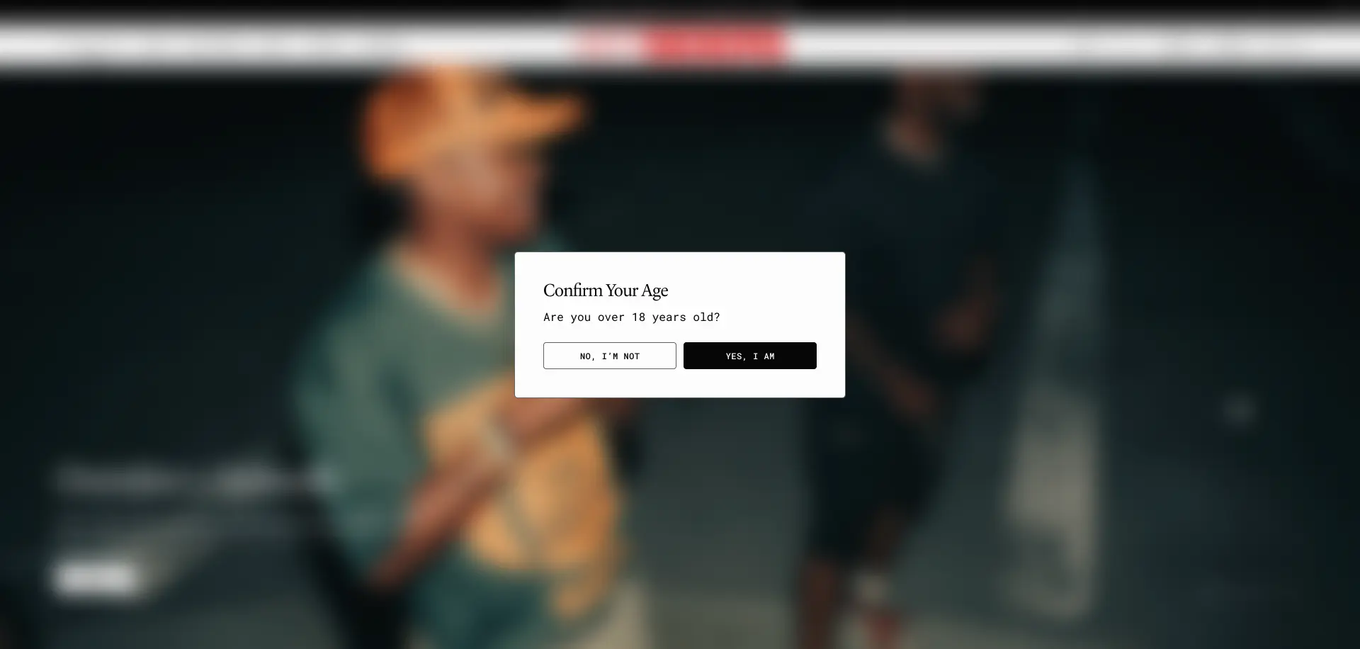
An Age verification popup asks users to confirm their age before accessing restricted content. You can customize the text and buttons in the popup settings.
Footer Group
Sections is used on all pages by default.
Footer
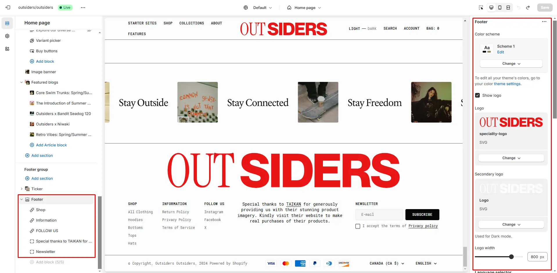
Footer appears at the bottom of every page. You can customize it to fit your brand and product offerings.
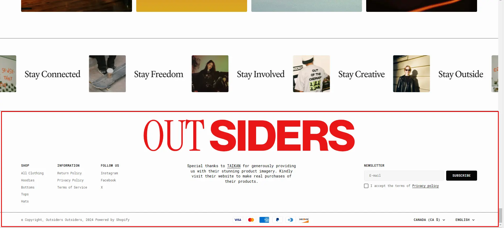
- Use Color scheme selector to change the color scheme.
- Show logo enables the display of the logo in the footer.
- Use the Logo file selector allows you to select or upload your logo file.
- Use the Secondary logo file selector to select or upload your logo, which can be seen in Dark mode.
- If you add a logo, you can adjust its size using the Custom logo width slider. (Optional)
- Language selector field enables the display of the language selector in the footer.
- Country/region selector field enables the display of the region selector in the footer.
- Follow on Shop To allow customers to follow your store on the Shop app from your storefront, Shop Pay must be enabled.
- Payment methods field enables the display of payment methods in the bottom line of the footer.
- Policy links field enables the display of the policies links in the footer.
- Social media icons field enables the display of social media icons in the bottom line of the footer.
- Block Menu allows you to select menus, which will be displayed on the top line of the footer.
- Block Subscribe form allows you to add and customize subscribe form.
- Block Store information allows you to add details about your store, which will be displayed in the footer.
All Sections
The theme contains several customizable sections that you can add to your page in any order.
Slideshow
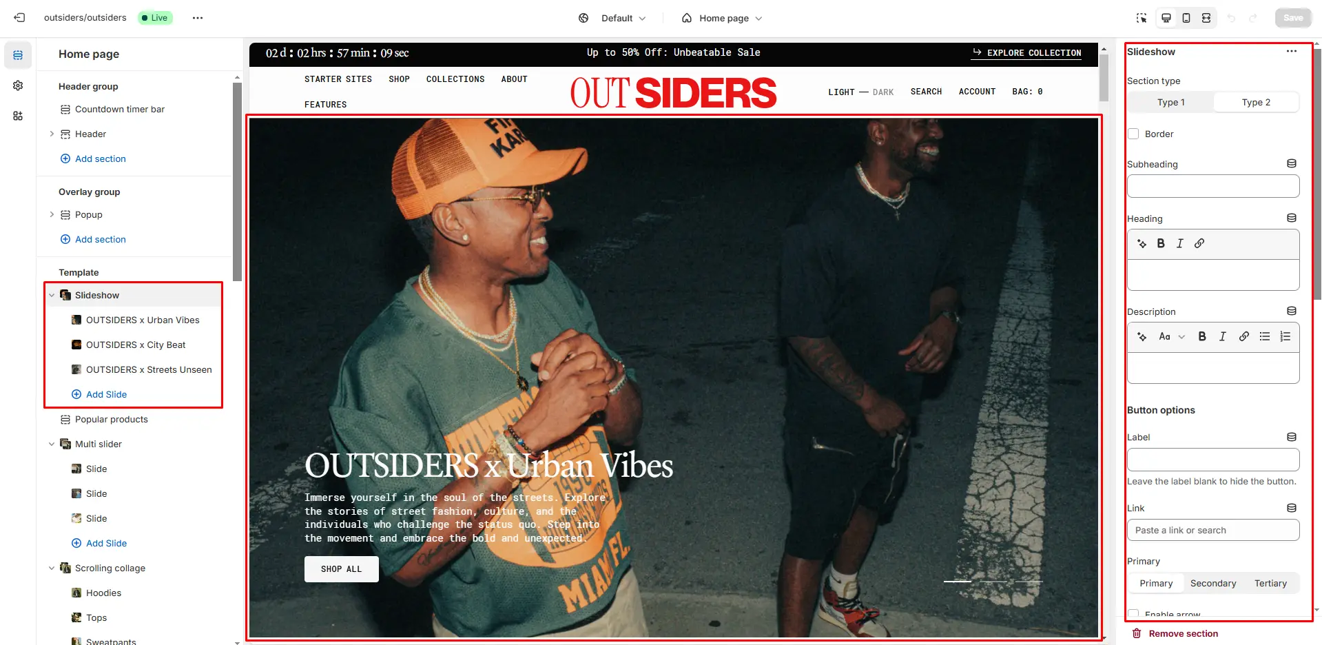
The section allows you to add slides with image and heading.

- Image size selector allows you to change the height of this section.
- Button style selector to change the button style.
- Enable autoplay checkbox field allows you to enable autoplay for slider.
- Show bullets checkbox field enables the display bullets.
- Speed sliding allows you to change speed of transition between items.
- Delay sliding allows you to change delay after each slide.
- Block Slide options Color scheme selector to change the color scheme for the block.
- Block Slide options Image allows you to set a image for the block.
- Block Slide options Video allows you to set a video for the block.
- Block Slide options Overlay opacity slider allows you to change the opacity of the overlay.
- Block Slide options Heading allows you toset a heading for the block.
- Block Slide options Text allows you toset a text for the block.
- Block Slide options Button options allows you to set a button and customize it.
Multi Slider
The section allows you to add slides with image and heading.
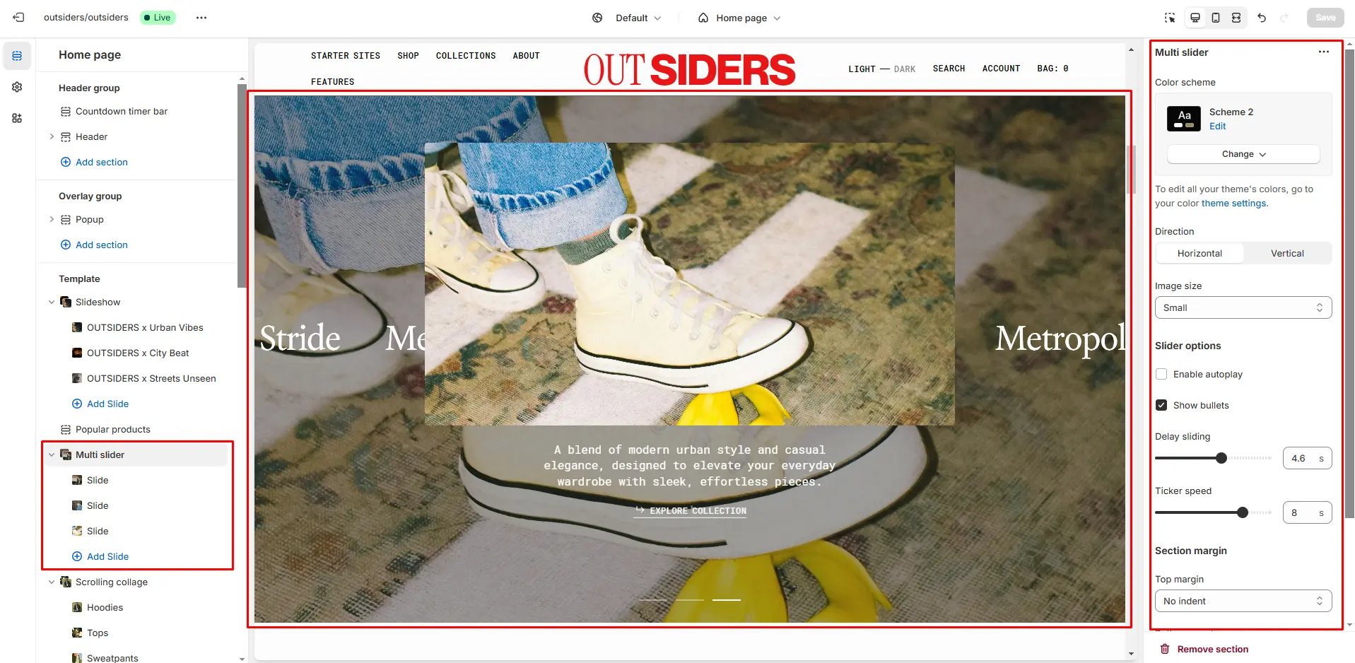
- Image size selector allows you to change the height of this section.
- Direction lets you choose either vertical or horizontal slide transitions.
- Enable autoplay checkbox field allows you to enable autoplay for slider.
- Show bullets checkbox field enables the display bullets.
- Speed sliding allows you to change speed of transition between items.
- Delay sliding allows you to change delay after each slide.
- Block Slide options Color scheme selector to change the color scheme for the block.
- Block Slide options Image allows you to set a image for the block.
- Block Slide options Video allows you to set a video for the block.
- Block Slide options Overlay opacity slider allows you to change the opacity of the overlay.
- Block Slide options Heading allows you toset a heading for the block.
- Block Slide options Text allows you toset a text for the block.
- Block Slide options Button options allows you to set a button and customize it.

Hero
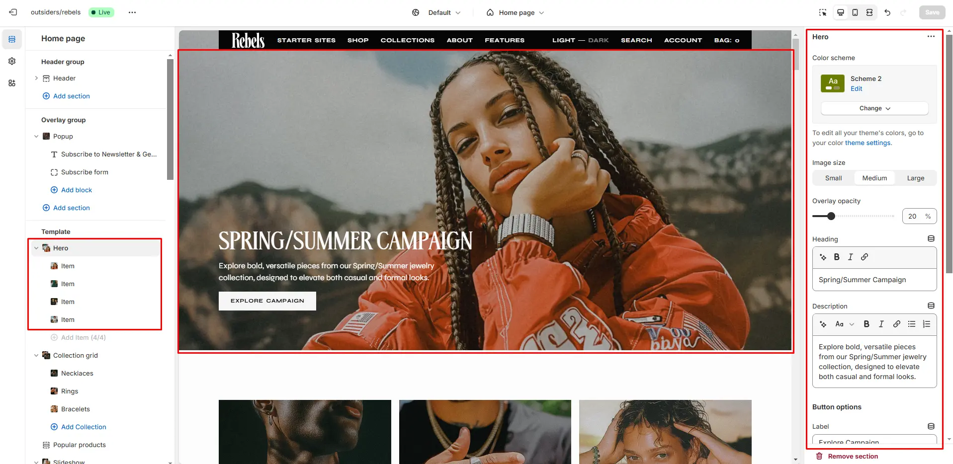
- Use Color scheme selector to change the color scheme.
- Image size selector allows you to change the height of this section.
- Overlay opacity slider allows you to change the opacity of the overlay.
- Heading allows you toset a heading for the section.
- Button options allows you to set a button and customize it.
- Description allows you toset a description for the section.
- Block Slide options Image allows you to set a image for the block.
- Block Slide options Video allows you to set a video for the block.
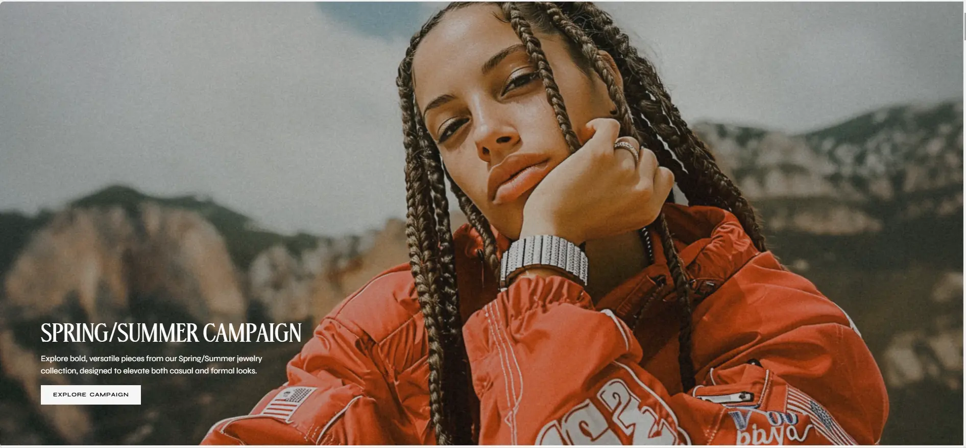
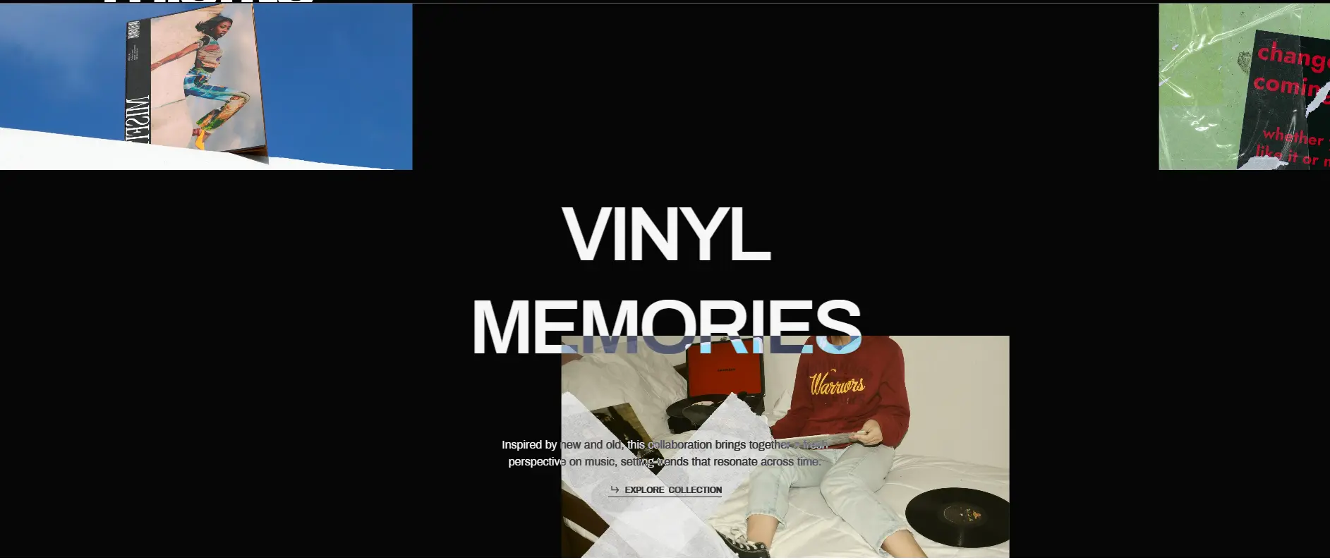
Animated Image Collage
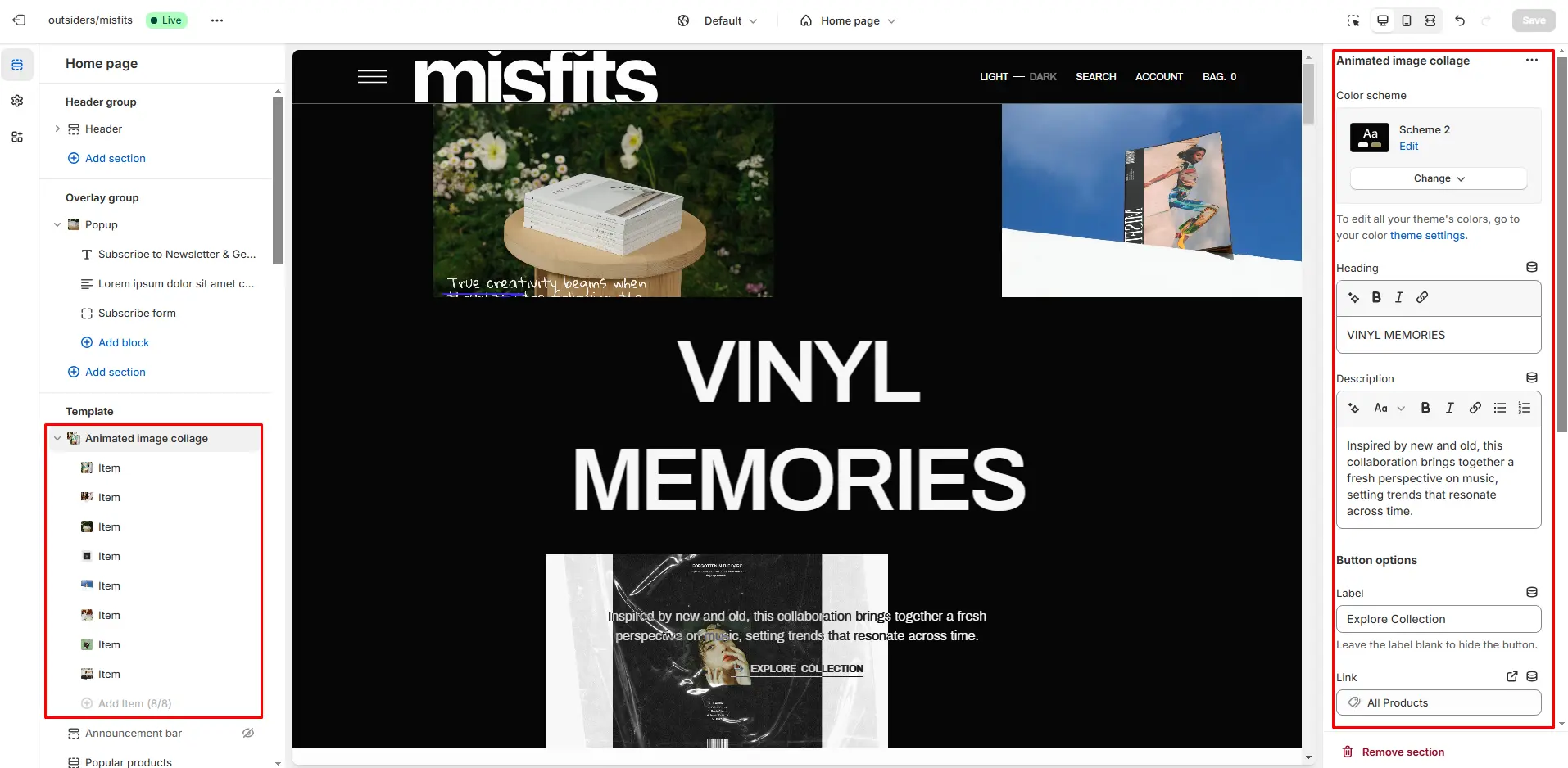
- Use Color scheme selector to change the color scheme.
- Image size selector allows you to change the height of this section.
- Overlay opacity slider allows you to change the opacity of the overlay.
- Heading allows you toset a heading for the section.
- Button options allows you to set a button and customize it.
- Description allows you toset a description for the section.
- Block Slide options Image allows you to set a image for the block.
- Block Slide options Video allows you to set a video for the block.
Flickity Carousel
The section allows you to add slides with image, description and button.
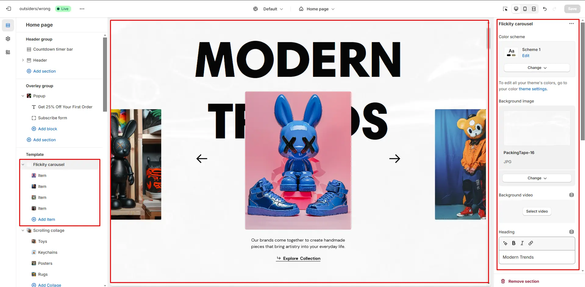
- Use Color scheme selector to change the color scheme.
- Background image allows you to set a image for the section.
- Background video allows you to set a video for the section.
- Heading allows you toset a heading for the section.
- Image size selector allows you to change the height of this images.
- Enable autoplay checkbox field allows you to enable autoplay for slider.
- Show navigation checkbox field enables the display arrows.
- Speed sliding allows you to change speed of transition between items.
- Delay sliding allows you to change delay after each slide.
- Block Slide options Image allows you to set a image for the block.
- Block Slide options Video allows you to set a video for the block.
- Block Slide options Description allows you toset a description for the block.
Flicker Collage
The section allows you to add slides with image and heading.
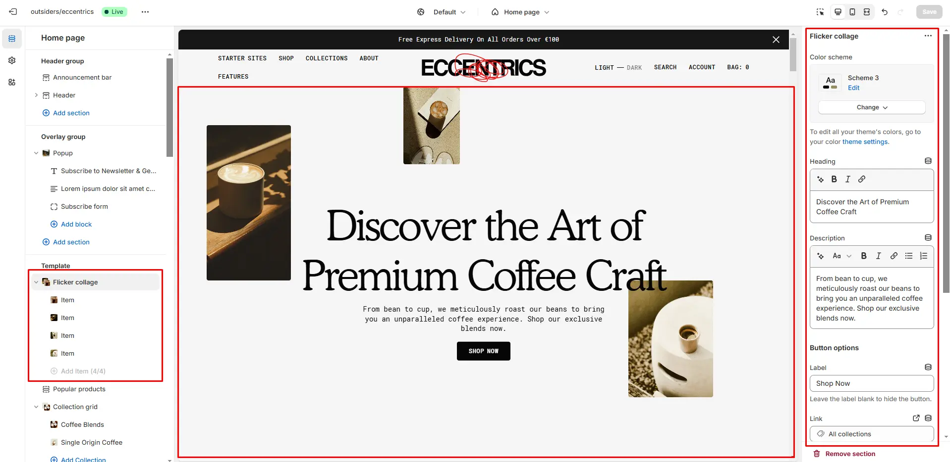
- Use Color scheme selector to change the color scheme.
- Heading allows you toset a heading for the section.
- Description allows you toset a description for the section.
- Button options allows you to set a button and customize it.
- Block Slide options Image allows you to set a image for the block.
- Block Slide options Video allows you to set a video for the block.
Countdown
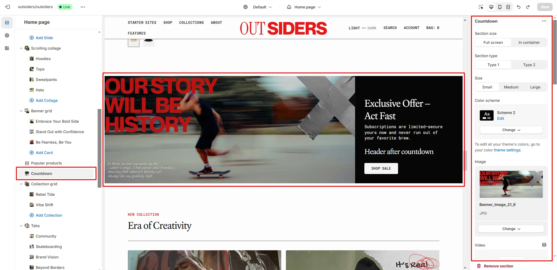
You can add and customize a countdown timer.

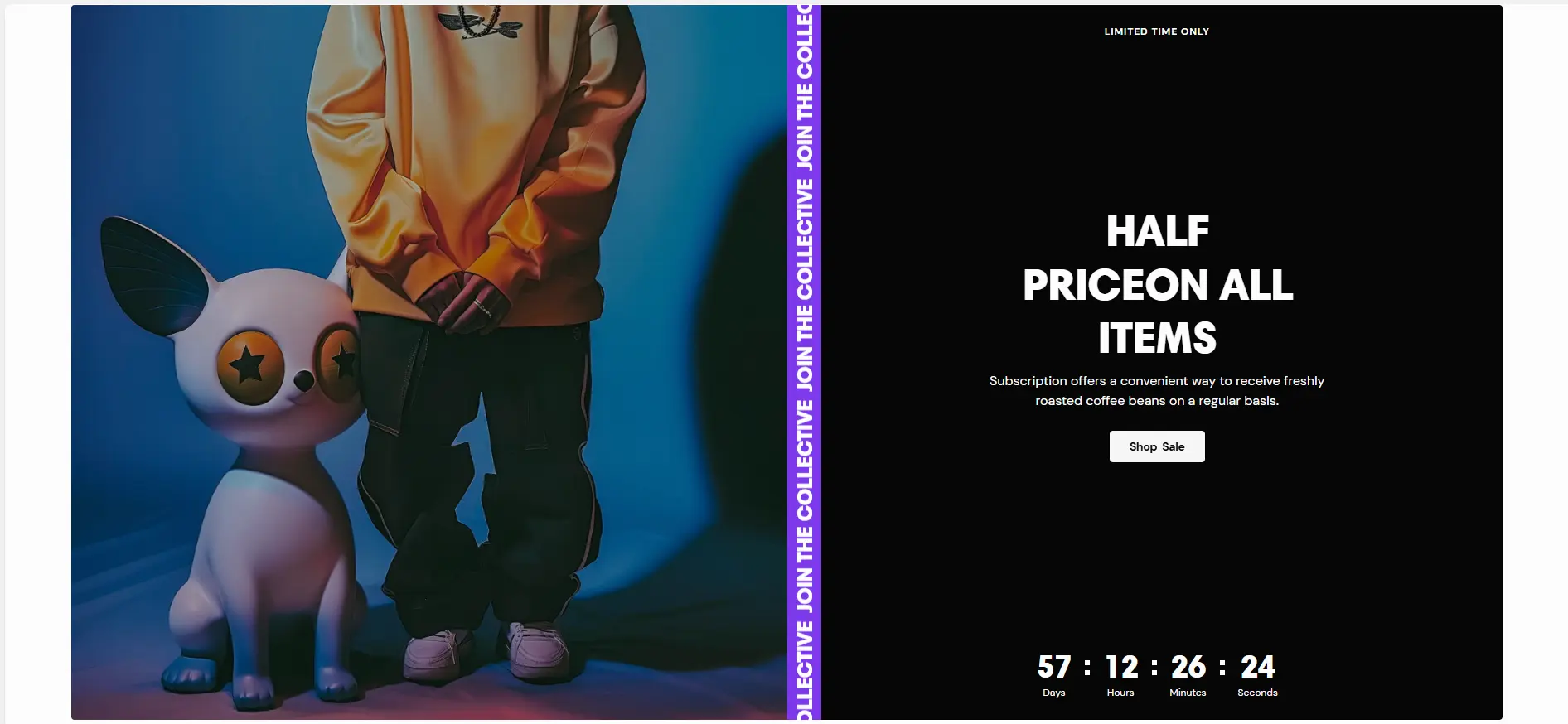
- field allows you to select layout type.
- Use Color scheme selector to change the color scheme.
- Image allows you to set a image for the section.
- Video allows you to set a video for the section.
- Overlay opacity slider allows you to change the opacity of the overlay.
- Heading allows you to set a heading for the section.
- Heading animation checkbox field allows you to enable animation for heading.
- Description allows you to set a description for the section.
- End date allows you to set the countdown end date.
- End time allows you to set the countdown end time.
- After the timer ends allows you to select what should be when countdown is completed.
- Text allows you to set a text when countdown is completed.
- Button options allows you to set a button and customize it.
Logo List
Section allows you to add brand logos with their links.
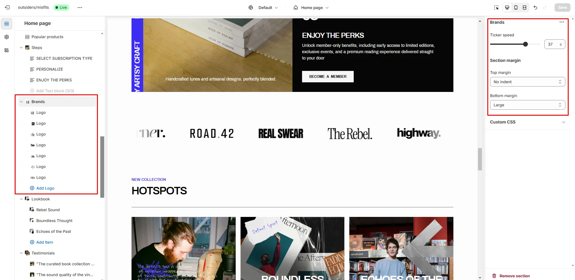
- Ticker speed allows you to change speed for the ticker.
Ticker
The section allows you to add ticker.
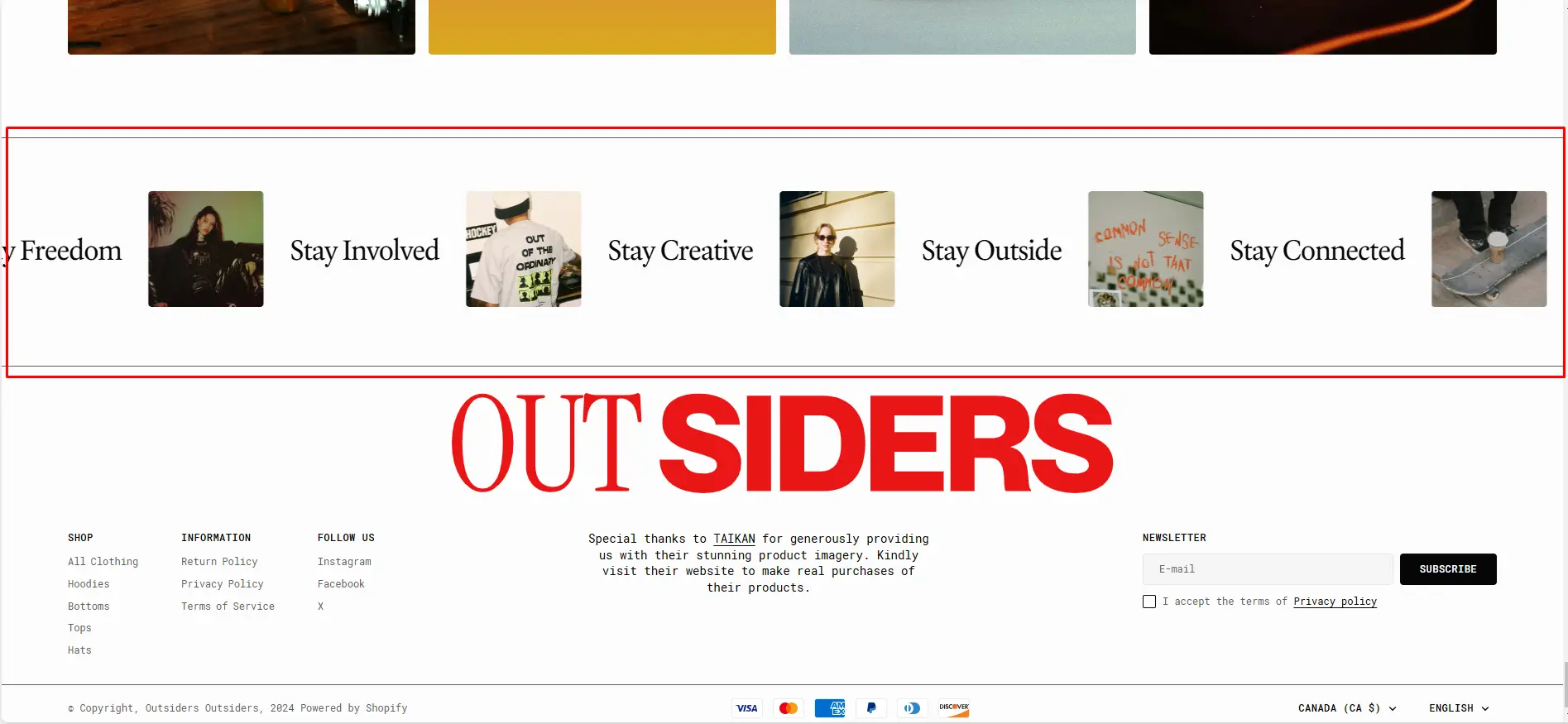
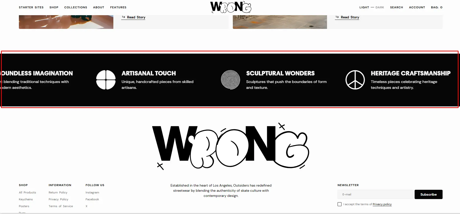
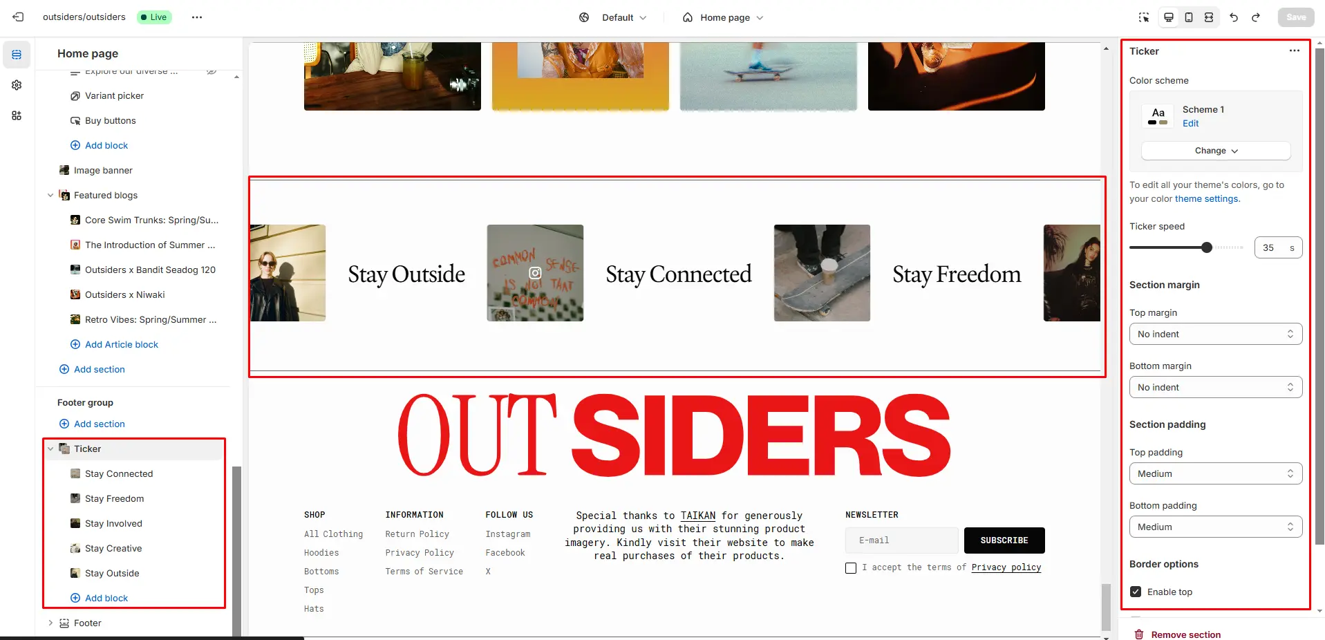
- Use Color scheme selector to change the color scheme.
- Speed allows you to change speed for the ticker.
- Block Media options Text allows you to set a text for the block.
- Block Media options Image allows you to set a image for the block.
- Block Media options Link field allows you to add a link to any source.
- Block Media options Social icon allows you to add a icon that appears on hover over the image.
- Block Info options Heading allows you to set a heading for the block.
- Block Info options Description allows you to set a description for the block.
Before/After
The section allows you to compare products results.
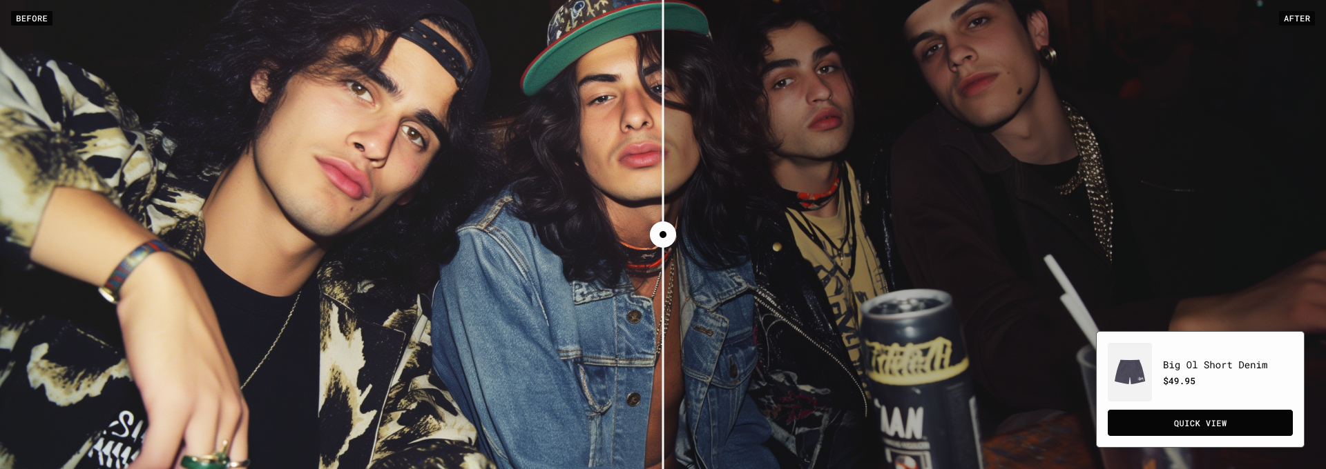
- Before options allows you to add images and texts for compare.
- After options allows you to add images and texts for compare.
Collapsible Content
You can add and customize a collapsible content section, such as using it for FAQs.
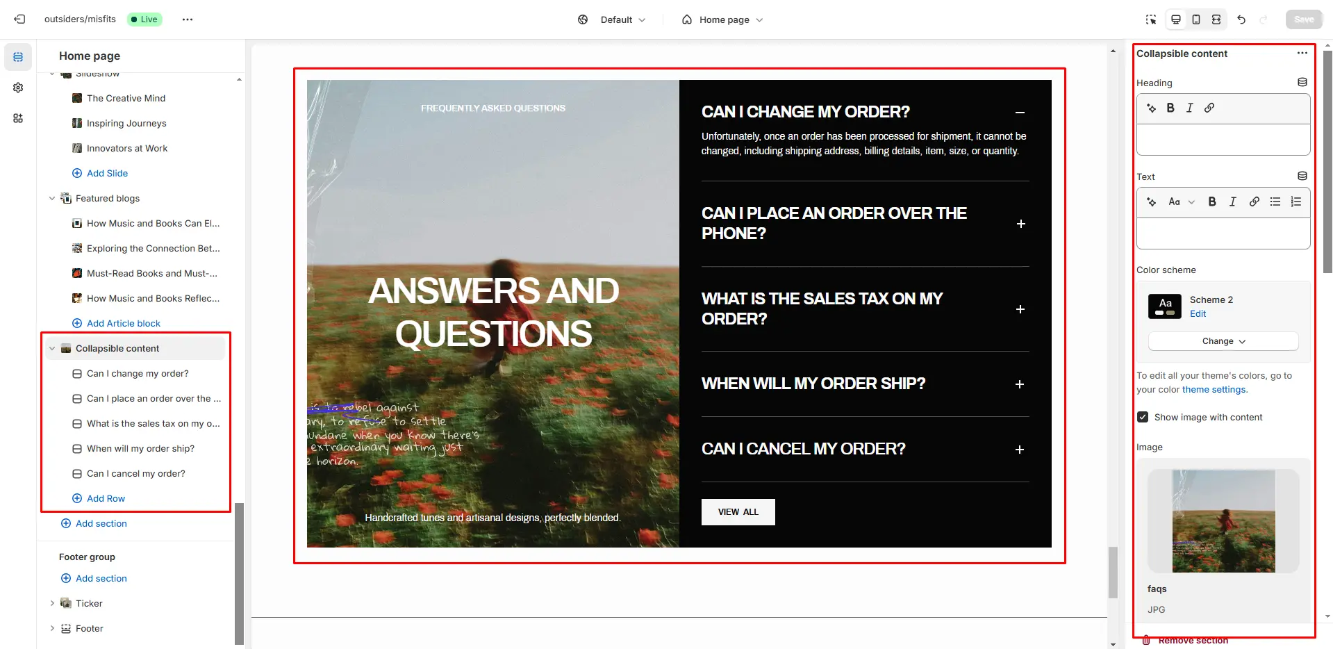
- Use Color scheme selector to change the color scheme.
- Heading allows you to set a heading for the section.
- Description allows you to set a description for the section.
- Image allows you to set a image for the section.
- Video allows you to set a video for the section.
- Subheading allows you to set a subheading for the section.
- Heading allows you to set a heading for the section.
- Heading animation checkbox field allows you to enable animation for heading.
- Description allows you to set a description for the section.
- Button options allows you to set a button and customize it.
Multicolumn
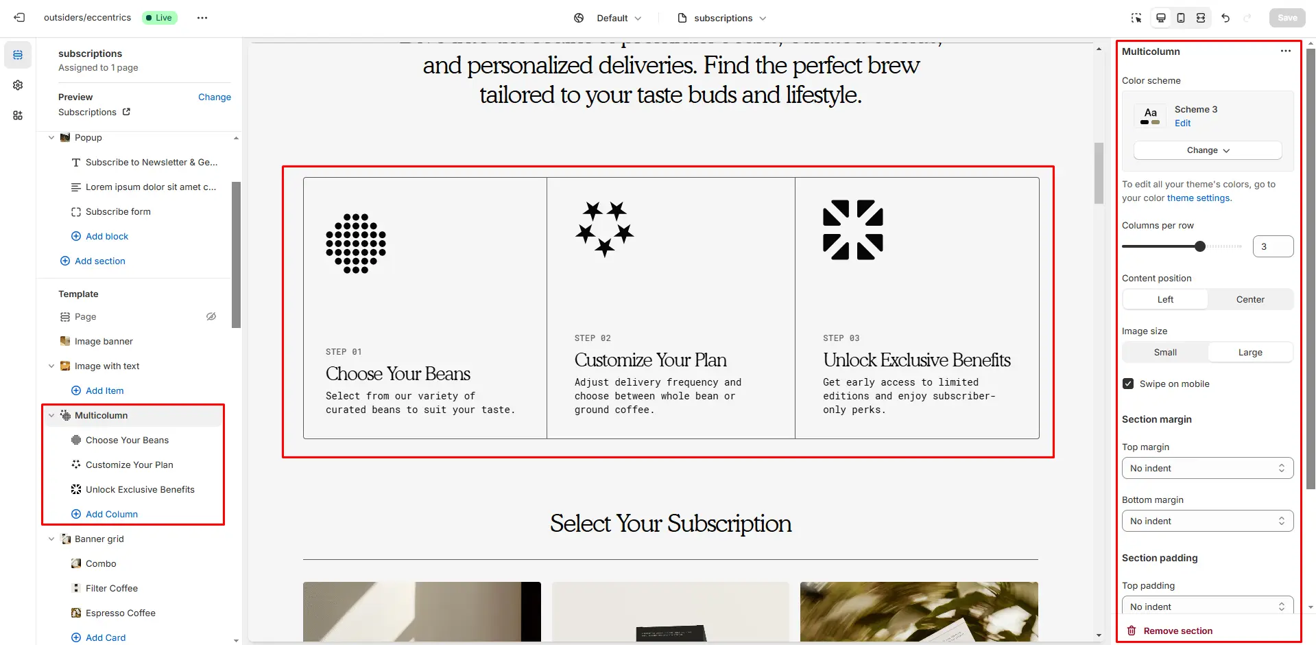
- Columns per row slider allows you to change the number of blocks per line only on desktop devices.
- Image size allows you to change the size of the icon.
- Swipe on mobile checkbox field allows you to enable the slider on mobile devices.
- Block Column options Image file selector allows you to select or upload your image file.
- Block Column options Secondary image file selector to select or upload your image, which can be seen in Dark mode.
- Block Column options Heading allows you to set a heading for the block.
- Block Column options Description allows you to set a description for the block.
- Block Column options Button label field sets the button's label.
- Block Column options Button link field allows you to add a link to any source.
Featured Product
In this section, you can display one product and show information about it .
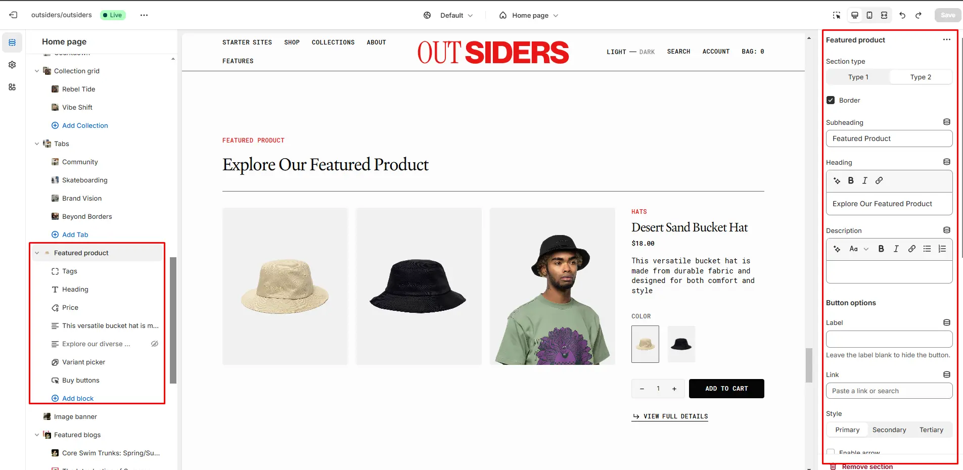
Image Banner
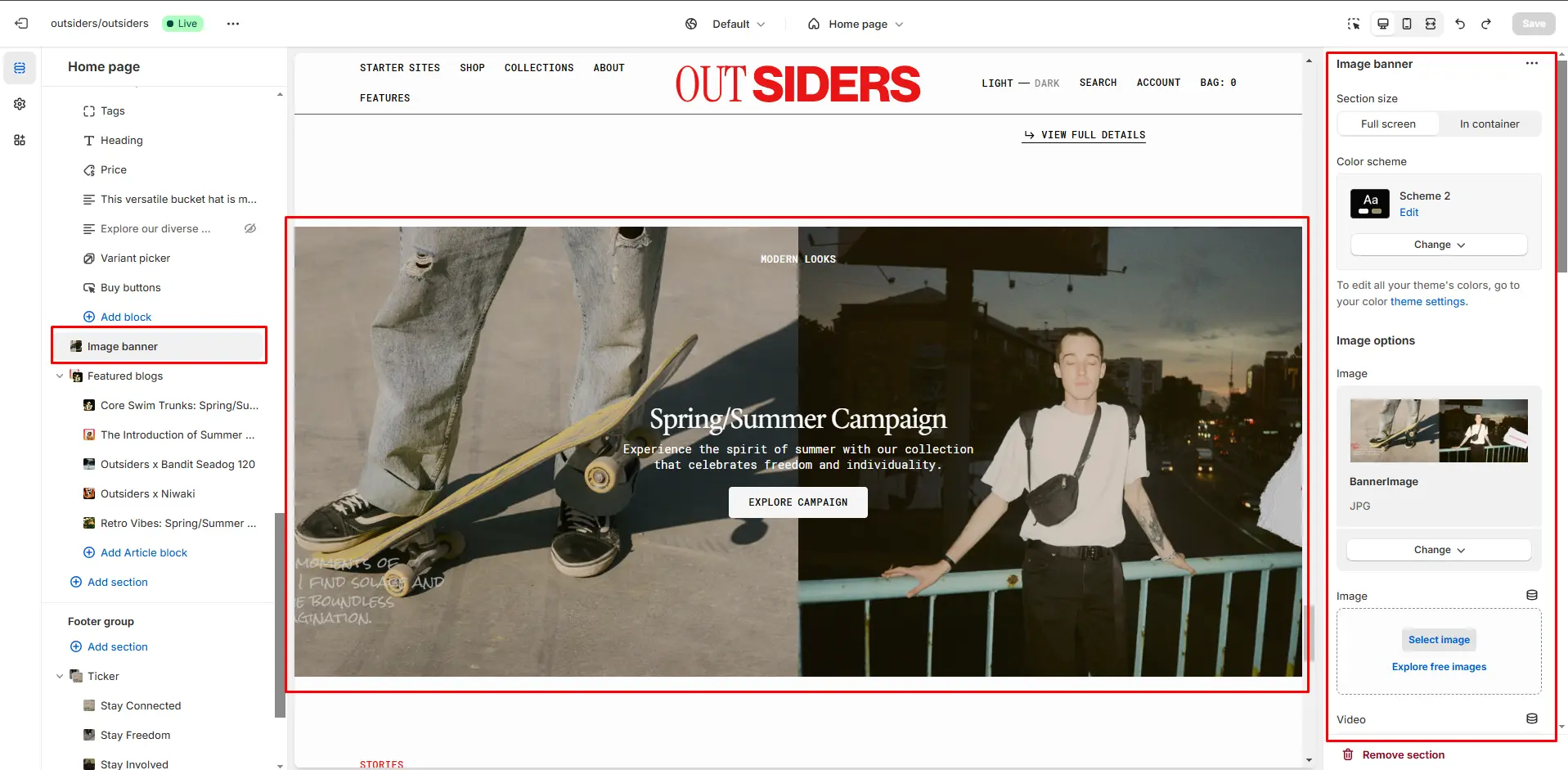
In this section, you can add and customize an image/video.
Page
This section provides information related to the pages.
Product Page
Product Information
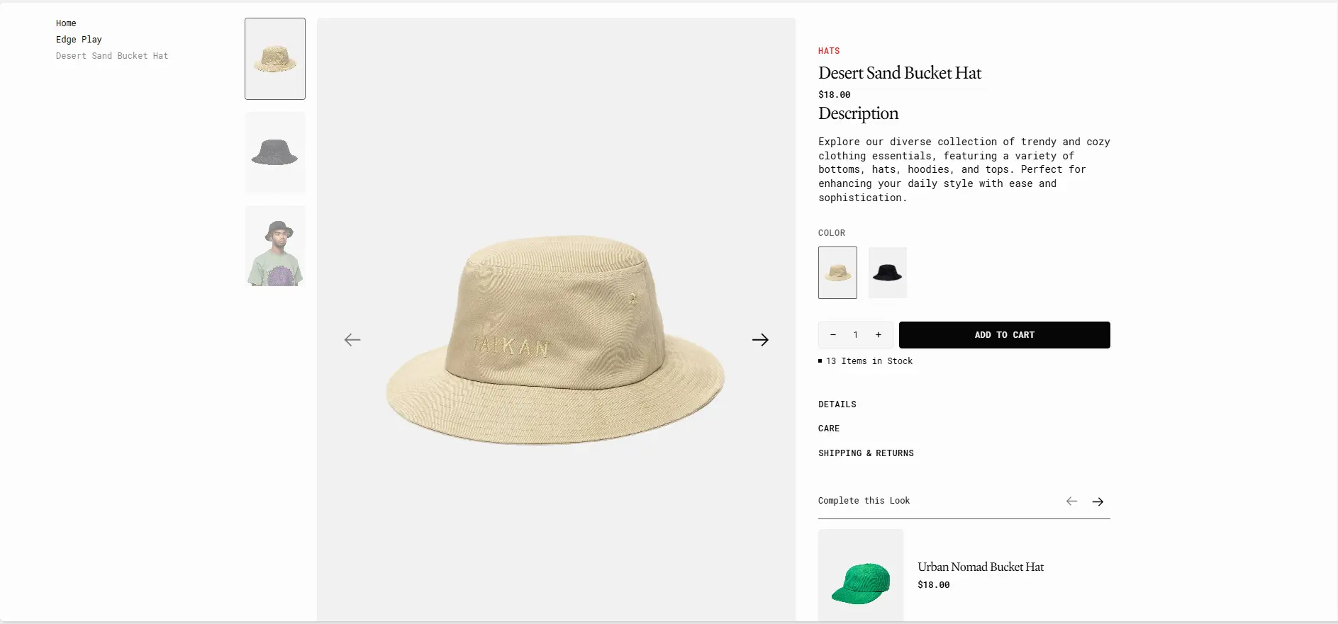
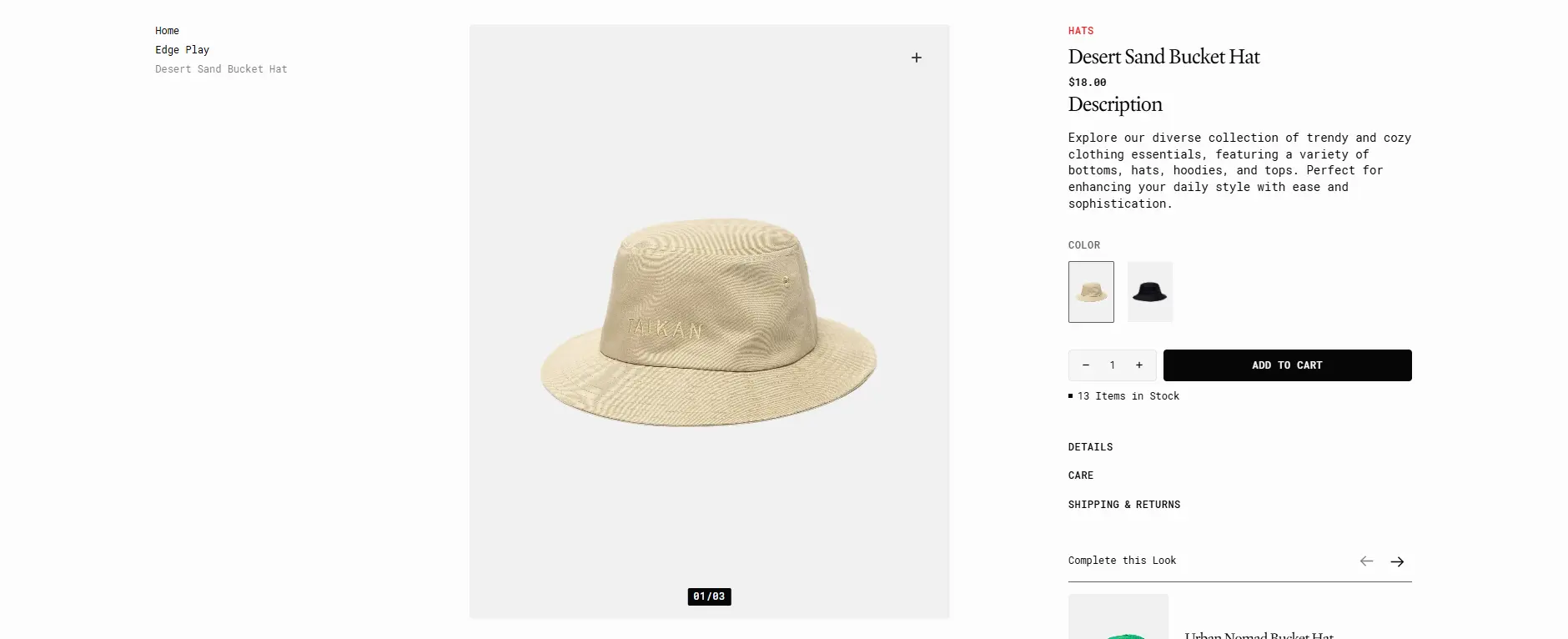
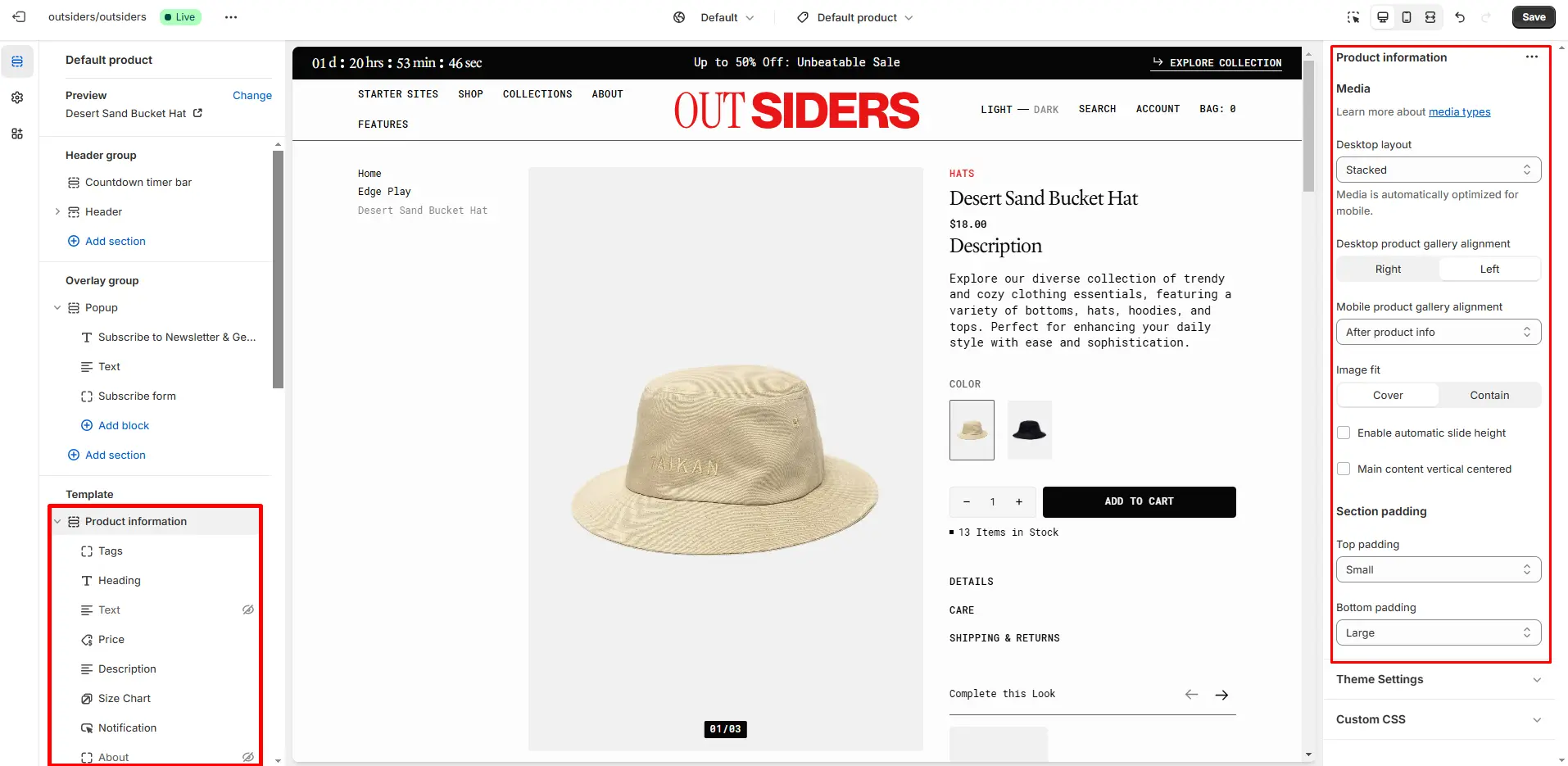
- Desktop layout selector allows you to choose gallery type on desktop devices.
- Desktop product gallery alignment selector allows you to choose alignment type on desktop devices.
- Mobile product gallery alignment selector allows you to choose alignment type on mobile devices.
- Block Pop-up allows you to enable and customize pop-up modals.
- The Block Buy Buttons option displays dynamic checkout buttons using the payment methods available in your store. Customers will see their preferred option, such as PayPal or Apple Pay.
Product Recommendations
Dynamic recommendations use order and product information to change and improve over time.
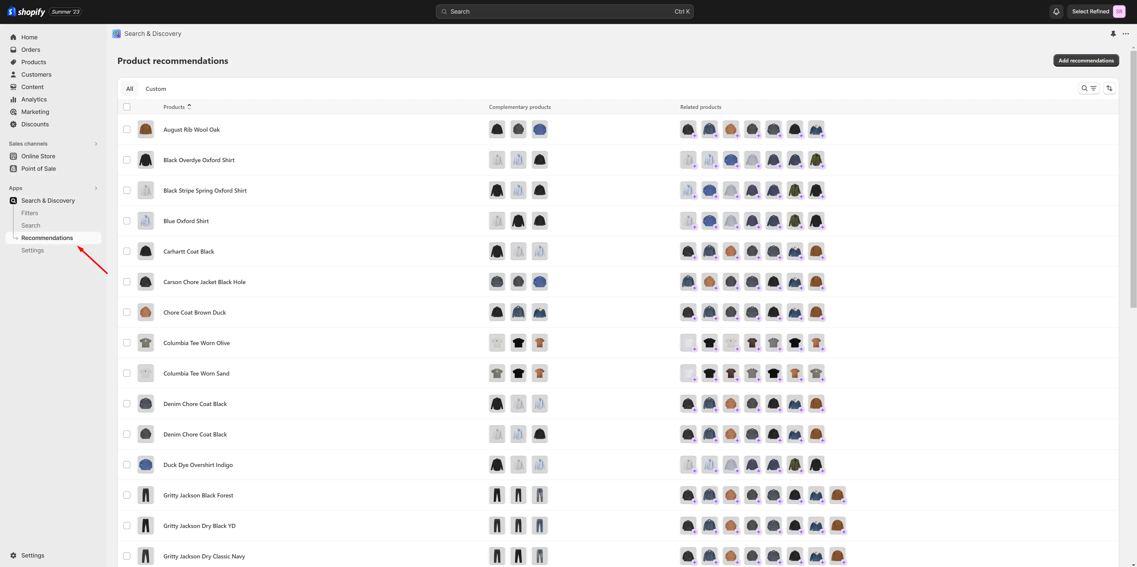
To add and edit product recommendations, follow these steps:
-
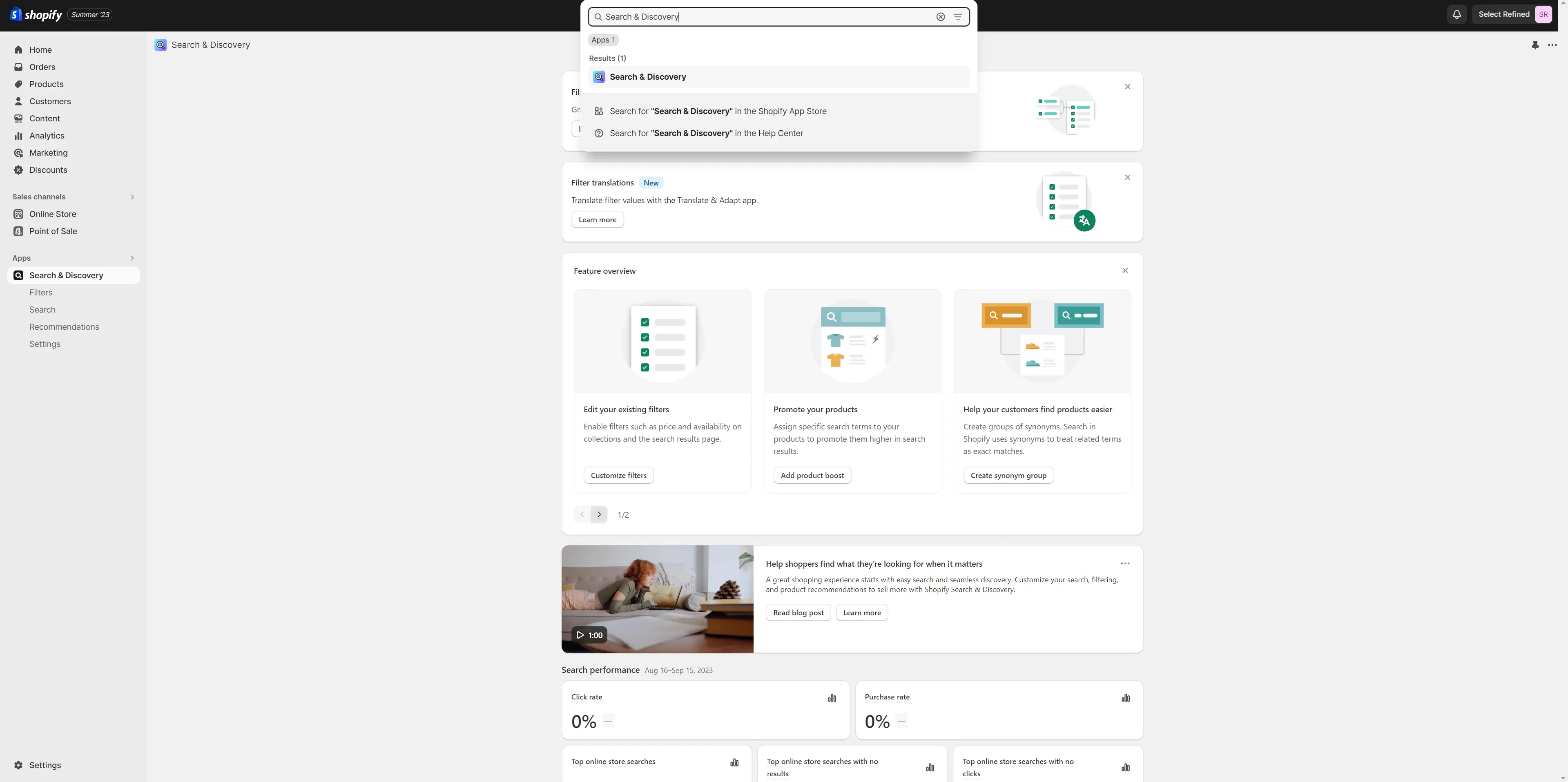
Install the Search & Discovery app by Shopify from the Apps page in the Admin Panel.
-
Once installed, open the app and follow the 'View recommendations'
link in the Feature overview section to add recommendations to your
products.
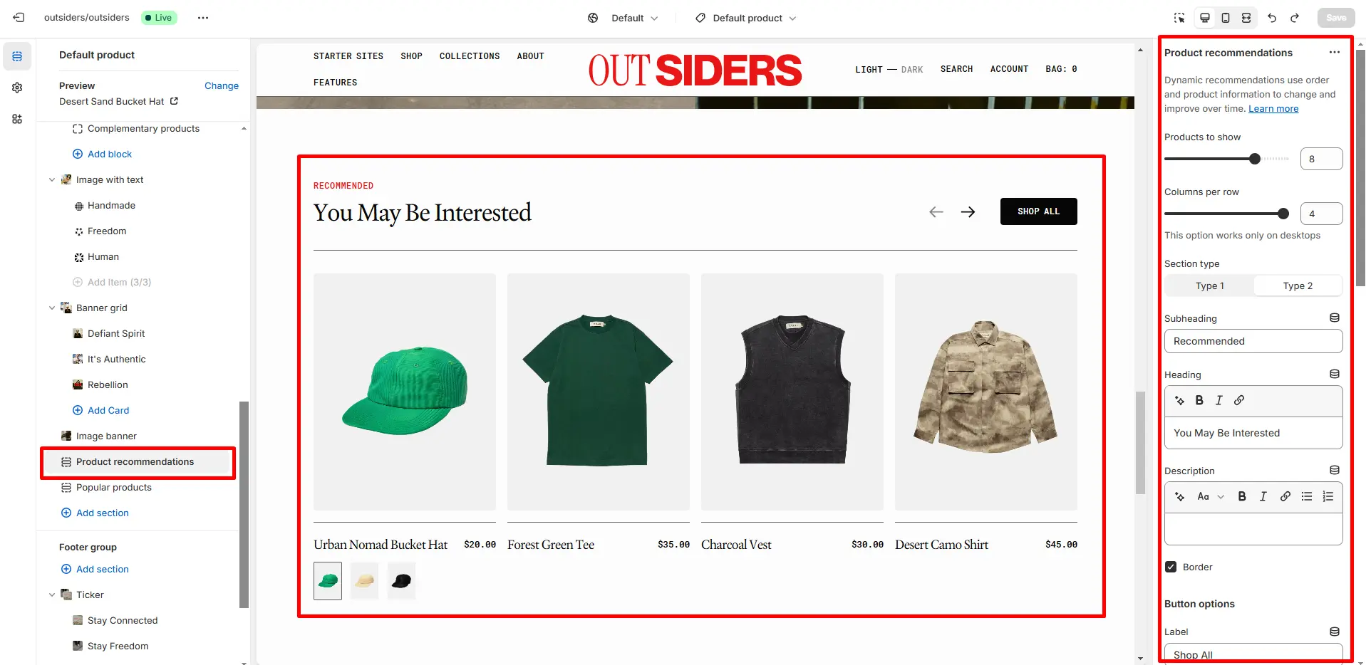
- Heading allows you to set a heading for the section.
- Product card options allow you to customize product cards in the section.
Collections Page
Collection Banner
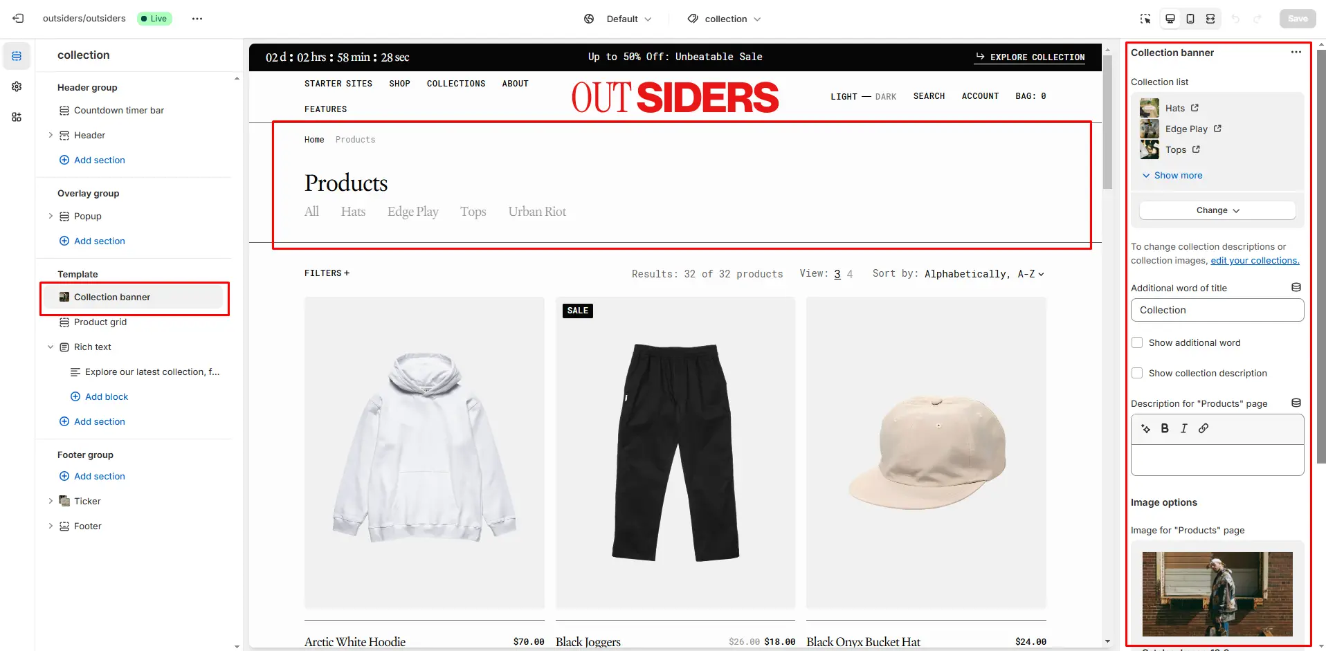
- Show collection description field turn on description display.
- Show collection image field turn on image display.
- Image for "Products" page Image for automatically generated page with all products.
Product Grid
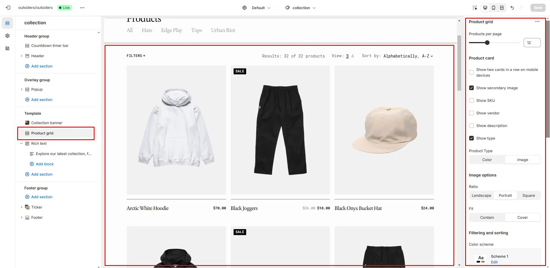
- Products per page field sets the number of displayed cards.
- Product card options allow you to customize product cards in the section.
- Enable filtering field turn filtering.
- Enable sorting field turn sorting.
Collections List
Displays a list of all the collections.
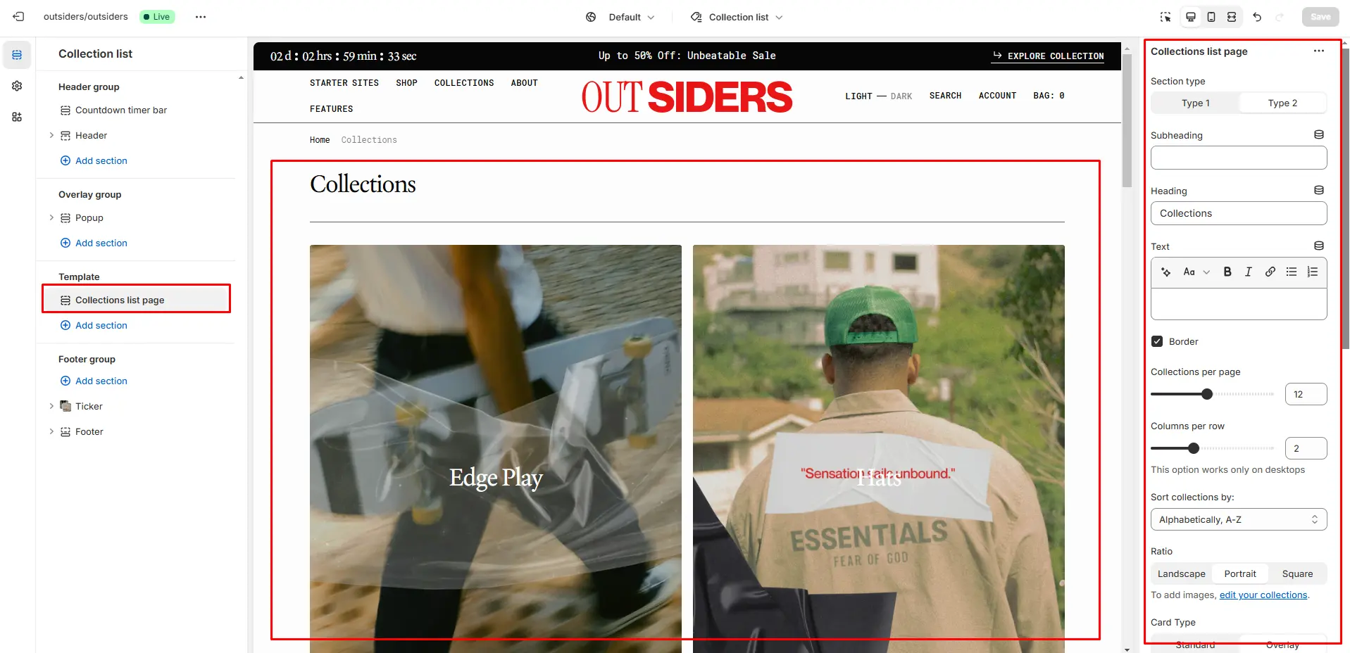
- Heading field sets a header section.
- Collections per row slider allows you to change the number of collections per line only on desktop devices.
- Collections per page field sets the number of displayed collections.
- Sort collections by field filters the collection by the specified parameters
- Image ratio field allows you to choose the orientation of pictures for cards.
- Title size selector field allows you to change the size of the title.
- Description size selector field allows you to change the size of the description.
- Heading animation checkbox field allows you to enable animation for heading.
- Show description enables the display of the collection description.
Cart
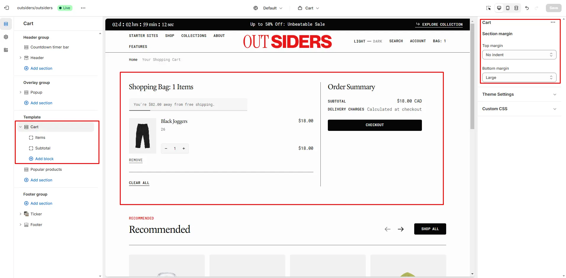
- Image fit field allows you to choose the fit of pictures for cards.
- Subtotal option Enable cart note field sets note.
Free Shipping
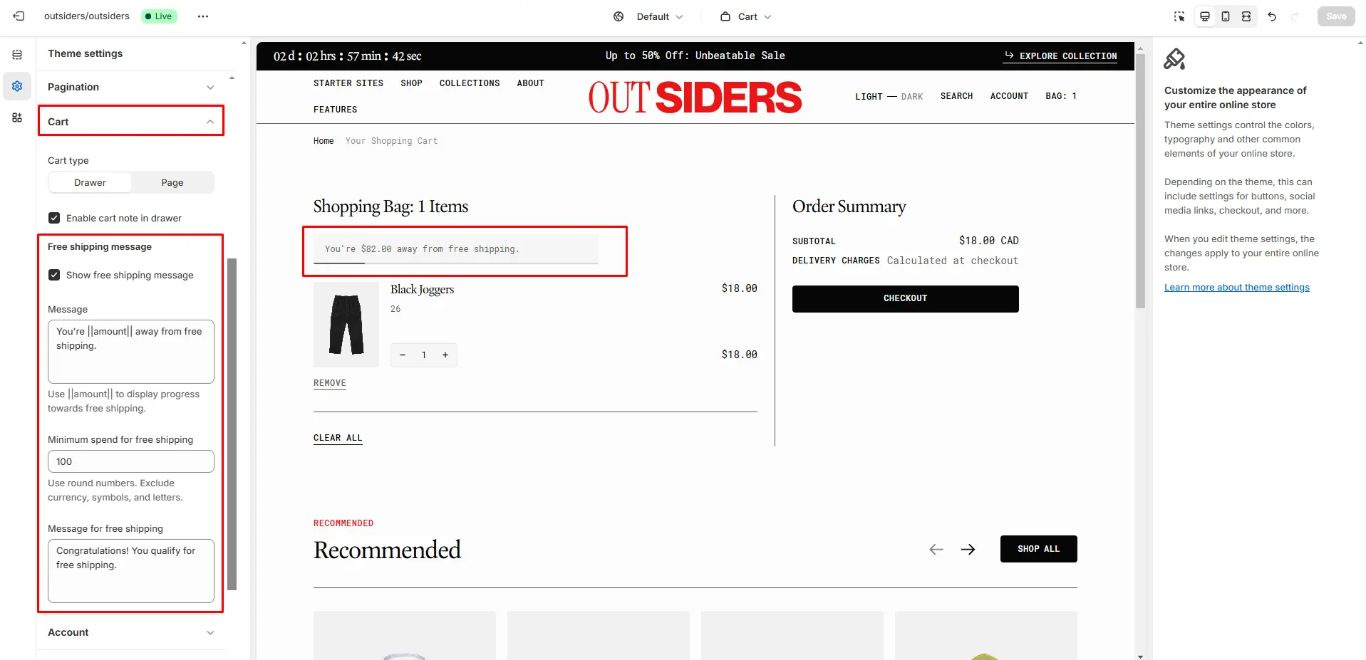
There can be issues when a store has multiple languages. To avoid them, keep the text '{amount}' untranslated.
Blog
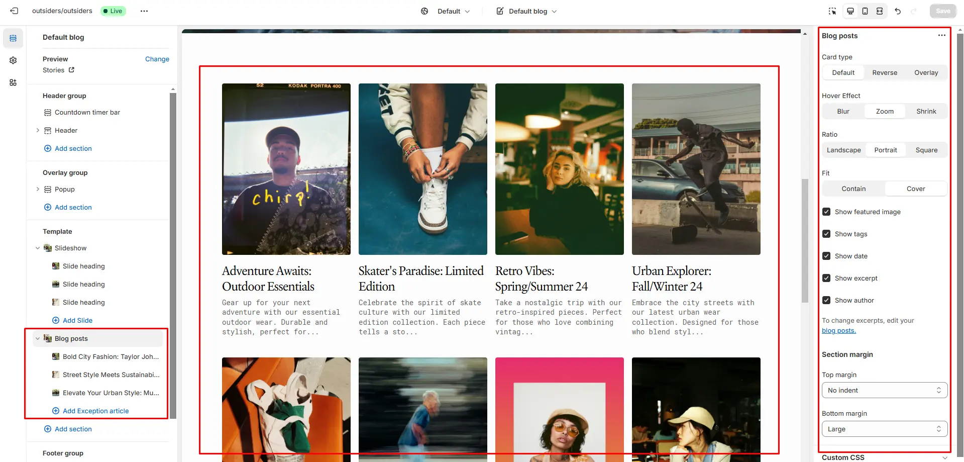
- Show featured image field enables the display of an image for the blog post.
- Show tags field enables the display of tags for the blog post.
- Show date field enables the display of the date for the blog post.
- Show author field enables the display of the author for the blog post.
- Show excerpt field enables the display of the excerpt for the blog post.
Blog Post
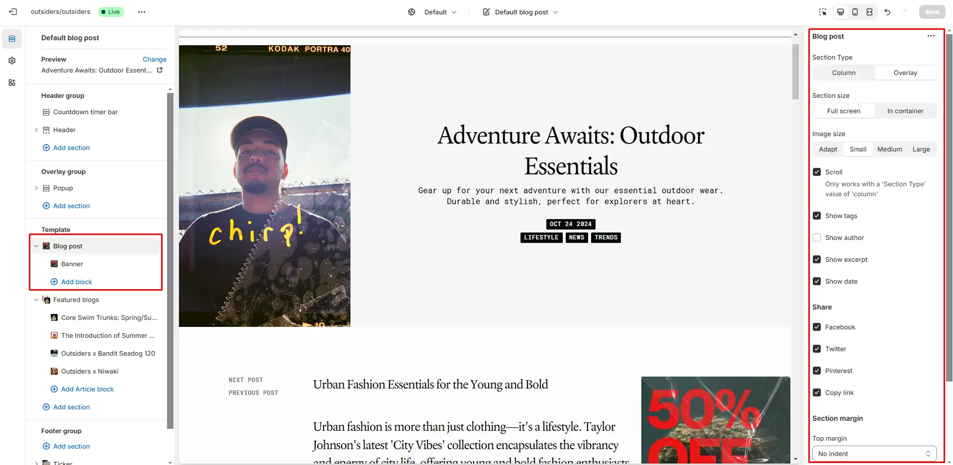
- Section type allows you to select the type of section to define its layout and style.
- Image size field allows you to select an image ratio.
- Show tags field enables the display of tags for the blog post.
- Show excerpt field enables the display of the excerpt for the blog post.
- Show date field enables thedisplay of the date for the blog post.
- Show author field enablesthe display of the author for the blog post.
Support
You can ask any questions about the theme and our support agent will help you within 24 hours on business days.
Visit Help Center View Terms & Conditions
