Minimalista Documentation
Header Group
Header
This theme offers multiple header layouts. You can customize the search promo and choose from three Mega Menu styles.


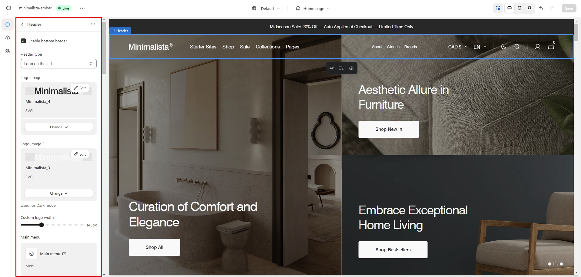
Mega Menu
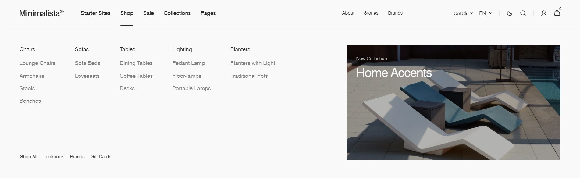
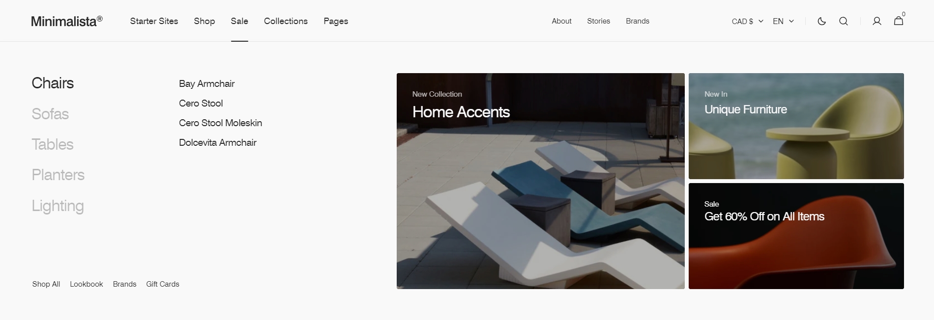
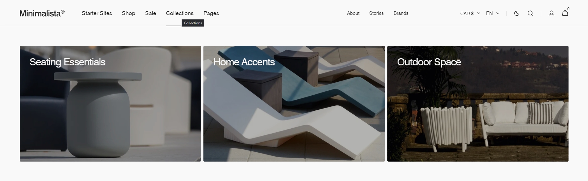
To add a Mega menu, ensure that the main menu link has sublinks, then follow these steps:
- Add the Mega Menu to the Header.
- Enter the exact name of the link in the Trigger field.
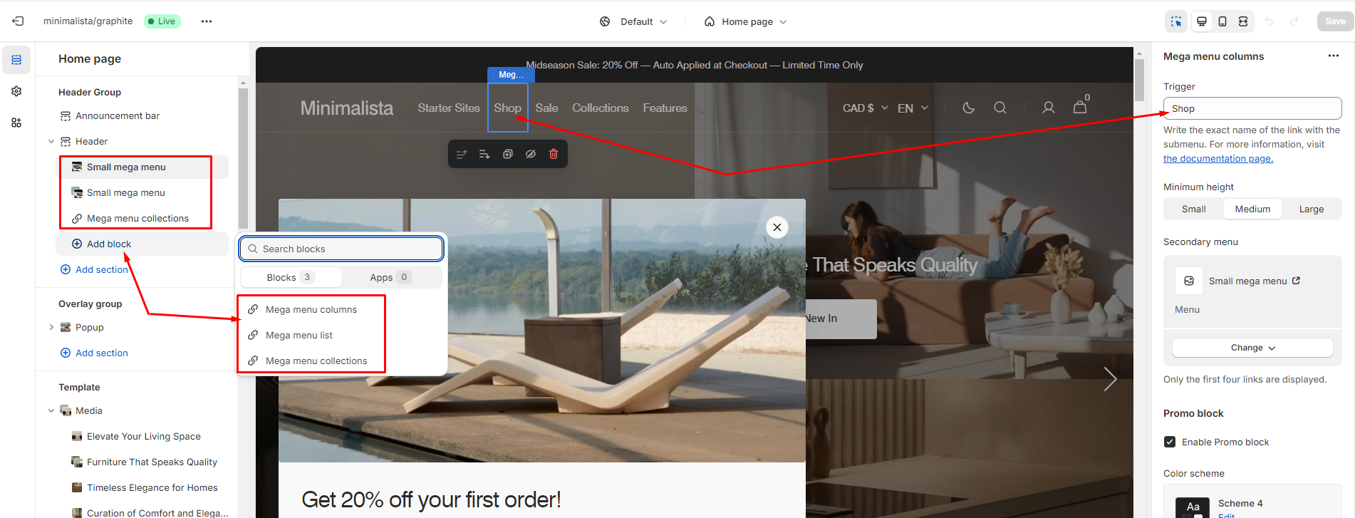
Additionally, you can add images, text, and links to the two promo blocks, and customize their color scheme.
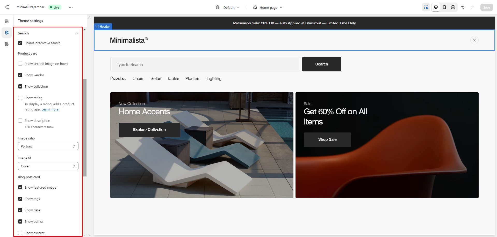
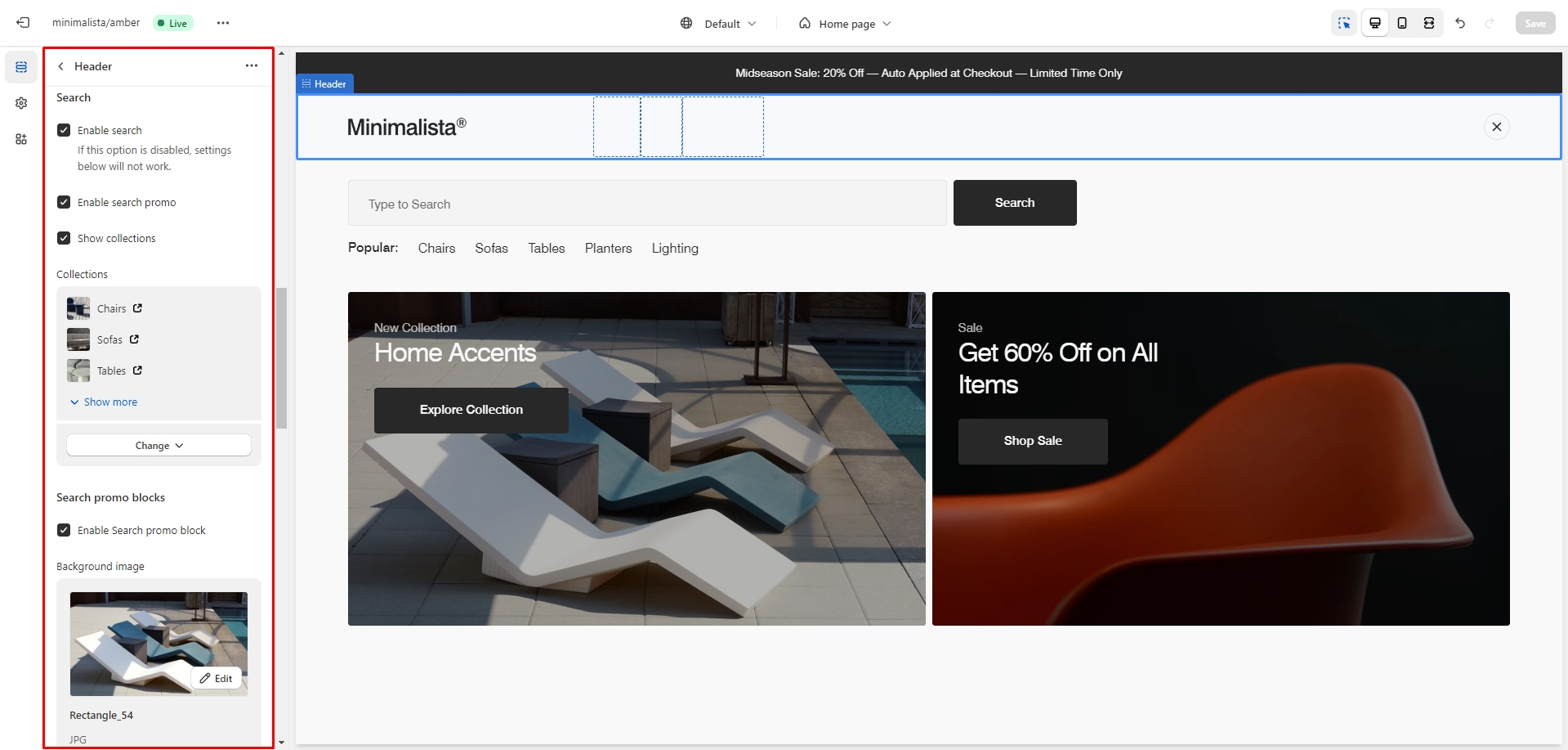
Search
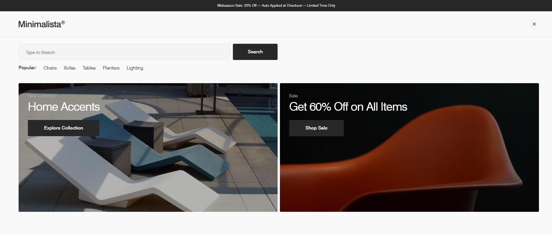
This theme includes predictive search, which is enabled by default. You can disable it in the Theme settings > Search.
You can also enable the Search promo dropdown in the Header settings, which appears before the user starts typing. You can add two types of content to this dropdown: collections and two promo blocks.
Overlay Group
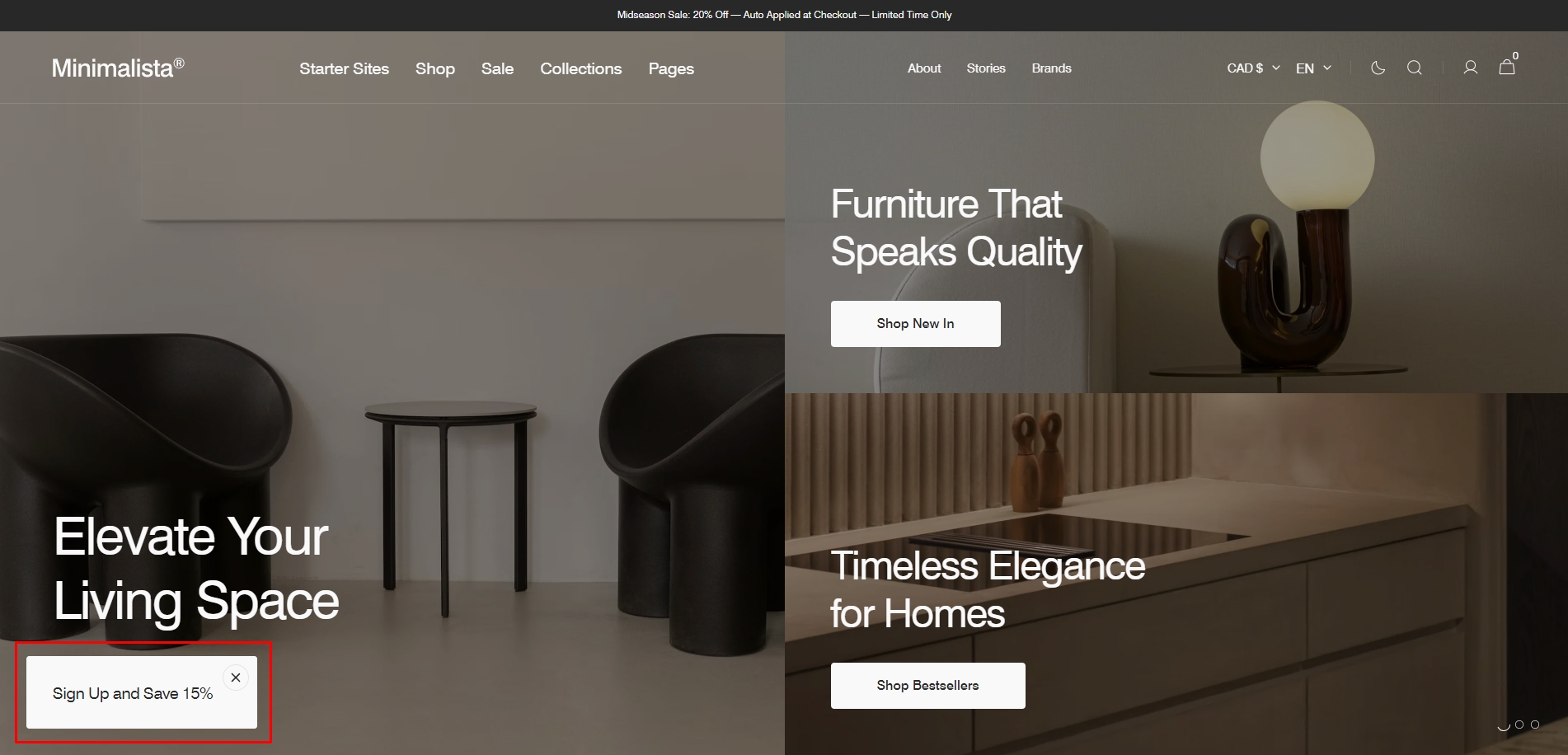
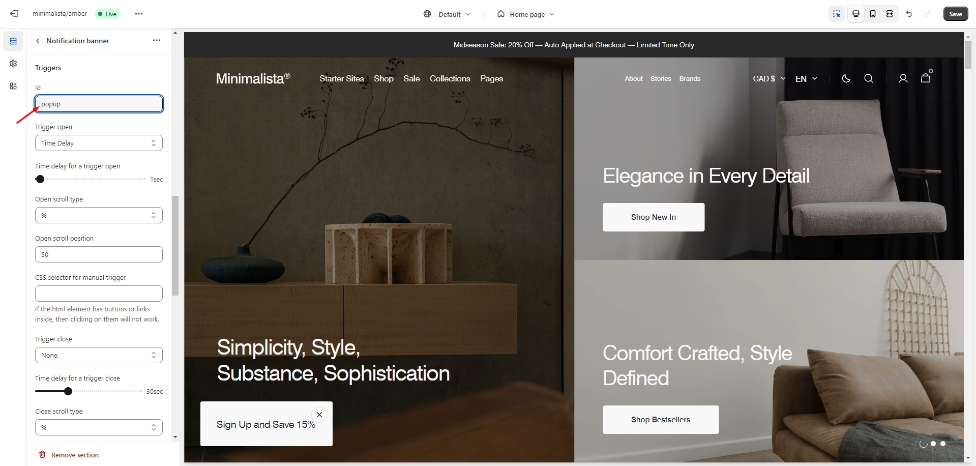
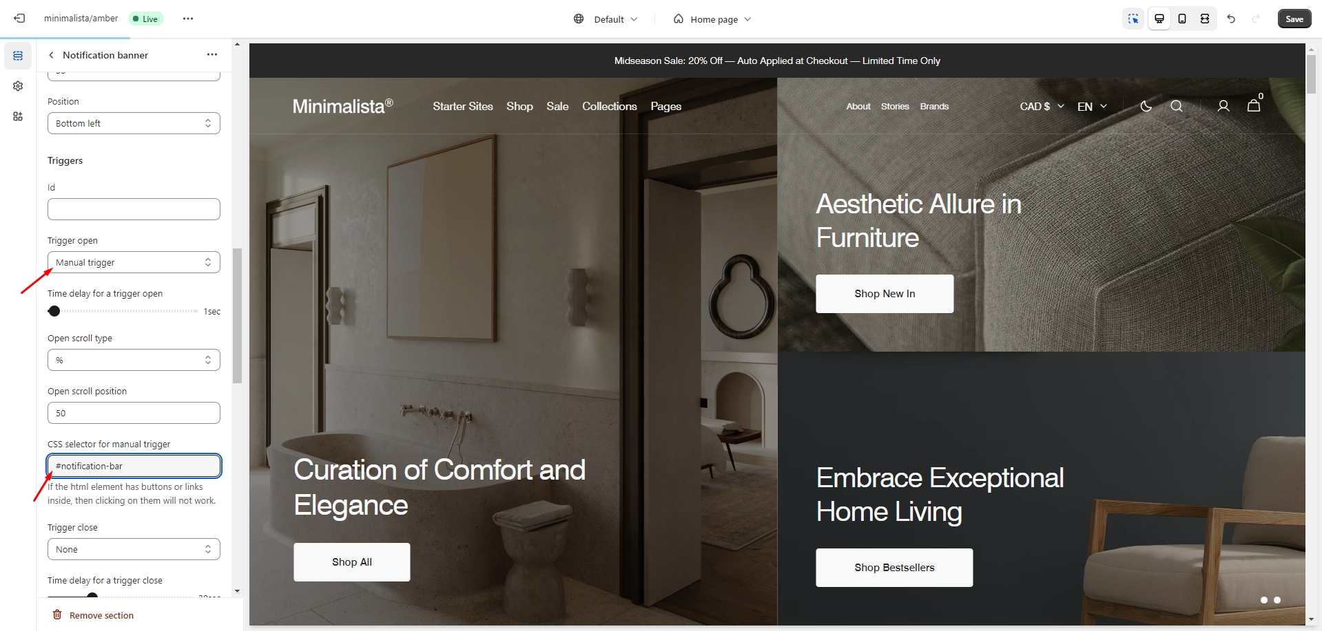
Notification Banner
In the Notification Banner settings, you can customize the layout, add images and text, adjust the banner position, and modify the open/exit animations and options.
You can also use this banner as a button to trigger another notification bar or popup. Follow these steps:
- In the Triggers section, add the ID of the popup/notification bar you want to open (e.g. 'popup').
- Go to the popup/notification bar settings and enter the ID, starting with '#' (e.g. '#popup'), in the 'CSS selector for manual trigger' field.
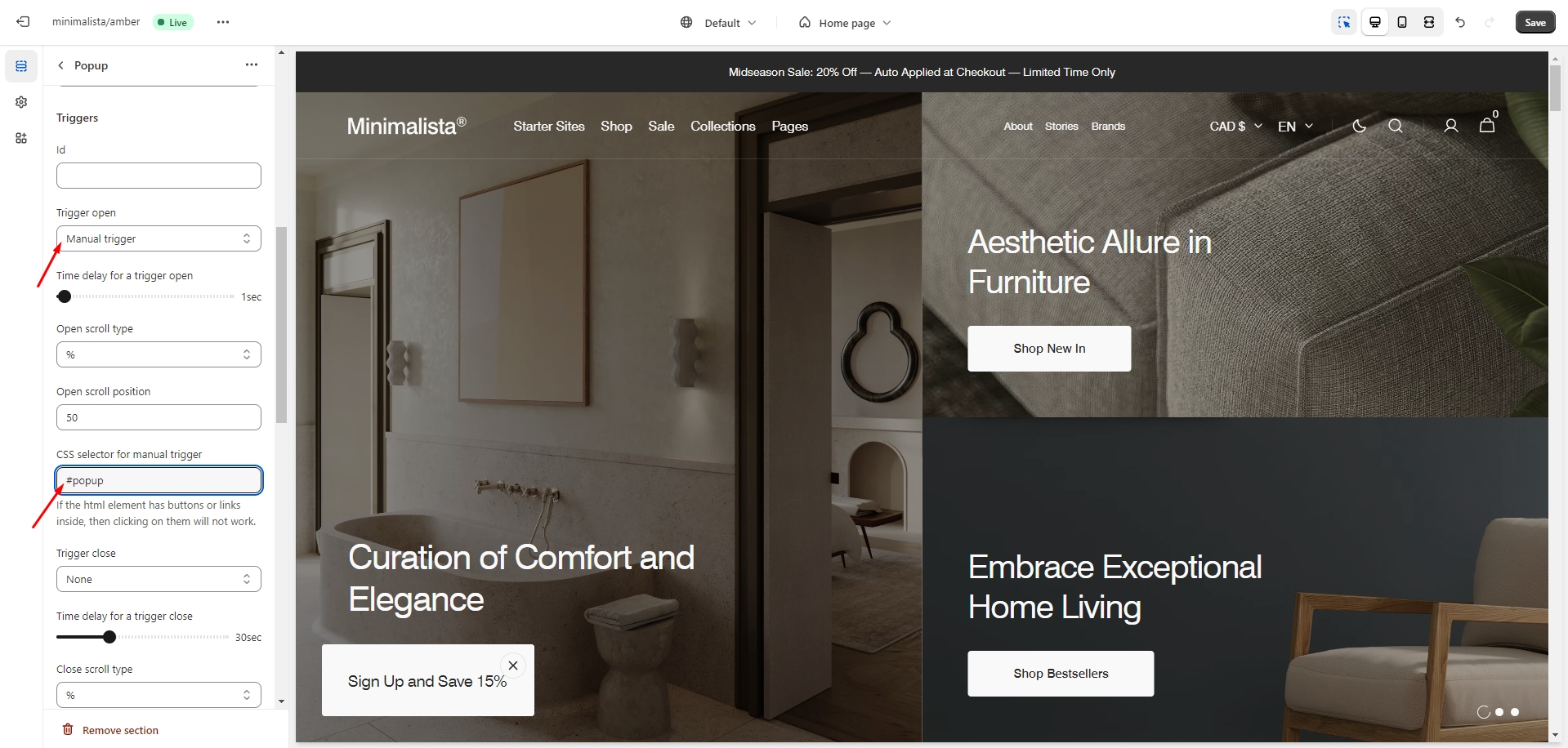
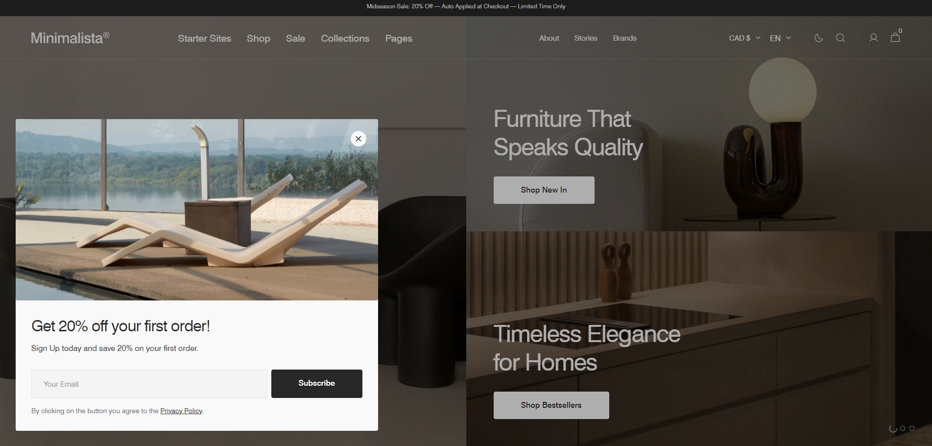
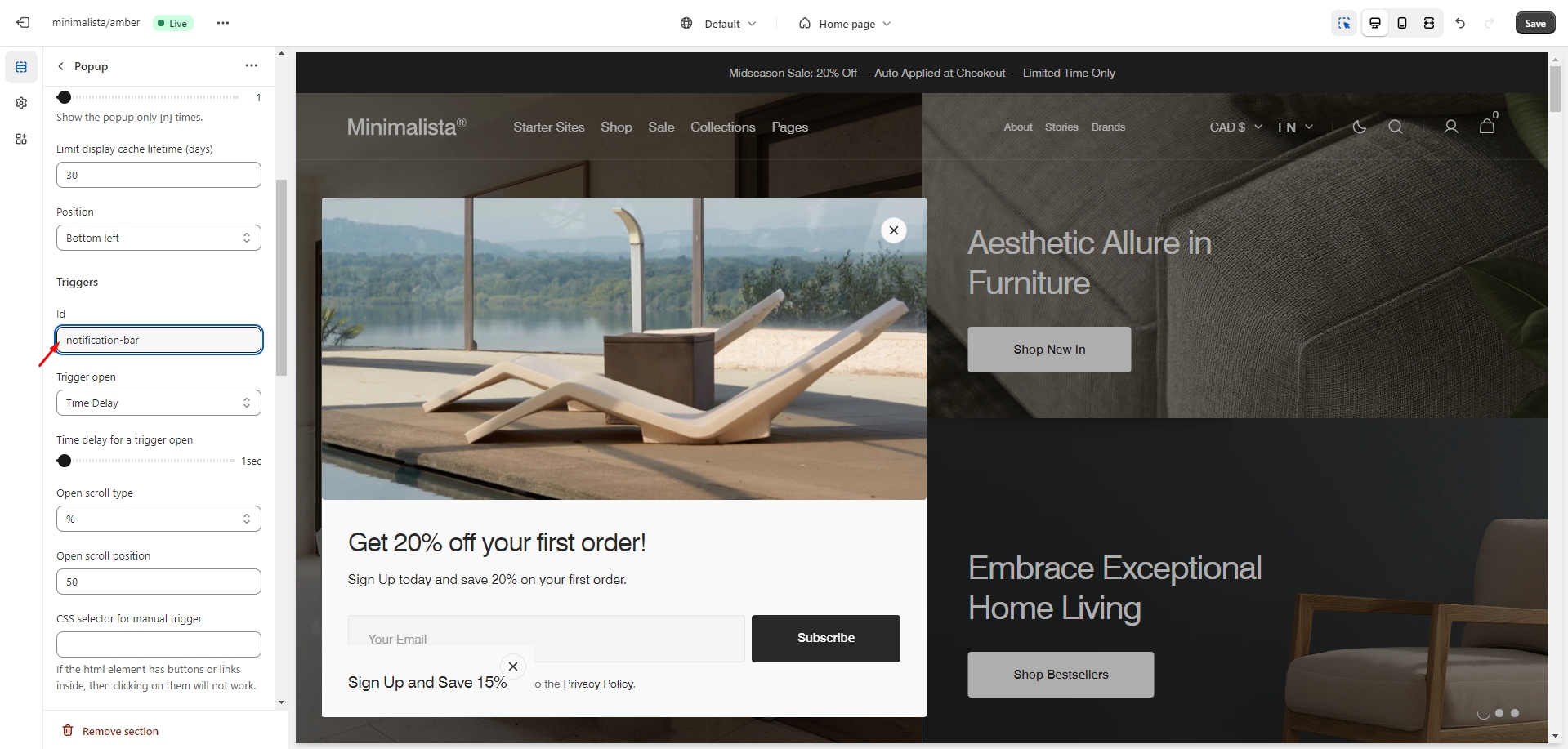
Popup
In the Popup settings, you can customize the layout, add images and a subscription form, adjust the position, and modify the open/exit animations and options.
You can also use this popup as a button-trigger for opening another popup or notification bar by following these steps:
- In the Triggers section, add the ID of the popup/notification bar you want to open (e.g. 'notification-bar').
- Go to the popup/notification bar settings and add the ID, starting with '#' (e.g. '#notification-bar'), in the 'CSS selector for manual trigger' field.
Sections
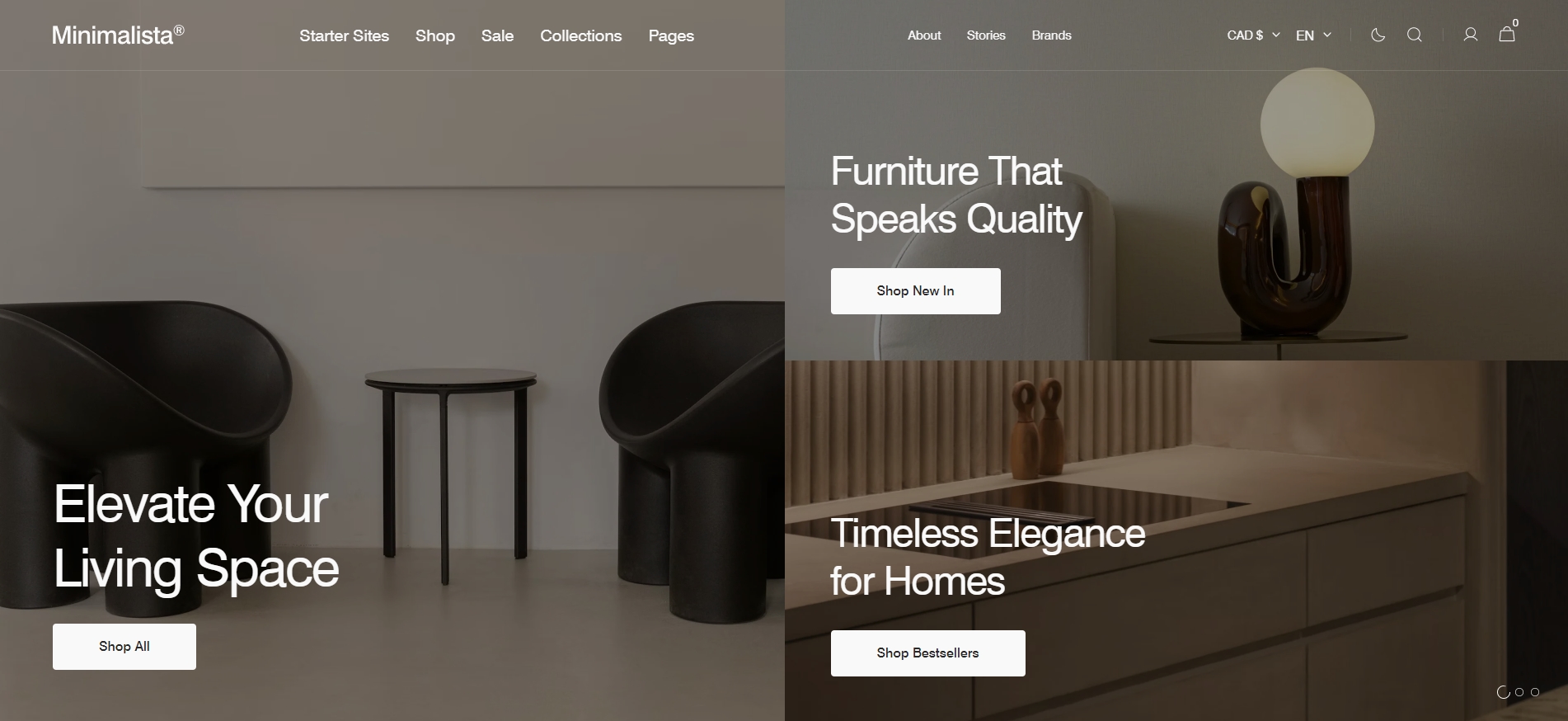
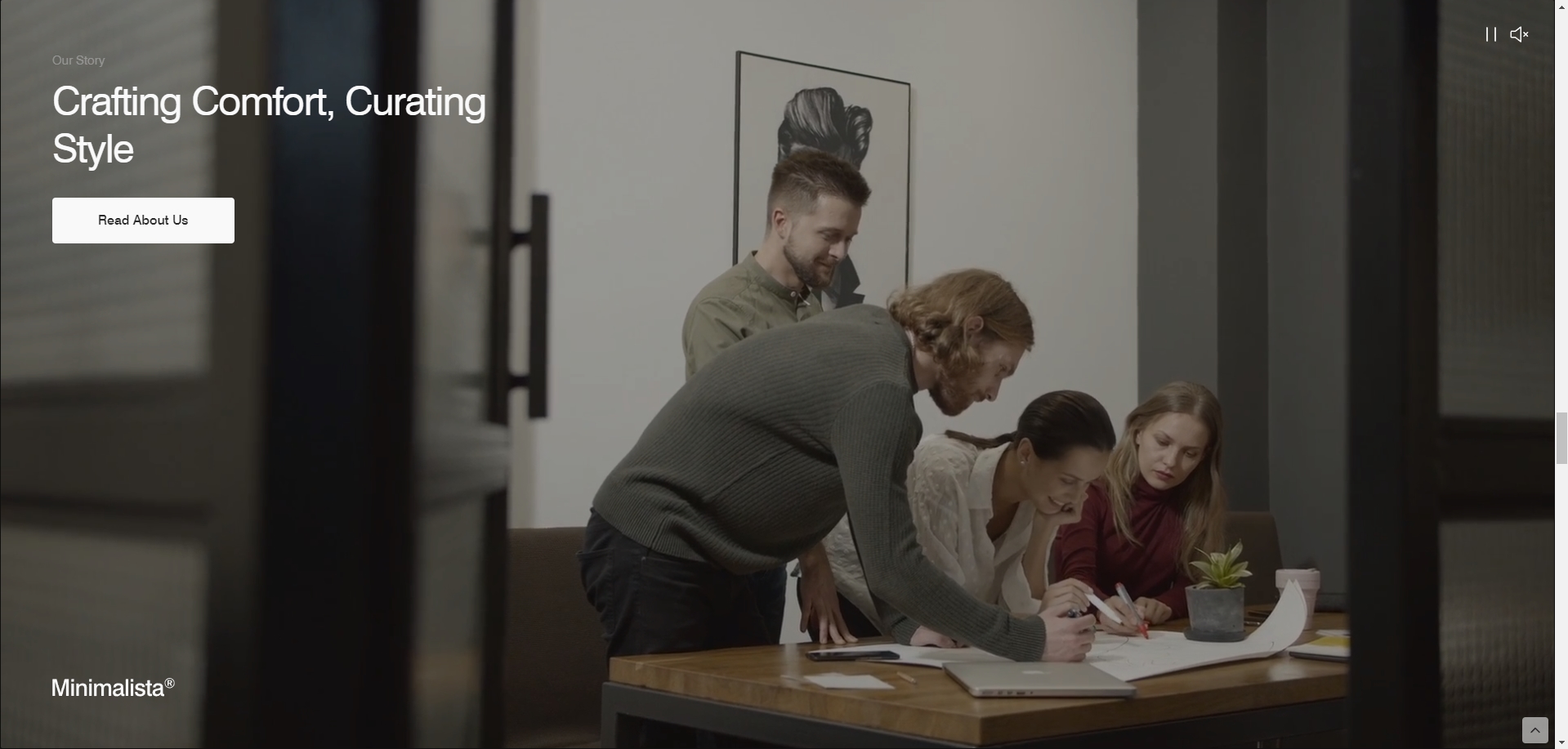
Media
This section has multiple layouts and settings, here are some examples below.
-
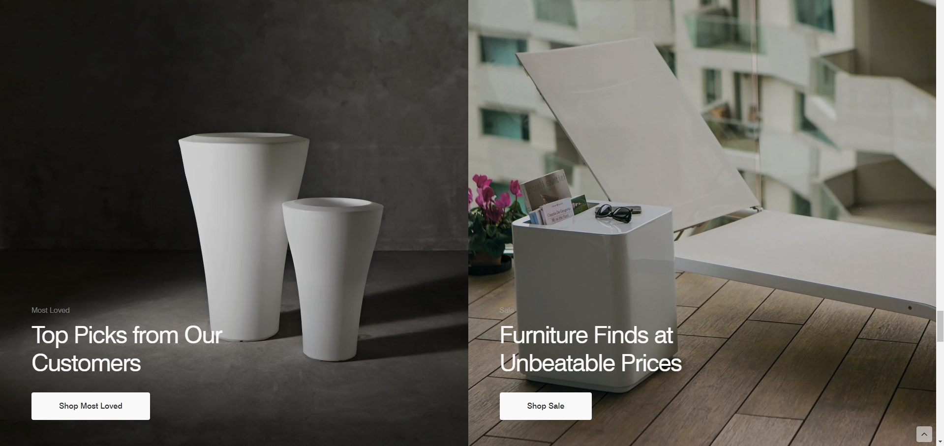
9 slides, Desktop layout — Grid format.
-
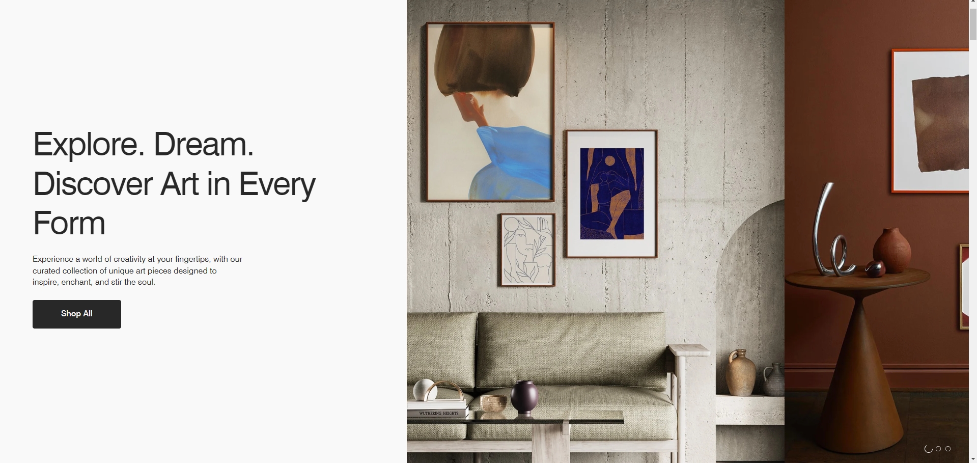
1 block, Desktop layout — Full-width.
-
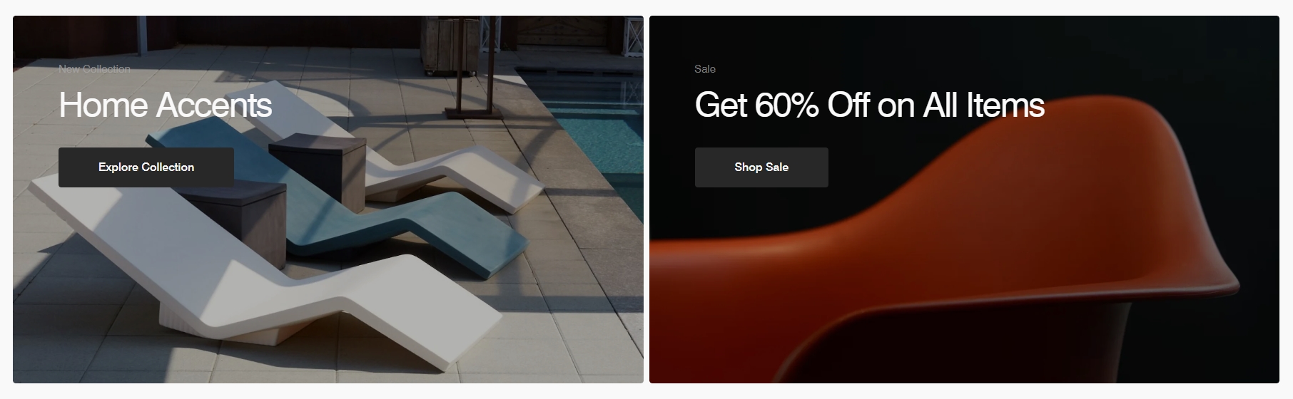
2 blocks, Desktop layout — Half page.
-
9 slides, Desktop layout — Split page.
-
2 blocks, Desktop layout — Half page, disabled Full width, enabled gap between slides, and enabled border
radius for slides.
Settings
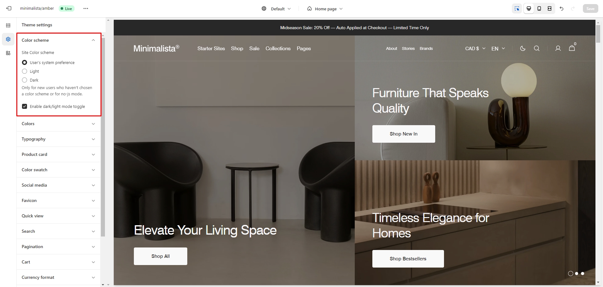
Dark Mode
To edit the Dark Mode settings, go to Theme settings > Color scheme.
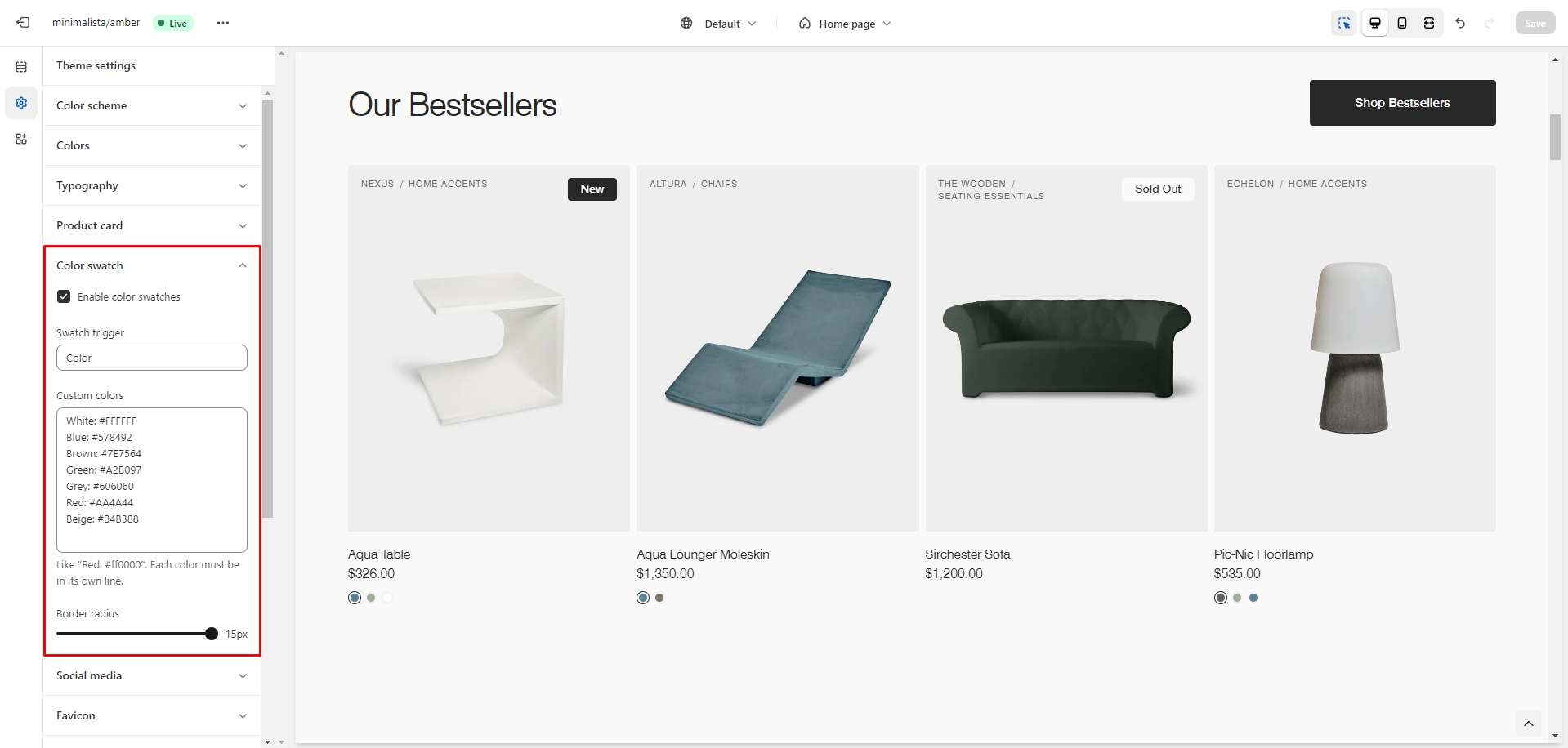
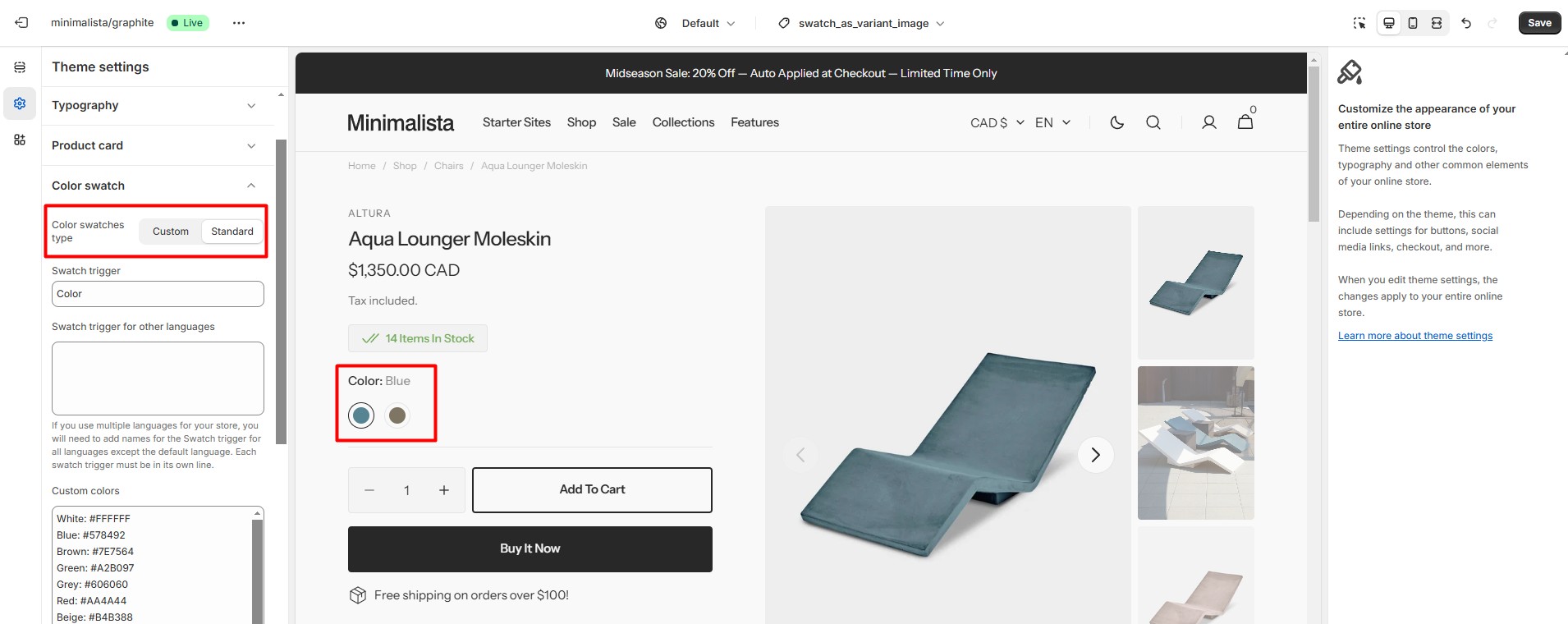
Color Swatches
To enable and edit Color Swatches, go to Theme settings > Color swatch.
To display color swatches as variant images, you can check the instructions here.
Custom Colors
The swatch trigger should match the option in Product variants.
You can also add custom colors by specifying their name and HEX color code.
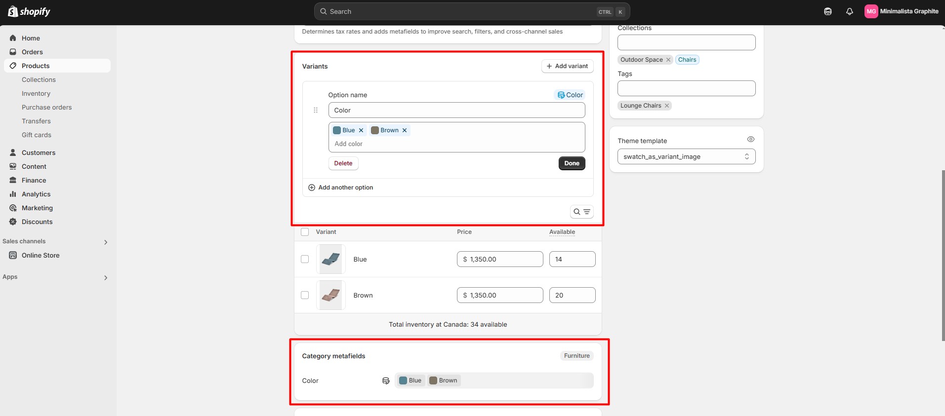
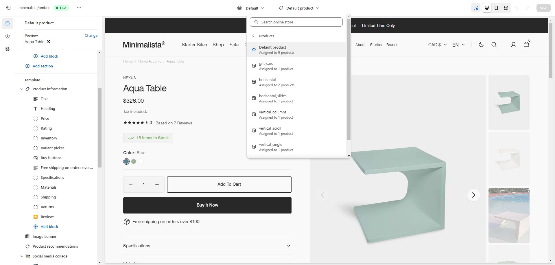
Category Metafields
To display the value from an option configured using Category metafields on the product creation/edit page, you need to enable the Standard type in Theme Settings > Color swatch > Color swatches type.
At the same time, to display the Color Swatch on the product card, you will still need to fill in the Swatch trigger field.
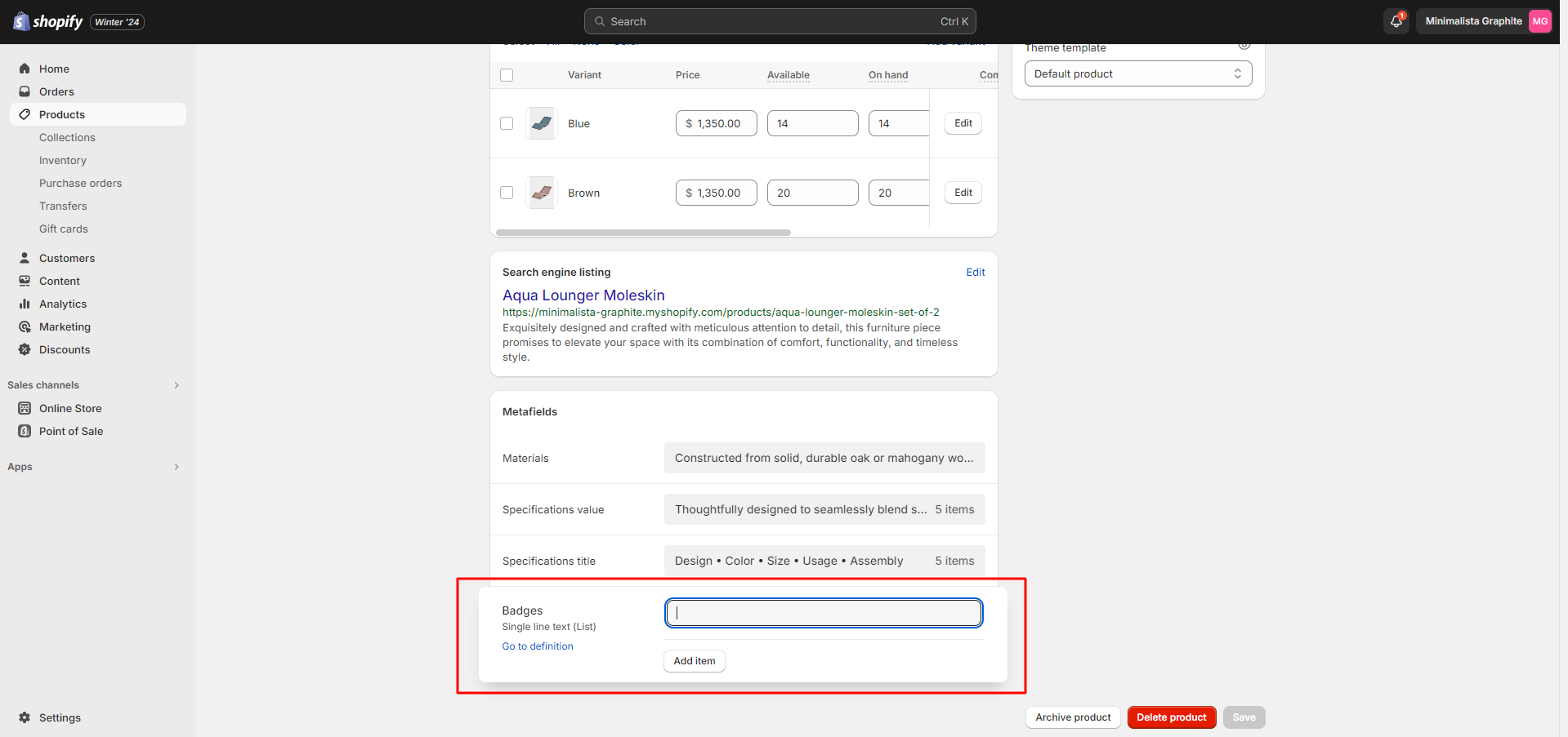
Custom Product Badges
To enable and edit Custom badges, navigate to Theme settings > Product card.
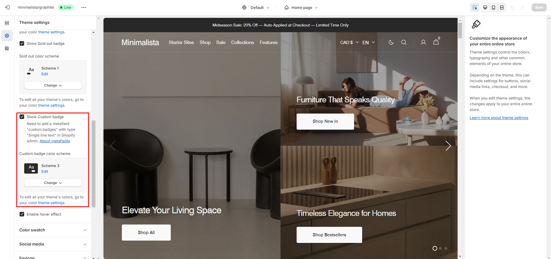
The next step is to add metafields to the products.
To add and edit metafields, follow these steps:
-
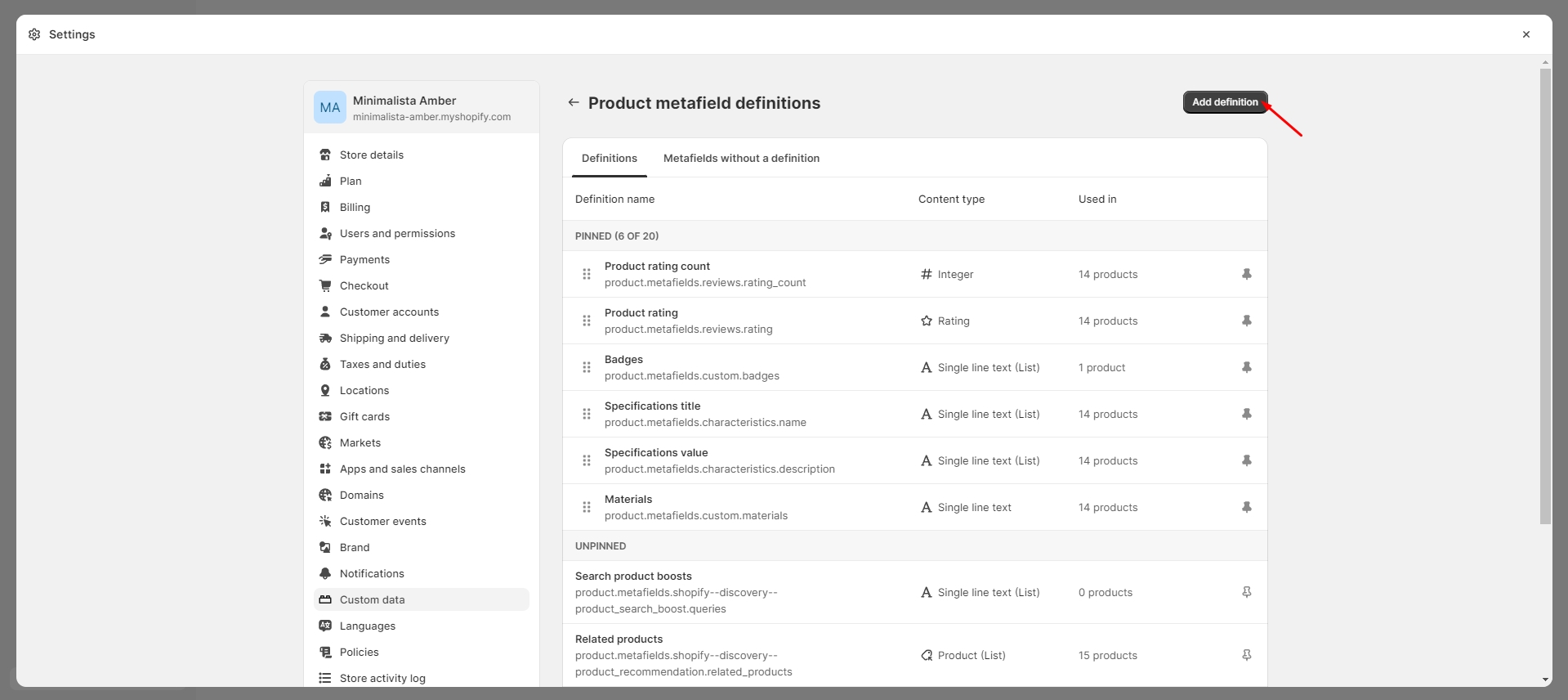
Navigate to Settings > Custom data in the Admin Panel.
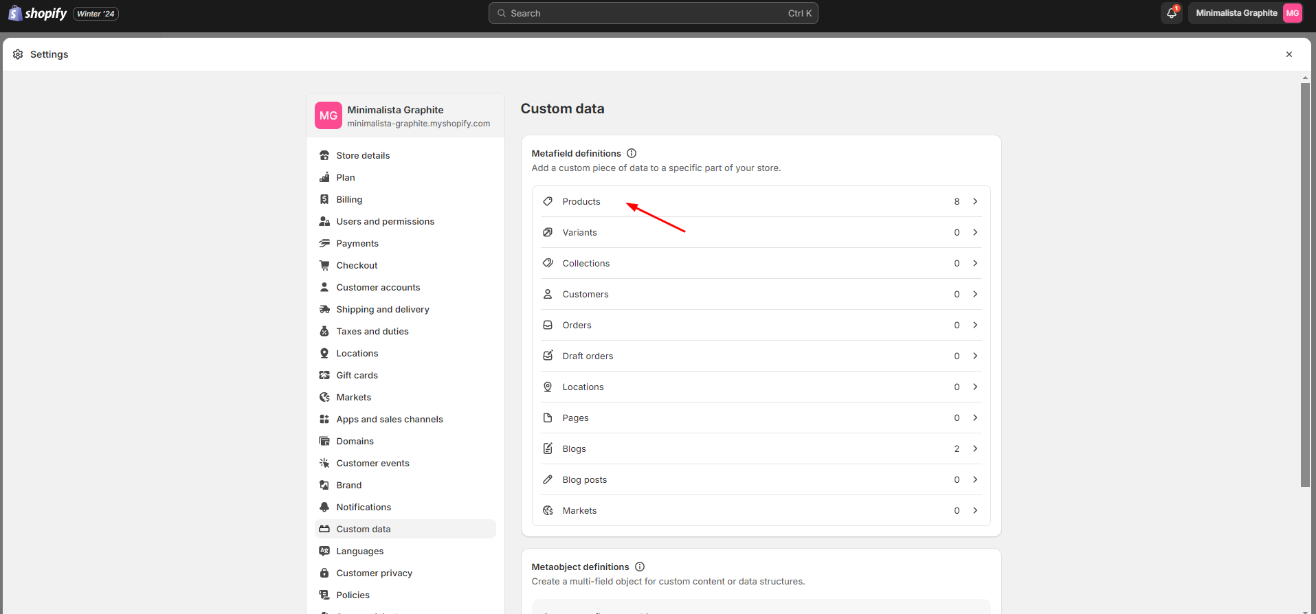
- Select Products.
- Click the 'Add definition' button and fill in the fields.
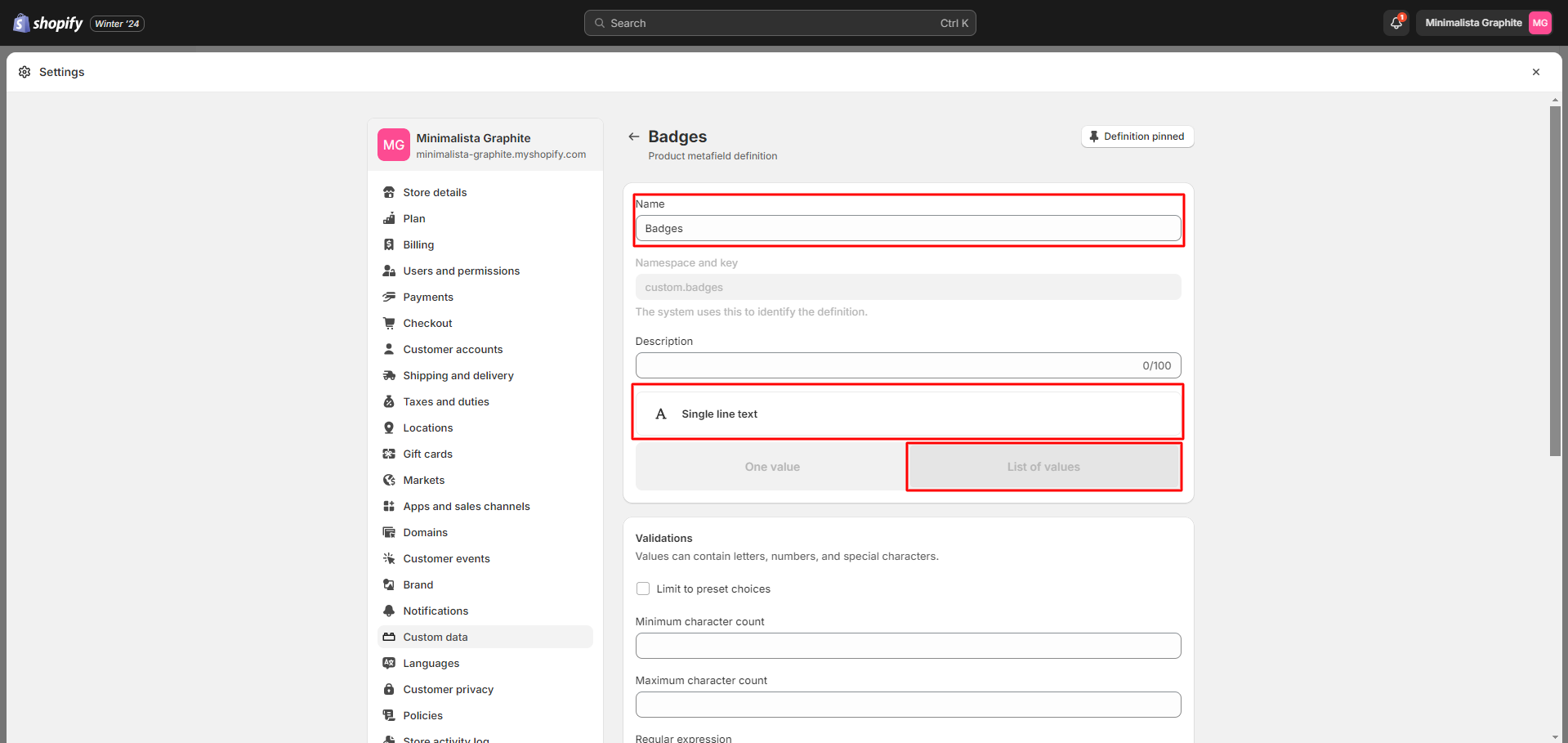
- Navigate to the product and add
information
below.
For more information about metafields, follow the link.
Metafields
To add and edit metafields, follow these steps:
-
Navigate to Settings > Custom data in the Admin Panel.
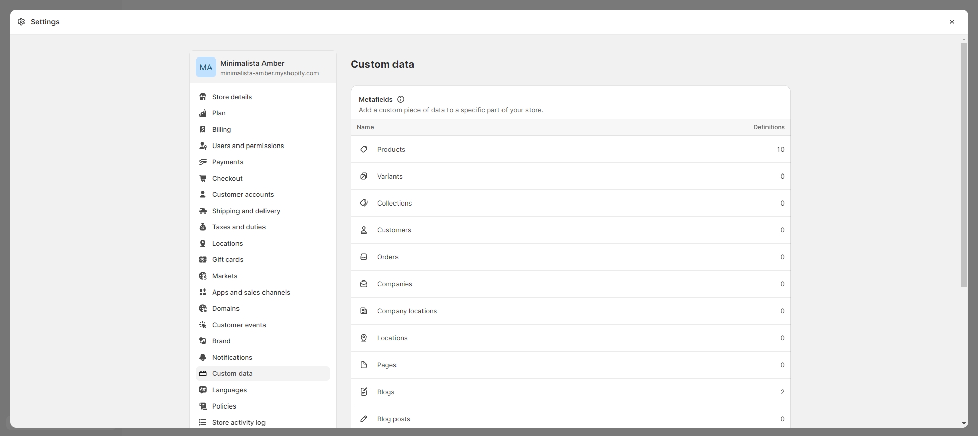
- Select an item to which you would like to add a metafield.
- Click the button "Add definition" and fill the fields.
- Go to the item where you've added the metafield (e.g., Product or Collection) and add the information below.
For more information about metafields, follow the link.
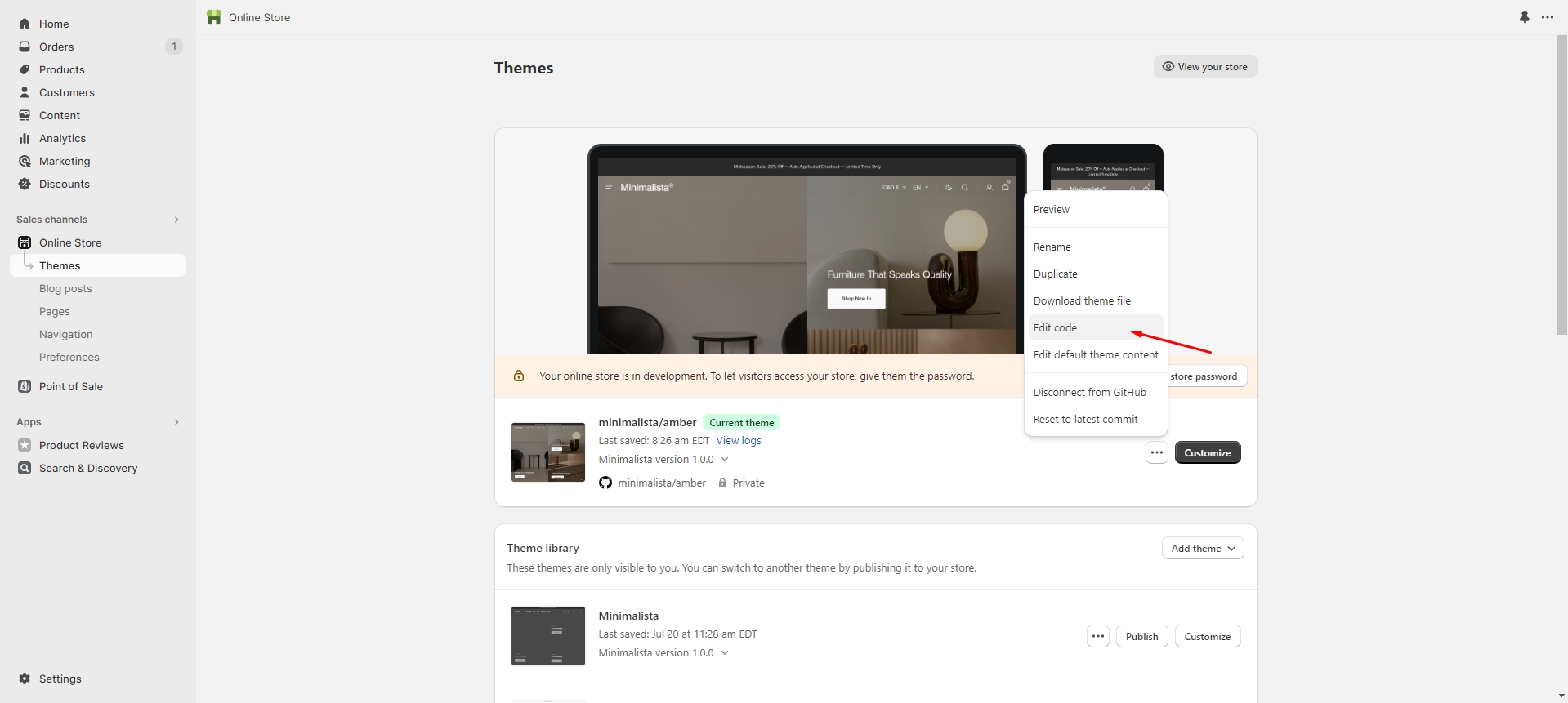
Custom Templates
You can easily create and customize your templates. Here's an example below:
-
Choose the type of template you'd like to create and give it a name.
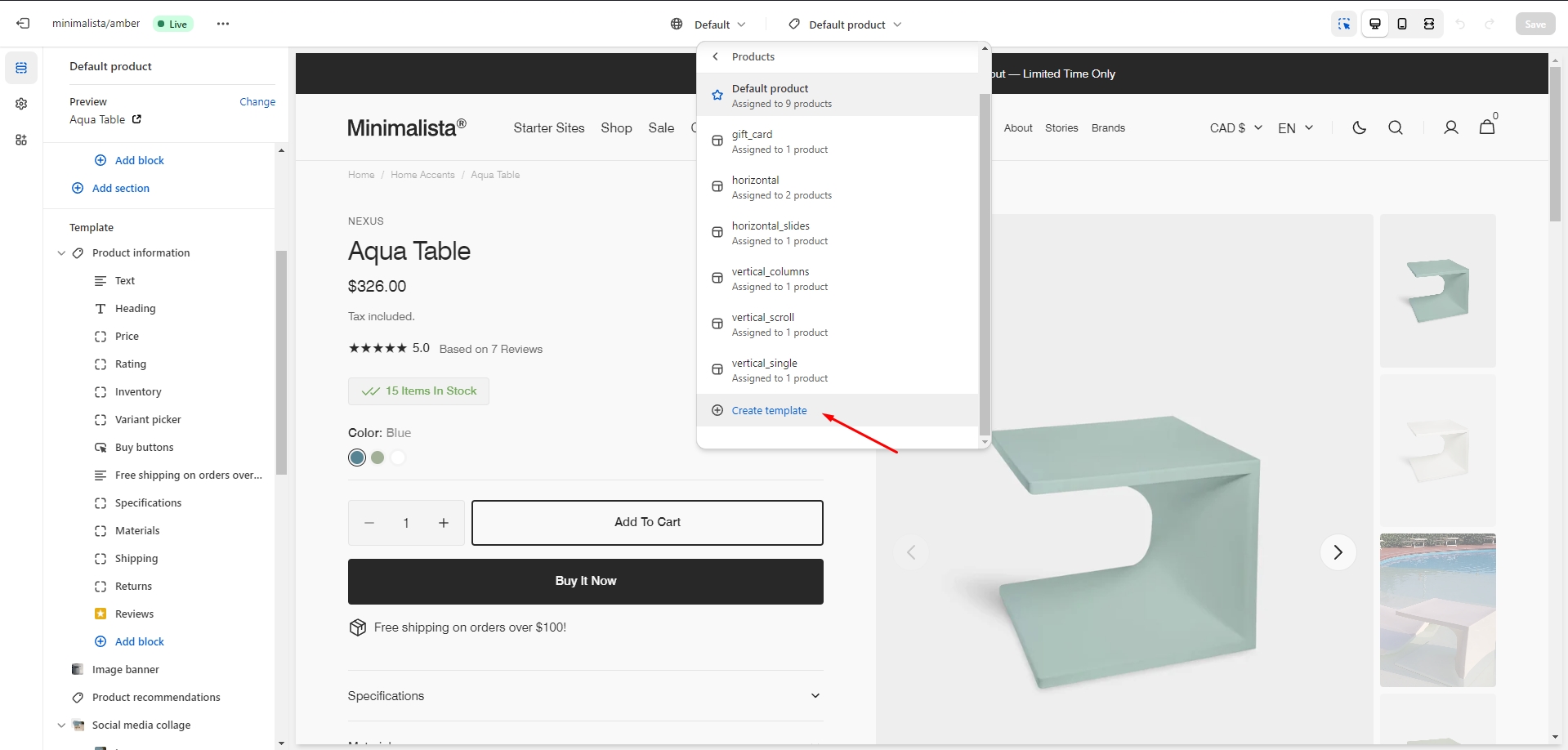
-
In the Admin Panel, select the page you want to assign the custom template to. Choose the theme template and save the changes.
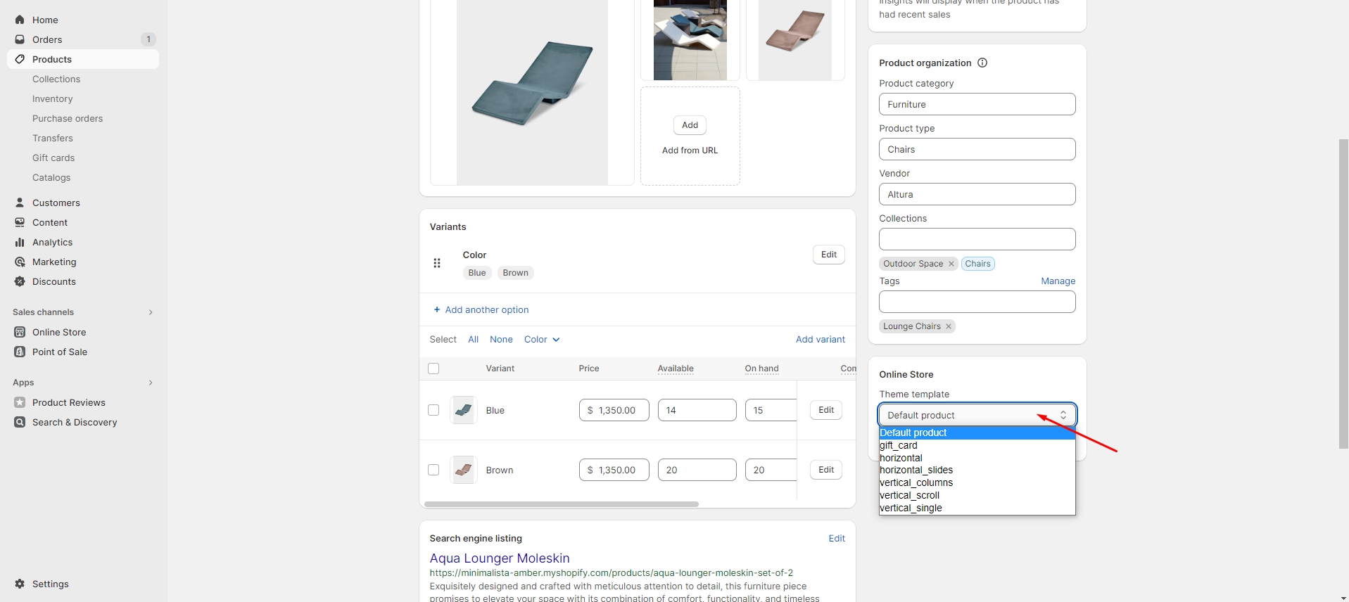
-
Now, you can go back to the customizer, open the new template, and add the desired
sections.
If you want to delete a custom template, follow the 'Edit code' link in the Admin Panel, select the template, and click the delete button. Please note that this action can impact your theme, so be cautious.
Pages
Product Page
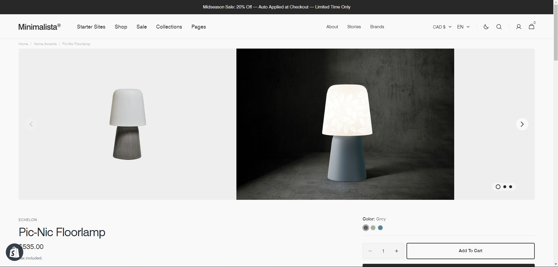
There’re 6 types of Gallery:
-
Horizontal Slider
-
Horizontal Carousel
-
Slider with Bullets
-
Grid Gallery
-
Slider with Previews
-
Stacked Gallery
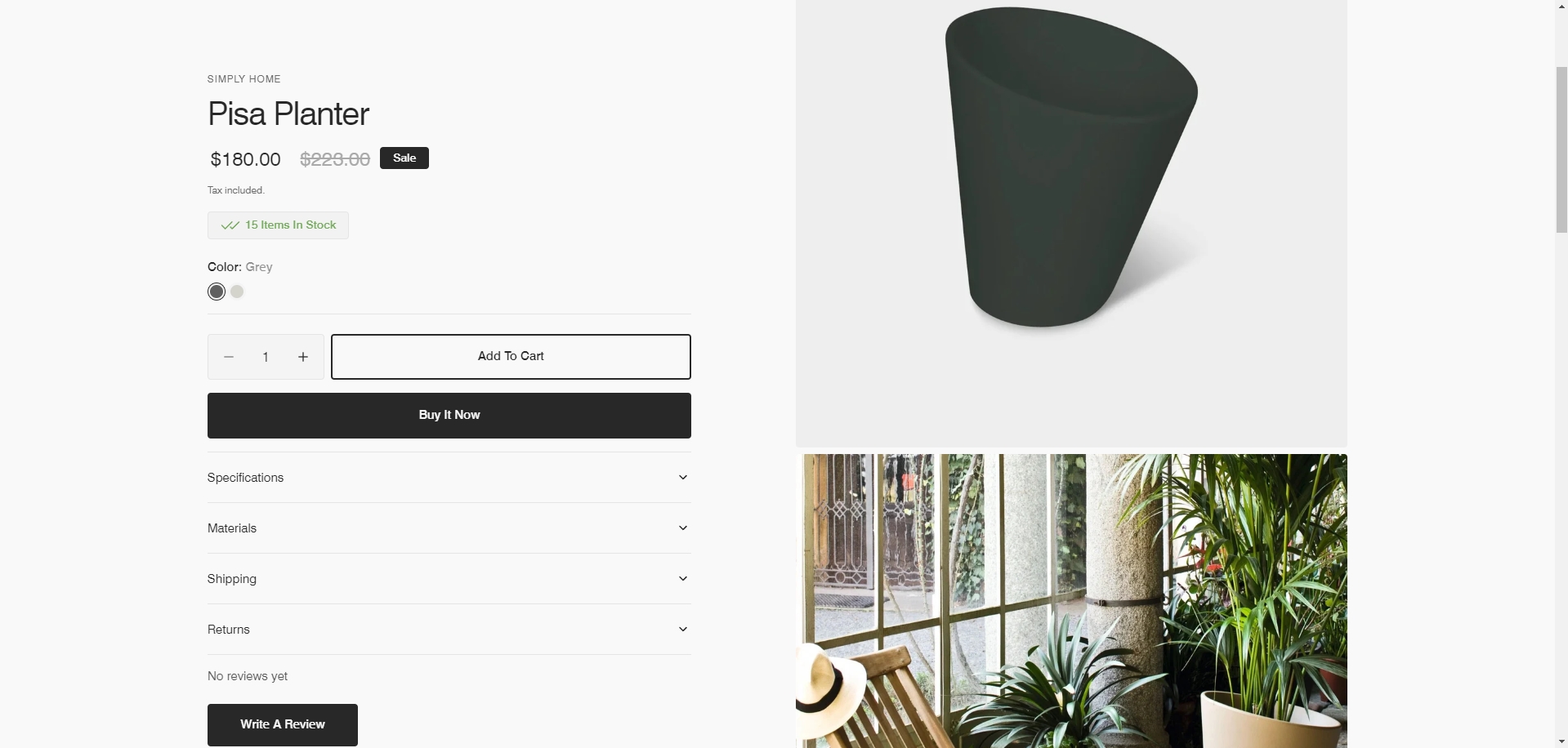
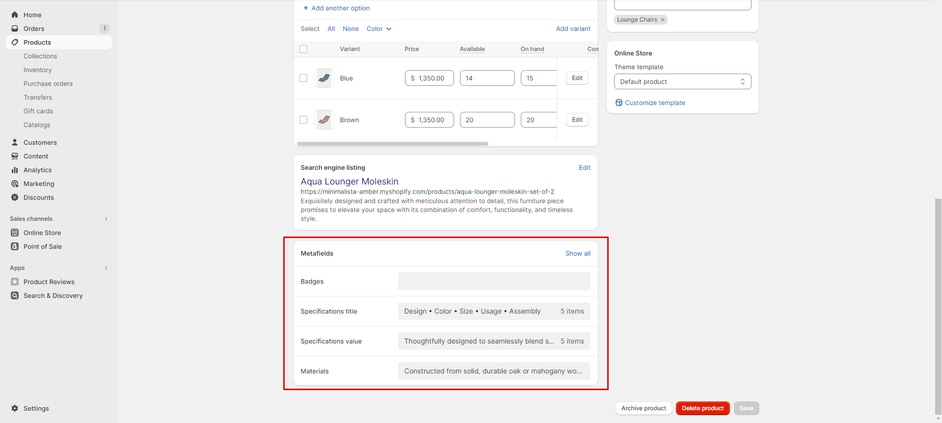
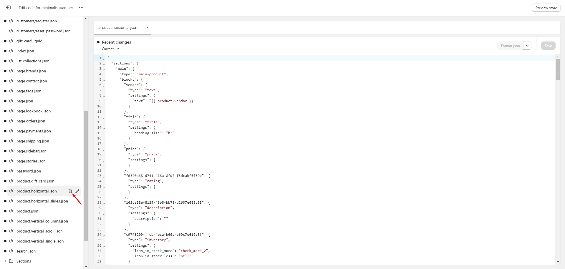
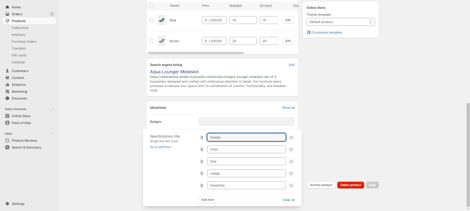
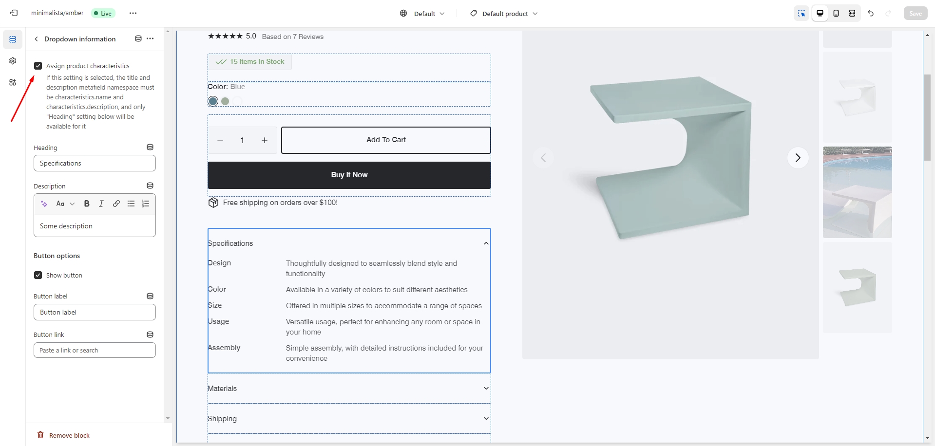
To add more dynamic information to a product, you can use metafields. To do so, go to Settings > Custom data > Products in the Admin panel. Follow these steps to add dynamic characteristics to the product:
- Add two metafield definitions with the key names "characteristics.name" and
"characteristics.description".
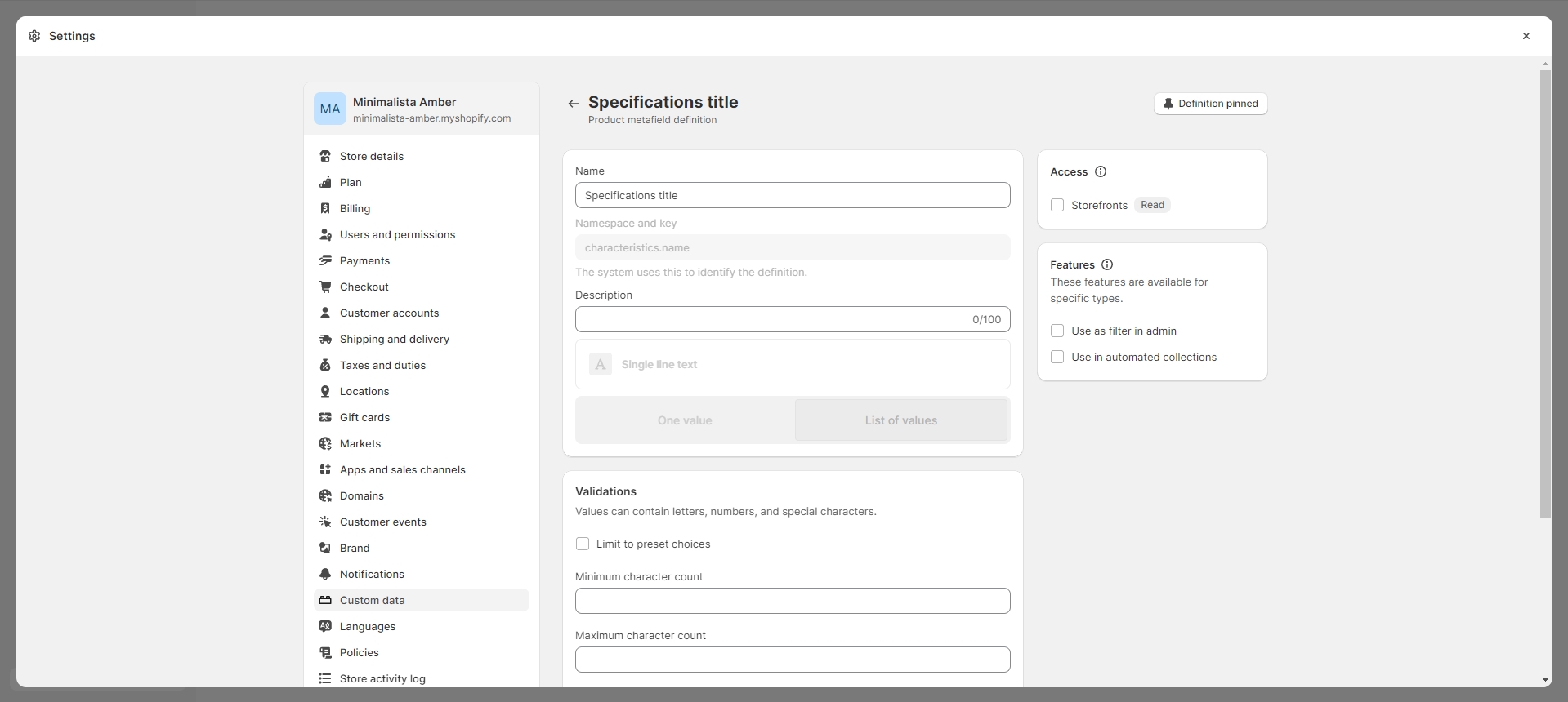
- Choose the "Single-line text with list of values" type for the both metafields.
-
Navigate to the product and add characteristics.
-
Add a Dropdown information block to the product page and enable the 'Assign product characteristics' checkbox.
For more information about metafields, follow the link.
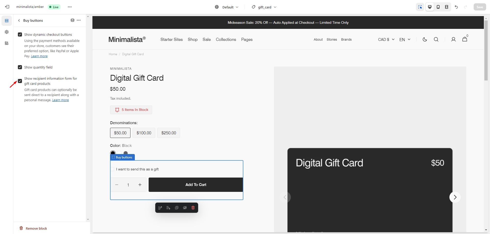
Gift Card Recipient
To add recipient and message fields to gift card products, go to the customizer > Product page > Buy buttons block. Check the 'Show recipient information form for gift card products' option to enable the recipient information form for gift cards.
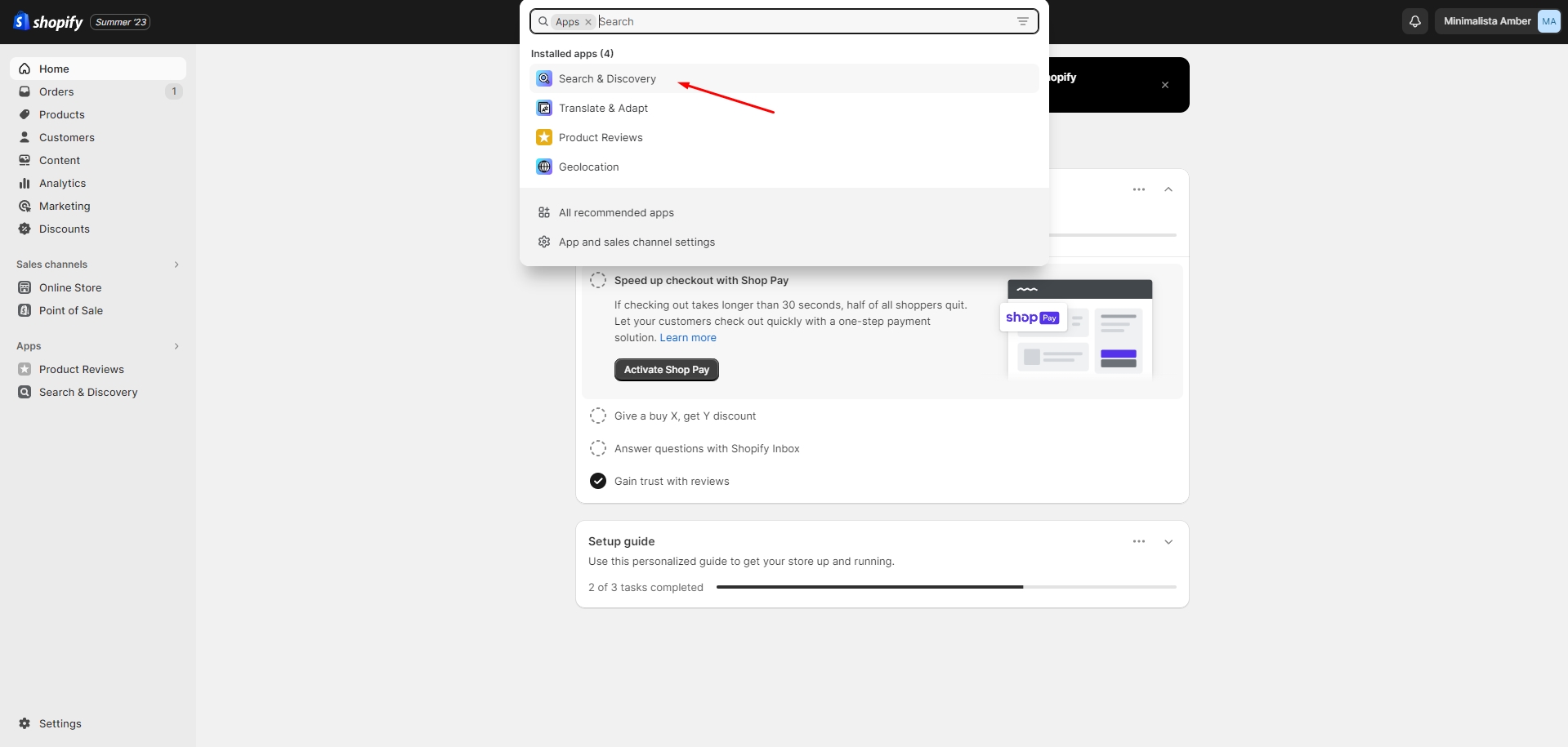
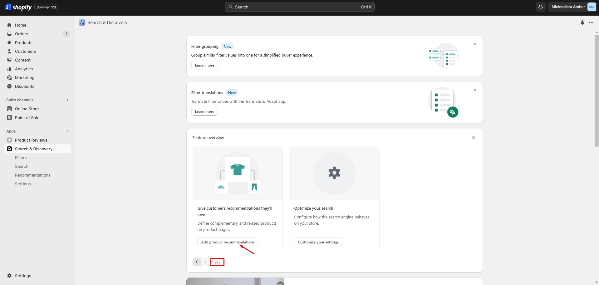
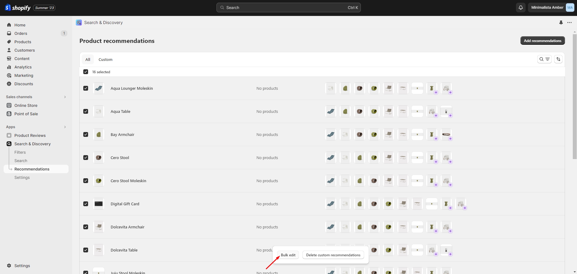
Product Recommendations and Complementary Products
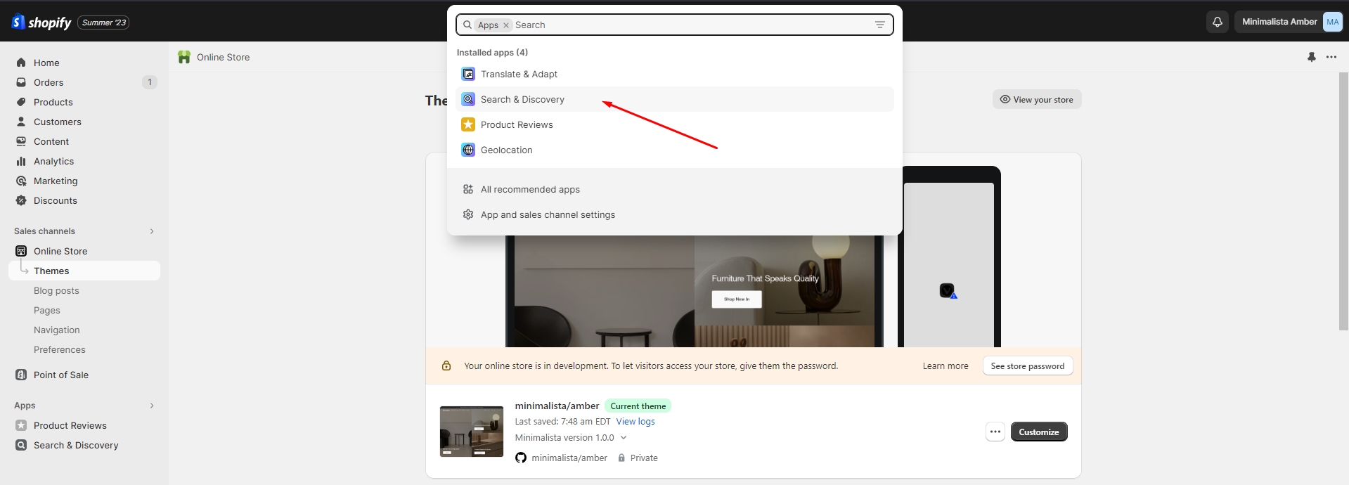
To add and edit product recommendations, follow these steps:
- Install the Search & Discovery app by Shopify from the Apps page in the Admin Panel.
-
Once installed, open the app and click the 'View recommendations' link in the Feature overview section to add recommendations to your products.
You can easily edit or add recommendations for multiple products using the Bulk Editor in the Products tab in the Admin Panel.
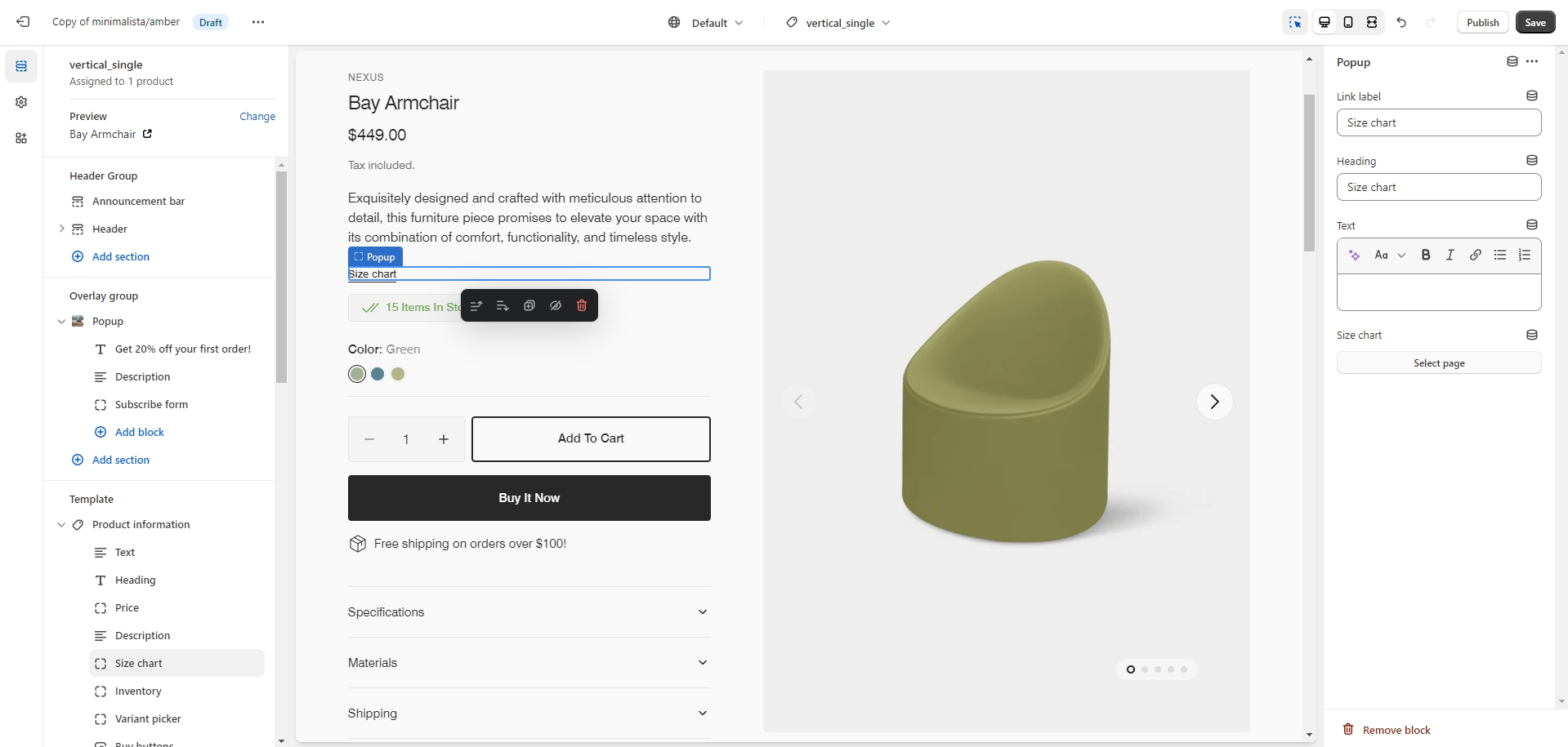
Size Chart
To add a Size Chart, follow these steps:
- Create new page with a table.
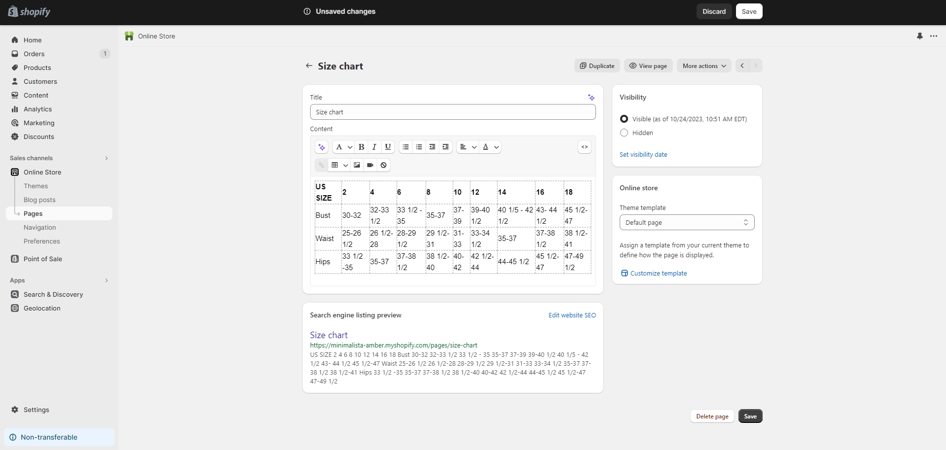
- Add a "Popup" block to the product page.
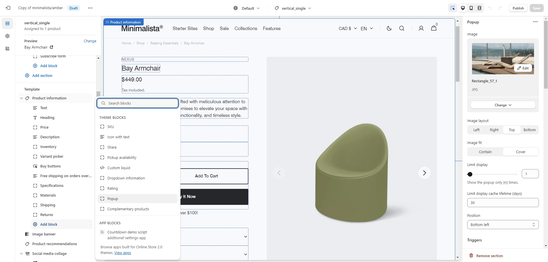
- Select "Size Chart" page.
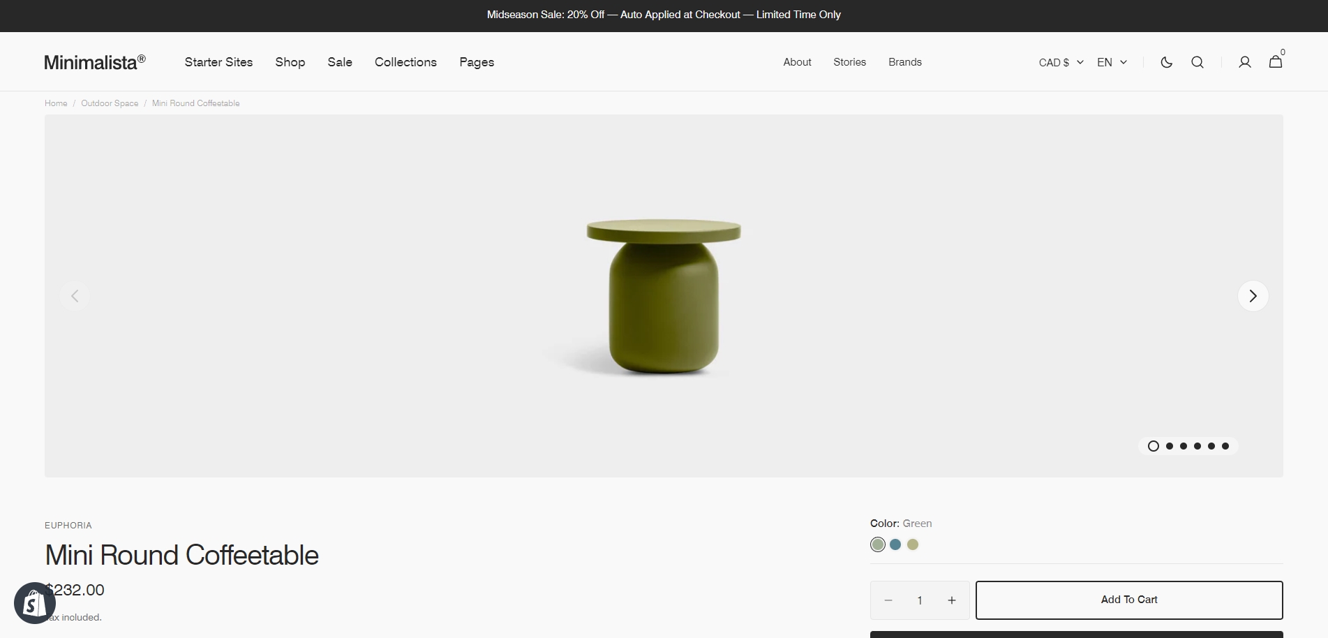
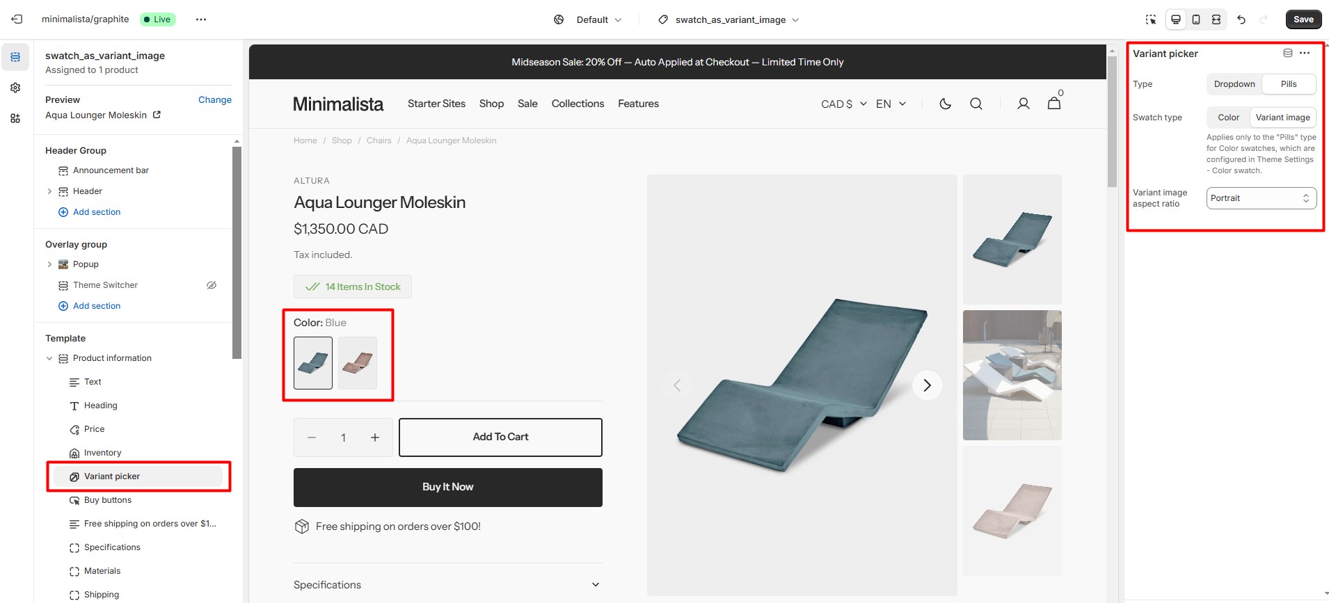
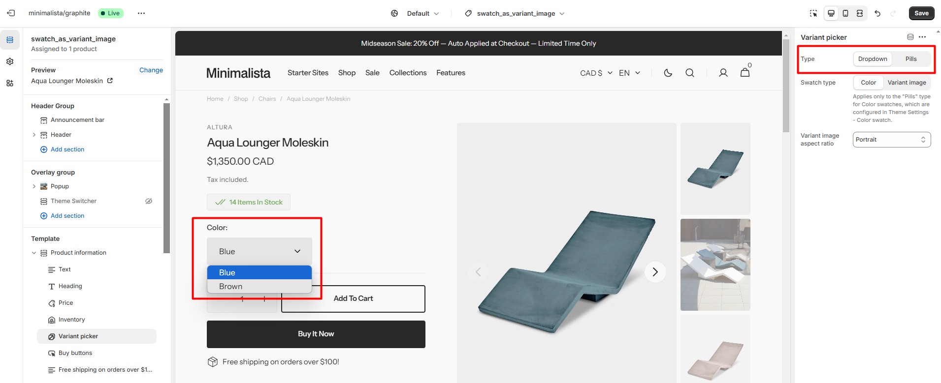
Variant Picker
You can choose between two types for the Variant Picker: Pills and Dropdown.
Pills
Pills display options as buttons. In this type, the color option can be shown as Color swatches.
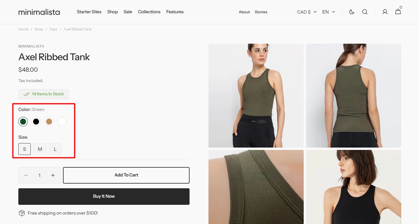
To display a color as a variant image, follow these steps:
-
Select an image for each variant on the product creation/edit page.
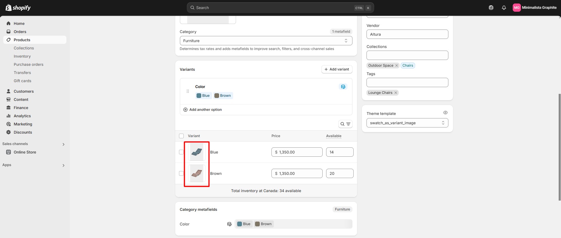
- Fill in the Swatch Trigger field in Theme Settings > Color Swatch.
-
On the product page (you can create a separate template if needed), add the Variant Picker block with the following settings: Type: Pills, Swatch Type: Variant image.
Pills
Dropdown allows variant selection through dropdown menus. This type does not support Color swatches.
Product Cart
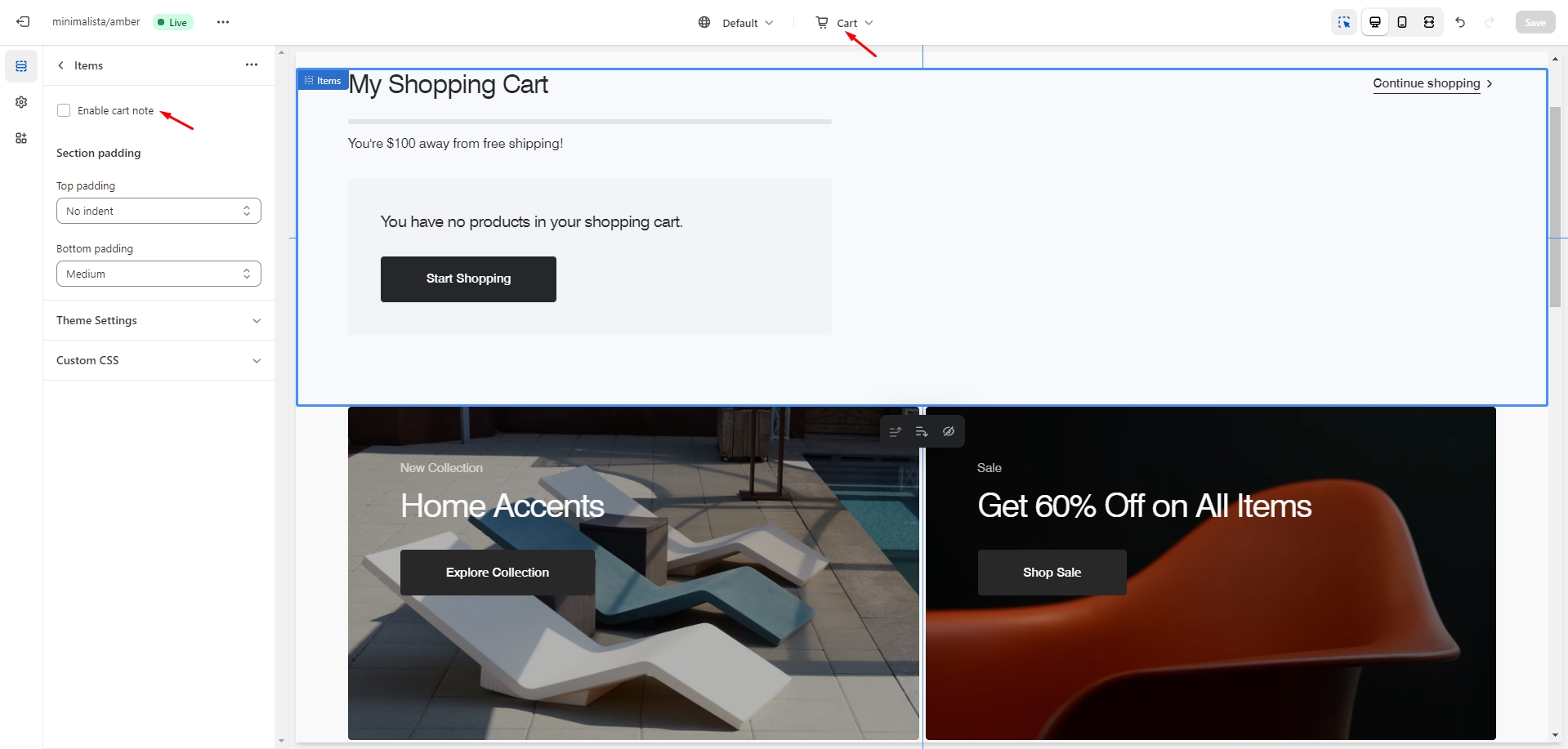
To enable cart note, navigate to the customizer > Cart > Items, and check the “Enable cart note” option.
Free Shipping
There can be issues when a store has multiple languages. To avoid them, keep the text '{amount}' untranslated.
Collection Page
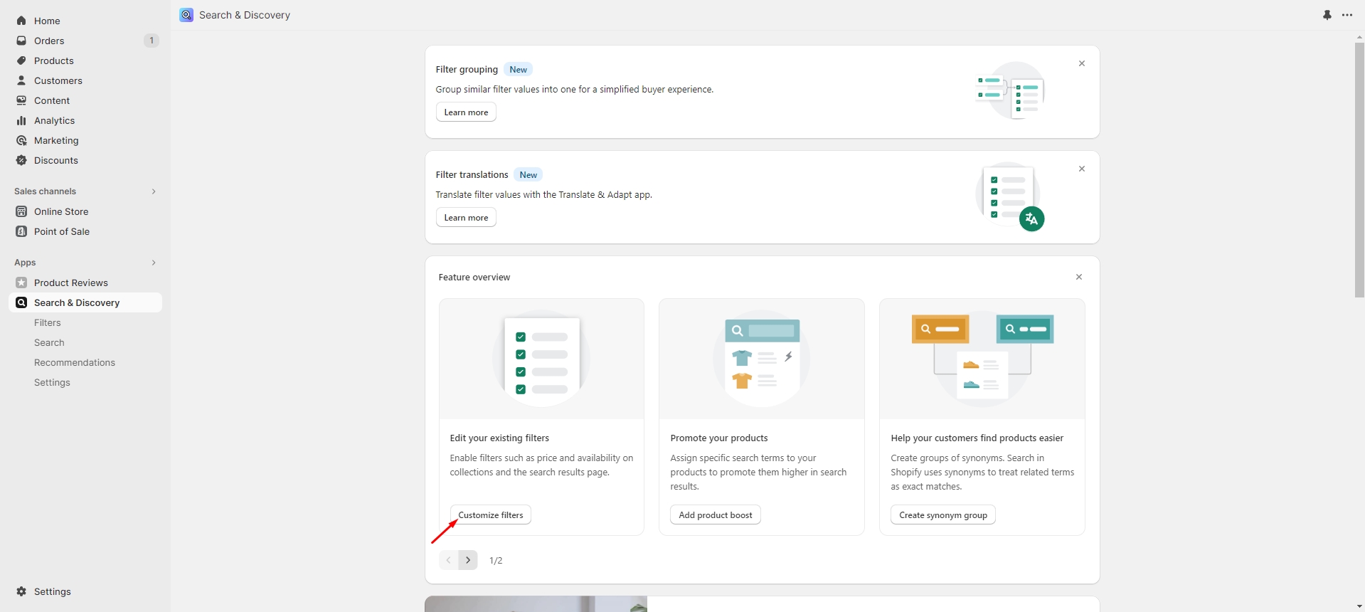
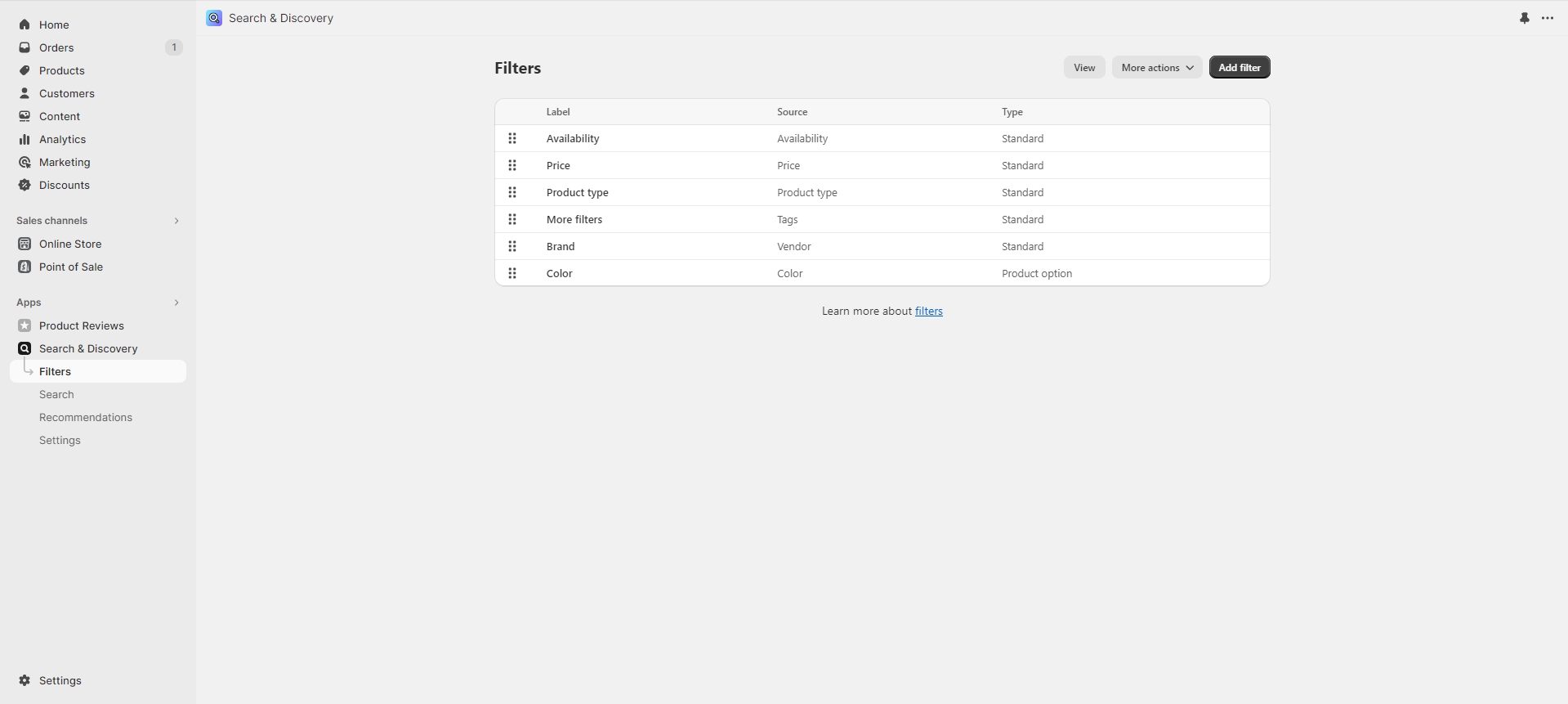
To enable advanced filtering, follow these steps:
-
Install the Search & Discovery app by Shopify from the Apps section in the Admin Panel.
- Once installed, open the app and follow the 'Customize filters' link in the Feature
overview section
to
manage
the filters.
Blog
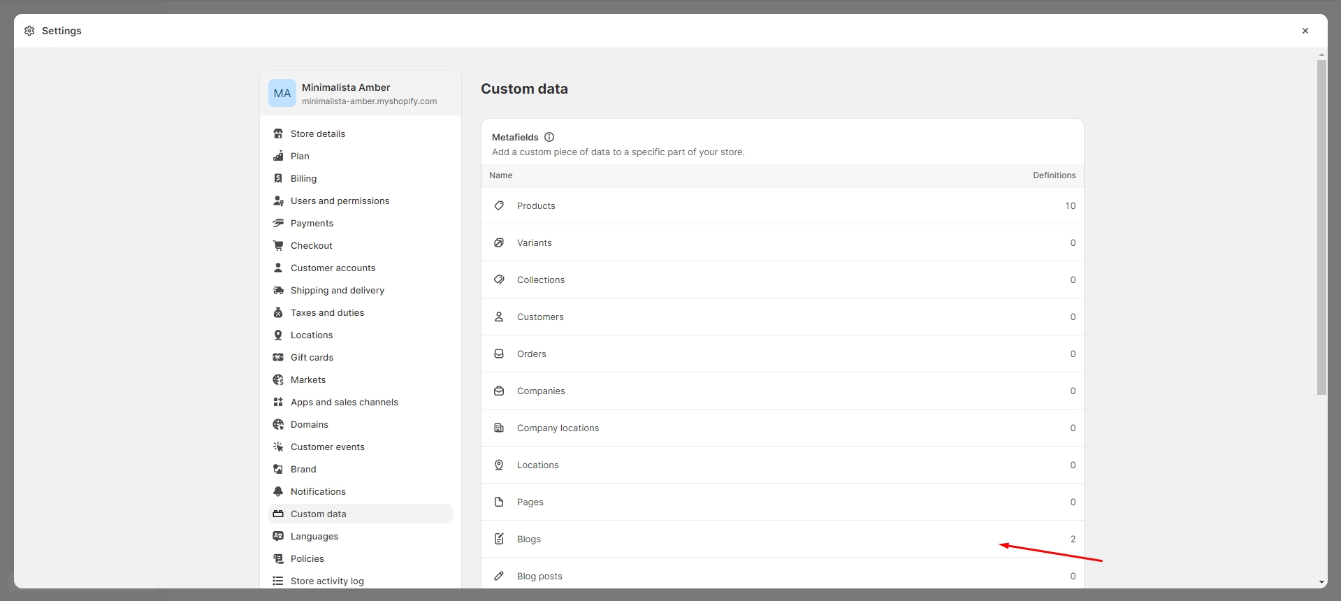
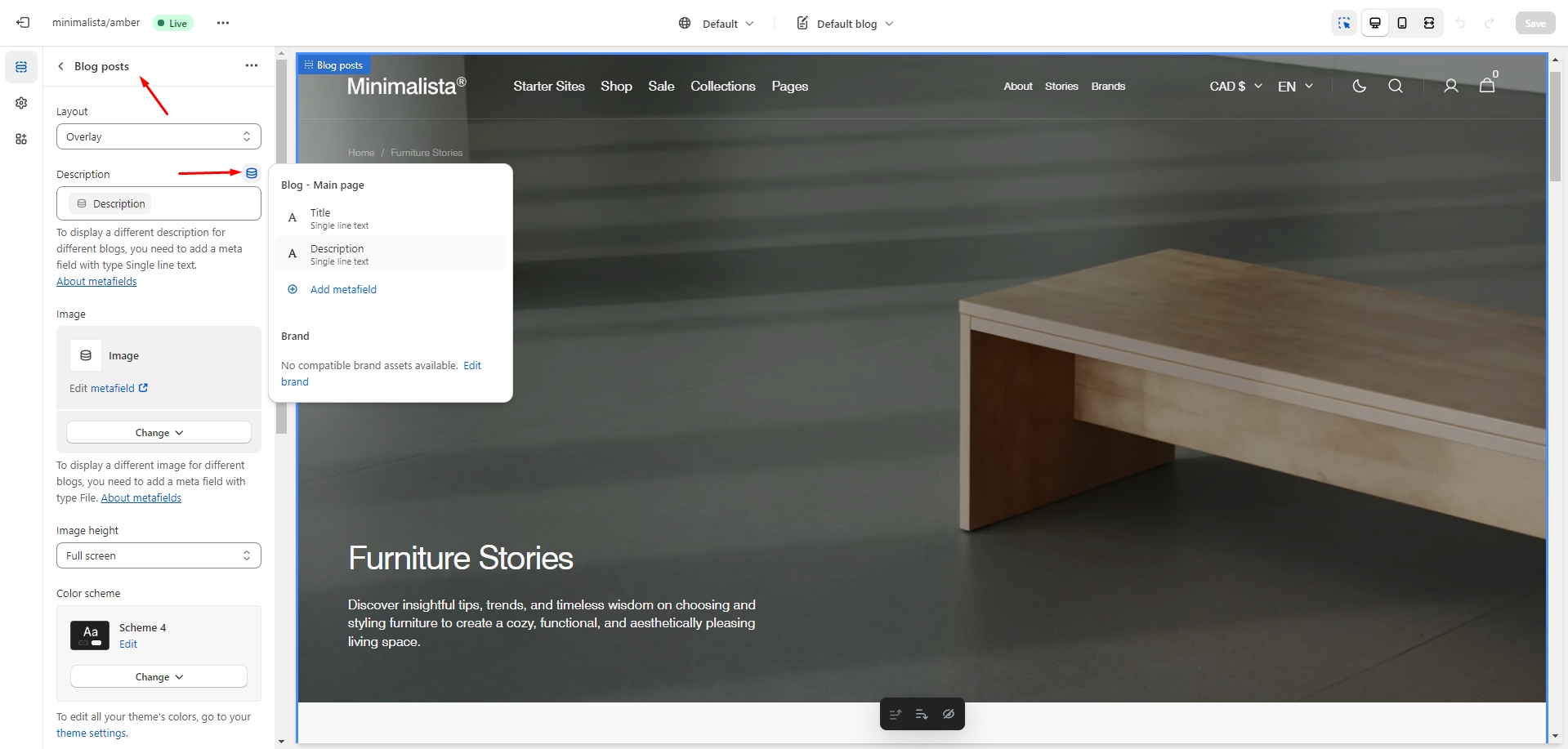
To add a custom image and description for each blog, follow these steps:
-
Navigate to the Admin Panel > Custom Data > Blogs and add new definitions.
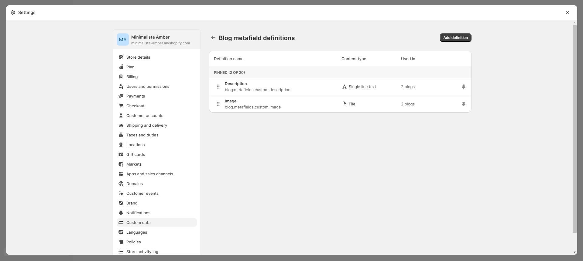
-
Go to the customizer, select the blog page, and add your custom information using the 'Insert dynamic' source button.
Importing Our Demos
You can also copy the structure of any of our 5 demos in a few steps.
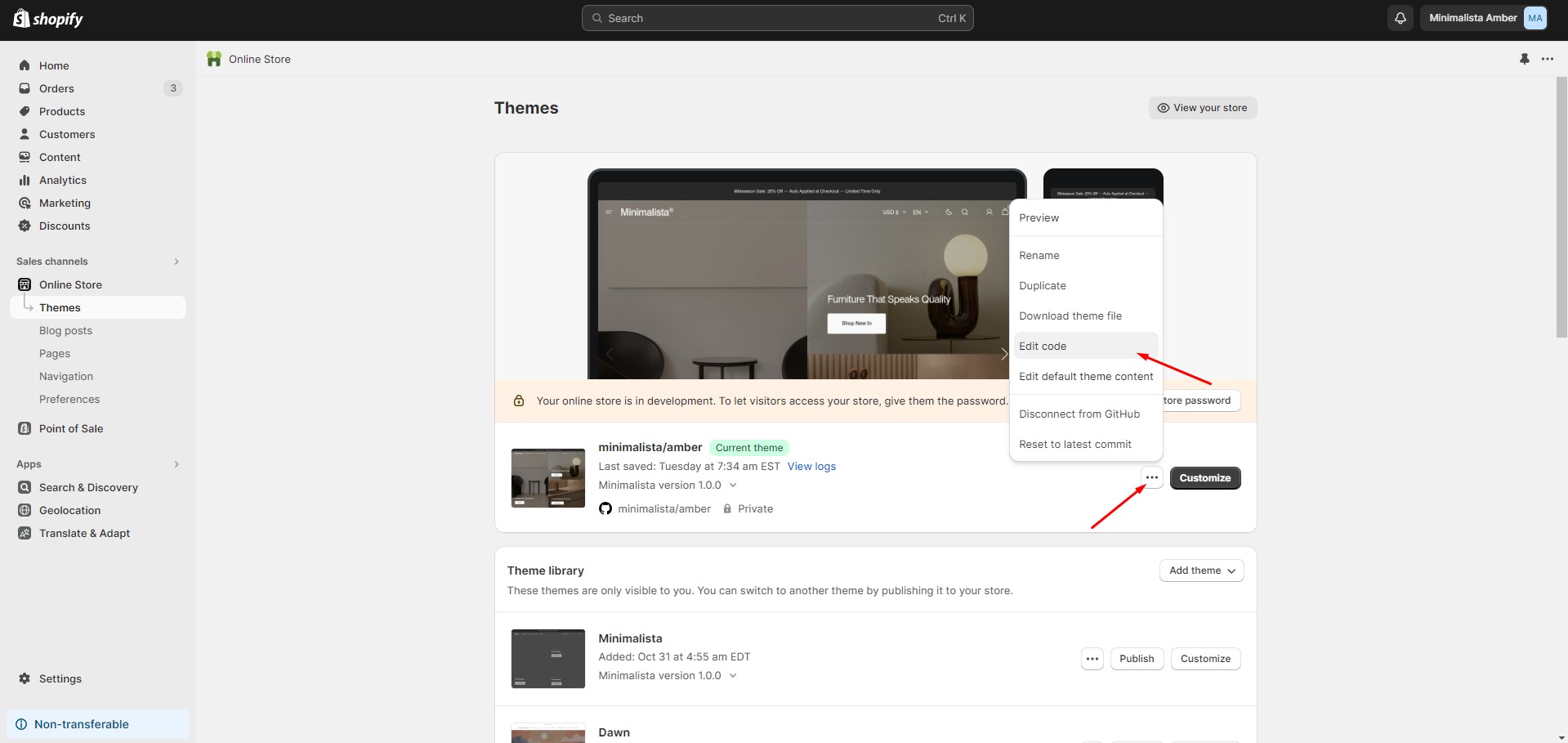
- Copy the demo structure from the links below (Cmd-A or Ctrl-A to select all).
- Follow to the section Online Store > Themes in your store. Click the three dots button of your theme.
-
Open the code editor by clicking the Edit code button.
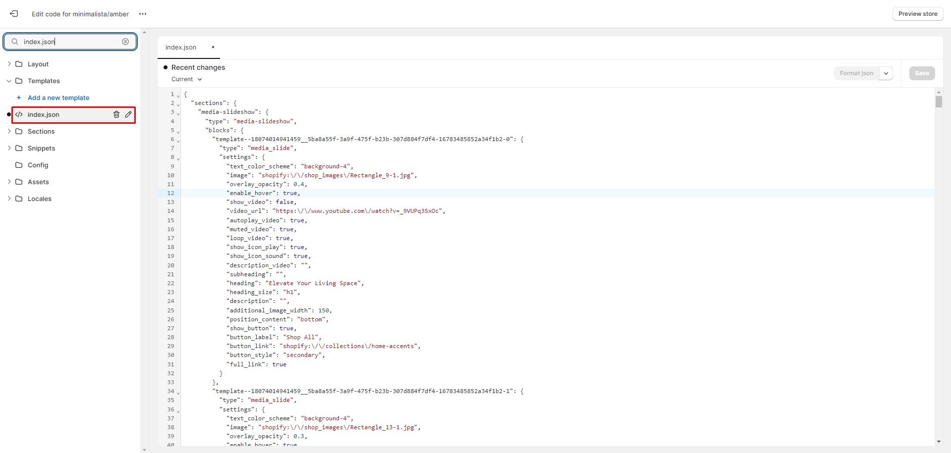
-
In the code editor, search for the 'index.json' file, select all its content, and replace it with the new structure. Click 'Save' to apply the changes. If an error occurs, click 'Format json' and try saving the file again.
Demos Structure
Support
You can ask any questions about the theme and our support agent will help you within 24 hours on business days.
Visit Help Center View Terms & Conditions
