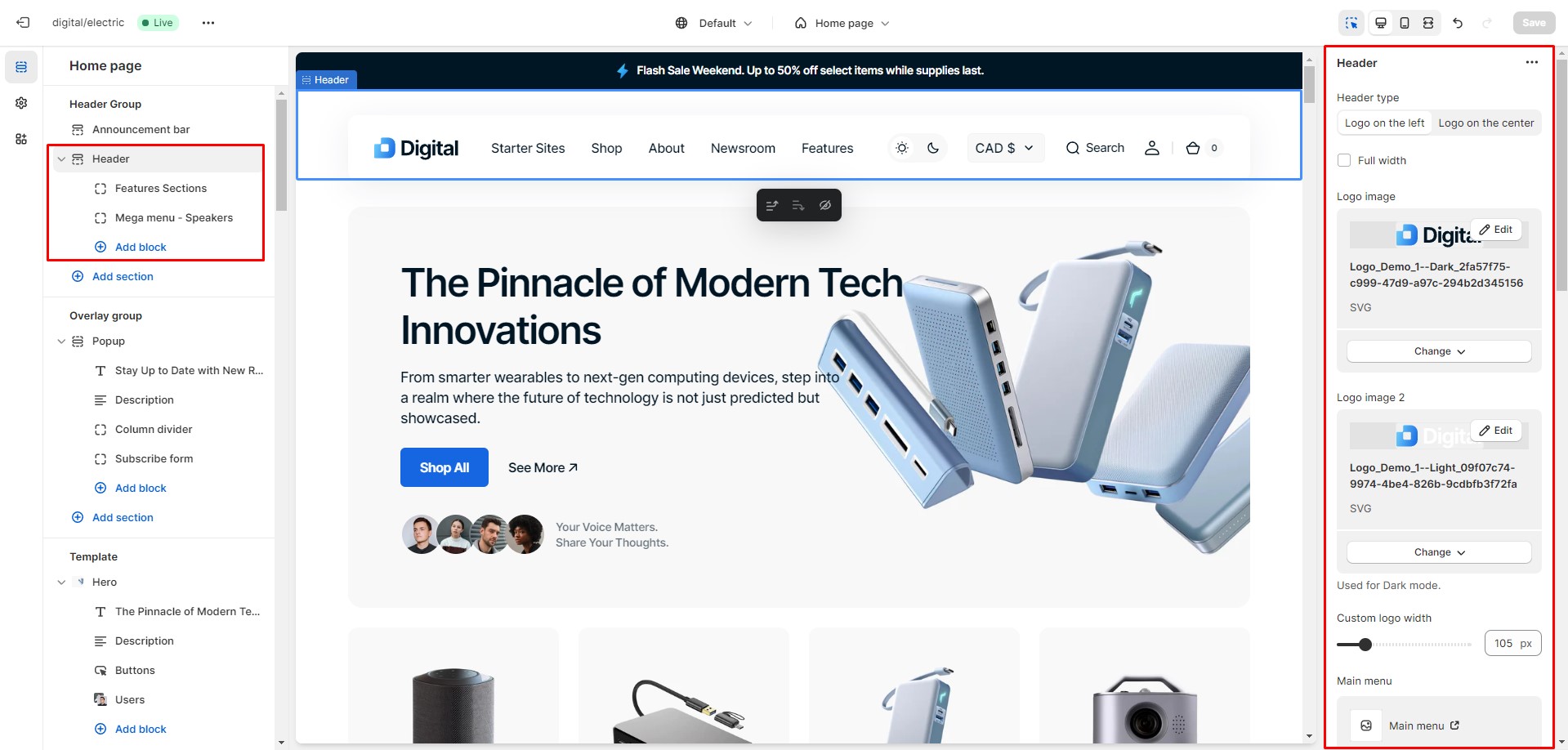
This theme provides various header layout options. You can customize the search promo and add two types of Mega Menu. Additionally, a light header with a blurred background and an overlay header can be enabled in sections where available.
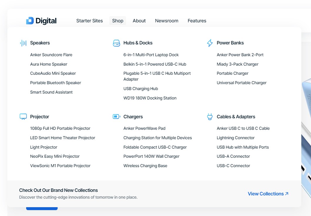
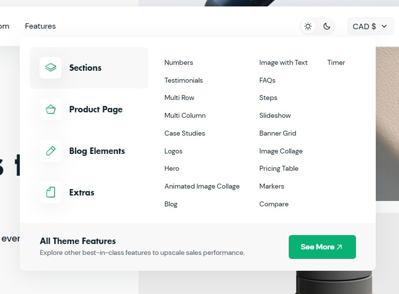
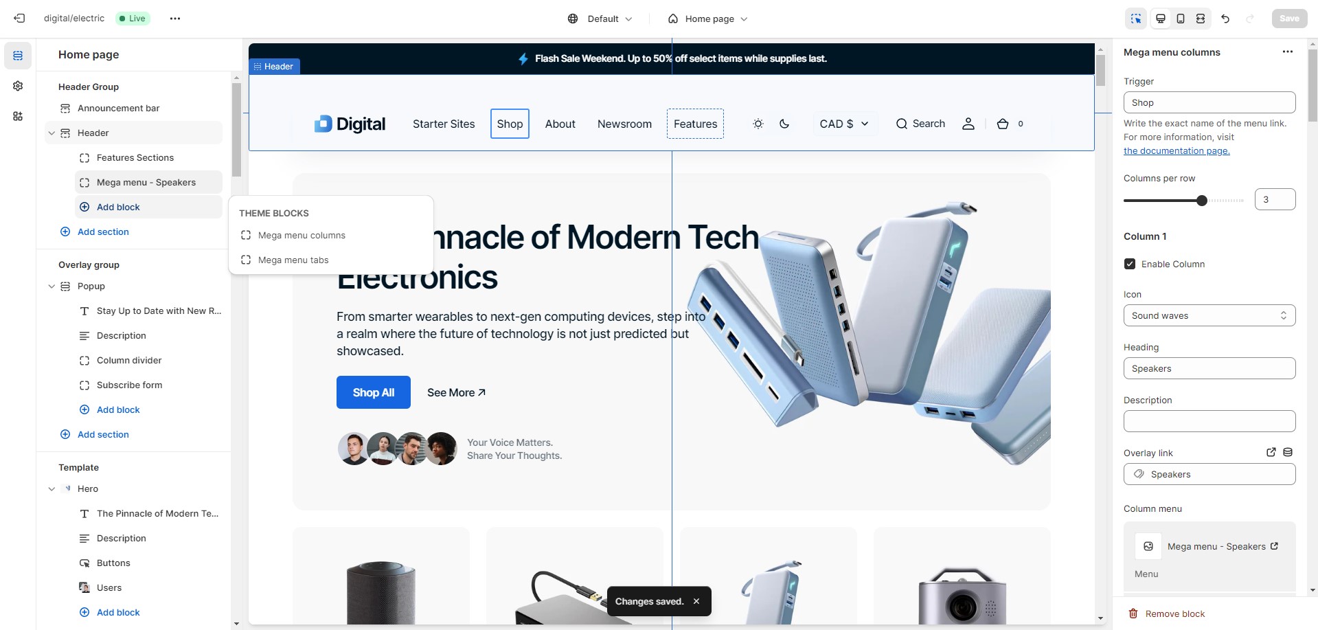
Mega Menu
To add a Mega menu, make sure that the main menu link has sublinks, and then follow these steps:
Add the Mega Menu to the Header.
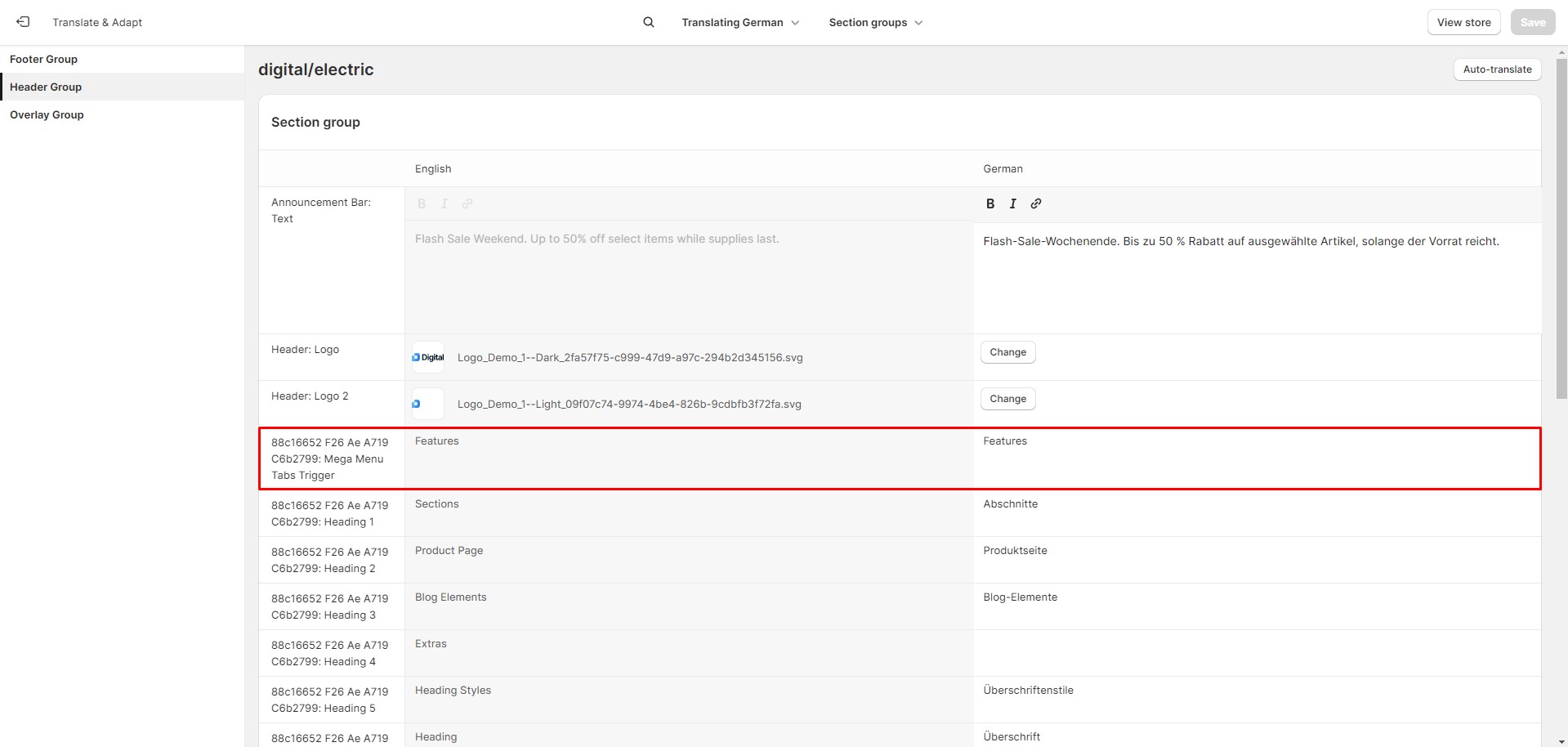
Type the exact name of the link in the Trigger field.
To avoid issues in stores with multiple languages, keep the {trigger} untranslated.
Search
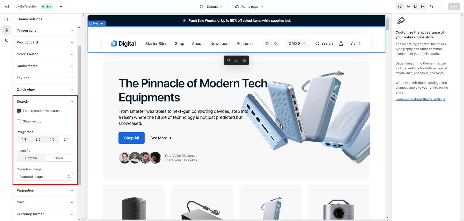
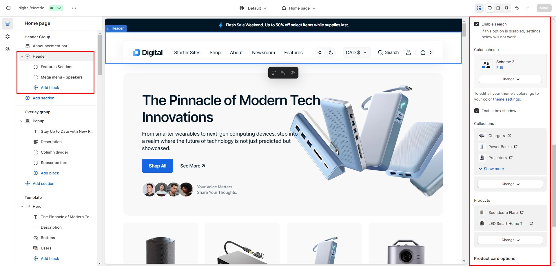
In this theme, you can use a predictive search. It is enabled by default, but you can disable it in the
Theme settings >
Search.
You can also enable the Search promo block in the Header settings, which appears before the user starts typing. This block can display two types of information: collections and products.
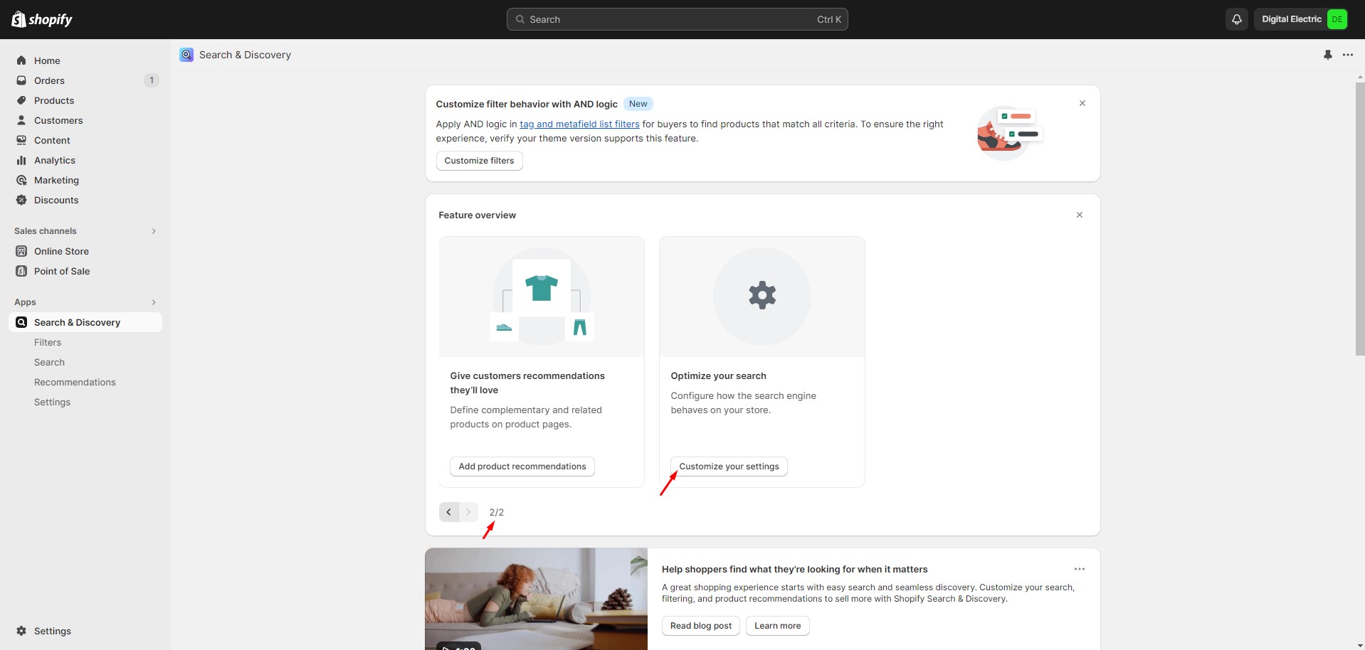
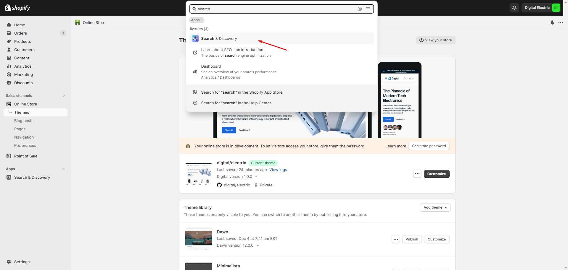
To manage search results, go to the Search settings within the Search & Discovery app.
Overlay Group
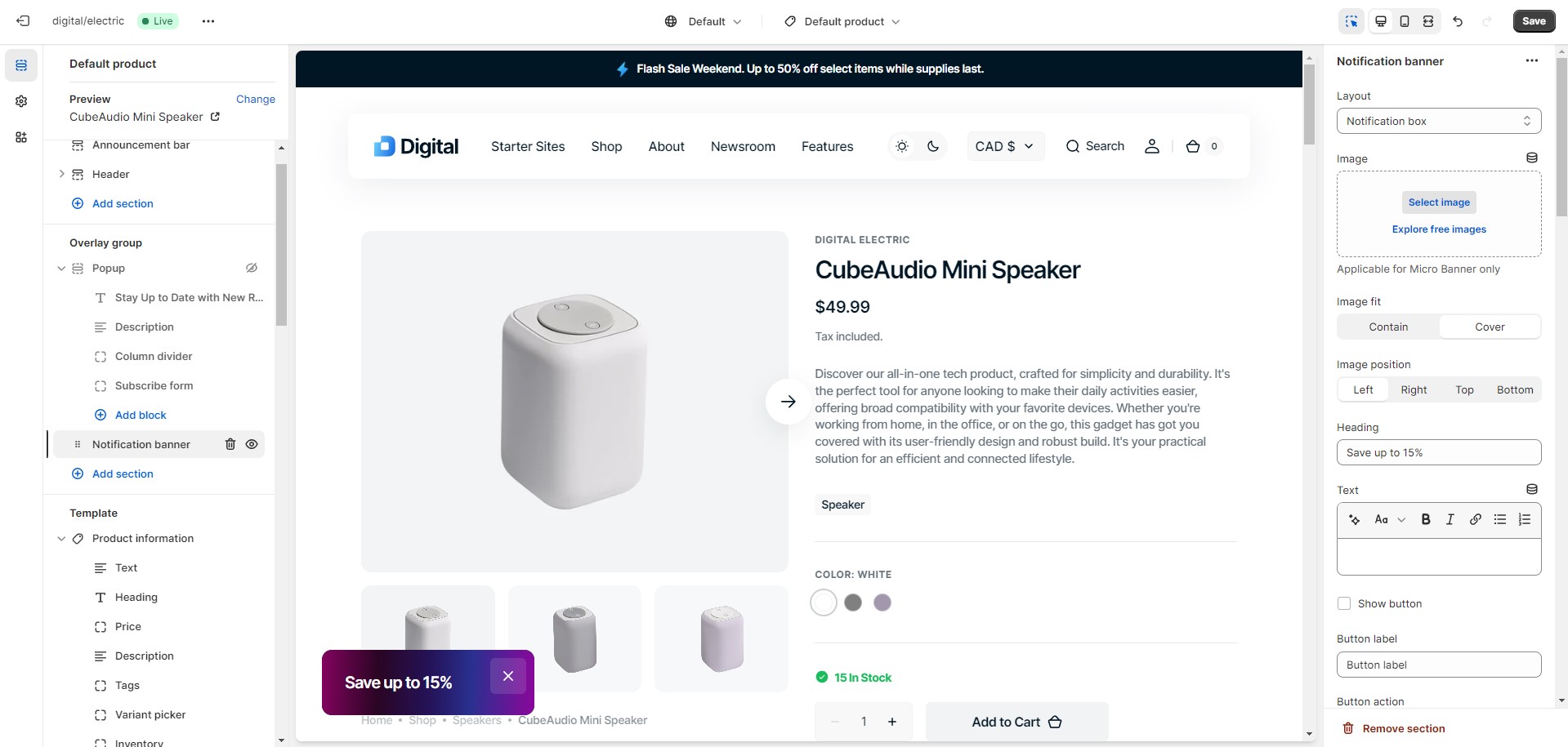
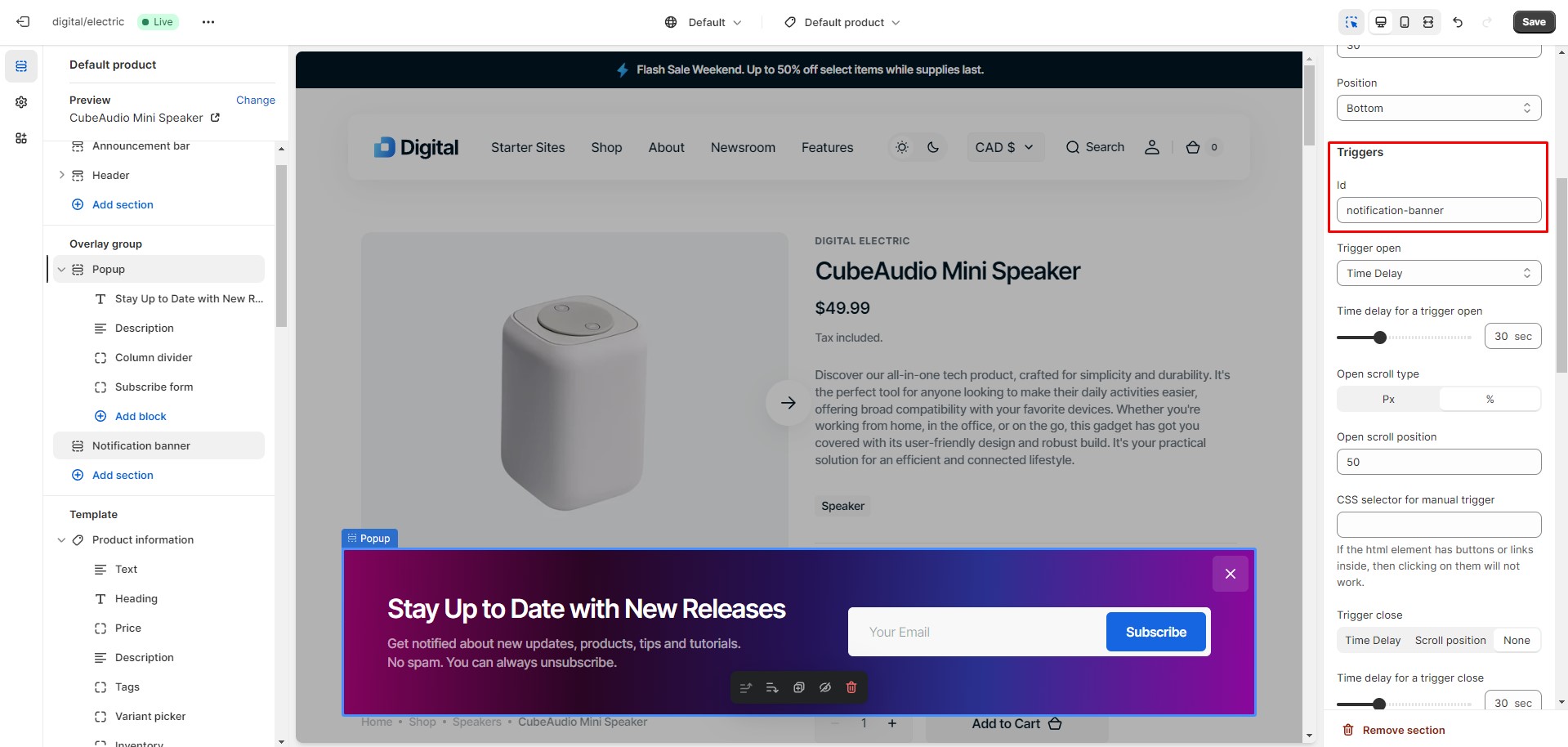
Notification Banner
In the Notification Banner settings, you can change layout, add image, texts, edit banner position, change
open and exit
animations and options.
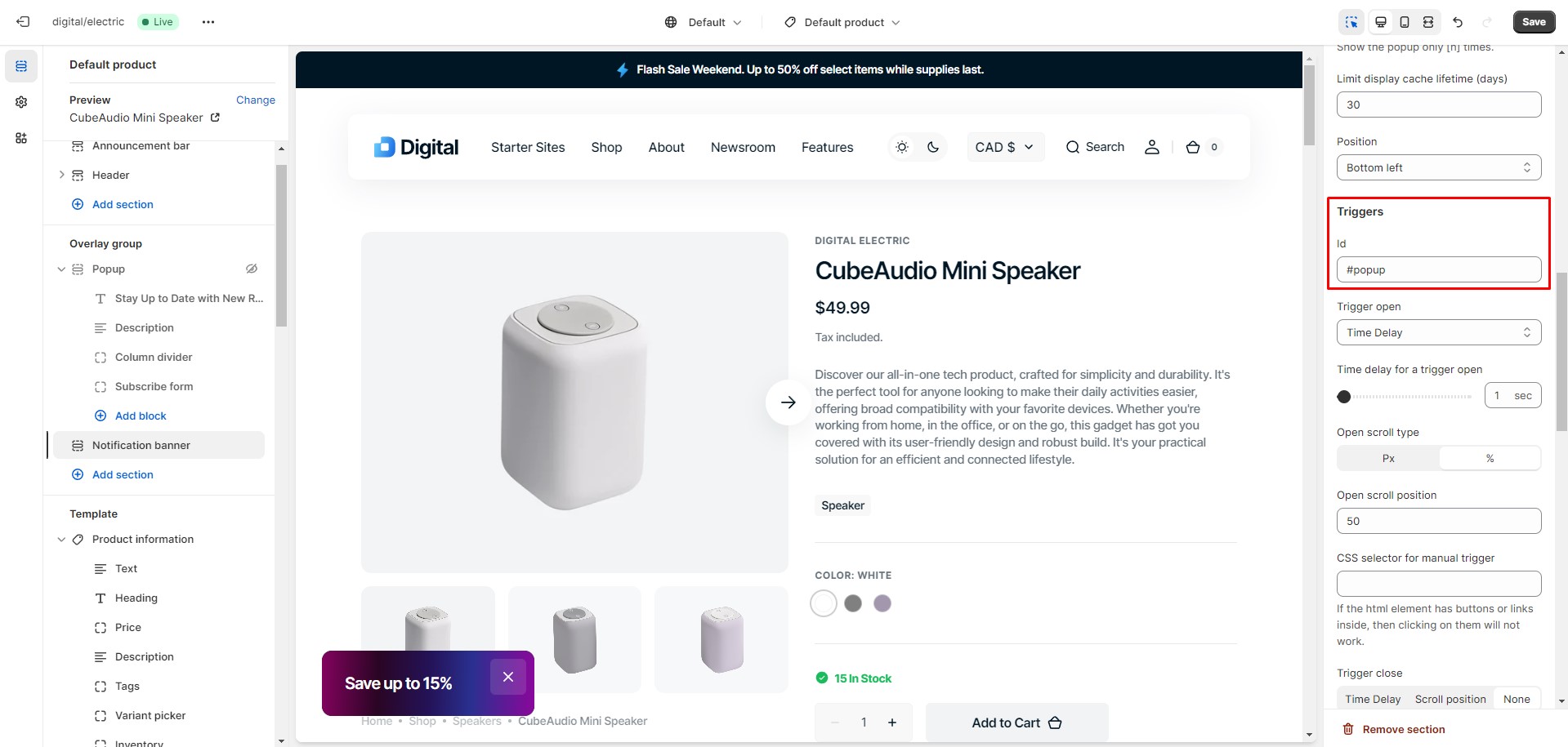
You can also use this banner as a button-trigger for opening another notification bar or a popup by
following these
steps:
Pass the ID of the popup/notification bar you would like to open to the Id field in the Triggers section
(e.g. "popup").
Navigate to the popup/notification bar settings, add the same ID with "#" at the beginning to the "CSS
selector for
manual trigger" field, and choose an option in the "Trigger open" select.
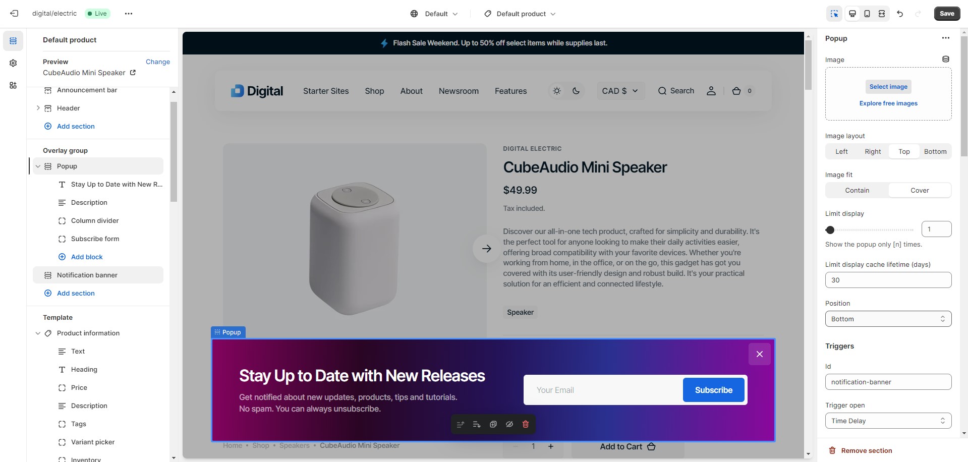
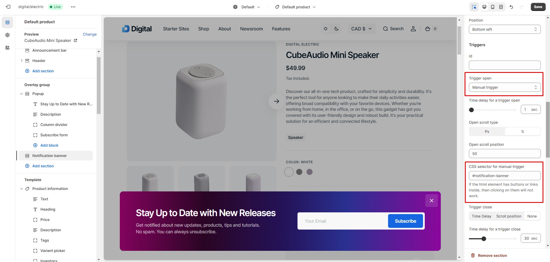
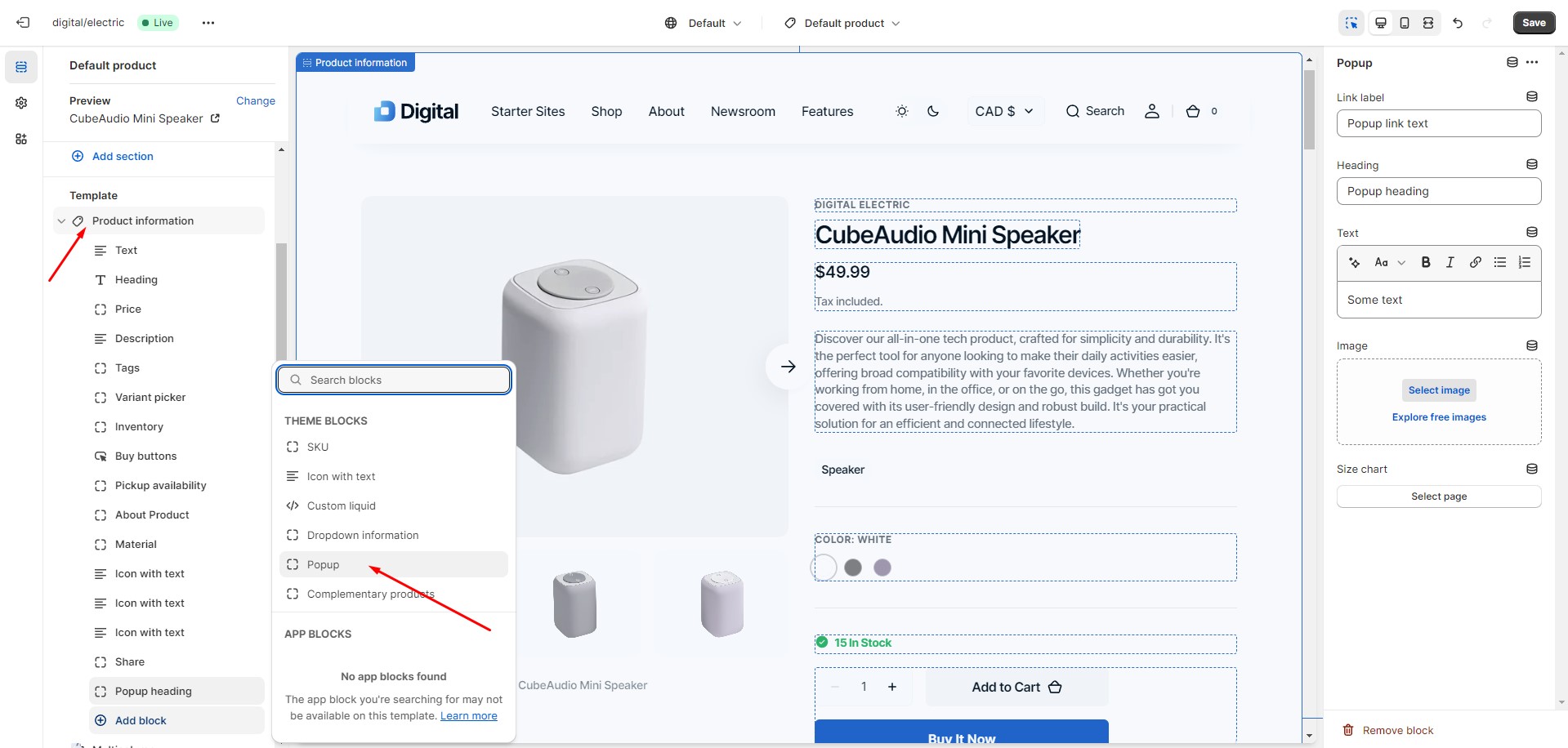
Popup
In the Popup settings, you can change layout, add image, subscribe form, edit position, change open and
exit animations
and options.
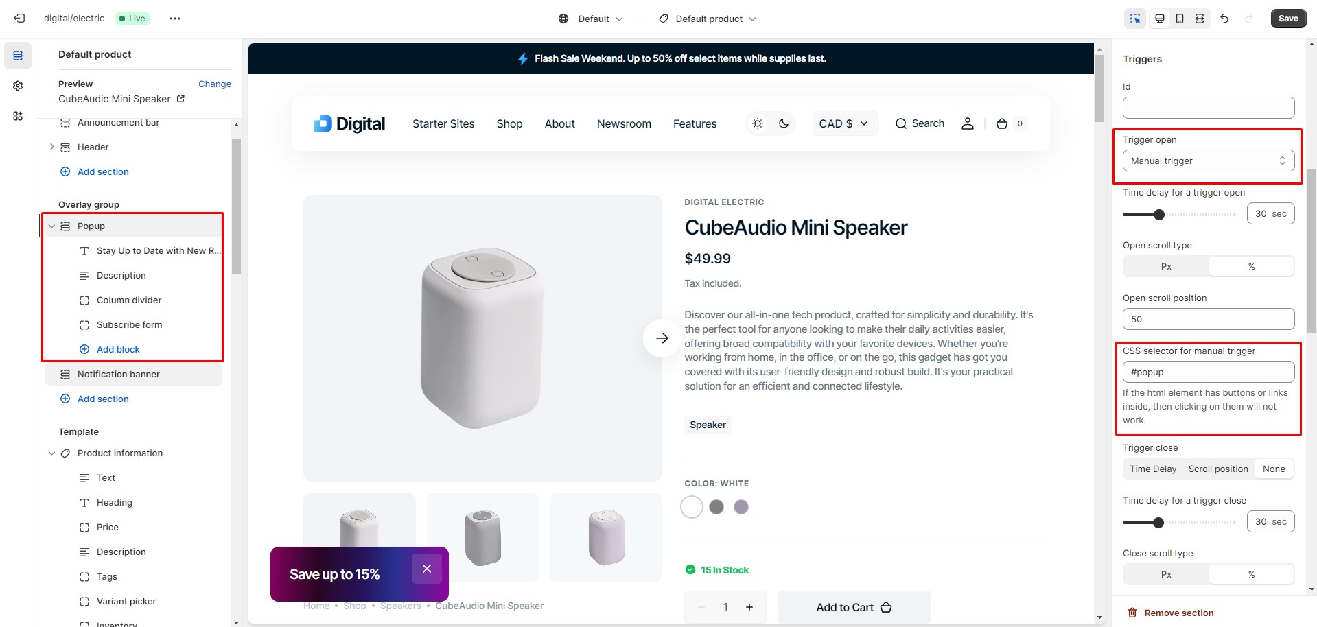
You can also use this popup as a button-trigger for opening another popup or notification bar by following
these steps:
Pass the ID of the popup/notification bar you chose to open to the Id field in the Triggers section
(e.g.
"notification-bar").
Navigate to the popup/notification bar settings and add the same ID with "#" in the beginning to the
"CSS selector for
manual trigger" field.
Sections
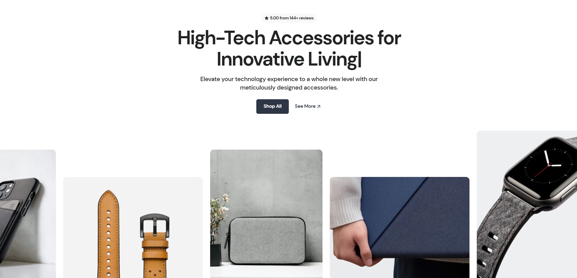
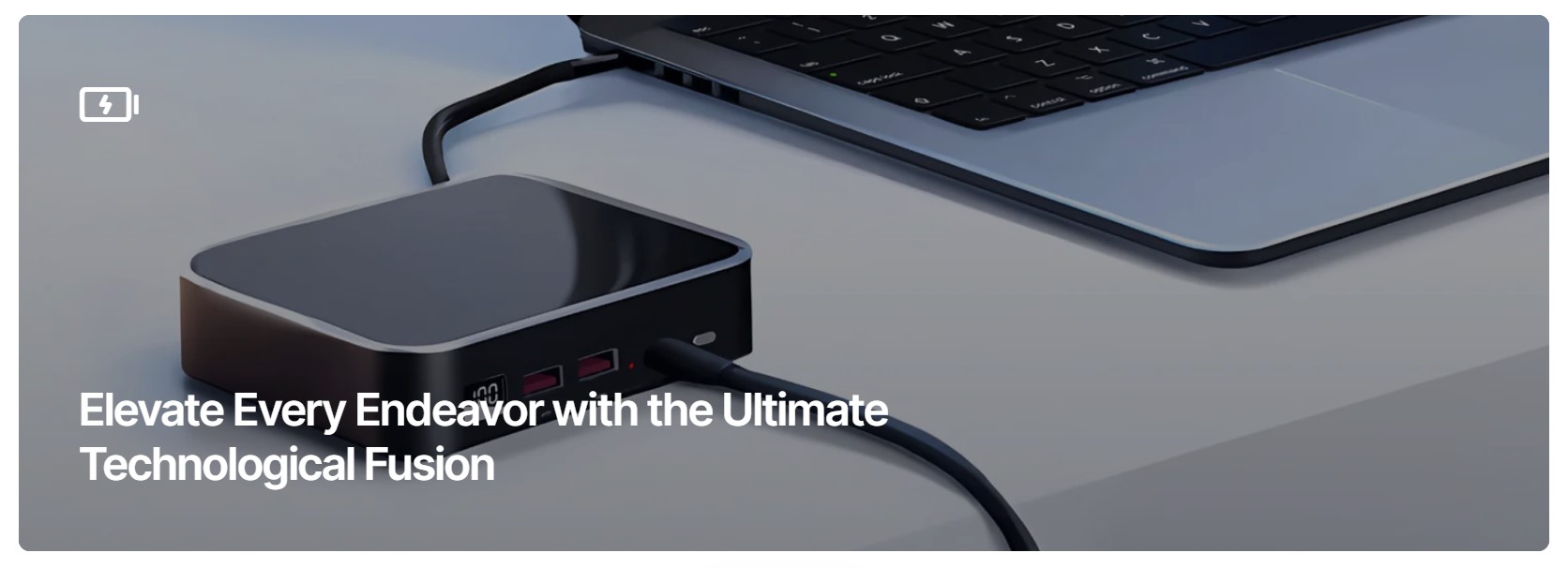
Animated Image Collage
There are 3 types of layout:
Marquee on the background
Marquee on the right
Carousel on the bottom
It is recommended to add a number of images that can be evenly divided by the number of columns without any remainder. The recommended minimum is 3 images per column for "Marquee on the background" and "Marquee on the right" types, and 5-6 images for the "Carousel on the bottom" type.
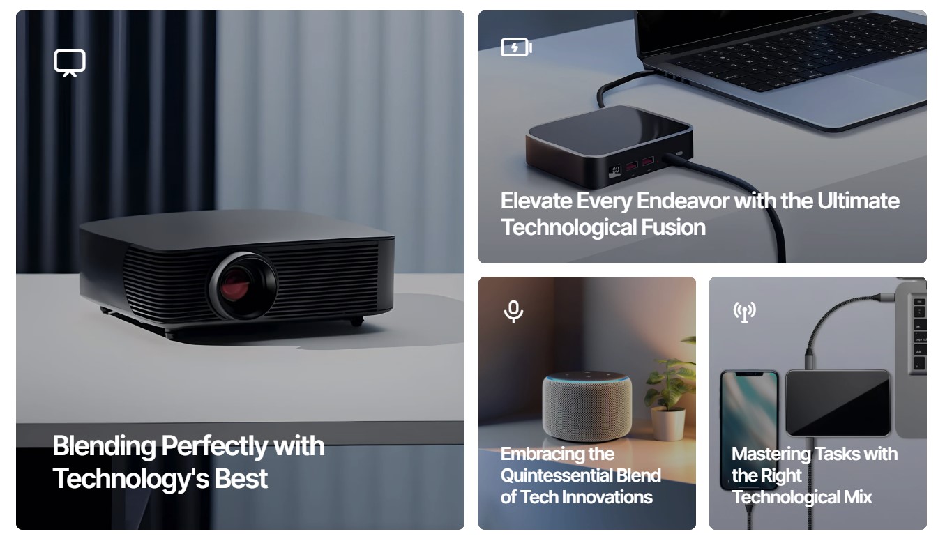
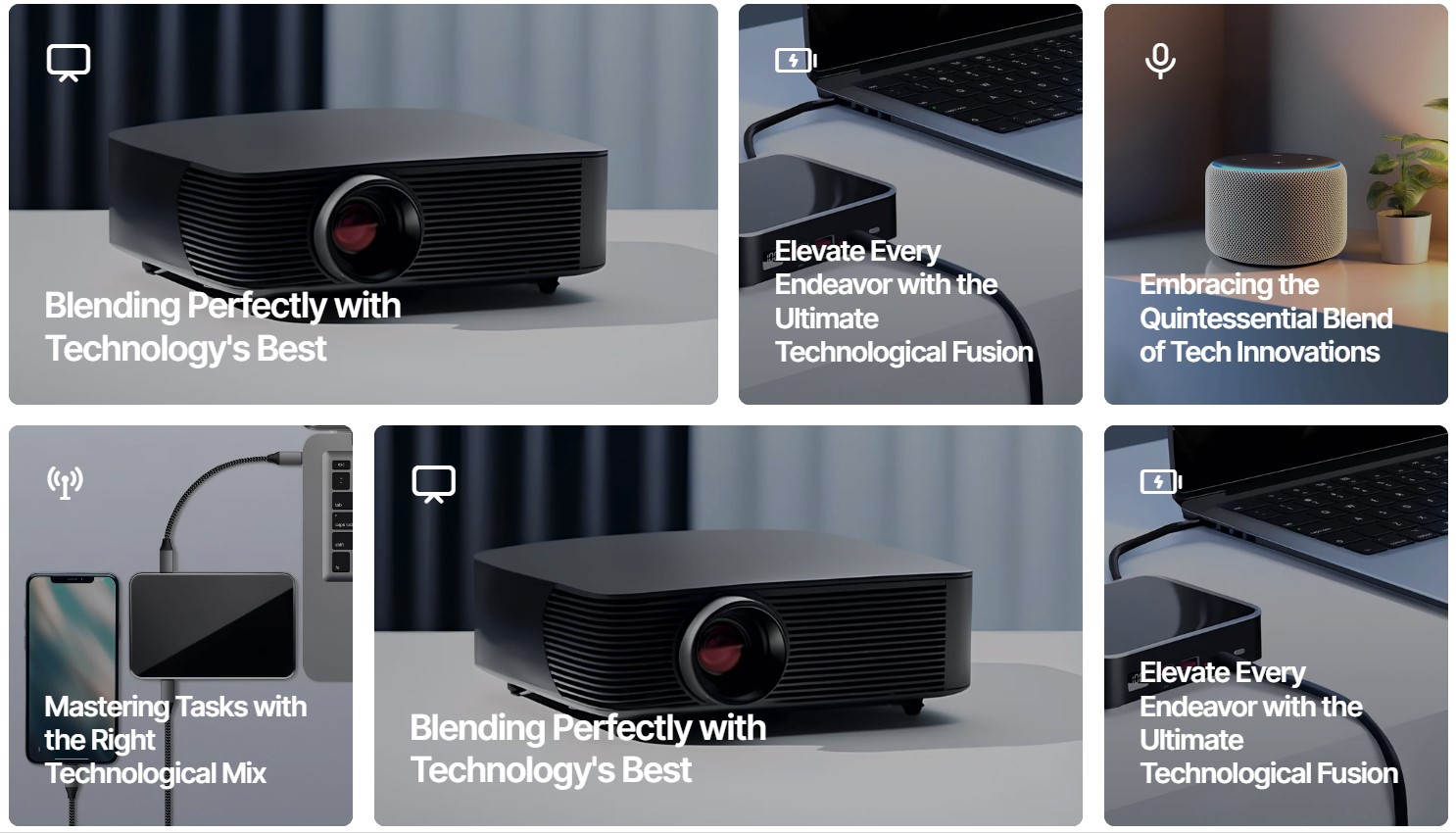
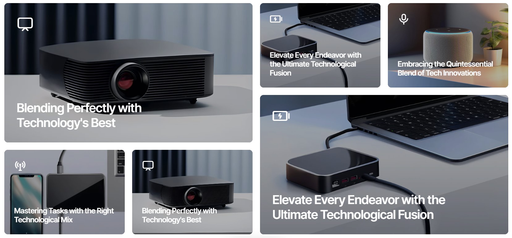
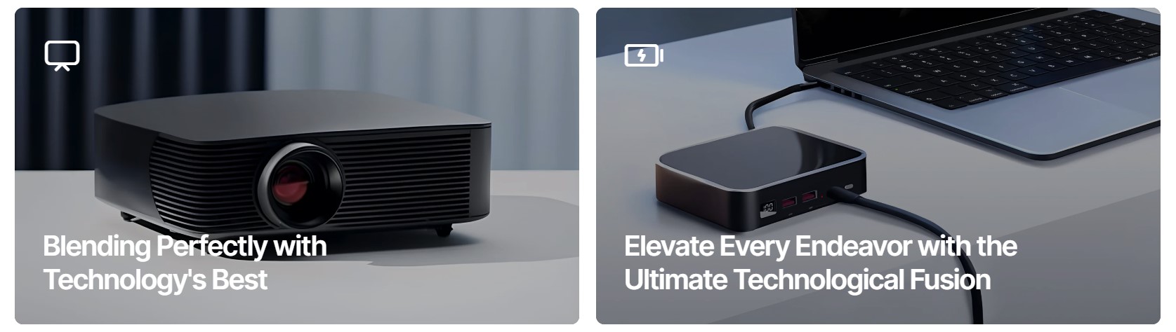
Banner Grid
There are 6 types of layout:
Type 1
Type 2
Type 3
Type 4
Type 5
Type 6
1 column
2 columns
3 columns
4 columns
5 columns
6 columns
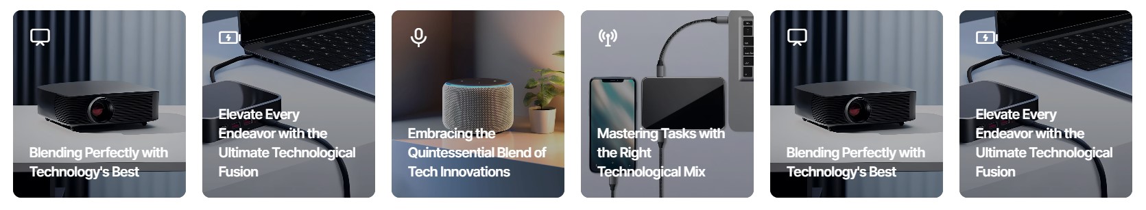
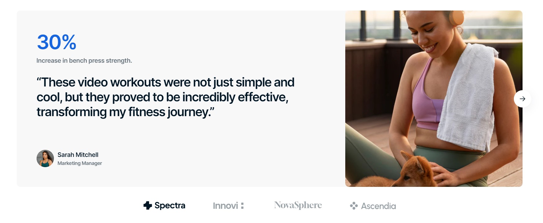
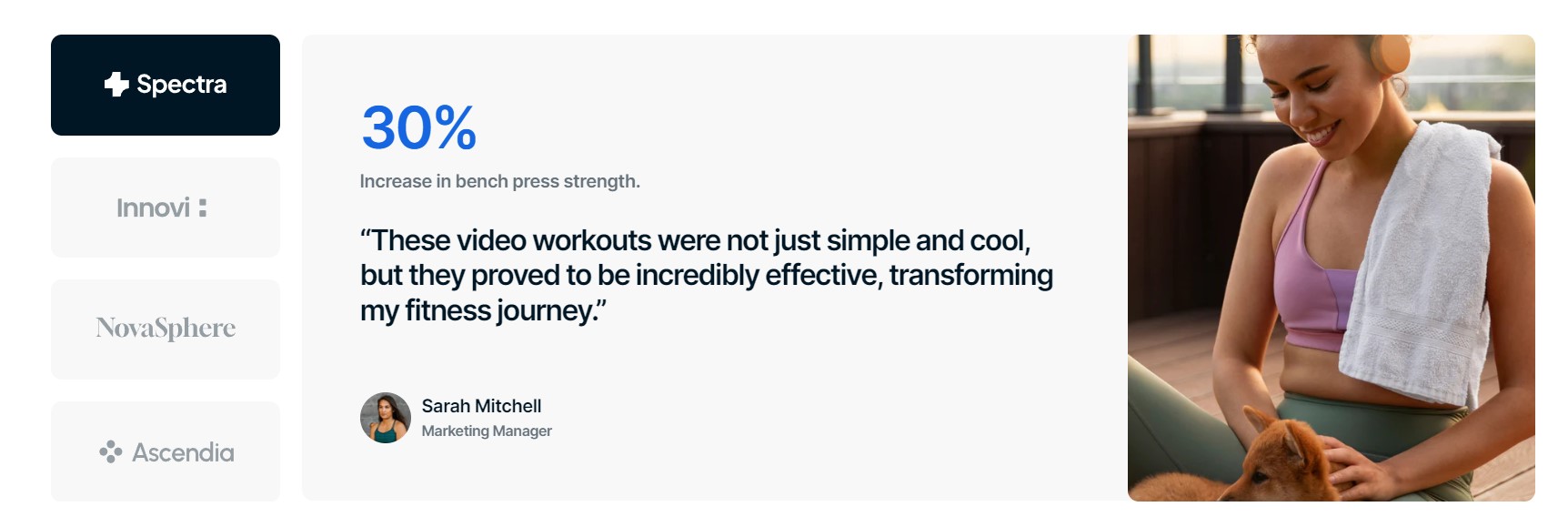
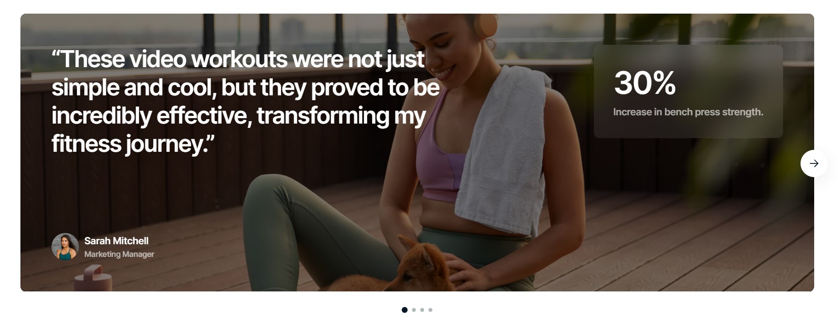
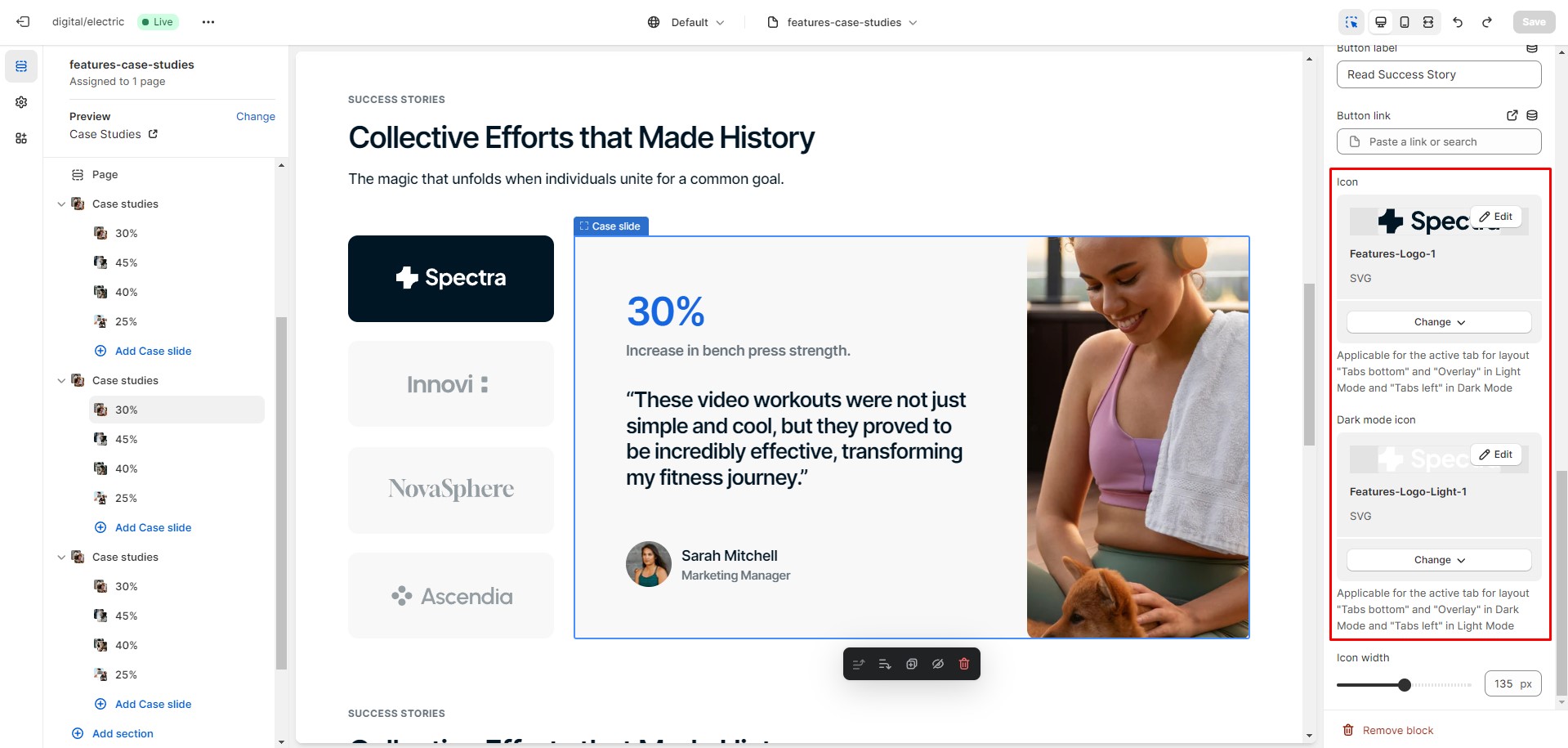
Case Studies
There are 3 types of layout:
Tabs on the bottom
Tabs on the left
Overlay
It is recommended to add two types of icons or logos for a better experience—one for light mode and inactive tabs, and another for Dark Mode and active tabs.
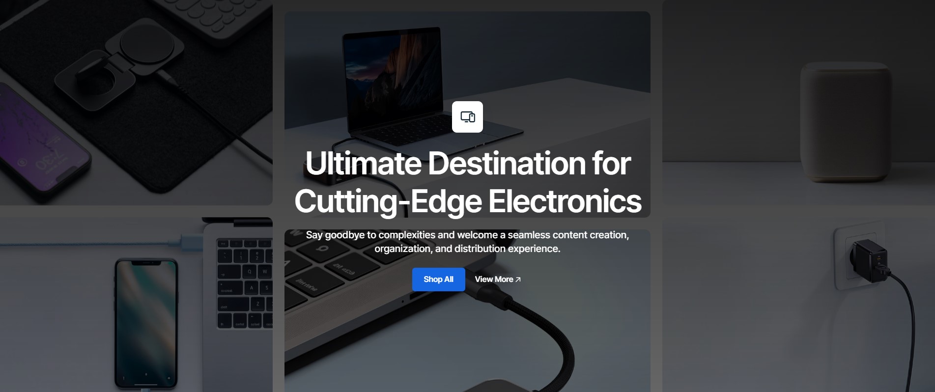
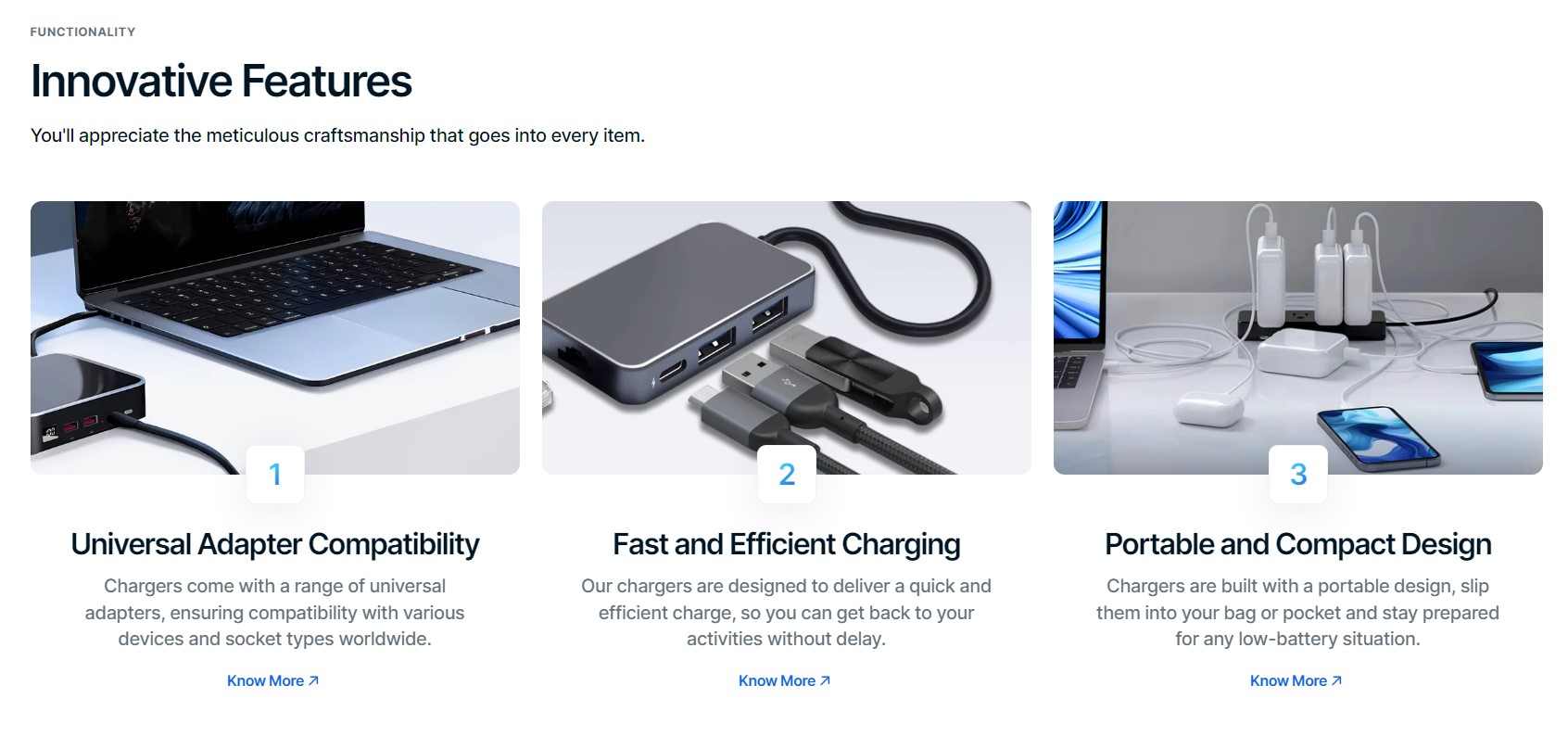
Hero
There are 3 types of layout:
Horizontal
Vertical
Overlay
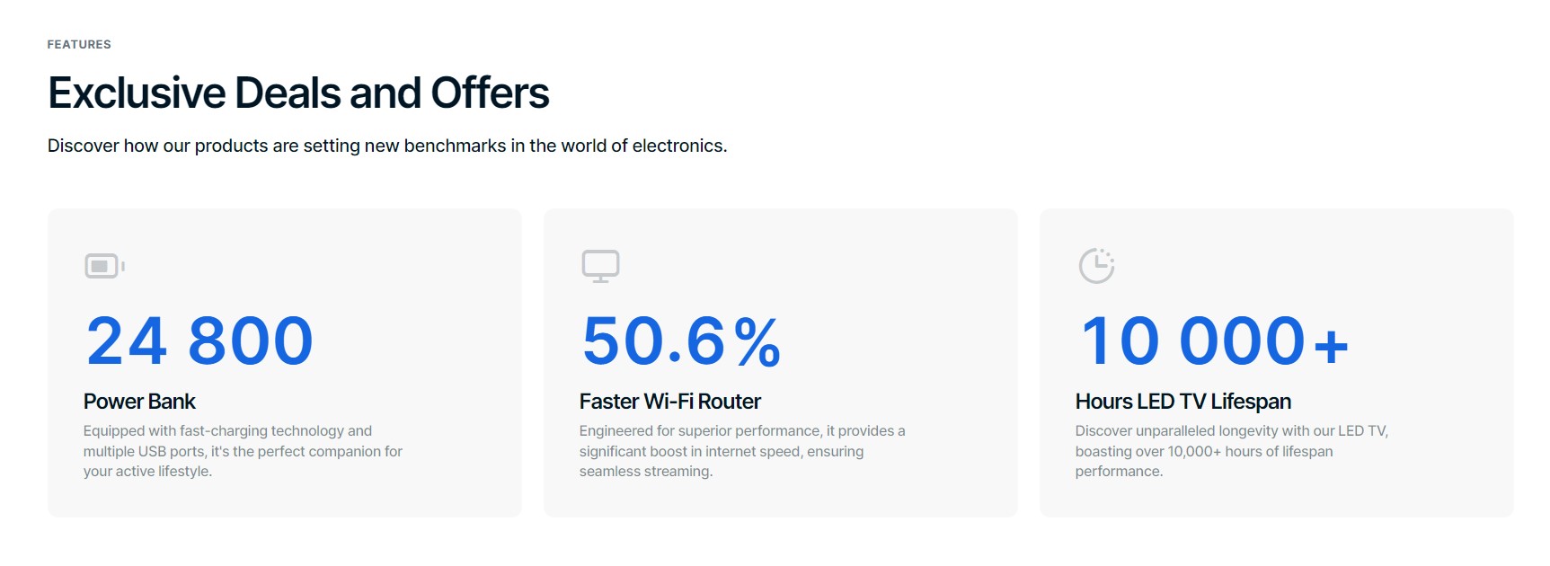
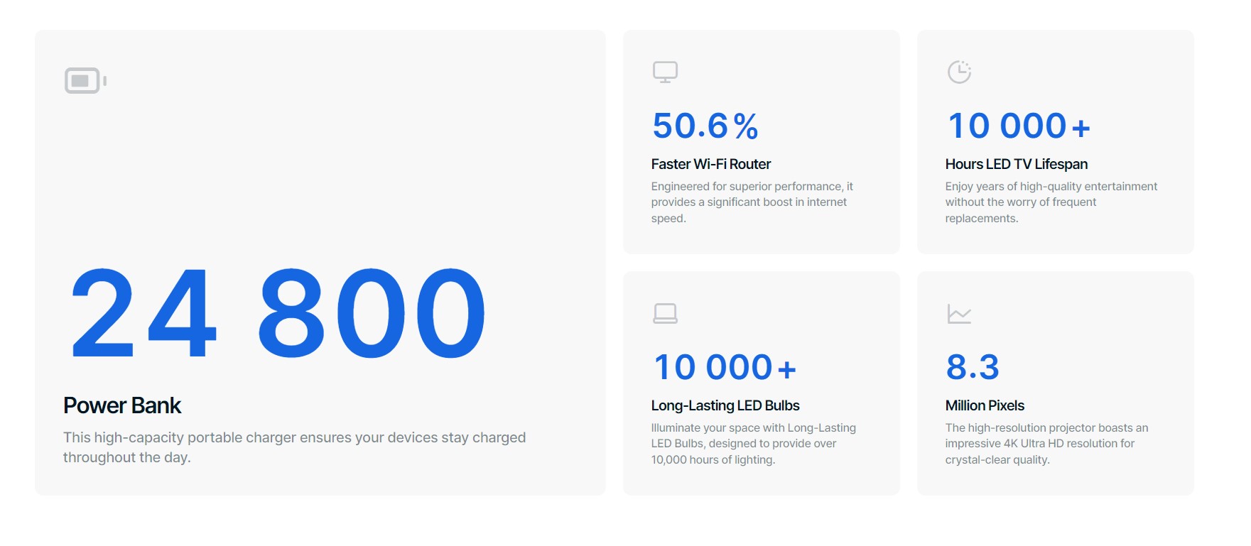
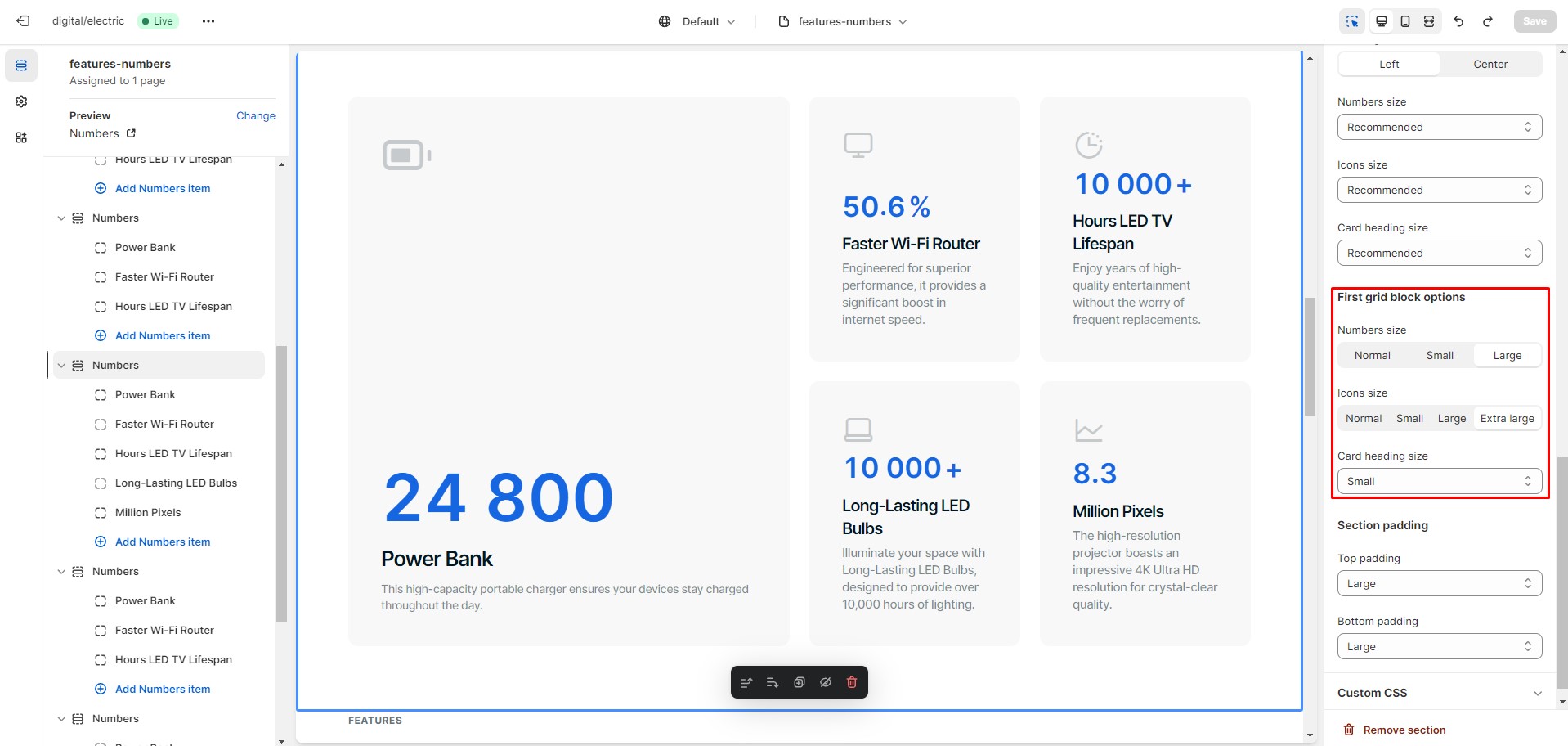
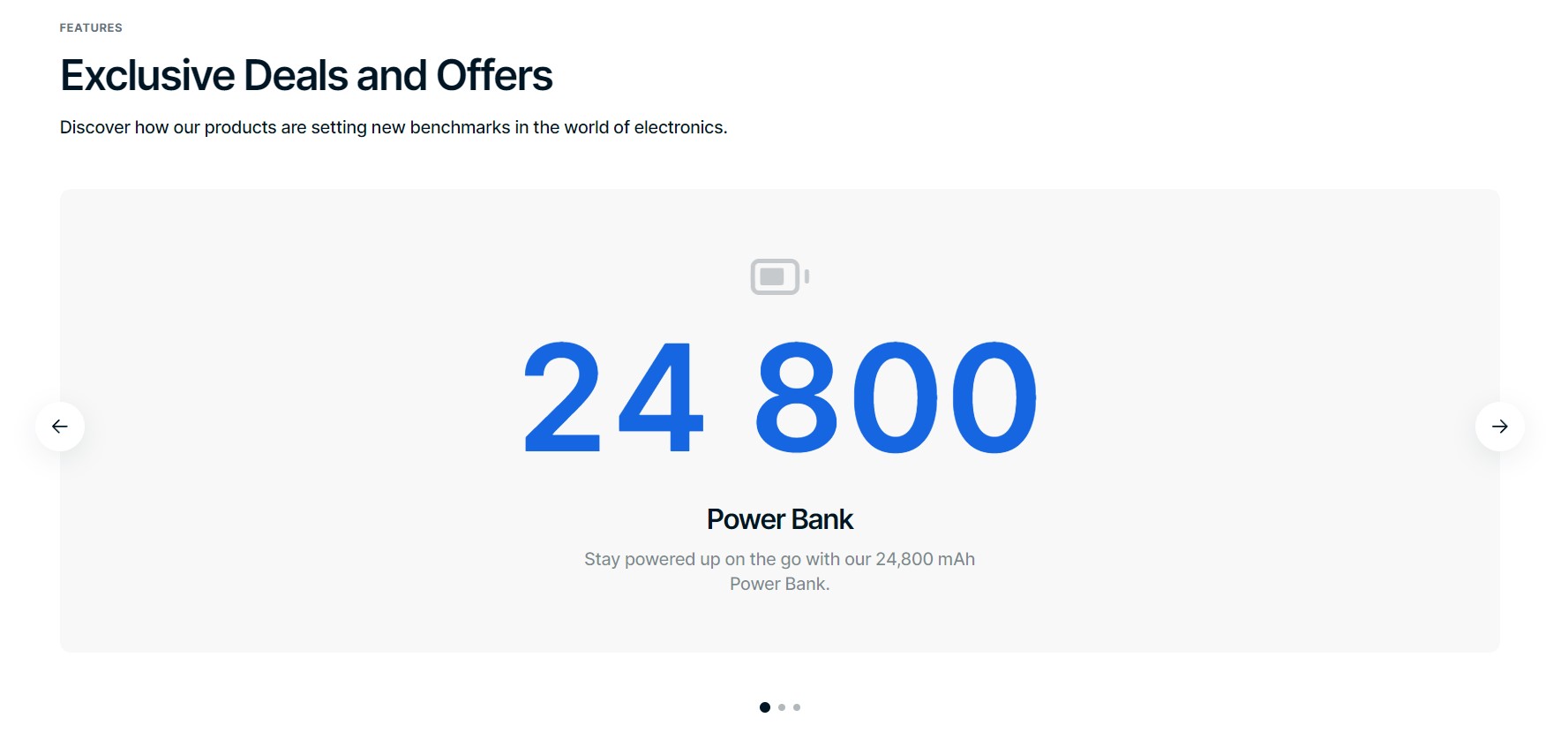
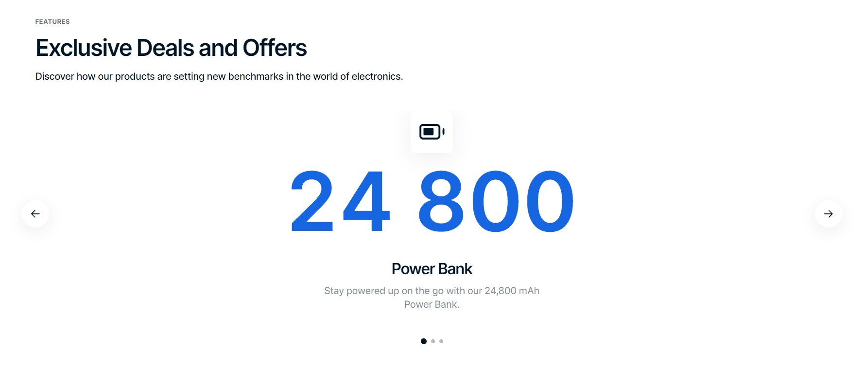
Numbers
There are 3 types of layout:
Columns
GridThere are special options available for the first grid block.
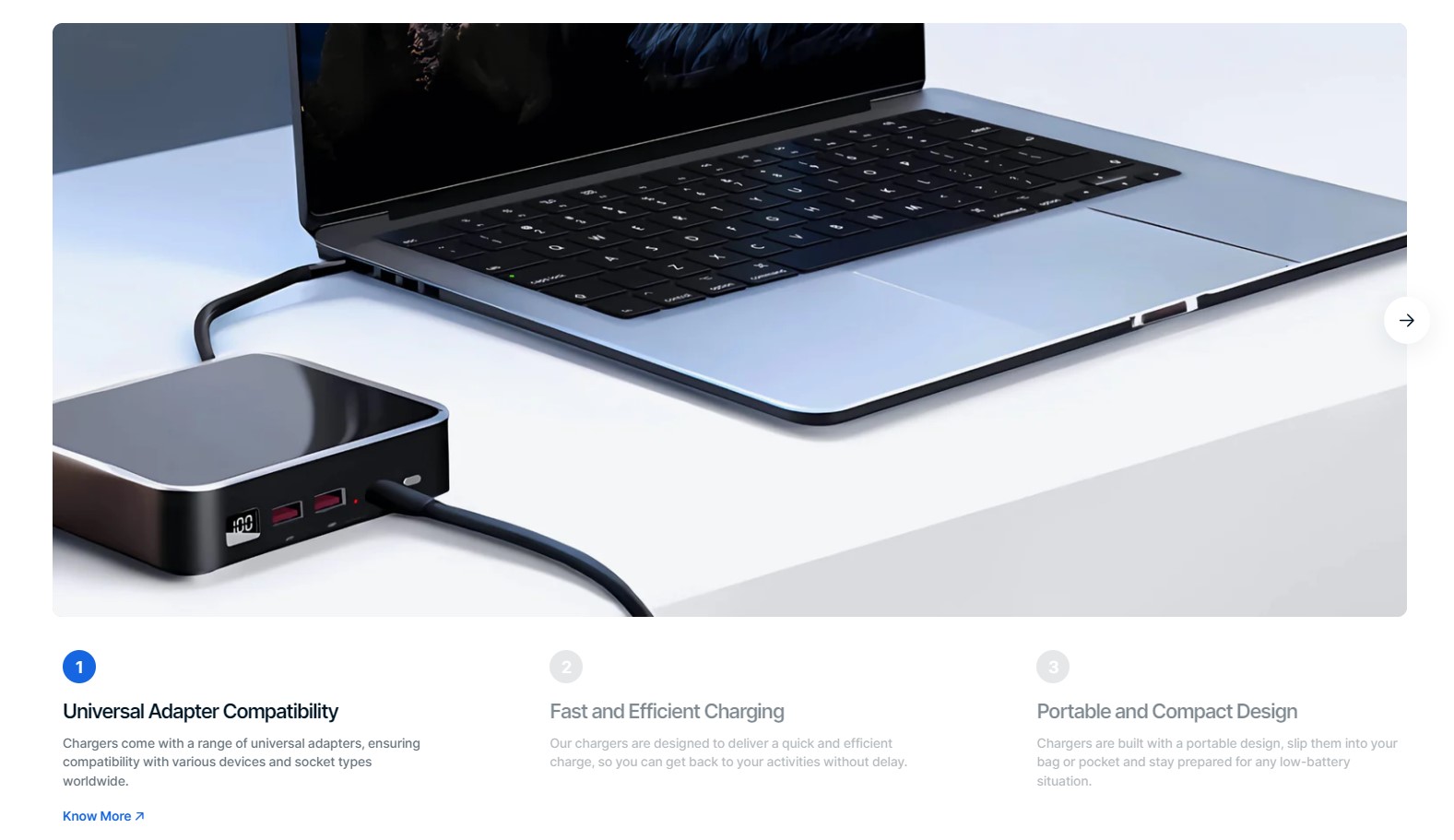
Slideshow
Slideshow
There are 2 types of layout:
Simple
Overlay
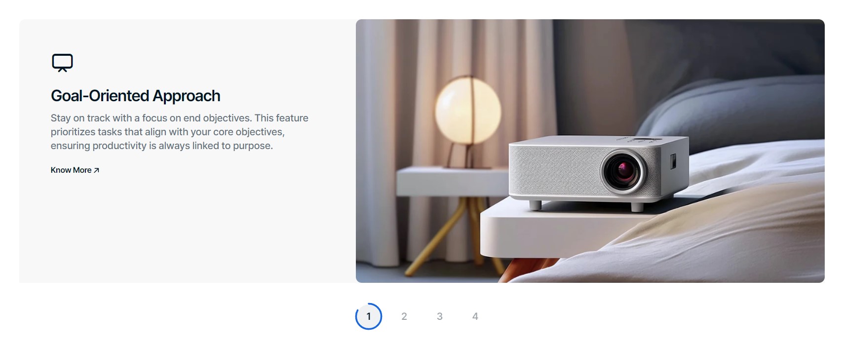
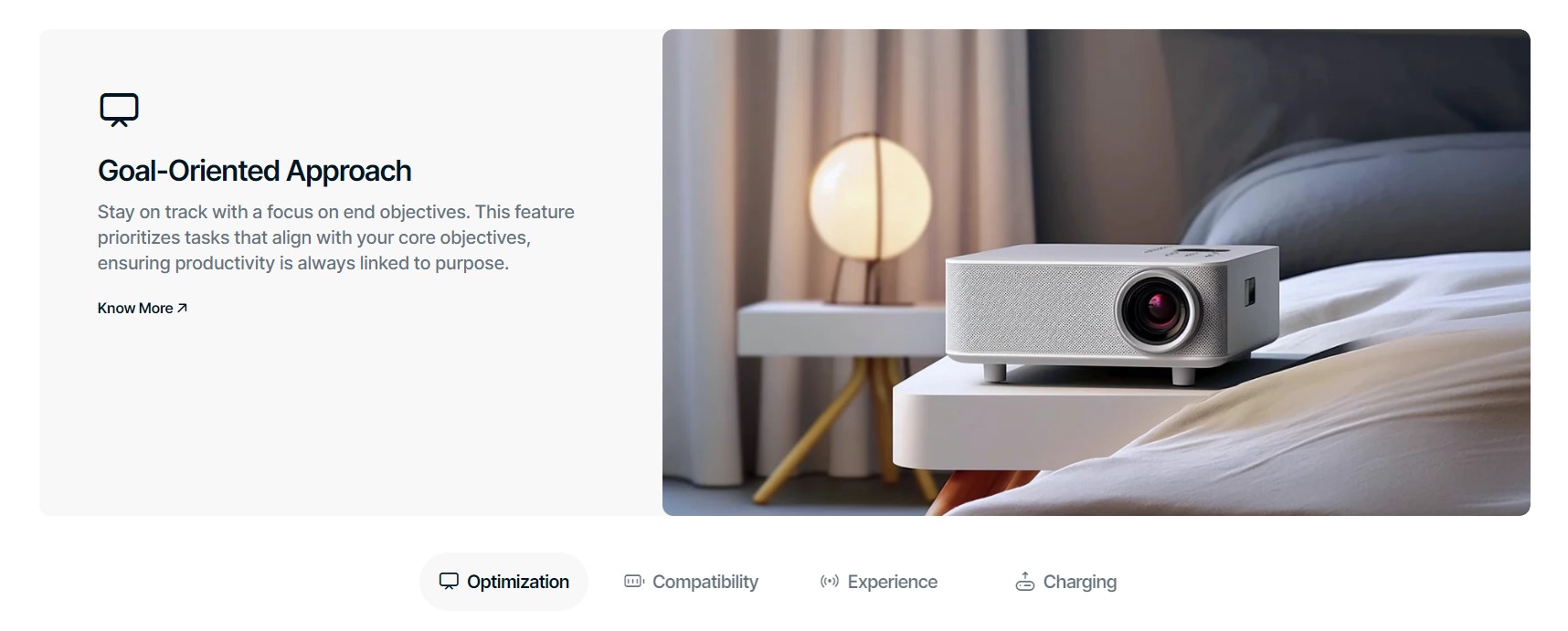
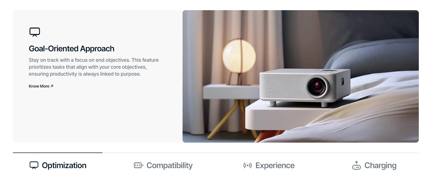
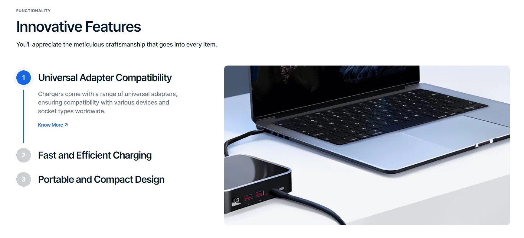
Steps
There are 4 types of layout:
Columns
Scroll
Collapsible
Slideshow
Settings
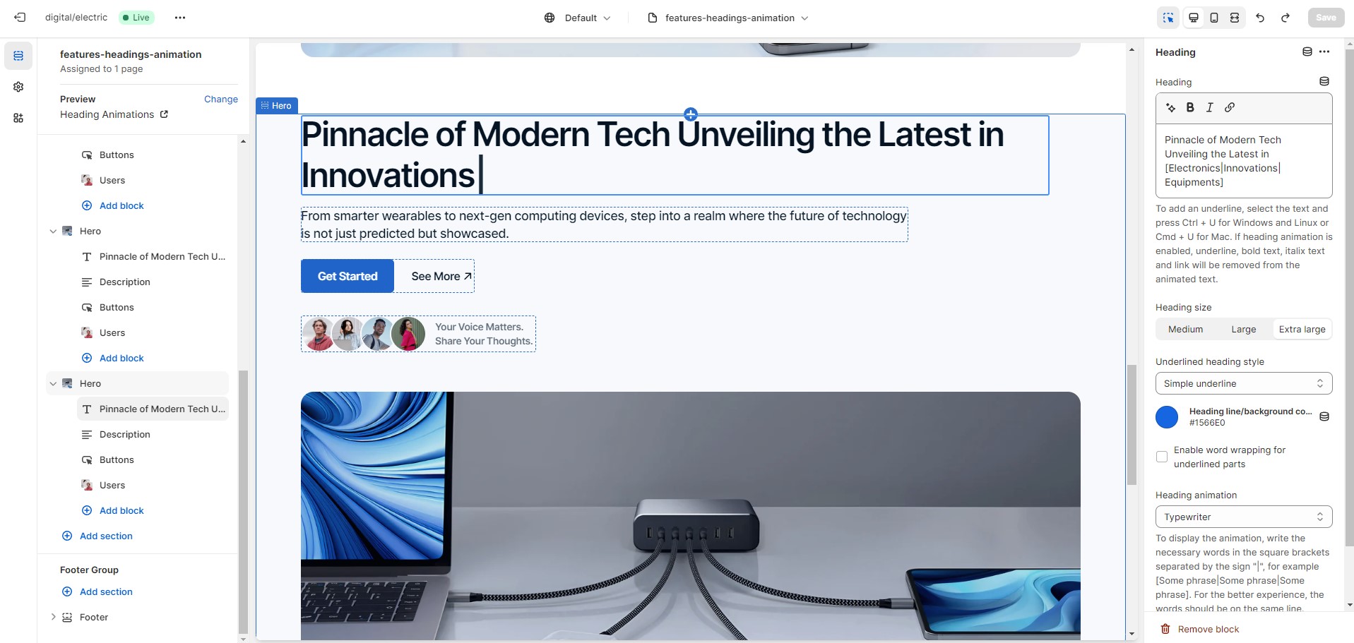
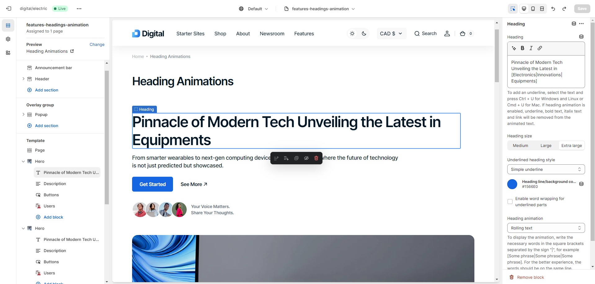
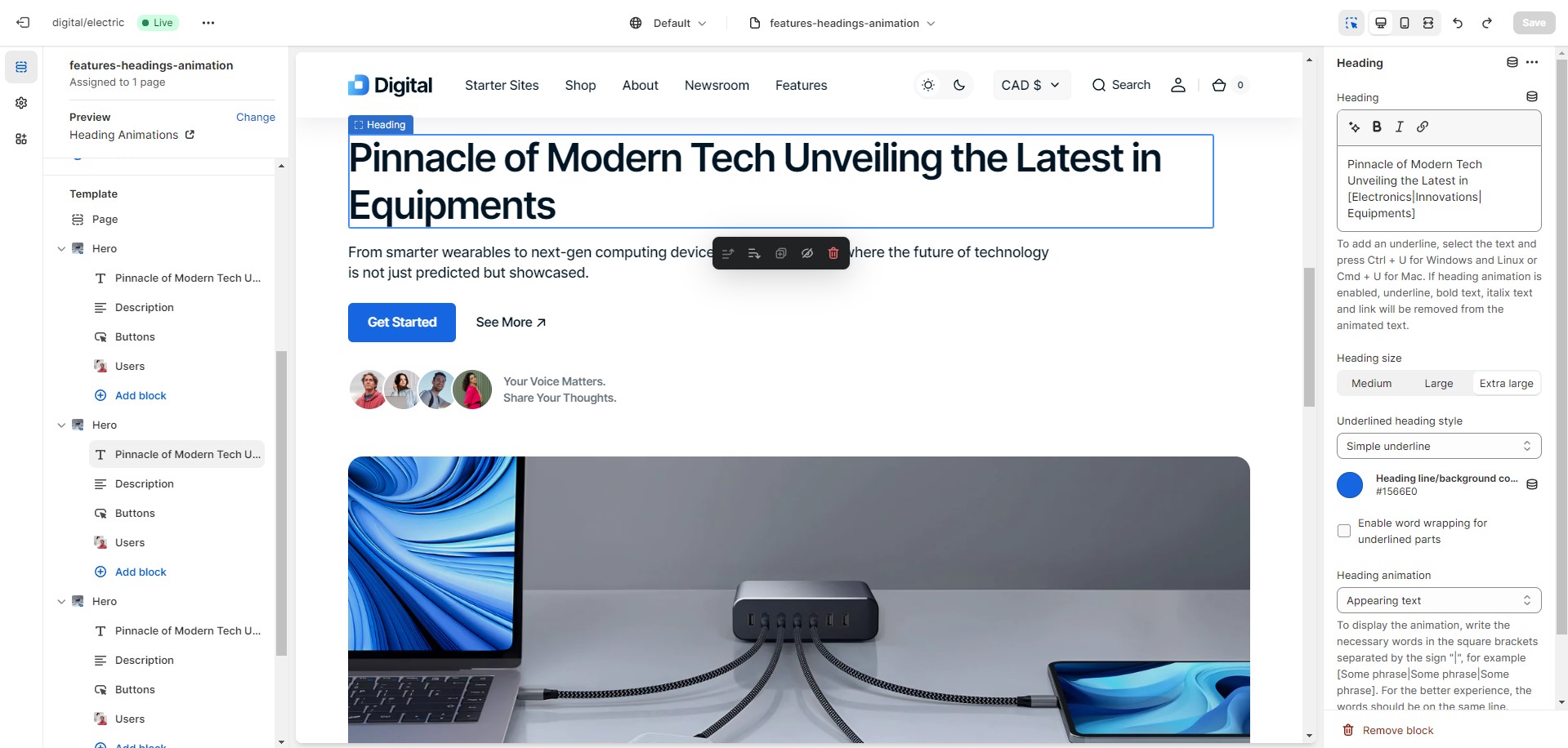
Heading Animations
There are 3 types of animations:
Typewriter
Rolling text
Appearing text
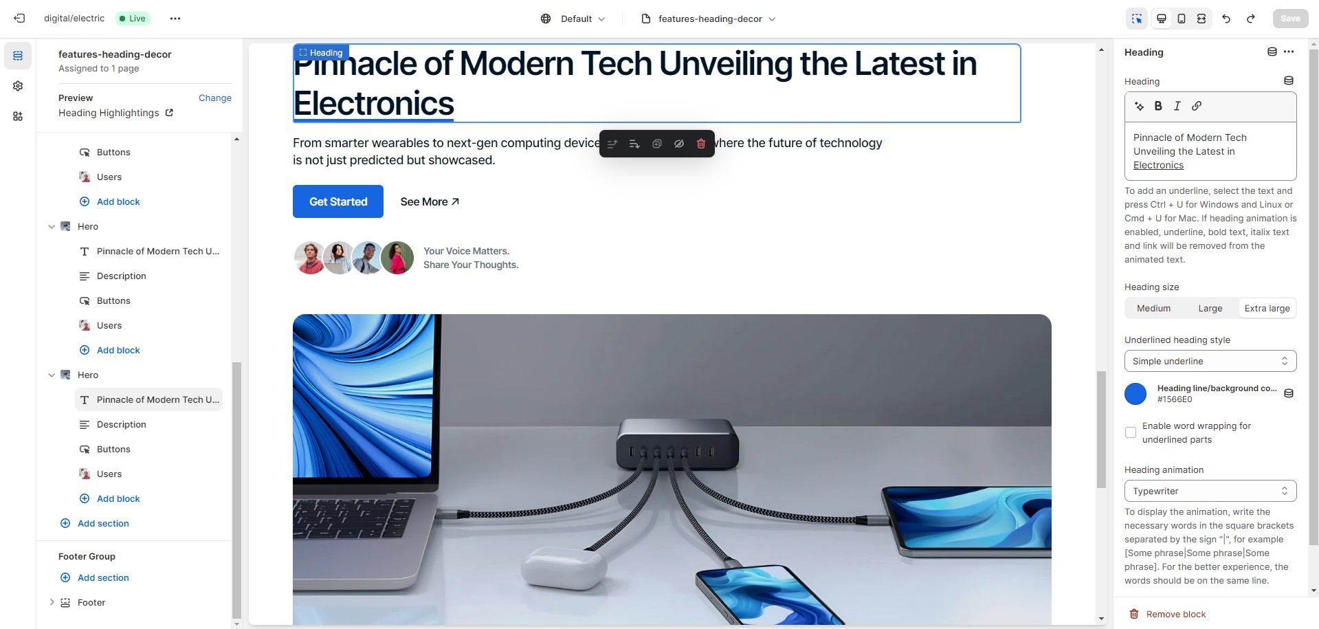
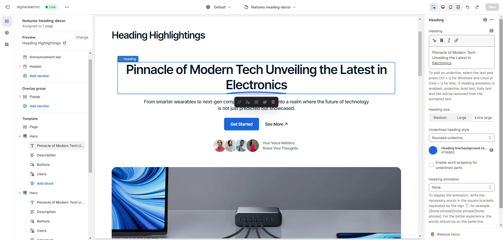
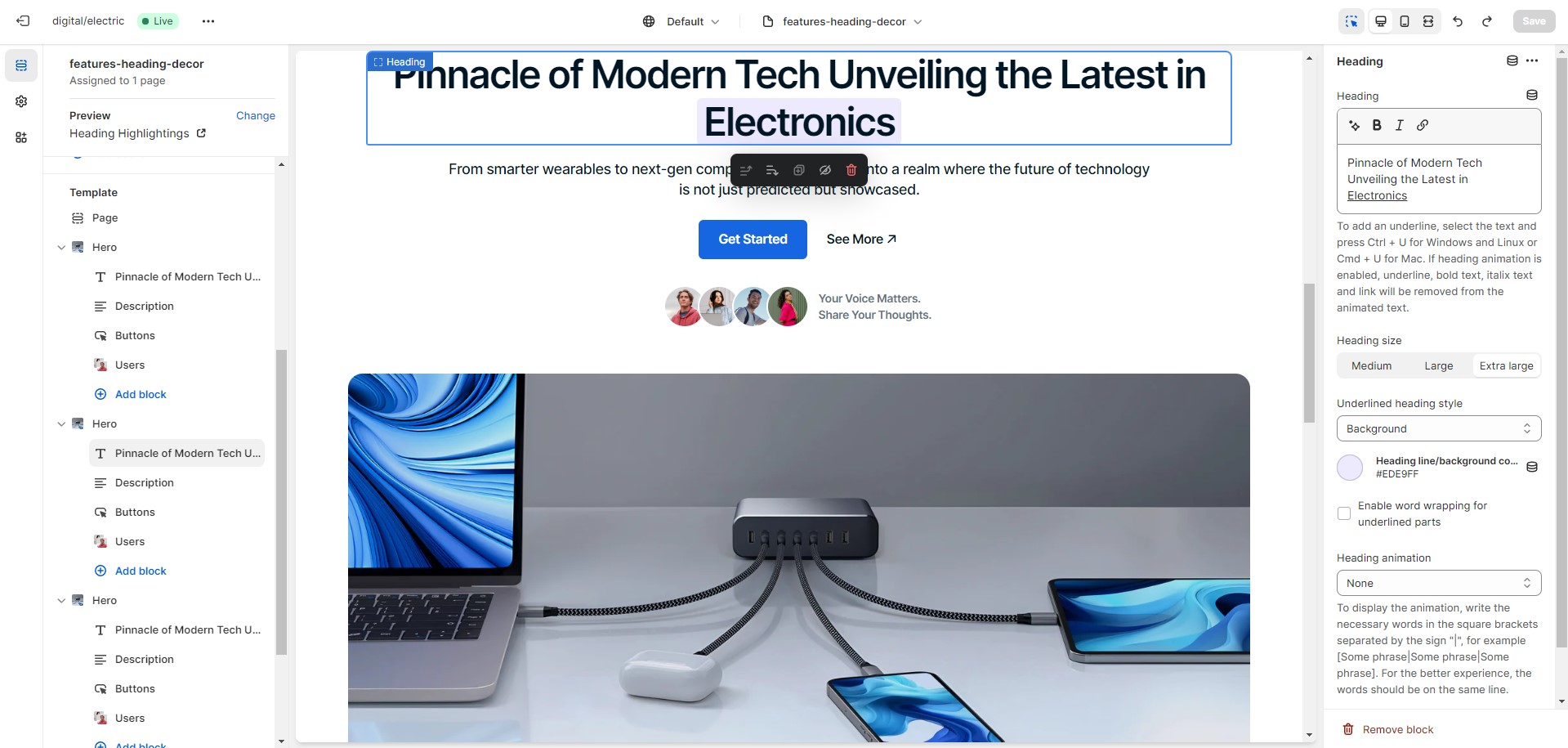
Heading Highlightings
There are 3 types of highlightings:
Simple underline
Rounded underline
Background
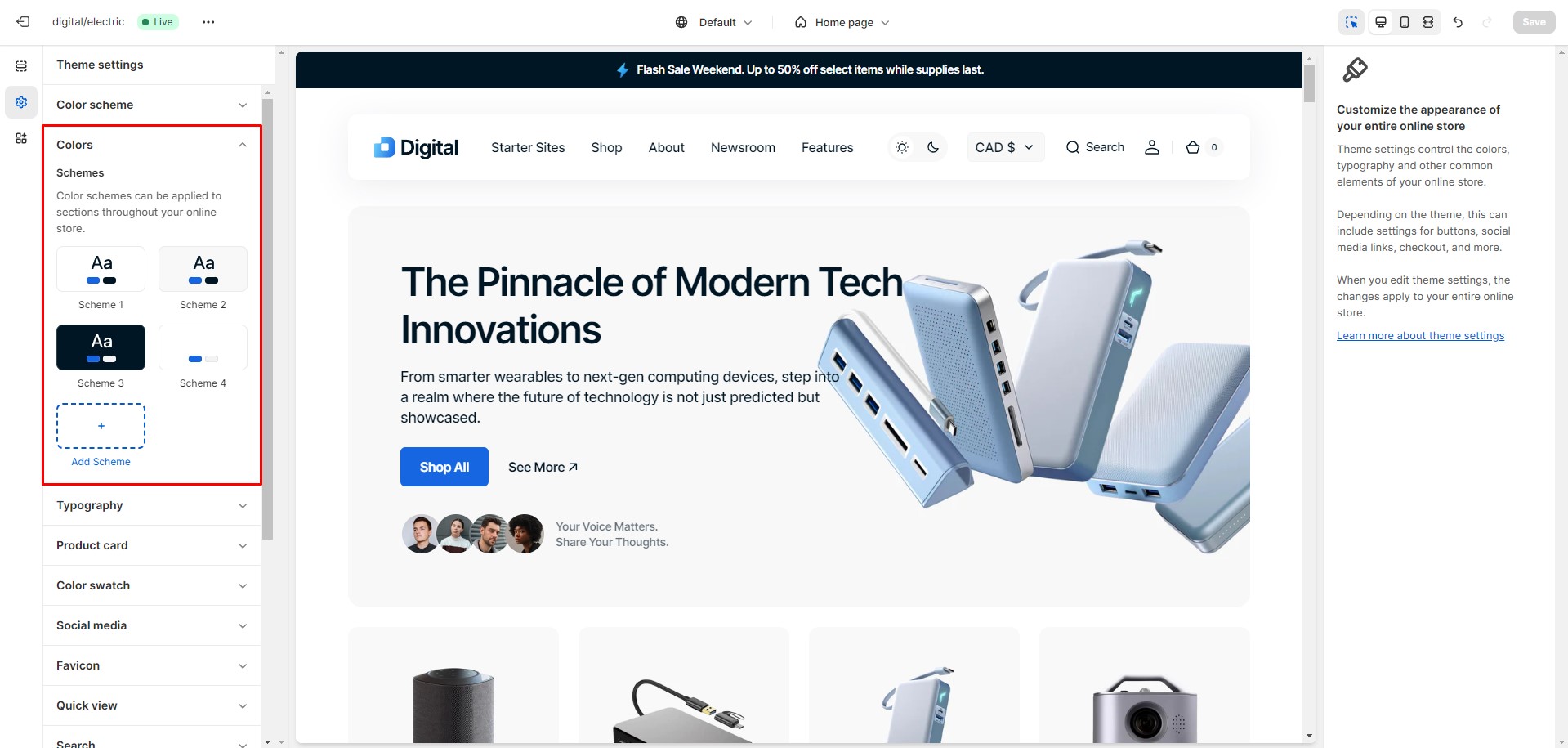
Colors
To edit the three base color schemes and add new ones, go to Theme settings > Colors. From there, you can
select a color
scheme in the sections and blocks where this option is available.
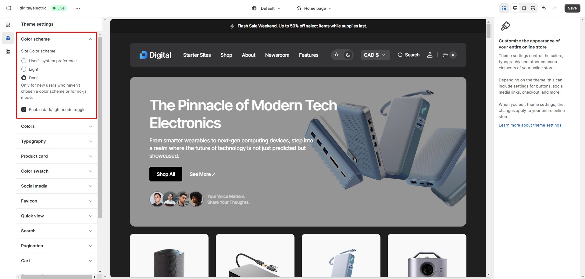
Dark Mode
To edit the Dark Mode settings, navigate to Theme settings > Color scheme.
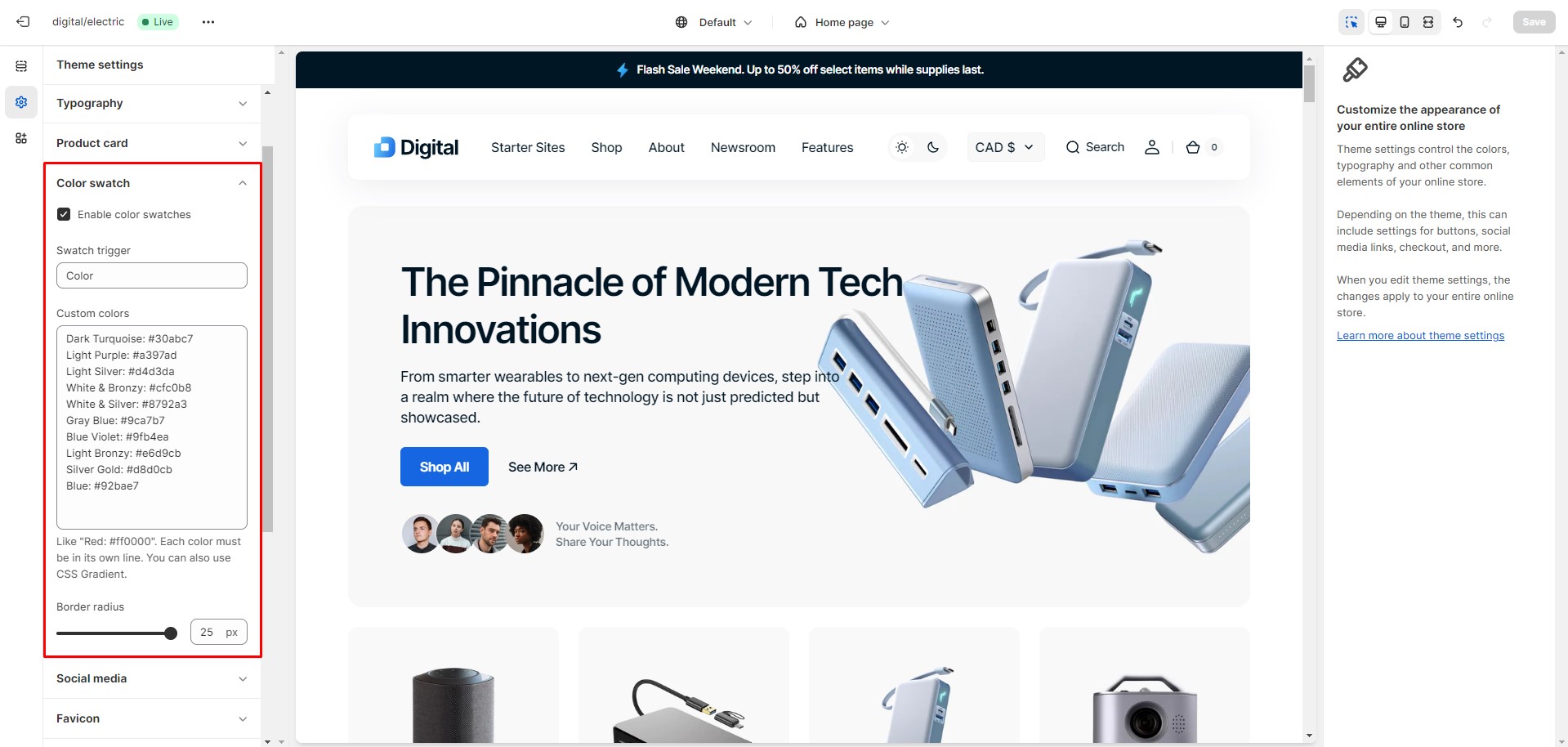
Color Swatches
To enable and edit Color swatches, navigate to Theme settings > Color swatches.
The swatch trigger should match the option in Product variants.
You can also add custom colors by specifying their name and HEX color code.
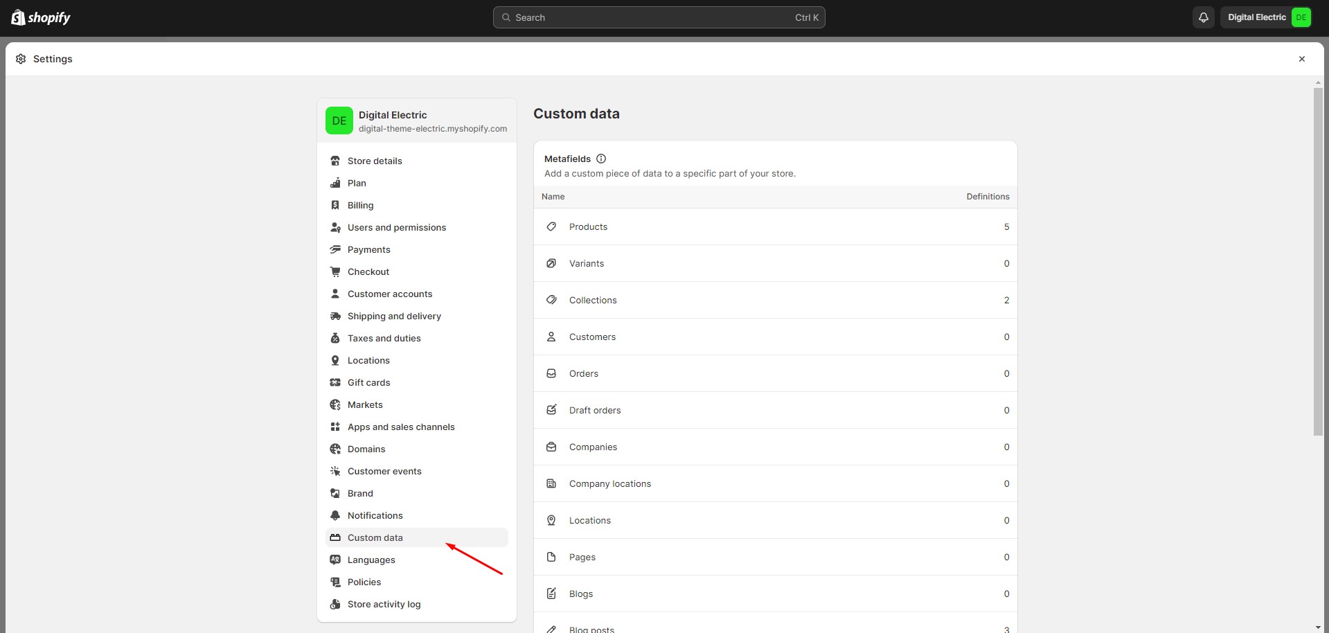
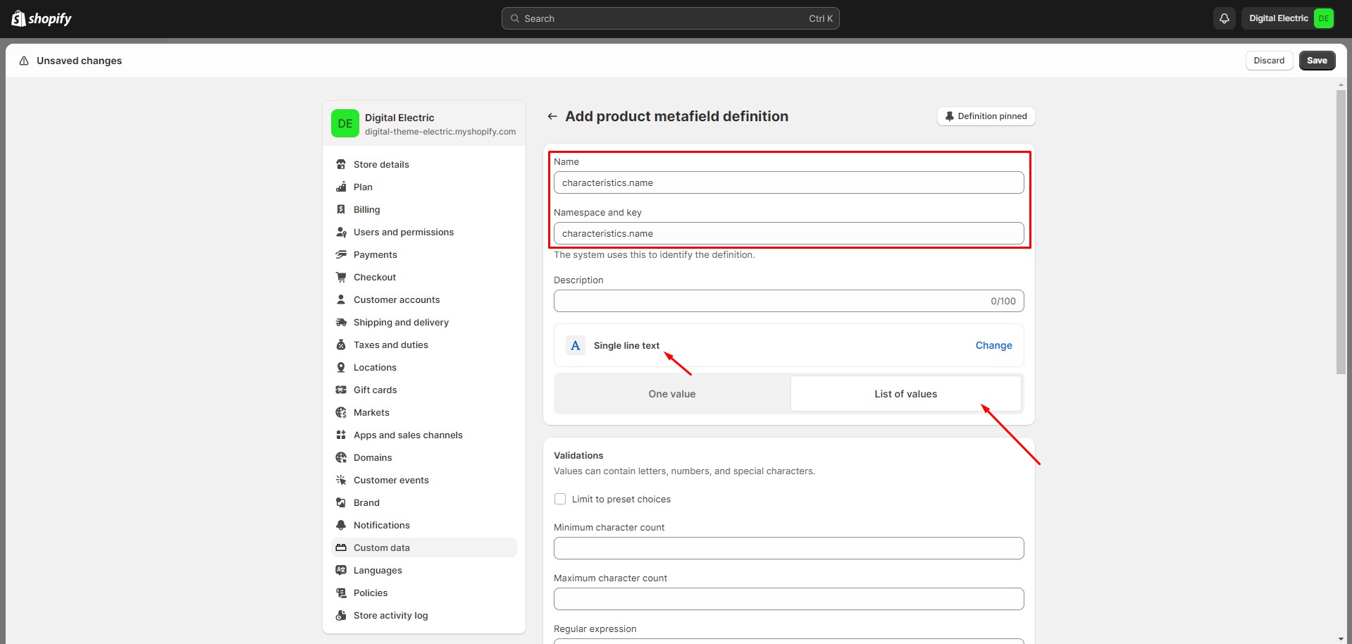
Metafields
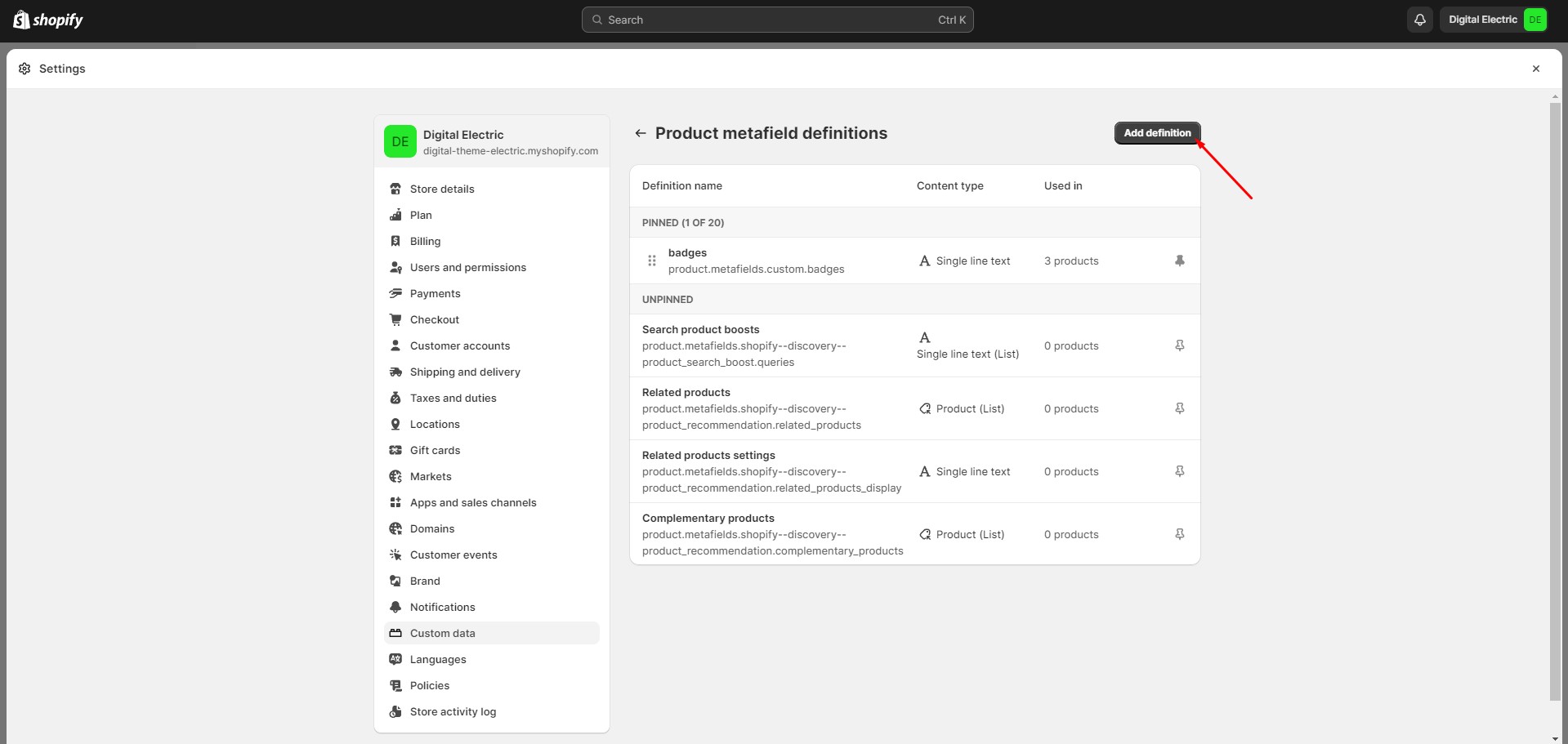
To add and edit metafields, follow these steps:
Navigate to Settings > Custom data in the Admin Panel.
Select an item to which you would like to add a metafield.
Click the button "Add definition" and fill the fields.
Navigate to the item to which you've added a metafield (e.g. Product or Collection) and add
information
below.
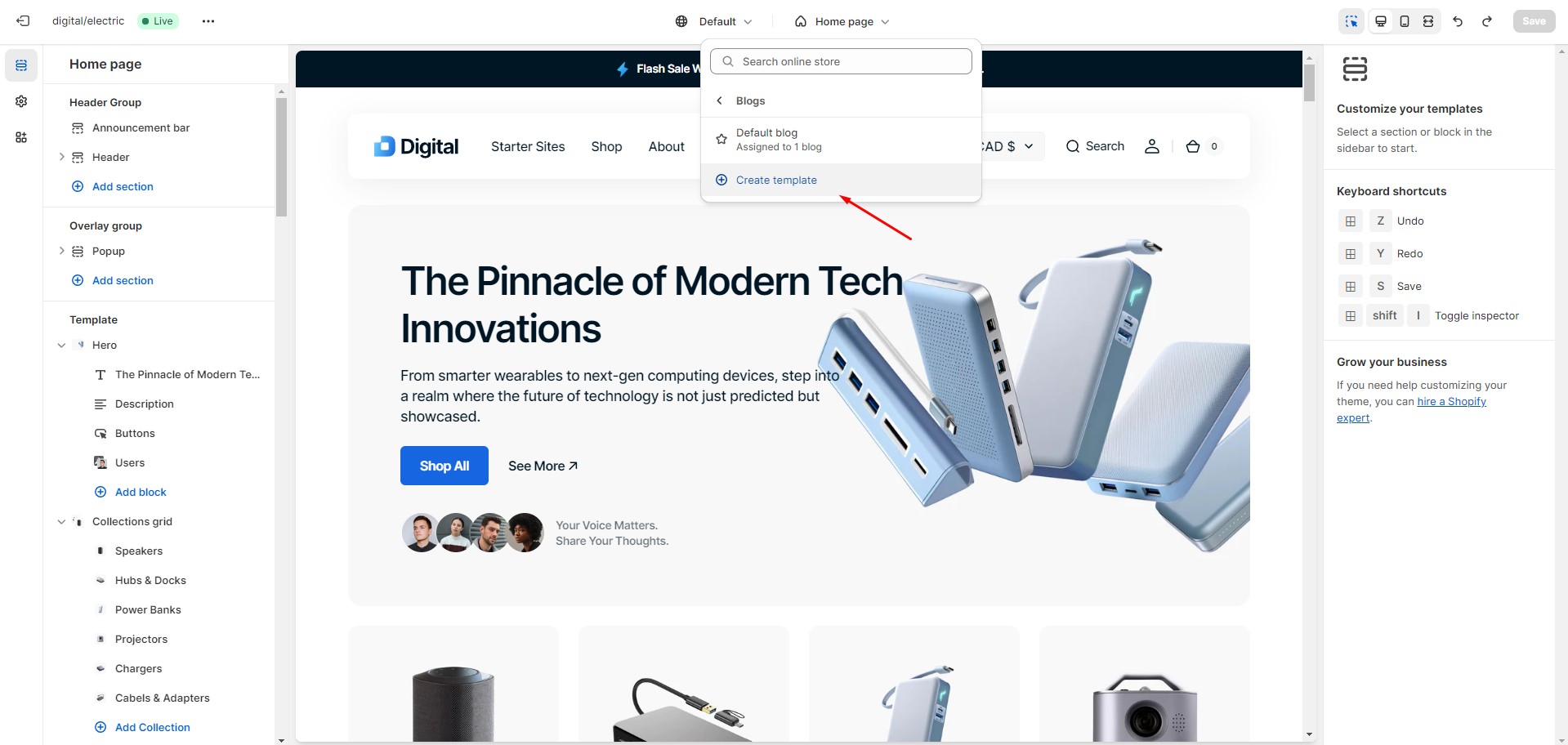
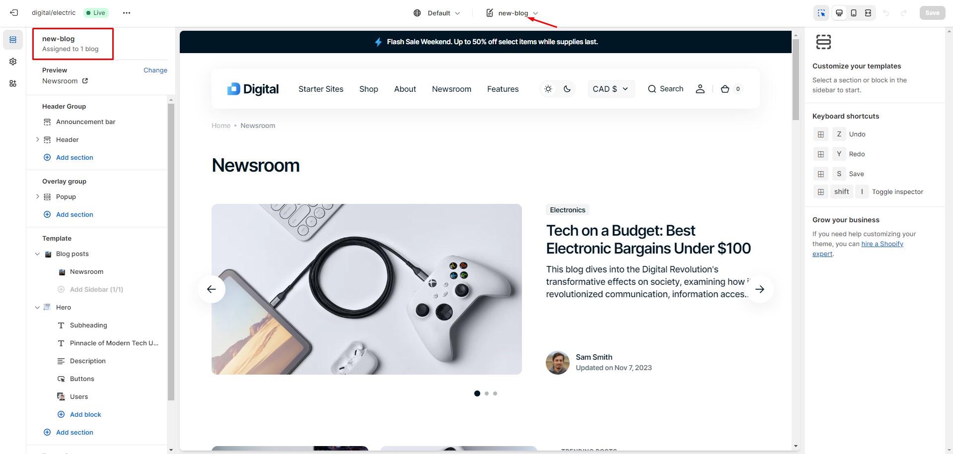
You can easily create and customize your templates. Here's an example below:
Choose the type of template you'd like to create and give it a name.
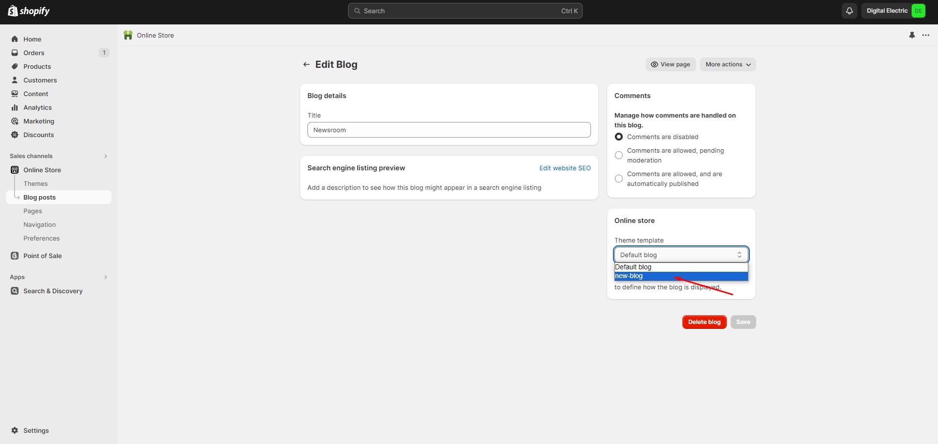
In the Admin Panel, select the page you want to assign your custom template to. Choose a theme template and save the changes.
Now, go back to the customizer, open the new template, and add the sections you want.
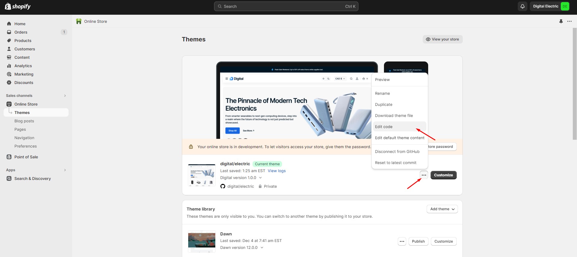
If you want to delete a custom template, go to the 'Edit code' section in the admin panel, select the template, and click the delete button. Please note that this action can impact your theme, so proceed with caution.
Page
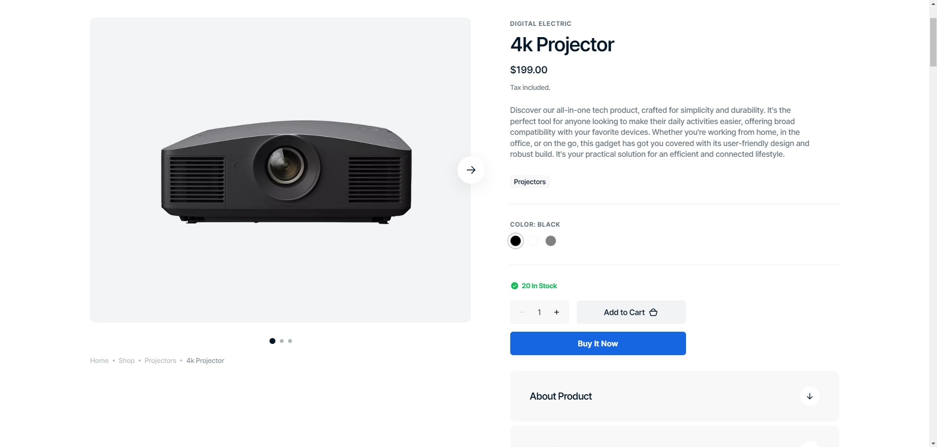
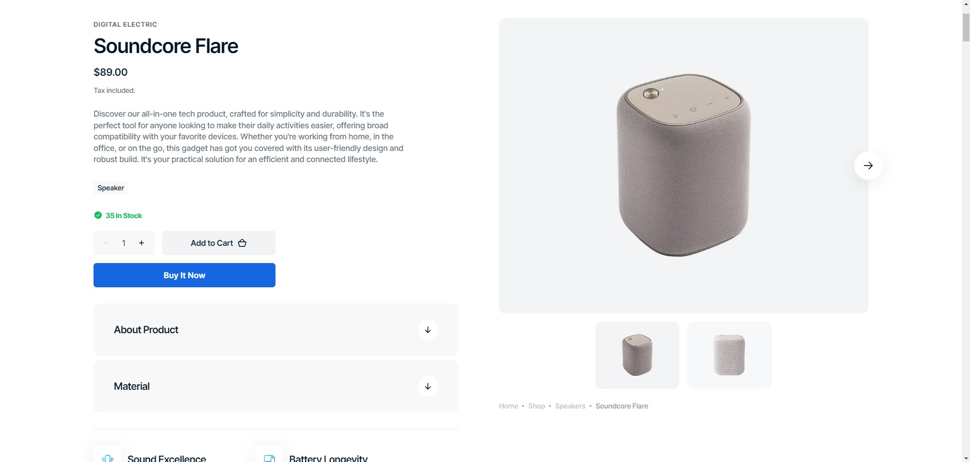
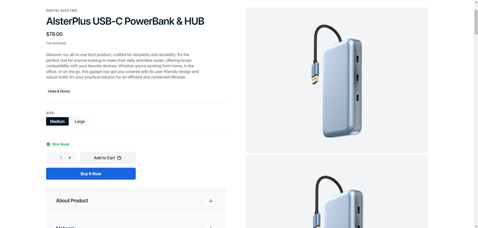
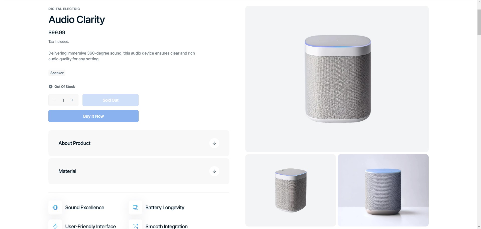
Product Page
There are 4 types of product galleries:
Slider with previews
Slider with bullets
Stacked gallery
Grid gallery
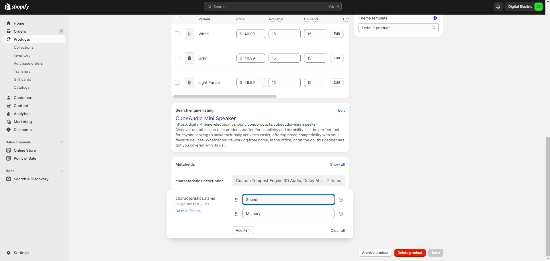
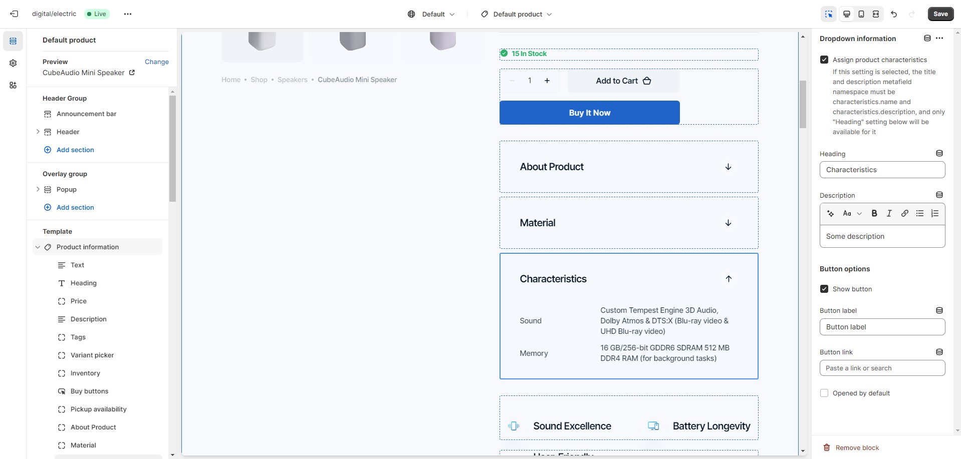
If you would like to add more dynamic information to the product, you can use metafields. To add metafields,
navigate to
Settings > Custom data > Products in the Admin panel.
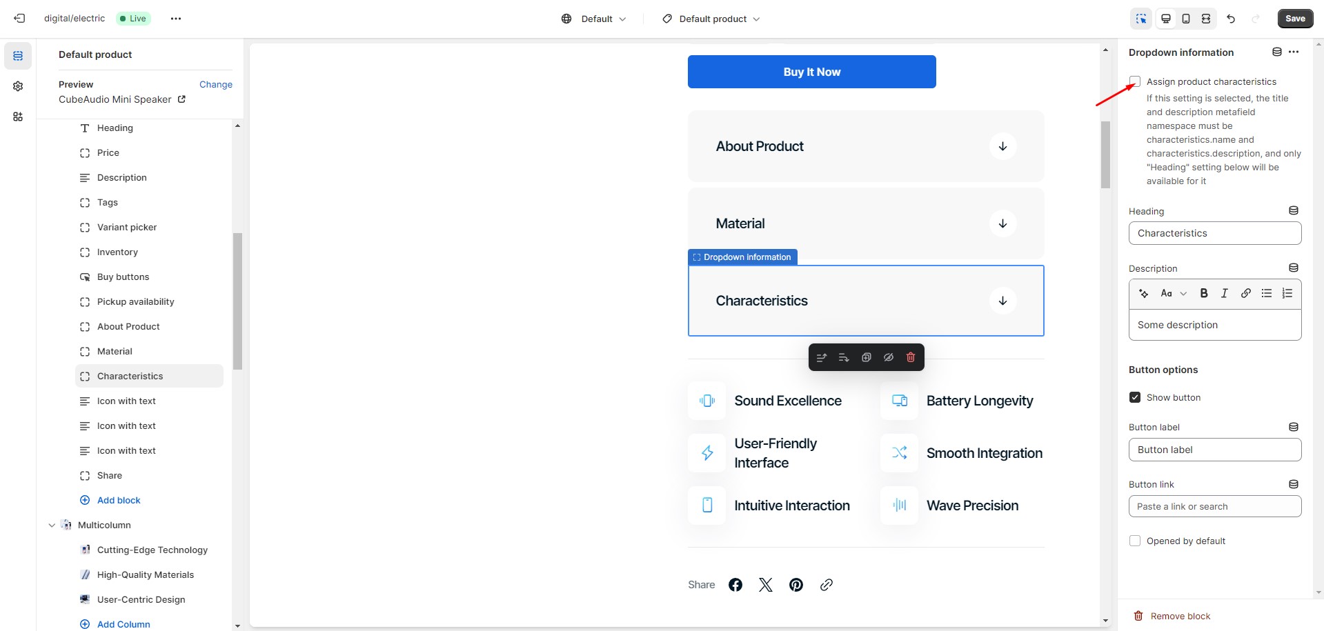
You can add dynamic characteristics to the product by following these steps:
Add two metafield definitions with the key names "characteristics.name" and
"characteristics.description".
Choose the "Single-line text with list of values" type for the both metafields.
Navigate to the product and add characteristics.
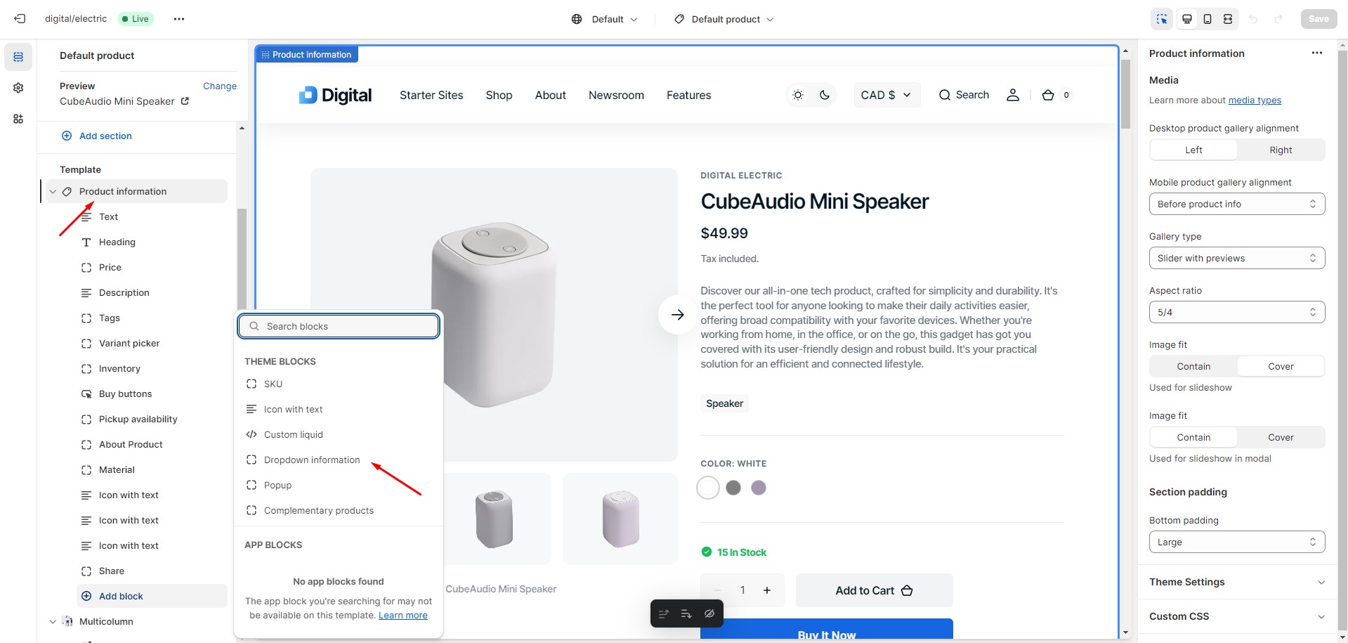
Add Dropdown information block to the product page and enable checkbox “Assign product
characteristics”.
Product Recommendations and Complementary Products
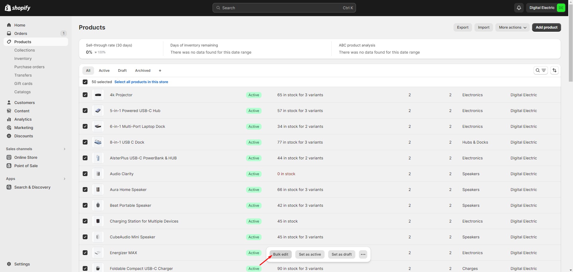
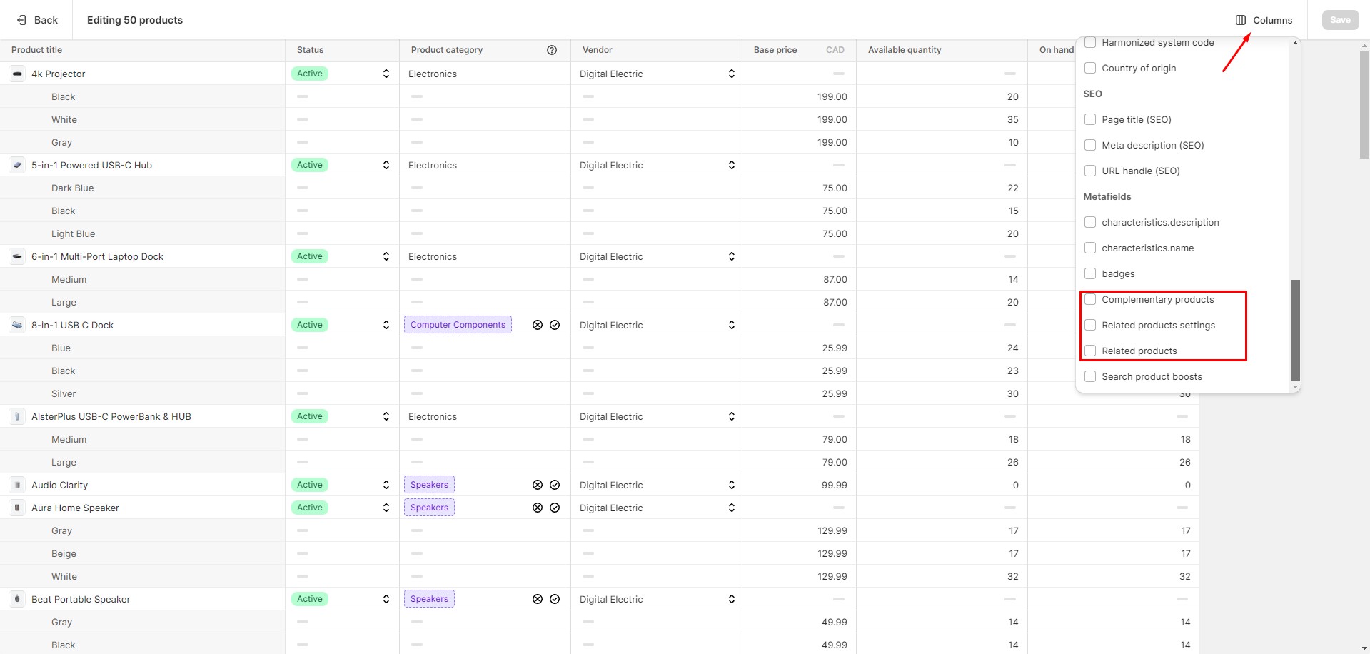
To add and edit product recommendations, follow these steps:
Install the Search & Discovery app by Shopify from the Apps page in the Admin Panel.
Once installed, open the app and follow the “Add product recommendations” link in the Feature overview section to add recommendations to your products.
You can easily edit or add recommendations for multiple products using the Bulk Editor in the Products tab in the Admin Panel.
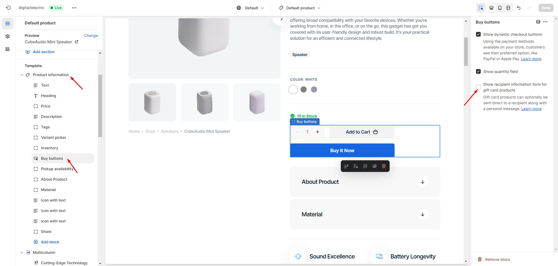
Gift Card Recipient
To add recipient and message fields to gift card products, navigate to the customizer > Product page > But
buttons
block. Check the "Show recipient information form for gift card products" option that enables the display of
recipient
information form for gift card products.
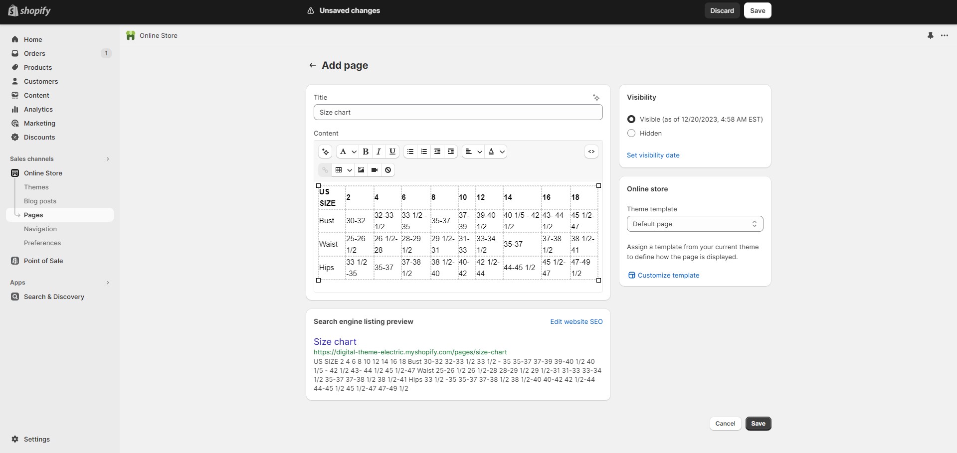
Size Chart
To add a Size Chart, follow these steps:
Create new page with a table.
Add a "Advantage" block to the product page.
Select "Size Chart" page. Works only in Popup toggle type.
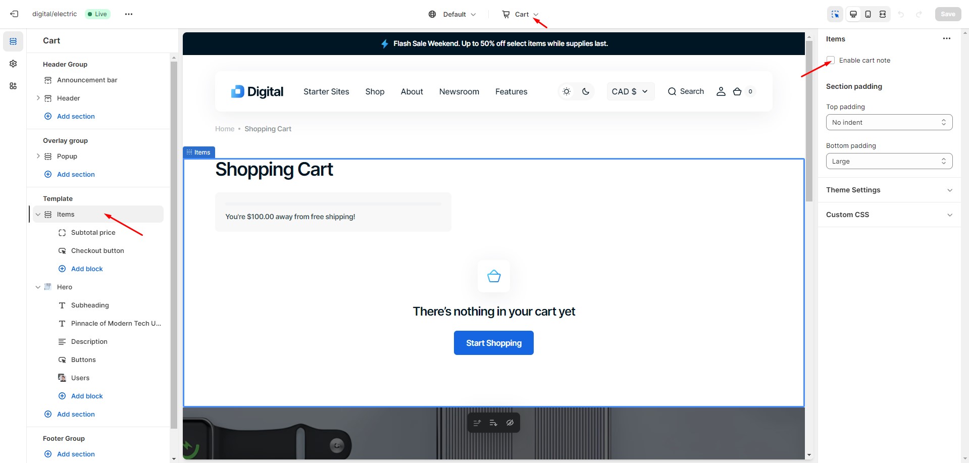
Cart
To enable cart note, navigate to the customizer > Cart > Items, and check the “Enable cart note” option.
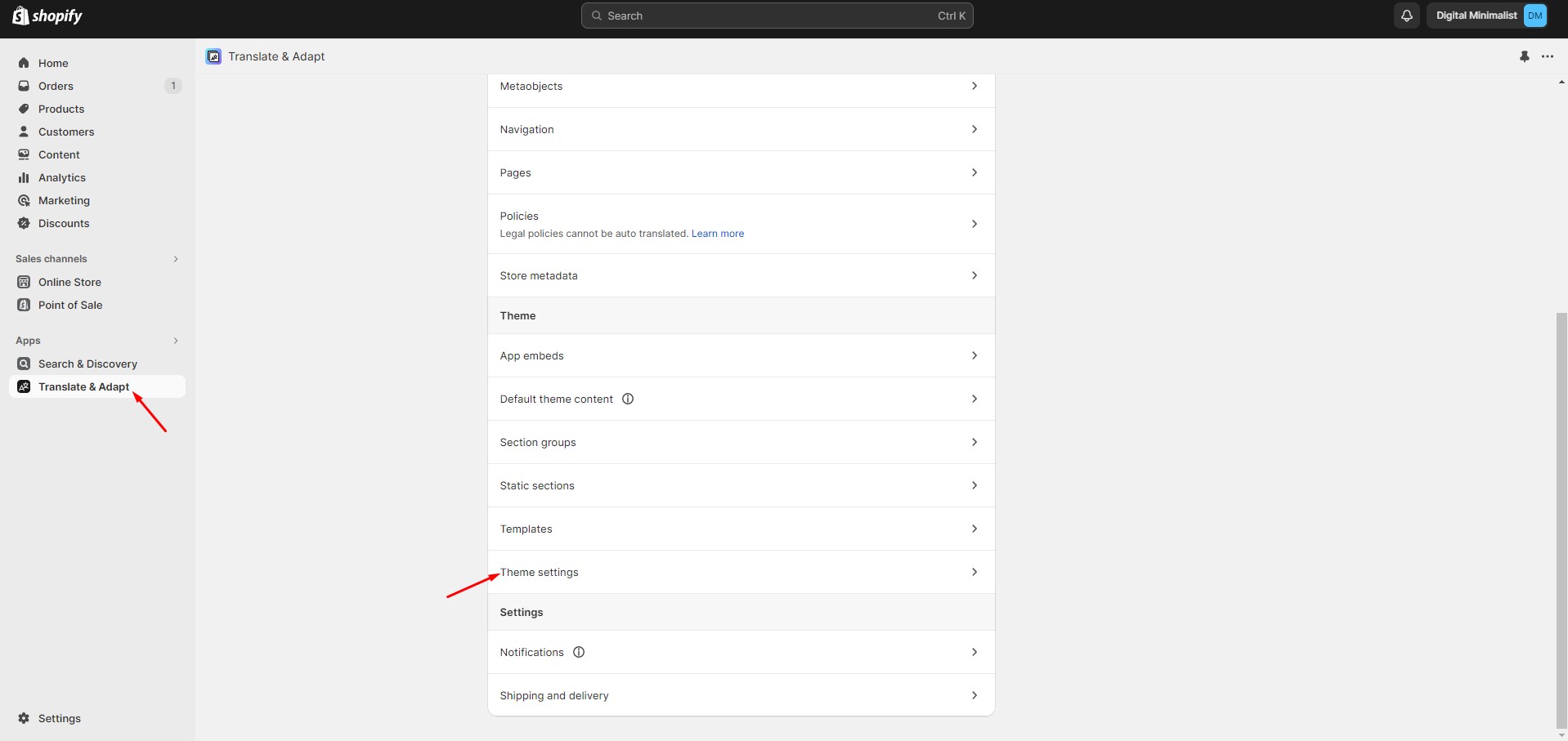
Free Shipping
To avoid issues in stores with multiple languages, keep the text '{amount}' untranslated.
Collection Page
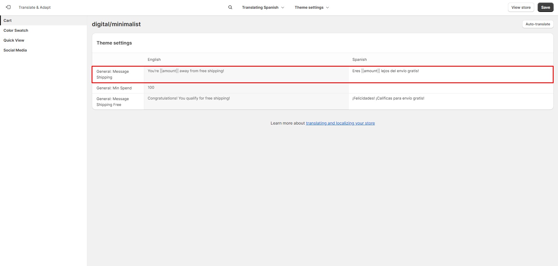
To enable advanced filtering, follow these steps:
Install the Search & Discovery app by Shopify from the Apps page in the Admin Panel.
Once installed, open the app and follow the 'View filters' link in the Feature overview section to
manage
the filters.
Note: Product type and tag filters are only shown to customers shopping in the store's default language. Vendor
filter
values are always based on the store's default language.
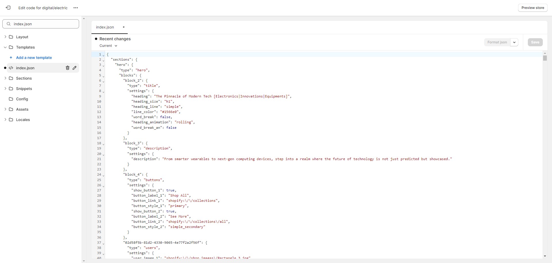
Importing Our Demos
You can also copy the structure of any of our 5 demos in a few steps.
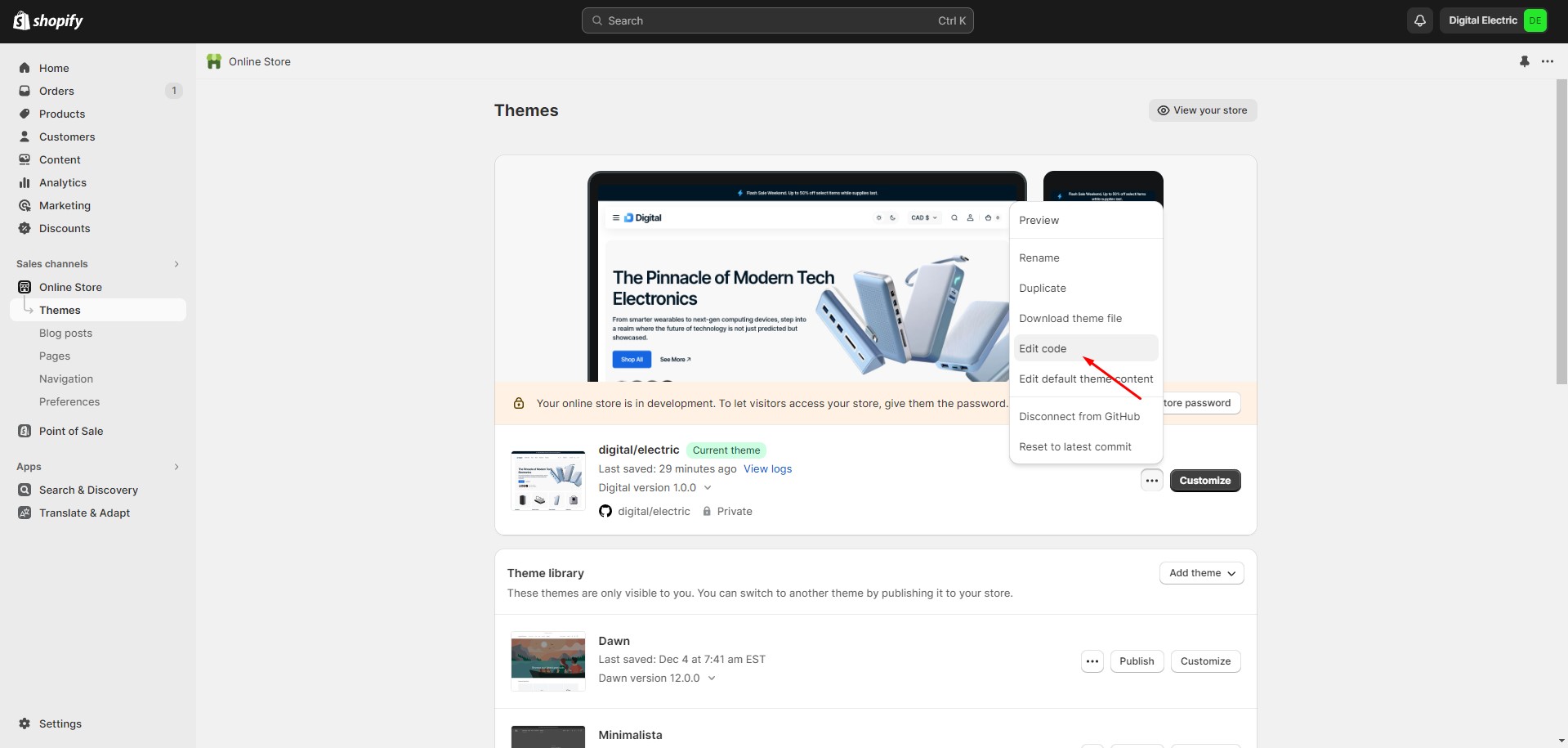
Follow to the section Online Store > Themes in your store. Click the three dots button of your
theme.
Open the code editor by clicking the Edit code button.
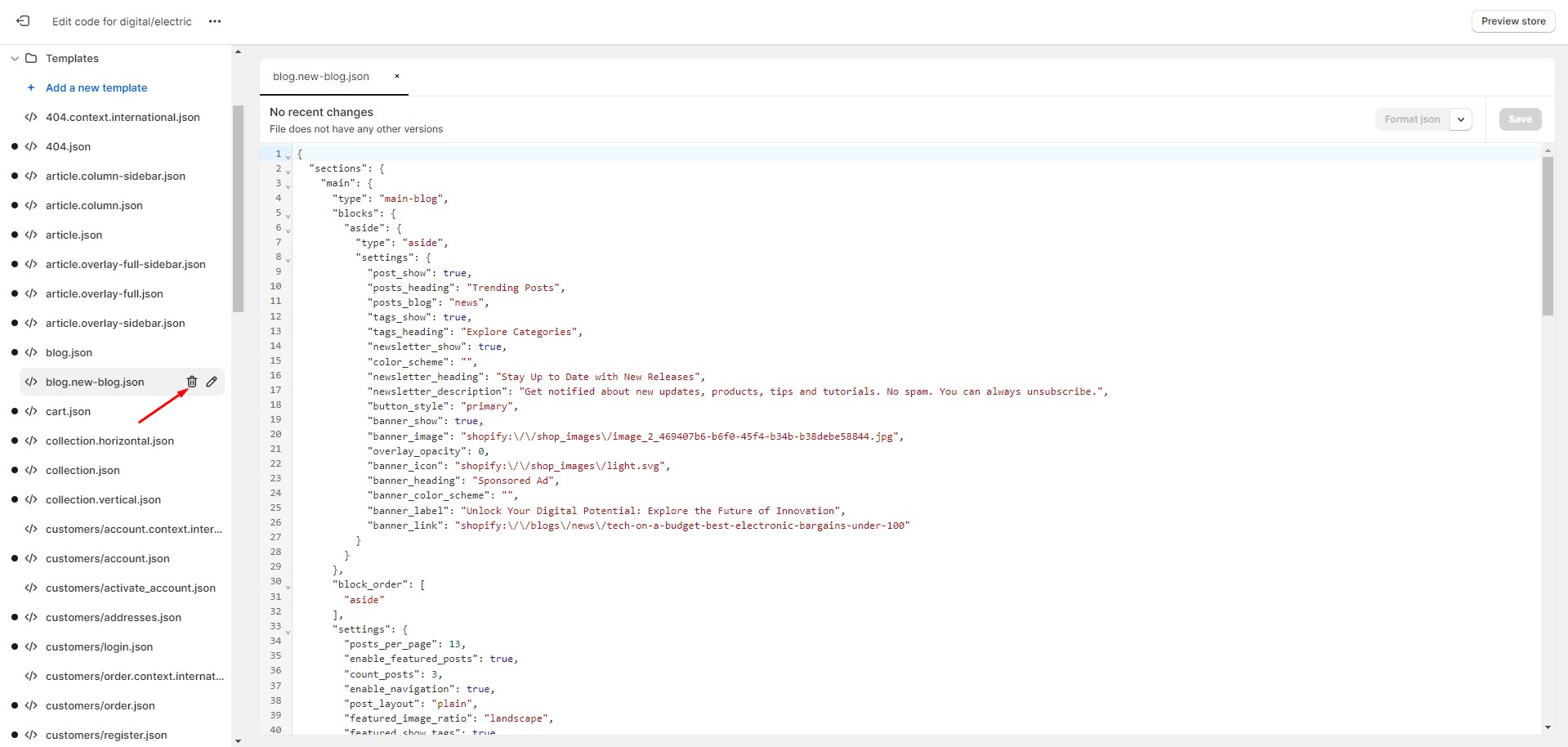
In the code editor, search for the file "index.json", select all content, and paste replacing the demo
structure. Click
"Save" to save your changes. If there's an error, click "Format json" and try to save the file
again.


